10,000 search results
(0.186 seconds)
- Screamous by Fikryal,
$22.00 Screamous – Unique Display This font is very suitable to be applied in various aspects of design, and your branding. It’s perfect for logos, branding, title, social media posts, advertisements, product packaging, product designs, label, photography, watermark, special event, magazine, web designs, etc. Features : Multilingual Support If you have any questions please don’t hesitate to contact me follow my Instagram: fkryall Thank you
 - Creatify by Fikryal,
$18.00 Creatify – Font is a bold script font. It’s perfect for logo, branding, title, social media posts, advertisements, product packaging, product designs, label, photography, watermark, special event, magazine, web design, etc. Features : Creatify ( Uppercase, Lowercase ) Contextual alternates Stylistic alternate Ligatures Multilingual Support If you have any questions please don’t hesitate to contact me. follow my Instagram: fkryall Thank you Fikryal Studio
 - Used Cars JNL by Jeff Levine,
$29.00Used Cars JNL is based on one of the many unique alphabets created by the late Alf R. Becker for Signs of the Times magazine from the 1930s through the 1950s. Special thanks to Tod Swormstedt of ST Media (who is also the curator of the American Sign Museum in Cincinnati, Ohio) for providing the reference material for this design - Lemon Mocktail by Fikryal,
$20.00 Lemon Mocktail – Display Serif This font is very suitable to be applied in various aspects of design, and your branding. It’s perfect for logos, branding, title, social media posts, advertisements, product packaging, product designs, label, photography, watermark, special event, magazine, web designs, etc. Features : Multilingual Support If you have any questions please don’t hesitate to contact me follow my Instagram: fkryall Thank you
 - Timothy Signature by Typesthetic Studio,
$13.00 Timothy Signature is a flowing handwritten font, described by an elegant touch, perfect for your favorite projects. Fall in love with its incredibly distinct and timeless style and use it to create spectacular designs! Fall in love with its incredibly versatile style and use it to create gorgeous wedding invitations, beautiful stationary art, eye-catching social media posts, and much more!
 - Gresic by Yukita Creative,
$14.00 Gresic is a modern sans serif font, which is very bold, and contrasting, a font with this style is being sought after on the planet for modern design needs such as logo design, application design, website, social media, and others. Why not try Gresic Modern Font today? It comes in uppercase, lowercase, punctuation, and numbers; no more worrying about anything else.
 - Simplesky by Timurtype,
$14.00 Introducing by Timur type Proudly Present, Simplesky Simplesky A Handwritten Script Font, which was created with great care and specially created for you ✨ Simplesky is perfect for product packaging, branding project, megazine, social media, wedding, or just used to express words above the background. Simplesky also multilingual support. Embelish your designs with our original fonts. Enjoy the font 😉 Thank you!
 - Molaka by Maulana Creative,
$12.00 Molaka Modern Script Font consisting of a fashionable sophisticated signature-style script with it's own unique curves and an elegant inky flow. Molaka Modern Script Font is perfect for branding projects, logo, wedding designs, social media posts, advertisements, product packaging, product designs, label, photography, watermark, invitation, stationery and any projects that need handwriting taste. Thanks for use this font, MaulanaCreative
 - Russeline by Stringlabs Creative Studio,
$25.00 Russeline is a sweet and simple script with an authentic vibe. Fall in love with its authentic feel and use it to create gorgeous wedding invitations, beautiful stationary art, eye-catching social media posts, and cute greeting cards. The Chellyne font is a great choice to increase the prominence in your project. Although the typography is traditional, the basic elements are great.
 - Beauty One by Attype Studio,
$15.00 Introducing Beauty One, a stylish monoline script style font. This beautiful script font offers your personal touch to your latest art project with fresh, curvy and beautiful look. Beauty One offers is perfect for many different project such as logo, branding, invitation, flyer, posters, social media posts, advertisements, product packaging, product designs, label, photography, special events or anything that need monoline script taste.
 - Requista by Timurtype,
$14.00 Introducing by Timur type Proudly Present, Requista Requista A Handwritten Script Font Requista is perfect for product packaging, branding project, megazine, social media, wedding, or just used to express words above the background. This Claritty font includes: -Full Set of standard alphabet and punctuation & symbol -Extra set Ligature -multilingual support. Embelish your designs with our original fonts.Enjoy the font,Thank you!
 - Paper Sign by Arukidzfl,
$12.00 Paper Sign is a new, modern, and fresh script with a handwritten and style making this font look elegant, natural, stylish and perfect for any awesome project that need a handwritten taste. Paper Sign would perfect for photography, watermark, social media posts, advertisements, logos & branding, invitation, product designs, label, stationery, wedding designs, product packaging, special events or anything that need handwriting taste.
 - Balpoine by Krntype Studio,
$18.00 Introducing Balpoine! a wonderful Handwritten, monoline font display. made with a unique and high curve style that makes it look different Balpoine is an eye-catching, and clean handwritten font. balpoine comes with an accent language and ligatures. This font is suitable for handwriting logos, Wedding invitation cards, T-shirts, merchandise, quotes, social media posts, advertising, and a lot more!
 - Humaira by SimpleType Studios,
$18.00 Humaira is a modern Sans serif font that embodies elegance and charm in every character. It is perfect for luxury logos, branding, classy editorial designs, women magazines, cosmetic brand, promotional designs, the fashion industry, and more. Humaira is perfect for branding projects, logo, wedding designs, social media posts, advertisements, product packaging, product designs, label, photography, watermark, invitation, stationery and any projects
 - Oriole Bird by Tanincreate,
$17.00 Oriole Bird is a modern calligraphy script to bring an elegance to your designs - branding projects, social media, wedding invitation, greeting cards, packaging, logo design, news, titling, headlines, posters, signboards and more. It features multi language support (for most of Western Europe), contains glyphs with some OpenType features - standard ligatures, alternates for uppercase (beginning swashes) and lowercase letters (beginning and ending swashes).
 - Mister Golden by Nathatype,
$29.00 Mister Golden is a beautiful handwritten font. It brings an attractive typeface. Made for any professional projects. The font is suitable for any project like logo, t-shirt printing, wedding invitations, and greeting cards to social media quotes, branding, and more! Outstanding in a wide range of contexts. Featured : Standard Ligatures Stylistic Sets Multilingual Support PUA Encoded Numerals and Punctuation
 - Headbrush by Putracetol,
$16.00 Headbrush is a bold script font with brush effects on each character. Those effects make this font unique and different. You can use this font for making an awesome logo, apparel projects, signature, album covers, posters, labels, branding, magazines, social media, & advertisements, but Headbrush also works great for other projects. Headbrush has many OpenType features like ligature, alternate and also multilingual support.
 - Champagne Toast by Fikryal,
$20.00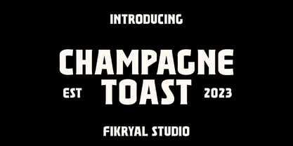 Champagne Toast – Display Serif This font is very suitable to be applied in various aspects of design, and your branding. It’s perfect for logos, branding, title, social media posts, advertisements, product packaging, product designs, label, photography, watermark, special event, magazine, web designs, etc. Features : Multilingual Support If you have any questions please don’t hesitate to contact me follow my Instagram: fkryall Thank you
 - Electrica by Scannerlicker,
$33.00 Electrica is a contemporary monospaced typeface family; a tribute to classic typewriters, while designed for today’s needs and media. In spite of taking inspirations from several typefaces used in typewriters (most notably the IBM Selectric), Electrica is far from a revival: it’s a typeface on its own, winking to the past while standing its ground confidently in a contemporary environment.
 - Cuttauri Script by Nk Studio,
$14.00 Cuttauri is a lovely modern script, with an authentic feel. Use it to create gorgeous wedding invitations, beautiful stationary art, eye-catching social media posts, and cute greeting cards. This font is PUA encoded which means you can access all of the glyphs and swashes with ease! It also features a variety of special features including alternate glyphs and ligatures.
 - Patrick Cleo by Ergibi Studio,
$19.00 Patrick Cleo is a sophisticated signature font in manuscript style and with an elegant ink flow. Patrick Cleo has swashes for the lowercase only, which makes it perfect for projects that need an elegant glow, like logos, wedding designs, branding, social media posts, advertisements, product packaging, product designs, labels, photography, watermarks, invitations, stationery and any project that requires a handwriting touch.
 - Shelline by Almarkha Type,
$29.00 Welcome to the new Romantic script font, Shelline. This is a modern script with a delicious flow, snap-perfect characters and start & end swash. With its alternative character, you will immediately get an original handmade look. Become the perfect professional in a minute and start creating modern designs such as advertising, sales, logos, branding, posters, social media text overlays today!
 - Jorgey by Gatype,
$12.00 Jorgey's casual brush script has a nice texture and flow. Jorgey has many alternatives to make it look like real handwriting; four sets of lowercase and two sets of uppercase. suitable for design projects; logos, branding, posters, quotes, beautiful wedding invitations, beautiful stationery art, eye-catching social media posts, and cute greeting cards and other designs. It is unique, very natural and attractive
 - Bellanos by Letterara,
$12.00 Bellanos is a new, fresh, sweet, and unique handcrafted font. It's ideal for branding and decorate your projects. Bellanos font has a classy and modern look that can be used for logos, branding, invitations, posters, advertisements, stationery, animated films, social media posts, youtube channel, and much more! It is PUA coded which means you can access all the glyphs and sweeps easily!
 - Xwisth by Allouse Studio,
$16.00 Proudly Presenting, Xwisth a Gothic Handwritten Font that will bring an a classical type. Xwisth is perfect for any titles, logo, product packaging, branding project, megazine, social media, wedding, or just used to express words above the background. Xwisth also come with Multi-Lingual Support. Enjoy the font, feel free to comment or feedback, send me PM or email. Thank You!
 - Lovely Couple by Putracetol,
$19.00 Introducing a new romantic and a beautiful handwritting script font called "Lovely Couple". Come with open type feature with a lot of alternates, its help you to make great lettering. Lovely Couple best uses for invitation, wedding, heading,cover, poster, logos, quotes, product packaging, header, merchandise, social media & greeting cards and many more. This font is also support multi language.
 - On Melody by Hatftype,
$15.00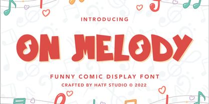 Is a comic display font with distinctive handwritten characters perfect for branding projects, logos, clothing designs, media posts, advertisements, product packaging, product designs, labels, photography, watermarks, invitations, stationery, and any project who need handwritten dishes. Feature : Symbol Number Punctuation Multilingual support Support in Mac and Windows OS Support in design application (photoshop, illustrator, and more) I really hope you enjoy it.
 - Quentine by Alex Couture,
$15.00 Quentine is a script typeface with sharp and rough character. Ideal for logos, name tag, quotes, product packaging, merchandise, social media & greeting cards. It contains a full set of lower & uppercase letters, alternative characters, a large range of punctuation, numerals, and multilingual support. The alternative characters in this font were divided into several OpenType features such as Stylistic Alternates, Stylistic Sets, and Ligature.
 - Okelani Script by Fontop,
$14.00 Tropical temptation with Okelani script. Cute hand lettered font inspired by Hawaii islands’ natural beauty and zest. Stylistic alternates gives an additional handmade mood. Your quotes, wedding items would look sooo cute with this font. Also is perfect for social media texts, blogs and much more. Font is Latin multilingual and have uppercase letters, lowercase letters, numbers and basic punctuations.
 - Rainbow Lemonade by Nathatype,
$29.00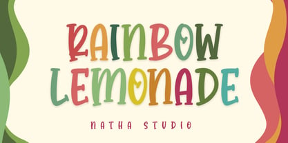 Rainbow Lemonade is a beautiful handwritten font. It brings an attractive typeface. Made for any professional projects. The font is suitable for any project like logo, t-shirt printing, wedding invitations, and greeting cards to social media quotes, branding, and more! Outstanding in a wide range of contexts. Featured : Standard Ligatures Stylistic Sets Multilingual Support PUA Encoded Numerals and Punctuation
 - Barbies by OtterType,
$22.00 Barbies is an outstanding display font for your inner princess. You can use it for a variety of design projects like posters, business cards, birthday and wedding invitations, games, covers, social media posts, quote photos, branding, editorials, and much more. Decorative curves add an amazing touch to create some cute accents. Barbies is a multilingual font, also supporting Cyrillic alphabet.
 - Promag Fonts Duo by XdCreative,
$29.00 Promag sans duo is inspired by climora serif by faldykudo, while maintaining a feminine and elegant impression, combined with a beautiful Promag Scripts which is a perfect combination to your various design needs. Promag would look great for logos & branding, invitations, stationery, wedding designs, social media, advertisements, printed quotes, product packaging, labels, photography, watermarks, special events, or even magazine layouts. Thank you.
 - September Twilight by Sronstudio,
$15.00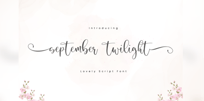 September Twilight is a beautiful calligraphy font perfect for crafting, branding, invitation, stationery, wedding designs, social media posts, advertisements, product packaging, product designs, label, photography, watermark, special events or anything. September Twilight comes with full set of uppercase and lowercase letters, swash alternates, ligatures,multilingual symbols, numerals and punctuation. If you have any questions don't hesitate to drop me a message ;) Happy Creation !!
 - Bethanien by Rezastudio,
$9.00 Bethanien is beautiful sweet calligraphy font. It is fresh, modern, and maintaining its elegance. This font is so perfect for many designs, from wedding invation, greeting card, social media quotes, branding, logo, and many more. Features: +Tons of Glyphs, including beautiful alternate glyphs. +Can be used in any software, like Adobe Photoshop, Illustrator, even Microsoft Word, PowerPoint and others. +Multilingual glyphs.
 - Grizzly Attack by Rometheme,
$25.00 Grizzly Attack is a brush and handdrawn font, this font looks urban, cool, readable, stylish, catchy and easy to use. Grizzly Font is the best choice for your professional design projects, including : logo, poster design, t-shirt, headline, flyer, cd cover album, quotes, business card, branding, magazines, social media, advertisements, product designs, or something that need urban or cool looks.
 - Bulgary Rose by Heinzel Std,
$18.00 Bulgary Rose is a Signature Script Font, described by an elegant touch, perfect for your favorite projects. It looks stunning on wedding invitations, thank you cards, quotes, greeting cards, logos, business cards, social media, magazines, marketing materials, and every other design which needs a handwritten touch. Fall in love with its incredibly distinct and timeless style and use it to create spectacular designs!
 - Chizcake by Tigade Std,
$35.00 Chizcake. Do you love random shape thick font? This font is cuteness overload. It is for everyone, for various design purpose. This font is suitable for happy theme, cute, party, holiday, kids and many more. It is also suitable for Logo, Cards, Branding, Social Media, Youtube Thumbnail, Advertisement, Posters, any many others. Features: – Standard Characters (Uppercase and Lowercase) – Numerals – Punctuation – International Characters
 - HV Sweet Orange by Harmonais Visual,
$12.00 Sweet, cute & expressive - Sweet Orange helps bring out the playfulness in your designs. Hand-painted with a touch of heartiness and imperfection, Sweet Orange is perfect for adding a humanist and friendly feel to your artwork. This typeface comes in 2 styles: Regular and Alternative. Sweet Orange is perfect for a wide range of designs, especially packaging, book covers, and social media...
 - Garden Yard by Hatftype,
$17.00 Is a groovy display font with distinctive handwritten characters perfect for branding projects, logos, clothing designs, media posts, advertisements, product packaging, product designs, labels, photography, watermarks, invitations, stationery, and any project who need handwritten dishes. Feature : * Symbol * Number * Punctuation * Multilingual support * Support in Mac and Windows OS * Support in design application (photoshop, illustrator, and more) I really hope you enjoy it.
 - Fenimore SRF by Stella Roberts Fonts,
$25.00 Fenimore SRF is a variation of Jeff Levine's Theater District JNL with added highlights, created especially by Jeff for Stella Roberts fonts. This Art Deco-influenced typeface typifies the streamlined style of 1930s era-influenced modernism and streamline. The net profits from my font sales help defer medical expenses for my siblings, who both suffer with Cystic Fibrosis and diabetes. Thank you.