10,000 search results
(0.112 seconds)
- Masa Brush by Azetype,
$29.00 Presenting Masa Brush! A Brush San Serif with an organic texture. It looks original and can be used for all your project needs. Each glyph has its own uniqueness and when meeting with others will provide dynamic and pleasing proximity. This font can be used at any time and on any project. So, Masa Brush can't wait to give its touch to all your design projects such as quotes, poster design, personal branding, promotional materials, logotype, product packaging, etc. Happy Creating! www.azetypestudios.com
 - Tube Station-Plus. - Unknown license

- TAN The Laundry Room by TANTypeCo.,
$19.00 TAN - THE LAUNDRY ROOM is a fun display serif. Wonky yet composed and retains the legibility. *the italic font used in the display is TAN - ANGLETON (italic) — Our fonts are supported by most design software, please make sure it can read the OpenType fonts to be able to access all ligatures. Please be informed that while our font works well in Canva, but Canva itself doesn’t support advance opentype features such as special characters. For support, please don’t hesitate to contact us at tantypeco@gmail.com.
 - 1815 Waterloo by GLC,
$38.00 This script font was inspired by a few manuscripts and letters written by French representatives or ministers after the defeat of Napoleon at Waterloo. It is an attempt to offer a typical handwritten script from this period. This font can be used variously as website titles, in the design of posters, fliers and greeting cards, as well as for menus, certificates and letters as a very decorative, elegant and unusual font. This font supports large sizes as well as small ones, remaining clear and easy to read.
 - Masbrushy by Sesa Grafika,
$69.00 Masbrushy is a bold and Modern handwritten Lettering font. Clean and a little bit quirky, this font is the perfect fit for all of your logos, branding, social media, and crafty DIY projects. This font especially design for awesome logo project. You can use this font for Logomark Project. This font is PUA encoded which means you can access all of the glyphs and swashes with ease!
 - Hello Arsenio by Figuree Studio,
$18.00 Say hello to Hello Arsenio font. Made with love and joy. Kids look, so it will make your design more beautiful, cute, fun, and colorful.
 - FS Jack by Fontsmith,
$80.00 a, g, k and y It was a forensic examination by Jason Smith of his existing designs that laid the groundwork for FS Jack. Jason made a list of unique characteristics that would give the sans serif font its typographic thumbprint, which included an unusually large x-height and slightly off-the-wall letters like the lower-case “a”, “g”, “k” and “y”. “I wanted to make something that was slightly uncomfortable,” says Jason, “and in doing so simplify the quirkiness down to a few letters.” Fernando Mello did “the rest of the cooking”, filling the design out and making the additional weights. Tipos Latinos Upon its release in 2010, FS Jack was submitted by Fernando, who is Brazilian, for the esteemed type design biennial, Tipos Latinos, where it was selected as a winner in the Families category. It went on to be selected for type exhibitions throughout Latin America and around the world. “FS Jack is a workhorse,” says Fernando, “but also very ownable and distinctive, and available in a good range of weights, crafted by Jason and I.” Corporate “FS Jack took a couple of years to get noticed and is still fairly underused,” says Jason, “which is good in a way, for our Brandfont clients that have adopted it.” FS Jack was chosen as the signature font for The Shard in London, from its signage down to business cards. Fontsmith also worked with Lloyds Bank to customise FS Jack into a bespoke font for the bank’s updated brand identity – part of Fontsmith’s Brandfont service, which you can read about here. Fat Jack Included in the FS Jack family – just – is FS Jack Poster, the super-heavy weight of the range. “That was a last minute addition,” says Fernando, “after Jason and I started talking about how much we liked Gill KO, a typeface that is almost comically fat.”
 - Monceau by URW Type Foundry,
$19.99 As a successor of Didots famous font, which marked the beginning of modern typography, the Monceau has inherited the spirit, elegance and sophistication of french style, although in a revamped design, typical for the first years of the 21st century. Liberated from its serifs and with soft and round small letters the Monceau approaches ornamental typography and thus perfectly lends itself to being enlarged: it’s a font that loves to be closely looked at. Its name, lent from the famous parc Monceau in Paris, evokes and reinvents in a modern graphical way all of the Parisian chic at the end of 18th and the beginning of the19th century (the time Didot was born), the French Revolution and Empire, the architecture of this business quarter and notably the arabesques of the monumental gates still present in our times.
 - Gopixel by Ditatype,
$29.00 Go Pixel is an exciting game-themed display font designed in uppercase, capturing the essence of retro pixel art. The consistent proportions of this font create a harmonious and balanced visual experience. Each uppercase letter is crafted with precision, ensuring uniformity and maintaining the overall aesthetic appeal. This design choice guarantees that every character fits seamlessly together, resulting in a cohesive and visually pleasing typographic composition. The uneven borders of Go Pixel add a touch of vintage charm and quirkiness to the font. Each letter is outlined with varying thickness, mimicking the imperfections found in retro pixel art. This unique feature gives the font a distinct personality and captures the nostalgia of classic video games. With low contrast, it embraces a softer and more subtle approach to readability. The slight variation in stroke width allows for a smooth and comfortable reading experience. While the low contrast may be unconventional, it enhances the overall retro feel of the font, immersing your audience in the world of classic gaming. Enjoy the available features here. Features: Multilingual Supports PUA Encoded Numerals and Punctuations Go Pixel fits in headlines, logos, posters, titles, branding materials, print media, editorial layouts, website headers, and any projects that aim to evoke a sense of fun and nostalgia. Find out more ways to use this font by taking a look at the font preview. Thanks for purchasing our fonts. Hopefully, you have a great time using our font. Feel free to contact us anytime for further information or when you have trouble with the font. Thanks a lot and happy designing.
 - BMF Objects Pi by BuyMyFonts,
$25.00BMF Objects Pi is part of the BMF Symbols Collection, a gorgeous, versatile and highly original family of symbols (drawings, icons, pictograms). Unlike the other fonts in the Symbols Collection, Objects Pi doesn’t have a specific theme: it covers various aspects of ou day-to-day activities, such as cooking, eating, working, playing and getting sick. When you buy BMF Objects Pi (which, of course, you’re highly recommended to do today) you will have access to all of these activities on you very own computer keyboard! - Milky Skies by Bogstav,
$15.00 Thursday Afternoon is like a typewriter that was out in the rain all night - all wobbly and worn, but with the well-known details of a typewriter, just a bit...well a lot...out of the ordinary! Although being awkward, Thursday Afternoon is surprisingly legible. I'd like that the font should be used for labels, toys for kids, candy or any kind of organic product. It even looks really well with headlines or shoutouts in all-caps!
 - Paragraph Stretch by Paragraph,
$15.00 When merely “extended” just would not do, here is Paragraph Stretch™: a super extended or elongated geometric display typeface. It is a typeface with an unicase effect: the capitals and lower case fit the same height and a similar width, so they are interchangeable: fancy a round “W” in all caps? Use the lower case. Want a straight “x” in lower case? Use the cap. And so on. Designed for use at larger sizes for logotypes, short titles or headings. It supports Western plus Nordic, Eastern European and Turkish languages.
 - Biblia by Hackberry Font Foundry,
$24.95 This all started with a love for Minister. This is a font designed by Carl Albert Fahrenwaldt in 1929. In the specimen booklet there’s a scan from Linotype’s page many years ago. They no longer carry the font. I’ve gone quite a ways from the original. It was dark and a bit heavy. But I loved the look and the readability. This came to a head when I started my first book on all-digital printing written from 1994-1995, and published early in 1996. I needed fonts to show the typography I was talking about. At that point oldstyle figures, true small caps, and discretionary ligatures were rare. More than that text fonts for book design had lining OR oldstyle figures, lowercase OR small caps—never both. So, I designed the Diaconia family (using the Greek word for minister). It was fairly rough. I knew very little. I later redesigned and updated Diaconia into Bergsland Pro —released in 2004. It was still rough (though I impressed myself). In 2006, I found myself needing a readable sans serif. So I went to Bergsland Pro, and eliminated the serifs. I named the font Brinar. I kept a flare in place for the serifs and cupped the ends. I was stunned. People loved it. It’s remained my bestseller until very recently. So, at the end of 2016 I decided that Brinar really needed some help. The flares were basically random. The stem width and modulation variances all needed to be fixed. My old OpenType feature code was quite limited and clumsy. So, I created the 6-font Biblia family. I cleaned up or redesigned all the glyphs. I updated the fonts to the 2017 set of features: small caps, small cap figures, oldstyle figures, fractions, lining figures, ligatures and discretionary ligatures. These are fonts designed for book production and work well for text or heads.
 - Dense by North Type,
$- Dense is a versatile, elegant, geometric and compact sans-serif typeface. Though it is a very flexible typeface, it truly shines at larger sizes when used for headlines and poster design.
 - The Glory by FunType,
$14.00 The Glory is a sans serif font designed by Funtype in 2023. The Glory is made to fit for various reading purposes. The Glory is fit for non-industrial themes, yet it can also be used for various designed needs.
 - Sutro Shaded by Parkinson,
$25.00 My affection for Slab Serifs began in the early 1960s in Kansas City when Rob Roy Kelly was at the Kansas City Art Institute, teaching and writing his book on American Wood Type. I got to know him just well enough to gain access to his fabulous collection of wood type and wood type catalogs. Later, in the1970s, I tried to re-create a Nebiolo Egiziano for Roger Black at New West magazine. And again for Roger, in the 1980s, I designed a Slab Serif logo for Newsweek Magazine. Finally, in 2003, designed the Sutro Family. There were things I didn't like about it, so, over time, I’ve been adding some things and dressing it up a little. Sutro Shaded has existed for a few years as a one color, outlined, drop-shadowed display font. It seemed like it was just dying for a little color. I added five more fonts: Fill, Gradient, Hatching, Rules and HiLite. These fonts can be used in different combinations to achieve various effects. There is a downloadable SUTRO SHADED USER MANUAL PDF in the Gallery section for this family.
 - Neuro X by Sawdust,
$35.00 Neuro X is a narrow sans serif typeface consisting of three weights with additional rounded versions and matching italics. It was first drawn as an exploration for a headline font and later expanded on to become a full typeface family. Neuro X explores the extremities of narrow proportions whilst also allowing for eccentric cuts. The typeface has been tightly monospaced and intended for use at larger sizes as a display but can also work at smaller scales for the more courageous among us. This 339 glyph font has language support for 26 languages: Afrikaans, Albanian, Catalan, Croatian, Czech, Danish, Dutch, English, Estonian, Finnish, French, German, Hungarian, Icelandic, Italian, Lithuanian, Maltese, Norwegian, Polish, Portuguese, Slovak, Slovenian, Spanish, Swedish, Turkish, Zulu.
 - Love Duets by Ingrimayne Type,
$9.00 LoveDuets is a family of two novelty fonts that have letters on hearts. There are at least five other font families on myfonts that have have letters on hearts but LoveDuets differs from them because it uses the OpenType feature of Contextual Alternatives (calt) to put two letters on each heart, one on the left side and a second on the right side. The two styles in the family can be used in layers to increase color possibilities. The brace characters have empty half hearts that can be used to replace spaces or to complete hearts at ends of lines. LoveDuets can be used when hearts are appropriate such as for Valentines Day, anniversaries, and weddings.
 - Just Believe by Seemly Fonts,
$12.00 Just Believe is a simple and organic handwritten font. Natural and a bit quirky, this font will brighten up each of your designs. Add it confidently to your projects, and you will love the results.
 - Cute Bubble by Creaditive Design,
$14.00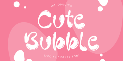 Cute Bubble is a fun, playful and friendly display font. It is perfect for any kid or cute design that need bubble effect. Just choose this font, your special cute project can be more cuteness.
 - Troquel by Pau Lamuà,
$28.00 Troquel is a fat font, with feminine curves. Soft edges give this slightly overweight typeface a big and beautiful happy style. Combining fatty with his sister outline version helps to provide a nice contrast between each weights glyphs. Troquel has uppercase characters, numbers, and the basic punctuation.
 - Neon Bugler Squared by Breauhare,
$35.00 Neon Bugler Squared is a soft, boxy version of Neon Bugler, which is a font based on the third logo created by Harry Warren in early 1975 for his sixth grade class newsletter, The Broadwater Bugler, at Broadwater Academy in Exmore, Virginia, on Virginia’s Eastern Shore. This font design has these principles as its parameters: The letters generally follow what would be natural stroke directions; no sharp corners, all gentle turns; no lines back up over each other, cross each other, or run into each other. All of this civility between the lines produces an unintentional but welcome neon quality about it. This font can have a variety of vibes depending on its context-it has a certain nostalgia to it, yet it also has a slick, clean, futuristic, sci-fi look. It can even be used in a semi-grunge setting. This is a very versatile font! Digitized by John Bomparte.
 - Sui Generis Free - Unknown license

- Pirate Bay by Vozzy,
$5.00 A vintage look label font named "Pirate Bay".Typeface includes five styles plus aged version, for sample look at 4th preview. This font will good viewed on any retro design like poster, t-shirt, label, logo etc. For using effects layers: - Type your text in Regular. - Copy that and paste at the same position. - Change the style to Effects, Shadow or Texture.
 - Mustang by Robert Arnow,
$21.99 Mustang is a powerfully expressive brush font that combines an edgy urban aesthetic with a smooth feminine flow. Some have suggested that Mustang is romantic. Some say it has something to do with speed or freedom. While precisely what Mustang expresses is up to debate, there’s no doubt that it’s expressing it with intensity. The style was born in my high school years, when I would wreck my notebooks with multiple layers of graffiti tags which would start in the margins and then creep in to cover the entire page. I developed a sensibility towards a very fast, expressive use of my hand, which later easily and naturally translated into brush. I used this style typographically on several projects throughout the years, and even turned it into a signature illustration style. Mustang is the second font, after Streetbrush, to use this brushwork as its inspiration. Mustang will be especially evocative at large sizes, where the details and sharpness of the shapes really come to life. It also holds together well for use as body copy, but may lose some of its aesthetic integrity at really small sizes.
 - Fragment Pro Inline by (v) design,
$49.00 Fragment Pro Inline is a part of a larger OpenType font family (see also Fragment Pro). It is an elegant, soft and decorative typeface built on classical proportions. Its outlines have been carefuly crafted with a high attention to detail, so it could be used even at very large sizes. Fragment is a layered typeface – you can either use the standalone version of Fragment Inline or combine its two layers (Lit and Shadow) to achieve various color effects. It is not recommended to use “inline” layers separately. Instead, choose the separately sold Fragment Pro, which has been significantly optimized for standalone use. Fragment has been conceived to be used as a display typeface in publications, titles, logotypes etc., but it is surprisingly legible even in smaller print sizes. Thanks to its strictly onefold oulines, Fragment can be also used as a stencil typeface. Fragment supports many OpenType features and offers great multilingual support for most of the Latin-based languages. Feel free to download the detailed PDF Specimen.
 - Pepperminta by PizzaDude.dk,
$16.00 A curly and playful sans serif font with blurry lines. Fits nice to anything that has to do with products for kids! Comes with 3 different versions of each lowercase letter, and they automatically cycle as you type
 - Cosmic Turtle by Hanoded,
$10.00 Cosmic Turtle is the belief that the world is supported by a giant turtle. It is mostly found in Hindu and Chinese mythology and the mythologies of the indigenous peoples of the Americas. I had to think of this, as the idea of the Cosmic Turtle is referenced to in the 1982 book ‘A Wild Sheep Chase’ by Haruki Murakami - my favourite author. Cosmic Turtle is a font that I made using a broken chop stick and Chinese ink. I was actually trying to create something scary for Halloween, but this is what came out and I quite like it. Cosmic Turtle is a fat display font with rough edges, wobbly glyphs and a set of double letter ligatures for you to play with.
 - Astronauts In Trouble by Comicraft,
$49.00 AiT/Planet Lar publisher and writer, Larry Young loves The Space Program. Next time you see him at a comic convention just ask him about any one of the Moon Landings and you'll see.
 - Swadi Marker by Sipanji21,
$15.00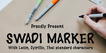 Swadi Marker is a sweet and friendly serif font and features Cyrillic and Thai character. Its natural and unique style makes it incredibly fitting to a large pool of designs. The only limit is your imagination!
 - Playkidos by Stringlabs Creative Studio,
$25.00 Playkidos embodies fun, quirkiness and authenticity. This enchanting decorative font will turn any creative idea into a true standout. Get creative with its childlike playfulness, and use it to brighten up any kids and school project!
 - Circuity by Din Studio,
$29.00 Circuity is a display font designed in a racing theme which provides a unique yet modern capital letter font. Each stroke shows a firm brave character. Due to its shape and size, it is suitable to apply for a large-sized text such as titles. Enjoy the interesting features to maximize the design projects. Features: Multilingual Supports PUA Encoded Numerals and Punctuation Circuity is definitely proper to use in any design projects such as posters, banners, logos, book covers, headings, printed products, merchandise, social media, and so on. Find out more ways to use this font by taking a look at the font preview. Thanks a lot for purchasing our font. Happy designing.
 - Linotype BioPlasm by Linotype,
$29.99Linotype BioPlasm is a display face created by Italian design Mauro Carichini in 2002. It distorts and deletes parts of letters, creating the appearance of a living, typographic organism in pages of text. Lines set in Linotype BioPlasm seems bubble to the surface, and always hints at some sort of unrevealed secret. Although only parts of most letterforms are visible, the high x-heights of Linotype BioPlasm's letters make its text surprisingly legible for such a concept-font. For usage in products ranging from Sonic to Science, Linotype BioPlasm may be the font for you! - Kettering 105 by Talbot Type,
$12.99 Kettering 105 is inspired by the classic, geometric slab-serifs such as Lubalin, but has shallower ascenders and descenders for a more compact look. It's a versatile, modern slab-serif, highly legible as a text font and with a clean, elegant look as a display font at larger sizes. It includes old style non-aligning (lower case) numbers, both proportional and tabular, as well as accented characters for Central European languages. The Kettering 105 family comprises of six weights and is closely related to Kettering 205, its more intensely Deco flavoured cousin.
 - CPL Kirkwood by Kimmy Design,
$15.00 CPL Kirkwood is a distressed condensed bold slab and sans serif typeface. With both the serif and sans serif type options, it can be used in a broad range of design works. Included is a set of Extras that give the typeface an array of symbols, lines and banners. INSTALL NOTE: If you have purchased CPL Kirkwood ALL and are installing via Font Book, it is best to install in small groups rather than opening all font files at once. Once one group is installed (SLAB + SLAB Italics) you open and install the next group.
 - Pleasure Point by Comicraft,
$39.00 Slocals! Check out the action of our radical new font, PLEASURE POINT! It's Bananas, Totally Tubular, Stoked and ready to ride some waves. Back in his grom days, Comicraftsman John JG Roshell could be found down at Pleasure Point, waiting for The Big One, and this is IT! Don't be a criddler, paddle hard and rip this font to your motherboard to keep it real every time you gun, rail or tail. And if you get rag dolled, dude, don't blow out your squeaker. Pleasure Point will hang loose and chillax you to the max.
 - Kedem ML v1 AAA by AlefAlefAlef,
$105.00 Kedem is a multilingual serif font inspired by heritage posters from the time of Israel’s national founding. The font is characterized by wide letters set at unusual angles, distinctive negative spaces, an upbeat cadence and a free and nostalgic spirit. Kedem spans five weights, including “Ultralight” – a monoline inline style. As the weight of Kedem increases, the contrast between its serifs and the shape of its letters is magnified. Kedem supports Hebrew, English and Russian (designed by Anna Khorash), as well as 181 additional Latin and Cyrillic languages.
 - Leifa by Identity Letters,
$39.00 A flare-serif socialite. Elegant and affable at once. Leifa is a flare-serif typeface that strikes a balance between elegant and affable. It’s pleasant to read in text sizes yet takes center stage in headlines and display applications. With its higher-than-usual contrast, Leifa might evoke Didone typefaces at first. However, it differs from strictly Didone designs in the details: flattened serifs and deeply incised, tapered spurs provide an organic effect. These humanist elements are restrained and almost inconspicuous in body copy. It’s in display sizes that they realize their full potential. Set your message in Leifa, set it large, and it will get noticed. A true socialite, Leifa is a most welcome guest on any party. With its dual character and a range of weights that allow for fine-tuning the desired visual voice, it’s a brilliant choice for branding and editorial design. Its good-natured yet sophisticated character makes Leifa the perfect typeface for fashion, sports, lifestyle, social media, food and cooking, health, beauty, architecture, interior design, art, literature, theater, and travel. (And any other topic that you’d love to talk about at a dinner in good company.) The entire font family consists of eight weights. Each comes with an italic counterpart, totaling 16 styles. Leifa’s italics are oblique, optically corrected versions of the upright styles. Each style comprises a character set of 883 glyphs that includes small caps, a set of ligatures, tabular and old-style figures, case-sensitive forms, fractions, symbols, and many other features. Four stylistic sets allow you to adjust the appearance of the Leifa fonts: a single-story a (SS01), a simple f (SS02), a triple-story g (SS03), and thin punctuation marks (SS04) are at your disposal. If you’re looking for a typeface with some debonair spirit, look no further than Leifa.
 - Selfie Neue Rounded by Lián Types,
$29.00 INTRODUCTION When I started the first Selfie back in 2014 I was aware that I was designing something innovative at some point, because at that time there were not too many, (if any) fonts which rescued so many calligraphy features being at the same time a monolinear sans. I took inspiration from the galerías’ neon signs of my home city, Buenos Aires, and incorporated the logic and ductus of the spencerian style. The result was a very versatile font with many ligatures, swashes and a friendly look. But… I wasn’t cognizant of how successful the font would become! Selfie is maybe the font of my library that I see the most when I finally go out, (type-designers tend to be their entire lives glued to a screen), when I travel, and also the font that I mostly get emails about, asking for little tweaks, new capitals, new swashes. Selfie was used by several renowned clients, became part of many ‘top fonts of the year’ lists and was published in many magazines and books about type-design. These recognitions were, at the same time, cuddles for me and my Selfie and functioned as a driving force in 2020 to start this project which I called Selfie Neue. THE FONT "Selfie for everything" Selfie Neue, because it’s totally new: All its glyphs were re-drawn, all the proportions changed for better, and the old and somehow naive forms of the first Selfie were redesigned. Selfie Neue is now a family of many members (you can choose between a Rounded or a Sharp look), from Thin to Black, and from Short to Tall (because I noticed the feel of the font changed notoriously when altering its proportions). It also includes swashy Caps, which will serve as a perfect match for the lowercase and some incredibly cute icons/dingbats (designed by the talented Melissa Cronenbold) which, as you see in the posters, make the font even more attractive and easy to use. You'll find tons of alternates per glyph. It's impossible to get tired with Selfie! Like it happened with the old Selfie, Selfie Neue Rounded was thought for a really wide range of uses. Magazines, Book-covers, digital media, restaurants, logos, clothing, etc. Hey! The font is also a VF (Variable Font)! So you can have fun with its two axes: x-height and weight, in applications that support them. Let me take a New Selfie! TECHNICAL If you plan to print Selfie Neue VF (Rounded or Sharp), please remember to convert it to outlines first. The majority of the posters above have the "contextual" alternates activated, and this makes the capitals a little smaller. I'd recommend deactivating it if you plan to use Selfie for just one word. Use the font always with the "fi" feature activated so everything ligatures properly. The slant of the font is 24,7 degrees, so if you plan to have its stems vertical, you may use Selfie with that rotation in mind. THANKS FOR READING
 - Last Dance by Wing's Art Studio,
$10.00 Last Dance: Redux - The 80s Feel-Good Script Font - Updated! Welcome to Last Dance: Redux, a new and improved version of my popular brush-script font inspired by 80s movie posters, VHS covers and Friday nights at the video store! This hand-drawn script aims to capture the feel-good vibes of movie blockbusters that won our teenage imaginations, while serving as the go-to font for recreating this unique and nostalgic period. The original Last Dance font features a gritty, hand-drawn texture that looks equally at home on an aerobics competition poster or steamy urban thriller - making great titles that look distinctly cinematic. Last Dance: Redux takes that original design and strips it back to it’s bare essentials resulting in a clean, uniform look that improves letter flow and readability. It’s also much lighter on system resources making it the preferred choice when using extensively across print and web projects. Both versions come with upper and lowercase characters along with punctuation, numerals and language support, plus two full sets of alternatives and a selection of underlines. Check out the visuals to see it in action!

