10,000 search results
(0.043 seconds)
- IxD by The Ampersand Forest,
$20.00 IxD is a modular, semi-futuristic sans serif that uses its geometry to evoke the kind of future we all thought we'd have back when we were kids: sleek, assertive, cool. Many of its deep cuts and unusual letterforms are strikingly out of the norm, but they still feel inviting.
 - Relica by Artisticandunique,
$12.00 Relica - Serif font family - Multilingual support, 18 Style Relica serif font family has an elegant character with smooth curved turns. If you want to try a modern or classic, elegant look, it can meet all your needs with its timeless structure that is ideal for your projects in capital and small letters. Relica serif font family ensures good overall appearance and easy reading of texts while creating your projects especially in publishing. With its soft curved turns, it is also ideal for branding, logo design, brand identity creation, packaging design. This font comes with uppercase, lowercase, punctuation marks, symbols and numbers, ligatures, and multilingual options. With this font you can create your unique designs. If you have a question, please contact me. Have a good time.
 - Stobart by Protimient,
$39.00 Stobart is a script font based on the characters written in a letter by Mr Henry Stobart, dated 1899. It contains over 1200 individual glyphs, supports the extended latin character set and includes a total of 8 different alphabet sets to make up the extensive OpenType contextual substitution needed to make the font appear as genuinely handwritten as possible. It is for this reason that Stobart is an exclusively OpenType font and is intended for use in an application that has advanced OpenType support, although it should be said that the font will work (as in appear) in any application on any operating system that supports the OpenType font format, albeit without all those delightful features that make it a connected script.
 - Holy Mordigan by BlackLotus,
$10.00 Holy Mordigan is a modern script font that is inspired by luxury. Holy Mordigan font makes every design created has an elegant aura. so it has its own value for everyone who sees it. Holy Mordigan also has a variety of alternate options that can be used. What's included in this font pack : -- LARGE GLYPH SETS : There are 409 total glyphs in this font pack. Holy Mordigan comes with a large range of glyphs including punctuation, numerals, international language support, ligatures & additional extra glyphs for stylistic sets. It includes 182 Glyphs of Stylistic Sets to make your text looks natural and beautiful. -- NO SPECIAL SOFTWARE REQUIRED -- INTERNATIONAL LANGUAGE SUPPORT : This font supports English, French, Italian, Spanish, Portuguese, German, Swedish, Norweigen, Danish, Dutch, Finnish, Indonesian, Malay.
 - Orittish by Hanzel Space,
$25.00 Orittish - Lettering Brand Font Introducing our font Orittish, we have finished the font project we made for your company's branding needs. The character of this font is that it has characters that are not connected to each other, we deliberately made it that way so that it is more flexible when it will be paired in a product branding for your business. Orittish comes with upper and lowercase characters, punctuation, numerals,supports international languages and OpenType features with Stylistic Alternates,watshot type is very best choice fonts for : ,quotes, Posters, Logos, Print Ads, Digital Ads, Promotion Product, video bumper, etc. Stylistic alternates for key lower case characters are also available, accessible in the Adobe Illustrator Glyphs panel, or under Stylistic Alternates in the Adobe Photoshop OpenType menu.
 - Skolar Sans PE by Rosetta,
$70.00 Any prototype you can imagine, Skolar Sans can materialise. This industrious type family is more than just a versatile partner for our award-winning Skolar collection: it is a true sans-serif type system envisioned for the age of responsive design. We developed Skolar Sans to accommodate contemporary typographers and the challenges they confront: an ever-changing spectrum of outputs and devices, in which serious typography can get lost. Skolar Sans is engineered to cope with complex editorial texts and data-rich layouts alike. Its construction is designed for easy reading, and its subtle personal style and a touch of flourish. From gently thin to black, the finely-tuned weight variants will fit any composition from wide-screen dashboards to compact mobile editorial designs. Its four subtly graded width variants allow you to fit any page context with comfort. The 72 styles; 36 weight and width variants in uprights and true italics with ligatures, arrows, scientific figure variants, and fleurons. The two variable fonts (one for uprights and one for the italics) allow user precise navigation of the Skolar Sans design space and streamline delivery. The linguistic scope of Skolar Sans PE is an exact match to Skolar PE: Latin, Cyrillic, and Greek (including polytonic) scripts and support for hundreds of languages and transliterations.
 - Pomthinq by Stringlabs Creative Studio,
$29.00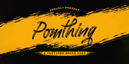 Pomthinq is a remarkable brush script font. Fall in love with its incredibly versatile style and use it to create spectacular designs!
 - Beijing by Solotype,
$19.95One of the many Solotype experiments in developing fonts with an ethnic flavor, this one is a bit less obvious than most. The lowercase seems to work well. - Kidspace by Monoco Type,
$18.00 Kidspace is playful style font, with alphabet, numbers, symbol, and multilingual feature. You can use this on kids project, logo, social media post, book cover, and other project.
 - LHF Firehouse by Letterhead Fonts,
$42.00 This style was actually inspired by some old stock certificates Tom had collected. It’s a very versatile font and allows for some horizontal stretching. Fits almost any space.
 - Amazónica - Personal use only

- Tabac Big by Suitcase Type Foundry,
$39.00 Tabac Big can satisfy all expressionists desiring idiosyncratic colouring in setting because it provides black weights. But at the same time it offers solutions for orthodox environmentalists who like to save ink and toner — all the fragile hair styles are intended just for them. Less clearly-defined typographers can then choose from the six other weights, from Thin through Light, Regular, Medium, Semibold and Bold, including true italics. Tabac Big is a first and universal choice where we look for pronounced display type as a complement to text type. Its modern drawing, made up of precise arcs, sharp lines and seemingly simple segments, gives a clear and unmistakeable impression every time. And yet the typeface knows how to intrigue — especially in shaping the italics, which fully expresses the typeface’s unique details, such as its large bulbous instrokes and outstrokes and heavy wedge serifs.
 - Densa by Graviton,
$24.00 Densa font family has been designed for Graviton Font Foundry by Pablo Balcells in 2020. It is a condensed sans serif typeface with some unconventional display endings. Its condensed design makes it very effective for space economizing and its display features make it a very interesting option for display usages such as logos, packaging and posters. It has been conceived to be most suitable for headlines and short length text blocks. Densa consists of 8 styles. Each containing small caps and glyph coverage for several languages.
 - Miss Christine by Letterara,
$12.00 Miss Christine is a beautiful script font with lots of authenticities!. It has beautiful and well-balanced characters and as a result, it matches a wide pool of designs. It will turn any design project into a true stand-out. Add it to your most creative ideas and notice how it makes them come alive! This font is PUA encoded which means you can access all of the amazing glyphs and swashes with ease! It also features a wealth of special features including alternate glyphs and ligatures.
 - Heartberry by Letterara,
$14.00 heartberry is a lovely romantic script font with lots of authenticities!. It has beautiful and well-balanced characters and as a result, it matches a wide pool of designs. It will turn any design project into a true stand-out. Add it to your most creative ideas and notice how it makes them come alive! This font is PUA encoded which means you can access all of the amazing glyphs and swashes with ease! It also features a wealth of special features including alternate glyphs and ligatures.
 - Rotunda by TipoType,
$24.00 Rotunda blends the best of three worlds: it’s geometric, humanist and grotesque. But, far from being a tasteless hybrid, it has a strong personality and British undertones that turn it into a stylish and sober classic font face. Thanks to its ample character set and many variables, it stands as a versatile, all-terrain font. Strong and elegant, modern and classic, firm and humanistic. It truly is a 21st Century classic. It includes a very thorough coverage for a wide variety of Latin alphabet-based language families.
 - Antoine Drop Caps by Kaer,
$19.00 These initials set I collected from “Tristan of the Round Table”, published approximately in 1513, by Antoine Verard. Antoine drop caps font family has Regular, Light and Colored styles. It's all you need to precisely imitate medieval style text. Use this font as a decorative element at the beginning of a paragraph or section, other part of the paragraph should be in regular black letter font. You’ll get Drop Caps & Numbers set. --- *You can use color fonts in PS CC 2017+, AI CC 2018+, ID CC 2019+, macOS 10.14 Mojave+ * *Please note that the Canva & Corel & Affinity doesn't support color fonts!* *Please download this test file with only A letter ( https://www.dropbox.com/s/lpzmdikw0ewxozx/AntoineDropCaps-Test.otf?dl=0 ) to check your app & system.* --- Please feel free to request any help you need: kaer.pro@gmail.com Best, Roman.
 - 1523 Holbein by GLC,
$28.00 This typeface is an attempt to offer as a font the well known marvelous Hans Holbein “Death Alphabet”, first published in 1523. We have tried to preserve as much as possible the spirit and appearance of the original Initials set — incredibly fine and enriched with detailed figures — trying at the same time to create a font not too complex to be usable. Neverteless, the font files are large, and when used, the decorated initials may appear on screen more slowly than ordinary characters. (Minimum size recommended : 96 pts) We are offering here two complete standard sets (no accented characters) : Initials and capitals. We have reconstructed the missing letters : J and U, Eth, Lslash, Thorn and Oslash. The font may be used with all our Humane and Garalde fonts, like 1543 Humane Jenson or 1592 GLC Garamond and others from the GLC foundry catalog.
 - Midwinter Fire by Wing's Art Studio,
$24.00 Widwinter Fire: A Gothic Fantasy Font A decorative serif font inspired by tales of gothic fantasy and horror. Inspired by gothic cathedrals, ancient myths and campfire horror stories, Midwinter Fire is a font for the coming of Autumn when our days become shorter, darkness closes in and the snow begins to fall. It's for those chilling tales of terror and fairy tales that caution us not to go into the woods. Midwinter Fire is a versatile serif font, classical in style that can be applied to book covers, movie titles, rock albums, arcade games or even a vintage ale! It's the perfect choice for a decorative gothic look that remains readable at smaller sizes. Midwinter Fire is an all-caps serif font that includes lots of alternative characters and underlines along with numerals, punctuation and language support.
 - Bronela by Arterfak Project,
$14.00 Bronela is an elegant serif font that comes with a regular and bold style. Created with a strong serif, high contrast, and luxury feel, inspired by classic text font and fashionable typography trends. These fonts look very versatile to use in large or small sizes and possibly to be used for many purposes. Feminine and masculine at the same time. Bronela equipped with lots of classy ligatures and tons of alternates characters that you can mix and match to get more variation of typographic designs. In 590+ glyphs total, Bronela is suitable for logo, headline, labels, editorial, poster, packaging, quotes, cards, weddings, and other advertising needs! Fonts featured : Uppercase Lowercase Numbers Punctuation & symbols Multilingual support Stylistic alternates Stylistic set 01 - 06 Ligatures Thank you for watching and your support. Hope you enjoy playing with Bronela, as much as I created this lovely font.
 - Dirty Bubble Gum Grunge by TypoGraphicDesign,
$15.00 The character of the rough, rugged and raw handmade typeface has a very unique sticky atmosphere. Letters lovingly decorated with chewing gum. Warmth, love, handmade. For support of human warmth. CONCEPT/ CHARACTERISTICS Experimental analog handwritten style. Handwritten in ink in a conventional roll-on deodorant. The dirty, grimmy Grunge-Look and the sloppy, rough Handwritten-Look script character, gives the typeface a high recognition value and uniqueness. The motto is handmade, rough & experimental. APPLICATION AREA The rough, ink-like, handwritten look of the handmade font „dirty deo hand ink“ would look good at logos, display size for poster, flyer, comics and graphic novel lettering, headlines in magazines or websites, packaging, music covers or webbanner etc. TECHNICAL SPECIFICATIONS Headline Font | Display Font | Raw Trash Script Font „dirty deo hand ink“ OpenType Font with & 282 glyphs & 1 style (regular). Symbols and ligatures (with accents & €)
 - Tahoma by Microsoft Corporation,
$49.00Tahoma™ Family is one of Microsoft's most popular sans serif typeface families. The original Tahoma™ Family consisted of two Windows TrueType fonts (regular and bold), and was created to address the challenges of on-screen display, particularly at small sizes in dialog boxes and menus. In 2010 Ascender Corporation added italics, so now the Tahoma font family contains 4 fonts in total: Tahoma regular, italic, bold and bold italic. The Latin, Greek and Cyrillic characters were designed by world renowned type designer Matthew Carter, and hand-instructed by leading hinting expert, Tom Rickner. The Tahoma fonts set new standards in system font design. Tahoma is ideal for use in User Interface scenarios and other situations requiring the presentation of information on the screen. Character Set: Latin-1, WGL Pan-European (Eastern Europe, Cyrillic, Greek and Turkish). - Rhiccus by Patria Ari,
$19.00 Rhiccus is inspired from vintage and classic look. This font is suitable for any design like branding, print templates, fashion, print templates, & more. With more than 9 variants, this font works well to mix and match with each other to best fit the occasion.
 - XKnightMares by Ingrimayne Type,
$6.00 There are three XKnightMares fonts. Each has rather formal chess fonts. The key layout is a bit complicated; see the key guide for detailed information on how to position pieces correctly. In addition to making chess boards, some of the pieces make interesting decorations.
 - Grandift by Din Studio,
$25.00 Are you trying to find a charming font for your audience, clients, and customers? We have all the best solutions for any of your designs. Let’s introduce you to the Grandift Sans Serif Font Family. The Grandif is a font package to please you with a variety of choices for your own project consisting of eight different choices of thickness level. Make your dream design come true and add elegant, modern styles to Grandift as this font expresses clean eligible displays. Features: Multilingual Supports PUA Encoded Numerals and Punctuation Use Grandift for various designs, such as posters, banners, logos, book covers, headings, printed products, merchandise, social media, and more. Find out more ways to use this font by taking a look at the font preview. Enjoy your experience with this font and feel free to contact us for further product information or trouble complaints. Thank you and wish you good luck with your designs
 - Powlina Theater by Attype Studio,
$16.00 Powlina Theater is a Modern Calligraphy Font. Perfect font for your wedding ceremony. Combine Powlina Theater stylistic set to create amazing script font for wedding! Fall in love with its incredibly versatile style and use it to create spectacular designs! Powlina Theater is perfect for branding, logo, invitation, quotes, wedding invitation, cricut font, silhouette font, product packaging, merchandise, game titles, cute style design, Book/Cover Title and more. What's Included : - Ligatures - Multilingual Support Hope you enjoy with our font! Attype Studio
 - Gin by Bykineks,
$12.00 Gin is a futuristic decorative font that combines calligraphy, graffiti and typography. This font is inspired by the street art called calligraffiti where it is abstract and elegant. This font is suitable for those who are anti mainstream and out of the zone, this is a new face in the world of fonts, for those who are against this font it will be considered broken but for those who are from the future, this font is an answer to futuristic design needs
 - Aeogo Pro by ffeeaarr,
$9.00 Aeogo is unique font, the form was made are different like as usual. we made it include a pixel style font
 - Molor by Sons Of Baidlowi Typefoundry,
$8.00 Molor Font is a sans serif font with an amazing feel. It will turn any design idea into a stand out.
 - Talk to the hand - Unknown license

- AW_Siam English not Thai - Unknown license

- Memory by Fewell Foundry,
$39.00A typeface inspired by 1980's graphic design fused with a modern futuristic style. Aimed at the Fashion industry and style magazines. - Monster Mash by Comicraft,
$19.00 While working on our Macs late at night, Our Eyes beheld an Eerie Type: It's called The Mash! It's called MONSTER MASH!
 - Wind by ParaType,
$25.00Developed at ParaType in 1995 by Alexander Tarbeev, based on TextBook, 1987, by Emma Zakharova. For use in advertising and display typography. - Amerigo BT by Bitstream,
$29.99 An original Bitstream typeface prepared by Gerard Unger to provide a typeface of tapered stroke that will work well at lower resolutions.
 - Crash by ParaType,
$25.00 Developed at ParaType in 1995 by Alexander Tarbeev, based on Pragmatica, 1989, by Vladimir Yefimov. For use in advertising and display typography.
 - Neue Frutiger Paneuropean by Linotype,
$79.00During planning for the new Roissy Charles de Gaulle airport in Paris at the beginning of the 1970s, it was determined that the airport's signage system had to include the clearest and most legible lettering possible. The development of all signage was put into the hands of Adrian Frutiger and his studio. The team carried out their task so effectively that a huge demand for their typeface soon arose from customers who wanted to employ it in other signage systems, and in printed materials as well. The Frutiger® typeface not only established new standards for signage, but also for a range of other areas in which a clear and legible design would be required, especially for small point sizes and bread-and-butter type. The typeface family that which emerged as a result of this demand was added into the Linotype library as "Frutiger" in 1977. Frutiger Next, created in 1999, is a further development of Frutiger, not necessarily a rethinking of the design itself. It was based on a new concept, the most obvious visual characteristics of which is the larger x-height, as well as a more pronounced ascender height and descender depth for lower case letters in relation to capitals. This new design created a balanced image and included considerably narrower letterspacing. Frutiger Next meets the demand for a space-saving, modern humanist sans. 2009's Neue Frutiger is a rethink of the 1977 Frutiger family, now revised and improved by Akira Kobayashi in close collaboration with Adrian Frutiger. Despite the various changes, this "New Frutiger" still fits perfectly with the original Frutiger family, and serves to harmoniously enhance the weights and styles already in existence. The perfect mix, guaranteed Neue Frutiger has the same character height as Frutiger. As a result of this, already existing Frutiger styles can be mixed with Neue Frutiger where necessary. Likewise, Neue Frutiger is perfect for use alongside Frutiger Serif. Newly added are the "Neue Frutiger 1450" weights. Especially for the requirements of the newly released German DIN 1450 norm we have built together with Adrian Frutiger specific weights of the Neue Frutiger. The lowercase l" is curved at the baseline to better differentiate between the cap "I", additionally the number "0" has a dot inside to better differentiate between the cap "O", and the number "1" is now a serifed 1. The font contains additionally the origin letterforms from the regular Neue Frutiger font which can be accessed through an Opentype feature." - Neue Frutiger Cyrillic by Linotype,
$89.00During planning for the new Roissy Charles de Gaulle airport in Paris at the beginning of the 1970s, it was determined that the airport's signage system had to include the clearest and most legible lettering possible. The development of all signage was put into the hands of Adrian Frutiger and his studio. The team carried out their task so effectively that a huge demand for their typeface soon arose from customers who wanted to employ it in other signage systems, and in printed materials as well. The Frutiger® typeface not only established new standards for signage, but also for a range of other areas in which a clear and legible design would be required, especially for small point sizes and bread-and-butter type. The typeface family that which emerged as a result of this demand was added into the Linotype library as "Frutiger" in 1977. Frutiger Next, created in 1999, is a further development of Frutiger, not necessarily a rethinking of the design itself. It was based on a new concept, the most obvious visual characteristics of which is the larger x-height, as well as a more pronounced ascender height and descender depth for lower case letters in relation to capitals. This new design created a balanced image and included considerably narrower letterspacing. Frutiger Next meets the demand for a space-saving, modern humanist sans. 2009's Neue Frutiger is a rethink of the 1977 Frutiger family, now revised and improved by Akira Kobayashi in close collaboration with Adrian Frutiger. Despite the various changes, this "New Frutiger" still fits perfectly with the original Frutiger family, and serves to harmoniously enhance the weights and styles already in existence. The perfect mix, guaranteed Neue Frutiger has the same character height as Frutiger. As a result of this, already existing Frutiger styles can be mixed with Neue Frutiger where necessary. Likewise, Neue Frutiger is perfect for use alongside Frutiger Serif. Newly added are the "Neue Frutiger 1450" weights. Especially for the requirements of the newly released German DIN 1450 norm we have built together with Adrian Frutiger specific weights of the Neue Frutiger. The lowercase l" is curved at the baseline to better differentiate between the cap "I", additionally the number "0" has a dot inside to better differentiate between the cap "O", and the number "1" is now a serifed 1. The font contains additionally the origin letterforms from the regular Neue Frutiger font which can be accessed through an Opentype feature." - Neue Frutiger 1450 by Linotype,
$71.99 During planning for the new Roissy Charles de Gaulle airport in Paris at the beginning of the 1970s, it was determined that the airport's signage system had to include the clearest and most legible lettering possible. The development of all signage was put into the hands of Adrian Frutiger and his studio. The team carried out their task so effectively that a huge demand for their typeface soon arose from customers who wanted to employ it in other signage systems, and in printed materials as well. The Frutiger® typeface not only established new standards for signage, but also for a range of other areas in which a clear and legible design would be required, especially for small point sizes and bread-and-butter type. The typeface family that which emerged as a result of this demand was added into the Linotype library as "Frutiger" in 1977. Frutiger Next, created in 1999, is a further development of Frutiger, not necessarily a rethinking of the design itself. It was based on a new concept, the most obvious visual characteristics of which is the larger x-height, as well as a more pronounced ascender height and descender depth for lower case letters in relation to capitals. This new design created a balanced image and included considerably narrower letterspacing. Frutiger Next meets the demand for a space-saving, modern humanist sans. 2009's Neue Frutiger is a rethink of the 1977 Frutiger family, now revised and improved by Akira Kobayashi in close collaboration with Adrian Frutiger. Despite the various changes, this "New Frutiger" still fits perfectly with the original Frutiger family, and serves to harmoniously enhance the weights and styles already in existence. The perfect mix, guaranteed Neue Frutiger has the same character height as Frutiger. As a result of this, already existing Frutiger styles can be mixed with Neue Frutiger where necessary. Likewise, Neue Frutiger is perfect for use alongside Frutiger Serif. Newly added are the "Neue Frutiger 1450" weights. Especially for the requirements of the newly released German DIN 1450 norm we have built together with Adrian Frutiger specific weights of the Neue Frutiger. The lowercase l" is curved at the baseline to better differentiate between the cap "I", additionally the number "0" has a dot inside to better differentiate between the cap "O", and the number "1" is now a serifed 1. The font contains additionally the origin letterforms from the regular Neue Frutiger font which can be accessed through an Opentype feature."
 - Crayon Crumble by Hanoded,
$15.00 Crayon Crumble is exactly what it reads on the package: it was made using cheap crayons, since the cheapies crumble a lot. It is a fun, kiddie font, with a grown-up look to it. Of course it comes with all the accents.


