10,000 search results
(0.019 seconds)
- MVB Cafe Mimi by MVB,
$39.00Kanna Aoki was designing fabrics and dishware for several major manufacturers when she designed MVB Cafe Mimi. The design came from a few words Aoki painted as decoration for a set of cappuccino cups. Aoki created the Regular weight for MVB Fonts using a brush. The Bold was adapted after digitization. Using several double-letter ligatures, the fonts can feel as natural and spontaneous as the original hand-painted lettering. Despite its curlicues and free-flowing forms, great care was taken to keep this script balanced and legible. It skips and hops along the baseline but doesn't lose its step. - Creamy Bubble by Balpirick,
$15.00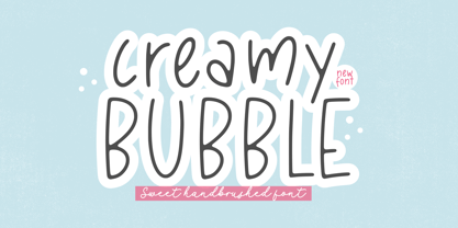 Creamy Bubble - a Sweet Handbrushed Font that's clean, elegant and perfect for a range of design projects! With its smooth, effortless lines and understated sophistication, this font is the perfect choice for those who want a modern look that's still timeless in its appeal. Crafted with precision and care, this font is incredibly versatile and can be used for a range of design projects, including logos, branding, invitations, packaging, and more. With its simple yet refined aesthetic, it's sure to make a lasting impression on anyone who sees it. - also multilingual support Enjoy the font! Feel free to comment or feedback! Thank you!
 - Pistol Twelve JNL by Jeff Levine,
$29.00Pistol Twelve JNL is a novelty version of Jeff Levine's Twelve Oaks JNL wood type font, with the addition of random bullet holes in the upper case characters. The font design was suggested by fellow type designer Ray Larabie. Pistol Twelve JNL is a two-fold pun. Initially, this conveys the obvious fact that the design is a variation of Twelve Oaks JNL with bullet holes... but the name is also a play on an old, old joke. One person asks the other: "Would you care to join the Pistol Club? You drink 'til twelve and..." Well, you get the picture! - Nettle Sans by Duck Soup Design,
$11.00 Influenced by Blackletter type and highway fonts, the Nettle Sans font family sets out to be both a quirky and confident headline font (at the heavier weights), and an easily legible body font for print or screen (at the lighter weights). Careful attention was taken in choosing distinct shapes for each letter to maximise legibility, and to balance a daring experimental form with function. Through its brutal angled cuts out of the ends of tapered links, ink-traps, ascenders and descenders, Nettle Sans' defining motif offers a visual language that communicates speed, efficiency, advancement and the "cutting edge".
 - Sweet Cakery by Balpirick,
$15.00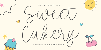 Sweet Cakery - a monoline Sweet Font that's clean, elegant and perfect for a range of design projects! With its smooth, effortless lines and understated sophistication, this font is the perfect choice for those who want a modern look that's still timeless in its appeal. Crafted with precision and care, this font is incredibly versatile and can be used for a range of design projects, including logos, branding, invitations, packaging, and more. With its simple yet refined aesthetic, it's sure to make a lasting impression on anyone who sees it. - also multilingual support Enjoy the font! Feel free to comment or feedback! Thank you!
 - Magenta Basket by Balpirick,
$15.00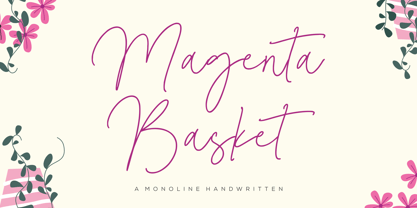 Magenta Basket - a Monoline Handwritten that's clean, elegant and perfect for a range of design projects! With its smooth, effortless lines and understated sophistication, this font is the perfect choice for those who want a modern look that's still timeless in its appeal. Crafted with precision and care, this font is incredibly versatile and can be used for a range of design projects, including logos, branding, invitations, packaging, and more. With its simple yet refined aesthetic, it's sure to make a lasting impression on anyone who sees it. - also multilingual support Enjoy the font! Feel free to comment or feedback! Thank you!
 - Gradus by Brenners Template,
$19.00Gradus is a multi-purpose typeface designed to properly mix elegance and rhythm. The balance between modern and sophisticated touches and styles can achieve the effect of harmonizing well with any device and channel. The hardness of the rigid stem of the grotesque typeface is transformed into a soft touch that organically matches words and sentences. Langages. Basic Latin. Western European, Central European, South Eastern European, South American, Oceanian, Basic Cyrillic, Ukrainian OpenTypeFeatures. Standard Ligatures : fi, ff, ffi. Discretionary Ligatures : ai, ia, il, ill, illi, ma, md, mi, mu, na, nd, ni, nu. Fractions, ss01, ss02, and more. - Burger Honren by IRF Lab Studio,
$12.00 Burger Honren is a beautiful collection of fonts, consisting of scripts, monolines and serifs. In this collection you will see fonts in various styles. With their help, many options open up for you to create your projects, both in vintage and modern styles. The script fonts in this collection provide both charisma and charm, crafted with care and complemented by alternatives and strokes. Serif comes in 10 styles and it is possible to choose the required style for your design. This font is PUA encoded which means you can access all the glyphs and sweeps easily!
 - 1483 Rotunda Lyon by GLC,
$38.00 Towards the end of the 1400s, in Lyon (France), was living Barthélémy Buyer, descendant of a rich family of merchants. In the end of 1472, he engaged a typographist from Liège (Belgium): Guillaume Le Roy. The first book stemming from their print shop was the Compendium breve ( by Pope Innocent III.) using Blackletter “textura”. Many books followed, most often illustrated with wood carving. In 1483, to print a French translated “Eneide”, they used a venetian “Rotunda” blackletter. Our font was inspired by this “Rotunda” set, with historical forms and ligatures enriched with accented letters and other characters not existing in the original.
 - Processual by letra Um,
$2.00After readings and reflections about the process-poem,“anti-literary” movement, contemporary of concretism, a font of simple form that could provide directions and sense of reading demanded its creation. So we have done the labor of the processual, modulate by consequence and not by option, born with autonomy and authority. The process demanded soon two things: first, to not be one more “hard to read pixelfont” used only by its creators; second, to attend to the requirements of the poem-process, not like a good daughter but like a modern and comprehensive grandchild (the generations understand themselves to the jumps). - Staple by Ajeet Mestry,
$50.00 Staple is a Display Font. Each letter and number is made up of a clever arrangement of staples. Together, they retain the simplicity and beauty of a perfectly folded stapler pin. This creates a font that provides very good readability, solid shape and simple elegance that makes it perfect for use as a display font. To add elegance to the font, the letters and numerals are designed to retain the pin identity across all characters. Care has been taken so that the pins do not overlap. Nor are the pins bent or twisted into unnatural shapes to create the characters.
 - Ermou by TEKNIKE,
$199.00 Ermou is a display monospace font. The typeface has a distinct geometry using sharp angled corners as a tribute to writing and carvings of Ancient Greece. The name is derived from Ermou Street (Οδός Ερμού) or “Street of Hermes” named after the Ancient Greek messenger God and "the bringer of good luck" Hermes (Ἑρμῆς). The famous street was one of the first roads designed in modern Athens, Greece. Today Ermou is Athens’ commercial heart and top ten most expensive retail streets in the world. Ermou is great for team sports, display work, invitations, writing, architecture, fashion, posters, titles and headings.
 - Bobbi Bee by Baseline Fonts,
$39.00 Bobbi Bee won't stop popping her bubblegum, even though that's not very ladylike. Bobbi Bee is very proud of all of her 361 numbers, letters and alternates - all of which are chock full of summer sunshine and life. The font comes in a single weight (because she's perfect just the way she is.) She's cut out for a very special book title, logotype, or love letter. Keep Bobbi's hand firmly in yours in shopping malls, as she tends to get distracted and wander, and though it's hard, always remember to tell her how smart she is, as well as how beautiful.
 - Roseline by Balpirick,
$15.00 Roseline - a Monoline Handwritten that's clean, elegant and perfect for a range of design projects! With its smooth, effortless lines and understated sophistication, this font is the perfect choice for those who want a modern look that's still timeless in its appeal. Crafted with precision and care, this font is incredibly versatile and can be used for a range of design projects, including logos, branding, invitations, packaging, and more. With its simple yet refined aesthetic, it's sure to make a lasting impression on anyone who sees it. - also multilingual support Enjoy the font! Feel free to comment or feedback! Thank you!
 - Adore You by Resistenza,
$39.00 Fall in love with Adore you, a new script font designed with dry-brush. These original letterforms were created by the expert hand of calligrapher Giuseppe Salerno. A fresh expressive and playful calligraphic approach, then digitized keeping textured strokes and the feeling of dry ink on paper. 2 versatile fonts, upright and slanted, and a set of strokes and lovely decorations which works on very diverse circumstances… beauty care, food, fashion, health, publishing, stationery and so many other uses. It includes opentype features - stylistic alternates and an extended set of Ligatures to customize your text. More About Opentype Features: https://bit.ly/opentype-rsz
 - Telegramo by Volcano Type,
$35.00 Telegramo is modeled on a historic telegraph from Belgrade to Vienna 1914. The original archetypal character set consists of lowercase letters and numerals only. Uppercase letters and special characters were added after careful research. Contact pressure variations of the rudimentary type writing machine are directly imitated in the three weights: the regular weights edges are sharp, medium edges are rounded and the bold letters can nearly be called soft. Since the original typeface did not seem perfectly suitable for modern desktop publishing purposes, two additional stylistic sets were created for each weight, improving certain issues in rhythm, legibility and quirkiness.
 - Linotype Russisch Brot by Linotype,
$29.00Linotype Russisch Brot is part of the Take Type Library, chosen from the entries of the Linotype-sponsored International Digital Type Design Contests of 1994 and 1997. The inspiration of German designer Markus Remscheid is not hard to see for those who are familiar with the chocolate cookies in the form of letters which are called Russisches Brot. The font is available in six weights. The basic weight is perfectly legible and is good for both headlines and shorter texts and from there the weights become more and more nibbled away, leaving the basic form of the characters and a few crumbs. - Holistic Haircut by Kitchen Table Type Foundry,
$16.00 My son Sam turned 12 and all of a sudden he cares for his hairdo. It needs to be just so, not too long, not too short, with a lot of gel to hold it in place. ;-) He just had a haircut when I was creating this font, so now you know where the Haircut part comes from. The Holistic part is something that sort of sounded ok. Holistic Haircut is a nice, handmade display font. It comes with wider and narrower glyphs for the upper and lower case AND a set of alternates that likes to party with the rest.
 - Solingen by Mysterylab,
$14.00 Solingen is an elegant display serif font well suited to logo design applications. The capital letter set features many unique double-letter pairings which serve as inspirational design features when creating posh, delicate, and luxurious logos. Suggested uses for Solingen might include high-end branding for boutique apparel, accessories, jewelry, or cosmetics; unique wedding invitation headlines; packaging for personal care items, and much more. In many applications, the ligatures feature is turned on by default as Standard Ligature alternates, but these can generally be easily overridden in the Glyphs panel when you prefer to use the standard characters instead.
 - Compotes by Piñata,
$9.90 Fontfamily “Compotes” was created with love and with care about small collections of hand-made" fonts. We have created a perfect product for the decoration of home design, small barber’s shops, cafes and bakeries. This fonts is ideally combined with any type of design, for example, you can use them on labels of homemade jams and pickles and “Compotes” perfectly can be used in logos and in the press. We did 5 main main typefaces by alphabetical list: A - Apple, B - Basilic, C - Citro, D - Dew, E - Espresso In addition, we have developed five “supplements” for each font!
 - Normaliq by Differentialtype,
$12.00 Normaliq is a geometric and modern sans serif family that exudes a unique and minimalist charm. comes in nine weights, ranging from Thin to Black, combined with an Italic style, as well as the addition of Black Outline and Black Italic Outline. The balance of hard lines and subtle curves provides strength and eye-catching for every weight of the family. Each font in the family can stand alone, dynamic and authoritative. This font family offers versatility for a variety of design needs, designed specifically for looks such as titles, branding, logos, books, branding and other impactful editorial work.
 - Wildfire Dreams by Balpirick,
$15.00 Wildfire Dreams - a monoline calligraphy that's clean, elegant and perfect for a range of design projects! With its smooth, effortless lines and understated sophistication, this font is the perfect choice for those who want a modern look that's still timeless in its appeal. Crafted with precision and care, this font is incredibly versatile and can be used for a range of design projects, including logos, branding, invitations, packaging, and more. With its simple yet refined aesthetic, it's sure to make a lasting impression on anyone who sees it. - also multilingual support Enjoy the font! Feel free to comment or feedback! Thank you!
 - Bacterio by Wiescher Design,
$39.50 Bacterio is a typeface I designed for this hulk of a friend of mine who is a kitchen designer. He is huge but has a very delicate feeling for form. One day he said he was trying out something new and if I couldn't make a font for him. Then he showed me the surface design, a hard-plastic covered multilayered wood. The surface design was called "Bacteria" and it looked just like that, only in multicolors. Well here is "Bacterio" the font that looks just like that surface of my hulky friend. Yours very design infected Gert Wiescher
 - Potbank by Asdesign,
$50.00 Like many cities in the Midlands and North of England, Stoke-on-Trent has a rich history linked to making and industry. In Stoke’s case it was pottery. In the early 1900s bottle kilns could be seen covering the landscape of the six towns making up Stoke-on-Trent with hundreds of factories producing some of the best ceramics in the world. But by the 1990s most of these had gone. Torn down for development of housing or just left to rot. During the next few decades Stoke continued to change. The industry was in a decline and Stoke itself was seen as another poor midlands city with a dwindling industry. Then in 2008, Spode, one of the largest and most famousceramics factories in Stoke entered into administration. Pens cast aside, drawings left half finished, designs left in the turned-off kilns; Spode factory was abandoned. This was a real shock and the way everything was getting thrown into skips to be put on the tip was heartbreaking. Thankfully people salvaged some of the technical drawings, sketch design, old sample pieces and ceramics that people hard worked so hard on. Potbank has been in development over a number of years taking inspiration from the heritage and designs from the ceramics industry. It has a mixed Clarendon and Antiqua style structure with its main purpose to be used as a printed type.
 - Axial cut by deFharo,
$21.00 Axial Cut is a sans serif typeface (Latin Extended-A), a contemporary and rounded evolution of geometric fonts for screen, but this time the letters are built on an axial axis that results in trapezoidal counter-shapes, joints with reduced antlers and rounded corners that correct optical effects in small sizes to make the typography more legible, and at the same time, in large sizes it shows its original shapes. The Axial Cut typeface family is made up of four weights: Light, Regular, Medium and Bold, each with 785 characters. I have taken particular care with the metrics and dimensions of each letter or sign, with a very careful and precise kerning configuration to achieve the For maximum readability, these are fonts with slightly higher ascenders than capitals and short descenders to make it more compact. The editing possibilities and unique designs with these complex typefaces are very wide, the fonts have a complete set of uppercase letters and a lowercase set with alternative characters as well as lowercase letters and numbers in different positions (lowercase, denominators, numerals, and uppercase) that They also work as automatic fractions, they also incorporate small capital letters and three sets of alternative numbers (Normal, Old style numbers, Square numbers), etc. Discover other alternative signs, characters and Open Type functions in the PDF: Specimen & The Cheat Sheet.
 - Fodecumbers Display by Zamjump,
$9.00 Fodecumbers is a strong FontFamily and Sans sophisticated look. Inspired by dynamic squares can be felt through controlled letterforms and a modern twist. Balance of hard lines and smooth curves. Each font in the family can be standalone, dynamic, and authoritative on its own, or mix it with italics for the tagline in a logo. it's really worth it. Fodecumbers includes all thirteen uppercase fonts: Four weights, two outlines, seven italics. FEATURES Four weights / Italics / Lines / Numbers & Punctuation / Extensive Language Support USE Fodecumbers works well in every branding, logo, magazine, film. The different weights give you the full Fodecumbers is a strong FontFamily and Sans sophisticated look. Inspired by dynamic squares can be felt through controlled letterforms and a modern twist. Balance of hard lines and smooth curves. Each font in the family can be standalone, dynamic, and authoritative on its own, or mix it with italics for the tagline in a logo. it's really worth it Fodecumbers includes all thirteen uppercase fonts: Four weights, two outlines, seven italics. FEATURES Four weights / Italics / Lines / Numbers & Punctuation / Extensive Language Support USE Fodecumbers works well in every branding, logo, magazine, film. The different weights give you the full range to explore a whole host of applications, while the fonts outlined give a real modern feel to any project. Any specific license questions or questions, feel free to contact zamjump@gmail.com zamjump
 - Flintlock by CozyFonts,
$25.00 The Flintlock Font Family has a Bold personality. The 'Rough' version of the Flintlock Font has a hand-carved or hand-etched edge, carefully crafted for each of over 300 glyphs. Caps, lower case, all numbers, fractions, accents and European characters that work in over 70 languages. 'Classically Built with a Vintage Flair'. Vintage in the American West Tradition that might have been forged and implemented from the 1860s through the 1930s and consequently fresh again. Flintlock Rough can be envisioned on many things dated from 1860 to present day. The font is available in 3 basic weights as of this release date. There are other versions on the drawing board... Flintlock Rough works extremely well with Posters, Branding, Movie Titles, Invites, Stationary, Signage, Embroidery, Letterpress, Ads, Logos and anything that feels Industrial or Hand-Crafted, eg. Coffee, Breweries, Antiques, Woodcuts, Western Styles, Sports Styles, Holidays, Menus, and more. Flintlock Flat & Flintlock Flat Italic are the siblings to Flintlock Rough without the hand-carved edge but rather clean with slightly rounded corners and edges. Extremely Legible, Bold and best used in all the same application descriptions mentioned above and more, specifically contemporary uses and settings, eg. Sports, Titles, Branding, Headlines, Logos and more. Curiously the Flat & Italic versions of Flintlock work extremely well in 1960s and 1970s settings.
 - FS Rome by Fontsmith,
$50.00 Trajan The original template for this one-weight, all-caps font was the inscription on Trajan’s Column, carved in AD 113 to celebrate the emperor Trajan’s victory in the Dacian Wars. College student Jason Smith copied the stone lettering from the cast on display in London’s Victoria & Albert Museum. In Roman times, the signmaker would paint letters onto stone with a wide brush for the stone mason to chisel out later. The signwriter would end each stroke with a flick of his brush, which the mason would also carve into the stone. Ecce (as they would have said in Rome): the serif was born. Hand-crafted “I first drew this typeface when I was 17,” says Jason. “I drew it with a very sharp 9H pencil on polydraw film. “Then, using a Rotring pen, I inked the letters in and scraped back the serifs so they were perfectly sharp. These letters were then reduced on a PMT camera. I’d designed my first typeface, although it wasn’t digitised till much later.” Digitised Years after Jason had drawn the original typeface, its transfer into digital form made further refinements necessary. The serifs and weights needed thickening slightly, creating a crisp, new version whose delicate elegance is best appreciated in larger sizes. A classically-inspired font, timeless and perfectly-proportioned, to reflect the refinement of premium brands.
 - Bello Pro by Underware,
$50.00 Now check this, Underware’s blockbuster type, Bello. Bello Pro is a brush typeface for headline point sizes - it’s big & beautiful. Bello has lots of ligatures and start and ending swashes. They are automatic in Bello Script Pro, which is a cross-platform OpenType font with many OpenType features. Bello has Underware’s world-dominating Latin Plus character set, supporting a total of 219 languages (Latin 1 + 2 and beyond). After a period of hand sketching and lettering, Bello got two main styles: Script and Caps. These two fonts create a strong typographic contrast - while Bello Script Pro is flourished and flowing, Bello Caps Pro provides upright and sturdy capital lettering. As sturdy as brush lettering allows, of course. Careful spacing and kerning ensures* that Bello appears like fluently written handwriting. However, that’s not enough for a hand-lettered feel. Therefore Bello comes with a set of 64 ligatures. Some of them are typographic, some made simply to create a more intimate, natural impression. For the same reasons we have added a few ornaments and a set of snap-on beginning and ending swashes which attach to the lowercase letters of Bello. With Bello Words Pro you can add some two-color words in your text by the pre-designed word logotypes. Trust the brush! *So take care: use ‘metrics’, not ‘optical’ as a spacing setting in layout apps.
 - Ringbearer is a font that transports you into the heart of Middle-earth, drawing significant inspiration from the epic narrative and legendary ambiance of J.R.R. Tolkien's "The Lord of the Rings." Th...
- Berlewi FA by Fontarte,
$39.00 FA Berlewi is inspired by stencil lettering of a vanguard creator, Henryk Berlewi, who was a precursor of contemporary typography, a painter and a creator of the mechano-facture (Mechano-Faktura) theory. In 1924 he designed a poster for his mechano-facture one-man show in Warsaw Austro-Daimler car salon. An attention-grabbing composition with stencil lettering was doubtless a real innovation and according to Berlewi - the first typographic poster to be made in Poland.
 - Busy Day by PizzaDude.dk,
$16.00 Today has been a busy day. I managed to take the dog for a walk, go for a run, empty the dishwasher, clean the car, vacuum the entire apartment AND make this font! :) The Busy Day font is all about fun and games: it’s playful, whimsical and legible at the same time. I’ve added an Outline version, Inside and the Regular version. They all work well together or as individual fonts - and they all have multilingual support!
 - Rackem PB by Pink Broccoli,
$14.00 Rackem PB started as a digitization of a film typeface known as "Eightball" by LetterGraphics, not to be confused with Eightball that was released by other film type companies of a totally different look. This crazy typestyle had all the flavor it needed to make regular appearances in 70's sticker body modification ads for Chevrolet cars and trucks side panels. Loaded with hooptie appeal, it's something you really need to take for a ride to appreciate its novelty.
 - Vinice by Illuminaut Designs,
$15.00 This typeface was created as a personal project. Inspired by places like Chattanooga and Berkley, I wanted to create a bespoke typeface family for the US Virgin Islands. I noticed that the typeface Berlin Sans was in use all over the islands, in signs, logos, even on the side of police cars. So I built this typeface from the ground up with the goal of updating an old tried-and-true font into a family with versatile potential.
 - Type Ultimate by VP Creative Shop,
$39.00 Type Ultimate is an exquisite serif font that combines elegance and sophistication. It comes in regular and italic versions, each containing a stunning collection of 383 ligature glyphs and alternate glyphs, as well as 26 swashes for both regular and italic versions. With its extensive character set, Type Ultimate supports a wide range of languages, making it a versatile choice for various projects. This font is perfect for creating a memorable logo, establishing a strong brand identity, and making headlines that stand out. Its timeless and refined design also makes it an excellent choice for elegant wedding invitations and other formal occasions. Overall, Type Ultimate is a font that exudes beauty and refinement, adding a touch of sophistication to any project it's used in. Language Support : Afrikaans, Albanian, Asu, Basque, Bemba, Bena, Breton, Chiga, Colognian, Cornish, Czech, Danish, Dutch, Embu, English, Estonian, Faroese, Filipino, Finnish, French, Friulian, Galician, Ganda, German, Gusi,i Hungarian, Indonesian, Irish, Italian, Jola-Fonyi, Kabuverdianu, Kalenjin, Kamba, Kikuyu, Kinyarwanda, Latvian, Lithuanian, Lower Sorbian, Luo, Luxembourgish, Luyia, Machame, Makhuwa-Meetto, Makonde, Malagasy, Maltese, Manx, Meru, Morisyen, North Ndebele, Norwegian, Bokmål, Norwegian, Nynorsk, Nyankole, Oromo, Polish, Portuguese, Quechua, Romanian, Romansh, Rombo, Rundi, Rwa, Samburu, Sango, Sangu, Scottish, Gaelic, Sena, Shambala, Shona, Slovak, Soga, Somali, Spanish, Swahili, Swedish, Swiss, German, Taita, Teso, Turkish, Upper, Sorbian, Uzbek (Latin), Volapük, Vunjo, Walser, Welsh, Western Frisian, Zulu Ligatures Uppercase - AB,AC,AD,AG,AK,AL,AM,AN,AP,AR,AS,AT,AV,AY,BE,BL,BO,BU,CE,CH,CK,CO,CT,DE,DI,DO,EA,ED, EE,EF,EI,EL,EM,EN,EP,ER,ES,ET,EV,EX,EY,FA,FE,FF,FI,FO,FR,FT,FU,GA,GE,GH,GO,GR,HA,HE,HI, HO,HT,KE,KI,KN,LA,LD,LE,LF,LI,LL,LO,MA,ME,MI,MM,MO,MP,MU,NA,NC,ND,NE,NG,NK,NO,NS,NT, NY,OA,OD,OK,OL,OM,ON,OO,OP,OR,OS,OT,OU,OW,PA,PE,PL,PO,PP,PR,RA,RD,RE,RI,RO,RR,RS,RT, RY,SA,SE,SH,SO,ST,SU,TA,TE,TH,TI,TL,TO,TR,TS,TT,TU,UG,UL,UN,UR,US,UT,VE,VI,WE,WH,WI,WO,YO, YS,MEN,WER,FRO,RON,ROM,THE,AND,ING,HER,HAT,HIS,THA,ERE,FOR,ENT,ION,TER,WAS,YOU,ITH, VER,ALL,THI,TIO,OUL,ULD,IGH,GHT,AVE,HAV,ICH,HIC,HIN,HEY,ATI,EVE,HING,WERE,FROM,THAT,THER, TION,OULD,IGHT,HAVE,THIS,THIN,THEY, ATIO,EVER,MENT Lowercase - ab,ad,ag,ai,ak,al,am,an,ap,as,at,av,ay,ba,be,bl,bo,bu,ca,ce,ch,ck,co,ct,de,di,do,ea,ec,ed,ee,ef,eg,ei,ej,el,en,ep,es,et,ev,ew,ey,fa,fe,fi,fo,fr,fu,ga,ge,gh,gi,gr,ha,he,hi,ho,ht,ic,id,ie,ik,il,im,in,io,ir,is,it,iv,ke,ki,kn,la,ld,le,lf,li,lo,ly,ma,me,mi,na,nc,nd,ne,ng,ni,nk,nl,no,nt,ny,oa,oc,od,of,oi,ok,ol,om,on,oo,op,ot,ou,ov, ow,pa,pe,pi,pl,po,pp,qu,ra,rd,re,ri,rm,rn,ro,rr,rs,rt,ru,ry,sa,se,sh,si,so,sp,ss,st,su,ta,te,th,ti,tl,to,ts,tt, tu,uc,ug,um,un,up,ur,us,ut,va,ve,wa,we,wo,xp,ye,yo,ys,men,wer,fro,rom,ron,the,and,ing,her,hat,tha, ere,for,ent,ion,ter,you,ver,thi,ght,ave,hey How to access alternate glyphs? To access alternate glyphs in Adobe InDesign or Illustrator, choose Window Type & Tables Glyphs In Photoshop, choose Window Glyphs. In the panel that opens, click the Show menu and choose Alternates for Selection. Double-click an alternate's thumbnail to swap them out. Mock ups and backgrounds used are not included. Thank you! Enjoy!
 - Banknote 1948 by Ingo,
$39.00 A very expanded sans serif font in capital letters inspired by the inscription on a bank note Old bank notes tend to have a very typical typography. Usually they carry decorative and elaborately designed markings. For one thing, they must be practically impossible to forge and for another, they should make a respectable and legitimate impression. And in the days of copper and steel engravings, that meant nothing less than creating ornate, shaded or otherwise complicated scripts. Designing the appropriate script was literally in the hands of the engraver. That’s why I noticed this bank note from 1948. It is the first 20 mark bill in the then newly created currency ”Deutsche Mark.“ All other bank notes of the 1948 series show daintier forms of typography with an obvious tendency toward modern face. The 1949 series which followed shortly thereafter reveals the more complicated script as well. For whatever reason, only this 20 mark bill displays this extremely expanded sans serif variation of the otherwise Roman form applied. This peculiarity led me in the year 2010 to create a complete font from the single word ”Banknote.“ Back to those days in the 40’s, the initial edition of DM bank notes was carried out by a special US-American printer who was under pressure of completing on time and whose engravers not only engraved but also designed. So that’s why the bank notes resemble dollars and don’t even look like European currency. That also explains some of the uniquely designed characters when looked at in detail. Especially the almost serif type form on the letters C, G, S and Z, but also L and T owe their look to the ”American touch.“ The ingoFont Banknote 1948 comprises all characters of the Latin typeface according to ISO 8859 for all European languages including Turkish and Baltic languages. In order to maintain the character of the original, the ”creation“ of lower case letters was waived. This factor doesn’t contribute to legibility, but this kind of type is not intended for long texts anyway; rather, it unfolds its entire attraction when used as a display font, for example on posters. Banknote 1948 is also very suitable for distortion and other alien techniques, without too much harm being done to the characteristic forms. With Banknote 1948 ingoFonts discloses a font like scripts which were used in advertising of the 1940’s and 50’s and were popular around the world. But even today the use of this kind of font can be expedient, especially considering how Banknote 1948, for its time of origin, impresses with amazingly modern detail.
 - Bethlehem Star by HiH,
$10.00 For much of the world, the last half of December encompasses the beginning of winter and the a season of gift-giving, marked by Hanukkah and Christmas. It is generally accepted that the tradition of giving of gifts at this time was begun by The Three Wisemen. As described in The Gospel According to Matthew, the wisemen, led by a star from a distant land to the east, found the baby Jesus. First, they worshipped him and then, "they presented him with gifts: gold, frankincense and myrrh." (Matthew 2:11). Thus began the tradition of celebrating the birth of Christ with the giving of gifts. There is a parallel tradition in the Jewish faith of the giving of gelt or gold at Hanakkuh to help support poor students, in keeping with the rich history of scholarship that is fundamental to the rabbinic system. Inevitably, in our secular culture, there has been a blending and a secularization of these traditions. The reasons have gotton lost in the “gimme.” What is often overlooked is what Paul realized when he told Timothy, “Neglect not the gift that is in thee.” The most importent gift is the gift inside of us, the gift of sacrificial love for others. When we let that gift be diminished in our minds amid the clutter of modern day material seeking, we can recall the prophesy of Micah over 2800 years ago, But thou, Bethlehem Ephratah, though thou be little among the thousands of Judah, yet out of thee shall he come forth unto me that is to be ruler in Israel: whose goings forth have been from of old, from everlasting." (Micah 5:2 KJV) Never underestimate the impact you have on others. Words of kindness can change people’s lives. The Talmud says that the highest form of wisdom is kindness. Be wise this holiday season. The font BETHLEHEM STAR was originally designed for the church to which I belong, The Star Bethlehem Church of Ansonia, Connecticut, USA and is based on the typeface Accent with the permission of URW++ of Hamburg, Germany. You might choose BETHLEHEM STAR for your personal greetings as well as for flyers and programs at your church this holiday season. Like most display fonts, it is most effective at 18 points and larger. Like most script fonts, it is most effective when set with both upper and lower case. All caps with this font is like eating two pieces of pecan pie — too much of a good thing.
 - The NoRefunds font, crafted by the astute and ever-creative Christoph Mueller, stands as a distinctive typographic creation that embodies a perfect blend of retro charm and modern finesse. This font ...
- The CONFLICT DRIPS PERSONAL USE font, designed by the esteemed artist Billy Argel, stands as a testament to the emotive power of typography. This font doesn't just capture attention; it seizes it wit...
- Ah, Flaemische Kanzleischrift! If fonts were a party, Flaemische Kanzleischrift would be the mysterious character in the corner, sipping a fancy cocktail and regaling tales of medieval adventures. Cr...