4,842 search results
(0.012 seconds)
- Hot Pursuit by Wing's Art Studio,
$18.00 Hot Pursuit: A Hand-Drawn Grind-house Roller Derby Font A grungy hand-drawn font with attitude inspired by comic books, Roller Derby and bad Grindhouse movies. Hot Pursuit is a boiling pot of pop-culture references ranging from 70s chase movies to Roller Derby, horror comics to Grindhouse cinema. All combining to create a hand-drawn font for grungy designs with maximum punch. Supplied in regular and italic styles, it creates titles that race off the page, perfectly suited for dynamic movie posters and headlines. Along with the 4 font styles you’ll also find a host of original comic art by Christopher King, plus symbols and underlines to compliment your type. Hot Pursuit contains unique uppercase and lowercase characters, numerals, punctuation and language support. It’s a bad-ass font ready for your t-shirts, posters, stickers, movie titles, YouTube videos and more! Check out the visuals to see it in action for yourself.
 - Vianova Serif Pro by Elsner+Flake,
$59.00 The font superfamily Vianova contains each 12 weights of Sans and Slab and 8 weights of the Serif style. The design from Jürgen Adolph dates back into the 1990s, when he studied Communication Design with Werner Schneider as a professor at the Fachhochschule Stuttgart. Adolph started his carrier 1995 at Michael Conrad & Leo Burnett. He was responsible for trade marks as Adidas, BMW, Germanwings and Merz. He has been honored as a member of the Art Directors Club (ADC) with more than 100 awards. On February 26, 2014, Jürgen Adolph wrote the following: “I was already interested in typography, even when I could not yet read. Letterforms, for instance, above storefronts downtown, had an irresistible appeal for me. Therefore, it is probably not a coincidence that, after finishing high school, I began an apprenticeship with a provider of signage and neon-advertising in Saarbrücken, and – in the late 1980s – I placed highest in my field in my state. When I continued my studies in communications design in Wiesbaden, I was introduced to the highest standards in calligraphy and type design. “Typography begins with writing” my revered teacher, Professor Werner Schneider, taught me. Indefatigably, he supported me during the development of my typeface “Vianova” – which began as part of a studies program – and accompanied me on my journey even when its more austere letterforms did not necessarily conform to his own aesthetic ideals. The completely analogue development of the types – designed entirely with ink and opaque white on cardboard – covered several academic semesters. In order to find its appropriate form, writing with a flat nib was used. Once, when I showed some intermediate designs to Günter Gerhard Lange, who occasionally honored our school with a visit, he commented in his own inimitable manner: “Not bad what you are doing there. But if you want to make a living with this, you might as well order your coffin now.” At that time, I was concentrating mainly on the serif version. But things reached a different level of complexity when, during a meeting with Günther Flake which had been arranged by Professor Schneider, he suggested that I enlarge the offering with a sans and slab version of the typeface. So – a few more months went by, but at the same time, Elsner+Flake already began with the digitilization process. In order to avoid the fate predicted by Günter Gerhard Lange, I went into “servitude” in the advertising industry (Michael Conrad & Leo Burnett) and design field (Rempen& Partner, SchömanCorporate, Claus Koch) and worked for several years as the Creative Director at KW43 in Düsseldorf concerned with corporate design development and expansion (among others for A. Lange & Söhne, Deichmann, Germanwings, Langenscheidt, Montblanc.”
 - Vianova Slab Pro by Elsner+Flake,
$59.00 The font superfamily Vianova contains each 12 weights of Sans and Slab and 8 weights of the Serif style. The design from Jürgen Adolph dates back into the 1990s, when he studied Communication Design with Werner Schneider as a professor at the Fachhochschule Stuttgart. Adolph started his carrier 1995 at Michael Conrad & Leo Burnett. He was responsible for trade marks as Adidas, BMW, Germanwings and Merz. He has been honored as a member of the Art Directors Club (ADC) with more than 100 awards. On February 26, 2014, Jürgen Adolph wrote the following: “I was already interested in typography, even when I could not yet read. Letterforms, for instance, above storefronts downtown, had an irresistible appeal for me. Therefore, it is probably not a coincidence that, after finishing high school, I began an apprenticeship with a provider of signage and neon-advertising in Saarbrücken, and – in the late 1980s – I placed highest in my field in my state. When I continued my studies in communications design in Wiesbaden, I was introduced to the highest standards in calligraphy and type design. “Typography begins with writing” my revered teacher, Professor Werner Schneider, taught me. Indefatigably, he supported me during the development of my typeface “Vianova” – which began as part of a studies program – and accompanied me on my journey even when its more austere letterforms did not necessarily conform to his own aesthetic ideals. The completely analogue development of the types – designed entirely with ink and opaque white on cardboard – covered several academic semesters. In order to find its appropriate form, writing with a flat nib was used. Once, when I showed some intermediate designs to Günter Gerhard Lange, who occasionally honored our school with a visit, he commented in his own inimitable manner: “Not bad what you are doing there. But if you want to make a living with this, you might as well order your coffin now.” At that time, I was concentrating mainly on the serif version. But things reached a different level of complexity when, during a meeting with Günther Flake which had been arranged by Professor Schneider, he suggested that I enlarge the offering with a sans and slab version of the typeface. So – a few more months went by, but at the same time, Elsner+Flake already began with the digitilization process. In order to avoid the fate predicted by Günter Gerhard Lange, I went into “servitude” in the advertising industry (Michael Conrad & Leo Burnett) and design field (Rempen& Partner, SchömanCorporate, Claus Koch) and worked for several years as the Creative Director at KW43 in Düsseldorf concerned with corporate design development and expansion (among others for A. Lange & Söhne, Deichmann, Germanwings, Langenscheidt, Montblanc.”
 - Vianova Sans Pro by Elsner+Flake,
$59.00 The font superfamily Vianova contains each 12 weights of Sans and Slab and 8 weights of the Serif style. The design from Jürgen Adolph dates back into the 90th, when he studied Communication Design with Werner Schneider as a professor at the Fachhochschule Stuttgart. Adolph started his carrier 1995 at Michael Conrad & Leo Burnett. He was responsible for trade marks as Adidas, BMW, Germanwings and Merz. He has been honoured as a member of the Art Director Club (ADC) with more than 100 awards. On February 26, 2014, Jürgen Adolph wrote the following: “I was already interested in typography, even when I could not yet read. Letterforms, for instance, above storefronts downtown, had an irresistible appeal for me. Therefore, it is probably not a coincidence that, after finishing high school, I began an apprenticeship with a provider of signage and neon-advertising in Saarbrücken, and – in the late 1980s – I placed highest in my field in my state. When I continued my studies in communications design in Wiesbaden, I was introduced to the highest standards in calligraphy and type design. “Typography begins with writing” my revered teacher, Professor Werner Schneider, taught me. Indefatigably, he supported me during the development of my typeface “Vianova” – which began as part of a studies program – and accompanied me on my journey even when its more austere letterforms did not necessarily conform to his own aesthetic ideals. The completely analogue development of the types – designed entirely with ink and opaque white on cardboard – covered several academic semesters. In order to find its appropriate form, writing with a flat nib was used. Once, when I showed some intermediate designs to Günter Gerhard Lange, who occasionally honored our school with a visit, he commented in his own inimitable manner: “Not bad what you are doing there. But if you want to make a living with this, you might as well order your coffin now.” At that time, I was concentrating mainly on the serif version. But things reached a different level of complexity when, during a meeting with Günther Flake which had been arranged by Professor Schneider, he suggested that I enlarge the offering with a sans and slab version of the typeface. So – a few more months went by, but at the same time, Elsner+Flake already began with the digitilization process. In order to avoid the fate predicted by Günter Gerhard Lange, I went into “servitude” in the advertising industry (Michael Conrad & Leo Burnett) and design field (Rempen& Partner, SchömanCorporate, Claus Koch) and worked for several years as the Creative Director at KW43 in Düsseldorf concerned with corporate design development and expansion (among others for A. Lange & Söhne, Deichmann, Germanwings, Langenscheidt, Montblanc.”
 - Kamuy by Andinistas,
$39.95 Kamui is a font designed by Carlos Fabian Camargo G. and used to write headlines. Its strategy makes it ideal for covers and advertisements with Japanese-style manga comics requiring latin style. Precisely its purpose was inspired by typographical classics such as Mistral by R. Excoffon and Zapfino by H. Zapf that then were diluted by separate strokes as blackletter calligraphy. However, high doses of miscegenation and lettering untimely torn between 50% esthetic and 50% legibility. That way his radical expression is highly profitable for composing and designing words and phrases with Eastern look. And more importantly, the writing seems drawn quickly with thin-tipped brush staining over a rough surface, from that process comes the idea of corroded outlines and changes in contrast. In conclusion, some diagonal strokes, horizontal, curved and vertical stand or hide from their simulation of scarcity or abundance of ink clots. That way each stroke seems inconsistent, footprint of the 423 brush drawing glyphs in Regular Kamuy. In that sense, the OpenType features included are: Standard Ligatures, Contextual Alternates, discretionary ligatures, swash, stylistic alternates, alternatives for titles, ordinals, fractions. And to end the Variable “Kamuy Dingbats” has is 52 fictitious drawings and zamurais.
 - Homework by DAAZ,
$9.00 Homework font was specially conceived/designed for teaching cursive writing. This resource allows tutors and parents to create worksheets for individual or class teaching. Associated with the dashed version of the font, students can learn and exercise their handwriting abilities. All capital letters, excluding I, F, T and P, link to any following small letter: the sequence of the previous letter stroke always follows the angle of the initial stroke of the subsequent letter. This, in the real world, means that words built with the font can be handwritten without having to lift the pen from the paper (except to cross t and f and dot i and j) or interrupt the writing flow. All the letters are base aligned and all small letters have the same ‘x’ height in order to fit a ruled worksheet. Homework font letter stroke widths are uniform in order to emulate regular pens. Homework font also mimics genuine handwriting, making it useful for online stores gift cards, thank you cards and all applications where a real world feel is desired. The Homework font also performs well on long texts.
 - Cíclope by Andinistas,
$19.95 Cíclope is a typeface family designed by Carlos Fabián Camargo in 2012 and used to write the headlines. Its idea is based on an army of stone soldiers that with their size and strength cause earthquakes. Under this concept he obtained stencil and sans serif letters with monstrous shapes and torn counterforms. Its usefulness as well as readability consists in imitate rocks with scars and cracks. For that reason, Cíclope family has three sizes, each with their respective italics distributed at different levels of corrosion. In addition, each file contains 260 glyphs useful for designing words and phrases with systematically eroded treatments for advertisement material. Thus Cíclope works as a raw material in the exploration of new graphic design. Finally, Cíclope concept has grotesque, geometric and humanistics letters roots that seem disastrous but each and every detail has been planned with high definition drawing. Most importantly, it expresses a big amount of grunge style with cracked edges and medium contrast between thin and thick strokes. In that sense, the writing seems impaired and special for design of logos, posters, flyers, brochures and worn, crusty or demolished graphic design.
 - Veronika by Linotype,
$29.99Veronika is a semi-serif text face, available in three styles: Regular, Italic, and Bold. All three faces are available in OpenType format, with both lining and old-style figures. Grüger, a German artist and designer, first began the design of her typeface by writing out its letterforms with a wooden stylus. She wanted to create a new semi serif face that had uniform stroke widths, but still maintained some aspects of calligraphy. Veronika achieves this; the terminals that begin the first strokes of most letters are round and bulbous, as if the writing instrument added extra emphasis on that spot. This adds a dynamic, movement-like quality to texts designed with Veronika. Aside from some sans serif-ness, Veronika appears similar to old style typefaces from the renaissance: classical inscriptions inspired the proportions of the capital letters, and the lower case letters stem from Carolinian minuscule. These proportions allow Veronika to function very well in text and at small sizes. However, only when you design larger headlines, logos, or other elements with Veronika, will you notice all of its special qualities, like its weight distribution and stroke characteristics. - Ongunkan Ogham by Runic World Tamgacı,
$50.00 This font is a latin based version of the ogham alphabet used in the writing of the old irish language. It can be used on Latin keyboards. I will make a unicode font version of this font in the future. Ogham (/ˈɒɡəm/ OG-əm, Modern Irish: [ˈoː(ə)mˠ]; Middle Irish: ogum, ogom, later ogam [ˈɔɣəmˠ] is an Early Medieval alphabet used primarily to write the early Irish language (in the "orthodox" inscriptions, 4th to 6th centuries CE), and later the Old Irish language (scholastic ogham, 6th to 9th centuries). There are roughly 400 surviving orthodox inscriptions on stone monuments throughout Ireland and western Britain, the bulk of which are in southern Munster. The largest number outside Ireland are in Pembrokeshire, Wales. The vast majority of the inscriptions consist of personal names. According to the High Medieval Bríatharogam, the names of various trees can be ascribed to individual letters. For this reason, ogam is sometimes known as the Celtic tree alphabet. The etymology of the word ogam or ogham remains unclear. One possible origin is from the Irish og-úaim 'point-seam', referring to the seam made by the point of a sharp weapon.
 - Roughmarker by 38-lineart,
$16.00 Roughmarker font consists of two handwritten scripts, a slant (regular) version and upright. This Script fonts are manually handwritten with quick and rough strokes. We write them on paper until we find a very proportioned form. Then we scanned and took the selected glyphs to be processed into a font. The biggest challenge in making textures fonts are the very many node points, many node points make the font processing performance a bit slow. At first we tried raising the node parameters to 2000-4000 points in one glyph. This is a big number, but if this number is lowered it will eliminate the impression of brush and natural look. We repeatedly look for gaps to minimize points so that the font capacity is not too large and comfortable when typed. This script font is equipped with ligature as well as several alternate according to handwriting habits, very effective in the sense of not too much but often used. This font is the great choice for contemporary brands, especially for businesses in fashion, urban style, websites, trends in architecture, cosmetics, and energetic lifestyle themes. An attractive typographic layout makes it also looks more premium in writing quotes.
 - Ah, Jellyka by Jellyka Nerevan – the font that decided to take a leisurely stroll through the whimsical garden of creativity, wearing its most charming attire. Picture if you will, each letter crafte...
- First Ladies by Celebrity Fontz,
$24.99 First Ladies is a unique collection of signatures of almost all of the First Ladies of the United States plus the First Lady of the Confederacy in a high-quality font. A must-have for autograph collectors, desktop publishers, lovers of history, or anyone who has ever dreamed of sending a letter, card, or e-mail “signed” as if by one of these famous women. This font includes 45 signatures for the following First Ladies: Martha Dandridge Custis Washington, Abigail Smith Adams, Martha Wayles Skelton Jefferson, Dolley Payne Todd Madison, Elizabeth Kortright Monroe, Louisa Catherine Johnson Adams, Rachel Donelson Jackson, Anna Tuthill Symmes Harrison, Julia Gardiner Tyler, Sarah Childress Polk, Margaret Mackall Smith Taylor, Abigail Powers Fillmore, Jane Means Appleton Pierce, Harriet Lane, Mary Todd Lincoln, Eliza McCardle Johnson, Julia Dent Grant, Lucy Ware Webb Hayes, Lucretia Rudolph Garfield, Ellen Lewis Herndon Arthur, Frances Folsom Cleveland, Caroline Lavinia Scott Harrison, Frances Folsom Cleveland, Ida Saxton McKinley, Edith Kermit Cardow Roosevelt, Helen Herron Taft, Ellen Axson Wilson, Edith Bolling Galt Wilson, Florence Kling Harding, Grace Anna Goodhue Coolidge, Lou Henry Hoover, Anna Eleanor Roosevelt, Elizabeth Virginia Wallace Truman, Mamie Geneva Doud Eisenhower, Jacqueline Lee Bouvier Kennedy, Claudia Taylor (Lady Bird) Johnson, Patricia Ryan Nixon, Elizabeth Bloomer Ford, Rosalynn Smith Carter, Nancy Davis Reagan, Barbara Pierce Bush, Hillary Rodham Clinton, Laura Welch Bush, Michelle Obama, and Varina Howell Davis (First Lady of the Confederacy). This font behaves exactly like any other font. Each signature is mapped to a regular character on your keyboard. Open any Windows application, select the installed font, and type a letter, and the signature will appear at that point on the page. Painstaking craftsmanship and an incredible collection of hard-to-find signatures go into this one-of-a-kind font. Comes with a character map.
 - Just Another Hand Pro by Stiggy & Sands,
$29.00 My personal handwriting has changed a number of times over the years. Just Another Hand is a narrow brush drawn handwriting font, inspired very loosely by the handwriting of my high school days. There's a little artistic license taken with Just Another Hand in the sense that while I never really wrote with a brush in high school, I wanted a cleaner stroke for this interpretation. A little personality, a little restraint... a style that works for all sorts of projects across the board. The Just Another Hand Pro family contains 659 characters per font. The expanded SmallCaps option for gives the typestyle a little extra versatility, expanding on the original typeface inspiration. Opentype features include: A collection of ligatures Smallcaps Limitless Fractions Full set of Inferiors and Superiors Proportional figures and Tabular figure sets
 - Alpha Bravo by Wiescher Design,
$39.50 AlphaBravo was born on a napkin. I was just doodling, playing around with letterforms when the ballpoint glided a little bit too far and suddenly I had my first letter with the dash sticking out on the left of the e’s horizontal line. I quickly checked on how many letters I could let a line stick out! Then I wrote a couple of words that way and letters joined in the most unusual places, creating new closed forms. I gave the font a try and quickly discovered, that I had stumbled onto an interesting new typeface. I didn't know how to call it, so I simply used the first two letters of the alphabet, Alpha and Bravo. Looking forward to Charlie and Delta, your very curious, Gert Wiescher.
 - Oh, gather round, typography aficionados, design enthusiasts, and lovers of all things that speak in silent voices but with the presence of a medieval knight at a Renaissance fair! Today, we dive int...
- Rufina STD by TipoType,
$13.00 Rufina was as tall and thin as a reed. Elegant but with that distance that well-defined forms seem to impose. Her voice, however, was sweeter, closer, and when she spoke her name, like a slow whisper, one felt like what she had come to say could be read in her image. Rufina's story can only be told through a detour because her origin does not coincide with her birth. Rufina was born on a Sunday afternoon while her father was drawing black letters on a white background, and her mother was trying to join those same letters to form words that could tell a story. But her origin goes much further back, and that is why she is pierced by a story that precedes her, even though it is not her own. Maybe her origin can be traced back to that autumn night in which that tall man with that distant demeanor ran into that woman with that sweet smile and elegant aspect. He looked at her in such a way that he was trapped by that gaze, even though they found no words to say to each other, and they stayed in silence. Somehow, some words leaked into that gaze because since that moment they were never apart again. Later, after they started talking, projects started coming up and then coexistence and arguments, routines and mismatches. But in that chaos of crossed words in their life together, something was stable through the silence of the gazes. In those gazes, the silent words sustained that indescribable love that they didn't even try to understand. And in one of those silences, Rufina appeared, when that man told that woman that he needed a text to try out his new font, and she saw him look at her with that same fascination of the first time, and she started to write something with those forms that he was giving her as a gift. Rufina was as tall and thin as a reed, wrote her mother when Rufina was born.
 - Chevalon by Asenbayu,
$15.00 Chevalon is a versatile serif font consisting of 7 styles. Inspired by medieval roman letter, the Chevalon is like a glorious horse that has a strong yet elegant appearance. Each Chevalon letter is carefully crafted. Chevalon fonts can help you complete various projects such as luxury brand logos, journals, business cards, headlines, products, social media posts, web and much more. If you are involved in a project that requires strong, elegant and professional writing, Chevalon font is perfect to help you get it done.
 - Octavian by Monotype,
$29.99Octavian font was designed by Will Carter and David Kindersley for the Monotype Corporation in 1961. Mr. Carter writes: While the ultimate authority is the ancient inscriptional pattern, the physical characteristics of the present rendering are manifest in the economic proportions of the shapes and the modified relations of the strokes. Thus, the letters are narrower than the classical forms and their weight heavier." Octavian is a fine book font and works well for other text settings that are less demanding, such as magazines and brochures." - Monora by Flawlessandco,
$9.00 Monora is a sleek and modern sans serif font that embodies contemporary design with clean lines and a minimalist aesthetic. There's some connected letters and some alternates that suitable for any graphic designs such as branding materials, t-shirt, print, business cards, logo, poster, t-shirt, photography, quotes .etc This font support for some multilingual. Also contains uppercase A-Z and lowercase a-z, alternate character, numbers 0-9, and some punctuation. If you need help, just write me! Thanks so much for checking out my shop!
 - Lingua by JOEBOB graphics,
$30.00 Lingua is the unlikely offspring of our CAPUT font. Wondering what the undercast characters of this font would look like, I started writing. I was pleased with the first results and this encouraged me to pursue the process. The final font still has some slight resemblance to its predecessor, but stands completely on its own. This bold, sturdy typeface is very suitable for headers, posters and other designs where large sizes are needed. It comes with both a western and a cyrillic character set.
 - Akega by Flawlessandco,
$9.00 Akega is a beautifully Font Duo that contained Sans-Serif and Script that is perfect for any design project. An Original typeface that suitable for any graphic designs such as branding materials, t-shirt, print, business cards, logo, poster, t-shirt, photography, quotes .etc This font support for some multilingual. Modern Sweet Retro that contains uppercase A-Z and lowercase a-z, alternate character, numbers 0-9, and some punctuation. If you need help, just write me! Thanks so much for checking out my shop!
 - Clichy by Eurotypo,
$32.00 Clichy is a delightfully handwritten font with strong character. Clichy is a font inspired by the successful Nuit font, looking for the same harmony and casual character, Nuit's rounded strokes are now straight. Clichy has even more stylistic alternatives, decorative characters, ligatures, initial and terminal forms in upper and lower case, that allow you to mix and match pairs of letters. Also, with Clichy it is possible to write in capital letters. Clichy will help your creativity and make your typographic work expressive and elegant.
 - Smyrna by Ahmet Altun,
$19.00 Smyrna is a hand-drawn font family comes in two weights; light and regular. Thanks to its randomize effect, you can write 4 options for each letter. When the Smyrna Font used in OpenType-savvy applications, its Stylistic Alternates feature produce a random-like effect on the terminal points of the letters. So, typing is no longer monotony; it's returning full of fun. The name "Smyrna" comes from the city I live, Izmir. Smyrna is the name of the ancient city located at modern Izmir.
 - Belladonna by Atharuah Studios,
$18.00 Introducing Belladonna! A stylish hand-drawn script font. Carefully designed to display natural and flawless writing. Belladonna is also supported by the addition of 61 ligatures to display an authentic and elegant quality. With this font, you can beautify your various projects. Such as stylish branding & logos, packaging, handwritten quotes, merchandising, advertising, etc. That's it! I hope you enjoy it. Feel free to comment if there are issues or queries. You can also say hello to me on Instagram: https://www.instagram.com/atharuah_ Thank You!
 - New Yorkies by IKIIKOWRK,
$19.00 Proudly present New Yorkies - Bubble Type, created by ikiiko. New Yorkies is a handwritten bubble font with spontaneous curves inspired by the visual of the fashion street style. This type is in the form of free writing with a art, expressive, cheerful, and youth spirit. New Yorkies is very suitable for making a streetwear brand, poster or magazine layout, fashion design, quotes, or simply as a stylish text overlay to any background image. What's Included? Uppercase & Lowercase Numbers & Punctuation Alternates Multilingual Support Works on PC & Mac
 - Teacher's Pet by Scrowleyfonts,
$18.00 So often as a designer I have wanted a handwriting font that is modern, natural and realistic, simple and attractive. I created this font to meet my own need. Teacher's Pet makes full use of the knowledge I have acquired over the years designing school handwriting fonts. It contains many contextual alternates to ensure that the flow of writing is as unartificial as possible. I have been disciplined in its creation, always making and coding a new glyph to ensure this flow rather than compromising.
 - Oaxaca by Just My Type,
$25.00 Traveling through the central and southern parts of Mexico a number of years ago, I couldn’t help but be impressed with the amazing architecture of the indigenous peoples. From the giant pyramids of Teotihuacan to the extensive and impressive layout of Chichén Itzá to the smaller-but-spectacular Monte Alban ruins in Oaxaca, creativity abounds. One of the things I most enjoyed were the carved stone friezes that ran around many of the more complete buildings. Oaxaca calls to mind those beautiful carvings and, strangely, Chinese writing.
 - Alogical by Nathatype,
$29.00 Alogical is a script font that captures a touch of eloquence. Each letter in this font is crafted with high contrast outlines, adding a dynamic and eye-catching quality to the font. The combination of bold strokes and delicate lines enhancing the overall visual appeal. The swaying circular finish lines bring a sense of movement and grace to the font. With its flowing letterforms, Alogical offers a natural writing style. For the best legibility you can use this font in the bigger text sizes.
 - Titulata by Tipo,
$85.00 The design for Titulata was based on the need for a titles of extreme weight, dynamics and soft morphology. Strong and clear, it takes graceful form in the line and is legible even in small bodies. The script variable is softer and features some punch-line touches, providing another vision and incorporating traits of manual writing. One important feature is that both styles have the same rendering in text box, reason why signs can be combined without other alteration that the form of the printed word.
 - Classic Rock by Letterara,
$16.00 Classic Rock is an incredibly versatile duo font. It perfectly combines a beautiful script with an elegant sans serif. The script was created to look as close to a natural handwritten script as possible by including 62 ligatures. With built-in Opentype features, this script comes to life as if you are writing it yourself. These styles are ready to be used together and give your designs a modern and unique look! This font is PUA encoded which means you can access all of the glyphs.
 - Fran Hand by Signs of Gold,
$25.00 The "Architect's Font" for Everyone! Having taught Mechanical Drawing - BC (before computers), I have always wanted to digitize my every day lettering as I have previously done with my calligraphic lettering. Based on my own daily lettering style, which in turn is modeled after the hand lettering of draftsmen and architects, Fran Hand comes with Regular and Italic versions each for the same low price. Use "Fran Hand" for writing letters, fax cover sheets, invoices, spec drawings, or for enjoying a change from the prosaic and commonplace.
 - Mister Gordon by Supfonts,
$15.00 Mister Gordon is a classic calligraphy font. The font supports both Cyrillic and Latin alphabets. You can write an attractive invitation or issue menu. Шрифт поддерживает как кириллическую так и латинскую раскладку. Вы можете писать привлекательные приглашения или оформлять меню. Классическое начертание идеально впишется в любой проект :) Test it out below to see how it could look for your next project! Includes: Regular Script Latin languages support Cyrillic languages support Uppercase and lowercase Numbers and punctuation Ligatures Check out my blog: https://www.instagram.com/zloillev pinterest.com/dmitriychirkov7 Enjoy
 - Monotype Corsiva by Monotype,
$89.00 Monotype Corsiva is an italic typeface made in the style of the early Italian cursives as exemplified by the work of the writing master, Ludovico degli Arrighi, in the sixteenth century. The capitals of the Monotype Corsiva font are of swash design, with characteristic flourishes, designed primarily for use as initial letters. Monotype Corsiva can be used for short text passages in advertising but is best used to add sparkle to invitations, greetings cards and menus and to give a sense of occasion to certificates and awards.
 - Street North by Jehansyah,
$12.00 Street North this is a modern serif font, which is very elegant, and also looks very luxurious, make this the choice of your large project, it is suitable for all titles, or large writing, there are several alternates that you can use and combine, and supported by PUA encode , meaning you can easily access all the letters with a glyph, perfect for e-mail, magazines, book titles, movies, notes, brands, logos, and much more include : Street North otf punctuation numeric alternate Thank you very much
 - Neuromancer by Harvester Type,
$15.00 NEUROMANCER is a font inspired by the novel of the same name by William Gibson, the TV series "The Lone Gunmen" and the game "Watch Dogs". Two versions of glitch and regular, for different purposes. I wanted to convey the atmosphere of all references. The atmosphere of cyberspace and the oppressive atmosphere of hacking. The font can be used in posters, covers, texts, titles, banners, and others. If you find an error in the font or kerning, please write to me at: bunineugene@gmail.com
 - Alana Smooth by Laura Worthington,
$39.00 Alana is a connected script that glows with casual elegance. Its inviting letterforms work well in settings such as letter-writing and menu details; even at small sizes. Alana includes over 300 alternates, including swash capitals and ornamented forms to customize titles, headlines, packaging, and wordmarks. Alana includes 62 matching ornaments: botanical fleurons, birds, and cute lil’ bugs. See what's included! This font has been specially coded for access of all the swashes, alternates and ornaments without the need for professional design software! Info and instructions here.
 - Elphadora by Skypia,
$17.00 Elphadora is a versatile, high contrast display serif font features a mixed modern-classic design. Elphadora support multilingual languages, numbers, punctuation and alternative-ligatures. Create unique & beautiful logotype, use it as an elegant solution for your next magazine layout, or choose Elphadora for any graphics that require a sleek look with a elegant flair. I really hope you'll get pleasure using Elphadora font and it will be perfect addition to your font collection! If you have some questions, please write me a letter! Thank You, Skypia.
 - Tawakkal Sans by Fontdation,
$15.00 New month means new font. Let us introduce our latest (another) sans serif; Tawakkal Sans. This font is a mix of modern and classic style, its cleanliness and irregular shapes represent the future, while its elegant curve mimicking old style typography. Tawakkal Sans is highly versatile, you can use it on many designing fields, ex: headline, editorial, quote-writing, tees/poster design, logo, etc. Packed with lots of glyphs (including OpenType chars), this font is a must have weapon on your designing arsenal. Enjoy!
 - The Bouns by Flawlessandco,
$9.00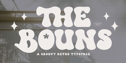 The Bouns is a Groovy Retro Font with fun and elegant style, so it's fitted for some retro project. There's some connected letters and some alternates that suitable for any graphic designs such as branding materials, t-shirt, print, business cards, logo, poster, t-shirt, photography, quotes .etc This font support for some multilingual. Also contains uppercase A-Z and lowercase a-z, alternate character, numbers 0-9, and some punctuation. If you need help, just write me! Thanks so much for checking out my shop!
 - Bentalista by Zamjump,
$17.00 Introducing Bentalista a modern sans typeface with lots of alternative characters, multilingual support, and unique ligatures. Bentalista is a very versatile font, easy to work with and perfect for creating minimalist style logos, labels, package designs, text for t-shirts, hoodies and much more. Features: Uppercase + Lowercase letters Numbers + Punctuation Swash feature OpenType Features Multilingual support OpenType features (ligatures and alternatives) help make your writing more interesting. There are also alternating swashes Software for using this font: Adobe Illustrator, Adobe Photoshop, Adobe Indesign, Word, Corel draw, inkscape).