5,420 search results
(0.013 seconds)
- Infusion by Andinistas,
$39.00 Infusion is a type family designed by CFCG & Fabio Godoy for andinistas.net. The creative process of Infusion evolved throughout a myriad of experiments supported by my font gluten This is why its expressivity comes from the addition and subtraction of its parts by mixing and combining, resulting in a great variety and new versatility of uppercase, lowercase, multiple and different numbers to be applied at the beginning, middle or end of the word. Infusion is used to write sentences in craft contexts that require organic graphic design, with meticulous imperfect look. Infusion offers typographic solutions out of the limits, or out of borders that divide the mechanics of the drawn by hand. Infusion has 6 decorative and legible fonts to write casual messages with organic, friendly and natural personality. Infusion “Script, Mix, Roman, Shadow, Extras, Dingbats” contain unconventional visually appealing ideas to work independently or in group in the design of logos, packaging, presentations, headlines or editorials.
 - Muraba by NamelaType,
$19.00 Muraba Font is a one-of-a-kind, bold vintage serif display typeface, defined by its distinctively thick, squared-off serifs that offer decorative flair. This versatile typeface is ideal for various applications, including logos, headers, and display text
 - Gallard by Type-Ø-Tones,
$40.00 Gallard is a two weights family that contains the display type of the great cartoonist and illustrator Miguel Gallardo. In addition, as we usually do for this kind of author fonts, there is a collection of drawings called Victims.
 - Fukuro by Diego Massaro,
$35.00 Fukurō recalls diurnal and nocturnal birds of prey. It instills the cutting shapes, the wings, the movement of those animals and translate them into signs. The font experiments new shapes and contrasts that give to it some Japanese aspects.
 - Embarla Firgasto by Mr. Typeman,
$15.00 Take a look at Embarla Firgasto - my new enchanting family of four styles. They pair beautifully together in all kinds of applications. Embarla Firgasto comes with uppercase, lowercase, standard punctuation and special letters for most of the European languages.
 - Yasashii by Dharma Type,
$14.99 Yasashii is an art deco font based on Japanese designs for cosmetic packaging and posters used from the end of the 19th century to the early 20th. When you prefer more geometric letter form, please try our Diamond Ring.
 - Moving Forward by Crumphand,
$20.00 Introducing, Moving Forward a Slab Serif Font. inspired by vintage and modern letterforms with alternate characters and full symbol sets. Moving Forward can be used for posters, web headers, and display text of all kinds. good kerning and readable.
 - Paris Metro by Studio K,
$45.00 Nothing is more iconic of Paris than its antique Metro signs, which are the inspiration for this typeface. The signs vary from station to station, some featuring plain block capitals, others the most exquisite Art Nouveau. This example falls somewhere in between. and should inject a strong gallic flavour into any design or publishing project. To recreate the Metro effect in Photoshop, set your text white on red, then go to Layer Style> Inner Shadow. Or with Paris Metro Reverse set your text red on white, then go to Layer Style> Drop Shadow.
 - Checker by Shinntype,
$29.00 Checker is an all-cap ‘three-D’ font which automatically alternates white letters on black tiles with black letters on white tiles, by means of the Contextual Alternates feature. Checker is an attention grabber suitable for logos, titles and short headings. With its tiled construction, it's a natural for colorful interpretation. The letters are properly italicized and back-slanted, and adjusted for maximum readability within the constraints of the font’s concept. The letter style is bold grotesque, so Checker will mix smoothly with any other fonts in a layout.
 - TB StarsAndStripes by TrueBlue,
$18.00This font is dedicated to the glorious flag of the U.S.A., "Old Glory". The family consists of two versions: a base and one called "composable" composed from a set of glyph (characters) that they can be inserted to pairs. One of blue color and one red for to obtain one glyph to two colors. As an example inserting "Aa" with a red 'A' and the a blue 'a' will produce a single letter 'A' colored to white stars in a blue field and white stipes in a red field, thus producing the most impact. - Baker Half by Ingrimayne Type,
$9.00 One of the odder things I remember from high school (50+ years ago) is the tile floor of hexagons in the bathroom. There is something fascinating with the way hexagons fill the plane. BakerHalfDozen is made of white letters that fit on black, hexagonal tiles. BakerHalfWhite switches the letters to black on white tiles, and BakerHalfBare eliminates the tiles. There are no true lower-case letters, but some letters have alternate shapes. To make the tiles line up right, alternate lines must be indented half a space. Use the {} characters (brackets) to do this.
 - Parking Lot Sale JNL by Jeff Levine,
$29.00 Here’s a novelty font emulating the plastic pennant streamers that were popular in the 1950s and 1960s used to decorate a store parking lot or used car lot for a sales event. The typeface inside the individual pennants is Manufacturer JNL, which can be used for body copy associated with titles made by this font. Parking Lot Sale JNL is available in regular (black letters on white pennants) and black (with white letters). A blank pennant for word spacing or end caps is available on the backslash key.
 - Chalk Hand Lettering by Fontscafe,
$39.00 If you are into the vintage feel, you will love this one. This is as vintage as it probably gets. There are probably only a handful of places in the world where schools still use blackboards and chalk – they’ve given way to their white board and marker counterparts for decades now. White boards are definitely more practical and less messy when compared to chalk, but then if you are creatively inclined you will agree that a little bit of mess is worth it if you are going to get the effects that you desired! Well, we can give you the effects minus the mess with our chalk hand lettering fonts! As the name suggests, this font gives you that distinctly unique chalk on slate feel, and if you are wondering what’s distinct about it; writing on slate or blackboard was a slow process which required deliberated and concentrated efforts resulting in a handwriting which was usually quite different to a person’s handwriting on paper. Typography of chalk on slate was an everyday event in the classrooms of yesterday, and today we hardly ever get to see one of these if it all. Writing on a black board with chalk was quite an interesting achievement in its own right, if you ended up with anything legible and if your writing remained focused and ‘in-line’! But of course like everything else, his took time to master and when you did get it right, chalk hand lettering was quite an enjoyable experience! For semi-permanent designs, say for example an eventful day at school; students of the day would create beautiful typography on the boards, and add a solidarity to it sometimes by shading one side of the lettering – usual y the right side towards which the lettering leaned. This is the effect our chalk hands lettering shaded variation gives you. You could get this font individually, but we strongly advise you check out the “chalk hand lettering pack” font. It includes the simple “chalk hand lettering” (minus the shading effect) and also a “chalk hand elements” bag of tricks. The elements is a collection of graphic art which resemble shapes and designs that used to be added to chalk art, to beautify the typography. If you enjoyed seeing the effects of our Chalk Hands font, and the shaded variant – you are simply going to go gaga over Chalk Hand Elements! The chalk hand font of course enables you to make typographic art similar to the effect of chalks on slates and black boards. This was quite the art form in the days gone by! The shaded variation added a bit of solidarity and the technique was commonly used to make semi-permanent designs say for example a welcome note when somebody important was to visit. Classic chalk hand designs, especially the semi permanent ones often had little pieces of art to help beautify the creation as a whole. It could simply be symmetrical graphics appearing before and after the title and headings, maybe just an interesting shape to fill in an empty area on the board, and such…our Chalk Hand Elements offers you a ton of such graphics. The two chalk hand variations and the elements are all included in the Chalk Hand Family, and this is strongly recommended if you want to make designs that are truly reminiscent of the days of chalk on slate.
 - Ronet by yasireknc,
$10.00 It can be tricky to find typefaces that can convey the feeling of personal warmth that comes from a handwritten note, custom brandings, special series of products, especially as we type more and more and write with a pen or pencil less and less. To add some more of that warmth to a font, I’ve made Ronet. A duo font based on the my handwriting. Double eponymous styles of the font —Ronet and Ronet Alternative— each have a unique flavor with its own rhythm and character. It can be used on branding designs, product labels, invitation cards, social purposes which is bloggers, influencers but they were capable of so much more, and I’m happy to share them for general use. Ronet has extraordinary alternative characters, that makes these fonts so impressive. These two styles have dynamic substitution, alternates, and beautiful kerning! Nevertheless, they each support an impressive range of languages using the Extended Latin alphabets and because they were designed to work well in a simple tool, a rare feature of these fonts is that they look just as good no matter where you use them. LOTS of writing, and then even more care once I developed and refined digital outlines from the samples. Ronet and Ronet Alternative each wrote pages and pages of letters to produce lots of examples for comparison and selection, in order to get the most authentic overall texture that captured the spirit of my left hand.. Ronet feels friendly and personal, like a neighbor or local shopkeeper who always seems happy to see you. This will perk up your social feeds in a snap. Start with Ronet and just add in your design to make it perfect. What started with a simple pen and paper has become a diverse and ever-expanding creative outlet that blends hand-drawn creativity with cutting-edge technology — and the end results are popping out everywhere, from advertising to design and decor to art and DIY.
 - Conversation Hearts by Harald Geisler,
$- Conversation Hearts are inspired by the sweethearts and conversation hearts that can be found all over the US and Britain, but not in Germany. A source of endless fun and surprise. As a typographer to me they are also a surprising document of written communication. Most people complain that nowadays the inscriptions are not as sweet as they used to be. While they used to held romantic and promising inscriptions like “Be True” “Sweet Talk”, today they carry “Tweet me” “Ur Hot” and “Party Girl”. So i took this as a motivation to work with conversation sweetheart on a conceptial inspirational and typographical level. The obvious: every letter pressed on the keyboard brings out a conversation heart that starts with the letter - i.e. L = Loverboy, H = Heartless but what to write? Since i didn't want to reproduce the old “Fax me” and “Email me” I had to come up with something new. Something with a personal relation and of course something that I Love - what else could i write in the shape of the heart? So I tried to access my upper subconsciousness and looked for two words for every letter in the alphabet. One for the capital letter pressed and one word for the lowercase letter. Resulting in a Kurt Schwitters worthy assemblage of vocables "Post-office" “Internship” “Zebra” “Answers” etc. It is not easy to read a text set in Conversation Hearts but easier as a text set in Zapf-Dingbats. To sparkle the visual appearance uppercase letters are filled hearts with “carved” inscription, while lowercase letters are an outlined heart with written inscription. Conversations Hearts is a part of the Light Hearted Font Collection that is inspired by a recording of Jean Baudrillard with the title, "Die Macht der Verführung" (The Power of Seduction) from 2006. Further inspiration came from the article, "The shape of the heart: I'm all yours". The heart represents sacred and secular love: a bloodless sacrifice. by British writer Louisa Young printed in EYE magazine (#43) London, 2002.
 - Odeon by Scriptorium,
$12.00Odeon is the kind of font you would have seen on theatre or concert posters around the turn of the twentieth century. It is based on Art Nouveau sign lettering and has a heavy, playful look that's hard to miss. - Hay Scary by HandletterYean,
$13.00 This is a Halloween-themed font. Its style will make your creativity stands out in your designs. Feel free to use it on any kind of creative design, and cherish your Halloween with this font to make it more festive.
 - Wapstina Love by VType,
$18.00 Wapstina Love is a modern duo font that combines stylish calligraphy with a classic serif font. It comes with one-of-a-kind ligature, making it an ideal font for your blog, logo, social media, branding, poster, quotes, wedding cards etc.
 - Mahaputra by Putracetol,
$14.00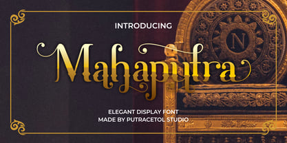 Mahaputra is a vintage display font that is classic, elegant, and unique. Mahaputra is great for any kind of display purpose from logos, t-shirt, apparel, quotes, product packaging, tittle headers, posters, merchandise, social media, labels, branding and greeting cards.
 - Space Captain by Patria Ari,
$15.00Space Captain is a modern all caps font with uniquely sharp and geometric shapes. Alternative wing shapes in the left and right in alphabet included in stylistic alternates. This font perfect for logotype such as technology, construction, automotive, heavyweight, etc. - Tenderfoot by FontMesa,
$20.00This font definitely reflects the name: Tenderfoot sort of gives that Home Sweet Home feeling. No, the little cowpoke on the pony isn't me, a close friend was kind enough to let me use his childhood photo for this font. - CA Prologue by Cape Arcona Type Foundry,
$19.00 Prologue was designed to look like a postmodern typewriter. With plain and simple upper cases and trickier lower cases. Three weights give a good variety for all kinds of designs and seem especially well made for headlines and short teasers.
 - Antartida Rounded Essential by Los Andes,
$18.00 Antartida Rounded Essential is a sans serif with rounded terminals. Its simple, kind of neutral feeling is functional, clean and minimal; its rounded terminals make it friendly and warm. It is a family of 4 fonts: 2 weights and their italics.
 - Nosy Note by PizzaDude.dk,
$16.00 Nosy Notes is originally handdrawn, but I digitally traced my sketches and the result is this font - a smooth, super steady and legible comic font. I've added multilingual support, in order for you to be nosy in all kinds of languages! :)
 - Eisha Script by Jorsecreative,
$22.00 The Eisha is a modern, handwritten calligraphic font with a sophisticated flow. It’s perfect for branding, wedding invitations, diaries, cups, mugs and greeting cards. Eisha has a smooth texture, so it will be perfect for all kinds of printing techniques.
 - Fallery Script by Zane Studio,
$15.00 Fallery Script is a calligraphy script font that comes with exquisite character changes, a kind of classic decorative copper script with a modern twist, designed with high detail for an elegant style. Fallery Script is interesting because it is smooth, clean, feminine, sensual, glamorous, simple and very easy to read, because of its many fancy letter relationships. I also offer a decent number of stylistic alternatives for some of the letters. Classic style is very suitable to be applied in various formal forms such as invitations, labels, restaurant menus, logos, fashion, make up, stationery, novels, magazines, books, greeting/wedding cards, packaging, labels or all kinds of advertising purposes.
 - Biro Script Plus by Ingo,
$50.00 An authentic script from the tip of the ball point pen. This hasn’t been seen yet: A typeface which truly looks as if it were handwritten. Calligraphy is, actually, the art of fine writing. And actually, written scripts as typeface for the computer are 100% nonsense. And yet, an obvious thought: Create a typeface which truly derives from everyday handwriting. And since we, if we write at all, utilize practically only a ball point pen anymore, then a modern cursive writing form must look like just that. As a counterpart to the artistic ”handwritings“ which have long been available as typeface, the thought of digitalizing a truly ”ugly“ handwriting is appealing. After all, time and again there is the need for a text to look ”handwritten“. Biró Script is written freehand with a ball point pen. Finally a truly individual script! Biró Script includes more than 300 authentic ligatures in addition to the customary alphabet. By the way, the most convincing effect is obtained with a font size of about 18 to 22 points, at which the thickness of the stroke is now about the same as that of a real ball point pen. There's a difference between the anglo-american forms of some characters (esp. the numerals 1 and 7, but also capitals I and F) and how it's written in the rest of the world. For those of us who aren’t used to the world-wide usual forms, Biró Script includes a US version with the appropriate characters.
 - Astronauts In Trouble by Comicraft,
$49.00 AiT/Planet Lar publisher and writer, Larry Young loves The Space Program. Next time you see him at a comic convention just ask him about any one of the Moon Landings and you'll see.
 - Dave Gibbons by Comicraft,
$49.00 How can we possibly call our line of celebrity fonts the MASTERS OF COMIC BOOK ART if it doesn't include a font based on the remarkable work of comic’s renaissance gentleman, artist/writer/colorist/letterer, Dave Gibbons?! Based on Dave’s easy-on-the-eye hand lettering, this is the font Dave himself uses to letter projects such as STAR WARS: VADER'S QUEST, MARTHA WASHINGTON & BATMAN: BLACK & WHITE. Other guys may imitate him, but the original is still the greatest! Get in with the In Crowd and check out the font created by Mister Fontastic for Dave Gibbons Original Graphic Novel, The, ah, The Originals. Yes, Dave Gibbons now comes in lower case, it’s not just what he does when he gets back from the off license. Be sure and pick up The Originals from Amazon -- now available in paperback, and probably still available as a hard case, much like Dave. After the crack about the beer above, I'm guessing you'll find me with a broken spine in the remainder pile. See the family related to Dave Gibbons: Dave Gibbons Journal & Dave Gibbons Lower .
 - ITC Bodoni Seventytwo by ITC,
$29.99Giambattista Bodoni (1740-1813) was called the King of Printers; he was a prolific type designer, a masterful engraver of punches and the most widely admired printer of his time. His books and typefaces were created during the 45 years he was the director of the fine press and publishing house of the Duke of Parma in Italy. He produced the best of what are known as modern" style types, basing them on the finest writing of his time. Modern types represented the ultimate typographic development of the late eighteenth and early nineteenth centuries. They have characteristics quite different from the types that preceded them; such as extreme vertical stress, fine hairlines contrasted by bold main strokes, and very subtle, almost non-existent bracketing of sharply defined hairline serifs. Bodoni saw this style as beautiful and harmonious-the natural result of writing done with a well-cut pen, and the look was fashionable and admired. Other punchcutters, such as the Didot family (1689-1853) in France, and J. E. Walbaum (1768-1839) in Germany made their own versions of the modern faces. Even though some nineteenth century critics turned up their noses and called such types shattering and chilly, today the Bodoni moderns are seen in much the same light as they were in his own time. When used with care, the Bodoni types are both romantic and elegant, with a presence that adds tasteful sparkle to headlines and advertising. ITC Bodoni™ was designed by a team of four Americans, after studying Bodoni's steel punches at the Museo Bodoniana in Parma, Italy. They also referred to specimens from the "Manuale Tipografico," a monumental collection of Bodoni's work published by his widow in 1818. The designers sought to do a revival that reflected the subtleties of Bodoni's actual work. They produced three size-specific versions; ITC Bodoni Six for captions and footnotes, ITC Bodoni Twelve for text settings, and ITC Bodoni Seventytwo - a display design modeled on Bodoni's 72-point Papale design. ITC Bodoni includes regular, bold, italics, Old style Figures, small caps, and italic swash fonts. Sumner Stone created the ornaments based on those found in the "Manuale Tipografico." These lovely dingbats can be used as Bodoni did, to separate sections of text or simply accent a page layout or graphic design." - ITC Bodoni Twelve by ITC,
$29.99Giambattista Bodoni (1740-1813) was called the King of Printers; he was a prolific type designer, a masterful engraver of punches and the most widely admired printer of his time. His books and typefaces were created during the 45 years he was the director of the fine press and publishing house of the Duke of Parma in Italy. He produced the best of what are known as modern" style types, basing them on the finest writing of his time. Modern types represented the ultimate typographic development of the late eighteenth and early nineteenth centuries. They have characteristics quite different from the types that preceded them; such as extreme vertical stress, fine hairlines contrasted by bold main strokes, and very subtle, almost non-existent bracketing of sharply defined hairline serifs. Bodoni saw this style as beautiful and harmonious-the natural result of writing done with a well-cut pen, and the look was fashionable and admired. Other punchcutters, such as the Didot family (1689-1853) in France, and J. E. Walbaum (1768-1839) in Germany made their own versions of the modern faces. Even though some nineteenth century critics turned up their noses and called such types shattering and chilly, today the Bodoni moderns are seen in much the same light as they were in his own time. When used with care, the Bodoni types are both romantic and elegant, with a presence that adds tasteful sparkle to headlines and advertising. ITC Bodoni™ was designed by a team of four Americans, after studying Bodoni's steel punches at the Museo Bodoniana in Parma, Italy. They also referred to specimens from the "Manuale Tipografico," a monumental collection of Bodoni's work published by his widow in 1818. The designers sought to do a revival that reflected the subtleties of Bodoni's actual work. They produced three size-specific versions; ITC Bodoni Six for captions and footnotes, ITC Bodoni Twelve for text settings, and ITC Bodoni Seventytwo - a display design modeled on Bodoni's 72-point Papale design. ITC Bodoni includes regular, bold, italics, Old style Figures, small caps, and italic swash fonts. Sumner Stone created the ornaments based on those found in the "Manuale Tipografico." These lovely dingbats can be used as Bodoni did, to separate sections of text or simply accent a page layout or graphic design." - ITC Bodoni Ornaments by ITC,
$29.99Giambattista Bodoni (1740-1813) was called the King of Printers; he was a prolific type designer, a masterful engraver of punches and the most widely admired printer of his time. His books and typefaces were created during the 45 years he was the director of the fine press and publishing house of the Duke of Parma in Italy. He produced the best of what are known as modern" style types, basing them on the finest writing of his time. Modern types represented the ultimate typographic development of the late eighteenth and early nineteenth centuries. They have characteristics quite different from the types that preceded them; such as extreme vertical stress, fine hairlines contrasted by bold main strokes, and very subtle, almost non-existent bracketing of sharply defined hairline serifs. Bodoni saw this style as beautiful and harmonious-the natural result of writing done with a well-cut pen, and the look was fashionable and admired. Other punchcutters, such as the Didot family (1689-1853) in France, and J. E. Walbaum (1768-1839) in Germany made their own versions of the modern faces. Even though some nineteenth century critics turned up their noses and called such types shattering and chilly, today the Bodoni moderns are seen in much the same light as they were in his own time. When used with care, the Bodoni types are both romantic and elegant, with a presence that adds tasteful sparkle to headlines and advertising. ITC Bodoni™ was designed by a team of four Americans, after studying Bodoni's steel punches at the Museo Bodoniana in Parma, Italy. They also referred to specimens from the "Manuale Tipografico," a monumental collection of Bodoni's work published by his widow in 1818. The designers sought to do a revival that reflected the subtleties of Bodoni's actual work. They produced three size-specific versions; ITC Bodoni Six for captions and footnotes, ITC Bodoni Twelve for text settings, and ITC Bodoni Seventytwo - a display design modeled on Bodoni's 72-point Papale design. ITC Bodoni includes regular, bold, italics, Old style Figures, small caps, and italic swash fonts. Sumner Stone created the ornaments based on those found in the "Manuale Tipografico." These lovely dingbats can be used as Bodoni did, to separate sections of text or simply accent a page layout or graphic design." - ITC Bodoni Brush by ITC,
$29.99Giambattista Bodoni (1740-1813) was called the King of Printers; he was a prolific type designer, a masterful engraver of punches and the most widely admired printer of his time. His books and typefaces were created during the 45 years he was the director of the fine press and publishing house of the Duke of Parma in Italy. He produced the best of what are known as modern" style types, basing them on the finest writing of his time. Modern types represented the ultimate typographic development of the late eighteenth and early nineteenth centuries. They have characteristics quite different from the types that preceded them; such as extreme vertical stress, fine hairlines contrasted by bold main strokes, and very subtle, almost non-existent bracketing of sharply defined hairline serifs. Bodoni saw this style as beautiful and harmonious-the natural result of writing done with a well-cut pen, and the look was fashionable and admired. Other punchcutters, such as the Didot family (1689-1853) in France, and J. E. Walbaum (1768-1839) in Germany made their own versions of the modern faces. Even though some nineteenth century critics turned up their noses and called such types shattering and chilly, today the Bodoni moderns are seen in much the same light as they were in his own time. When used with care, the Bodoni types are both romantic and elegant, with a presence that adds tasteful sparkle to headlines and advertising. ITC Bodoni™ was designed by a team of four Americans, after studying Bodoni's steel punches at the Museo Bodoniana in Parma, Italy. They also referred to specimens from the "Manuale Tipografico," a monumental collection of Bodoni's work published by his widow in 1818. The designers sought to do a revival that reflected the subtleties of Bodoni's actual work. They produced three size-specific versions; ITC Bodoni Six for captions and footnotes, ITC Bodoni Twelve for text settings, and ITC Bodoni Seventytwo - a display design modeled on Bodoni's 72-point Papale design. ITC Bodoni includes regular, bold, italics, Old style Figures, small caps, and italic swash fonts. Sumner Stone created the ornaments based on those found in the "Manuale Tipografico." These lovely dingbats can be used as Bodoni did, to separate sections of text or simply accent a page layout or graphic design." - ITC Bodoni Six by ITC,
$40.99Giambattista Bodoni (1740-1813) was called the King of Printers; he was a prolific type designer, a masterful engraver of punches and the most widely admired printer of his time. His books and typefaces were created during the 45 years he was the director of the fine press and publishing house of the Duke of Parma in Italy. He produced the best of what are known as modern" style types, basing them on the finest writing of his time. Modern types represented the ultimate typographic development of the late eighteenth and early nineteenth centuries. They have characteristics quite different from the types that preceded them; such as extreme vertical stress, fine hairlines contrasted by bold main strokes, and very subtle, almost non-existent bracketing of sharply defined hairline serifs. Bodoni saw this style as beautiful and harmonious-the natural result of writing done with a well-cut pen, and the look was fashionable and admired. Other punchcutters, such as the Didot family (1689-1853) in France, and J. E. Walbaum (1768-1839) in Germany made their own versions of the modern faces. Even though some nineteenth century critics turned up their noses and called such types shattering and chilly, today the Bodoni moderns are seen in much the same light as they were in his own time. When used with care, the Bodoni types are both romantic and elegant, with a presence that adds tasteful sparkle to headlines and advertising. ITC Bodoni™ was designed by a team of four Americans, after studying Bodoni's steel punches at the Museo Bodoniana in Parma, Italy. They also referred to specimens from the "Manuale Tipografico," a monumental collection of Bodoni's work published by his widow in 1818. The designers sought to do a revival that reflected the subtleties of Bodoni's actual work. They produced three size-specific versions; ITC Bodoni Six for captions and footnotes, ITC Bodoni Twelve for text settings, and ITC Bodoni Seventytwo - a display design modeled on Bodoni's 72-point Papale design. ITC Bodoni includes regular, bold, italics, Old style Figures, small caps, and italic swash fonts. Sumner Stone created the ornaments based on those found in the "Manuale Tipografico." These lovely dingbats can be used as Bodoni did, to separate sections of text or simply accent a page layout or graphic design." - Hasan Ghada by Hiba Studio,
$59.00 Hasan Ghada is an Arabic display typeface. It is useful for titles and graphic projects. The font is based on the simple lines of Modern Kufi calligraphy with new ideas for square shapes and geometric feel. It supports Arabic, Persian and Urdu. This font was designed in 2002 and the first version was released under name KactTitle in the typefaces group of King Abdulaziz City for Science and Technology (KACST), which supported the Linux operation system. In 2007, I developed this font and created five weights of it.
 - Pleasant Valley Sundae JNL by Jeff Levine,
$29.00 It seems only fitting that Pleasant Valley Sundae JNL, a typeface re-drawn from hand lettering on a piece of vintage sheet music, should take its name as a pun on another song's title from a different era. "Pleasant Valley Sunday" was a 1967 hit for the Monkees and was written by the legendary songwriting team of Carole King and the late Gerry Goffin; inspired in turn by a street they'd lived on named Pleasant Valley Way, in West Orange, New Jersey. The record made it to #3 on the pop charts.
 - Ongunkan Armanen Runes by Runic World Tamgacı,
$50.00 The Armanen runes (or Armanen Futharkh) are a series of 18 runes, closely based on the historical Younger Futhark, introduced by Austrian mysticist and Germanic revivalist Guido von List in his Das Geheimnis der Runen (English: "The Secret of the Runes"), published as a periodical article in 1906, and as a standalone publication in 1908. The name Armanen runes associates the runes with the postulated Armanen, whom von List saw as ancient Aryan priest-kings. The Armanen runes continue in use today in esotericism and in currents of Germanic neopaganism.
 - DIST Inking Bold - Unknown license

- Ballum by Luxfont,
$38.00 Get ready for a font revolution with the Bllum SVG script color font family. This is a unique calligraphic color font. Writing immediately with 3D realistic letters is now real. Create a stunning visual effect. Features: - Real Plastic effect - Extras & ligatures - Alternates characters - Kerning IMPORTANT: - Check the glyphs in the font before buying! - SVG fonts contain raster letters. - Check it www.colorfonts.wtf - Try a FREE DEMO version before buying. ld.luxfont@gmail.com
 - Shangri La NF by Nick's Fonts,
$10.00An unusual handlettered alphabet from the 1922 chapbook Modern Show Card Writing, by Joseph Bertram Jowitt, provided the pattern for this whimsical face. Its letterforms, as well as its name, conjure up visions of faraway places, and is sure to add a unique charm to your next project. This font contains the complete Latin language character set (Unicode 1252) plus support for Central European (Unicode 1250) languages as well.
