10,000 search results
(0.05 seconds)
- Cindoy Script by Realtype,
$12.00 Cindoy Script, with a soft style and elegant nuances, is classy and natural. It is perfect to add a more charismatic impression or unique touch to your projects such as branding, greeting cards, wedding, banners, name cards, lettering, pairing with other fonts, and more.
 - Designors by Sarid Ezra,
$15.00 Designors is a freestyle font that will make your project more stylish and free! You can use this font for any project. Suitable for quotes and your tees design. This font also support multilingual. With different lowercase and uppercase will make your design more natural!
 - Beautifull Weakness by Sarid Ezra,
$15.00 Beautiful Weakness is a free-styled handwritten font that will make all your project more unique. With brush touch, this font will make your artwork feels more natural. Comes with ligatures and underline that you can access it from opentype feature. Also support multi language!
 - Explore Wonders by Sarid Ezra,
$15.00 Explore Wonders is a bold handwritten font that will make all your project more unique and handy. With bold touch, this font will make your artwork feels more natural. This font is suitable for quotes & instagram post. Comes with number & symbol! Also support multi language!
 - Handler by Surotype,
$22.00 Handler a signature typeface great for Logotype, Poster, Digital Lettering Arts, Clean Design, Branding Design, Signs,and more. To enable the OpenType Stylistic alternates, you need a program that supports OpenType features such as Adobe Illustrator CS, Adobe Indesign & CorelDraw X6-X7 and more.
 - Rhiccus by Patria Ari,
$19.00 Rhiccus is inspired from vintage and classic look. This font is suitable for any design like branding, print templates, fashion, print templates, & more. With more than 9 variants, this font works well to mix and match with each other to best fit the occasion.
 - Extrend by Attractype,
$15.00 Extrend, a clean and modern sans serif typeface, ideal for text that requires more space. suitable for corporate use as well as corporate branding and identity design, magazines, books, comics. With five styles, Extrend can be used to make your creative projects more interesting.
 - Trio CT by CastleType,
$39.00 I was commissioned by Publish magazine to digitize Trio in 1990. Originally designed in a Light weight only, Trio is now available in Medium and Bold weights as well. Uppercase only, but each weight includes two alphabets, one more "deco," the other more "modern."
 - The Matesih by FallenGraphic,
$20.00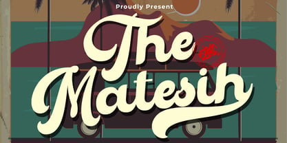 The Matesih is an amazing handwritten font. This font will make your design more beautiful and powerful, and is suitable for any design such as branding, quotes and more. It includes: -Accents (Multilingual Characters) -PUA encoded -Numerals and Punctuation (OpenType Standard) -Many alternate characters
 - Gratitude Script by Sudtipos,
$59.00 The quality or feeling of being grateful or thankful. An appreciation for the world around us. Gratitude for being a part of it all. No matter what’s happening in our lives, there’s always something to be grateful for. When we have an appreciation for all we have, life gives us more to feel grateful for. It’s a naturally occurring cycle. Some of the most profoundly grateful times in our lives can be felt when we find ourselves surrounded by beauty: in art, nature, music, special places, the seasons, family, loving relationships, a cozy home, meaningful work; in doing what brings us joy, comfort, and feelings of deep love and satisfaction. There is beauty everywhere, and creating beauty is an artist’s mission. We all have the ability to create and experience beauty. In this high-tech, fast paced world of strict, unbending rules, we give you Gratitude Script: A celebratory font that’s deeply rooted in tradition letterforms but with a modern, updated twist; a casual, whimsical, fun look that is also elegant and versatile! Partnering with Ale Paul is seasoned wedding calligrapher Kathy Milici, who is well known for her passionate writing style and highly ornamental pen flourishing. With its signature hand-written look, flowing lines, graceful curves and flourishes, Gratitude Script’s space saving, vertical style is perfect for small printing areas as well as large format presentations. An extended variety of alternates makes it a perfect and versatile addition to your font repertoire.. These are tender times. Long hours and work pressures add to our stress. Time spent with family and friends is more valuable than ever before, as we try to balance it all. It’s important to mark time with special, happy events in our lives that we can all appreciate and enjoy. Let’s be grateful for it all! Hooray for Gratitude, and Gratitude Script! About the font: Gratitude Script is an OpenType font that contains more than 1400 glyphs icluding ligatures, alternates, endings , a wide range of latin languages and a set of ornaments and words specially designed to use in stationery for weddings, birthdays, etc. There is a smooth version of Gratitude Script too. To access to all the extra characters you will need to use software that actually supports OpenType like Adobe CS apps or later where we recommend the use of the Glyph palette. About the presentation: Every time we publish a new typeface we love to invite an artist to collaborate. Vero Scherini, an argentinian and very talented designer and illustrator, fits perfectly with Gratitude.
 - Adelle Sans by TypeTogether,
$45.00 The Adelle Sans font family by José Scaglione and Veronika Burian provides a more clean and spirited take on the traditional grotesque sans. As is typical with TypeTogether typefaces, the most demanding editorial design problems were taken into consideration during its creation. The combination of lively character and unobtrusive appearance inherent to grotesque sans serifs make it an utterly versatile tool for every imaginable situation. Whether for global branding, screens, signage and advertising, or UI, the keyword behind Adelle Sans’s use is flexibility. To save space and keep legibility high, Adelle Sans is available in eight weights with matching italics and includes a condensed width of seven weights with their matching italics. Each of these 30 styles hits the perfect tone as a headline punch or subdued background hum, and the condensed widths are adept at setting short texts while retaining the expected personality. Rooted in the belief that broad language support is crucial to modern global type design, the Latin-matching variants are yet another push in TypeTogether’s ongoing multilingual efforts. The Latin script may have been first, but Adelle Sans has thus far been expanded into an exhaustive nine script family with extensive language support. Careful research and close collaboration with type experts yielded typographic consistency, legibility, and cultural awareness among all scripts, as well as filling the need for quality editorial typefaces in Arabic, Armenian, Chinese, Cyrillic, Devanagari, Latin Extended, Greek, and Thai, with more planned for the future. In addition to the 30 Latin styles, all other scripts have between seven and fourteen styles, each of which has been engineered to optically match the proportions of its counterparts. And each script comes bundled with the Latin script to ensure an harmonious fit amongst any two or more Adelle Sans families in the same block of text. The full Adelle Sans family delivers consistent, flexible, and personable results in multilingual documents, in apps, and multicultural branding worldwide. Its wide character set includes typographic niceties, small caps, several sets of figures, icons, and support for over 245 Latin-based languages. Be sure to check out the companions for Adelle Sans: Adelle, for a versatile and authoritative slab serif with no shortage of personality; and Adelle Mono, a two-width family flexible enough for developers and graphic designers alike.
 - LT Oksana - Personal use only

- Hollow Roachian Futhark - 100% free

- Quarter Braille by Echopraxium,
$20.00 Presentation QuarterBraille (Abbreviated as "QB" thereafter) is a decorative, steganographic and lattice font. Its core design concept is that Braille dots are represented as "quarters of a square"[1]. This is illustrated by posters 1 and 2 (NB: these glyph parts will be called "QB dots" thereafter). The other glyph parts (see poster 3) are purely decorative and meaningless in terms of Braille dots encoding[2]. All glyph parts are meant to generate a wide variety of patterns from horizontal and vertical combinations of glyphs. There is also a graphic convention to differentiate uppercase from lowercase letters with the presence or absence of shape subparts (in the "endings", "quarter of a circle with a ring" and "quarter of a diamond with a small square in the middle") like shown by poster 4. This font is suitable for very short texts (e.g. logos, acronyms, quotes, ambigrams, pangrams, palindromes, etc...) but on the other hand it may be used for steganographic purpose like geocaching as well as fictive alphabets (e.g. Alien/SciFi/Fantasy/Antique civilizations). Posters 1. Font Logo: the displayed text is " Quarter " followed by " Braille". There's a rainbow layer above the text to highlight the "QB dots", this is achieved by A..Z glyphs with "only QB dots" (codes 230..255) 2. Anatomy of a Glyph (L) and "QB Dots" (quarters of a square) 3. Glyphs Parts: Square and Cross (Inverted square), Circle and Inverted Circle (with or without the small circle in the middle), Diamond (with or without the small square in the middle), Inverted Square and Circle, Shape combos, Ending 4. Uppercase vs Lowercase (tiny shape subparts are shown in red) 5. Sample 1: Bathroom sink with QB tiles on the credence 6. Sample 2: Hands knuckle tatoos: "LOVE/HATE"[4] 7. Sample 3: Poker Hand: pocket Aces. It's an Ace of Hearts (Ah) on the left and an Ace of Spades (As) on the right. Like in regular cards, the card value (e.g. Ah) is displayed twice: at the top and rotated by 180 degrees at the bottom. This poster also illustrates that QB could be used to print embossed playing cards with tactile and visual display of card values. 8. Sample 4: Pangram: "Adept quick jog over frozen blue whisky mix" 9. Sample 5: Latin Magic Square: "SATOR AREPO TENET OPERA ROTAS" (NB: for compensation of the 2/3 glyph ratio, letters on each line are separated by a space: "S A T O R", ...). 10. Sample 6: Quote of Mahatma Gandhi: "Learn as if you will live forever, live like you will die tomorrow.". This is also a demonstration of border glyphs combinations. 11. Sample 7: Steganography use case: the text is a sequence of 64 aminoacids (1 Letter notation), this protein was described in a research paper "The complete Aminoacid sequence of an amyloid fibril protein AA of unusual size (64 residues) 1975". 12. Sample 8: Border Glyphs with the provided styles and mixed styles. The words are the same than in poster 9 ("SATOR AREPO TENET OPERA ROTAS"). Despite the 2/3 glyph ratio, the "TENET cross" was achieved by both inserting spaces in horizontally ("T ENE T") and by using the "thin borders glyphs". Notes a. Border glyphs[3] are meant to enhance the esthetics of text samples displayed with QB b. Special characters (e.g. *$()[].,;:&@# ...) are provided and follow the NABCC (North American Braille Computer Code) convention. c. A..Z Glyphs with only the "QB dots" are provided as demonstrated by posters 1 and 2 (A/N: this was very useful to create them). d. Glyph Map: 32..64: Special characters - 161..187: "Thin variant" of Border glyphs, 192..229: Border glyphs, 230..255: A..Z with only the "QB dots" - Codes 176 an 181 are "regular SPACE" (empty glyph). Footnotes 1. There is indeed two shapes which represent the braille dot: the "quarter of a square" and the "quarter of a cross". It's because a cross may be considered as an "inverted square" because the square corners are merged in the center. 2. That's why the SPACE glyph is only made of decorative/meaningless glyph parts (i.e. no "QB dots"). 3. For other fonts with border glyphs, please take a look at my other "decorative Braille fonts" (GoBraille, HexBraille, KernigBraille, StackBraille, MaBraille, DiamondBraille, LorraineBraille). 4. LOVE/HATE knuckle tatoos are inspired by the anthology scene from "The Night of the Hunter" movie (Charles Laughton 1955), it also appearead in "Do The Right Thing" movie (Spike Lee 1989). Disclaimer This font is not appropriate and not meant to print text documents in Braille for the blind readers audience.
 - Mexica by Sudtipos,
$39.00 Mexica is a typographic tribute to Nahuatl, the tongue of the Aztecs, but also the lingua franca of ancient Mexico. ‘Mexica’ is not only the feminized, latinized form of the word ‘Mexico’, but also the name of the inhabitants of this place: the Me-xic-cah. Nahuatl, when composed in the Latin alphabet, abounds in diagonal letter shapes: XYZ are ubiquitous in its classic orthography, just as KW are in its modern one. This visual feature is further enhanced by the absence of some rounded letters such as BDG that depict inexistent sounds in this millenarian tongue. Besides, Nahuatl is language with a tendency to form very long words that give the text quite a distinct appearance, unlike English, for instance, with its abundance of short words. Mexica was designed to look well in all these contexts, and to perform as well as a contemporary, daring, stylish serif type family, with several weights for text and display composition. Further, its terminals and general structure —devoid almost completely of straight lines—are inspired by the angled architecture and ornamentation of the ancient city of Mexico- Tenochtitlan. Mexica received an Award of Excellence at the Type Directors Club of New York annual competition.
 - Italiano Fushion New by RM&WD,
$35.00 Italiano Fushion is part of an expanding project on which we have been working for several years and which we are committed to in the future. Like the first two, this one too starts from the study of the great Futurist adventure of the early 1900s by great artists such as DEPERO and MARINETTI, who twisted the world of typography with shapes and colors. Italian Fushion is made up of almost 2,000 glyphs for each weight and in addition to hundreds of alternatives mainly, such as initials and endings of each word but also different alternatives for the letters I, J, Y. Thanks to the characteristics of Open Type, you can change them in automatic many of the alternatives, use it as a simple text font by changing only the I's and J's that have the typical capital dot, and giving the text a more fun breath to the composition. Italiano Fushion is suitable for large texts and to get the most out of it it is compulsory to transform the text into UPPERCASE text using the tabs of graphic applications such as Illustrator, or activate the Alternavive tabs and the various options of SS. Ideal for creating Logos, Head Lines, Web Titles, Posters, Epub Covers, Tatoo Projects, T-Shirts, Drink Labels ... Thanks
 - Galena Pro SC by Typorium,
$45.00 Galena Pro is an extended version of Galena, a typeface published for Bayer Corporation in 1996. Galena Pro is based on the open and organic forms imagined by the writers of humanist Italy, who designed the first so-called Roman characters. Humanist style fonts have moderate stroke contrast, uneven widths, and a classic, but soft and easy-to-read appearance. Galena Pro gives a new birth to the 15th century incunabula, a typographic drawing where the gestures of this standardized handwriting are not mechanical, but more fluid. The Galena Pro series can provide professional typography with OpenType features such as alternative sets of numbers, fractions and an extended character set to support Central and Eastern European as well as Western European Languages. The different styles of the Galena are enriched with a condensed variant to meet the need for space savings in titles and texts.
 - Rombi Technocrat by Mans Greback,
$39.00 Rombi Technocrat is a geometric, heavy font that features a unique combination of square shapes and slanting angles. Inspired by the dynamics of forward movement and the rigidity of structured design, this italicized font family brings a sense of purpose and direction to your creative projects. The Rombi Technocrat font family includes five weights: Thin, Light, Regular, Bold, and Black, providing a broad range of stylistic options for designs that call for a distinct, angular touch. The font is built with advanced OpenType functionality and has a guaranteed top-notch quality, containing stylistic and contextual alternates, ligatures, and more features; all to give you full control and customizability. It has extensive lingual support, covering all Latin-based languages, from Northern Europe to South Africa, from America to South-East Asia. It contains all characters and symbols you'll ever need, including all punctuation and numbers.
 - Galena Pro Condensed by Typorium,
$45.00 Galena Pro is an extended version of Galena, a typeface published for Bayer Corporation in 1996. Galena Pro is based on the open and organic forms imagined by the writers of humanist Italy, who designed the first so-called Roman characters. Humanist style fonts have moderate stroke contrast, uneven widths, and a classic, but soft and easy-to-read appearance. Galena Pro gives a new birth to the 15th century incunabula, a typographic drawing where the gestures of this standardized handwriting are not mechanical, but more fluid. The Galena Pro series can provide professional typography with OpenType features such as alternative sets of numbers, fractions and an extended character set to support Central and Eastern European as well as Western European Languages. The different styles of the Galena are enriched with a condensed variant to meet the need for space savings in titles and texts.
 - CF Nixt by CozyFonts,
$20.00 The Nixt Font Family is a new font with currently seven styles. As an alternative to Helvetica, Arial, Gill Sans, Futura, & Gotham, Nixt has a similar design aesthetic to those aforementioned in that its design, structure, and feel crosses decades of appeal. From Mid-Century, through the stark '60s, decades of succeeding modern architecture through the turn of the 21st Century, Nixt's glyphs are timeless, clear, ultra-legible in all styles and weights. Best use in Advertising, Branding, Signage, Architecture, Fashion, Posters, Headlines, and By-Lines, Print & Digital, and of course Labels. There are currently, at first release, 7 Styles: Extra Light, Light, Regular, Italic, Book, Bold, & Extra Bold. There are more in process and will be added when completed. The inspiration behind the Nixt Fonts is the Bauhaus, Mid Century Industrial Design, Art Deco through Moderne Era Architecture, American Pottery and American Design of The Twentieth Century.
 - Stena by LetterPalette,
$35.00 Stena is a very functional sans serif typeface with calligraphic feel, especially designed for contemporary typography. This family features deep and sharp ink-traps as part of its design. Thanks to its proportions, solid and balanced forms, combination of straight and curve lines, high x-height and expressive ink-traps, Stena combines readability with a strong personality. This dynamic typeface provides advanced typographical support with features such as ligatures, alternate characters, stylistics sets, fractions, etc. It also comes with a complete range of figure set options – oldstyle and lining figures, each in tabular and proportional widths. This carefully designed family consists of 8 weights, ranging from Thin to Black, each with matching true italics. It comes with a set of 566 characters per weight, supporting over 40 different languages using the Latin alphabet. Stena is the ideal choice for editorial, branding, corporate identity, and more.
 - Bellanny by Krafted,
$10.00 Looking for a stylish serif font to spice up your book, magazine, or newspaper? Introducing Bellanny - A Modern Serif Font. A perfect blend of elegance and style with just the right touch of creativity, Bellanny looks great on both web and print. Give it a go and see how a great font reshapes your work. What you’ll get: Multilingual & Ligature Support Full sets of Punctuation and Numerals Compatible with: Adobe Suite Microsoft Office Keynote Pages Software Requirements: The fonts that you’ll receive in the pack are widely supported by most software. In order to get the full functionality of the selection of standard ligatures (custom-created letters) in the script font, any software that can read OpenType fonts will work. We hope you enjoy this font and that it makes your branding sparkle! Feel free to reach out to us if you’d like more information or if you have any concerns.
 - Grrr by ParaType,
$30.00 Grrr is a headstrong modular display typeface with a large amount of alternative glyphs. It consists of eight weights ranging from Thin to Black. A variable font is also available. The typeface is designed on a modular grid and it proudly ignores the rules of optical compensations: the horizontal and vertical strokes have identical thickness, and round and triangular letters have no overshoots at all! All these peculiarities are making the typeface usable at sizes from 21pt and larger in print and approximately from 24px on non-retina screens. Grrr is especially good at extremely large sizes. The typeface includes three stylistic sets with even more bizarre letterforms. These sets activate a cyclic pseudorandom substitution of letters from a range of alternates — the letterforms keep changing as you type! The typeface was designed by Dmitry Goloub and Alexandra Korolkova and released by Paratype in 2019.
 - Carmensin by Rafael Jordan,
$35.00 Carmensin is a beautiful humanist serif typeface created by Rafael Jordán. Designed in the 21st Century with all the flavor of the Renaissance. The conclusion of a story that began in Type@Paris program in June, 2015 & ended at February, 2020. Inspired by historical models, its classic conventional appearance with small details, smooth curves, large x-height and open counters made of Carmensin a great, efficient and solid typeface for long text settings. Also, its bigger sizes styles show the beautiful shapes and contrast, exhibiting its exuberance. Carmensin has a great collection of OpenType features that will satisfy any typographic necessity as ornaments, ligatures, stylistic sets, small caps, automatic fractions and more options along 3 optical styles (Text, Headline and Display) plus a fancy Stencil style. With an extensive Latin character set, Carmensin covers a wide amount of Latin-based languages, including Latin Plus encoding.
 - Eutopia by Tipofil,
$- I was inspired by the letters of the mythical “Ideales” tobacco package, designed in 1936 in Barcelona by Carlos Vives, director of the designers studio of the Rieusset graphical industry. We have also studied other geometrical models from the 1920s, to be highlighted among them the alphabet drawn by Cornelis André Vlaanderen at Amsterdam in 1928, which would have been very probably the inspiration for the famous tobacco package. Eutopia has been born with the aim to be useful for the current graphic communications. For that purpose almost 400 glyphs have been designed and more than 2200 kerning pairs have been defined. The multiple diacritic signs have been prepared to allow a multilingual use in most of the languages based on Latin alphabet. The OpenType features have been used to get alternate characters of “A” and “g”, and also ligatures, lowercase numbers and other typographic refinements.
 - Eclectic Medley by Altered Ego,
$65.00STF Eclectic Medley is the budget-concious answer to your dingbat blues! This "best of" collection from the Eclectic One, Two and Three fonts is the ultimate grab-bag dingbat resource. Every slot in the font is filled (over 200 characters!), and includes the form-making glyphs from Eclectic Three. The Eclectic family is legendary, with a cult-like following among the inititated. You'll find yourself using Eclectic Medley almost daily to add spice to your otherwise san-serif typographic existence. This font is essentially a soap opera of typographic image elements, created for projects when I couldn't find the "thingbat" I needed. Almost more of a collection of illustrations, there are many characters which connect to form patterns, and of course it's like a "small neutral European country" army knife for the creative community. Available in Mac and PC formats. License it today! - Curvi Technocrat by Mans Greback,
$39.00 Curvi Technocrat is a rounded, geometric font that captures the essence of speed and forward movement. Inspired by the smooth curves of race cars and the energy of urban graffiti, this heavy, slanted font family adds a touch of dynamism and softness to your designs. The Curvi Technocrat font family offers five weights: Thin, Light, Regular, Bold, and Black, making it a versatile choice for a wide range of design projects that require a modern, geometric touch. The font is built with advanced OpenType functionality and has a guaranteed top-notch quality, containing stylistic and contextual alternates, ligatures, and more features; all to give you full control and customizability. It has extensive lingual support, covering all Latin-based languages, from Northern Europe to South Africa, from America to South-East Asia. It contains all characters and symbols you'll ever need, including all punctuation and numbers.
 - Yesterday Morning by Mans Greback,
$59.00 Yesterday Morning is a lively handwriting font that captures the essence of an active and cute brush style. This handmade calligraphy font is perfect for fashion projects, adding a sense of energy and excitement to your designs. The font family's hand-brushed appearance brings an authentic, personal touch to your creative work, making it feel warm and approachable. The Yesterday Morning font family includes four engaging styles to suit various design needs: Regular: A balanced and energetic style for everyday use Regular Italic: Adds a playful touch and a sense of movement Bold: Offers a bolder, more assertive presence for impactful designs Bold Italic: Combines the strength of bold with the flair of italic Built with advanced OpenType functionality, Yesterday Morning ensures top-notch quality and provides you with full control and customizability. It includes stylistic alternates, ligatures, and other features to make your designs truly unique.
 - Mustopha by Arterfak Project,
$17.00 Greetings! Introducing Mustopha, the brand new Arabic font, inspired by Latin classic handwriting and Arabic letters called 'hijaiyah'. The letterforms designed by a combination of Carolingian typography which visualizes a humanism feel and the Arabic calligraphy that mostly showing decorative with the long-swash of the letters. Feel the humanism with this font, neat, elegant, and luxurious with an extra set of alternates characters and Arabic symbols as a decoration of your typographic design. Musthopa created to bring back the classic typography (specifically cursive typography) between the many styles of design trends. This beautiful font also designed to be versatile that you can use this font for many themes, not only Islamic or Arabic. Perfect choice for poster, logo, branding, greeting card, wedding, apparel, cosmetic labels, packaging, Book cover, short body text, quotes, and many more! Fonts Featured : Uppercase Lowercase Numbers Symbols Stylistic alternates SS01 - SS05 Ligatures Extras
 - Lakone by Locomotype,
$20.00 Lakone is a modern serif font that brings a touch of sophistication to your designs. With its narrow character and sleek aesthetics, Lakone is the perfect choice for titles and headlines that demand attention. But Lakone offers more than just good looks. With its extensive set of Opentype features, including dozens of ligatures, swashes, and alternatives, this font empowers you to unleash your creativity and elevate your typography game. These features provide you with endless possibilities to customize your designs and add that extra touch of elegance. Stand out from the crowd with Lakone. Whether you're designing a magazine cover, a logo, or a website, this font will captivate your audience and leave a lasting impression. Don't settle for ordinary typography when you can have the allure and versatility of Lakone. Get ready to elevate your design projects and make a bold statement with this modern serif font.
 - Galena Pro by Typorium,
$45.00 Galena Pro is an extended version of Galena, a typeface published for Bayer Corporation in 1996. Galena Pro is based on the open and organic forms imagined by the writers of humanist Italy, who designed the first so-called Roman characters. Humanist style fonts have moderate stroke contrast, uneven widths, and a classic, but soft and easy-to-read appearance. Galena Pro gives a new birth to the 15th century incunabula, a typographic drawing where the gestures of this standardized handwriting are not mechanical, but more fluid. The Galena Pro series can provide professional typography with OpenType features such as alternative sets of numbers, fractions and an extended character set to support Central and Eastern European as well as Western European Languages. The different styles of the Galena Pro are enriched with a condensed variant to meet the need for space savings in titles and texts.
 - Hansplatz Grotesk by Heypentype,
$20.00 Hansplatz Grotesk is a sans serif type family of nine weight. Influenced by Akzidens Grotesk, Hansplatz typeface bring a new approach to this utilitarian style of grotesk. With more square proportions rather than geometric style, Hansplatz grotesk aimed to ease typesetting job when arranging a words or paragraph easily. A wide range of weight gives flexibility to every design project, hansplatz fit nicely to grid-system because of proportions. Furthermore Hansplatz Grotesk supplied with smart Opentype scripting to assist typesetter and designer very easily to Hansplatz feature. Hansplatz Grotesk truly a utilitarian, workhorse, neutral, and of course faceless. But, it makes the work done quickly. For display use, Hansplatz Grotesk Black to Semi-Bold is recommended, for paragraph heavy design, use regular and light weight. To spice up, adding Hairline or extra-light weight will make a design execution looks great and catchy but not intimidating.
 - Back In Black by IKIIKOWRK,
$17.00 Proudly present Back In Black - Hand Brush Type, created by ikiiko. Back in Black is a hand-drawn brush font that attempts to reflect the urban vibe of suburban walls. The expressive stroke style of this typeface mimics the look of graffiti and other street art with bold strokes that produce striking, eye-catching graphics. Large-scale text elements work very well with this font. They can be used to produce a wide variety of designs, from playful and whimsical to edgy and rebellious. Additionally, a level of artistic expression unattainable with more conventional fonts is made possible by the strong strokes and asymmetrical shapes. This type is very suitable for making a poster, magazine layout, book cover, quotes, or simply as a stylish text overlay to any background image. What's Included? Uppercase & Lowercase Numbers & Punctuation Stylistic Ligature Multilingual Support Works on PC & Mac
 - Lyrical by Funk King,
$5.00 Lyrical is a dot script font. The uppercase is more fanciful.
 - Road Gothic by BA Graphics,
$45.00Great new gothic; excellent for headlines, signs, display and much more. - Aspire SmallCaps by Grype,
$18.00 Geometric/Technical style logotypes have been developed for car chrome labels since the early 1980's. Many of these sleek logotypes are lacking an expansive family to enhance and express their brand in a richer sense, becoming true brand workhorses. The Aspire SmallCaps family finds its origin of inspiration in the ACURA automotive company logo, and from there expands to an 6 font family of weights & oblique styles, striving to become a workhorse. Aspire SmallCaps is perhaps the most true to form tribute to the original all capitals inspiration logotype. It maintains all capital forms (whether standard or smallcaps) and yet is still strikingly powerful in its presence and readability including numerals, and a comprehensive range of weights, creating a straightforward, uncompromising collection of typefaces that lend a solid foundation and a broad range of expression for designers. Here's what's included with the Aspire SmallCaps Family bundle: - 438 glyphs per style - including Capitals, Small Caps, Numerals, Punctuation and an extensive character set that covers multilingual support of latin based languages. (see the 6th graphic for a preview of the characters included) - Stylistic Alternates - alternate characters that remove the angled stencil cuts for a more standardized text look. - 3 weights in the family: Light, Regular, & Black. - 3 obliques in the family, one for each weight: Light, Regular, & Black. - Fonts are provided in TTF & OTF formats. The TTF format is the standard go to for most users, although the OTF and TTF function exactly the same. Here's why the Aspire SmallCaps Family is for you: - You're in need of automotive sans font family with a range of weights and obliques - You're love that ACURA letter styling, and want to design anything within that genre - You're looking for an alternative to Eurostile with more stylized letterforms. - You're looking for a battle-tech typeface for your futuristic war chest labelling. - You just like to collect quality fonts to add to your design arsenal
 - DT Paper Type by Dragon Tongue Foundry,
$9.00 DT PaperType has evolved and morphed over time from quite distant origins. I previously created DT Paperside. It was neither Papyrus nor SSI Countryside, but was inspired in some ways by the Papyrus form, although untextured and smoother, and had the more open dimensions and proportions, similar to that of Countryside SSi, with its larger easily readable lowercase body, and more consistent, shorter stems. DT Paperside had an open scripted feel which was pleasing to the eye and easy to read. DT PaperType has since been crafted from of the original Paperside font. The Organic flow and comfortable form of Paperside has been retained, but it has been shifted very much from the feel of a script font, into a quality, extremely readable, organic and friendly, serif font, retaining its clarity, while adding a great deal of pose and class. This font is primarily suited to body text, and as such is extremely readable. It does however also make an excellent Display font, and comes with a full set of over sized Caps that drop below the line to stand out on a headline when required. Paperside can also automatically enhance the first letter of most sentences, and changes other letters to suit their position within words, and the letters they appear beside. Now comes with an italic that curves and softens various letters. For best results, use this ‘smart font’ with Contextual Ligatures turned on. Mulitiple Stylistic Alternatives are included. Inspiration for this fonts predecessor (Paperside) came from two other fonts. Papyrus: designed by Chris Costello and created in 1982, it is a hand-drawn textured typeface, emulating texts written in biblical times. One of the most used (and misused) fonts of all times. Owned by Letraset, and currently published by the Internation Typeface Corporating (ITC). Countryside SSi: The serif font of an unknown designer, currently licensed by Southern Software Inc. Feel free to preview some other Dragon Tongue fonts that are yet to be released, at https://www.dragon-tongue.com/fonts
 - Code Next by Fontfabric,
$39.00 10 years later, one of the first geometric typefaces in our portfolio and a popular favorite of yours is rising to a whole new level! We’re revealing the stand-alone type family Code Next—a staggering evolution from Code Pro in functionality, versatility, and application. The transformation includes 6 new weights, 10 new Italics, full support of Extended Cyrillic and Greek, full redesign and glyphs refinement, 2 variable fonts, to name but a few. Going back to 2011, the grotesque-inspired Code Pro was designed to complement memorable pieces that make a statement. Balancing between stylization and simplification, it was encoded with the distinct voice of basic organic shapes to stand the test of time. Little did we know, it would expand and live up to the potential of a “font from the future” as the new Code Next. Today, a type family of 22 styles, this geometric sans solidifies its relevance and carries a strong constructive aesthetic through simplified forms with a twist. These fit any modern design in print, web, and display visualization. Developed to go above and beyond, Code Next comes prepared for multi-script projects with Extended Latin, Extended Cyrillic, and Greek. Explore Code Next’s versatility and switch things up with the help of 2 variable fonts, more than 1280 glyphs, and an extensive OpenType features set including small caps, standard and discretionary ligatures, contextual and stylistic alternates, stylistic sets, case sensitive forms, and much more. Overview: • Font family of 22 fonts • 10 weights • Languages - Full support of Extended Latin; Extended Cyrillic; Greek • Entirely refined design and metrics • Glyph count - 1288 • Variable fonts - 2 fonts OpenType features: • Small Caps • Standard Ligatures • Discretionary Ligatures • Contextual Alternates • Stylistic Alternates • Stylistic Sets • Case-Sensitive Forms • Ordinals • Localized Forms • Lining Figures • Proportional Figures • Tabular Figures • Oldstyle Figures • Subscripts • Scientific Inferiors • Superscripts • Numerators and Denominators • Fractions • Roman figures • Extensive mathematical support • Navigation symbols
 - Ambra Sans by Zetafonts,
$39.00 Designed by Cosimo Lorenzo Pancini with Francesco Canovaro as a development and reinvention of Tarif by Andrea Tartarelli, Ambra Sans is a humanist sans typeface family, drawn around a lively, expressive skeleton but developed with a contemporary, post-digital sensibility that implies low contrast and tall x-height. In designing Ambra Sans, the authors wanted to research the elusive natural signature of handmade humanist letter shapes, in the effort of preserving it while still developing all the capabilities of type as a technical tool in the digital age. Like a frail insect preserved in amber, humanist design is the "ghost in the machine" of this font, that aims at seducing the viewers with its soft, welcoming text flow, firmly opposing the rigid, formal tone of most sans serif fonts. Born to provide a useful tool to graphic designers with branding and editorial needs, Ambra Sans develops around two subfamilies with slight but fundamental differences. The display family offers a taller x-height, optimizing readability and spacing in headings and display use, while offering a single story lowercase g to provide more consistent branding usage. The text family, on the other side, goes for a smaller x-height to give more traditional proportion to the text and removes the slight tapering in the stems to provide better rendering on screen in small formats. Both subfamilies of Ambra Sans develop around a wide range of seven weights with corresponding true italics, with Ambra Display sporting an extra heavy weight for maximum versatility. In total the family counts 30 fonts, each with over 600 glyphs for a wide language coverage. Open type features and glyph alternates further enrich the usage possibility of this typeface that wants to offer contemporary designer an alternative, unexpectedly human approach to contemporary sans type, softly preserving the spirit of handmade calligraphy while encasing its frail nature in a transparent, strong and powerful design language.
 - Nutcake CatchWords by Andinistas,
$49.00 INSPIRED BY THE LOVERS OF LETTERS AND ANCIENT ANIMATED DRAWINGS: We present one of our most desired typographical tools of 2019: NUTCAKE CATCH-WORDS! Designed and produced by #carlosfabiancg and #a_freitez at different times and places in Venezuela and Colombia. Each word design was like “travel to the old school of hand lettering of 1930” due to the number of options and alternatives we discarded to solidify meticulous researches and Bezier drawings, based on analysis and synthesis of empty and full calligraphy, first done with a round brush and then perfected with pencil and paper. For this reason, each NUTCAKE CATCH-WORDS design contains a high dose of cursive expressiveness, apparently handwritten, and that is why our customers can take advantage of more than 160 words compiled in a single OTF file. NOTE: if you need any new word with the NUTCAKE CATCH-WORDS style, please write us and we will gladly design it to include it in your file. Below the list of 160 catch words: and, An, All, As, After, Ante, Avec, Break, Bright, Big, Back, Both, Best, Body, Butter, Breakfast, By, Bajo, Coffe, Café, Closet, Can, Cocktail, Cookies, Custom, Cabe, Con, Contra, Could, Crisp, Candy, City, Chocolate, Chocolat, Come, Del, Don't, Deliver, Desde, Di, Durante, Enjoy, Eat, Example, El, En, Entre, Front, Fire, Free, Fashion, For, Fresh, Friday, Family, Going, Great, Go, Heres, Here, Hand, Hacia, Hasta, Have, I'm, It’s, Imagine, It, Join, Just, Jam, Kitchen, Kiss, Know, Keep, Like, Life, Lady, La, Las, Les, Los, Le, Love, Money, More, Master, My, Mediante, Now, now, New, new, next, nuevo, nueva, Off, out, ofertas, oferta, offer, offers, Please, Para, Per, Page, Quality, Queen, Question, Valley, Queso, Right, Road, Save, See, Show, Something, So, Según, Sin, So, Sobre, Sale, Shop, Style, Styles, Sweet, Special, To, the, The, Theres, There, To, This, Three, They, That, Tras, Think, Time, Take, Transfer, Until, Vacation, Value, Vote, What, Hats, With, Welcome, Which, You, Y, You're, you, Zip, Zoom, Zombie.

