10,000 search results
(0.033 seconds)
- Headhunter Two by Barlov,
$25.00 The original Headhunter shareware font was created in ©1992 by the famous D. Rakowski. It consisted of 63 unique skeletal Glyphs, including Capital A-Z, and a few bone symbols, but lacked lowercase and numerals. He has since abandoned his fonts to pursue other things. (You can download it from FontSquirrel for free.) I've always enjoyed this limited Halloween font, but its incompleteness had to be rectified; thus I took it upon myself to delve slightly into the world of typography, resulting in the birth of HeadhunterTwo. I've slightly reworked his original contribution and "fleshed out" more of the font than necessary. As of this writing, it consists of 777+ Glyphs and passes Underware's compatibility test for Latin Plus (Supporting 219 Latin based languages, which are spoken in 212 countries.)
 - Linotype Tiger by Linotype,
$29.00Linotype Tiger is part of the Take Type Library, chosen from the entries of the Linotype-sponsored International Digital Type Design Contests of 1994 and 1997. This fun font was created by German designers G. Jakob and J. Meißner. Like the font Linotype Sunburst, Linotype Tiger is also a typeface without curves, rather, angular and almost aggressive. The forms are reminiscent of splinters of wood arranged to form letters, numerals and punctuation signs. The font contains five weights which can be combined experimentally with each other, even over each other, or combined with more neutral typefaces. With its energetic character, Linotype Tiger is genearlly suitable exclusively for headlines with point sizes of 18 or larger, although the weight Linotype Tiger Tame can also be used for shorter texts. - Halcom by The Northern Block,
$49.50 A modern sans serif typeface inspired by the historic geometric’s of the 1920’s, specifically Futura. The design is not a simple pastiche of what went before this is much more than that. It is a close investigation to how Futura inspired other type designs like Avenir and helped push the boundary of what is a modern typeface of its generation. Overlaying perfect geometric shapes careful adjustment is made for each character and each corner to a point of balance between pure mathematics and optical correctness. The result is a distinctively modern geometric font family that is strikingly simple in design yet perfectly pleasing to the readers eye. Details include 550 characters with an alternative lowercase a, g and y, five variations of numerals, manually edited kerning and Opentype features.
 - Sabotage by PintassilgoPrints,
$24.00 Sabotage is inspired by the iconic Vertigo movie poster by Saul Bass. It is a bold all-caps font that fits a wide range of eye-catching design projects surprisingly well. Check it out! Sabotage offers two versions for each letter, stored in upper- and lower-case slots. When turned on, its contextual alternates feature will instantly alternate these glyphs, preventing double letters from displaying the same letterform while boosting the nice handlettered feel of the typeface. The font is also loaded with a set of stylistic alternates and a couple of discretionary ligatures for even more flexibility. Sabotage is available in 2 flavours, solid and not-that-solid. The family also counts a cool complementary picture font which sort of draws inspiration from the minimalistic - but always striking - book-cover illustrations of Dick Bruna.
 - Vinlatte by Miracledsign,
$8.00 Vinlatte is a font inspired by the uniqueness of a cake topping by giving a hollow accent and arranged in such a way that makes Vinlatte very elegant and classic with a style that displays a uniqueness in each character of the letter. Vinlatte is shaped and made by combining the contours and anatomy of regular letters in general as a strong base and modified by giving a cavity accent so that it has a unique value and when used in a template, poster, cake advertisement, children's magazine and of course it will be very interesting for them. . who see it and will definitely make the product look more attractive, unique and will bring the soul to your product and of course add to the selling value of your product.
 - Revla Round by Eclectotype,
$40.00 Squeezing yet more life out of the Revla skeleton! This is Revla Round, a child-friendly version of Revla Sans, completely overhauled so there's no chance of cutting yourself on any corners. Every rounded terminal and corner has been painstakingly drawn, rather than using a round-corners filter. OpenType contextual alternates make for text that is lively and bouncy, without the monotony of obviously repeating letterforms. It's shamelessly fun, but pretty serious at the same time. The range of weights can be used to maintain an even colour across different sizes - use lighter weights for bigger sizes and vice versa. OpenType features include automatic fractions, ordinals, contextual alternates, standard and discretionary ligatures, and case-sensitve forms. Obviously, in sharing a common skeleton, it will work well with other members of the ever-growing Revla Superfamily.
 - Vendetta by Emigre,
$69.00 The famous roman type cut in Venice by Nicolas Jenson, and used in 1470 for his printing of the tract, De Evangelica Praeparatione, Eusebius, has usually been declared the seminal and definitive representative of a class of types known as Venetian Old Style. The Jenson type is thought to have been the primary model for types that immediately followed. Subsequent 15th-century Venetian Old Style types, cut by other punchcutters in Venice and elsewhere in Italy, are also worthy of study, but have been largely neglected by 20th-century type designers. There were many versions of Venetian Old Style types produced in the final quarter of the quattrocento. The exact number is unknown, but numerous printed examples survive, though the actual types, matrices, and punches are long gone. All these types are not, however, conspicuously Jensonian in character. Each shows a liberal amount of individuality, inconsistency, and eccentricity. My fascination with these historical types began in the 1970s and eventually led to the production of my first text typeface, Iowan Old Style (Bitstream, 1991). Sometime in the early 1990s, I started doodling letters for another Venetian typeface. The letters were pieced together from sections of circles and squares. The n, a standard lowercase control character in a text typeface, came first. Its most unusual feature was its head serif, a bisected quadrant of a circle. My aim was to see if its sharp beak would work with blunt, rectangular, foot serifs. Next, I wanted to see if I could construct a set of capital letters by following a similar design system. Rectangular serifs, or what we today call "slab serifs," were common in early roman printing types, particularly text types cut in Italy before 1500. Slab serifs are evident on both lowercase and uppercase characters in roman types of the Incunabula period, but they are seen mainly at the feet of the lowercase letters. The head serifs on lowercase letters of early roman types were usually angled. They were not arched, like mine. Oddly, there seems to be no actual historical precedent for my approach. Another characteristic of my arched serif is that the side opposite the arch is flat, not concave. Arched, concave serifs were used extensively in early italic types, a genre which first appeared more than a quarter century after roman types. Their forms followed humanistic cursive writing, common in Italy since before movable type was used there. Initially, italic characters were all lowercase, set with upright capitals (a practice I much admire and would like to see revived). Sloped italic capitals were not introduced until the middle of the sixteenth century, and they have very little to do with the evolution of humanist scripts. In contrast to the cursive writing on which italic types were based, formal book hands used by humanist scholars to transcribe classical texts served as a source of inspiration for the lowercase letters of the first roman types cut in Italy. While book hands were not as informal as cursive scripts, they still had features which could be said to be more calligraphic than geometric in detail. Over time, though, the copied vestiges of calligraphy virtually disappeared from roman fonts, and type became more rational. This profound change in the way type developed was also due in part to popular interest in the classical inscriptions of Roman antiquity. Imperial Roman letters, or majuscules, became models for the capital letters in nearly all early roman printing types. So it was, that the first letters in my typeface arose from pondering how shapes of lowercase letters and capital letters relate to one another in terms of classical ideals and geometric proportions, two pinnacles in a range of artistic notions which emerged during the Italian Renaissance. Indeed, such ideas are interesting to explore, but in the field of type design they often lead to dead ends. It is generally acknowledged, for instance, that pure geometry, as a strict approach to type design, has limitations. No roman alphabet, based solely on the circle and square, has ever been ideal for continuous reading. This much, I knew from the start. In the course of developing my typeface for text, innumerable compromises were made. Even though the finished letterforms retain a measure of geometric structure, they were modified again and again to improve their performance en masse. Each modification caused further deviation from my original scheme, and gave every font a slightly different direction. In the lower case letters especially, I made countless variations, and diverged significantly from my original plan. For example, not all the arcs remained radial, and they were designed to vary from font to font. Such variety added to the individuality of each style. The counters of many letters are described by intersecting arcs or angled facets, and the bowls are not round. In the capitals, angular bracketing was used practically everywhere stems and serifs meet, accentuating the terseness of the characters. As a result of all my tinkering, the entire family took on a kind of rich, familiar, coarseness - akin to roman types of the late 1400s. In his book, Printing Types D. B. Updike wrote: "Almost all Italian roman fonts in the last half of the fifteenth century had an air of "security" and generous ease extremely agreeable to the eye. Indeed, there is nothing better than fine Italian roman type in the whole history of typography." It does seem a shame that only in the 20th century have revivals of these beautiful types found acceptance in the English language. For four centuries (circa 1500 - circa 1900) Venetian Old Style faces were definitely not in favor in any living language. Recently, though, reinterpretations of early Italian printing types have been returning with a vengeance. The name Vendetta, which as an Italian sound I like, struck me as being a word that could be taken to signifiy a comeback of types designed in the Venetian style. In closing, I should add that a large measure of Vendetta's overall character comes from a synthesis of ideas, old and new. Hallmarks of roman type design from the Incunabula period are blended with contemporary concerns for the optimal display of letterforms on computer screens. Vendetta is thus not a historical revival. It is instead an indirect but personal digital homage to the roman types of punchcutters whose work was influenced by the example Jenson set in 1470. John Downer.
 - Leipziger Ornamente by SIAS,
$39.90 Leipziger Ornamente is another font inspired by the architecture of my home city. I draw inspiration from various buildings of the 1920s to the 1950s. The majority of motives in this font is adapted from sgraffitto ornaments found on residental buildings in the northern borough of Gohlis. The Leipsic Ornaments offer a delicate range of both floral and geometric embellishment pieces, to create fresh and lively designs from. You can use this font for smart and cool borders, frames and textures as well as for sparkling headpieces or vibrant eye-catchers in magazines, brochures, leaflets or personal stationary. If you’re interested in more ornaments, see also my classical Andron Ornamente, the splendid Art nouveau Behrens Ornaments and the exciting Art Deco Arthur Ornaments.
 - P22 Hopper by P22 Type Foundry,
$24.95 This font set is based on the handwriting styles of quintessential American artist Edward Hopper and his wife, Josephine Nivison Hopper, and was produced in conjunction with the Whitney Museum of American Art. Both artists kept a record of Edward's paintings in a series of journals, which provide the basis for this set. Unlike font sets which feature two similar handwriting samples of one artist, the Edward Hopper font set presents two distinct handwriting styles. The Edward Hopper font is typically masculine, with its sharp angularity, while the Josephine Hopper font presents an interesting contrast, given its elegant, rounded shape, with significantly more flourish. The extras, culled from the aforementioned journals, feature 52 Hopper sketches, which run the gamut from landscapes to nude studies.
 - Letteria Pro by Latinotype,
$29.00 A triple threat, Letteria Pro is a typographic trio designed for branding and packaging. With the soul of a broad nib pen and the grace of a brush, it has five weights and a lot of style. In order to achieve a pragmatic contrast between a composition’s communication levels, we have created a mechanical typeface with only capital letters in sans and slab versions that elude to a De Stijl style. Ligatures and swashes provide a plethora of options, including Thin, Light, Regular, Bold and Black weights, while its companions offer a single weight. Together, this Latinotype original covers more than 200 languages within the Latin alphabet. Yet another powerful tool for your arsenal of fonts that command consumer attention.
 - Heket by Eurotypo,
$48.00 Heket was a goddess of childbirth and fertility in Ancient Egypt. She was depicted as a frog, or a woman with the head of a frog. Frogs symbolized fruitfulness and new life. Heket font is an expressive handwritten font, it is available in four versions: Regular and slanted. They have many advantages of the OpenType futures to choose from: stylistic alternates, swashes, contextual alternates, and a full set of standard and discretionary ligatures. Heket supports all diacritics for CE languages; they come also with a huge variety of ornaments, underlines, beginnings and word endings that will allow you to work in a creative way. They've been specially thought to use in packaging design, children books, advertising, logotypes, greeting cards, web sites and much more.
 - Glypster by Ardyanatypes,
$15.00 Glypster - Bold Aesthetic Serif Fonts is a font that has boldness in every line. This font's robust and bold style conveys a luxurious, elegant, retro, and aggressive feel. The serenity afforded by this font's blend of boldness and subtlety makes Glypster suitable for a wide variety of design choices. Apart from that, the strengths of Glypster are its ability to support multiple languages and additional features that can add interest to every design you make. In terms of marketing, Glypster is very suitable for purposes such as logos, posters, business cards, and many more, so you can explore the potential of this font for various designs. Glypster's simplicity, but still elegant and luxurious, makes it the right choice for all procedures.
 - Study Symbol by Putracetol,
$22.00 Study Symbol is a whimsical and bold typeface designed to ignite the joy of learning and creativity. With its playful, thick lines and soft edges, this font adds a touch of fun to educational projects. Whether used on its own or in combination with any of its ten thematic variations, Study Symbol brings a sense of wonder to your designs. With ten unique variations inspired by education, including books, apples, math symbols, pencils, rulers, and more, this font is the perfect choice for projects centered around schools, students, and the art of learning. Study Symbol is the ideal font for logos, children's themes, crafting, invitations, packaging, posters, titles, businesses, greeting cards, stickers, children's books, magazines, and any educational designs that need a playful touch.
 - Tyneside by Trequartista Studio,
$25.00 created in 2023, Tyneside is corporate and not too eccentric, but still has a strong character that makes it a the perfect starting point for the new Tyneside text font family. Clarity is very important when displaying a lot of information on the screen. The ranking table is full of names and times and while the display typeface should stand out, the text pieces should be eye-catching and very legitimate. We sharpened the corners, made some shapes easier to read and more modular, clean and sporty overall. We are very satisfied that Tyneside managed to capture the “spirit of sporting enthusiasm” in the personality of the typeface. We hope to create a growing family of typefaces in the future and maintain our partnership
 - Boxed Pro by Tipo Pèpel,
$98.00 Boxed, the best seller of the Tipo Pèpel foundry has been expanded with variable font technology to multiply its creative possibilities, from now on and with a single file, it is possible to control its appearance thanks to three axes with which to modify the weight, the rounding and the the width of the characters. Offering more options to customize the appearance of the text and personalize the headlines. Boxed typography is brightly conceived and designed to look good on small screen devices, but offering also enlightened looks on paper. The semi-modular geometric font shapes seek to be fully responsive to the grid of screen«s pixels to deliver a crisp, fluid reading rate. It offers an extensive set of Latin characters, even the Cyrillic.
 - Meow Zilla by Putracetol,
$22.00 Introducing “Meow Zilla” - a Display Cat Theme Font that is as playful and fun as a kitten! This unique font, inspired by the whimsical world of cats and kittens, is designed to add a touch of charm to any project. With 10 distinct variations, each reflecting the delightful themes of paws, playful kittens, and more, Meow Zilla is versatile and adorable. Crafted with care and precision, it’s perfect for children’s themes, crafting projects, logos, branding initiatives or any design enriched by a touch of feline grace. Whether you’re creating invitations, packaging or personalized stickers – Meow Zilla shines in its versatility. Every stroke embodies the essence of fun making it an excellent choice for titles in children’s books or playful branding.
 - FF Bauer Grotesk by FontFont,
$50.99 FF Bauer Grotesk is a revival of the metal type Friedrich Bauer Grotesk, released between 1933 and 1934 by the foundry Trennert & Sohn in Hamburg Altona, Germany. The geometric construction of the typeface, infused with the art déco zeitgeist of that era, is closely related to such famous German designs as Futura, Erbar, Kabel and Super Grotesk that debuted a few years earlier. However, Bauer Grotesk stands out for not being so dogmatic with the geometry, lending the design a warmer, more homogenous feeling. The oval “O” is a good example of that, as well as characteristic shapes like the capital M or the unconventionally differing endings of “c” and “s” which make for a less constructed look. Watch the FF Bauer Grotesk introduction video on Vimeo
 - Senlot Serif by insigne,
$29.00 Senlot Serif is a follow-up to the technical yet elegant sans serif Senlot . In this serif edition, the original’s calligraphic tension shines through, with a moderate amount of contrast. Moreover, you can use Senlot Serif to set large amounts of text or for titling. It has a special calligraphic tension, and lends itself to luxury and design work of high quality. There’s a full set of small capitals and titling capitals and a real italic. Including thin to heavy, there are nine weights and three widths. Also included are a full set of OpenType features, super and subscript, old style numbers, and expanded Latin with support for more than 72 languages. For your next luxury campaign, the new rich text is Senlot Serif.
 - HS Ali by Hiba Studio,
$59.00 HS Ali was designed in memoriam of my brother - Ali Abu Afash who was martyred during the last aggression on Gaza in summer 2014. HS Ali introduced a modern OpenType Arabic typeface, which had the characterstic, features of Kufi style with noticeable both curvy and sharp segments; beside the refinements of its letters that made it more readable. HS Ali is a display font that has been designed to be used in titles in modern graphic and publication projects. It supports Arabic, Persian, Urdu and Kurdish languages and contains four weights: Light, regular, medium and bold which can be condsiderd as and elaboration to the library of Arabic fonts contemporary models that meet the variant purposes of designs for all tastes.
 - Fortune Teller by Kitchen Table Type Foundry,
$15.00 Back in the nineties I had a deck of Tarot cards. It was part interest and part curiosity, but I also liked the look of them. My readings were just for fun; I thought it was all a joke, but when people started to return for more readings (because what I had predicted actually happened), I quit. That was way out of my comfort zone! Fortune Teller is a nice brush font. I made it with one of my late father in law’s Chinese brushes and ink. It comes with all diacritics and a set of alternate glyphs. If you buy this font, you will meet with a tall and handsome stranger and you will win the lottery. Guaranteed! Haha!
 - Poblano by Niche,
$26.99 Poblano is a masterfully designed flared typeface, inspired by Gothic Tuscan that incorporates an aura of modern fun and classic southwest whimsy. With serifs that embody the beautiful, natural curve of the Poblano Pepper, it captures the pepper’s essence and attitude of having the perfect amount of piquant heat. Perfectly suited for menus, headlines, and logos, Poblano will be the ideal garnish to complete and elevate your food, rustic, grunge and hipster themed designs. The Poblano menu includes: • A range of styles from elegantly thin to boastful black • Over 400 glyphs per weight • More than 50 stylistic alternatives • Upper and lowercase characters • Uniquely stylized to elevate your design and add that finishing touch This is the ultimate niche solution to both display and functional Tuscan serif fonts.
 - Grange Rough by Device,
$39.00 Grange Rough is an inky, distressed version of Grange that mimics the effects of vintage hot-metal type on rougher paper. Grange is the Device interpretation of the classic “Grot” thick/thin sans style. Unlike the traditional models on which it is based, Grange takes a rational, consistent approach across wide range of weights and widths for contemporary use. The font includes alternative curved and straighter versions of key characters, most obviously the lower-case ‘g' and capital ‘R', allowing the font to take on either a sharper or warmer, more playful appearance. These can be toggled on or off using the ‘Alts' feature in Illustrator, or ‘Stylistc Sets’ in Indesign. Contains proportional, lining and tabular numerals. Perfect for both headline and text.
 - Didot Headline by Canada Type,
$24.95 In spite of its name, this font family embodies the ultimate classic modern advertising typeface, rather than concern itself with revivalism or Didone authenticity. Naturally the spirit of the original Didot faces still exists in this family, but over twelve years of work on it have made it more fitting to the luxurious expression of our day and age, rather than nineteenth century Europe. Upscale and stylish, Didot Headline is an essential tool for any designer involved in magazines, books, tasteful music, or overall luxury packaging that requires clean and large classic typography with an unmistakable modern spin. We recommend the use of Didot Headline between 12 and 48 points. For larger display use, check out its sister family, Didot Display.
 - Festival Script Pro by Sudtipos,
$69.00 Festival Script is a logical evolution within the deco script territory previously explored by Koziupa and Paul in efforts like Aranjuez, Bellas Artes, Heraldica and Tanguera. In Festival Script, strong bilinear contrast and ornamental swashes combine to convey a sense of modern luxury. This combination echoes the current trend in consumer goods of elevating simple, everyday products to objects of desire. Festival’s basic structure is the familiar Koziupa aesthetic of tapering stems and sharp endings, but this time informed by a more geometric sensibility. A wide variety of thin, ribbonlike strokes add a beautifully ornamental feel, evoking Argentine “filete” motifs. Almost every letterform includes multiple alternates, providing design possibilities from minimal to exuberant. Festival Script Pro is loaded with alternates, swashes, endings and Latin-based language support.
 - Luke by The Northern Block,
$49.50 Luke is a contemporary adaptation of historic English Blackletter, inspired by the creativity of leading English type-creator: Caslon Foundry. Their highly unique 19th century Blackletter typeface provided the core elements of Luke, with the name paying tribute to the Caslon family tomb in the churchyard of St Luke Old Street in London. This modern and versatile type family offers a wide range of styles — from thin to thick contours, and with half-filling to complete — allowing it to work best for headlines, short text and branding. Details include twelve styles and 641 glyphs. Opentype features include superscript, denominators, numerators, scientific inferiors, ordinals, stylistic alternatives, case-sensitive forms, fractions, contextual alternates and discretionary ligatures. Luke supports 37 languages, covering South, East and Western Europe.
 - Teip by Alex Jacque,
$15.00 Teip, designed by Alex Jacque in 2014, is a layerable geometric typeface system. Teip developed as a typographic exploration of overlapping tape where a over/under, foreground/background interplay would be a stylistic motif throughout. For the most part, the uppercase characters have a vertical stress in the foreground, while lowercase have the horizontal stressed in the foreground. Because this is a unicase typeface, upper and lower case glyphs can be mixed for a more random feel in the shape of individual words and the flow of sentences. In Teip, glyph widths and kerning are the same across all styles and weights. This opens up the ability to easily layer one style on top of another to create a large number of color and stylistic combinations.
 - Boilermaker by Stiggy & Sands,
$29.00 A Stylish Condensed Sans Boilermaker began as a digitization of a film typeface from LetterGraphics dubbed Flair G100. From this origin, it has evolved to a much more robust character set than its original. From the inclusion of original unicase and lowercase alternates to the addition of a Russian language expansion, Boilermaker really shines. See the 4th graphic for a comprehensive character map preview. Boilermaker is loaded with features to give you plenty of customisation options: - Stylistic Alternates feature for Unicase & Lowercase alternates. - Russian language coverage. - A Full set of Inferiors and Superiors for Limitless Fractions - Tabular and Proportional figure sets Approx. 602 Character Glyph Set: Boilermaker comes with a glyphset that includes standard & punctuation, international language support, unicase & lowercase alternates, alternate numeral styles, subscript and superscript.
 - Didot Display by Canada Type,
$24.95 In spite of its name, this font family embodies the ultimate classic modern advertising typeface, rather than concern itself with revivalism or Didone authenticity. Naturally the spirit of the original Didot faces still exists in this family, but over twelve years of work on it have made it more fitting to the luxurious expression of our day and age, rather than nineteenth century Europe. Upscale and stylish, Didot Display is an essential tool for any designer involved in magazines, books, tasteful music, or overall luxury packaging that requires clean and large classic typography with an unmistakable modern spin. We recommend the use of Didot Display at 48 points and over. For 12-48 pt. use, check out its sister family, Didot Headline.
 - Freigeist by René Bieder,
$29.00 The story of Freigeist is a journey into the past, back to the early grotesk fonts and long before Helvetica and Co were standard fonts in operating systems. For what we take for granted today is the result of innovation and pioneering spirit of type foundries such as Caslon or Stephenson Blake in the 19th century, whose expressive designs are mostly forgotten today. The Freigeist family captures this untamed spirit — hence the name (German for “free spirit”) — and puts it into a contemporary context, resulting in a multi-faceted family with a wide range of applications, font styles and features for modern typesetting. Design Details Unlike other modern grotesk typefaces like Helvetica or Univers, Freigeist is characterized by a warm and dynamic appearance. It draws inspiration from various historical models such as Caslon’s Doric or the Grotesque variants of Stephenson Blake. Particularly noticeable are the narrow terminals, the serpentine S or the dynamic g in combination with ascenders that reach to the cap-height only. Italics Many italic grotesk fonts are strongly oriented towards their upright counterparts. Unfortunately, this often means that they cannot do justice to their actual task, which is to highlight words or sections of a text. The italic cuts of Freigeist try to remedy this situation by using the greatest possible formal distance while reinforcing the untamed spirit. What adds to this, is a reminiscent of handwritten forms, which can be found in a, n, y or g, as well as the German sharp s or the ampersand. Alternate Characters Alternative letterforms are ideal for customizing the overall appearance of a text, for usage in logos or they can even work as custom fonts for companies. Freigeist comes with ten stylistic alternatives that are easy to insert via the Opentype window, such as the single-storey a, a tail-less version of the a for compact text, when uses in condensed widths or a dialed down version of the r. Languages Freigeist has a built-in support for Latin and Cyrillic based languages and covers more than 210 languages. Opentype Features and Symbols The family comes with many opentype features to support modern typesetting. This includes ligatures, different number sets or alternative shapes for texts set in all caps. Styles Freigeist is available in five widths (XCon, Con, Normal, Wide, XWide) and six weights (Thin, Light, Regular, Medium, Bold, Black). Including the accompanying italics, the family comes in 60 cuts that are suitable for any application. Testfonts If you like to test the fonts before buying the full version, please follow the link below: https://www.renebieder.com/test-fonts Update 1 A lot has changed in this first update. It is more than just a 1.01 or 1.02. It is actually the 2.0! I’ve gone through all! single glyphs of the 18 master files, making the family more sharp and even a bit more modern. I’ve added some new opentype features and redesigned the italics, because I wasn’t happy enough with the result. I’ve added new kerning pairs, new metrics, and even new glyphs. Please check my website for more details on the new design and overview about the opentype features and alternate shapes. If you purchased the Freigeist family already, thanks a lot!! It is the most advanced family that I published so far. I hope that you’re happy with this new version. Thanks!
 - Kewl Script by Sudtipos,
$59.00 Kewl is the result of being caught in the afterimage of one design project while conceptualizing another one. Just before finishing the final tests on Mrs Blackfort, the first of what became a long series of Charles Bluemlein fonts, some of the letters began morphing differently in my mind. The idea was to go on the heavier and more playful side, but with a South American sign letterer’s twist, rather than just good handwriting. I did some sketching, took some notes, then got busy with other projects. Some of that stuff eventually seeped into Candy Script and, to a lesser extent, the Whomp font. But it was only a matter of time before I got back to the original concept and finished it. Kewl is ideal for food packaging, book and music covers, magazines, and window splashes. Illustrations by Catriel Martinez.
 - Patika by Plasebo Studio,
$29.00 Patika Typeface is a contemporary neo-grotesque font that combines modern aesthetics with functional legibility. Inspired by the timeless elegance of classic typefaces such as Helvetica, Futura, and Avant Garde, Patika offers a fresh take on the genre with its unique blend of clean lines, balanced proportions, and subtle details. Designed with utmost care and precision, Patika Typeface achieves a harmonious balance between width and height, particularly in its lowercase letters, ensuring optimal legibility across various sizes and applications. Its versatile nature makes it an ideal choice for a wide range of typographic needs, from eye-catching headlines to extensive blocks of text. Equipped with a comprehensive set of OpenType features, including alternative glyphs, fractions, arrows, ligatures, and more, Patika offers designers an array of tools to enhance their typographic compositions and add a touch of uniqueness to their designs.
 - Hellenic Typewriter by Polytype,
$20.00 Hellenic Typewriter is a slab serif for text and display, combining the typewriter aesthetic's balance of elegance and pragmatism with some of the extended western flavour of Hellenic Wide. Rounded strokes, some unorthodox slab details and playful, looping tails all add to Hellenic Typewriter’s warmth and approachability, while its typewriter-inspired proportions and clean forms provide rythym and an honest, confident voice. The lightest weights, laying bare the simple, partly-geometric and optically-monolinear construction, embody an assertive elegance. Ball terminals feature extensively throughout the design, in both lower and uppercase. This miroring of details creates a greater harmony between the cases and ensures that the true character of Hellenic Typewriter is not lost when setting in all-caps. Expressive true italics elaborate upon and emphasise some of the freer, more decorative elements of the roman styles.
 - Samba by Linotype,
$29.99The Samba family was inspired by the lettering art of J. Carlos, a Brazilian illustrator during the early 20th century. Turned into a workable series of fonts by the contemporary Brazilian designers Tony and Caio de Marco, Samba is especially recommended for use in logos, flyers, posters, and tattoos! This family offers the user a chance to mix three different styles of lettering into one coherent design, which can be very useful in solving certain design problems. While the regular Samba face is made up of mono-line letters, the style of Samba bold offers much more of a thick to thin contrast. The Samba Expert set displays lavish swash endings, which were inspired by Brazilian metal work. The Samba family was one of the winners selected during the 2003 International Type Design Contest, sponsored by Linotype GmbH. - Masonic Lodge by Eclectotype,
$20.00 As part of the day job I had to trace an old hand drawn logo of a Masonic Lodge from a very poor scan. When I finally got to the end of it I had almost a whole alphabet and I really liked the hand drawn uneven quality, so I made up the rest of the letters and set about making it into a font. I roughened up all the edges for an even older look, added a host of OpenType features and hey presto, Masonic Lodge was born. There are two versions of each letter and number which automatically alternate when contextual alternates are set, more alternates for O and o characters, a good amount of interlock style L and T ligatures (uppercase) and a square & compass ornament. Use it for pub signs, secret society meetings, monster movie titles and pub menus.
 - Wishes Script by Typesenses,
$32.00 Plenty of swashes, ligatures, beginning and ending shapes, Wishes is a wit option for invitations, cards, stationery, fashion and apparel, among a wide range of uses. The curves of the cursive style are neither too solemn or pompous, its grace and playfulness are more 1950s than 1750s. This family offers the designer an additional decorative toolkit full of frames, ribbons, hearts, flowers and ornaments, plus a collection of caps and small caps. Wishes Script Pro includes the complete set of Script characters plus Ornaments and Caps. The family offers optically optimized Display and Text styles for each of the weights: Light, Regular and Bold. Use professional software that widely support Open Type features. Otherwise, you may not have access to some glyphs. For further information about features and alternates, see the User Guide Use Wishes to express your greetings!
 - Milkyway by RagamKata,
$14.00 Milkyway, a bubbly-bold font that is perfect for making your project looks even more fun! It’s rounded and curvy shape makes it more unique. Milkyway is very ideal for variety design projects, such as posters, Invitations, greeting cards, logo, and many more. Milkyway will jolly up you and your audiences! Get this font now to magnify your design!
 - Thintoys by Gassstype,
$23.00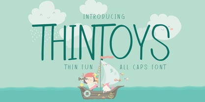 Hello Everyone, Introduce our new collection Thintoys - Fun All Caps Font and display for posters,t-shirt, packaging, branding, logotype and more. Thintoys font with strong and challenging nuances. very suitable for the title, branding projects,typography,Logo, Poster, magazines, brochures, packaging,Websites and much more for your design needs, making your designs more modern and professional.
 - Night Rumble by Gassstype,
$27.00 Introducing Night Rumble is a Strong Textured Typeface that is written casually and quickly. That is why Night Rumble has charming, authentic and relaxed characteristic more natural look to your text with a more natural look to your text. design more interesting. Night Rumble is perfect for homeware designs,branding projects, Logo design, Quotes product packaging.
 - Versatile EP by Borges Lettering,
$9.00 Versatile EP is a powerhouse of 9 fonts that make design and logo creation effortless. While other sans-serif fonts tend to be rigid and cold, Versatile stands out with it's warm and natural feel. It's generous x-height aids in its legibility and function, and the forms are classic yet modern allowing this font to live up to its name as a truly versatile workhorse for your next design or layout. Use it by itself, or in combination with Versatile 7 layer font package (Sold Separately.) https://www.myfonts.com/fonts/charlesborges/versatile-bold/ Versatile EP contains 3 body styles, and 6 shadow fonts including striped and solid in different weights. Versatile EP is not just for the Graphic Designer. It's well suited for the Sign Maker, Cricut and Silhouette users, and anyone else who uses a vinyl plotter. It weeds beautifully in cut vinyl. Its different layers allow the user to stack multi-colored vinyl to create one a kind signs and displays. Versatile EP is ideally suited for advertising and packaging, logo, branding and creative industries, poster and billboards, signage as well as web and screen design. What's included: 9 Fonts included in for one low price: 3 body fonts and 6 different shadows. 1,462 Glyphs (Characters) in each font for a total of 13,158 Glyphs per style pack. Over 200 Languages supported including Cyrillic, Bulgarian Cyrillic and Greek. A massive library of Alternate Characters: Latin, Extended Latin and Cyrillic Alternates including their Diacritic and Small Cap counterparts. Superscripts, Subscripts, Numerators, Denominators, and Scientific Inferiors. Small Caps in Latin, Extended Latin and Cyrillic include Numbers, Punctuation, Diacritics and Alternates. Extended currency symbols including Bitcoin. Fun assortment of speech bubbles. Unlimited fractions. PUA Encoded Versatile EP makes designing fun!
 - Generale Script by Alpha Bento,
$12.00 Generale Script is the font of choice for writing things that go beyond words. This font type is designed with high detail to deliver stylish elegance. So, it can be said, the character of the change is very beautiful, a kind of classical decorative copper script. Generale Script presents alternative variants of most letters, binders, and many calligraphy tips, ideal for elegant labels, high-end packaging, stationery, and compositions for certain brands, beautiful titling, verses, letters and short texts, which are intended to be read only with the eyes or intended to whisper into someone's ear. Generale Script has 300+ glyphs and alternative characters, including various language support. With the OpenType feature with an alternative style and elegant binder. The OpenType feature does not function automatically, but you can access it manually and for the best results needed for your creativity in combining these Glyph variations. To enable the OpenType Stylistic alternates, you need a program that supports OpenType features such as Adobe Illustrator CS, Adobe Indesign & CorelDraw X6-X7, Microsoft Word 2010 or later versions. (Windows), Font Book (Mac) or a software program such as PopChar (for Windows and Mac). How to access all alternative characters using Adobe Illustrator: https://www.youtube.com/watch?v=XzwjMkbB-wQ How to use stylistic sets fonts in Microsoft Word 2010 or later versions: https://www.youtube.com/watch?v=NVJlZQ3EZU0 There are additional ways to access alternates / swashes, using the Character Map (Windows), Nexus Font (Windows) Font Book (Mac) or a software program such as PopChar (for Windows and Mac). How to access all the alternative characters, using the Windows Character Map with Photoshop: https://www.youtube.com/watch?v=Go9vacoYmBw If you need help or advice, please contact me. :) Thank You, Alpha Bento