10,000 search results
(0.029 seconds)
- Secretary Typewriter by Ana's Fonts,
$16.00 Secretary Typewriter is a typewriter font in a lighter, softer weight that makes it perfect for more delicate designs. Use it in long or short texts, in digital collages, branding and packaging, social media posts, logotypes, etc. Secretary Typewriter includes: Contextual alternates. Each letter and number has 3 slight variations that appear "randomly" for extra realism. Underline version of the font. For a grungier look. New! Jumpy version of the font, based on contextual alternates.
 - CarbonPlus by Cadson Demak,
$29.00 The original Carbon is a popular face at T26. It was released in 2003 under influence of modern typewriter and OCR typeface. Carbon Plus, a re-work version, was commissioned by local communication technology firm and is now available for commercial release. This revised version was designed with more sensible letter forms in order to add some human touch to the face. The initial release of this font also known as Carbon C6.
 - Oyko by The Northern Block,
$39.00 A geometric typeface that follows the grid but understands the rule to go off-grid. The design is sharp, square and engineered yet has plenty of craftsmanship in each character to give it a more human and friendly touch. Oyko is best suited to immersive interfaces, including mobile apps, video games, virtual reality and the web. Details include five purposeful weights with italics, over 500 characters, five variations of numerals, stylistic zeros, and OpenType features.
 - Mintaka by Hoperative Design,
$12.00 Mintaka is a gorgeous and retro-styled script font crafted to add tons of stylish character to your designs. This font is PUA encoded, which means you can access all of the glyphs and swashes with ease! This font can be used for logos, branding, invitations, stationery, wedding designs, social media posts, and much more! Mintaka Features : Ligature Kerning Stylistic Alternates Swash PUA encoded which means you can access all glyphs Multilingual Support
 - SoHo Nights BF by Bomparte's Fonts,
$40.00 Named after the trendy New York City locale, SoHo Nights BF features sensuous curves and tapering lines that combine to create a unique new look that’s a little bit art deco and a little bit art nouveau. The font also exhibits attributes that can be described as cartoon-like, and even “spooky” when seen in short blocks of large text. Use SoHo Nights BF when your projects require that certain "air of mystique".
 - Les Bonbon Boutique PW by Patty Whack Fonts,
$29.98Reminiscent of vintage Paris. Think Tea Parties, Sweet Treats, Candy Shoppes, Boutiques, Fine China, Couture, Cakes and Pastries. This font is perfect for cards, menus, signage, and much more. Les Bonbon Boutique PW is intended and suitable for Display use and Titles. It's not suitable for long paragraphs of text. This font is meant for display, titles, beautiful signage, cards, etc. Les Bonbon Boutique PW is available in OpenType, and TrueType format. - Abhartach by Fontdation,
$18.00 Introducing Abhartach, funky reverse-contrast display typeface. A perfect mix from both classic and modern typography. Packed with lots of alternate characters and ligatures (and faux-italic style too!), lets you explore more letter variations that will level up your designing projects. Check out the entire preview images to get the inspiration & hints of how powerful slash beautiful this typeface is. Hope you enjoy this typeface as much as we created it for you! Cheers!
 - Secca Art Std by astype,
$36.00 Secca Art recovers some of the expressive forms of early art nouveau and art deco grotesques — not copying it, but carefully adapting it for today. Secca Art is based on the Secca typeface family and is full interchangeable. Both are equal in weights, widths and word spacing, so you can decide to give your layout a more expressive or serious look. If you need Italic styles just use the Italics from Secca .
 - Front Row JNL by Jeff Levine,
$29.00 Front Row JNL is an all-caps reinterpretation of Morris Fuller Benton's 1937 type design "Empire", and is available in both regular and oblique versions. As is often the case when a digital type font is based on a few letter examples found on a printed sample [in this case, the sheet music of the 1946 Guy Lombardo hit "What More Can I Ask For"], the missing characters were drawn from scratch.
 - Bestfriend Monkey by Mvmet,
$12.00 Bestfriend Monkey is a fun and playful hand-lettered font, mixing modern calligraphy and contemporary art in the process of creation. It will elevate a wide range of design projects to the highest level. You can use this font for many design ideas such as stickers, t-shirt designs, amazing logo designs, magazine or book covers, comics, cartoon drawings, and many more. This font will add a super cool touch to your designs!
 - Mageri by Twinletter,
$12.00 Mageri is a beautiful and charming typeface. Designed with smooth curves and a unique shape, Mageri is the perfect font for all of your creative projects, from websites to posters, banners, and more. of course, your various design projects will be perfect and extraordinary if you use this font because this font is equipped with a font family, both for titles and subtitles and sentence text, start using our fonts for your extraordinary projects.
 - Muffin by ParaType,
$30.00 Muffin is a soft and rounded humanistic low-contrast sans serif based on broad nib writing. It comes in five weights ranging from Regular to Black. The friendly character of the font becomes even more pronounced in the darkest styles. Muffin is well suited for food packaging, menus, children's products, while Regular may be easily used for long runs of text. The font was designed by Natalia Vasilyeva and released by Paratype in 2017.
 - Now Appearing JNL by Jeff Levine,
$29.00Now Appearing JNL is a digital version of some hand-lettering spotted on an early 1960s ad for a Miami Beach night club. Its fun, casual appearance makes it perfectly suitable for any project that conveys a relaxed atmosphere. The font was intentionally not kerned, so the free-flowing form of the lettering is at its best, but it can be set tight by hand if a more compact look is desired. - Branch by Peliken,
$15.00 Branch font with Cyrillic support is perfect for branding, Slavic motives, Russian menu design and many more Font includes a full set of gorgeous uppercase and lowercase letters, numbers, a large selection of punctuation. You can use this font for design logos, quotes prints on t-shirts and other. Ethnic serif font. Authentic slavic stylized alphabet bold symbols. Creative minimal latin character set. Please NOTE - Mock ups and photo are NOT included.
 - Clab by Eko Bimantara,
$19.00 Clab is meant for branding. The initial characters were build in bold and chunky personality, yet the thin strokes and flowy italics gives it a versatile and unique set of family. The glyphs crafted in low contrast strokes, short ascenders and descenders and low caps. Clab consist of 9 weight from Hairline to Black with each matching italics. Contain more than 400 glyphs with some OpenType features e.g, standard and discretionary ligature, fraction, e.t.c.
 - Vecmetry by Velvele,
$10.99 This font is more than just letters, it’s inspired by VECTOR ART. It’s name, VECMETRY' comes from the combination of vector and geometry, that’s why it keeps the most basic elements of design: circle, square and triangle. Vecmetry family has 4 LAYER ABLE FONTS and offers endless combinations; and this makes it especially perfect for headlines and logos. Besides, it supports 5 different languages: ENGLISH, ESPAÑOL, FRANÇAIS, ITALIANO and TÜRKÇE. _(189 glyphs)_
 - Felicity by Fenotype,
$35.00 Felicity is a tightly cut heavyweight display serif. Felicity has strict kerning and it creates strong looking words just by typing - but if you need even more try any of Felicity’s many OpenType features: Discretionary Ligatures, Stylistic, Titling or Swash Alternates. Felicity has also a small selection of ornaments you can from the Character Window. Felicity is also equipped with Contextual Alternates and Standard Ligatures that prevents letters from colliding. Both features are automatically on.
 - Debora Celina Script by Gatype,
$5.00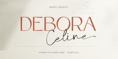 Debora Celina is a font Duo Script and Serif that is simple and unique looking.This customizable font will look great on a variety of design ideas such as Christmas themes,valentines, posters, invitations, weddings, branding projects, social media posts, magazines, book covers and more. This will add a fun and friendly touch to any of your projects.This font is PUA encoded which means you can access all the glyphs and sweeps easily.
 - Mondapick by UICreative,
$23.00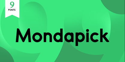 Introducing of our new product the name is Mondapick Sans Serif Font Family comes with 9 different weights. Modern Sans Serif font that feels beautiful classy, elegant, and modern .This font is perfect suited for a wide variety of projects, as to signature, stationery, logo, wedding, typography quotes, magazine or book cover, website header, clothing, branding, packaging design and more. Also for fashion related branding or editorial design and displays both masculine and feminine qualities.
 - Kontradix by Invasi Studio,
$19.00 A new collection of retro display fonts. Kontradix is a reverse contrast display font with a contemporary concept and modern styling. Ensuring carefully crafted styles result from the use of this font. The alternates and ligatures in this font can make your projects more interesting. The imperfections keep it casual while still providing legibility. It's ideal for headlines, flyers, posters, greeting cards, product packaging, book covers, logotypes, and album covers, among other things.
 - Horror Vibes by Gassstype,
$25.00 Introducing of our new product the name is Horror Vibes - Handmade horror Font and Multilanguage support.Introducing of designs look modern, unique and fun. It’s perfect for labels, quotes, posters, DIY projects, branding, packaging, greeting cards, websites, photos, photography overlays, signs, window art, scrapbooking, tags and so much more!our new product that inspired by Street Tagging, graffiti style with a fun theme very good for graffity poster, flyer, childrenbook, cartoon, comic etc
 - NOh Carbone by OhType!,
$32.00 NOh CARBONE is a serif typeface with more than 250 glyphs, including Capitals, Small Letters, Numbers & Special glyphs and Punctuation. Appropriate for medium and large formats, its high contrast, strong features & aggressive and unconventional diagonal endow it with great elegance and give it distinction over other types of the same style. This typeface is adapted to different topics and applications, is easily modifiable and capable of generating a clear and direct message.
 - Lesthone by Nathatype,
$29.00 Lesthone is a display font that seamlessly merges vintage aesthetics with modern elegance. The rounded shapes of Lesthone contribute to its friendly looks. Each letter has its own personality, and this contributes to the font's handcrafted appeal. On the other hand, the most standout characteristic of Lesthone is its slightly rough texture that add a rustic charm. This font includes beautiful ornaments as a bonus. Lesthone fits in headlines, logos, branding materials, and many more.
 - Bigwogs GT by Gartype Studio,
$15.00 Bigwogs is a Street Arts inspiration typeface with a touch of street artistic typeface with graffiti vibes. Bigwogs is an urban inspired typeface from us, that more come with touch of graffiti urban vibes and also comes with multilingual features and extra graffiti swashes to make graffiti vibes. This font look so cool when you using it for projects like text headlines, product packaging, poster, music purpose, game logo title, brands, and mascot logo designs.
 - RNS Pictografica Cocina by RNS Fonts,
$9.00 RNS Pictografica Cocina (Kitchen, culinary arts and food related font) it is comprised of 230 glyphs, it's based on a modular structure of a minimal thickness on lines and round corners, making a clean visually drawing, give importance to the surround white for improve contrast. The font is better used on a big white canvas for achieve visual focus. And in great sizes for more impact, however the font is legible even at small sizes.
 - Prima Donna by Larin Type Co,
$14.00 Prima Donna is a beautiful font that is light and elegant, and will emphasize your individuality in any project. You can also use them to create a logo or use for small businesses, branding, t-shirts, book covers, stationery, marketing, blogs, web site, magazines, and more. This font includes a basic set of letters and a complete set of alternatives set as well as numbers, fractions, and basic punctuation. This font supported PUA encoded.
 - Pentaprism NF by Nick's Fonts,
$10.00In the Dynamic Seventies, "prismatic" typefaces were all the rage, and few were more popular than variants of Paul Renner's Futura and the Herbert Bayer-inspired Bauhaus. This family of fonts features Futura-like forms in the uppercase and Bauhaus-like forms in the lowercase, so you can mix or match to create just the perfect headline. As always, all versions contain the complete Latin 1252, Central European 1250 and Turkish 1254 character sets. - Vennesia by Andrey Font Design,
$10.00 Vennesia is a sweet handwritten font. Fall in love with its authentic feel and use it to create gorgeous social media posts, wedding invitations, beautiful stationary art and much more! It also features a wealth of special features including alternate glyphs and ligatures. This font is PUA encoded which means you can access all of the cute glyphs and swashes with ease! Whether you’re looking for fonts for Instagram or calligraphy scripts for DIY projects.
 - Graviola by Harbor Type,
$30.00🏆 Selected for Tipos Latinos 7 with a Certificate of Excellence. With semi-rounded terminals, Graviola is soft and friendly. The family consists of 16 fonts, from Thin to Black and matching italics. While the intermediate ones are suited for body text, the extreme weights look specially beautiful at display sizes. Each font contains 530+ glyphs, supporting more than 90 languages. Stylistic sets provide alternates in two groupings (a, v, w, y and G, g, &). - Holiday Season by alphArt,
$23.00 Holiday season is new season of Holiday Font. With a touch of modern and unique design, this font will make your design projects more interesting and different from the others. Holiday Season comes with uppercase letters, lowercase letters, numbers, punctuation and ligature. Contains 369 glyphs and support for 92 languages detected. we hope you enjoy this font. If you have any questions please don’t hesitate to drop me a message Thank you,
 - Britania Vintage by Max.co Studio,
$15.00 Britania Vintage is a mix of retro and modern serif font styles, with these tight curves giving traditional groovy, luxury and versatility. Britania Vintage is made with a high degree of legibility and is perfect for nostalgic projects, vintage logos, wedding designs, social media posts, advertisements, product packaging, product designs, labels, photography, watermarks, invitations, stationery and more. Features · All Uppercase and Lowercase · Number & Symbol · Supported Languages · Alternates and Ligatures · PUA Encoded Thank you, Max.co Studio
 - Easter Day by Yoga Letter,
$16.00 Easter Day is a very cute and unique font. The font is embellished with a bunny shape which adds to the funniness of this font. This font is very easy to use because it is specially designed, so it will be very easy to bring out the embellishment of the letters. Easter Day is perfect for Easter celebrations, logos, branding, banners, book titles, movie titles, animation, children's world, promotions, business and more.
 - Stat Display Pro by Jure Kožuh,
$45.00 www.Stat-Type.com Complementary Type Family Stat Text Pro Stat Display Pro is an information design sans serif type family legible in circumstances of low visibility. Its large character set with multiple weights is defined by optimal size ratio, distinctive letter shapes, wide aperture and balanced counters. Stat Display Pro remains legible in unfavorable circumstances of distance, size, movement and similar. It contains nearly 700 glyphs, including diacritics, ligatures, small caps, old–style figures, arrows and more. This enables it to achieve wide language support. It consists of four main (Light, Regular, Medium, Bold) and four secondary, negative weights (Light Negative, Regular Negative, Medium Negative, Bold Negative) which are accompanied by their corresponding obliques. Stat Display Pro type family has higher than average x height (72% of cap height) which is accompanied by matching ascender and descender size ratios. With its distinctive letter shape detail it minimizes the possibility of letter shape confusion, while optimizing legibility with wide aperture and balanced counters. Its main intended use is information design, where it, with its characteristics, meets the requirements of wayfinding, infographics, table setting and much, much more. The development of the type family was based on research in legibility to achieve highly legible letter shapes, while not diminishing their visual character. A detailed description of Stat Pro type family is available at Stat-Type.com where a DEMO font can be downloaded.
 - Novin by Naghi Naghachian,
$85.00 Novin Font family is designed by Naghi Naghashian. This Font is developed on the basis of specific research and analysis on Arabic characters and definition of their structure. This innovation is a contribution to modernisation of Arabic typography, gives the font design of Arabic letters real typographic arrangement and provides more typographic flexibility. This step was necessary after more than two hundred years of relative stagnation in Arabic font design. Novin supports Arabic, Persian, and Urdu. It also includes proportional and tabular numerals for the supported languages. Novin Font is available in Light, Regular and Bold. Novin design fulfills the following needs: A Explicitly crafted for use in electronic media fulfills the demands of electronic communication. Novin is based on Aldo Novareses Eurostile Extended. B Suitability for multiple applications. Gives the widest potential acceptability. C Extreme legibility not only in small sizes, but also when the type is filtered or skewed, e.g., in Photoshop or Illustrator. Novin’s simplified forms may be artificial obliqued in InDesign or Illustrator, without any loss in quality for the effected text. D An attractive typographic image. Novin was developed for multiple languages and writing conventions. E The highest degree of geometric clarity and the necessary amount of calligraphic references. This typeface offers a fine balance between calligraphic tradition and the contemporary sans serif aesthetic now common in Latin typography.
 - Pershal by insigne,
$29.00 Pershal is something of an oddball, and that's the point. Dynamic and fast, Pershal attracts interest. Its architecture evokes growth and progress. Inspired by the futuristic styles of the 1990s, Pershal started on an aircraft ride as a sketch on a napkin. I set the concept aside for almost a decade before I went back to play with the typeface. Pershal is planned to complement applications in consumer finance, technology firms or biotechnology. As such, it has a complete set of both tabular and proportional figures. For the lowercase, Pershal features a distinctive shape that emphasizes its x-height. Its horizontal movement is highlighted by some of its other features, such as its crossbars. To emphasize growth, acceleration and inventiveness, crossbars and other elements are cut at a dynamic angle. It's a sans serif without a lot of contrast. Another unique feature of this typeface is the vast number of OpenType alternates. If you prefer a more conventional appearance to your sans, with stylistic alternates, you have that option. Altogether, there are more than seven separate sets of stylistic alternates and about 250 alternates for characters. This enables you to mix-and-match and create your own personal typeface. For branding, this makes it very useful. For your next project that requires a dynamic and technological appearance, give Pershal a shot.
 - Thicker by Zetafonts,
$39.00 Thicker is a type-family designed for Zetafonts by Francesco Canovaro with Andrea Tartarelli. A geometric sans typeface on steroids, it was first designed in the muscular Extrablack weight with the aesthetics of high-power dynamic typefaces used in sports communication, and then developed in the lighter weights where the shapes show some vintage-inspired proportions and the slightly squared look that nods to Novarese famous Eurostile, eponymous with retro-futurism. With these diverse influences the typeface allows for both impressive display use and effective logo design as well as more fine-tuned editorial use in body text - with a natural inclination for effective and powerful advertising. Sports typography usually uses italics to add dynamism and impact, and Thicker complies with this by offering a choice of three alternate italic forms with different slant, made even more customizable by the inclusion of variable font technology that allows fine tuning of the weight range as well as precise choice of typeface slant. In each of the 44 weights of the typeface family (as well as in the all-in-one variable type solution) Thicker offers a extended charset of over 900 latin, Cyrillic and Greek glyphs, covering over two hundred languages and including useful Open Type features (Alternate forms, Positional Numerals, Small Caps and Case Sensitive Forms) for flawless typesetting.
 - TT Nooks by TypeType,
$39.00 TT Nooks useful links: Specimen | Graphic presentation | Customization options TT Nooks is an experimental font family that includes a high contrast serif, TT Nooks, and an upright italic, TT Nooks Script. Despite the difference in style, both subfamilies get along well, which is partially thanks to their similar proportions. Each of the subfamilies includes 4 weights: Light, Regular, Bold and Black. The main subfamily is TT Nooks—a stylish high-contrast serif with a light touch of self-centeredness. If TT Nooks were a person, it would be an elegant lady with an independent and firm personality. In the original sketches of TT Nooks there were traces of a broad pen, but in the course of further evolution the typeface moved away from this style, retaining only the high contrast of strokes. In addition, in the process of design searches TT Nooks has obtained a touch of geometricity. The serifs in TT Nooks stand out especially visibly thanks to their geometric shape that resembles slippers. In addition to their peculiarity, such serifs add stability to the font and allow better compensation of the black and white ratio within the letters. TT Nooks has small capitals for Latin and Cyrillic alphabets, as well as a set of stylistic alternates (including some figures) that makes the typeface a bit more geometric. In addition, we have drawn more than 25 ligatures, including ligatures for capital letters, slashed zero and many other useful OpenType features. TT Nooks Script is a complementary family designed to harmoniously extend the main family and expand its scope. The forms of the characters in bold and light fonts of TT Nooks Script are quite different. For example, Black & Bold have high contrast strokes and an open aperture, and in Regular & Light the aperture of the characters is closed. TT Nooks also has small capitals for Latin and Cyrillic alphabets, ligatures, oldstyle figures and other OpenType features. In light faces, TT Nooks Script is more humanist and has artifacts inherent to the continuous movement of a flat pen. In bold faces, TT Nooks Script has a very dense and dynamic typing rhythm, and the shape of the letters begins to geometrize. We had had the difficult task of preserving the continuity of forms between bold and light faces, and we have managed to solve it thanks to the found rhythm, which united different fonts, and proximate stylistic solutions.
 - Fantini by Canada Type,
$29.95 Fantini is the revival and elaborate update of a typeface called Fantan, made in-house and released in 1970 by a minor Chicago film type supplier called Custom Headings International. In the most excellent tradition of seriously-planned American film faces back then, CHI released a full complement of swashes and alternates to the curly art nouveau letters. Fantan didn't fare much among the type scene's big players back then, but it did spread like electricity among the smaller ones, the mom-and-pop type shops. But by the late 1980s, when film type was giving up the ghost, most smaller players in the industry were gone, in some cases along with little original libraries that existed nowhere else and became instant rarities on their way to be forgotten and almost impossible to resurrect for future technologies. Fantini is the fun and curly art nouveau font bridging the softness and psychedelia of the 1960s with the flirtatious flare of the 1970s like no other face does. Elements of psychedelia and funk flare out and intermix crazily to create cool, swirly letters packed with a lot of joy and energy. This is the kind of American art nouveau font that made its comeback in the late 20th century and is now a standard visual in the branding drive of almost every consumer product, from coffee labels to book and music covers to your favorite sugar or thirst-crunching fix. Alongside Fantini's enormous main font come small caps and three extra fonts loaded with swashy alternates and variations on plenty of letters. All available in all popular font formats. Fantini Pro, the OpenType version, packs the whole she-bang in a single font of high versatility for those who have applications that support advanced type technologies. In order to make Fantini a reality, Canada Type received original 2" film specimen from Robert Donona, a Clevelander whose enthusiasm about American film type has never faltered, even decades after the technology itself became obsolete. Keep an eye out for that name. Robert, who was computer-reluctant for the longest time, has now come a long way toward mastering digital type design.
 - Portada by TypeTogether,
$35.00 For everyone wishing for a modern serif that’s as clear and readable as a sans in restrictive digital environments, meet Portada by Veronika Burian and José Scaglione. Sans serifs are commonly used on small screens to save space and carry a modern tone. Serifs may appear fickle and unsteady, pixel grids change from one product to another, and space is at a premium. Portada now provides a serif option for these restrictive digital environments, putting that old trope to rest. The screen has met its serif match. Portada was created from and for the digital world — from e-ink or harsh grids to Retina capability — making it one of the few serifs of its kind. Portada’s text and titling styles were engineered for superlative performance, making great use of sturdy serifs, wide proportions, ample x-height, clear interior negative space, and its subservient personality. After all, words always take priority in text. It’s not all business, though. Portada’s italics contain an artefact of calligraphy in which the directionality of the instrokes and the returning curves of the outstrokes give the family a little unexpected brio. Yet even the terminals are stopped short of flourished self-absorption to retain their digital clarity. When printed these details are downright comforting. Portada’s titling styles enact slight changes while reducing the individual width of each character and keeping the internal space clear. Titling italics have increased expressiveness across a few characters rather than maxing out the personality in each individual glyph. Digital magazines, newspapers, your favourite novel, and all forms of continuous screen reading benefit from Portada’s features. This family can also cover many of the needs developers have: user interface, showing data intensive apps on screen, even one-word directives and dialogs. And, as a free download, an exhaustive set of dark and light icons is included to maintain Portada’s consistent presence, whether as a word or an image. The complete Portada family (eight text styles, ten titling styles, and one icon set) is designed for extensive, clear screen use — a rare serif on equal footing with a sans.
 - Costa Std by Typofonderie,
$59.00 A mediterranean style sanserif in 4 styles The original idea of Costa was to create a contemporary mediterranean typeface style. Costa is a synthesis of the purity, as found on Greek capitals, and softness, found in Renaissance scripts. First thing was the design concept that take its roots on the Chancery script. Such writing style appeared during Italian Renaissance. Later few typefaces have been developed from such cursive models. Today most serifed typeface italic take their roots on such triangular structure we can find on gylphs like the n, p, or d. The Costa capitals remains close to pure sanserif models when the lowercases features an ending serif on many letters like the a, n, d, etc. This ending serif being more like a minimal brush effect, creating a visual contrast and referencing the exoticness of the typeface. Knowing that the Costa typeface family began life in the 90s as a bespoke typeface for Costa Crociere, an Italian cruise company — it suddenly makes sense and explains well why Jean François Porchez focused so much on Italian Chancery mixed to a certain exotism. The curvy-pointed terminals of the Costa n can obviously get find on other glyphs, such as the ending of the e, c and some capitals. So, the sanserif looks more soft and appealing, without to be to pudgy or spineless. The general effect, when set for text, remains a sanserif, even not like Rotis Semiserif. Costa is definitly not a classical typeface, or serif typeface which convey past, tradition, historicism as Garamond does beautifully. Because of the Costa crocieres original needs, Costa typeface was designed to be appropriate for any uses. Anytime you’re looking for good mood, qualitative effects, informal tone, cool atmosphere without to be unconvential or blowzy, Costa will convey to your design the required chic and nice atmosphere, from large headlines sizes, brands, to small text sizes. It’s a legible typeface, never boring. A style without neutrality which doesn’t fit comfortably into any typeface classification! Does it proves the novelty of its design and guarantees as well as its originality? Its up to you to be convinced. Barcelona trip Originally not planned, this need appeared because of a trip to Barcelona at the time of the project, where Jean François was giving a lecture. He wanted to pay an homage to that invitation to create something special. So, he designed during his flight some variations of the Spanish Ch, following ideas developed by the Argentinian type designer Rubén Fontana for his typeface called Fontana ND (published by the Barcelona foundry Bauer). Then, he presented during his lecture variations and asked to the audience which design fit the best to their language. They selected the design you can find in the fonts today. Read more about pairing Costa Type Directors Club 2000 Typographica: Our Favourite Typefaces 2004