10,000 search results
(0.018 seconds)
- Granite by Alias Collection,
$60.00 A semi text type with thin stresses, in Granite Semi Stencil the overall weight of the Granite Regular has been decreased by a set unit which has obliterated the stress to leave white space. This gives the typeface an idiosyncratic almost arbitrary take on the utility Stencil aesthetic.
 - Mulier Moderne by HiH,
$8.00 Even though the phrase Art Nouveau originated in Paris at the shop of Siegfried Bing, the French preferred to call it Le style moderne. This very sinuous, very Art Nouveau typeface was designed by an E. Mulier around 1894, probably also in Paris. The organic, vine-like curve forms are frequently seen in the art of the period. Examples include the architecture of Victor Horta, the furniture of Henry van de Velde and the jewelry of Max Gradl. Mulier Moderne is an all-cap font with a full Western European character set plus ST and TH ligatures, an alternate ‘E’ and two glyphs of period printer’s cuts. Warning: do not use for extended text. Duh!
 - Foom by Comicraft,
$19.00 DOCTOR OCTOPUS! BOOM! DOCTOR DOOM! 'SHROOM! DOCTOR EVIL! BA-THROOM! DOCTOR FRANKENSTEIN! KRA-KOOM! Never let it be said that Comicraft does not possess a Varied Vocabulary of Vile Villainy or a Tremendous Thesaurus of Terrible Tinkerers! It's our belief that every Medley of Madmen, every Rogue's Gallery of Ragged Rascals and every Sinister Selection of Scoundrels, Scalliwags and Sick Scientists --even they deserve a Nefariously Notorious Name-Finagling Font to announce their Apocalyptic Arrival. That font is here, towering murderously above the city blocks of Manhattan even as we speak... It's a Despicable Doctor of Dastardly Deeds, it's a Master of Evil Scheming, an Infamous Infidel, your Arch Enemy, your NEMESIS... IT'S THE END OF THE WORLD AS WE KNOW IT! FING... FAN... FOOM!
 - Bolda Display by The Infamous Foundry,
$29.00 Bolda Display is a a-z lowercase display font in two styles; regular and outline. Lowercase is regular and uppercase is outline. Inspired by the 1970’s tennis, dart and ping pong fashion. Perfect for headlines, logos and everything above the body.
 - Backline by Subectype,
$13.00 Backline is a monoline script font with an cute style. It has good readability and is perfect for logos, invitations, wedding, signatures, and much more! What's Included : - Kind Heart Font Script - Multilingual Support - Alternates I hope you enjoy this font. Thank You, Subectype
 - Aniron - Unknown license

- Cassius by W Type Foundry,
$23.00 Cassius & Cassius Italic are a postmodern typeface system from the Garaldes family. The main characteristic of this type family is its inverted anatomy and projected terminals. Cassius was meticulously designed with special focus on its structure. With its proposal for a fresh, attractive and rhythmic system, Cassius gives great personality to all kinds of composition. The family consists of 5 weights from regular to black, with respective Italics. Each instance includes; Case sensitives Accents, Ligatures, Fractions, Small Caps, Old Style Figures, Case Sensitives (symbols and punctuation) and more. This font is perfect for books and magazines compositions, and in general for the construction of immersive printed or digital texts.
 - Core Circus by S-Core,
$20.00 Core Circus is a layered type family consisting of seven 3D effect layers, eight 2D effect layers and one shadow effect layer. Uppercase and lowercase letters are separated by such features that counters are opened or closed. Core Circus provides other closed counter styles such as numbers with opentype feature (Stylistic Alternatives). Also available Core Magic (Slab- Serif version of Core Circus) and Core Circus Rough(Textured version) The shape of Core Circus is simple but the combinations of effect fonts are impressive. Core Circus makes your works charming and special with endless combinations (at least 262,551 kinds). This family is really nice for book titles, headlines, logotypes and any artworks.
 - Beiko by Nantia.co,
$12.00 Beiko Uppercase Greek Font is a decorative display font, made from digitized brush hand lettering. Of course, the uppercase font supports a full set of Greek characters and an extended Latin character set with diacritics. Also, this handwritten font is ideal for handcrafted projects. The hand-brushed organic style of Beiko is ideal for logotypes. In fact, this cute typeface can be your next typeface for your graphic design needs. From Instagram quotes to product packaging, merchandise, and branding projects, this font is so fun to use. Also, it can be used on social media content, for branding, poster design, for children projects, and any other kind of product packaging.
 - Mugio by Twinletter,
$14.00 Mugio is the latest addition to our San Serif font family. Mugio is a one-of-a-kind font that can be used for any project. It includes a lot of qualities that make it particularly powerful and handy for making elaborate designs. This font’s slanted letters and curves make it ideal for logos, flyers, posters, and a wide range of other typographic projects. of course, your various design projects will be perfect and extraordinary if you use this font because this font is equipped with a font family, both for titles and subtitles and sentence text, start using our fonts for your extraordinary projects.
 - Selektor Slab by Tour De Force,
$25.00 Selektor Slab is small font family created as logical extending of the Selektor font family. Inspired and after that designed with the charm of technical letters, it contains a few letters with specific endings that gives Selektor Slab peculiar impression. Global overview of Selektor Slab says it’s a neutral, corporate, stable, well balanced font family, but not cold and heartless to leave readers without remembrance on its characteristics. It is fully appliable in all kinds of publications, from long texts in paragraphs to titles and product names. Available in 3 weights - Light, Regular and Bold and matching Italics. All family members include Small Caps and Fractions as additional OpenType features.
 - Maladroit by Comicraft,
$29.00 Okay, we admit it! Comicraft's latest offering -- wrenched heavy-handedly from the pages of CHARLEY LOVES ROBOTS – is definitely a little awkward, maybe even loose-limbed and goofy. Those (usually) awfully nice chaps in the Comicraft studio are perhaps best known for their dexterity, their lightness of touch and nimbleness of finger rather than the kind of bungling, graceless, clumsy work evident in their latest digital alphabet. So, yes, MALADROIT is probably the most inept, cack-handed, undiplomatic addition to our catalogue ever submitted by freewheelin' John Roshell (formerly GAUCHE-ell) but might just possibly be the perfectly wrong font choice for your more bungling, inept, incompetent and hamfisted characters.
 - Thunder Inferno by Mans Greback,
$79.00 Thunder Inferno is a gothic black metal typeface with sharp serifs. Rooted in the aesthetics of heavy metal and the occult, this typeface is a harbinger of darkness and intensity. Evocative of Halloween and gothic grandeur, Thunder Inferno also captures a march toward darkness. It serves as a rebellious voice for skate culture and alternative lifestyles. Crafted exclusively in uppercase, this font is a growl in typographic form, a visual cacophony that grabs your attention and refuses to let go. Capitalize the first and last letters of any word for symmetrical heavy metal style. Example: Heavy metaL Enclose any word in < > ( ) [ ] { } to give it wings. Example: [HawkstylE]
 - Huyton by Letterhend,
$17.00 Introducing, Huyton- a unique display script with reverse contrast, comes with extrude. The unusual reverse contrast make this typeface one of a kind. This type of font perfectly made to be applied especially in logo, and the other various formal forms such as invitations, labels, logos, magazines, books, greeting / wedding cards, packaging, fashion, make up, stationery, novels, labels or any type of advertising purpose. Features : extrude version uppercase & lowercase numbers and punctuation multilingual alternates and ligatures PUA encoded We highly recommend using a program that supports OpenType features and Glyphs panels like many of Adobe apps and Corel Draw, so you can see and access all Glyph variations.
 - Valecia by ejhaa,
$20.00 Valecia is a calligraphic script font that presents exquisite vogue characters, a form of classic ornamental copper script infused with a modern touch. It has been intricately designed with 715 glyphs to convey a stylish and elegant flair. Valecia possesses an alluring quality characterized by refinement, cleanliness, femininity, sensuality, glamour, simplicity, and remarkable readability due to the abundance of lavish letter connections.
 - Eurotech Pro by RMU,
$40.00 The design of Eurotech Pro was inspired by Thannhaeuser’s Technotyp font family which was cut by Typoart, Dresden, in 1949. Eurotech is not a mere revival of the old Typoart version but many letterforms have been updated and modernized. The Cyrillic letters are designed entirely by myself. Eurotech Pro is well suited for technical purposes, like catalogs, manuals or articles which are multilingual.
 - WildWords by Comicraft,
$49.00 Created for Jim Lee's Wildstorm books, WildWords has proved to be one of our most popular fonts and has been featured in TIME magazine and the LEGO catalog, as well as used to letter thousands of Manga pages. Comicraft fonts are created BY comic book letterers FOR lettering comic books. Accept no substitutes! See this family related to WildWords: Wild Words Lower
 - Raspberry Jam by CounterPoint Type Studio,
$29.99 A whimsical and fun calligraphy style font that is perfect for informal and fun occasions. The design was inspired by a series of scrapbooking style fonts that I have been exploring over the past couple of years. Inspired by a hand lettered sample in a lettering how to book. Contains language support for both Latin-based and most Eastern European languages.
 - LTC Goudy Ornate by Lanston Type Co.,
$24.95 Goudy Ornate (also known as Ornate Title) was designed in 1931 by Frederic Goudy. He states "It is a simple, decorative face that has been used by some good presses for use on title-pages where size is more important than blackness of line." The new Lanston version includes a lower case and full character set designed in the style of Frederic Goudy.
 - Grigory by Hanoded,
$15.00 I have always been fascinated by Grigory Rasputin, the rogue ‘monk’ who influenced the Russian Tsar Nicholas and - according to rumours - bedded the Tsarina. Grigory font was handmade with the use of a Chinese marker pen and rough paper. Grigory comes with all the trimmings; some alternate glyphs, a few double letter ligatures, a great amount of diacritics and basic Cyrillic as well.
 - NeuAltisch by Ingrimayne Type,
$14.00 NeuAltisch is a calligraphic version of a modernized, more rounded Fraktur. Blackletter fonts of this sort are useful for decorative purposes in certificates, invitations, labeling, and advertising. The family has two weights, plus three versions that are shadowed or striped. The shadowed versions have been deconstructed so that they and their derived font can be used in layers to add color.
 - Chollistio by Letterara,
$14.00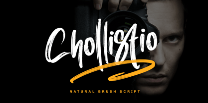 Chollistio is a handwritten font with a dry brush texture with rough details. This font has been designed to suit a variety of projects such as business branding, Instagram quotes, Christmas greeting, Poster, blog headers, Packaging, sports communities, film, photography, hobbies, and much more. This font is PUA encoded which means you can access all of the glyphs and swashes with ease!
 - Brigitta Signature by Letterara,
$12.00 Brigitta Signature is a handwritten font with a dry brush texture with rough details. This font has been designed to suit a variety of projects such as business branding, Instagram quotes, Christmas greeting, Poster, blog headers, Packaging, sports communities, film, photography, hobbies, and much more. This font is PUA encoded which means you can access all of the glyphs and swashes with ease!
 - Progelud by Beary,
$13.00 Hello guys Proudly presents our font Progelud. Progelud is mazing sans-serif look attractive and natural! Every single letters have been carefully crafted to make your text looks beautiful. It has beautiful and well-balanced characters and as a result, it matches a wide pool of designs. Progelud is PUA encoded, which means you can access all of the glyphs!
 - Suomi Hand Script by Suomi,
$60.00 This script is made for mimicking handwriting with a fair amount of ligatures: there are more than 700 ligature pairs (or even more characters; I never really counted them) to help you to make very, very convincing lines of text without ever lifting a pen! It’s been a bestseller in FontShop for years, and now it’s available here as well!
 - Printers Plant Ornaments by Gerald Gallo,
$20.00 Printers Plant Ornaments was inspired by the decorative motifs used to fill in page space that have been around since moveable type printing commenced in the 15th century. All the ornaments are representations of plants. There is an assortment of 47 ornaments located under the character set keys. Under their respective shift + character set keys are the same 47 ornaments flopped.
 - Ornata C by Wiescher Design,
$39.50 Ornata C is the third of a series of old ornaments that I am trying to save from oblivion. I am not just scanning these, I am completely redesigning the ornaments from scratch, thereby eliminating imperfections. These ornaments have been first designed by a designer named Ben Sussan. The designs date back to about 1910. Your digitizing type-designing savior, Gert Wiescher
 - Vestigia by Rodrigo Navarro Bolado,
$32.00 Vestigio m. Ing. & Fr. vestige: a trace, mark or visible sign left by something as an ancient city in a condition or practice vanished or lost. Vestigia is born by lost pieces of other typography, being then, Garbancera's descendant. It evolved to be seen in big point sizes and compete with other fierce competitors, while retaining some features of it ancient predecessor, navigates a gothic fraktur experimental style, existing between legible and illegible reading.
 - HWT Lustig Elements by Hamilton Wood Type Collection,
$24.95 'Euclid. A New Type,' originally designed in the 1930s by modern American designer Alvin Lustig (1915-1955), has been revived as 'Lustig Elements' through a collaboration of designers Craig Welsh and Elaine Lustig Cohen. Only twelve letterforms from the original font design had been retained in archive material in the many decades since its initial development. Lustig Elements combines four simple, geometric shapes aligned to an underlying grid with letterform designs that hold true to the spirit of the original font. Lustig Elements initially came to life in 2015 as wood type cut at Hamilton Wood Type & Printing Museum. The digital version expands on the basic character set with a pro expanded latin character set, small caps and even an Inline variation.
 - Fashionable JNL by Jeff Levine,
$29.00 For years, the print ads for the Hickok Jewelry Company [renowned for their line of men's belts, suspenders, wallets, cufflinks, etc.] featured its name and related main line ad copy hand-lettered in a condensed monoline with Art Deco styling. This has been reproduced in Fashionable JNL, available in both regular and oblique versions. For those of you who are wondering: yes, the founder of the company was a distant relative of "Wild Bill" Hickok.
 - Decima Pro by TipografiaRamis,
$39.00 Decima – condensed geometric Sans Serif typeface, released back in 2009 and quite successful ever since (MyFonts Rising Star, February 2009). Decima Pro – an upgraded version of Decima, with careful refinements to glyph shapes and extension of glyph amounts, which enabled support of more Latin languages as well as support of Cyrillic. Six more alternate styles have been added to the original six styles. Typeface is released in OpenType format with some OpenType features.
 - Design System by Dharma Type,
$14.99 Design System is a great type system consisted of 5X7X2=70 font styles from 70s-style simple square sans to the widest style of all time that are best for titles, logo and text. Their simple form does not limit the target of design and can be used for any creative work. Additionally they all have been designed not to provide a feeling of strangeness when they are used in mixture each others.
 - Modern Love Slanted by Resistenza,
$39.00 Modern Love has been one of our most popular fonts during last year, so we decided to create a new version of this sweet character set. Modern Love Slanted is a new casual slanted brush-handwritten family. It has the effortless hand-painted feeling and keeps a high density of contrast like Modern Love Regular and It also includes a set of ornaments, swashes and alternates accessible through Opentype features. Check out also ‘Modern Love’
 - Park West JNL by Jeff Levine,
$29.00 The thin, stylish Art Deco slab serif lettering featured on the cover of the 1934 sheet music for “Then I’ll be Tired of You” inspired the digital type face Park West JNL, which is available in both regular and oblique versions. Central Park West has always been the upscale area for affluent New Yorkers, but in the Great Depression years of the 1930s the mystique of the well-to-do held an even stronger significance.
 - Along Sans by Brenners Template,
$19.00Along Sans font family has evolved to reflect geometry-based glyph design and modern typography trends. The appropriate transformation of the lowercase letters a, d, and u alleviates the tension of the grotesque temperament. All of the glyphs have been refined to focus more on balance and rhythm, making it a smart tool for designers. And, the standard ligatures of the previous version returned to discretionary ligatures to suit their original use. Thanks. - Manstein by Gold Type,
$16.00 Manstein Script is one of the Elegant script fonts that comes with a very beautiful character change, a kind of classic copper decorative script with a modern touch, designed with high detail to present an elegant style. Manstein Script is interesting because the typeface is pleasing to the eye, clean, feminine, sensual, glamorous, simple and very easy to read, because of the many luxurious letter connections. I also offer a number of decent stylistic alternatives for some of the letters. The classic style is very suitable to be applied in various formal forms such as invitations, labels, restaurant menus, logos, fashion, make up, stationery, novels, magazines, books, greeting / wedding cards, packaging, labels or all kinds of advertising purposes. . . Manstein supported With OpenType features with alternative styles and elegant ligatures. The OpenType features don't work automatically, but you can access them manually and for best results your creativity will be required in combining variations of these Glyphs. I highly recommend using a program that supports OpenType features and the Glyphs panel such as Adobe Illustrator, Adobe Photoshop CC, Adobe InDesign, or CorelDraw, so that you can view and access all variations of Glyphs. How to access all alternative characters using Adobe Illustrator: https://www.youtube.com/watch?v=XzwjMkbB-wQ How to access all alternative characters, using the Windows Character Map with Photoshop: https://www.youtube.com/watch?v=Go9vacoYmBw If you need help or have any questions, let me know. I'm happy to help. Thanks & Happy Designing
 - Poliphili by Flanker,
$19.99 Hypnerotomachia Poliphili, which can be translated in English as “Dreaming Love Fighting of Poliphilus”, is a romance about a mysterious arcane allegory in which the main protagonist, Poliphilo, pursues his love, Polia, through a dreamlike landscape. In the end, he is reconciled with her by the “Fountain of Venus”. The author of the book is anonymous, however, an acrostic formed by the first, elaborately decorated letter in each chapter in the original Italian reads “POLIAM FRATER FRANCISCVS COLVMNA PERAMAVIT”, which means “Brother Francesco Colonna has dearly loved Polia”. Despite this clue, the book has also been attributed to many other authors. The identity of the illustrator is less certain than that of the author. It was first published in Venice, in December 1499, by Aldo Manutio. This first edition presents an elegant and unique page layout, with refined woodcut illustrations in an Early Renaissance style and a refined Roman font, cut by Francesco da Bologna, which is a revised version of the type used in 1496 for the De Aetna of Pietro Bembo. The print quality is very high for the time, but nevertheless it presents many inconsistencies and imperfections due to the non-ideal inking and adherence of the matrix to the paper. For that reason numerous samples of the original have been used to create every single glyph which will result in an appropriate reconstruction and not a mere and humble reproduction. Some letters like \J, \U and \W were extrapolated, because they are not part of the original alphabet of the period. Some letters like \Q, \X, \Y, \Z and \h have been updated to more modern variants, but the original shape is accessible by Stylistic Alternates Opentype Feature, which also changes the shape of the \V and the \v. The original numerals \zero, \one, \tree, \four and \six have been accompanied by reconstructions of the missing numbers and extended by modern figures. Finally, swashed lower cases and original scribal abbreviations were also included. The font has joined by a matching Italic variant, closely inspired from Aldo Manuzio's 1501 "Vergilius", the first book printed entirely in Italic type by Francesco da Bologna.
 - Monthly Statement JNL by Jeff Levine,
$29.00 The 1934 French publication L'Art du Tracé Rationnel de la Lettre is a vintage guide book on lettering chock full of interesting alphabets that have been an ongoing source of digital type revivals from the designs found within its pages. Monthly Statement JNL is a squared slab serif design with some Art Deco flair; available in both regular and oblique versions. This style of type evokes images of billheads, bank statements and other important documents of the era.
 - Near Myth by Comicraft,
$19.00 The Norse Gods of Asgard, the Titans of Olympus and the Elders of Middle Earth have spoken! Their pronouncements have been carved in the solid rock across the mountains of Midgard and their Legend will now be known to many... 'cause JG --- our very own Mr Fontastic -- signed a license for comicbookfonts.com to make the typestyles of the gods commercially available. No really, he made a deal with Loki. Dipped his pen in his own blood and everything.
 - Centima Pro by TipografiaRamis,
$39.00 Centima Pro is an enhance development of Centima – a geometric Sans Serif typeface, released back in 2011. Centima Pro family consists of two sub-families Sans and Serif fonts. Centima Sans – an upgraded version of Centima, with careful refinements to glyph shapes and extension of glyph amounts, which enabled support of Cyrillic languages. A new extended sub-family Centima Serif have been added to the Centima Pro family. This typeface is released in OpenType format with some OpenType features.
