10,000 search results
(0.018 seconds)
- Computer by Monotype,
$40.99Computer is an all-capitals headline font that immediately implies early mainframe computer technology. Although desktop computers and better screen and printer faces have been available for some time, the type style of the Computer font is still used for futuristic topics. - Tall Order JNL by Jeff Levine,
$29.00 The condensed style and square character shapes of a vintage typeface originally known as Raleigh has been re-interpreted by Jeff Levine Fonts as Tall Order JNL. There is an alternate A, K, M, N and S on the respective lower case keys.
 - Pinot Grigio Modern by Alan Meeks,
$45.00 A modern update of the unique sans display font Peignot originally designed in 1937 by A. M. Cassandre. The font has been modernised by making all the terminals soft and making a larger x height and lessening the contrast between thick and thin.
 - Alleyn Pro by AVP,
$25.00 Alleyn Pro is a re-working of the font Alleyn in response to a request to increase the character set and include Vietnamese. The fonts now cover most Latin languages, Greek and many Cyrillic languages – apparently around 275 in total. The letters have been redrawn and re-proportioned and the spacing recalculated to make for better reading at text sizes. Alleyn Pro has been developed to meet the needs of publishers, companies and individuals addressing a wide international market in a range of publishing media. The low contrast, slightly rounded sans-serif letterform with six weights and corresponding obliques provides a friendly and highly legible set of styles which are equally effective on signage, packaging, advertising and editorial. Opentype features include many numeral and positioning options, ligatures, stylistic alternatives and localised variants.
 - Qonora by Charles Casimiro Design,
$22.50 Qonora is an innovative new sans-serif text face that combines flowing, almost calligraphic strokes with a post-modern sensibility for a look that works as well on the printed page as it does on screen. Its comfortable proportions and no-nonsense streamlining (note the lack of spurs, serifs or any unnecessary ornamentation) make it an excellent choice for legibility even at very small point sizes. Qonora includes a true italic, drawn independently from the Roman. Strokes for the italic have been re-weighted to complement the Roman, and idiosyncratic italic glyphs have been substituted where appropriate. The typeface’s extensive Hebrew implementation (including diacritics and cantillation marks) is an important part of its character. The Latin, Cyrillic and Greek ranges of the face maintain a consistent ethic of form and function.
 - Kwodsity by Ingrimayne Type,
$12.95 The two Kwodsity fonts are derived from Kwersity, a narrow, blocky typeface with slab serifs and a high x-height. In Kwodsity Up the bottom edges and bottom serifs have been thickened, while in Kwodsity Down the top edges and serifs have been thickened.
 - Kestrel Script by Alan Meeks,
$45.00 Originally designed in 1985 and released by Letraset for dry transfer Lettering, Kestrel has, until now, never been digitized. The face now has been completely re-drawn and digitized for all formats. It is a heavy formal script similar in form to Commercial Script.
 - Bodoni Poster by Linotype,
$29.99 Giambattista Bodoni (1740–1813) was called the King of Printers and the Bodoni font owes its creation in 1767 to his masterful cutting techniques. Predecessors in a similar style were the typefaces of Pierre Simon Fournier (1712–1768) and the Didot family (1689–1836). The Bodoni font distinguishes itself through the strength of its characters and embodies the rational thinking of the Enlightenment. The new typefaces displaced the Old Face and Transitional styles and was the most popular typeface until the mid-19th century. Bodoni’s influence on typography was dominant until the end of the 19th century and even today inspires new creations. Working with this font requires care, as the strong emphasis of the vertical strokes and the marked contrast between the fine and thick lines lessens Bodoni’s legibility, and the font is therefore better in larger print with generous spacing. Chauncey H. Griffith’s Poster Bodoni displays characteristics of the advertisement fonts of the first half of the 20th century. The font was most often used for posters and signs, eventually including neon signs.
 - Aristotelica Pro by Zetafonts,
$39.00 Aristotelica Pro is the 2020 redesign of the rounded geometric sans designed by Cosimo Lorenzo Pancini and Andrea Tartarelli developing the original philosophy of one of the classic and best-selling Zetafonts typefaces, Arista by Francesco Canovaro. Originally conceived as an exercise in restraint and simplicity, Aristotelica is typographic eulogy to the simple beauty of circular shapes, aptly named after the greek philosopher who pioneered formal logic. It shows its strengths mostly in display uses and logo design, with a palette of moods ranging from the stark elegance of the uppercase hairline weights to the playful softness of the lowercase bold weights. True to its universalist calling, it has however been developed in a variant text version that applies slight corrections to design and metrics to allow for better legibility in long body copy. In Aristotelica Pro both the display and the text subfamilies have been complemented with a condensed version, though especially for mobile screens and other situations where space-saving is a concern. Also the original language coverage (extended latin, greek and cyrillic) has been expanded with the inclusion of arabic language glyphs, bringing the typeface to a total of over 1100 glyphs and 200 languages covered. The family is further enriched by the inclusion of Aristotelica Icons, a set of matching variable-width monoline icons that can be used to faultlessly match the typeface line width. OpenType features includes stylistic alternates, old style and lining figures and small caps.
 - The Hand by S&C Type,
$12.00 The Hand is a handwritten font designed by Fanny Coulez and Julien Saurin in Paris. We wanted to create the most generic, readable and finely balanced handwritten font, to work well in every kind of design. We also designed two playful dotted weights to add a fancy touch in your graphic design. We hope you will enjoy our work :) You could follow us on our Instagram: instagram.com/sc.type Merci beaucoup!
 - Handy Snack by PizzaDude.dk,
$15.00 It's always handy with a good font that helps your design stand out. And if you have a delicious snack while designing, then everything should be in its place. This font is quite handy, and its litterally a designing snack! And it contains zero calories! :) Well, its a comic book kind of font, and comes in Regular, Black and Layer. Mix those 3 versions for great designing results!
 - Crossfit by TypeThis!Studio,
$54.00 Crossfit is a new headline font family, designed by Anita Jürgeleit at TypeThis!Studio. It’s suitable for big sizes and titles, such as big movie posters, advertising or editorial headlines. Matching topics might be adventures, sports, strong nature and all kind of challenging life events. Its bold stability transformes your creation into a non questionable design. It is bold, clear and also friendly thanks to its rounded corners. www.typethis.studio
 - BOT by fontkingz,
$19.00The BOT font package includes two character sets, BOT-Regular and -Stencil. The futuristic looking characters are designed to work in both large scale and small sizes; it works very well as a comfortable, readable lettering on machines of any kind as much as in print and screen publications. In addition, the BOT-Stencil letters can easily be cut out and work as a template for painting type on any surface. - Big Black Scar by Olivetype,
$18.00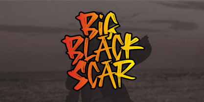 Black Big Scar is a cool hand brush font with a graffiti style. This kind of font is suitable for poster, apparel, product branding, etc. This font is also supporting multi-Languages, which include: Afrikaans Albanian Catalan Danish Dutch English Estonian Finnish French German Italian Norwegian Portuguese Spanish Swedish Zulu. So what's included: Basic Latin A-Z & a-z. Numbers, symbols, and punctuations. Multilingual Support. Accented Characters : ÀÁÂÃÄÅÆÇÈÉÊËÌÍÎÏÑÒÓÔÕÖØŒŠÙÚÛÜŸÝŽàáâãäåæçèéêëìíîïñòóôõöøœšùúûüýÿžß Thank You.
 - Arodora Pro by Arodora Type,
$40.00 Say hello to Arodora. Arodora is a creative sans serif family with modern and geometric lines. It easily adapts to all kinds of creative graphic works and screen applications and reflects you well with its modern appearance. Corporate identities, web designs, mobile applications, ui / ux designs will give you an advantage thanks to its unique appearance. Arodora also offers you Cyrillic Alphabet, Ligatures, Alternate Glyphs, and much more.
 - Royal Grande by Subqi Studio,
$20.00 Introducing our first old english black letter Royal Grande. Quite basic anatomy not the contemporary style. With this not too complicated black letter that make this font good for general display projects. We also make it a black letter family because we rarely see this kind of option in the market. Another good news , we also offer the variable format this time for the new font enthusias community.
 - Rugfish by Darumo,
$15.00 Introducing Rugfish, a playful chunky font with a cheerful and slightly infantile mood. This eclectic font is specially designed for vivid and eye-catching headers and allows you to do some crazy tricks with it like multi-colored letters or filling with patterns. Perfect for logo/emblem design, package design, etc. Also, it works really well if you are designing any kind of product for kids. Have fun using it!
 - Maletha Collection Signature by Yoga Letter,
$13.00 "Maletha Collection" is a font duo that combines elegant serif fonts and beautiful signature fonts. This font is very nice and can be used for all kinds of your work. "Maletha Collection" is perfect for making banners, posters, prints, logos, stickers, social media, weddings, promotions, decorations, portraits, presentations, and others. This font is very complete, because it is equipped with basic characters, uppercase, lowercase, multilingual support, numeral and punctuation.
 - Stigna by Kufic Studio,
$20.00 Stigna (All Caps) is a branding font to enhance and beautify your designs. A modern factor has been applied to bring a classy and elegant look. All characters have been manually designed to bring more into your graphics. The font has been created keeping in mind the modern and trending factors for web or printing. The font can be best used with Websites, magazines, and Social Media Posts. Stigna Font Family Includes: Stinga Regular, Stigna Italic, Stigna Bold, Stigna Expanded Regular, Stigna Expanded Italic, Stigna Expanded Bold, and Stigna Expanded Bold. Kufic Studio is a platform that provides professional and high-quality designs & fonts to fill the gap that has been missing in the market.
 - Dulcinea by Re-Type,
$79.00 Dulcinea is the title of Ramiro Espinoza’s in-depth look at Spanish Baroque calligraphy’s most extreme tendencies, and especially at some of those produced by the writing masters Pedro Díaz Morante and Juan Claudio Aznar de Polanco. These 17th and 18th centuries alphabets with their plentiful calligraphic flourishes represented a marked break with the harmonic and angular Renaissance Cancellaresca style. It was Morante who first introduced and popularized the use of the pointed quill in Spain, and although his famous text entitled “Arte Nueva de escribir” – first volume published in 1616 – contains alphabets that have much in common with traditional broad nib Cancellaresca calligraphy, most of the examples therein are outgrowths of the new models put forward by the Italian master Gianfrancesco Cresci. The writing’s swashes are complex and intricate, but at the same time they feature a profusion of defects. Many of them sometimes come close to ugliness. However, these pages contain an artistic essence that bears a relationship to the ironic and sometimes somber character of Spanish Baroque. That’s why the name of the font pays homage to “Dulcinea del Toboso”, the fictional beauty from Miguel de Cervantes’s ‘Don Quixote’, a work that reveals many of the period’s conflicts, such as the contrast between utopian ideals and reality, uncertainty and madness. But Dulcinea is far from being just a revival. Its forms are not careful tracings of the outlines of Morante and Polanco’s letters, nor are they attempts to reproduce them digitally. In fact, the author of the letters says that had the font been created that way it would have been too archaic to serve as acceptable contemporary typography. However, he believes that there are myriad interesting details that can be rescued and preserved, along with the playful spirit of the original. The work of designing Dulcinea consisted of combining original historical elements with the creativity and calligraphy of the font’s author in order to produce a modern typography that isn’t based on the same traditional sources as many recently created scripts fonts. Dulcinea offers attractive options for the setting of texts and headlines: abundant ligatures and swashes along with intricate alternate characters. It sophisticated forms make it an ideal option for women’s magazines, recipe books, lingerie products or perfume packaging.
 - Seashore Pro by Sudtipos,
$59.00 A feminine, graceful script whose thicker horizontals create a wave-like rhythm — hence the name. Seashore is loosely based on an "eccentric" (left-leaning) penmanship style of the late 19th century. Used mainly by professional "engrossers" in certificates and tributes, or by society ladies in their stationery and invitations, it sent a message of true refinement, as the style would have been only been mastered after the more common business, Spencerian, and standard ornamental styles. In fact, unusual script styles were in such demand that type foundries of the era exploded with metal-type knockoffs of increasing fanciness. Seashore includes a wide variety of swash capitals, alternate endings, and contextual ligatures, over 900 glyphs in all. Seashore is best used in short display settings — in names and addresses on formal invitations, in menus and food packaging, or fashion and beauty contexts.
 - Nora Grotesque by vve.type,
$34.99 Nora Grotesque is a modern sans serif type family of five weights plus true matching obliques, all completely equipped with opentype features, fractions, lining numbers, old style figures, capsular numbers, superscript and inferiors. It has been designed parallel within the neogrotesque universe of typefaces and is inspired by humanist proportions and humanist-grotesk features in multiple languages, support Central and Eastern European as well as Western European languages. Working on Nora Grotesque type family, we've aimed to create a modern geometric grotesk with the widest implementation range, a reliable workhorse. Nora Grotesque is equipped for complex, professional typography with a high x-height for maximum legibility and a powerful personality then other alternates. We've been especially careful working on the uniq geometry of each glyph, both from the point of view of visual correctness and forms continuity.
 - Blacker Pro by Zetafonts,
$39.00 Blacker Pro is the revised and extended version of the original wedge serif type family designed by Cosimo Lorenzo Pancini and Andrea Tartarelli in 2017. Blacker was developed as a take on the style that Jeremiah Shoaf has defined as the "evil serif" genre: typefaces with high contrast, oldstyle or modern serif proportions and sharp, blade-like triangular serifs. Due to the high contrast in the design - slightly reminescent of didone typefaces - Blacker has been developed in two optical subfamilies. The display version offers tighter tracking, higher contrast and sharper corners for maximum effect at big sizes, while the text variant offers better readability and screen rendering at smaller sizes, with lower contrast and looser spacing. In the pro version, two additional condensed variant families have been added (condensed display and condensed text) allowing for more freedom and versatility in typesetting where space constraints are present. Also, three titling uppercase-only variants have been added, with a slightly extended feel, and two decorative subfamilies (inline and diamond). Each of these seven variants has been developed in six weights from light to heavy, with matching italics, for a total of 69 styles covering a wide range of editorial and advertising uses. All Blacker Pro feature a revised and extended character set covering over two hundred languages using the latin, cyrillic and greek alphabets. Open type features include small caps, positional numerals, fractions, superior & inferior figures, alternate forms, and an extended set of standard and discretionary ligatures. With its bold personality, Blacker aims to be a modern classic used for bold statements and self-conscious brands, making your text look great both on paper and on the screens.
 - Hagrid by Zetafonts,
$39.00 Crypto-typography - the passion for unknown, weird and unusual character shapes - is a disease commonly affecting type designers. Cosimo Lorenzo Pancini has celebrated it in this typeface family, aptly named Hagrid after the half-blood giant with a passion for cryptozoology described by R. K. Rowling in her Harry Potter books. Extreme optical corrections, calligraphic counter-spaces, inverted contrast, over-the-top overshoots: all the inventions that abound in vernacular and experimental typography have been lovingly collected in this mongrel sans serif family, carefully balancing quirky solutions and solid grotesque design. Hagrid is a typeface designed for editorial & display use, bringing dynamism to the printed and digital page thanks to its extreme contrast and unique details. It has been developed in a range of six display weights ranging from the monolinear and more traditional thin to the expressive heavy weight. For better readability in small sizes and on the web, a companion text family has been developed, with a slightly different selection of weights, wider metrics, and fine adjustments to keep the dynamic expressivity of the design without sacrificing legibility. This is evident in the design of italics: while the display italics sport a cursive feel with calligraphic terminals to lowercase letters, the text design is more restrained, with a more classical geometric grotesque slanted look. Given the crypto-typographer love for foreign specimens of letters, special care has been put into making Hagrid ready for multilingual projects, giving it an extended character sets covering over two hundred languages that use Latin, Cyrillic and Arabic alphabets and adding a selected range of OpenType features to handle alternate forms and stylistic sets.
 - LHF Grants Antique by Letterhead Fonts,
$33.00 Nice for an authentic old fashioned flavor without being over-bearing.
 - Quantico by MADType,
$21.00 Quantico is an angular typeface family that was inspired by old beer packaging and military lettering. It utilizes 30 degree angles and completely straight lines to form unique character shapes. Equally at home in text or display settings, Quantico includes 3 alternate characters as well as several ligatures.
 - Nouveau Cartoon JNL by Jeff Levine,
$29.00 Samuel Welo’s “Studio Handbook – Letter and Design for Artists and Advertisers” was a go-to source of inspiration for generations of layout artists, graphic designers and sign painters. An interesting example of free-form pen lettering was found amongst the pages of one edition and it has now been recreated as a digital typeface called Nouveau Cartoon JNL; available in both regular and oblique versions.
 - Qiduwy by Twinletter,
$15.00 Qiduwy is a futuristic and stylish font perfect for designing labels, retro, stamps, badges, Oktoberfest posters, packaging, titles, beer, logos, barbershops, whiskeys, tattoos, music, movies, or certificates. This font is perfect for a dark and mysterious look. Bold black lines make this font perfect for a classy and stylish look. The wide, bold typeface gives this font an upscale look. Sharp corners and edges add a touch of class. This is the perfect font for a dark and mysterious look.
 - Cub Reporter JNL by Jeff Levine,
$29.00 In the 1934 edition of the American Type Foundry’s “Book of American Type” is a selection of letterpress fonts which emulate typewriter faces. One design named “Bulletin Typewriter” served at the model for Cub Reporter JNL, and is available in both regular and oblique versions. The font has been monospaced in order to add a more traditional typewriter look to any project.
 - Vinea by Greater Albion Typefounders,
$12.00 Vinea is a family of ten display faces that take us on an enjoyable excursion into the world of the retro-futuristic. Ideal for posters, book covers, and anything that needs the sort of futuristic feel that abounded in designs from the 30s to the fifties. The en faces have been designed with uniform metrics, to facilitate multi-coloured overlay effects.
 - Annabelle Matinee NF by Nick's Fonts,
$10.00A charming headline font, bold yet feminine, based on Lilith, designed by Lucien Bernhard for Bauersche Gießerei in 1930. Some of the fussier elements of the original have been removed in order to create an elegant exercise in typographic chiaroscuro. Both versions of this font contain the Unicode 1252 (Latin) and Unicode 1250 (Central European) character sets, with localization for Romanian and Moldovan. - Esfera NF by Nick's Fonts,
$10.00This handy family takes its design cues from Beton, a slab serif designed by Heinrich Jost for Bauersche Gießerei in 1931. A number of characters have been softened by the addition of ball terminals, commonly seen on manual typewriter type in the 1950s. Both versions of this font contain the complete Latin A Extended character set, as well as extended ligatures and fractions. - RM Serif by Ray Meadows,
$19.00 A modern classic which will readily find a place in your font folder. Great effort has been taken to ensure the balance of color and weight for every glyph to promote flowing legibility. Due to the modular nature of this design there may be a slight lack of smoothness to the curves at very large point sizes (around 100 pt and above).
 - Libran by Bean & Morris,
$35.00 The Libran font family consists of Libran Regular, Libran Italic, Libran Antique and Libran Small Caps. The broad open counters make for easy reading with a touch of classic roman clarity. The diminutive serifs add a suggestion of the hand crafted origins without obstructing Its clean, contemporary lines. Libran’s generous x-height and short ascenders have been carefully proportioned to maximise reproduction qualities.
 - Oakes Grotesk by Studio Few,
$12.00 Oakes Grotesk is a more corporate take on the Oakes typeface. It explores a set of brand new metrics that allow it to be more legible in body text as well as headings. The letter 'g' has been tweaked to become double-story as well as the refinement of other characters. This is all whilst maintaining the subtle curves of the Oakes typeface.
 - Retail Establishment JNL by Jeff Levine,
$29.00 The 1935 catalog for Vitrolite (a brand of pigmented structural glass) featured artist renderings of how the glass could be applied to business exteriors. One of the lettering styles used in these examples was an Art Deco lower case. This design has been turned into a digital typeface called Retail Establishment JNL and is available in both regular and oblique versions.
 - Santral by Taner Ardali,
$39.00 Santral typeface has been designed with the idea of achieving the ideal balance of geometrical perfection and optical impression. The sharp and precise design of Santral leads to a clear and reliable communuciation with the reader. 12 weights and italic versions, including kerning values and Opentype layout features provide all typographic equipments to get the best result for the typographic layouts.
 - Wyoming Macroni by Ingrimayne Type,
$14.95 Wyoming Macroni is the split-serif (or Tuscan) version of the Wyoming series. The Pegged version adds a horizontal spike through the middle of the stems, which has been a popular variation of this style. Included in the family are two shadowed versions. The ShadowedInside styles can be used in layers with the Shadowed styles to easily create two-colored letters.
 - Musical Comedy JNL by Jeff Levine,
$29.00 The hand lettered show card brush lettering in the trailer for the 1960 musical comedy “Bells are Ringing” (starring Dean Martin and Judy Holliday) inspired Musical Comedy JNL, which is available in both regular and oblique versions.
 - Moyenage by Storm Type Foundry,
$55.00Blackletter typefaces follow certain fixed rules, both in respect to their forms and to the orthography. Possibly, they were a reaction to the half-developed Carolingian minuscule which was soon to end in the Latin script. Narrow, ordered script was to replace the round, hesitant and shattered shapes of letters in order to simplify writing, to unify the meaning of individual letters, and to save some parchment, too. Opposed to the practice common in monasterial scriptoriums where Uncial, Irish and Carolingian inspiration flew freely and as a result, the styles of writing differed in each monastery, the blackletter type was to define one, common standard. It was to express spiritual verticality, in perfect tune with the architecture of the Gothic era. Typography became an integral part of the overall style of the period. The pointed arch and the blackletter type were the vanguard of the spectacular transformation from the Middle Ages towards the modern era, they were a celebration of a time when works of art were not signed by their makers yet. Some unfortunate souls keep linking blackletter solely with Germany and the Third Reich, while the truth is that its direct predecessor, the Gothic minuscule, evolved mostly in France. Even Hitler himself indicated blackletter type obsolete in the age of steel, iron and concrete – thus making a significant contribution to the spreading of the Latin script in Germany. Once we leave our prejudice aside, we find that the shapes of blackletter type have exceptional potential, unheard of in sans-serif letterforms. The lower case letters fit into an imaginary rectangle which is easily extended both upwards and sideways. In its scope and in the name itself, the Moyenage type family project is to celebrate the diversity of the Middle Ages. I begun realizing the urge to design my own blackletter when visiting the beer gardens of Munich and while walking through the villages of rural Austria. The letters from the notice boards of inns are scented with spring air, with the flowers of cudweed, with white sausage and weissbier. The crooked calligraphic hooks and beaks seem to imitate the hearty yodeling of local drinkers and the rustle of the giant skirts of girls who distribute the giant wreaths of beer jugs. Moyenage is, however, a modern replica of blackletter, so it contains some otherwise unacceptable Latin script elements in upper case. I chose these keeping the modern reader in mind, striving for better legibility. The font is drawn as if written with a flat pen or brush, and with the ambition to, perhaps, serve as a calligraphic model. In medium width, the face is surprisingly well legible; it is perfect for menus as well as posters and CD covers for some of the heavier kinds of music. It has five types of numerals and also a set of Cyrillic script, symbolising the lovelorn union of Germans and Russians in the 20th century. Thus, it is well suited for the setting of bilingual texts of the German classic literature, which, according to the ancient rules, must not be set in Latin script.