3,102 search results
(0.02 seconds)
- Daliwood NF by Nick's Fonts,
$10.00This quirky charmer is based on a typeface called "Les Catalanes", designed in 1952 by Enric Crous-Vidal for Fonderie Typographique Française. Appropriately, it is named for the king of quirky Cataláns. - Velvet by Reserves,
$39.99 Velvet is a heavy rounded block retro face inspired by the typeset album cover of the protopunk rock band The Velvet Underground’s debut. Stylistically, Velvet’s extreme angled terminals exude a sense of tension and irreverance, contrasting the smooth rounded block letter forms.
 - Florensa by Variatype,
$16.00 Florensa was designed carefully with love and passion, created for type poster design, graphic design, logotype, branding, and choose everything you want. Contains more than 50 beautiful ligatures to produce a modern look and playful typography, upgrade your design creativity with Florensa.
 - La Volicia by Prominent and Affluent,
$30.00 A modernist typeface with powerful elegance. This bold and sophisticated font captures the essence of idealistic beauty through its tension, balance, and unexpected shapes. Inspired by the ideals of modernism, creating a distinct look that is sure to make a lasting impression.
 - Fried Cassava by Gassstype,
$22.00 Fried Cassava - Natural Handwritten Font with a natural style and dramatic movement. Crafted manually with love and passion, This font is great for your next creative project such as logos, printed quotes, invitations, cards, product packaging, headers, Logotype, Letterhead, Poster, Label, and etc.
 - Boochild by Gassstype,
$28.00 Boochild - Natural Handwritten Brush Font with a natural style and dramatic movement. Crafted manually with love and passion, This font is great for your next creative project such as logos, printed quotes, invitations, cards, product packaging, headers, Logotype, Letterhead, Poster, Label, and etc.
 - Bruce Old Style by Bitstream,
$29.99This is the Bruce Foundry’s Old Style No.20, which was loosely based on the Miller & Richard Old Style. It was recut at Lanston under Sol Hess’ direction in 1909, and survives as the second text face in the Sears Roebuck Catalogue. - Sanstuy by Gassstype,
$22.00 Sanstuy - Dynamic Typeface Font with a natural style and dramatic movement. Crafted manually with love and passion, This font is great for your next creative project such as logos, printed quotes, invitations, cards, product packaging, headers, Logotype, Letterhead, Poster, Label, and etc.
 - LTC Glamour by Lanston Type Co.,
$24.95 Glamour was originally released by Lanston Monotype in 1948. It is based on Corvinus designed by Imre Reiner. P22 Designer Colin Kahn has added some unusual variants to this family illustrating that Glamour can be taken too far and have somewhat unglamorous results.
 - Kotes by Gassstype,
$22.00 Kotes - Natural Handwritten Allcaps Font with a natural style and dramatic movement. Crafted manually with love and passion, This font is great for your next creative project such as logos, printed quotes, invitations, cards, product packaging, headers, Logotype, Letterhead, Poster, Label, and etc.
 - Ninces by Twinletter,
$15.00 cartoon, bubble, bubble letter, San serif, funny, kids, movie, cinema, playful, poster, minions, game, handwriting, child, comic, comic book, youtube, school, teacher, cute, dental, quote, event, typeface, children, fun, drink, headlines, magazine, branding,
 - Juan Carlos by Homelessfonts,
$49.00 Homelessfonts is an initiative by the Arrels foundation to support, raise awareness and bring some dignity to the life of homeless people in Barcelona Spain. Each of the fonts was carefully digitized from the handwriting of different homeless people who agreed to participate in this initiative. A biography/story of each homeless person captures their story, to help raise awareness and bring some dignity to the life of homeless people. Monotype is pleased to donate all revenue from the sales of Homelessfonts to the Arrels foundation in support of their mission to provide the homeless people in Barcelona with a path to independence with accommodations, food, social and health care. Juan Carlos was born in Barcelona, Spain 46 years ago. Since the age of 17 – and during eleven years – he worked double shifts of eight hours every day in a factory. Excessive work and family problems debilitated his health and he lost his job. He then faced a dilemma: to spend unemployment benefits to pay for rent or for food. For a few years, he worked helping in the kitchens of different restaurants while he lived on a pension, until he was definitively left without work and ended up living in the street for 10 years. “In the street I tried to find rest in the ATMs of banks. I preferred to be alone, and if I ran into conflictive people, I looked for somewhere else” he explains. Living in the street he was the victim of an aggression. Since then, with the help of Arrels he moved into a pension. Today, Juan Carlos is a volunteer in the shower service of Arrels, the same showers he used during years. He also collaborates with the maintenance team, helps prepare hygienic and cleaning material, and participates in activities such as the theatre group and the football team.
 - Alexaniri by Gassstype,
$25.00 Alexaniri is a Handwritten Brush font with a natural Rough style and dramatic movement. Crafted manually with love and passion, This font is great for your next creative project such as logos, printed quotes, invitations, cards, product packaging, headers, Logotype, Letterhead, Poster, Label, and etc.
 - LTC Remington Typewriter by Lanston Type Co.,
$39.95 Remington Typewriter, whose original designer is unknown, was one of the earliest Lanston Monotype designs. The italic was designed by Frederic Goudy in 1927. His approach was to make an unconventional typewriter form that looked well-spaced even though all letters shared the same width.
 - Schmalfette CP by CounterPoint Type Studio,
$29.95 SchmalfetteCP is the result of another collaboration between designers Jason Walcott and Rob King. King suggested that Walcott revive this wonderful and somewhat forgotten sans serif typeface from the mid 1950s. Originally designed by Walter Haettenschweiler in 1954, Schmalfette Grotesk was used for many years in the German magazine "Twen". The typeface was notoriously hard to acquire at the time and graphic designers in the USA often resorted to cutting letters from the Twen magazines and reusing them in their own designs. Later, when digital type came along several typefaces very similar were created that claimed to be digital revivals of Schmalfette Grotesk. However, they are actually only loosely based on the original. The proportions are different and in some cases a lower case was added. The original font was all caps. At Rob King's suggestion, Jason Walcott has strived to recreate the most faithful digital revival possible of the original Schmalfette Grotesk with the new version of SchmalfetteCP. In some cases small changes were made to accommodate today's digital needs (e.g. web fonts), but anyone who has ever searched for this typeface now has a version available that most closely resembles Haettenschweiler's original work. Schmalfette CP comes in OpenType format in both .ttf and .otf files and offers support for all Latin based and Eastern European languages.
 - Creatie by MaxnorType,
$12.00 Creatie is a lovely modern script font. This beautiful hand-lettered script font is perfect for styling logos, stationery, social media, websites and much more! Creatie was created with multilingual support, ligatures, contextual alternates, stylistic alternates, swash and wings, allowing you to create a great look to your projects. These features work well in programs that support OpenType features, such as Adobe Indesign, Illustrator, and Photoshop. The start wings and end wings use contextual alternates and ligature features, making it easy to access and change the wing style simply by changing the number on the end of the wing formula.
 - LTC Bixler Ornaments by Lanston Type Co.,
$24.95 LTC Bixler Ornaments One includes all designs found in the metal Bixler Type Handypacks #1–6 from P22 that were created using actual Lanston mats to cast these metal type sets. The 14 designs found in the metal type are presented in this digital version—each rotated and optimized to align easily and tightly for digital layouts.? LTC Bixler Ornaments Two incudes all designs found in the metal Bixler Type Handypacks #7–14 from P22 that were created using actual Lanston mats to cast these metal type sets. The 17 designs found in the metal type are presented in this digital version—each rotated and optimized to align easily and tightly for digital layouts.
 - Bolívar by César Puertas,
$39.95 Bolívar is a contemporary display typeface inspired in the handwriting of one of the most prominent personalities of the Latin American 19th century: Simón Bolívar, “the liberator". The typeface intends to capture the passion of handwritten letterforms and to translate it into type. Among the characteristics that best contribute to its strong personality, are the impressive length of ascenders and descenders as well as the more than 45 degrees of slant. Bolívar mimics certain aspects of handwriting such as the slightly different baseline for each letter and ink clogs in the counters of some letters. Use Bolívar whenever you need to add passion to a piece of text, from logos or single words to sentences and captions.
 - Kis Classico by Linotype,
$29.99Kis Classico™ is named after the Hungarian monk Miklós Kis who traveled to Amsterdam at the end of the seventeenth century to learn the art of printing. Amsterdam was a center of printing and punchcutting, and Kis cut his own type there in about 1685. For centuries, Kis's type was wrongly attributed to Anton Janson, a Dutch punchcutter who worked in Leipzig in the seventeenth century. Most versions of this type still go by the name Janson. In 1993, the Italian/Swedish type designer Franko Luin completed Kis Classico, his own contemporary interpretation of the Kis types. About the Kis/Janson story, Luin says: If you understand Hungarian I recommend you read the monograph, 'Tótfalusi Kis Miklós' by György Haiman, published in 1972 by Magyar Helikon. It has hundreds of reproductions from his Amsterdam period and from the time when he was an established printer in Kolozsvár (today's Cluj in Romania)." Kis Classico has five weights, and is an admirable version of this classic type. - Royal Bavarian by Wiescher Design,
$39.50 RoyalBavarian was comissioned by King Ludwig the First of Bavaria about 1834. He was probably the greatest king Bavaria ever had, but he fell in disgrace for a short affair with the infamous Lola Montez and subsequently had to resign. He died in 1868, peaceful and happy in Nice on the French Riviera. I happened on an original etching of his type-guidelines for official writers of those days about 20 years ago. I always thought it was a very nice Fraktur (Blackletter), not a sturdy militaristic one as most of them are. Being me, I started with first tests immediately and then just forgot the font on my computer. When I was sorting out old stuff a couple of months ago I happened on the etchings once again and kept on working intermittently on the letters. The Plain cut is pretty much like the king wanted it. The Fancy cut is more to my liking and very decorative. Yours in a royal mood, Gert Wiescher.
 - Swine And Roses by Proportional Lime,
$1.99 It's cool to be square. Among the many strange attempts to conceal writing, these two systems allegedly used by the Masons have a wonderful simplicity and relative ease of use. Both systems, the Rosicrucian and Free Mason, (also called the Pigpen cypher) as simple replacement ciphers never offered very great cryptographic security, but certainly would ensure that the casual observer would not be able to read documents written in such scripts.
 - Brush In Space by Gassstype,
$25.00 **Brush in Space** - Handwritten Brush font with a natural Rough style and comical type. Crafted manually with love and passion, This font is great for your next creative project such as logos, printed quotes, invitations, cards, product packaging, headers, Logotype, Letterhead, Poster, Label, Game project and etc.
 - Trust Issue by Gassstype,
$23.00 Trust Issue - Natural Fun Handmade Font Handwritten Allcaps Font with a natural style and dramatic movement. Crafted manually with love and passion, This font is great for your next creative project such as logos, printed quotes, invitations, cards, product packaging, headers, Logotype, Letterhead, Poster, Label, and etc.
 - Heavens Cildren Script by Zane Studio,
$15.00 Duo Heavens Children Font is a script font that contains over 450 alternatives, is very easy to play, and the best part: You also have lots of illustrations to play with, not to mention various arrows you can toggle at the start and end of each word!
 - Brand X JNL by Jeff Levine,
$29.00 Brand X JNL is a retro-inspired Art Deco typeface with its name being derived from the generic label given to competitor's brands. Whenever a product wishes to extol its virtues without directly naming its competitors and thereby giving reverse publicity to them, "Brand X" is mentioned.
 - Kingthings Spike - 100% free

- Independant - Small Caps - Unknown license

- TiredOfCourier by Ingrimayne Type,
$14.95 Courier is the king of typewriter faces. But if you want an alternative, something with a look reminiscent of the older, manual typewriters, consider TiredOfCourier. The family includes true italics, something very unusual in a typewriter face.
 - Independant - Unknown license

- Cift by Graptail,
$15.00 Cift Serif is inspired by the work of charming lettering artists with a combination of Old Style Display Bold. Each letter is modified so that the distance, width and weight can give the beauty of the alternates given. A passionate curve gives a touch of beauty to this font.
 - Attomi Gilbert by Motokiwo,
$16.00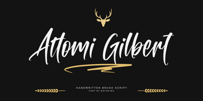 Organic handwriting gesture from a cool brush that useful for multipurpose projects. This is Attomi Gilbert, an elegant script font with passionate handmade feels in each characters. You can use it for vintage or urban projects style. Features: Ligatures Swashes Access All Alternates Special Characters (Multilingual) PUA Encoded
 - Ailey Display by Graptail,
$15.00 Ailey Display is inspired by the work of charming lettering artists with a combination of Old Style Display Bold. Each letter is modified so that the distance, width and weight can give the beauty of the alternates given. A passionate curve gives a touch of beauty to this font.
 - Dotoria Slant by Gassstype,
$19.00 Hello Everyone, Introduce our new collection Dotoria is a Handwritten Brush font with comical type. Crafted manually with love and passion, This font is great for your next creative project such as logos, printed quotes, invitations, cards, product packaging, headers, Logotype, Letterhead, Poster, Label, Game project and etc.
 - Red Square by Letterhead Studio-YG,
$40.00 Red Ring and Red Square - the super-family of two families of fonts. The super-family includes sanserif Red Ring and geometric font Red Square. Families are synchronized by the number and weight of the typefaces and can be used either separately or together. Together Ring and Square produce a cumulative effect of Art Deco and Constructivism.
 - Kingthings Petrock - Unknown license

- Goudy Initialen - Personal use only

- LTC Nicolas Cochin by Lanston Type Co.,
$24.95 Nicolas Cochin (not to be confused with another font named simply "Cochin") was originally designed by Georges Peignot in the early 20th Century and was based on engraved letters of the 17th Century artist Charles Nicholas Cochin. Many foundries including Lanston released versions in the 1920s. Several digital versions can now be found, but none have kept the irregular details of the metal type which include strokes that cross over each other as if hand drawn (see letters K & y). The new Lanston digitization is the only digital version to retain the idiosyncratic treatment which makes the metal type so alluring. The Opentype version included an expanded Central European character set as well as ligatures, alternates, fractions, superior/inferior numerals (the Italic also has swash characters).
 - Senlot Serif by insigne,
$29.00 Senlot Serif is a follow-up to the technical yet elegant sans serif Senlot . In this serif edition, the original’s calligraphic tension shines through, with a moderate amount of contrast. Moreover, you can use Senlot Serif to set large amounts of text or for titling. It has a special calligraphic tension, and lends itself to luxury and design work of high quality. There’s a full set of small capitals and titling capitals and a real italic. Including thin to heavy, there are nine weights and three widths. Also included are a full set of OpenType features, super and subscript, old style numbers, and expanded Latin with support for more than 72 languages. For your next luxury campaign, the new rich text is Senlot Serif.
 - Basco Std by Typofonderie,
$59.00 A mix of Renaissance & tropical atmosphere Basco is an exploration of the Renaissance style, a period in which letterforms were informed primarily by hand writing. It is clearly a contemporary interpretation of calligraphic shapes forms. The serifs are subtly asymmetrical. Slightly curved arches on the n, m and u are noticeable, creating an interesting tension in the text. Bruno Mello’s distinctive style is most obvious in his mastery of super fluid curves. It is a result of his extensive exploration of calligraphic forms, their tensions and dynamics, mixing angularities with curves. The roman weights include alternate swashes, as well as initial and terminal glyphs. The italics, based on chancellery script, feature simple stroke endings, most visible on the s and c. ➼ Basco minisite
 - Tita Script by Latinotype,
$59.00 Tita is dedicated to my grandmother Hebe, witty and arrabalera 1. The font is inspired by Milonga 2 music and the fileteado porteño 3. I picture it at The Moulin Rouge, sparkling, provocative, loving. It evokes Tita Merello and my grandmum singing her music. Tita is Argentinean to its very core. A font to shout goal and dulce de leche 4 with passion! Its curves originate from polirhythmic calligraphy, which I learnt from my mentor Silvia Cordero Vega. Tita is a pedigree script that is based on hand lettering and Sandra Biondi’s calligraphy works. Font digitalisation by Daniel Hernández. Edited by Javier Quintana / Programmed by Manuel Corradine. 1. A person from the arrabal (a working class neighborhood on the outskirts of the city of Buenos Aires) 2. Musical genre originated in the Río de la Plata areas of Argentina and Uruguay 3. Decorative hand lettering and artistic style that is frequently spotted in Buenos Aires 4. Sweet milk sauce


