9,322 search results
(0.026 seconds)
- Anziano Pro by MAC Rhino Fonts,
$59.00 Anziano follows the direction staked out with Delicato. When creating traditional typefaces, it is inevitable to be influenced by earlier designs. Anziano does show touches of another classic typeface – Weiss (by Emil Rudolf Weiss, 1926). Weiss is often misjudged and overlooked. Perhaps the most well known Swedish typeface – Berling (by Karl-Erik Forsberg, 1914–1995) is actually based largely on Weiss. MRF have appreciated the design of Weiss uprights for a long time. When Stefan Hattenbach bought the first Swedish edition of The Lord of the Rings (1959–61), in 2004, he was amazed by the excellent flow of the text presented on each page. Despite the very original character that Weiss has, it was a pleasure to read a book set in such a typeface. MRF realized that several major foundries had already done interpretations of Weiss, more or less true to the original. MRF didn’t want to add on to that list! Instead Stefan tried to find his own path. Anziano consists of three core styles, Regular, Italic and Bold; each with small caps, ornaments, stylistic ligatures, and extended Latin accents. Lining, tabular, oldstyle and smallcap numerals help round out Anziano’s typographic range and function.
 - Dealova by HKL Studio,
$19.00 Dealova Script is the font of choice for writing things beyond words. This typeface is designed with great detail to convey stylish elegance. So, it can be said, the character of the transformation is very beautiful, a kind of classic ornamental copper script. Dealova Script provides alternative variants of most fonts, binders and many calligraphy tips, ideal for elegant labels, high-end packaging, stationery and composition for specific brands, beautiful titles, paragraphs, fonts and short text intended for read only with the eye or intended to be whispered into someone's ear. Dealova Script has 691+ glyphs and 440 alternate characters, including multiple language support. It features OpenType with alternate styles and elegant binding. The OpenType features don't work automatically, but you can access them manually and for best results your creativity will be required in combining variations of these Glyphs. And also a touch of ornament makes this font look elegant. To enable the OpenType Stylistic alternative, you need a program that supports OpenType features such as Adobe Illustrator CS, Adobe Indesign & CorelDraw X6-X7, Microsoft Word 2010 or later. (Windows), Font Book (Mac) or a software program such as PopChar (for Windows and Mac).
 - Kereru by Daniel Reeve,
$20.00 Artist and calligrapher Daniel Reeve, well known for the lettering and maps in The Lord of the Rings films, is creating hand-crafted fonts of some of his writing styles - Kereru is the inaugural release, allowing users to emulate some of his much-admired calligraphy. Nominally a half-uncial style, clever arrangements of the stylistic sets allow Kereru to be set as full uncial or standard roman, as well as offering numerous alternates, ligatures, swashes and flourishes, ornaments, unlimited fractions, scientific inferiors and numeric superscript, all accessible via OpenType features. Cyrillic and Greek alphabets are included, in addition to the letters required for all the languages of Western, Central and Eastern Europe, Scandinavia and the Baltic. Kereru is very legible and easy on the eye, without sacrificing calligraphic flair. A pdf description of the Stylistic Sets and their usage is included with the font package, which comprises regular, bold and italic variations. Kereru Italic supercedes and improves upon its previous incarnation, Shire Regular. The name Kereru comes from New Zealand's Maori language - it is our native wood pigeon, a bird of generous and rounded form, like the font itself.
 - Expreso by JVB Fonts,
$19.00 EXPRESO was inspired by the extinct art and craft of urban Lettering applied to buses and other kind of cars for public service of transportation. Since the mid of last century, main cities of Colombia - as Bogotá, Medellín and others - were growing in population and brought urban area expansion with it and serious traffic problems due to the lack of political will and urban planning. The problem of urban transport in Colombia's largest cities has not yet been resolved, despite adopting some examples of mass transit system in other cities in the region. Before these actions, public transport in cities such as Bogotá was quite varied, leaving space for popular culture that survived for a couple of decades, until the massive dieback of these old buses early this decade, either by practices associated with Lettering it was displaced by some technological, some expressions of art street and city that evolved or disappeared. EXPRESO can be used mainly in titles and display texts. You have a multitude of options using combination of layers from the basics of the font family to the various textures and shades. Supports East Europe languages.
 - Bartosh by jpFonts,
$19.90 Bartosh is the American short form for Bartholomew. Although I chose this font name because of its sound and its short conciseness, I also liked the fact that Bartholomew had been one of the 12 apostles who had worked in India and Iran and the idea that his spirit could be the inspiration for my work.Bartosh was designed for display on the screen: the large x-height and the clear, open shapes facilitate readability. As a result, it develops a strong expression of character and makes it ideal for headings or highlighting individual text passages – it is ideal for captions of any kind. In each of the six weights, it unfolds its own and special charm. The extra-bold version is particularly noteworthy because fonts in this stroke width are rare and it is precisely these extreme bolds that give them a special graphic appeal.For all fonts there are matching italics in a well-developed set of 677 characters. In addition, it is possible to change the digits and currency characters from proportional to tabular or OldStyle via the OpenType feature, and small caps are also available in all fonts.
 - Fakir Pro by Underware,
$50.00 Fakir | A Hindu ascetic or religious mendicant, especially one who performs feats of magic or endurance. The well known feats performed by them include sitting steadily on a bed of nails and walking on burning coals. Blackletter | A script used throughout Western Europe from approximately 1150 to 1500. It continued to be used for the German language until the 20th century. Fakir, a blackletter with a holy kiss is a contemporary interpretation of gone letterforms with origin in blackletters. More precisely, we based the construction on broadnip textura, with lots of broken, edgy, interrupted strokes – try to sit on a nail bed and you’ll know why fakirs like to read just these kind of fonts! After being abandoned for some time (not accepted, nearly forbidden), we would like to give our generation a blackletter from here and now. So Fakir is not a revival, but an all new 21st-century blackletter. Fakir is a set of edgy text and display fonts, ranging from tight and heavy to light and wide. It has 11 fonts, all supporting Underware Latin Plus character set, that covers 219 languages.
 - The Daylight by Krafted,
$10.00 Get ready to transcend to a world of magic, laughter, and butterflies. Your branding will spark delight and engage everyone who sees it! Introducing The Daylight - A Calligraphy Font. A beautifully handcrafted calligraphy font that’ll make your guests sing and elevate your projects! Every swash, stroke, and curve was created to entice happiness and elegance. The ideal font for social media banners; posts, and ads, printed quotes, t-shirt designs, packaging, or even as a modern text overlay to any background image. The Daylight includes gorgeous swashes and ligatures that give the font even more flair! What you’ll get: Multilingual & Ligature Support Full sets of Punctuation and Numerals Compatible with: Adobe Suite Microsoft Office KeyNote Pages Software Requirements: The fonts that you’ll receive in the pack are widely supported by most software. In order to get the full functionality of the selection of standard ligatures (custom created letters) in the script font, any software that can read OpenType fonts will work. We hope you enjoy this font and that it makes your branding sparkle! Feel free to reach out to us if you’d like more information or if you have any concerns.
 - Sketchen by Mike Zuidgeest,
$10.00 Hey there! As the proud creator of Sketchen, I'm stoked to introduce you to my latest font creation! Sketchen is a sketch style font that's just perfect for outdoor advertising and menus. Imagine a beachy vibe, summer vibes, and a whole lot of fun – that's what Sketchen brings to the table! I designed Sketchen to capture the essence of summertime and the carefree attitude of beach life. With its playful, hand-drawn style, Sketchen adds a whimsical touch to any design project. Whether you're creating a menu for a tiki bar or promoting a surf competition, Sketchen is the perfect font to convey a sunny, laid-back feeling. Sketchen's bold, eye-catching letters ensure that your designs won't be missed. And with its relaxed, playful vibe, it's sure to make a splash in any setting. So why not give Sketchen a try and see what kind of summery designs you can come up with? With Sketchen, you can add a touch of fun to all your outdoor advertising and menu design projects. So let your creativity run wild and see where Sketchen takes you!
 - Plethora by Sudtipos,
$49.00 A few years ago I've discovered the work of one of the most prolific typeface designers of the Bruce type Foundry in NYC during late nineteenth century. Browsing Julius Herriet's work I found a very unique kind of ligatures in his patented "Old Style Ornamented" type design. Some letters were designed with a little top tail that allowed them to connect to each other. After that, I found that he also designed a single italic weight of the same font 7 years later. Since the beginning of the Opentype days I’ve been deeply obsessed with exploring different ways to build ligatures, so that lead me up to this point where I felt the need to create “Plethora”, this new font inspired by Herriet’s work. Extrapolating weights, adding variable technology and playing with additional interconnected letters and alternates. Definitely, Plethora means a large or excessive amount of something, and this font tries to bring back this abundance of details two centuries later. Available in 9 weights, from roman to italic, and also as variable format, “Plethora” supports plenty of latin languages and is a perfect choice for today’s design tides.
 - Pantographia by Intellecta Design,
$9.00Pantographia Collection is a Intellecta digitization, in facsimile style, without artistical interpretation of any kind, of the work of Edmund Fry (monumental book), Pantographia , a work on languages containing over 200 alphabets. We just are collecting in digital way these alphabets. Each alphabet has a short pdf description (see in the gallery). For example, in the pdf brochure of the "Saracen One" font, according to Edmund Fry, "This characters, according to Theseus Ambrosius, was used by the Saracens at the time of their conquests. Claude Duret, p. 475." Ambrosius, Theseus: Introductio in Chaldaicam lingua, Syriaca, atque Armenicam, [et] dece*. - 1539. Theseus Ambrosius or AMBROGIO, was an Italian orientalist, which born in 1469, and died in 1539 - He wrote his Introduction to the Chaldean, Syrian, Armenian, and ten other tongues, with the alphabetical characters of about forty different languages, 4to." The Pantographia font have only the original characters showed in Fry's book. There are instructions in the PDF files to get them. These fonts have no philological (or linguistic) academic pretentions. They are digitized and faithful versions of the original, like first published at Fry's book. - Authentic Romantic by SilverStag,
$14.00 A brand new year is here and a brand new font is here as well. I have to say I had so much fun working on this funky slab serif typeface. I have created some quirky letters and over 100 ligatures + the font comes in four weights - light, regular, medium & italic. The font also includes full language support, punctuation, numerals and detailed instructions how to use ligatures in most of the apps on your computer, as well as in Canva. I invite you to check out the preview images, and I hope you will be immersed in my vision for this creative typeface that, I am sure, will work for all kinds of interesting projects you might be working on this year. If you end up publishing your designs on Instagram, tag me - @silverstagco and I will make sure to showcase your design and work to my audience as well! Authentic Romantic - Slab Serif Font Includes: 100+ Ligatures Numerals & Punctuation Language Support Detailed instructions on how to use alternates in most of the apps on your computer as well for Canva Happy creating everyone!
 - Dragonflight Pro by Fontforecast,
$29.00 Dragonflight Pro is a script collection of four modern calligraphy fonts. Each glyph was hand-drawn with a brass folded pen dipped in ink. The tip of the folded pen resembles the shape of a dragonfly’s wing, hence the name. By tilting the pen variations in line width are made. This produces fun, expressive letters with a spontaneous personality. The regular and rough version of Dragonflight Pro have alternate glyphs that can either be accessed by the swashes feature, stylistic set 1, or the glyphs panel, depending on the application you are using. There are lots of discretionary ligatures that offer even more variation. By typing _1 to _10 you can access bonus swashes that are part of Dragonflight Pro Regular and Rough. Both fonts have 567 glyphs. Dragonflight Pro Sans is an all caps font with 402 glyphs, also hand-drawn with the folded pen, that compliments the other styles perfectly. Dragonflight Pro Extra offers an additional 117 swashes, doodles and ink splatters. With Discretionary Ligatures activated you can type an underscore in front of a letter and (when available) this gives you the rough version of the glyph.
 - Kefir by ROHH,
$39.00 Kefir™ is charismatic, cheerful and full of character. It is inspired by such classics as Cooper and Windsor and serves as their modern alternative. It is a display font family with very strong personality and feels at home in editorial design, all kinds of headlines, posters, badges, websites and branding. Its light weights let you set friendly and legible paragraphs of text as well! Kefir has beautifully flowing lines, its nature is soft, rounded and elegant with charming retro vibes. The letterforms were crafted with much passion and love in order to send powerful positive message whenever used! Kefir has two additional stylistic sets to adjust the font to your liking and decide if you choose upright or sloping stems (in characters like h, m ,n , a) or go even more playful with some super-friendly letterforms. Kefir family consists of 7 styles + 1 variable font, letting you adjust the weight to your exact needs. It has extended latin language support as well as broad number of OpenType features, such as stylistic sets case sensitive forms, ligatures, swash caps, final forms, contextual alternates, lining & oldstyle figures, basic fractions, superscript and subscript, ordinals, currencies and symbols.
 - Lattolatoo by Zamjump,
$17.00 Lattolatoo is a unique modern display font with a fun and trendy kind of street style twist. From poster designs to t-shirts and packaging, Lattolatoo will give your designs an alternative to the minimal look and supercharge your creative work. Lattolatoo is hand-drawn, having an almost handwritten appearance; the characters skip the baseline giving it a charming yet modern look and feel. Alternative All characters A to Z one alternative. To make your text look less repetitive, you can substitute the letters for something else—this makes your design look more like handwriting. Ligature Lattolatoo has standard ligatures, 7 of them in total. You can activate it through the glyph panel in Adobe applications. The binder makes a huge difference in the look of Beautiful Freak. It switches the order of two popular letters making your design look more individual. opentype Please note: Alternatives and Binders use OpenType features. Therefore, you'll need a design application to access these options—an application such as Adobe Photoshop, Illustrator, or InDesign. Included : - Uppercase glyphs only (This font is unicase) - Punctuation, Symbols, and Numbers - Alternate A-Z characters (1 character) - 7 Ligatures - Support for Central, Western, and Southeast European characters
 - Pattern by Mauve Type,
$29.00 The Pattern Project is an ornamental display type family. It is inspired by medieval initials and transforms their mesmerizing rhichness of detail into cool state-of-the-art typography. All letter shapes and patterns are exclusively geometric, providing a very distinct and contemporary feel. Pattern is the new sexy – perfect for vodka labels, record sleeves and posters. For editorial design and packaging. With a special typographic impact. Some practical details: - Family consists of 9 diverse patterns + a blank version. - 3 weights available. - As with patterns in general: It is quite essential how far you zoom in to change the graphic impression. 3 pattern resolutions (Coarse, Medium + Fine) allow varying the pattern size independently from the font size. - Each pattern comes with diverse weights and/or pattern resolutions. - Use in display sizes only. The bigger – the better! - Fine pattern resolutions require even larger font sizes than coarse resolutions. - Fonts gain kind of ʺtransparencyʺ through the patterns - handy for use on top of images. - Characterset is caps only and supports Central, Eastern and Western European languages. - Entertaining 2 min movie explaining the basic concept: youtube.com/watch?v=wbuUkRDApzs
 - Densit by Adtypo,
$32.00 Densit is a display mega black typeface, containing 6 styles. It aims for a ultimate density with a maximum weight on a minimum place. Glyphs therefore balances on a slim border of touch. The typeface is designed for expressive and short texts at big sizes and is suitable for photography or other visual materials underlaying. The 3 basic styles parodies ordinary type styles. They only differents from each other lays in the lenght of straight thin lines. The stencil style without these lines is intended especially for spray stencils, the sans style is imitating linear sans types and the serif style having stronger contrast and indicated serifs. The typeface contains a large set of special ligatures for playing with aesthetic qualities of text and obtain maximum space saving. Densit contains 34 special forms for members and frequently used short words in various languages. Very short terminals offer compact setting of multi-lines captions. Densit can be used for music posters, eye-catching headlines of art articles and everything in which is possible graphic impression from legibility prefered. • 6 styles (2 alternatives, 3 kinds) • 12 OT features • 1313 glyphs • sophisticated system of ligatures • support of latin languages
 - Seconda Round by Durotype,
$49.00 Seconda Round is a contemporary, legible, and versatile typeface. It is the round companion of Seconda. Unlike Seconda Soft, which has moderate rounding — the edges of Seconda Round’s characters are fully rounded. The Seconda Round family has been enriched by a collection of Outline and Shadow fonts, each with its own Fill font. Combine an Outline or Shadow font with its Fill font in an application that uses layers, to create a two-color version of the Outline or Shadow font. Seconda Round has 32 styles, extensive language support, eight different kinds of figures, sophisticated OpenType features — so it’s ready for advanced typographic projects. For text and display use. The Outline, Shadow, and Fill fonts are not suitable for small size texts. The Fill fonts are only to be used in combination with their Outline or Shadow font. Seconda Round can be combined with any other member of the Seconda superfamily, extending the wealth of design options the Seconda superfamily offers. Seconda Round is well suited for graphic design, editorial design, and corporate identity design. Seconda Round’s Outline and Shadow fonts will add flair to any design project. For more information about Seconda Round, download the PDF Specimen Manual.
 - Felfel Arabic by Boharat Cairo,
$20.00 Felfel is an Arabic typeface inspired by the rich history of the Arabic Ruq’ah, one of the most widely used Arabic calligraphy styles, but with a modern pinch influenced by the visual identity of Egyptian streets. Born from the fundamental need in the Arabic design scene, Felfel is made to celebrate the elegance and timeliness of Arabic calligraphy while solving the problem of the cascading nature of Ruq’ah that results in increased line spacing. Felfel is space-friendly, perfect for headlines and quotes. Felfel supports major Arabic-script-based languages and covers Arabic, Hindu, and Farsi numbers. Like Traditional Ruq'a, Felfel works with the same context, but it adjusts to your needs without the rigidity of Ruqa’ah’s slanted baseline to give you the flow, beauty, and richness of the Arabic calligraphy with a modern feel. Felfel is dynamic. A substantial part of the font is based on versatile components, that minimizes characters and maximizes possibilities. the dots are in motion! They rotate from and to horizontal and vertical form, based on the word to match the calligraphy and the context, also the dots and marks move up and down, left and right to prevent all kinds of overlapping.
 - Andrade by DSType,
$19.00Andrade is a new typeface designed by Dino dos Santos in 2005. This typeface was inspired in the typographic work of Manoel de Andrade de Figueiredo (b.1670-d.1735), Nova Escola para Aprender a Ler, Escrever e Contar, printed in 1722 at Offcina de Bernardo da Costa de Carvalho. This is one of the most important books, and almost forgotten, about Portuguese calligraphy and typography, and the work of Andrade de Figueiredo is among the most amazing examples of type design of the Eighteenth Century. His work inspired Ventura da Silva, a Portuguese typographer, who in 1803 published a book named Regras Methodicas, where he redesigns some of Figueiredo's type specimens. But Ventura's purpose was to create a more elegant and readable typeface than Didot and Bodoni. This kind of typeface used to be called leitura and is a transition between the baroque and modern typography. Andrade is a brilliant text typeface and is available in Regular, Italic, Bold, Bold Italic, Ligatures, Ligatures Italic, Swashes and Ornaments. Andrade is my tribute to Portuguese typography and to the work of Manoel de Andrade de Figueiredo in particular. - Walbaum by Monotype,
$50.99 First designed in the early 1800s, Walbaum never achieved the audience or acclaim it deserved – despite its easy elegance, and sophisticated persona. It’s been fully restored for this expansive family, which includes 32 weights including ornaments and two decorative cuts. Walbaum offers the kind of warmth that’s missing from comparable typefaces such as Bodoni or Didot, feeling effortlessly approachable and legible. Monotype team Carl Crossgrove, Charles Nix and Juan Villanueva have adhered to designer Justus Erich Walbaum’s original intentions, also incorporating work by the designer’s son into some of its more extreme display weights – pushing the possibilities of Walbaum without compromising on its spirit. Text weights work well for the demands of digital environments, while decorative and display weights offer more dramatic, sculptural forms. Unusually, the family also includes a generous range of ornaments. From massive billboards, to micro-type on e-readers, Walbaum has it covered. The family is available as OpenType OTF font format, and includes over 600 glyphs with OpenType typographic features including small capitals, old style and lining figures, proportional and tabular figures, fractions and ligatures. Featured in: Best Fonts for Logos
 - Dearest Outline - Unknown license

- Dearest Open - Unknown license

- Yoshida Soft by TypeUnion,
$29.00 Yoshida Soft is the cheeky partner in crime to Yoshida Sans. Based on the original sans, we've gone heavy with the curves to create a unique font that again comes in 2 widths and 8 weights and which has a multitude of uses from branding to posters to digital applications. Have fun with this big softy.
 - Joyful Magnolia by Youngtype,
$18.00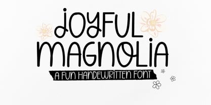 Joyful Magnolia handwritten. Contains a complete set of lowercase, uppercase, alternative, ligatures, punctuation marks, numbers and multilingual support. This font is ideal for use in watercolor designs or monoline styles, such as blog headers, posters, wedding elements, t-shirts, apparel, book covers, business cards, greeting cards, branding, merchandise, invitations and handmade quotes and more. again. Thank You :)
 - QSansPro by Fontop,
$11.00 Create bold headlines and elegant designs with a versatile QSansPro font family. Excellent for large type as well as logos, quotes, advertisements and more. QSansPro is a strong and sophisticated sans serif, yet classic and you'll keep coming back to it again. Each font in this family is full of character and can stand on its own.
 - Eat More Fruit JNL by Jeff Levine,
$29.00 Eat More Fruit JNL is an odd name for a typeface, but then again the lettering style of the font is just as unusual. Named for a 1940s-era poster espousing "Put more pep in your step... eat more fruit", the lettering (although Art Deco in nature) also evokes images of 1960s and 1970s hippie-era concert posters.
 - Bodoni Highlight by Image Club,
$29.99Giambattista Bodoni (1740-1813) was called the King of Printers; he was a prolific type designer, a masterful engraver of punches and the most widely admired printer of his time. His books and typefaces were created during the 45 years he was the director of the fine press and publishing house of the Duke of Parma in Italy. He produced the best of what are known as modern" style types, basing them on the finest writing of his time. Modern types represented the ultimate typographic development of the late eighteenth and early nineteenth centuries. They have characteristics quite different from the types that preceded them; such as extreme vertical stress, fine hairlines contrasted by bold main strokes, and very subtle, almost non-existent bracketing of sharply defined hairline serifs. Bodoni saw this style as beautiful and harmonious-the natural result of writing done with a well-cut pen, and the look was fashionable and admired. Other punchcutters, such as the Didot family (1689-1853) in France, and J. E. Walbaum (1768-1839) in Germany made their own versions of the modern faces. Even though some nineteenth century critics turned up their noses and called such types shattering and chilly, today the Bodoni moderns are seen in much the same light as they were in his own time. When used with care, the Bodoni types are both romantic and elegant, with a presence that adds tasteful sparkle to headlines and advertising. This version of Bodoni was done by Morris Fuller Benton for American Typefounders between 1907 and 1911. Although some of the finer details of the original Bodoni types are missing, this family has the high contrast and vertical stress typical of modern types. It works well for headlines, logos, advertising, and text." - Parma by Monotype,
$29.99Giambattista Bodoni (1740-1813) was called the King of Printers; he was a prolific type designer, a masterful engraver of punches and the most widely admired printer of his time. His books and typefaces were created during the 45 years he was the director of the fine press and publishing house of the Duke of Parma in Italy. He produced the best of what are known as modern" style types, basing them on the finest writing of his time. Modern types represented the ultimate typographic development of the late eighteenth and early nineteenth centuries. They have characteristics quite different from the types that preceded them; such as extreme vertical stress, fine hairlines contrasted by bold main strokes, and very subtle, almost non-existent bracketing of sharply defined hairline serifs. Bodoni saw this style as beautiful and harmonious-the natural result of writing done with a well-cut pen, and the look was fashionable and admired. Other punchcutters, such as the Didot family (1689-1853) in France, and J. E. Walbaum (1768-1839) in Germany made their own versions of the modern faces. Even though some nineteenth century critics turned up their noses and called such types shattering and chilly, today the Bodoni moderns are seen in much the same light as they were in his own time. When used with care, the Bodoni types are both romantic and elegant, with a presence that adds tasteful sparkle to headlines and advertising. Parma was designed by the monotype Design Team after studying Bodoni's steel punches at the Museo Bodoniana in Parma, Italy. They also referred to specimens from the "Manuale Tipografico," a monumental collection of Bodoni's work published by his widow in 1818. - Beauty Club by Cultivated Mind,
$25.00 Beauty Club is a modern font collection that includes four serif weights, a thin signature brush script and free marketing words. Beauty Club Brush is a hand-painted script that includes 7 ligatures and 26 alternates. The brush script works great paired with the serif fonts. Try the Beauty Club free font for beauty marketing and social media. It’s a great font for promoting your beauty brands. Fonts and posters designed by Cindy Kinash. See font details below. VERSIONS: American (US) and Extended Latin Pro (Standard) FREE WORDS FEATURES: 57 free words useful for beauty marketing and social media promoting. Keyword examples include beauty, makeup, free, love and sale. Intended use for: beauty, fashion, apparel, marketing, music, social media, websites, magazines, sales, film and packaging. BRUSH SCRIPT AMERICAN (US) Shorter version Thin hand-painted brush script 7 ligatures and 26 alternates OpenType Includes the common alphabet, numbers, American symbols and punctuation. BRUSH SCRIPT EXTENDED LATIN PRO (Standard) Extended version of the American (US) version. Thin hand-painted brush script 7 ligatures and 26 alternates OpenType Includes Latin Pro characters for Albanian, Basque, Catalan, Cornish, Croatian, Czech, Danish, Dutch, English, Esperanto, Estonian, Feroese, Finnish Scots, French, Gaelic, Galician, German, Greek Transliterated, Hawaiian, Hungarian, Icelandic, Indonesian, Irish, Italian, Latvian, Lithuanian, Maltese, Nynorsk Bokmal Norwegian, Polish, Portuguese, Romanian, Slovak, Slovenian, Spanish, Swedish, Turkish, Welsh. SERIF AMERICAN (US) Shorter version OpenType Includes the common alphabet, numbers, American symbols and punctuation. SERIF EXTENDED LATIN PRO (Standard) Extended version of the American (US) version. OpenType Includes Latin Pro characters for Albanian, Basque, Catalan, Cornish, Croatian, Czech, Danish, Dutch, English, Esperanto, Estonian, Feroese, Finnish Scots, French, Gaelic, Galician, German, Greek Transliterated, Hawaiian, Hungarian, Icelandic, Indonesian, Irish, Italian, Latvian, Lithuanian, Maltese, Nynorsk Bokmal Norwegian, Polish, Portuguese, Romanian, Slovak, Slovenian, Spanish, Swedish, Turkish, Welsh. TIPS: Try the OpenType brush script alternates/ligatures by turning on the feature in your preferred program that supports ligatures. DISPLAY- Pair the Beauty Club brush script with the serif fonts as large headline text for optimization. FONT USE- Use Beauty Club for beauty, fashion, apparel, marketing, music, social media, websites, magazines, sales, film and packaging."
 - Bree by TypeTogether,
$37.50 The Bree font family is a spry sans serif by Veronika Burian and José Scaglione that delivers a spirited look and feel for branding and headline usage. As an upright italic, Bree shows a pleasant mix of rather unobtrusive capitals with more vivid lowercase letters, giving text a lively appearance. Bree is clearly influenced by handwriting. As such, some of its most characteristic features are the single-story ‘a’, the cursive ‘e’, the outstroke curves of ‘v’ and ‘w’, the flourished ‘Q’, and the fluid shapes of ‘g’, ‘y’, and ‘z’. Alternates of these letters are available when a more neutral look is desired. Bree has a touch of cheekiness, a wide stance for each character, and an extra-large x-height. All this adds up to a big personality, so even when set in small text there is no skimming past the words Bree voices. In 2019, the Bree font family got a huge update. A few shapes were updated or added (the ‘k’ and German capital ‘ß’), two entirely new weights were added (Book and Book Italic), and spacing was perfected. More than that, Vietnamese support was added to Bree Latin, and the Bree Greek and Bree Cyrillic scripts were designed from scratch to parallel the Latin’s tone. Additionally, Bree was designed in variable font format for those who want complete control over the font’s appearance while simultaneously saving digital weight in the form of kilobytes and megabytes. Bree is in the perfect position for the next digital revolution. The complete Bree font family, along with our entire catalogue, has been optimised for today’s varied screen uses. Bree has been chosen for such wide-ranging uses as Breast Cancer Awareness Month in the US, the branding for the country of Peru, and numerous layouts including mobile apps, magazines, newspapers, and books. Awards – Tipos Latinos exhibition 2008 – Several best-of-the-year typeface lists of 2008 MyFonts Top 10 Fonts of 2008 Smashing Magazine: 60 Brilliant Typefaces For Corporate Design https://www.smashingmagazine.com/2008/03/60-brilliant-typefaces-for-corporate-design/ Die besten Schriften 2008 http://www.fontwerk.com/619/die-besten-schriften-2008/ – Selected for Typographica’s Best Typefaces of 2008 – Won Bronze for Original Typeface in the 2009 European Design Awards
 - DeDisplay by Ingo,
$24.99 A type designed in a grid, like on display panels Type is not only printed. There were always and still are a number of forms of type versions which function completely differently. Even very early in the history of script there were attempts to combine a few single elements into the diverse forms of individual characters and also efforts to construct the forms of letters within a geometric grid system. The “instructions” of Albrecht Dürer are probably most well-known. But although designers of past centuries assumed the ideal to basically be an artist’s handwritten script, the idea which developed in the course of mechanization was to “build” characters in a building block system only by stringing together one basic element — the so-called grid type was discovered, represented most commonly today by »pixel types.« But even before computers, there were display systems which presented types with the help of a mechanical grid display, like the display panels in public transportation (bus, train) or at airports and train stations. In a streetcar, I met up with a modern variation of this display which reveals the name of each tram stop as it is approached. This system was based on a customary coarse square grid, but the individual squares were also divided again diagonally in four triangles. In this way it is possible to display slants and to simulate round forms more accurately as with only squares. The displayed characters still aren’t comparable to a decent typeface — on the contrary, the lower case letters are surprisingly ugly — but they form a much more legible type than that of ordinary [quadrate] grid types. DeDisplay from ingoFonts is this kind of type, constructed from tiny triangles which are in turn grouped in small squares. The stem widths are formed by two squares; the height of upper case characters is 10, the x-height 7 squares. DeDisplay is available in three versions: DeDisplay 1 is the complex original with spaces between the triangles, DeDisplay 2 forgoes dividing the triangles and thus appears somewhat darker or “bold,” and DeDisplay 3 is to some extent the “black” and doesn’t even include spaces between the individual squares.
 - Nefertiti by JAB,
$12.00As you can see, Nefertiti is a font based on ancient Egyptian hieroglyphs and could be classified as a fun-font. I've always been really interested in Egyptology and a couple of years ago I thought it would be great to be able to write in hieroglyphs. I started to study them but soon realized it would take me a long time to be able to do this. Still, I was determined to find a way around this problem. At some point I came up with the idea of rearranging and reforming the hieroglyphs so as to resemble the English alphabet. During this process I tried as much as possible to preserve their ethos and appearance. However, since they are designed to write in English with, it's obvious that they are not always going to look like the real thing. Despite this, I'm really happy with the final result and I think many Pharaohphiles who just want to have some fun will be also. The only difference in this font between lower and upper case characters, is that the latter are set between two parallel, horizontal lines. These are for use with brackets (motif ends) to form cartouches - elongated ovals for names and/or titles. Try typing the following using the upper case in the sample text box. e.g. (JOHN} The zigzagged vertical lines at each end, separate the motifs from the hieroglyphs. Note the three types of ends/brackets. These lines are also used to separated words from one another and to give a more authentic appearance. So pressing the space bar gives a zigzagged line - not a space. They can also be used at any point within a cartouche to separate first and last names or titles. e.g. ; (JOHN;BROWN} walked straight home after work. Notice the eye glyph (period/full stop) at the end of the sentence. This is the only punctuation mark which can be used within a cartouche, e.g. after Mr. or to add a more Egyptian appearance to a name or title. e.g. (MR>;JOHN;BROWN} Parallel lines dividing hieroglyphical inscriptions and writing into rows or columns are very common. To incorporate these in a body of text, simple use the underline U. e.g. (OSIRUS) and {ISIS} were important gods of the ancient Egyptians. (HORUS) {HATHOR} and [RA],the sun god, were also highly revered deities. The punctuation marks available are shown below. . , " " ' ! ? "where is the king?" The font also includes the numbers 0-9, the following mathematical symbols and the hash sign(Scarab beetle). Once again, I've tried to make them look as Egyptian as possible; whether I've succeeded or not is open to debate. e.g. + - x / = # This font is named after Akhenaten's beautiful wife, Nefertiti, who's image can be seen in the graphic on this page. - Bramz by Ergibi Studio,
$19.00 BRAMS Display Serif Font. This font has unique and sleek letterform, make it great to be used for modern and minimalistic design theme. The unique ligatures on serif makes this typeface cool and stands out rather than the regular serif font, perfectly for headlines, logos, posters, packaging, T-shirts,coffee shops, restaurants, magazine’s headers, signs or gift/post cards,cafe’s and weddings or any type of advertising purpose. BRAMS only comes with an uppercase, Numeral, Punctuation, Ligature, and also Support Multi Language. if you have any Question please Message Me. Thank you ERGIBI STUDIO
 - Lostar by Ergibi Studio,
$19.00 LOSTAR Display Modern Font. This font has unique and bold letterform, make it great to be used for modern and minimalistic design theme. The unique ligatures on serif makes this typeface cool and stands out rather than the regular serif font, perfectly for headlines, logos, posters, packaging, T-shirts,coffee shops, restaurants, magazine’s headers, signs or gift/post cards,cafe’s and weddings or any type of advertising purpose. LOSTAR only comes with an uppercase, Numeral, Punctuation, Ligature, and also Support Multi Language. if you have any Question please Message Me. Thank you ERGIBI STUDIO
 - Vingard by Ergibi Studio,
$20.00 Vingard is a sophisticated serif, The many alternate character swash on serif makes this typeface unique and stands out rather than the regular serif font, perfectly for headlines, logos, posters, packaging, T-shirts,coffee shops, restaurants, magazine's headers, signs or gift/post cards,cafe's and weddings or any type of advertising purpose. comes with 2 versions namely Regular and bold What's Included : Standard glyphs Ligatures Alternate Characters International Accent Works on PC & Mac Simple installations If there is a problem, question, or anything about my fonts, don't hesitate to ask! Big Thanks ~ Ergibi Studio
 - The Jagret by Ergibi Studio,
$19.00 Jagret is a Soft and Bold serif, The many alternate character on serif makes this typeface unique and stands out rather than the regular sans font, perfectly for headlines, logos, posters, packaging, T-shirts,coffee shops, restaurants, magazine's headers, signs or gift/post cards,cafe's and weddings or any type of advertising purpose.With italic version that you can use as a complimentary! Features Regular & Italic Version Uppercase & Lowercase Number & Symbol Ligatures Multilingual and PUA Encoded If there is a problem, question, or anything about my fonts, don't hesitate to ask! Big Thanks Ergibi Studio
 - Blank Page by Ergibi Studio,
$21.00 Blank Page Font Duo, these fonts are of two types serif and script. Display Serif inspired by famous logo, This typeface has been made carefully to make sure its premium quality and luxury feel. The ligatures on serif makes this typeface unique and stands out rather than the regular serif font, perfectly for headlines, wedding, social media, logos, posters, packaging, T-shirts,coffee shops, restaurants, magazine’s headers, signs or gift/post cards,cafe’s and weddings or any type of advertising purpose. if you have any questions, don’t hesitate to contact us Ergibi Studio
 - Ringbearer is a font that transports you into the heart of Middle-earth, drawing significant inspiration from the epic narrative and legendary ambiance of J.R.R. Tolkien's "The Lord of the Rings." Th...
- Konfuciuz, a unique typeface developed by Apostrophic Labs, stands out for its distinctive blend of modern and traditional elements that conjure the essence of wisdom and ancient philosophy, subtly h...
- The Hooge 05_55 Cyr2 font, designed by Nikolay Dubina, is a distinctive and impactful typeface that commands attention through its bold, minimalist aesthetic. Crafted with precision and sharp geometr...

