10,000 search results
(0.15 seconds)
- Destructive Decisions by Chank,
$99.00 Destructive Decisions is a font based upon the inherent flaws of human nature—presented under the guise of complete legibility. At first impression this font is very readable, but upon closer examination you'll notice the edges are fuzzy and some of the lines are off-kilter. You can read it, but it is also a bit foggy. No matter how hard it strives for perfection. This font was originally designed for a cable tv show about substance abuse, but is now available for use in your web and print designs, too.
 - Birthday Wish PB by Pink Broccoli,
$16.00 Birthday Wish is a totally off-kilter sans-serif font inspired by a late 70's birthday greeting card. Much like a typographic drunken stumble, this font wonderfully and awkwardly fumbles across designs, surprising with each letter typed. With a pseudo unicase character set, and offbeat letter weighting, Birthday Wish is fun to typeset with, with a cluster of ligature combinations that add to the quirky playfulness. You’ll find this Birthday Wish is a typesetting ride of a font. Try typing standard, all caps, or all lowercase for even more visual variety.
 - Stage Invader by Hanoded,
$16.00 There was a big climate protest in Amsterdam a couple of days ago. During Greta’s speech, a man jumped onto the stage and grabbed her microphone, because he didn’t approve of what she was saying. Some English media referred to him as ‘the stage invader’, which I really liked. Long story short: I made a ‘protest-ish’ font, using cheap black finger paint from the local store and a brush from my kids. The result is a rather unique font called Stage Invader. And yes, you can use it for your protest signs too!
 - LiebeMenu by LiebeFonts,
$19.90 LiebeMenu is a comprehensive set of hand-drawn restaurant and menu essentials: Restaurant signs and menu labels, dishes with vegetables, meat, fish and cheese, and of course drinks and desserts. Whether you design professional menus for a gourmet restaurant or for your friend’s dinner party, LiebeMenu instantly adds a warm personal touch. Over 110 carefully crafted drawings are included in this single font and can be used in any text or graphics application. If you like this font, you may also like our cooking ingredients font LiebeCook and our decorative restaurant phrases font LiebeMenuLettering.
 - Kavinas by Ekahermawan,
$15.00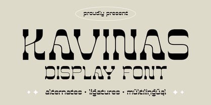 Kavinas is an unique display font that comes with alternates characters and ligatures characters. Kavinas will give you a wide range to create an attractive typographic design result for many different projects such as logo design, branding, poster, magazine, labels, merchandise, invitation, presentation, advertising, quotes and so much more! FEATURES: OpenType support Playfull to use (with ligatures and alternates options) Multilingual support PUA Encoded If you need support or more information about this item, please kindly contact me : ekahermawanputu@gmail.com Thank you so much.. I really hope you enjoy when using it!
 - Peanut Ache by PizzaDude.dk,
$17.00 I don't know what it is with me and peanuts. I simply love it! I like peanuts in all kinds of meals: breakfast, lunch, dinner and even in desserts! But with an addiction like this, an overload of peanuts sometimes appear...and I guess that's where the name of this font comes from :) The Peanut Ache font is super clean, and super steady - use it for anything that needs a clean look! I've added 5 slightly different versions of each letter, and this really helps making your text to look even more fresh and lively!
 - Cat Burglar PB by Pink Broccoli,
$16.00 Cat Burglar is another off-kilter sans-serif font by Pink Broccoli, this time inspired by the titling of a 1961 Looney Tunes cartoon called "The Pied Piper of Guadalupe". As with some of my previous type designs, it is a typographic drunken stumble, wonderfully and awkwardly stumbling across designs, surprising with each letter typed. With an extensive character set, and offbeat letter weighting, Cat Burglar is fun to typeset with, with a collection of double letter ligatures, as well as discretionary ligature combinations that add to the quirky playfulness.
 - Tulpe Fraktur NF by Nick's Fonts,
$10.00Tucked inside the November 5, 1927 issue of a German signpainters' trade paper was a single sheet headed Der Schilder und Schriftenmaler, which featured an alphabet called "Neue Fraktur". An exuberant (if somewhat unconventional) combination of Art Deco sensibilities and blackletter forms, the font retains its freshness, even today. Included in this version are Deco bishops fingers at the bar and broken bar positions, and a styling, horn-blowing herald at ASCII circumflex and tilde positions. Both versions of the font include 1252 Latin and 1250 CE (with localization for Romanian and Moldovan) character sets. - Vegetability by Hanoded,
$15.00 Vegetability: “The quality or state of being vegetable”. Yes, I know: it’s kinda weird, but I quite like the name of this font! I am trying to become a vegetarian (I am a ‘flexitarian’ right now) and I was trying to find a good veggie recipe for dinner, when this name crossed my mind. Vegetability is a handwritten font with a dash of roughness, a splash of attitude and a pinch of class. Comes with a whole bunch of diacritics and double letter ligatures for the lower case letters.
 - Migaela by Nurrontype,
$15.00 Hi, I'm Migaela. I'm optimistic, inspiring and expressive typeface. My friend told me I'm cheerful, positive and charming. My designer made me with three optional style, Regular, Overlap and Smooth (rounded), each with oblique version. It has unique stylistic and ornament. Don't you see that lowercase I with snow flake. It's so cute isn't it. Before I forget, kindly look my ligature, I know you like it. Buy me know, let me works together in your Christmas project, Holiday card, New Years event, and of course your next Valentine project.
 - TA Bankslab by Tural Alisoy,
$33.00 The building of the Northern Bank of St. Petersburg's Baku branch was built in 1903-1905. It was the first Art Nouveau-style building in Baku, Azerbaijan. Later the bank was transformed into the Russian-Asian Bank. After the oil boom in Baku in the 19th century, branches of many banks and new banks were opened in the city. The branch of the Northern Bank of St. Petersburg was among the first banks that was opened in Baku. N.Bayev was the architect of the building for the branch of the Northern Bank of St. Petersburg located at Gorchakovskaya 3 in 1903-1905. The building currently houses the Central Branch of the International Bank of Azerbaijan. My purpose in writing this is not to copy and paste the information from Wikipedia. What attracted me to the building was the word "Банкъ" (Bank) written in Cyrillic letters, which was also used in Azerbaijan during the Soviet era. The exact date of the writing is not known. Every time I pass by this building, I always thought of creating a font of this writing someday. I had taken a photo of the building and saved it on my phone. I did a lot of research on the font and asked a lot of people. However, some did not provide information at all and some said they did not have any information. I was interested in the history of this font but I do not know if this font really existed or it was created by the architect out of nowhere. If there was such a history of this font, I wanted to recreate this font and make it available. If not, I had to create it from scratch in the same way, using only existing letters on the building. Finally, I made up my mind and decided to develop the font with all letters I have got. It was difficult to create a font based on the word, Банкъ. Because in the appearance of the letters, the midline of the letters on A, H, K was very distinct, both in the form of inclination and in more precise degrees. The serif part of the letters, the height of the upper and lower sides, differed from each other. I don't know whether it was done this way when the building was constructed or it happened over time. I prepared and kept the initial version of the font. I took a break for a while. I started digging on the story of the font again. Meanwhile, I was researching and got inspired by similar fonts. Unfortunately, my research on the font's history did not yield any results. I decided to continue finishing up the font. After developing the demo, I created the font by keeping certain parts of these differences in the letters. In addition, I had to consider the development of letters in the Cyrillic, as well as the Latin alphabet, over the past period. Thus, I began to look at the appearance of slab-serif or serif fonts of that time. In general, as I gain more experience in developing fonts, I try to focus on the precision of the design for each font. In recent years, I specifically paid attention to this matter. YouTube channel and articles by Alexandra K.'s of ParaType, as well as, information and samples from TypeType and Fontfabric studios on the Cyrillic alphabet were quite useful. I gathered data regarding the Latin alphabet from various credible sources. I do not know if I could accomplish what I aimed at but I know one thing that I could develop the font. Maybe someday I'll have to revise this font. For now, I share it with you. I created the font in 10 styles. 7 weight from Thin to Extra Black, an Outline, Shadow, and Art Nouveau. The Art Nouveau style was inspired by the texture in the background used for the text on the building. The texture I applied to capital letters adds beauty to the font. If you like the font feel free to use it or simply let me know if your current alphabet doesn't support this font.
 - TA Bankslab Art Nouveau by Tural Alisoy,
$40.00 TA Bankslab graphic presentation at Behance The building of the Northern Bank of St. Petersburg's Baku branch was built in 1903-1905. It was the first Art Nouveau-style building in Baku, Azerbaijan. Later the bank was transformed into the Russian-Asian Bank. After the oil boom in Baku in the 19th century, branches of many banks and new banks were opened in the city. The branch of the Northern Bank of St. Petersburg was among the first banks that was opened in Baku. N.Bayev was the architect of the building for the branch of the Northern Bank of St. Petersburg located at Gorchakovskaya 3 in 1903-1905. The building currently houses the Central Branch of the International Bank of Azerbaijan. My purpose in writing this is not to copy and paste the information from Wikipedia. What attracted me to the building was the word "Банкъ" (Bank) written in Cyrillic letters, which was also used in Azerbaijan during the Soviet era. The exact date of the writing is not known. Every time I pass by this building, I always thought of creating a font of this writing someday. I had taken a photo of the building and saved it on my phone. I did a lot of research on the font and asked a lot of people. However, some did not provide information at all and some said they did not have any information. I was interested in the history of this font but I do not know if this font really existed or it was created by the architect out of nowhere. If there was such a history of this font, I wanted to recreate this font and make it available. If not, I had to create it from scratch in the same way, using only existing letters on the building. Finally, I made up my mind and decided to develop the font with all letters I have got. It was difficult to create a font based on the word, Банкъ. Because in the appearance of the letters, the midline of the letters on A, H, K was very distinct, both in the form of inclination and in more precise degrees. The serif part of the letters, the height of the upper and lower sides, differed from each other. I don't know whether it was done this way when the building was constructed or it happened over time. I prepared and kept the initial version of the font. I took a break for a while. I started digging on the story of the font again. Meanwhile, I was researching and got inspired by similar fonts. Unfortunately, my research on the font's history did not yield any results. I decided to continue finishing up the font. After developing the demo, I created the font by keeping certain parts of these differences in the letters. In addition, I had to consider the development of letters in the Cyrillic, as well as the Latin alphabet, over the past period. Thus, I began to look at the appearance of slab-serif or serif fonts of that time. In general, as I gain more experience in developing fonts, I try to focus on the precision of the design for each font. In recent years, I specifically paid attention to this matter. YouTube channel and articles by Alexandra K.'s of ParaType, as well as, information and samples from TypeType and Fontfabric studios on the Cyrillic alphabet were quite useful. I gathered data regarding the Latin alphabet from various credible sources. I do not know if I could accomplish what I aimed at but I know one thing that I could develop the font. Maybe someday I'll have to revise this font. For now, I share it with you. I created the font in 10 styles. 7 weight from Thin to Extra Black, an Outline, Shadow, and Art Nouveau. The Art Nouveau style was inspired by the texture in the background used for the text on the building. The texture I applied to capital letters adds beauty to the font. If you like the font feel free to use it or simply let me know if your current alphabet doesn't support this font.
 - Dupla by Tipo Pèpel,
$22.00 When Dupla was designed, its DNA shown the best of the typographic heritage from the XIX century types, the oldest san serif known, also named as “Grotesk”, a soft synonym for bizarre, unnatural weird. XIX century Germans' eyes were surprised, astonished by the formal strangeness that provoked the mutilation of the well known serifed types. But the skeleton and DNA are barely perceptible, an invisible part of the nature of objects. We are interested in the epidermis, the outer, the visible, which directly speak to the eyes, and Dupla tells us with overwhelming presence, that is a formal, traditional type, covered with a childlike sweetness, with slight curves, epidermic, sweetening even ink’s traps up. Frutiger said that Latin alphabet letter’s minimum skeleton is like a lock where you should fit all the letters you see, but that skeleton allows many skins. We use a different skin for every specific use. And Dupla’s skin points to how generous, how friendly it is; the sweetness of the big and good-natured. They do not feel very comfortable in low-cost airplanes company’s seats, but in the proper location with enough room, they'll fill the atmosphere with kindness. Do not ask for narrow columns, or terse captions in squalid sizes; do not ask for ridiculous “small print” in dark contracts where «The party of the first part shall be known in this contract as the party of the first part …» That’s not for Dupla. Large headlines, generous width columns to cover, rude pullquotes half-breaking columns, loud exclamations, great sizes, with black weights. It’s in the insultingly generous, almost obscene use where Dupla is felt. And if you consider this a obscene, gargantuan, typographical feast, Dupla brings you everything to demonstrate that quantity does not mean less quality. Multi-language support, Latin plus full coverage, complete sets of small caps, fractions, old numerals, modern, tabular, bonds and all the “gourmet” paraphernalia that Patau has accustomed us, after many years of work. If you want to be obscene and pass the censorship, use Dupla. Hedonism is just a venial sin.
 - Changstein - Unknown license

- Telidon Ink by Typodermic,
$11.95 Introducing Telidon Ink, the dot-matrix typeface that takes you back in time to the glory days of retro computing. With its upright and legible structure, Telidon Ink boasts a distinctive textured ink impression that will transport you back to the age of the dot-matrix printer. Not only does Telidon Ink look retro, but it also has a fast and easy vibe that adds a sense of momentum to your phrases. And with its versatile range of widths, weights, and italics, you have the flexibility to create a unique and dynamic look for your designs. But that’s not all—Telidon Ink also has a clean and straight-laced companion, Telidon, which complements its retro style perfectly. Together, these typefaces will give your designs a classic and timeless look that is sure to impress. So if you’re looking to add a touch of vintage charm to your graphic design projects, Telidon Ink is the perfect choice. Let it transport you back in time to the golden age of computing and bring a touch of nostalgia to your designs. Most Latin-based European writing systems are supported, including the following languages. Afaan Oromo, Afar, Afrikaans, Albanian, Alsatian, Aromanian, Aymara, Bashkir (Latin), Basque, Belarusian (Latin), Bemba, Bikol, Bosnian, Breton, Cape Verdean, Creole, Catalan, Cebuano, Chamorro, Chavacano, Chichewa, Crimean Tatar (Latin), Croatian, Czech, Danish, Dawan, Dholuo, Dutch, English, Estonian, Faroese, Fijian, Filipino, Finnish, French, Frisian, Friulian, Gagauz (Latin), Galician, Ganda, Genoese, German, Greenlandic, Guadeloupean Creole, Haitian Creole, Hawaiian, Hiligaynon, Hungarian, Icelandic, Ilocano, Indonesian, Irish, Italian, Jamaican, Kaqchikel, Karakalpak (Latin), Kashubian, Kikongo, Kinyarwanda, Kirundi, Kurdish (Latin), Latvian, Lithuanian, Lombard, Low Saxon, Luxembourgish, Maasai, Makhuwa, Malay, Maltese, Māori, Moldovan, Montenegrin, Ndebele, Neapolitan, Norwegian, Novial, Occitan, Ossetian (Latin), Papiamento, Piedmontese, Polish, Portuguese, Quechua, Rarotongan, Romanian, Romansh, Sami, Sango, Saramaccan, Sardinian, Scottish Gaelic, Serbian (Latin), Shona, Sicilian, Silesian, Slovak, Slovenian, Somali, Sorbian, Sotho, Spanish, Swahili, Swazi, Swedish, Tagalog, Tahitian, Tetum, Tongan, Tshiluba, Tsonga, Tswana, Tumbuka, Turkish, Turkmen (Latin), Tuvaluan, Uzbek (Latin), Venetian, Vepsian, Võro, Walloon, Waray-Waray, Wayuu, Welsh, Wolof, Xhosa, Yapese, Zapotec Zulu and Zuni.
 - Sachiko - Personal use only

- Standbury Script by Cooldesignlab,
$12.00 Standbury - a calligraphy font consisting of 2 versions (Normal and Thick) that is designed very skilfully and thoroughly so that they can be combined. This font is perfect for wedding postcards. Or you can create logos, blogs, stationery, marketing, magazines, invitations, models, branding cards and other designs that are perfect and unique :) Standbury includes a complete set of large international letters, numbers, punctuation marks and binders. All lowercase letters include the beginning and end of the attack. Also, follow the multilingual symbols. The script is coded with Unicode PUA, which allows full access to all additional characters without special design software. Mac users can use Font Book, and Windows users can use Character Maps to view and copy additional characters to be included in your favorite text editor / application. Thank you and have a nice day. CooldesignLab
 - Hello Darling by Nk Studio,
$14.00 Your purchases include the Hello Darling Script, conjunctive handwritten script, and printed, handwritten, and printed script fonts. Hello Darling is made side by side to work together. All lowercase letters are placed to receive a connecting tail from Hello Darling. You can mix and match the same words to your heart's content! Hello Darling is also made with the crafter in mind: there are no closed counters on either type, meaning they can easily be used for stencils and electronic cutters such as the Cricut line and the Silhouette. The Hello Darling package includes: - More than 300 glyphs in the Hello Darling font, designed to work together! - No closed counters - useful for stencils and vinyls! - More than 200 accented characters in each font. - Double letter binder staggered for a hand drawn look! - PUA-encoded for easy character map access! Enjoy and thank you.
 - Thestone by Picatype,
$14.00 Thestone is a font display with a noble and vintage appearance. It has serif at the beginning of stroke and formal design. Thestone has an alternative character, and a binder. all with special characteristics in the past. Thestone is perfect for creating something that feels good and vintage or a sporty look for your design. This letter makes it very flexible. You can design beautiful, elegant and diverse typographic elements. This is perfect for logos, letters, shirt designs, editorial illustrations, product name packages, labels, old coffee shops. Files included: Thestone OTF Thestone is coded with PUA Unicode, which allows full access to all the extra characters without having special designing software. Mac users can use Font Book , and Windows users can use Character Map to view and copy any of the extra characters to paste into your favourite text editor/app.
 - Baskuline by Zeenesia Studio,
$15.00 Introducing the new font Baskuline. Baskuline font is a HanwrittenHandbrush handwriting on paper with a coarse type brush, to produce a consistent texture. Baskuline also has ligature which is very suitable if you don't really like lowercase letters and want to change some letters with available ligature letters. and available lowercase alternatives that you can change according to your taste. Baskuline suitable for various projects such as stationery invitations, social media, logos, weddings, branding, graphic design with the addition of several binders and swashes. and can be combined with various types of serif fonts to perfect the project you want to work on. We hope you enjoy the font, please feel free to comment if you have any thoughts or feedback. Or simply send me a PM or email me at zeenesia@gmail.com. Thanks for purchasing and have fun!
 - Vintage Culture by Mega Type,
$20.00 Introducing Vintage Culture - a modern classic serif with a modern and classy style. Vintage Culture is a unique, fun, and versatile serif font with 192 alternatives and 42 ligatures to spice up any design you love. Vintage Culture is built with OpenType features and includes ligatures, alternatives, numbers, punctuation, and also supports other languages. Vintage Culture is a versatile serif font that works in both large and small sizes. This font is suitable for a wide variety of projects such as: headlines, logos, labels, branding projects, magazines, homeware designs, product packaging, mugs, quotes, posters, and more. Feature · All Uppercase and Lowercase · Numbers & Symbols · Supported Languages · Substitutes and Binders · PUA Encoded Have fun using Vintage Culture!!! I really hope you enjoy it! Feel free to follow, like and share. Thank you so much for checking out my shop!
 - Saverny by HKL Studio,
$21.00 Saverny Script This is a Vintage calligraphy script font that comes with beautiful alternative characters. copper plate mixed calligraphy with handttering style. Designed to convey stylish elegance. Saverny Script has a smooth, clean, feminine, sensual, glamorous, simple, and easy to read typeface. Saverny Script comes with a Clean and Aged version, beautiful upper and lower case, binding and favored by many finishes. It has Multilingual support (West European characters) and works with the following languages: English, Danish, Dutch, Estonian, Finnish, French, German, Hungarian, Icelandic, Italian, Norwegian, Polish, Portuguese, Spanish, Swedish. In my example I show how this script can be used. It's perfect for logos, wedding invitations, alcohol labels, romantic cards and more. Products include: Clean & Aged Script Version Alternative Uppercase & Lowercase Font Style Binders Recommended for use in Adobe Illustrator or Photoshop. Custom features don't work in Microsoft Word.
 - Mr. Jenkins by Lindstrom Design,
$13.00 Mr. Jenkins is designed to fill the void between the crazy, wacky and reckless comic style fonts, and the standard boring but very readable sans-serif typefaces. It makes for a distinctive bold headline, but is also quite legible at small sizes. It’s just off kilter enough to not take itself too seriously. A deceptively care-free font, each character was carefully drawn. The spacing and kerning of each letter and letter combination were painstakingly considered. Particular attention was paid to maintaining consistent optical weights and a spontaneous appearance. Mr. Jenkins is inspired heavily by humanist sans-serif faces such as Myriad and Lucida Sans, with its open apertures, and low contrast but almost calligraphic line weights. The lowercase a is single story in the italic face, but two story in the regular face. It contains uncommon features amongst many “quirky” fonts, including a full set of latin accented characters, lining and proportional figures, math symbols, standard fractions, foreign currency marks, contextual alternates, and even a few ligatures.
 - Disruptor's Script by Piñata,
$15.00 Disruptor's Script is the alter ego of our previous project Gentlemen's Script. Unlike the Gentlemen's Script, the new font is an elegant rebel and defies traditions. The font is painted with a brush pen, which is especially noticeable in the characteristic shabbiness and different thicknesses of the strokes. While the Gentlemen's Script is an embodiment of a classic costume, dress shoes and an expensive watch, Disruptor's Script is a fashionable suit, sneakers, an iWatch and a tattoo that peeks from under the shirt. The font retained the incline, speed and overall sense of dynamics inherent in Gentlemen's Script, but got a bit more chaotic and unpredictable. This is especially noticeable in the newly added shabbiness, elongated extenders, a large number of contextual alternates and different ligatures. For some high-frequency letters (10 for the Latin alphabet and 10 for the Cyrillic alphabet), we painted alternative versions that are substituted in the word instead of the standard characters when following our preceding certain groups of letters. In addition, in the Disruptor's Script you can find functional ligatures, including some of the frequently occurring two- and three-letter combinations. All these solutions dilute the monotonous line of the set, add a bit of unpredictability to the font and a touch of chaos to inscriptions. To fully enjoy usage of the font, we recommend that you always keep the features contextual alternates (calt) and standard ligatures (liga) turned on. If you do not have access to applications that support OpenType features, it does not matter—even without these features you can use and enjoy our font!
 - Batman Beat the hell Outta Me - Unknown license

- Pop Cubism by K-Type,
$20.00 The Pop Cubism fonts are inspired by Roy Lichtenstein who combined the strong outlines and benday dots of Pop Art with the fragmented viewpoints and facet line divisions of Cubism. The bold letterforms are derived from a variety of styles, both serif and sans, angular and rounded. Pop Cubism is available in two packages: Pop Cubism Shaded is a single font which contains the lines and dot tones for use in a single color. The Pop Cubism Color Kit contains three matching fonts (Pop Cubism Outline, Pop Cubism Halftone Underlay and Pop Cubism Color Underlay) for overlaying different colors of lines, dot tones, and background color.
 - DotLinDot by Pankabre,
$9.00 Accurate handwritten font with dots and lines. In small sizes it looks especially good in the texts of history books.
 - Gladifilthefte - 100% free

- Brewsky - 100% free

- Alpenkreuzer - 100% free

- SquircleCirquare - Unknown license

- Barracuda by Wiescher Design,
$39.50 Barracuda has this sharp, sharky look and I do a lot of diving with my best friend. What else is there to say? If you see a shark say hello from me. Yours from under the Red Sea, Gert Wiescher
 - Hoakey by PizzaDude.dk,
$20.00 Hoakey is not really a grunge font, although it comes with rugged edges and a worn surface. This may sound like a grunge typeface, but Hoakey is a lot more than that! It oozes romance. Hoakey has curly alternate uppercase letters, and ligatures for both double lowercase and double numbers. You will need to use OpenType supporting applications to use the autoligatures.
 - Sweeper by Gustav & Brun,
$12.00 Sweeper is a font with several personalities; it’s friendly and scary at the same time, almost like Santa Claus, but nicer. Sweeper has got a handy touch with a lot of different possibilities. You can use it in several occasions. Sweeper is suitable in any environment: the business district in London or the shores of Oxelösund. It’s hella wide and hella fun!
 - Saihat by Alit Design,
$19.00 The Saihat font is inspired by Arabic or Middle Eastern style calligraphy. This font is made with Latin characters so that it can be read internationally which does not have to be able to read Arabic characters. This font is perfect for Middle Eastern or Muslim designs. In addition, the Saihat font can also be used for other decorative design concepts.
 - Wurstwagen NF by Nick's Fonts,
$10.00The pattern for this typeface was suggested by a poster for beer, designed by German artist Ludwig Hohlwein around 1920. The plump curvy serifs suggested a great complement to beer, hot dogs, and thus the name translates roughly to “weiner wagon.” Prosit! Both versions of this font include the complete Latin 1252 and CE 1250 character sets, with localization for Romanian and Moldovan. - Tenterhooks by Hanoded,
$15.00 I like the expression ‘being on tenterhooks’. Not that I’m on tenterhooks very often! Tenterhooks was made with a broken satay skewer (see poster 2 for the actual thing) and Chinese ink. It came out rather rough, but it does have a nice flow and a certain ‘wild elegance’. Comes with double letter ligatures and a whole bunch of diacritics.
 - Imperia by Wiescher Design,
$49.50 Imperia is derived from my Classic font Imperium – the Roman Original from the Trajan column. I pushed Imperia a lot further, adding two versions of swings. To make the family more usable I threw in my own version of lowercase letters for free; Roman did not have lowercase letters of that kind! The other three cuts – A, B, and C –have classic smallcaps.
 - Watchmaker by Ingrimayne Type,
$5.95 Watchmaker was designed with the limitations imposed by a simple LCD that is meant only to display numbers. Most LCD typefaces use some diagonals to make the letters look better. This one does not and from it you can see why a few diagonals are needed to display letters on a LCD. Watchmaker is monospaced and comes in plain and bold weights.
 - Squat by BA Graphics,
$45.00 Squat may be vertically challenged but hey, even the vertically challenged need love too! And you know what? Squat is worth much more than Diddley Squat! It gets the tough jobs done in half the vertical space with its sturdy, low profile. Randy Newman may not care for it, but Squat shows that short fonts got plenty of reason to live! So there.


