4,974 search results
(0.098 seconds)
- Antiques by Fantasy Inspirations,
$9.75With my dingbats and your favorite software, you can create elegant web graphics in minutes! All these fonts were created with the web designer in mind. Each font consists on 26 original shapes with endless possibilities: virtual jewelry, buttons, framing, interfaces, etc. For examples of what you can do with these fonts: Click Now! - Jewelry by Fantasy Inspirations,
$8.00With my dingbats and your favorite software, you can create elegant web graphics in minutes! All these fonts were created with the web designer in mind. Each font consists on 26 original shapes with endless possibilities: virtual jewelry, buttons, framing, interfaces, etc. For examples of what you can do with these fonts: Click Now! - Mumos by Muykyta,
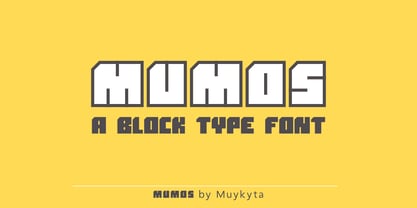
$9.00Mumos is a block type font. Is a font of thirteen units of height with straight terminations in which there is complete absence of curves. Although very basic is a dynamic typography with many possibilities thanks to its three styles, including open space, which facilitates the work with fillers without having to vectorize the glyphs. - Human by Susana Simplício,
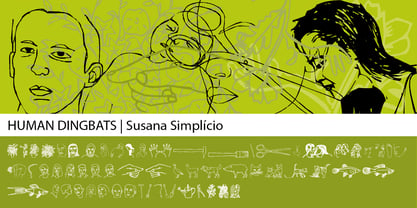
$25.00Human Dingbats are inspired by everyday life, and its main feature is the design-based lines and a wide range of topics of human life. Each Dingbat can be used individually or in the construction of illustrations through the combination of drawings, the limit is the imagination to create a variety of creative possibilities. - Suspiria Vampira by Konstantine Studio,
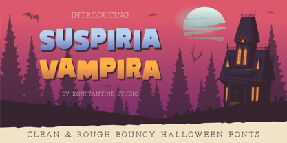
$10.00Halloween is coming. Get prepared earlier with our Suspiria Vampira. A bold and bouncy fonts with 2 styles, Clean and rough. Very good for a halloween concept, but the versatility level are high in this font. It can be placed into any fun and cheerful branding or event concept. So many possibilities coming up! - OrientOne - Unknown license
- Notebook Scribble by Mariess,
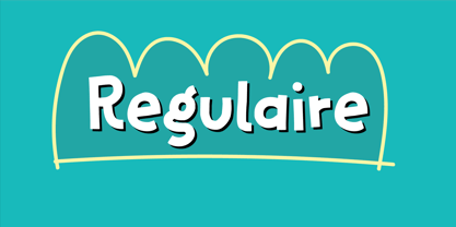
$7.00 - Regulaire by PizzaDude.dk,
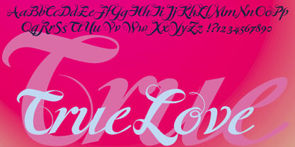
$16.00 - TrueLove by Autographis,
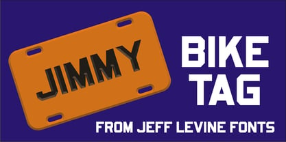
$39.50 - Bike Tag JNL by Jeff Levine,
$29.00 - Architype Catalogue Outline by The Foundry,
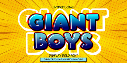
$99.00Architype Crouwel is a collection of typefaces created in collaboration with Wim Crouwel, following his agreement with The Foundry, to recreate his experimental alphabets as digital fonts. Crouwel's most recognized work was for the Van Abbe and Stedelijk museums (1954 –72) where he established his reputation for radical, grid-based design. Architype Catalogue originates from Wim Crouwel’s Stedelijk Museum exhibition catalogue for sculptor Claes Oldenburg, 1970. The cover’s soft ‘padded’ letterforms evoke the artist’s work. Oldenburg was so taken with the design, that he asked Crouwel to complete the alphabet. - Giant Boys by Sipanji21,
$13.00"Giant Boys" is a cute display font characterized by thick and rounded letterforms, making it a great choice for design projects aimed at children, such as children's games, book covers, and any projects related to schools. With its playful and friendly appearance, this font adds a touch of whimsy and charm to your designs, making them more engaging and enjoyable for young audiences. The simplicity and clarity of "Giant Boys" make it easy to read and understand, making it an excellent choice for educational materials and other projects aimed at young learners. - Informational Gothic JNL by Jeff Levine,
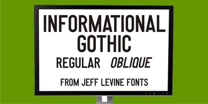
$29.00The Wood-Regan Instruments Company (Wrico) of New Jersey manufactured for decades a line of lettering kits called the Wrico Sign Maker. With only special ink pens, plastic templates and a template guide anyone could letter clean, clear signs, posters and notices. Based on the same principles of architectural templates, the lettering was [for the most part] utilitarian and functional. Few templates were of stylized or decorative lettering. Informational Gothic JNL and its oblique version are based on the four inch high lettering templates from one of those kits. - Hysterian by Gassstype,
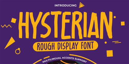
$23.00Hello Everyone, introduce our new product Hysterian is a Rough Display Font.This Playful Kids with a natural feel. This handmade font will make your design has a beautiful natural touch for each details. It is perfect for any design project as Invitation,logo, Kids,book cover, craft or any design purposes. This font is PUA encoded which means you can access all of the magical glyphs. That is Hysterian has charming unique,authentic and relaxed characteristic more natural look to your text. It also features a wealth of special features including Alternates glyphs. - Bold Galde by Sipanji21,
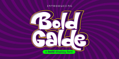
$15.00"Bolde Galde" is a cute display font characterized by thick and rounded letterforms, making it a great choice for design projects aimed at children, such as children's games, book covers, and any projects related to schools. With its playful and friendly appearance, this font adds a touch of whimsy and charm to your designs, making them more engaging and enjoyable for young audiences. The simplicity and clarity of "Bolde Galde" make it easy to read and understand, making it an excellent choice for educational materials and other projects aimed at young learners. - Toadstool by Hanoded,
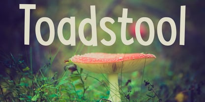
$15.00My kids love toadstools, especially the red capped ones with the white spots (they’re called Amanita muscaria, a.k.a. fly agaric - in case you’re wondering). A couple of months ago you could find loads of them in the forest, but now they’ve all disappeared. Toadstool font will not disappear, however. It is a very legible, clean and neat text font with an uneven baseline, slightly bouncy glyphs and more diacritics than a forest has mushrooms. Use if for packaging, kids’ book covers and posters. This toadstool is the non-toxic variety, so go nuts. - Back jones by Sipanji21,
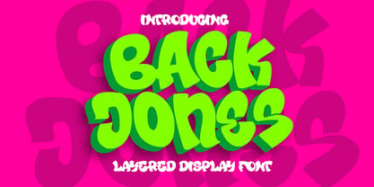
$15.00"Back Jones" is a cute display font characterized by thick and rounded letterforms, making it a great choice for design projects aimed at children, such as children's games, book covers, and any projects related to schools. With its playful and friendly appearance, this font adds a touch of whimsy and charm to your designs, making them more engaging and enjoyable for young audiences. The simplicity and clarity of "Back Jones" make it easy to read and understand, making it an excellent choice for educational materials and other projects aimed at young learners. - Tokig Px by Letradora,
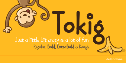
$15.00 - Chalkboy by Typefactory,
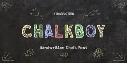
$14.00 - Ninces by Twinletter,
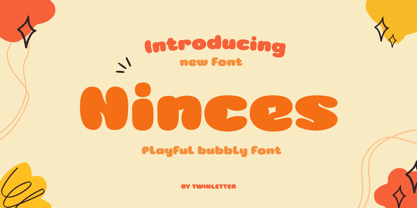
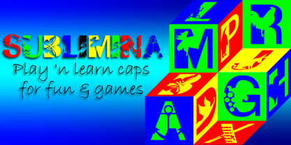
$15.00 - Sublimina by Deniart Systems,
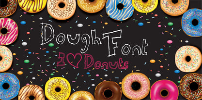
$15.00 - Dough by Zefrar,
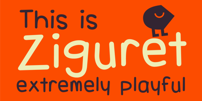
$19.00 - TOMO Ziguret by TOMO Fonts,
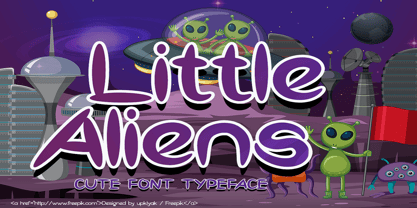
$15.00 - Little Aliens by Sealoung,
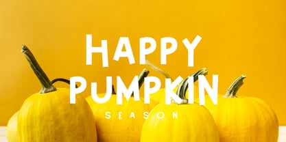
$10.00 - Happy Pumpkin by Nadezda Gudeleva,
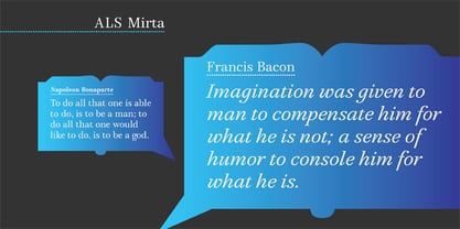
$14.00 - ALS Mirta by Art. Lebedev Studio,
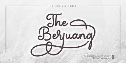
$63.00 - Berjuang by Sulthan Studio,
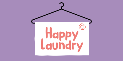
$12.00 - Happy Laundry by PizzaDude.dk,
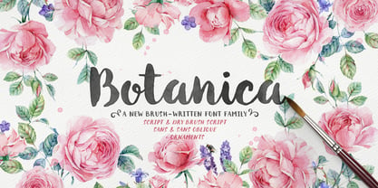
$17.00 - Botanica by My Creative Land,
$18.00Botanica is a 100% brush written font family with inky texture that was inspired by modern trends in brush lettering and design. The fonts look good both together or separately and possibilities are only limited by your imagination. Two types of initial and terminal swashed makes the Script font a good companion in wedding invitations design. - Blackheat by Almarkha Type,
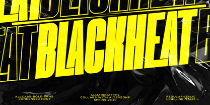
$19.00Blackheat is a bold, condensed sans with 4 styles inspired by the title of the sports poster. We designed it to look very energetic, taking into account the thickness and density of each glyph. Extra ligatures give you even more possibilities. This family is suitable for the titles, clothes, posters, magazines, brochures, packaging, websites and much more. - Gridlocker by Device,
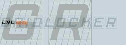
$29.00An isometric grid of a font, Gridlock takes an italicised modular approach to its letterforms. It is, however, not willfully strict about the application of that grid - the W and V and S, for example, have carefully considered diagonals that freely intersect the layout. More strictly designed but possibly less attractive versions are available as alternate characters. - Belco by Tour De Force,
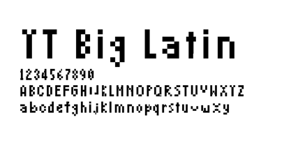
$25.00Belco, designed by Slobodan Jelesijevic, was the first font family released by Tour De Force Font Foundry. Belco is elegant and useful for all kinds of publications such as books, magazines, catalogs and brochures. With a wide range of possibility and smooth personal touch, the Belco font family is ideal for longer texts, titles and typography exercises. - YT Big Latin by Yangtype,
$9.00The concept of this letter is a young alligator. Young crocodiles have lean bodies and are agile. It has uncontrollable power, and the angular leather vinyl and teeth feel vivid. This font was created to convey the most compressed energy possible through a collection of compressed squares. Although it doesn't attack, it is quite an aggressive letter. - Scarlett Mackenzie by Letterhanna Studio,
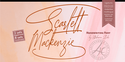
$19.00Introducing our new modern handwriting signature font Scarlett Mackenzie. A sophisticated signature-style handwriting script with an uppercase swash alternatives for each letter and 7 sets of alternate for each lowercase letter. Scarlett Mackenzie handwriting font was created to look as close to a natural handwritten script as possible by including over 35 natural-looking opentype ligatures - Ryden by Graphicfresh,
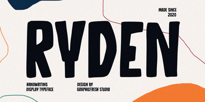
$18.00Ryden - A Handwriting Display Font In making this font, I spent a lot of time thinking about handwriting with a display style. Each letter is carefully made to look as natural as possible. This font is suitable for use in brands or logos with the theme of handwriting. I hope you like the font we made. Thanks - Daguin by Konstantine Studio,
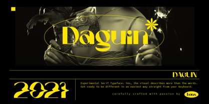
$18.00Introducing DAGUIN, inspired by the medieval look and feel in fashion visual, fusion up with the contemporary modern serif to reach the wider range of visual trend possibilities. From past to the future. Perfectly fit for your logo, magazine, look book, social media branding and content, beauty blog, fashion branding, website, clothing, merchandise, mood board concept, etc. - Cancellaresca Script by ITC,
$40.99Alan Meeks designed Cancellaresca Script, a decorative, almost cheerful script typeface, in 1982. The details that grace Cancellaresca Script's forms, both capital and lower case, give the typeface its unique appearance. Its generous and flowing capitals are complemented by a more reserved lowercase. This font's elegance offers a variety of possibilities for headline or display use. - Roney JNL by Jeff Levine,
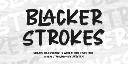
$29.00If it's at all possible to "Deco-ize" an Art Deco font even more, it's been done with Roney JNL. Named for one of the classic hotels built during the heyday of Miami Beach, this font is a stylized version of Jeff Levine's Metalet Modern; a design derived from an actual 1940s home movie titling set. - Blacker Strokes by Letterara,
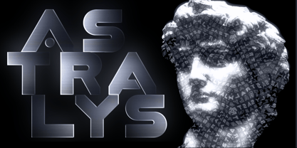
$19.00Dive into creativity with Blacker Strokes, a font embodying the wild beauty of natural brush strokes. Elevate logos, branding, and more with its mesmerizing design. Versatile and impactful, it adds character to any project. With PUA code for easy access to captivating glyphs, Blacker Strokes is your artistic ally for limitless design possibilities and lasting impressions. - ASTRALYS by Cerri Antonio,
$37.00Astralys is a linear decorative font, works very well as a type of identity logo, poster and 3d works. It continues the tradition of precedent Xova but with a hard linear impact. Its interesting to note that with it its possible to play with straight corners to create endless couplings geometric styles and beyond. Caps only fonts.
