10,000 search results
(0.042 seconds)
- Diediedie - Unknown license

- Booer by Product Type,
$18.00 Introduce the Booer Font Express Your Creativity with a Powerful and Modern Gaming Style. Booer display is a font that reflects the power and style of the gaming world in a sharp, modern package. Booer is the perfect solution for a variety of projects that require a unique theme, whether it's a film, game, or streaming event. Her bold and exciting style provides room for creativity to flourish. What Makes Booer Special: Powerful Gaming Style, Booer Design exudes power, capturing the essence of the gaming world. Each letter is a statement of dominance and modernity. Two Style Families: The Booer font offers two different style families: Regular and Italic. This advantage allows you to adapt your designs to various contexts, whether requiring a strong presence or an elegant touch. Multilingual Support: Booer Font supports multiple languages, allowing you to connect with a global audience easily. Enhance your designs and make an impact with Booer Fonts. It's not just a font; it's a gateway to a bold, modern, and compelling visual world. Download Font Booer now and experience the thrill of creating unforgettable designs!
 - Metrock by Ditatype,
$29.00 Meet Metrock, a bold and distinctive brush sans-serif font that exudes strength, modernity, and artistic edge. Crafted with large letters, Metrock is the epitome of impactful design with a touch of rugged elegance. The characters in Metrock are deliberately bold, featuring boxy shapes that command attention. The thick weight adds a sense of solidity and substance, while the sharp corners and brush details introduce an element of raw creativity. This unique combination makes Metrock a font that stands out in any display setting. In addition, enjoy the features here. Features: Multilingual Supports PUA Encoded Numerals and Punctuations Metrock fits in headlines, logos, posters, flyers, branding materials, greeting cards, print media, editorial layouts, and many more designs. Find out more ways to use this font by taking a look at the font preview. Thanks for purchasing our fonts. Hopefully, you have a great time using our font. Feel free to contact us anytime for further information or when you have trouble with the font. Thanks a lot and happy designing.
 - East Gates by Nathatype,
$29.00 East Gates is a mesmerizing display font that commands attention. Each letter is a work of art, meticulously crafted to elevate the overall appearance with a perfect blend of visible contrast and intricate details. The characters in East Gates boast a generous size, ensuring a bold and impactful presence. The visible contrast between thick and thin strokes adds a dynamic quality to the font, creating a sense of both strength and delicacy. What sets East Gates apart is the enchanting ornamentation gracing the letters, enhancing the overall beauty with a touch of intricate design. Enjoy the features here. Features: Multilingual Supports PUA Encoded Numerals and Punctuations East Gates fits in headlines, logos, posters, flyers, branding materials, greeting cards, print media, editorial layouts, and many more designs. Find out more ways to use this font by taking a look at the font preview. Thanks for purchasing our fonts. Hopefully, you have a great time using our font. Feel free to contact us anytime for further information or when you have trouble with the font. Thanks a lot and happy designing.
 - Calista Brighton by Timurtype,
$14.00 Introduced by Timurtype Studio! Calista Brighton is a Handwritten Script Font This font depicts a journey of typography where the art of handwriting transcends the ordinary, revealing the captivating dance of ink on paper. This beautiful font, decorated with stylish alternate ligatures, weaves a narrative of elegance and sophistication. Every stroke is a stroke of creativity, proof of the perfect blend of tradition and modernity. As your eyes trace its curves and turns, you are transported to a world where each character is a work of art, an embodiment of meticulous craftsmanship. The interplay of alternating styles provides a rhythmic rhythm, inviting the eye to linger on the page, enjoying the visual symphony of each letter. It's not just a font; it is a visual poem that whispers tales of timeless charm and unparalleled elegance, leaving an indelible mark on the design canvas." Calista Brighton Font also supports multilingualism. Enhance your designs with our original fonts, feel free to comment or provide feedback, Enjoy the fonts 😊 Thank You
 - Corner by URW Type Foundry,
$35.99 A unique kind of type by Michael Herold: The 14 cuts of Corner are equally distributed to the two style variants A and B. From Thin to Extra Bold, variant A comes with technical and pure forms while B appears with a soft, more personal character. In combination, the two variants add up to a highly versatile family which is very well suited for branding purposes, thanks to its diverse forms of expression. Eine besondere Schriftfamilie von Michael Herold: Die 14 Schnitte der Corner sind auf die beiden Stilvarianten A und B verteilt. Von Thin bis Extra Bold kommt die Corner im Stil A mit technischen, reinen Formen und im Stil B mit weichem, persönlicherem Charakter. Als Kombination ergibt sich eine sehr vielfältige Familie, die sich mit ihren verschiedenen Ausdrucksformen besonders fürs Branding eignet.
 - DIN Neue Roman by Vibrant Types,
$43.00 The DIN Neue Roman adds something new to the established concept of the DIN 1451 type’s technical origin. As a serif counterpart it leaves its static appeal to bring some friendliness into this industrial idea. With more contrast than a slab serif and the dynamic stroke of transitional type DIN Neue Roman defies all conventions, but keeps its legibility. To have enough resources for diverse and complex typography this type family offers 7 weights with italics, small caps and all kind of opentype features. Type designer Philip Lammert likes to play with the great potential of contradictions. That brought him to this design combining two essentially different classics. DIN Neue Roman is part of his 2015’s master thesis at the HAW Hamburg which was supervised by Prof. Jovica Veljovic.
 - Hideout by Monotype,
$50.99 Jim Ford's Hideout typeface is definitely walking on the wrong side of the law. Inspired by the flared serif lettering of antique tobacco tins, its sturdy shapes are confident, eye-catching, and hark back to the Wild West. Large sizes bring Hideout's details to life, emphasising the delicate nicks in its Ks and Rs. For designers that need to soften some of its swagger, a set of decorative alternatives offer a little Art Deco elegance, adding some refinement to its chunky letterforms. With its 14 weights, Hideout is an adaptable design that works especially well when used for display – for example in book covers, packaging, posters, restaurant menus, or editorial. Don't miss the ghost weights, which hint at the kinds of weathered lettering found on faded and peeling Wanted posters.
 - Saratoga Slim AOE by Astigmatic,
$19.95He's rough around the edges, but he's an outlaw from the Old West, what did you expect? He's Saratoga Slim, a playful shaken up dust devil of a typeface. With a shaken appearance and rough hewn letters, he steps onto the scene, yet is clearly legible to read. He's alot like a one of those ruffigans that is crude around the edges, but when he looks at you and says, "Get what I'm saying partner?", you know exactly what he means. Put some rough and tumble type into your designs with Saratoga Slim. He's been through the ringer a few times but keeps coming back for more. Isn't that what you look for when you create a design...durability...? Here it is, Saratoga Slim, looking at you! Get it today! - AW Conqueror Std Carved by Typofonderie,
$59.00 Engraving inspired typeface The AW Conqueror Carved encapsulates perfectly the lettering styles in fashion during the 19th century quite often in the frontispieces of books. It wasn’t rare to see these kinds of typefaces, with their variations in depth and relief effects, adorning boxes and other forms of packaging of the time. AW Conqueror superfamily AW Conqueror Didot is part of a larger family, who include 4 others subfamilies with great potential: They’re but based on same structure, with some connection between them (width for example), to offer a great & easy titling toolbox to any designers, from skilful to beginner. Each of the members try their best to be different from the others because of their features. They should work harmoniously in contrast. Club des directeurs artistiques Prix 2010 European Design Awards 2011
 - Gia by XO Type Co,
$40.00 Gia is 7 weights, true small caps and unicase options, designed after iconic letterforms of the 1960’s to 1980’s. In the early years of the American tech revolution, when Silicon Valley was more closely identified with Dallas, Texas, a curious type of letterform began to appear—strict in geometry, and curiously minimal in geometry and stroke, making it easier to be read by machine-readers, and people more used to reading machine-generated typography. Coders! As the years went on, this kind of sinewy, curved letterform began popping up in logotypes and music videos and upright video games: NASA, The Buggles, Atari, Pong, Sega, Namco, Stern, Devo, Apple. Gia pays homage to that letterform, and is named after Gia Carangi, the iconic face of early 1980’s pop fashion.
 - Jet by Brownfox,
$39.99 Jet is an assertive italic sans that anticipates the return of the simpler, optimistic times when progress was considered positive and forward seemed to be the only way to go. It may have felt right at home in the mid-1970s, the time of Sc-Fi, synthetics and disco, yet it unmistakably belongs to the present. Its dynamic sturdy forms and angular tapering of some horizontal forms convey movement and edgy impatience for change, with a few re-imagined details, like the reversed slant on top of the lowercase t and the atypical round counter of the lowercase a, showing a new hope for the bygone optimism. Available in five weights in Latin and Cyrillic, supporting many languages, with stylistic alternates and two sets of figures. Designed by Gayaneh Bagdasaryan and Vyacheslav Kirilenko, 2020
 - Halfroy by Heypentype,
$20.00 Halfroy is our answer to generic geometric sans trends exploding nowadays who creates sameness. Halfroy brings new sans perspectives by combining rounded and sharp edges to create delicate sans fonts. See the difference by looking at counter-shapes compared to outline, insides counter shapes you will sees a sharp edges while round but not geometrical on outlines. Halfroy gives your project unique visual impact whatever your design project is, but we recommend using thin, semibold to Fat as display then light and regular. Halfroy taken inspirations not from looking at other sans typeface, but its design inspirations comes from observing a land contour and geographical statistics in our city, Kota Batu. We found that our city geographic consist of steep slope like waves with sharp peaks and surrounded by small and third highest mountains peak on our country. From then on we begin visualize and applied on few letters. Take a look on our 'O', 'f', 's' letters, its like a stone carved letters. Its hard edges and soft edges outline clearly draws from our inspiration source. Even Halfroy looks stony, hard as individual letters, we treat this type with humanist approach in mind. Therefore you can sense a friendly yet casuals of typical sans serif fonts when it grouped together to form a words or sentences. We hope Halfroy will gives your design project a unique on its own.
 - Testament by Canada Type,
$24.95 From the standpoint of calligraphy, a font family of capitals and uncials makes perfect sense. The Roman square capitals, the quadrata, are matched by round capitals of older Greek origin; the word "uncus" means hook-shaped like a beak or talon. Interrelated and often interchangeable, these capital letters served as book hands for both the Latin West and the Greek-speaking East before they evolved into minuscule alphabets. The Testament family is based on the few formal capital manuscripts of the Bible, Virgil and Homer that have survived from the ancient world. Throughout the Middle Ages both uncials and square capitals were used, often together, for headings and initial characters. By their nature the Roman capitals are the voice of Caesar and hold the place of authority, while the uncials speak for the Church in a balanced relationship. In ancient times church and state were not as separate as they are now, and the alphabets were not as different as typographic tradition has made them. In this calligraphic rendering it is clear that they are of the same substance and can be written in the same style, conveying even to the modern eye the eternal and classical quality of epic and scripture. Testament comes in all popular font formats, and includes support for a vaster-than-usual range of Latin-based languages.
 - FS Hackney by Fontsmith,
$80.00 Elliptical The squareness of curves. That was the elliptical – in more than one sense – notion being explored in the making of FS Hackney. The squareness of curves and vertical terminals to create a gentle, soft sans serif, with a little bit of magic. A momentary thought – “It doesn’t have to be like this” – provided the spur to explore the verticals and skeletons of letterforms beyond conventional type design limits. A 12-month gestation period gave rise to a font with a larger-than-usual character set, including non-lining figures, small caps and superior and inferior numbers. It’s a collection that speaks confidently for itself. Assertive It was the Hackney carriage – the black London cab – that gave this font its name, not the north London neighbourhood. Solid, dependable, effective and built to last, FS Hackney was honed to perform in all conditions. Cool, compelling lines and a satisfying overall simplicity lend FS Hackney its assertive air. Assured, versatile and effective; just like a black cab (but without the grumbling). Machined Over a string of meetings, Jason Smith and FS Hackney designer Nick Job worked out how to infuse Nick’s sketched letterforms with Fontsmith’s familiar geniality. “Nick is very meticulous and produces very clean design work,” says Jason. “Hackney is ideal for branding as it’s very clear and its quirks are sensible ones, not odd ones, that don’t distract from the message.”
 - Chubby Lines by Yumna Type,
$15.00 It can be a difficult task to find a unique, attractive, prominent display font for your design because you always want to use a more distinctive font than the others. Therefore, Chubby Lines offers you the best solution. It is a lovely display font in rounded shapes to express soft, friendly nuances to your design. Its unique geometry details and contrast sketch lines create a visually interesting font. To be easily readable, this font is best applied for big text sizes, which also provides you with a special clipart as a bonus. Furthermore, you can enjoy the available features here. Features: Multilingual Supports PUA Encoded Numerals and Punctuations Chubby Lines fits best for various design projects, such as brandings, posters, banners, headings, magazine covers, quotes, printed products, merchandise, social media, etc. Find out more ways to use this font by taking a look at the font preview. Thanks for purchasing our fonts. Hopefully, you have a great time using our font. Feel free to contact us anytime for further information or when you have trouble with the font. Thanks a lot and happy designing.
 - Alabama Book by Krafted,
$10.00 Looking for a cute and playful font to delight your guests? If you’re hosting a baby shower, birthday party, or need a versatile font for printed materials - then we’ve got the font that’ll make your branding sparkle! Introducing Alabama Book - A Cute Playful Font This adorable, fun, and stylish font can be used for a host of different content needs and projects. Create gorgeous party invitations, printed quotes, standout packaging, or beautiful t-shirts! You can even use it to create amazing headings, logos, resumes, and social media graphics. Inspire your audience, clients, or guests with this beautiful, statement font. What you’ll get: Multilingual & Ligature Support Full sets of Punctuation and Numerals Compatible with: Adobe Suite Microsoft Office KeyNote Pages Software Requirements: The fonts that you’ll receive in the pack are widely supported by most software. In order to get the full functionality of the selection of standard ligatures (custom created letters) in the script font, any software that can read OpenType fonts will work. We hope you enjoy this font and that it makes your branding sparkle! Feel free to reach out to us if you’d like more information or if you have any concerns.
 - Hughetta by Hrz Studio,
$16.00 Hughetta is the font of choice for writing things beyond words. This typeface is designed with great detail to convey stylish elegance. So, it can be said, the character of the transformation is very beautiful, a kind of classic ornamental copper script. Hughetta provides alternative variants of most fonts, binders and many calligraphy tips, ideal for elegant labels, high-end packaging, stationery and composition for select brands, beautiful titles, paragraphs, fonts and short text, meant to be read only with eyes or meant to whisper into someone's ear. Hughetta has 368 , including multiple language support. It features OpenType with alternative styles and elegant binding. The OpenType features don't work automatically, but you can access them manually and for best results your creativity will be required in combining variations of these Glyphs. And also a touch of ornament makes this font look elegant. To enable the OpenType Stylistic alternative, you need a program that supports OpenType features such as Adobe Illustrator CS, Adobe Indesign & CorelDraw X6-X7, Microsoft Word 2010 or a later version. (Windows), Font Book (Mac) or a software program such as PopChar (for Windows and Mac). How to access all alternative characters using Adobe Illustrator: https://www.youtube.com/watch?v=XzwjMkbB-wQ How to use the font style set in Microsoft Word 2010 or later versions: https://www.youtube.com/watch?v=NVJlZQ3EZU0 There are additional ways to access alternatives/swashes, using the Character Map (Windows), Nexus Font (Windows) Font Book (Mac) or a software program such as PopChar (for Windows and Mac). How to access all alternative characters, using the Windows Character Map with Photoshop: https://www.youtube.com/watch?v=Go9vacoYmBw If you need help or advice, please contact me by email Thank you for watching!
 - Moskau Pattern by Letter Edit,
$49.00 The design of the typeface Moskau Grotesk and Moskau Pattern is based on the signage created for the Café Moskau in Berlin by the graphic artist Klaus Wittkugel in the beginning of the 1960s. The Café Moskau, across from the Kino International on Karl-Marx-Allee in Berlin Mitte was one of the prestige edifices of the former DDR (German Democratic Republic). Built in the early 1960s, it advanced over the years and changing social developments to a trademark building of the capital. The lettering display on the roof was created by the graphic artist Klaus Wittkugel (October 17, 1910 – September 19, 1985). He had been Professor at the School for Applied Arts in Berlin, and, in addition to the creation of many posters, book covers and postage stamps, he was responsible for the signage of the Kino International as well as for the complete graphic treatment for the Palace of the Republik. The signage for the Café Moskau with the words »RESTAURANT«, »CAFÉ«, »KONZERT« and »MOCKBA« set in capital letters, becomes the basis for the Moskau Grotesk which was developed by Björn Gogalla in 2013. This face should not be seen as an imitation. A few shortcomings were »fixed«. In favor of maintaining the core characteristics some unique features were, however, not relinquished. Lower case letters and the missing capital letters were designed from scratch. It is not surprising that the plain, unassuming geometrical direction of the basic character style forms a bridge to the architecture of the 1960s. Inspired by the then favored, diverse possibilities inherent in the architectural example and wall reliefs, two complimentary pattern fonts emerged.
 - Moskau Grotesk by Letter Edit,
$39.00 The design of the typeface Moskau Grotesk is based on the signage created for the Café Moskau in Berlin by the graphic artist Klaus Wittkugel in the beginning of the 1960s. The Café Moskau, across from the Kino International on Karl-Marx-Allee in Berlin Mitte was one of the prestige edifices of the former DDR (German Democratic Republic). Built in the early 1960s, it advanced over the years and changing social developments to a trademark building of the capital. The lettering display on the roof was created by the graphic artist Klaus Wittkugel (October 17, 1910 – September 19, 1985). He had been Professor at the School for Applied Arts in Berlin, and, in addition to the creation of many posters, book covers and postage stamps, he was responsible for the signage of the Kino International as well as for the complete graphic treatment for the Palace of the Republik. The signage for the Café Moskau with the words »RESTAURANT«, »CAFÉ«, »KONZERT« and »MOCKBA« set in capital letters, becomes the basis for the Moskau Grotesk which was developed by Björn Gogalla in 2013. This face should not be seen as an imitation. A few shortcomings were »fixed«. In favor of maintaining the core characteristics some unique features were, however, not relinquished. Lower case letters and the missing capital letters were designed from scratch. It is not surprising that the plain, unassuming geometrical direction of the basic character style forms a bridge to the architecture of the 1960s. Inspired by the then favored, diverse possibilities inherent in the architectural example and wall reliefs, two complementary pattern fonts emerged.
 - Moucha by Vibrant Types,
$41.00 Moucha is a geometric superfamily that received the German Design Award 2024 for its multitude of variants. Find a vintage and a modern variant and play with all the proportions in between. The variable font is your typographic toolbox with the perfect sans-serif match for your favorite serif. It supports 619 Latin, Cyrillic and Greek languages. How it works: All variants share the same round characters while rectangle-based characters vary in width. Do you want a dynamic classic look with a narrow ‘n’ and uppercase proportions like you know from prototypes like Futura®? Or do you prefer a homogenous contemporary look? Use Moucha X for the exact middle or bubble up your own variant!
 - Steiner - Unknown license

- EQuity by Nathatype,
$29.00 Are you looking for a serif font? Do you dream of creating headings that stand out and inspire creativity, imagination, and endless fun? Wait no more, we will give you the best choice. EQuity-A Serif Font EQuity is a modern, luxury, but still authentic serif font. This font is perfect for branding, logos, wedding stationery, cards, gift designs, photography, watermark, product packaging and quotes. You won't get cute, whimsical, funny logos with this font. Only high-end, upscale, sophisticated Branding Design. Our font always includes Multilingual Support to make your branding reach a global audience. Inspire your audience, clients, or guests with this beautiful, statement font. Features: Alternates Ligatures Swashes PUA Encoded Numerals and Punctuation Thank you for downloading premium fonts from Natha Studio
 - Kayto by Majestype,
$20.00 Kayto Script is the second collaboration of Erwin Indrawan as the calligrapher and Dexsar Harry Anugrah of Majestype as the typeface designer. Today the resurgence of calligraphy has reached the summit, with social media as the vehicle, we are now familiar with many styles of calligraphy. One of the popular styles is brush lettering, especially the pointed brush calligraphy. Kayto Script is an exploration in pointed brush calligraphy. It’s an interpretation of modern brush calligraphy that combines cursive writing with the East Asian calligraphy flair. Kayto is made with a real brush and held perpendicular to the paper so the brush can twist and turn freely to follow the movement of the hand. This technique gives a natural gesture and energetic look to the strokes. Kayto has a unique rhythm of brush pressure to generate the thick-and-thin strokes... the beating heart of brush calligraphy. Instead of the mechanical thick-and-thin strokes like the regular calligraphy, Kayto is written with a lot of variety of pressure that is somewhat melodic but still conform with the discipline. The result is a script that feels personal and characterized with lively energy. And just like handwriting, every letter in Kayto script is crafted with many varieties of glyphs and ligatures to make an unlimited combination of personalized lettering. Because of its natural letterforms, Kayto Script is best suited to complement anything that is earthy or has nature as the ground. Erwin, the calligrapher, has used Kayto in many of his watercolor illustrations. Another ideas are wedding names on invitations or place cards, logo for any natural products, inspirational quotes, business cards and the list goes on... but in the end, if you wish for something personal and truly one of a kind then Kayto script the one you want. Also, Kayto offer a free version called "Kayto Doodles" designed by Adiet Pramudya.
 - Nyxali by Typodermic,
$11.95 Nyxali exudes an industrial ruggedness, a typeface that is not content to be relegated to the background. No, Nyxali demands attention, with its rusted metal stamping style that creates an impression of hard work and gritty determination. This typeface’s design is inspired by a misaligned mechanism that is not afraid to show its imperfections. The result speaks to the rough-and-tumble nature of life and the willingness to get one’s hands dirty to get the job done. Nyxali’s alphabet is not content to be perfect; instead, it embraces the irregularity that comes with the cryptic stamping process. But make no mistake, while Nyxali may be rough around the edges, it is not without refinement. The letter pair ligatures are a testament to this, breaking up the monotony of plain, repeating characters and adding a touch of sophistication to an otherwise brutal design. With Nyxali, you can infuse your message with an element of cryptic allure, drawing in your audience with its mysterious and edgy charm. So, if you’re looking for a font that is bold, rugged, and industrial, look no further than Nyxali. It’s the perfect choice for designers who want to inject some personality into their designs and give their message an authentic, industrial edge. Most Latin-based European writing systems are supported, including the following languages. Afaan Oromo, Afar, Afrikaans, Albanian, Alsatian, Aromanian, Aymara, Bashkir (Latin), Basque, Belarusian (Latin), Bemba, Bikol, Bosnian, Breton, Cape Verdean, Creole, Catalan, Cebuano, Chamorro, Chavacano, Chichewa, Crimean Tatar (Latin), Croatian, Czech, Danish, Dawan, Dholuo, Dutch, English, Estonian, Faroese, Fijian, Filipino, Finnish, French, Frisian, Friulian, Gagauz (Latin), Galician, Ganda, Genoese, German, Greenlandic, Guadeloupean Creole, Haitian Creole, Hawaiian, Hiligaynon, Hungarian, Icelandic, Ilocano, Indonesian, Irish, Italian, Jamaican, Kaqchikel, Karakalpak (Latin), Kashubian, Kikongo, Kinyarwanda, Kirundi, Kurdish (Latin), Latvian, Lithuanian, Lombard, Low Saxon, Luxembourgish, Maasai, Makhuwa, Malay, Maltese, Māori, Moldovan, Montenegrin, Ndebele, Neapolitan, Norwegian, Novial, Occitan, Ossetian (Latin), Papiamento, Piedmontese, Polish, Portuguese, Quechua, Rarotongan, Romanian, Romansh, Sami, Sango, Saramaccan, Sardinian, Scottish Gaelic, Serbian (Latin), Shona, Sicilian, Silesian, Slovak, Slovenian, Somali, Sorbian, Sotho, Spanish, Swahili, Swazi, Swedish, Tagalog, Tahitian, Tetum, Tongan, Tshiluba, Tsonga, Tswana, Tumbuka, Turkish, Turkmen (Latin), Tuvaluan, Uzbek (Latin), Venetian, Vepsian, Võro, Walloon, Waray-Waray, Wayuu, Welsh, Wolof, Xhosa, Yapese, Zapotec Zulu and Zuni.
 - Fontella by Canada Type,
$24.95 Italian type design master Aldo Novarese was not famous for making calligraphic designs, nor had he any interest in them. He is much better known for his text faces, and quite innovative sans serif and decorative designs which became the definition of what we now know as techno and modern. But in 1968, Novarese surprised everyone with a fantastic flowing deco script entitled Elite. Novarese's formula of simple soft curves and toned-down swashes makes for one of the most unique alphabets ever seen, not to mention one of the best flowing and most legible scripts. This is now its digital incarnation, named Fontella. Fontella's applications are virtually limitless. This is the sort of script that can feel at home pretty much anywhere; a sign, a fridge magnet, a bumper sticker, a greeting card, a movie poster, a book cover, music artwork, magazine ads, newsletter headlines, etc. Digitized from original specimen and expanded with a few built-in alternates and ligatures by Rebecca Alaccari, the font was named after the famed jazz singer Fontella Bass. These letters are just so sweet they had to be called Fontella.
 - Open Serif by Matteson Typographics,
$19.95 OPEN SERIF - answering the question “what font pairs well with Open Sans?”. Designed by Steve Matteson for extraordinary legibility and comfortable reading on screen and in print. Open Interpretation: Not quite Veronese – not quite Egyptian. A dash of panache in an otherwise sturdy serif typeface. Open Serif is an elegant text and display typeface family. Open Interiors: Visually open and legible at text sizes just like its cousin Open Sans. Open Serif reads smoothly but has an energetic texture. The chancery style italic contrasts nicely to the roman in a full bodied nod to Italian Renaissance forms. Open Type: Open Serif is full of OpenType features including Small Capitals for the Roman, Italic Swash Capitals and Old Style Figures for both. Open Translation: Supporting all the languages available in Open Sans, Open Serif completes the translation capabilities of international companies. Extended text is more pleasant to read in a serif typeface so go global with a unified typeface family! Open Face: Open Serif Titling is an elegant companion to round out the family. These ‘open-face' capital letters are ideal for initial letters, mastheads, titles and decoration.
 - Gidget by Gatype,
$12.00 Gidget is an elegant script with a contemporary atmosphere and impeccable form, inspired by timeless classic calligraphy. Not too thin and not too thick, balanced and varied, born to luxury and beauty. Hand-drawn design elements allow you to create many beautiful typographic designs in an instant such as branding, web and editorial design, prints, crafts, quotes, It's great for logos, wedding invitations, romantic cards, labels, packaging, name spelling and more. Gidget includes an alternative to OpenType styles, ligatures, and International support for most Western Languages. To enable the OpenType Stylistic alternative, you need a program that supports Adobe Illustrator CS, Adobe Indesign & CorelDraw X6-X7, Microsoft Word 2010 or a later version. How to access all alternative characters using Adobe Illustrator: https://www.youtube.com/watch?v=XzwjMkbB-wQ Gidget is coded with a Unicode PUA, which allows full access to all additional characters without having to design any special software. Mac users can use Font Book, and Windows users can use Character Map to view and copy any additional characters for pasting into your favorite text editor / application. How to access all alternative characters, using the Windows Character Map with Photoshop: https://www.youtube.com/watch?v=Go9vacoYmBw Designer: khaidir
 - Wooden Nickel NF Pro by CheapProFonts,
$10.00 A nice, black display face - for a retro/western poster look. I have kept the quirky “t”, increased the dot above “i” and “j” slightly, improved the spacing/kerning and modified/added all the usual diacritics. A pretty easy reworking of a good quality font. Nick Curtis says: "An old favorite, Bernhard Antique Bold Condensed, cleaned up and fattened up. Warm, charming, personable … suitable for any occasion." ALL fonts from CheapProFonts have very extensive language support: They contain some unusual diacritic letters (some of which are contained in the Latin Extended-B Unicode block) supporting: Cornish, Filipino (Tagalog), Guarani, Luxembourgian, Malagasy, Romanian, Ulithian and Welsh. They also contain all glyphs in the Latin Extended-A Unicode block (which among others cover the Central European and Baltic areas) supporting: Afrikaans, Belarusian (Lacinka), Bosnian, Catalan, Chichewa, Croatian, Czech, Dutch, Esperanto, Greenlandic, Hungarian, Kashubian, Kurdish (Kurmanji), Latvian, Lithuanian, Maltese, Maori, Polish, Saami (Inari), Saami (North), Serbian (latin), Slovak(ian), Slovene, Sorbian (Lower), Sorbian (Upper), Turkish and Turkmen. And they of course contain all the usual “western” glyphs supporting: Albanian, Basque, Breton, Chamorro, Danish, Estonian, Faroese, Finnish, French, Frisian, Galican, German, Icelandic, Indonesian, Irish (Gaelic), Italian, Northern Sotho, Norwegian, Occitan, Portuguese, Rhaeto-Romance, Sami (Lule), Sami (South), Scots (Gaelic), Spanish, Swedish, Tswana, Walloon and Yapese.
 - IMAN RG by LGF Fonts,
$10.00 This type of Richard Gans, has always seemed very striking, despite having the complexity of the sources extrusion, has its own personality, and readability unusual for this type of letters. Use it for composing posters, programs or logos was very common at the time. My father, Antonio Lage Parapar, typographer by profession, who composed the texts, which not only had it for profession, but he liked to do, always he spoke of sources and decorative elements of the type foundry Richard Gans, as well as other foundries, especially those that required the mender of them, exercised creator, many of these types they have already been recovered by professionals and companies with excellent results. I've been surrounded by these movable type, and the occasional catalog unfortunately lost. One of those guys that has always struck me visually speaking was the type IMAN Richard Gans, the typographer and more of German origin arrived in Spain, back in 1874, also a pioneer. This work to revive the type mentioned, as well as create non existing glyphs between documents and parts I've been finding, is and has been a personal pleasure all I want serve as a tribute to my father (of aopodo curiously "Richard"), the only sadness it has not been completed. Richard Gans, arrived in Spain in 1874 as a representative of several European factories. then liaised with journalistic and publishing companies, which led him knowledge required of the first sector art. In 1878 he created a center importer gadgets graphic arts and three years later he created his own type foundry. The first rotary newspaper ABC, very famous and the most advanced of the time, the brand manufactured Richard Gans.
 - California Dream SS by Sensatype Studio,
$15.00 California is a Stylish Fashionable Serif Font A Serif Display font that we created special for classy branding needs, with extra ligature in unique and vintage shape add value of your brand. It's so nice to leverage designer or product owner that need solutions to make their design look more stylish and fashionable. And specially for California font, We prepared any ligatures, and any alternate characters to help you create unlimited variations for your creative needs. California serif font ready with: Any options to get creative variations (combination of Alternate and Ligatures) Preview as a inspirations that you can do with California font Ready with Lowercase and Uppercase characters Wish you enjoy our font.
 - Mikayla Style by Sensatype Studio,
$15.00 Mikayla is a Modern Display Font A new font that we created special for branding needs, with unique characters and awesome alternative characters are ready to add value of your brand. It so nice to leverage designer or product owner that need solutions to make their design look more beauty and modern. And specially for Salute font, We prepared any swash and any alternate characters to help you create unlimited variations for your creative needs. Mikayla is a Modern Display Font ready with: Any options to get creative variations (combination of Alternate and Ligature) Preview as a inspirations that you can do with Mikayla font Ready with Lowercase and Uppercase characters Wish you enjoy our font. :)
 - Hocky by Sensatype Studio,
$15.00 Hocky is an Ultra Condensed Headline Sans Serif Font that perfect for headline, Title, Instagram post, etc. A new San Serif Font that we created special for Headline, Title and more stand out typography needs, with extra ligature that will add your variations. It's so perfect to add your style and headline overview. And specially for Headline font, we crafted for unique style and modern feels so enjoy to create any project that will show your main idea out. Hocky Ultra Condensed Headline Sans Serif Font ready with: Any options to get creative variations (combination of Ligature Characters) Preview as a inspirations that you can do with Hocky font Ready with All characters Wish you enjoy our font. :)
 - Varien SS by Sensatype Studio,
$15.00 A Modern Strong Display Font that perfect for technology, sport, racing, action design project. A new Display Font that we created special for Headline, Title and more stand out typography needs, with extra outline that will add your variations. It's so perfect to add your style and headline overview. And specially for Headline font, we crafted for futuristic style and modern feels so enjoy to create any project that will show your main idea out. Varien Modern Strong Display Font ready with: Any options to get creative variations (combination of Outline Characters) Preview as a inspirations that you can do with Varien font Ready with All Uppercase characters Wish you enjoy our font. :)
 - Influencer by Sensatype Studio,
$15.00 Influencer is a Modern Feminine Beauty Sans Serif Font A new Sans Serif font that we created special for logo and branding needs, with extended shape that will add your brand value. It so nice to leverage designer or product owner that need solutions to make their design look more classy and stunning. And specially for Influencer font, We prepared any characters to help you create any creative things specially for logotype, Poster, Social Media Post or wordmark. Influencer Beauty Sans Serif font ready with: Perfect characters for beauty or fashion needs Preview as a inspirations that you can do with Influencer font Ready with Uppercase and Lowercase characters Wish you enjoy our font. :)
 - The Marbler by Nathatype,
$29.00 Are you looking for a handwritten font? Do you dream of creating headings that stand out and inspire creativity, imagination, and endless fun? Wait no more, we will give you the best choice. The Marbler-A Handwritten Font The Marbler is a handwritten font with retro look. Inspired from 1960s style. Every stroke and curve was created to entice happiness and elegance. The best choice to ensure a great font match for your designs and projects! Well suited to titles, poster designs, branding, quotes, and logos. Our font always includes Multilingual Options to make your branding globally acceptable. Features: Ligatures Stylistic Sets Swashes PUA Encoded Numerals and Punctuation Thank you for downloading premium fonts from Natha Studio
 - Stylish Style by Sensatype Studio,
$15.00 Stylish is a Unique Ligature Sans Serif Font with Modern shape make your design look unique and modern A new Display Font that we created special for Headline, Title and more stand out typography needs, with extra ligature that will add your variations. It's so perfect to add your style and headline overview. And specially for this font, we crafted for unique style and modern feels so enjoy to create any project that will show your main idea out. Stylish Unique Ligature Sans Serif Font ready with: Any options to get creative variations (combination of Ligature Characters) Preview as a inspirations that you can do with this font Ready with All characters Wish you enjoy our font. :)
 - Golden Style by Sensatype Studio,
$15.00 Golden is a Modern Luxury Elegant Sans Serif Font with Sharp shape make your design look classy and elegant A new SansSerif Font that we created special for Headline, Title and more stand out typography needs, with extra ligature that will add your variations. It's so perfect to add your style and headline overview. And specially for Golden font, we crafted for unique style and modern feels so enjoy to create any project that will show your main idea out. Golden Modern Luxury Elegant Sans Serif Font ready with: Any options to get creative variations (combination of Ligature Characters) Preview as a inspirations that you can do with Golden font Ready with All characters Wish you enjoy our font. :)
 - Jenifer Style by Sensatype Studio,
$15.00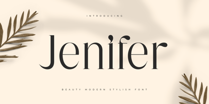 Jenifer is a Beauty Modern Stylish Font A new font that we created special for branding needs, with unique characters and awesome alternative characters are ready to add value of your brand. It so nice to leverage designer or product owner that need solutions to make their design look more beauty and modern. And specially for Salute font, We prepared any swash and any alternate characters to help you create unlimited variations for your creative needs. Jenifer is a Beauty Modern Stylish Font ready with: Any options to get creative variations (combination of Alternate) Preview as a inspirations that you can do with Jenifer font Ready with Lowercase and Uppercase characters Wish you enjoy our font. :)
 - Ramole Style by Sensatype Studio,
$15.00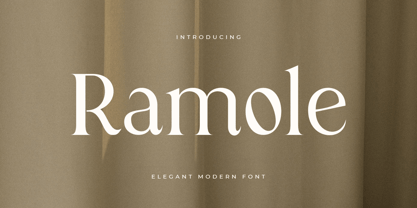 Ramole is a Elegant Modern Serif Font A new Serif font that we created special for logo and branding needs, with extra unique shape and ligatures that will add your brand value. It so nice to leverage designer or product owner that need solutions to make their design look more gorgeous and modern. And specially for Ramole font, We prepared any alternate characters to help you create unlimited variations for your creative needs specially for logotype or wordmark. Ramole Elegant Modern Serif font ready with: Any options to get creative Preview as a inspirations that you can do with Ramole font Ready with Lowercase and Uppercase characters Wish you enjoy our font. :)

