10,000 search results
(0.148 seconds)
- Ask For Mercy by Comicraft,
$49.00 She’s tall and thin with elegant, long legs and striking features. She can be seen in Comicraft’s COMIXOLOGY ORIGINALS series, ASK FOR MERCY. No, not Mercy herself — we’re talking about the ASK FOR MERCY font! Yes, you asked for Mercy -- begged for it even -- and now we are granting it to you! Mercy Mercy Me. ASK FOR MERCY contains alternate uppercase alphabets, auto-ligatures for a more random, hand-drawn appearance, and Comicraft's revolutionary Crossbar I Technology™, which puts that tricky character in exactly the right places.
 - Le Blanc by Factory738,
$15.00 Le Blanc is a strong and condensed sans serif font family with a retro vibe. Combining vintage and minimalist elements resulted in an elegant design. The different weights give you a lot of options when it comes to choosing the right typographic color for your project. 5 Weights (Thin, Light, Regular, Medium, Bold, Black) 2 Styles (Regular and Italic) Basic Latin A-Z and a-z Numerals & Punctuation Stylistic Ligatures glyphs Multilingual Support for ä ö ü Ä Ö Ü ... Free updates and feature additions Thanks for looking, and I hope you enjoy it.
 - Brokefold Sans by Tigade Std,
$15.00 Brokefold Sans, is a Sans Serif font with combination of rounded and strong edges. It's suited to cover various of tasks such as editorial to brand design, advertising, magazine layout and many more. Brokefold consists with plenty OpenType features to ease your tasks. Brokefold comes with all uppercase shapes. However, it comes with complete characters as well as international characters. Features: - Standard Characters (Uppercase) - Numerals - Punctuations - International Characters Disclaimer: Clips arts shown in the posters/images are not included. It is for promotional purpose. Enjoy designing and stay Safe! Tigadestd
 - Vow by Thinkdust,
$15.00 Vow is an incredibly stylised font, strutting its stuff on the typography catwalk. Vow does everything to excess, even when cutting down: where it’s curvy, it’s very curvy, but where it’s thin, it’s thin. Vow’s regular weight has a certain boldness at text size, but its ultra-thin alternative is much better used at larger sizes, managing to take up very little space even when scaled up. Using a mix of the two creates a subtle emphasis, especially when coloured, which helps to create stunning messages in elegant ways.
 - Galle by Typophobia,
$25.00 Galle is a very distinctive and specific typeface. It has 356 glyphs that are coherent in their own way. We have two versions to use: regular and italic. It is a display font with very characteristic letters, each of which has been developed separately, but in such a way as to match the rest of the typeface. The inspiration taken to design the cut is Sri Lankan typography - a lot of squiggles and sharp edges, hence the name of one of the prettiest and atmospheric cities in Sri Lanka - Galle.
 - Anchoe by Cooldesignlab,
$20.00 Anchoe is a bold, unique, fashionable, luxurious, modern and elegant serif with lots of ties and alternatives that will make your presentation more amazing and stand out! Anchoe supports Multi Languages and PUA has been coded. This font is versatile and perfect for any modern project including branding designs, logos, invitations, wedding decorations, website designs, Instagram, business cards, and more. Feature: Uppercase + Lowercase Numbers + Punctuation OpenType features Multilingual support If you have questions, feel free to contact me via Gmail: Cooldesignlab@gmail.com. Give us "like" and support our work. Thank you very much. Enjoy !!!
 - Sunshine Formula by PizzaDude.dk,
$17.00 Imagine having a formula for sunshine. I mean, in a way to make the sun shine when you want it, or really need it. That could be for a day at the beach, or for the plants in your garden - or even better: make someone happy with a little bit of sunshine! I made this font on the first day of summer in Denmark 2020 - the rounded corners and the soft and easy look of Sunshine Formula, really got me into the "this-is-going-to-be-a-great-summer" mode! :)
 - Mrs Summer by Hipopotam Studio,
$20.00 Mrs Summer is a hand drawn narrow typeface with a Western touch. It has only uppercase characters with alternate glyphs in place of lowercase letters and additional alternate glyph in a Stylistic Set. It has build in OpenType Contextual Alternates feature that will automatically set alternate glyphs depending on frequency of appearance of the same character (even in web font but only in HTML5 browsers). The script doesn’t just throw random glyphs. Additionally Mrs Summer is filled with ornaments, arrows, stars, horses, trees and a lot of other symbols.
 - Melodica by Scholtz Fonts,
$19.95 Melodica was so named because the characters dance easily across the page as music wafts across a room. The font was designed to meet the need of designers that need clarity, sensuousness, a suggestion of the oddball, and a modicum of humor. With its boldly curvy caps, and large x-height lower case characters, Melodica suggests a boldness of purpose while enjoying a well modulated delicacy of line. Use Melodica for any purpose that wants a happy, vibrant, slightly quirky yet "not too far from the norm" solution. Language support includes all European character sets.
 - Supaduper PB by Pink Broccoli,
$16.00 Supaduper PB is a font inspired by some wonderfully funky hand-lettered greeting cards from the 1980's. The delightfully awkward and animated playfulness of this lettering style was maintained throughout the fleshing out from the original specimens - and I think you're going to have a lot of fun typing with this. Even if you haven't seen these old greeting cards, the lettering style has a familiar visual to it. Bring back a little nostalgia, add a little wonkiness, or just have fun typing with Supaduper PB today!
 - MB Narrow by Ben Burford Fonts,
$20.00 MB Narrow is a very compressed display font that comes in three weights. with is full use of the 20 stylistic sets it gives the user a lot of scope to how it look. without using them it has a very rounded and geometric look but with alternates for the Capital A, M, N, V, W, X, Y and the lowercase a, f, g, v, w, x & y you can create a more traditional 'movie poster' look. with standard & discretional ligatures and oldstyle figures there are plenty of opentype features.
 - Akros by VP Creative Shop,
$20.00 Introducing Akros - Art Deco Serif typeface Akros is luxury, Art Deco inspired typeface with 4 weight, 51 ligature glyphs and multilingual support. It's a very versatile font that works great in large and small sizes. Akros is perfect for branding projects, home-ware designs, product packaging, magazine headers - or simply as a stylish text overlay to any background image. Uppercase, numeral, punctuation & Symbol Light Regular Bold Black Ligatures Multilingual support Feel free to contact me if you have any questions! Mock ups and backgrounds used are not included. Thank you! Enjoy!
 - Big Top by Comicraft,
$19.00 Step Right Up, Step Right Up, the Font Circus is in town and ready to reveal our stupendous new tent-pole feature! Step inside for the best seat in the house. Ringmaster Roshell Beauregard dons his Big Top Hat especially for this occasion and promises us that Clowntime ain't over until the Bearded Lady takes a custard pie in the face. Our Big Top Bonanza performance begins with sideshow attractions and distractions, high-wire acrobats and low-cost rubber band guns. Can you smell the greasepaint and hear the roar of the crowd already...?
 - HGB Bluesband One by HGB fonts,
$23.00 The roots of this font go back to 1967. A book title in trendy letters was created in a completely ingenuous way as a film prop for a Super 8 fun film. I drew the letters with felt-tip pen and poster paint without thinking too much about it. It wasn't until a good 50 years later that I realized, this was a first awkward typeface draft. The flower power vibe was captured here subconsciously. In 2019 I completed the few glyphs and created variants that I would not have thought of at the time.
 - Muifamoso by TypeClassHeroes,
$17.00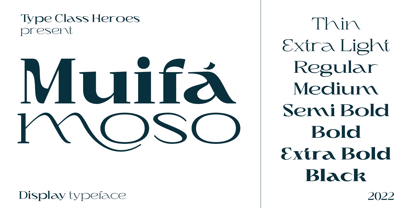 Muifamoso designed to become a elegant, this font has the potential to bring each of your creative ideas to the highest level. Combine with ligatures and special alternative glyphs so you can create a lots with layouts and compositions. Muifamoso brings a touch of luxury and bespoke custom typography to logos, websites, social media quotes, wedding branding, and more. Whats Included? Uppercase & Lowercase Number & Symbol International Glyphs Multilingual support Thank you so much for checking out my shop, and please get in touch if you have any questions!
 - Basic Sans by Latinotype,
$29.00 Basic Sans: A necessary sans. Designed by Daniel Hernández A family of Grotesque features with a functional, neutral and seeming clean style that looks to keep a neutral (or basic) appearance on paper, but including lots of details that give it a unique personality. Basic Sans is a sans-serif typeface well-suited for publishing projects, medium-sized text, branding, posters, headlines and more! This font family comes in 7 weights—ranging from Thin to Black—plus matching italics and has a set of 416 characters that support 206 different languages.
 - PRIMITIVE by JAF 34,
$1.90 PRIMITIVE is an attempt for an essential of urban culture, especially graffiti and the unique pixaçao. PRIMITIVE is also inspired by the ancient cultures, especially scandinavian tribes as an anagram to the present. This "vandalism" is viewed from several angles. PRIMITIVE is one of them. PRIMITIVE is one of the modern headline fonts which include a lot of alternates, a variation of one word for a comfortable use. Two weights, ligatures and stylistic sets are obvious. And this cheap price is a support to this independent culture from me.
 - Fine Gothic by Fine Fonts,
$29.00 Fine Gothic was developed over several years, and was partly inspired by the blackletter fonts of the great 20th century calligrapher and lettering designer, Rudolf Koch. Although blackletter has many historical and cultural associations with Germany, and has been used in the English-speaking world excessively on the mastheads of newspapers or the facades of antique shops, contemporary designers should not be deterred from adding these vigorous letterforms to their repertoire. Conventional blackletter tends towards the heavier weights, which makes the Light weight of Fine Gothic something of a delight and a rarity.
 - Retrouvailles by Hanoded,
$15.00 Retrouvailles is a French word, which means ‘the feeling one gets after reuniting after a long time’. This script font was based on a couple of handwritten letters and postcards and my own imagination. I used a drawing tablet for the ligatures and the connecting strokes. Retrouvailles comes in 3 distinct styles: the slightly slanted regular style, an Italic style and a back slanted style. Retrouvailles has an abundance of goodies under the hood: it comes with a lot of ligatures and all the diacritics you could poke a stick at.
 - Mayonaise by Hanoded,
$8.00 Ah, so you've noticed a typo! Mayonnaise - the sauce, is written with double 'n'! I know. This font was named after a Smashing Pumpkins song that I like very much. Mayonaise is a bit of an ugly duckling. It is strange, open and messy, and might not be love at first sight. BUT, when you spend some time with Mayonaise and get to know her, you might actually fall in love. Just like that song I mentioned earlier. Go on then, give it a try! At this price, you can't go wrong!
 - Culinary by Latinotype,
$39.00 Culinary is a typographic system inspired by the art of cooking. This family comes with 2 subfamilies: one Regular Family of 4 weights plus a Sans Line font and a set of Borders, and one 4-weight Script Family that also includes Sans Line and Borders. Culinary is well-suited for packaging, restaurant and cafe branding, bakeries, logos, magazines, menus, recipe books, invitations and much more. The OpenType features allow access to a wide set of characters, including ligatures, swashes, endings, initial and terminal forms, and lots of alternates.
 - Spydolls by SemutHitam,
$15.00 Introducing Spydolls a playful monoline script font inspired by the handwriting of marker pen, highly recommended for your design projects. You can use it for: logo design, t-shirt, branding, prints, and much more. A total of 600 glyph with a great selection of each glyph multilingual language support comes with a standard european made you not difficult to use. We hope to always keep making products more attractive. Don't hesitate to ask us if there are things you want to tell them:) Thanks and havefun with Spydolls
 - Jasan by Storm Type Foundry,
$49.00 Jasan is the Czech expression for ash tree (Fraxinus Excelsior) which provides great wood for tools and furniture. In a landscape it’s a rather inconspicuous tree which forms beautiful alleys. Jasan typeface represents a synthesis of many famous sans-serifs: despite the concept being strictly rational, it’s not at all cold. Simple shapes & human expression will make your projects nicely colored. It brings excellent clarity for printed and web publishing, visual identity & information systems. The 36-font family contains multi-lingual support including Cyrillics, Small Caps & rich palette of OpenType Features.
 - Alternasci by Morganismi,
$9.00 The Alternasci family consists of five consists of five individual fonts in the spirit of renaissance. Alternasci Regular is a handmade typeface resembling markings in old manuscripts. It supports most European languages. Alternasci Alchemia comes with the uppercase Alternasci letters and (in Latin) explained alchemy symbols. Alternasci Magia comes with lowercase Alternasci letters. The upper case is the so called Theban or Witch's Alphabet. It has also got some magical idols. Alternasci Picturae gives you by its four hundred pictures an imagery of good old science, mostly related with alchemy and occultism.
 - Bidena by Twinletter,
$18.00 Introducing Bidena, the perfect script font for those looking to add a touch of elegance and sophistication to their designs. With its unique and stylish curves on each character, Bidena is perfect for all kinds of projects that require a touch of sophistication and class. This font features stylistic set alternates and ligatures that add an extra element of style and creativity to your work. Its flowing lines and intricate details create a stunning and memorable impression that is sure to leave a lasting impression on your audience. Bidena is perfect for any design project, from wedding invitations to branding and advertising materials. Its unique and versatile style makes it the perfect choice for designers who want to add a touch of personality and character to their work. So whether you’re creating a logo, a product label, or a poster, Bidena is the perfect script font that is sure to help you make a statement and stand out from the crowd. Try it out today and see for yourself just how unique and versatile Bidena can be! What’s Included : - File font - All glyphs Iso Latin 1 - Alternate, Ligature - Simple installations - We highly recommend using a program that supports OpenType features and Glyphs panels like many Adobe apps and Corel Draw so that you can see and access all Glyph variations. - PUA Encoded Characters – Fully accessible without additional design software. - Fonts include Multilingual support
 - Kastella Script by Mans Greback,
$79.00 Kastella Script is essentially an artist's dream tool. It feels as if you're not just typing but crafting a visual narrative, almost like putting the finishing touches on a piece of design art. It's not about the text; it's about the story it tells. The font is equipped with heavy letterforms and a range of stylistic swashes, providing a versatile toolset for modern design projects, from branding to editorial layouts. Use underscore _ to make an underline. Example: Bea_uty Use multiple underscore for different swashes. Example: Super____human Kastella Script is built with advanced OpenType functionality and has a guaranteed top-notch quality, containing stylistic and contextual alternates, ligatures, and more features; all to give you full control and customizability. It has extensive lingual support, covering all Latin-based languages, and includes all the characters and symbols you'll ever need. Behind this exquisite creation is Mans Greback. Known for pushing the boundaries of type design, Greback has ventured into the intricacies of aesthetic diversity with Kastella Script. His portfolio is a testament to his versatility and daring, turning simple alphabets into powerful visual narratives.
 - Mad Scientist by Comicraft,
$19.00 Working on The Lab late one night, evil comic book genius Scott Christian Sava realized there was something missing from his graphic experiment! No, not slugs and snails or puppydogs' tails, nor sugar, spice, everything nice and formula 'X'....No, what his nefarious scheme was missing were the actual numbers and letters with which he could complete his equation! BRILLIANT! What he needed was something antiseptically clean and readable, even at small sizes for megalomanical rambling as well as the 5 point type under the Bio-Hazard logo that nobody really reads, and yet also bouncy and energetic enough for the inevitable sound effects that might follow exclamations such as: "IT'S ALIVE!" or "IT JUST-MIGHT-WORK!" Thanks to those awfully nice chaps at Comicraft, MadScientist is now available to evil geniuses everywhere, and guaranteed Laboratory tested.* *On reanimated human beings reconstituted from bones and organic body parts and organs from local charnal houses. No animals or small children were hurt during the creation and use of this font. Well, not yet, anyway. Artwork by Lew Stringer
 - Trivia Humanist by Storm Type Foundry,
$53.00 I decided to draw the Regular style of Trivia Humanist not too light and the Bold not too dark. Delicate anatomy and moderate contrasts of serifed humanist typefaces aren’t usually born by interpolating between extremes, but rather by meticulous care for each individual letter. A delicious blend of a trace of punchcutter’s tool and calligrapher’s hand with as few historical reminiscences as possible. It stays away from any strong aesthetic colorations as well, which is a common feature of the Trivia family system. I wanted a clear and majestic typeface for book jackets, LP cover designs, posters, exhibition catalogues and shorter texts. But at the end it turned out excellent for largest books as well.
 - Voice by Hubert Jocham Type,
$39.00 In comparison to most of my typefaces that tend to be fairly expressive, I wanted Voice to be simple, effective and easy to use. Voice was designed to work well in a wide range of sizes, and also in narrow tight columns with a wide range of weights. Those are some criteria for a good corporate typeface that I could clearly see in all my corporate branding projects. It is not that a brand needs all the weights but some appropriate weights can be chosen from that wide range. In copy you should not use heavier than Heavy. ExtraBold and UltraBold work best in display. Recommended uses: corporate branding, magazines and other publications.
 - Acklebury by Studio Buchanan,
$32.00 Acklebury is a chunky, reverse contrast, slab-serif typeface available in two styles. It has heaps of personality, plenty of open type features, and a whole host of special characters and dingbats. Although it's drawn from historical sources, Acklebury is not a straight revival, rather more of an homage to the many, varied, extended lining figures of the late 1800's. Acklebury celebrates the once labelled 'hideous' combination of wide rounded forms and hard slab serifs. Only using modern type technology to fix the spacing and kerning issues that would of been impossible with metal or wooden type. Acklebury is not a French Clarendon, neither is it really an Italienne... but it is phat, wide and hella funky.
 - Walklike by Cerulean Stimuli,
$17.00 You've searched for "Egyptian" but, thanks to a quirk of type jargon history, much of what you found is not what you had in mind for the voice of Thoth in your comic book, or the hints in your Mummy's Tomb game. And you don't want to fall back on You-Know-What. Fear not; now there's Walklike! Pyramids, reeds, the Eye of Horus, and other recognizable symbols inspire the letterforms of Walklike to create the feel of Ancient Egyptian hieroglyphs while remaining fully legible. The strokes are casual but careful, at home in ink or stone alike, and kept interesting and natural-looking automatically with ligatures and some contextual alternates. The air of ancient mystery is unmistakable!
 - Hermanz Titling by California Type Foundry,
$47.00 Hermanz™ Titling is inspired by the most majestic caps that Hermann Zapf ever drew. They are inscriptional caps, square caps, or “capitalis monumentalis”. These caps are some of the most beautiful letters made by one of the greatest talents of our time; so beautiful they deserve to be seen and appreciated by everyone. If you do any work for churches, wedding, funeral, anniversary, or other ceremonies, for the fine arts, exclusive clubs, or higher education—you will love how these letters make your brochures, pamphlets and announcements look. Hermanz Titling works for anything labeled "fine": fine dining, fine music, fine art (pamphlets, books, posters, cookbooks). It also fits well for religious topics: posters, events, websites, hymnals, for biblical; and ceremonies, religious or otherwise. Emotions It Can Communicate: • Importance • Timelessness • Special Event • Tradition • Reverence • Artistry • Beauty Released June 2021 on the Memorial of Hermann Zapf, as part of the California Type Foundry Memorial Series: Honoring the life and work of the great font designers. FONT STORY The Majestic Caps When I was on one of my visits to rare books rooms I found some large caps of Hermann Zapf, and I knew that I had to make a font inspired by these. I was surprised that no one had ever made them into a font. They were some of the most beautiful caps I had ever seen. These caps were surprisingly difficult to make. I thought it would take me a week or two; to get the detail and spirit right took significantly longer– but it was well worth the effort! When you print Hermanz Titling on a page, you will see what I mean. Even when printed digitally, it’s the closest thing to letterpress. You might even have some people thing it was printed by a traditional method with ink! (Note: Unless printed at very large sizes, this font is not recommended for actual letterpress, because the serifs are too thin.) If you do any work for churches, wedding, funeral, anniversary, or other ceremonies, for the fine arts, exclusive clubs, or higher education—you will love how these letters make your brochures, pamphlets and announcements look. Enjoy this breathtaking font, and may it help inspire people with your messages! –Dave Lawrence & the California Type Foundry
 - Ah, the ever-so-futuristic and slightly otherworldly font known as Nasalization, crafted by the visionary Ray Larabie, is like the Vespa scooter of typography: quirky, stylish, and with a hint of ret...
- Extra Extra by Comicraft,
$19.00 EXCLUSIVE! Read all about it! The latest scoop from Comicraft is sure to be in all the newspapers today! The Times are a changin' -- comic book letterers everywhere can say a font farewell to typesetting the front pages of Planets and Bugles in Helvetica, Verdana or Gill Sans! Superhero's Pal, Johnny "Roshell" Olsen, was up all night writing copy for the late-night edition, making sure that your newspaper headlines and copy have a warm, pen lettered look... some might say a Rosen-glow! Put a little Extra Extra in your bylines and maybe there's a Pulitzer and an Eisner in your future! Not ready to purchase? Get ExtraExtra Engraved free with any purchase, or by subscribing to our newsletter at the bottom of this page. Features Seven fonts (Regular, Italic, Bold, Bold Italic, Heavy, Heavy Italic & Engraved) with upper and lower case alphabets.
 - Bodrum Soft by Bülent Yüksel,
$19.00 You can download Bodrum Soft PDF Type Specimen here . "Bodrum Soft" is a rounded sans serif type family, designed by Bülent Yüksel in 20018/19. The font, influenced by serif styles that were popular in the 1920s and 30s, is based on optically corrected geometric forms for a better readability. "Bodrum Soft" is not purely geometric; it has vertical strokes that are thicker than the horizontals, an “o” that is not a perfect circle, and shortened ascenders. These nuances helps the legibility and gives "Bodrum Soft" an harmonious and sensible appearance for both texts and headlines. Bodrum Soft provides advanced typographical support for Latin-based languages. An extended character set, supporting Central, Western and Eastern European languages, rounds up the family. “Bodrum Soft 14 Regular” forms the central point. "Bodrum Soft" is available in 10 weights (Hair, Thin, Extra-Light, Light, Regular, Medium, Bold, Extra-Bold, Heavy and Black) and 10 matching italics. The family contains a set of 650+ characters. Case-Sensitive Forms, Classes and Features, Small Caps from Letter Cases, Fractions, Superior, Inferior, Denominator, Numerator, Old Style Figures can be accessed with one simple touch in all graphic programs. Bodrum Soft is the perfect font for web use. I hope you enjoy using it!
 - Flanker Tanagra by Flanker,
$12.00 In order to give new imput to the art of typeface design in Italy, Nebiolo Company held, in March 1910, an artistic competition for a new alphabet conception, so the best-ranked design would be transformed into a real new typeface. 42 competitors participated and, although the first prize was not technically awarded, "Ancora" resulted as the best typeface, created by the designer-typographer Natale Varetti of Turin. Nonetheless, the new alphabet was transformed into a full-fledged metal typeface in 1924, renamed "Tanagra" in honor of the Greek city in the center of Boeotia. The new font, although not significantly detached from the classical Roman form, introduced decorative elements that allowed its use in both rational and artistic compositions. This font appears very clear and easy to read, with very high ascenders and some decorations that make it distinctly retrò. Finally, after almost 100 years, this peculiar character has been digitized taking it as a model the shapes of the 16 points size (other dimensions have significantly different contrasts and proportions). To adapt it to modern use, some glyphs have been modified, but all the originals are available as Stylistic Alternate OTF, as well as all the swashed variants while the missing ones were added.
 - Doris by Fontsphere,
$16.00 Introducing DORIS: A Sweet Handwritten Font Family. DORIS is a stunning new font designed to add a touch of sweetness and charm to your designs. It was originally created for a series of children's books, then it was expanded with additional glyphs and additional thicknesses were added.. --- Key Features:. Handwritten Charm: DORIS captures the beauty and warmth of handwritten lettering, bringing a personal and intimate feel to your designs. Its imperfect lines and organic shapes radiate authenticity and evoke a sense of genuine connection. . Versatile Usage: Whether you're designing coloring books, creating beautiful illustrations, making invitations, or crafting nicely-made quotes, DORIS adapts beautifully to various applications, providing endless creative possibilities. . Feminine and Playful: With its soft curves and whimsical strokes, DORIS exudes a feminine and playful essence. It is a font that effortlessly brings a touch of joy to any design, making it perfect for creating illustrations, invitations, and other projects aimed at capturing a sense of happiness. . Multiple Thickness Options: The availability of five different thicknesses in the DORIS font family allows you to choose the perfect stroke weight for each project. Whether you need a delicate touch or a bold statement, DORIS has you covered. . --- Usage Recommendations:. Children's Books and Illustrations: DORIS is an excellent choice for children's books, illustrations, or any other project targeting a young audience. Its playful and friendly aesthetics will capture the hearts of kids and adults alike. . Invitations and Greeting Cards: Create stunning invitations and charming greeting cards with DORIS. Its sweet and friendly style sets the right tone for special events, celebrations, or heartfelt messages. . Nicely-Made Quotes: Give your quotes a personal and endearing touch with DORIS. Whether it's motivational quotes, lovely sayings, or inspiring messages, DORIS will add warmth and authenticity to every word. . Personal Branding: Incorporate DORIS into your personal branding materials, such as business cards, logos, or website headers, to showcase your unique personality and create a lasting impression. . --- Let DORIS bring a touch of sweetness and handwritten charm to your designs. With its delightful handwritten style, multiple thickness options, and endless usage possibilities, DORIS is the perfect companion for creating projects that are full of happiness and joy.
 - Tiresias by Bitstream,
$29.99Tiresias was designed for subtitling by Dr. John Gill from the Royal National Institute for the Blind (RNIB), in the United Kingdom. The Tiresias font is designed to have characters that are easy to distinguish from each other, especially important for the visually impaired. The following key factors were considered during the design process: character shapes, relative weight of character stokes, intercharacter spacing, and aspect ratios that affect the maximum size at which the type could be used. The benefits of the Tiresias font are greatest on lower resolution displays, such as televisions, train and airline information terminals, and low resolution displays on wireless communication and handheld devices. InfoFont is for printed instructions on public terminals where legibility is the primary consideration; these instructions are often read at a distance of 30 to 70 cm. Infofont is not designed for large quantities of text. The Tiresias LPfont is a large print typeface specifically designed for people with low vision. Large print publications should be designed to specifically help with reading problems, and should not just be an enlarged version of the ordinary print. The Tiresias LPfont family, made up of roman, italic, and bold weights, was designed to address and solve these issues. The RNIB developed PCfont for people with low vision to use on computer screens. It is designed for use at larger sizes only. PCfont includes delta hinting technology in the font to ensure pixel-perfect display at key sizes. Signfont is for fixed (not internally illuminated) signage. The recommended usage is white or yellow characters on a matt dark background. Note that the “Z” versions have slashed zeroes, and are identical in all other respects. These faces were developed together with Dr. John Gill of the National Institute of the Blind, Dr. Janet Silver; optometrist of Moorfields Eye Hospital, Chris Sharville of Laker Sharville Design Associates, and Peter O'Donnell; type consultant. Tiresias himself is a figure from Greek mythology, a blind prophet from Thebes. - Neue Haas Unica by Linotype,
$53.99 The Neue Haas Unica™ family is an extended, reimagined version of the Haas Unica® design, a Helvetica® alternative that achieved near mythical status in the type community before it virtually disappeared. Originally released in 1980 by the Haas Type Foundry and designed by Team ’77 — André Gürtler, Erich Gschwind and Christian Mengelt— for phototypesetting technology of the day, the design was never successfully updated for today’s digital environments – until now. Toshi Omagari of Monotype Studio has given this classic a fresh, digital facelift with more weights, more languages and more letters to meet today’s digital and print needs. Available in 18 styles, the Neue Haas Unica family is remarkably appropriate for a wide range of applications, possessing a delicate gradation of weights and clear character shapes. The family's lighter weights are perfect for headlines and other large settings, as well as small blocks of copy at typical text sizes. The regular, medium and bold weights know no boundaries and the heavy and black designs are ideal for when typography needs to be powerful and commanding. Like the Neue Helvetica and Univers Next typefaces, the Neue Haas Unica family can be used just about anywhere – or for any project. In addition to its 9 tailored weights and complementary italics, the Neue Haas Unica family also possesses additional characters for Eastern and Central European, Greek and Cyrillic language support, which did not exist in the original design. A cosmopolitan typeface for today's modern, discerning design needs, the Neue Haas Unica collection is a new classic in the making—one that every designer should surely have at their disposal.
 - Choret Fudyng by Alit Design,
$19.00 Introducing Choret Fudyng, a font with a captivating Bubble style that will elevate your designs to new heights. This font family offers a range of options to suit your creative needs, including the enchanting 3D, classic Regular, and elegant Light variants. Whether you're designing logos, posters, or social media graphics, Choret Fudyng has the perfect style to make your text pop. Each letter is meticulously crafted with attention to detail, ensuring a visually pleasing and harmonious look. With Choret Fudyng, you can effortlessly add depth and dimension to your typography, creating stunning visuals that leave a lasting impression. Choret Fudyng is not just a font; it's a complete typographic solution. With full support for PUA Unicode, this font allows you to access a wide range of additional characters and symbols, expanding your creative possibilities. It's also designed to be multilingual, enabling you to effortlessly communicate in different languages and alphabets. But that's not all - Choret Fudyng takes ligatures to the next level. With an extensive collection of ligature options, this font lets you create fluid and seamless connections between characters, enhancing the overall aesthetic appeal of your designs. Whether you're designing logos, branding materials, or invitations, Choret Fudyng's ligatures will add a touch of elegance and sophistication. Experience the power of Choret Fudyng and unlock a world of typographic versatility. With its PUA Unicode support, multilingual capabilities, and abundant ligature options, this font is a must-have for any designer or creative enthusiast. Language Support : Latin, Basic, Western European, Central European, South European,Vietnamese. In order to use the beautiful swashes, you need a program that supports OpenType features such as Adobe Illustrator CS, Adobe Photoshop CC, Adobe Indesign and Corel Draw. but if your software doesn’t have Glyphs panel, you can install additional swashes font files.