10,000 search results
(0.016 seconds)
- D Blues by W Type Foundry,
$29.00 D Blues its a sans serif typefamily of 9 weights plus matching italics. It is inspired by the neo humanist typefaces with a mix of 20st grotesque sans typeface. D Blues serve very well in web & print design areas, body text, excellent web-font legibility etc… D Blues is equipped with a complete set of opentype features including alternative glyphs, fractions, ligatures and many more. It is perfectly suited for highlighting lettering, magazines, web, interaction design, advertising & logotypes.
 - Monka by DYSA Studio,
$19.00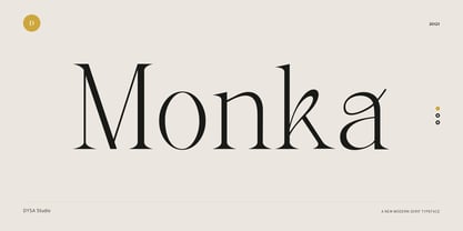 Monka is a New Modern Serif Typeface. This another collection of Serif is perfect for your next branding project, excellent for your business. Monka have a smooth edges, so this font gives an authentic handcrafted feel style. Monka is perfect choice for people looking for clean, modern, minimalist, elegant, beauty design styles. Suitable for almost any graphic designs such as logo, branding materials, business cards, gift cards, t-shirt, cover, thumbnail, print, poster, photography, quotes .etc
 - Belgia by HansCo,
$15.00 Here come our latest product with sans serif typeface called Belgia. This font has the characteristics of a rounded shape on each side. Besides this font is perfect for those of you who are looking for font with bold and rounded but still look classy. You can use it on corporate branding, logo, document, social media design, presentation, print design, web, etc. This typeface is comes in uppercase, lowercase, punctuation, symbols, numerals, etc also support multilingual.
 - Solomon Sans by Fontfabric,
$40.00 The new Solomon Sans type family includes 14 unique design styles. The font family is characterized by excellent legibility, well-finished geometric designs, optimized kerning etc. Solomon Sans is most suitable for headlines of all sizes, as well as for text blocks that come in both maximum and minimum variations. The font styles are suitable for any type of graphic design - web, print, motion graphics, etc, and perfect for t-shirts and items like posters and logos.
 - Glimp by OneSevenPointFive,
$15.00 Glimp, is a new versatile modern geometric font family, offering 3 widths, 9 weights and corresponding italics. It features rich set of opentype features such as stylist sets, contextual alternates, case sensitive forms, superscripts, subscripts, fractions, and more. Glimp is expertly crafted to be your top choice across a diverse array of projects, be it branding, web design, print materials, or presentations. It seamlessly enhances your designs, embracing your unique creative vision. Note: Also available in Variable version
 - NorB Sketch by NorFonts,
$30.00 NorB Sketch is inspired from my NorB Felt Pen font, so trying a new technique of lettering. It is a handwritten text font witch can be used with any word processing program for text and display use, print and web projects, apps and ePub, comic books, graphic identities, branding, editorial, advertising, scrapbooking, cards and invitations and any casual lettering purpose… or even just for fun! It comes with 6 weights, Normal, Bold and Heavy each with their Italics.
 - Beau's Varsity by Beau Williamson,
$4.99 I designed this font a few years ago to address a direct problem. My work demanded small paragraphs of text to be screenprinted in a varsity font style. The house varsity was rather uneven and created small blobs of ink at sharp angles when printed. I designed Beau's Varsity to address both of these problems. The new font eliminated the blobbing, and I like to think my original design is a step up in evenness from the other options.
 - Durer Display by iframe,
$28.00 Durer is a modern font, its soft curves and refined details create a sense of elegance. Inspired by the work of Albrecht Dürer (21 May 1471 – 6 April 1528), who was a German painter, printmaker, and theorist of the German Renaissance. Born in Nuremberg, Dürer established his reputation and influence across Europe in his twenties due to his high-quality woodcut prints. 551 Glyphs Upper / lower case, numbers, punctuation Language support: Latin / Greek Designed by iframe type foundry
 - Rotally by DYSA Studio,
$19.00 Rotally is a New Modern Serif Typeface. This another collection of Serif is perfect for your next branding project, excellent for your business. Rotally have a smooth edges, so this font gives an authentic handcrafted feel style. Rotally is perfect choice for people looking for clean, modern, minimalist, elegant, beauty design styles. Suitable for almost any graphic designs such as logo, branding materials, business cards, gift cards, t-shirt, cover, thumbnail, print, poster, photography, quotes .etc
 - Baby Algutta by IM Studio,
$19.00 Baby Algutta is a modern, handwritten and modern calligraphy font. The shape is modern and unique and the writing style is very natural. The Baby Algutta features a varied baseline, smooth lines, beautiful glyphs, and amazing alternatives. Hand-drawn design elements allow you to create many beautiful typographic designs in an instant such as branding, web and editorial design, prints, crafts, quotes, It's great for logos, wedding invitations, romantic cards, labels, packaging, name spelling, and more. Thank you.
 - JAF Herb by Just Another Foundry,
$59.00 Herb is based on 16th century cursive broken scripts and printing types. Originally designed by Tim Ahrens in the MA Typeface Design course at the University of Reading, it was further refined and extended in 2010. The idea for Herb was to develop a typeface that has the positive properties of blackletter but does not evoke the same negative connotations – a type that has the complex, humane character of fraktur without looking conservative, aggressive or intolerant.
 - Eternity by Senekaligrafika,
$12.00 "Eternity" is a font with hard strokes and a signature style that instantly evokes a romantic sensation. With this font, you can take your creative projects to the next level. Whether it's for everyday use or special occasions such as weddings, Valentine's Day, greeting cards, headings, flyers, product packaging, book covers, printed quotes, logos, and more, "Eternity" will help you create unique and touching typographical designs. It's a versatile and modern font that offers endless possibilities to the user.
 - Lineare by Tipo,
$35.00 Lineare Serif is an attempt at solving the difficult problem of creating readable text type, seeking new ways to provide readers with some pleasure and rest as they walk along each line, creating a space where there is harmony between man and the printed form. Asymmetric serifs both in their height and width, medium contrast in the stroke, and balanced upward and downward movements make “Lineare Serif” a typeface featuring both attitude and aptitude for editorial purposes.
 - Stenka by Katatrad,
$39.00 Stenka is a sans-serif stencil typeface that stand for display typeface to use in any typographic situation. It has his own unique style in expressed perfect condensed forms. Stenka is an ideal font family for display, print, corporate identity, mobile devices, magazine cover, signage, and web design creation, with a set of ligatures and alternative characters for your design in any layout. The family has 4 weights ranging from Light to Black and their italic.
 - Nocken by skillyas studio,
$15.00 Nocken is a sleek and modern sans-serif font that exudes elegance and simplicity. With its clean lines and minimalistic design, Its versatility allows it to be used for a wide range of projects, from branding and logo design to web and print materials. Nocken's balanced proportions and subtle details make it highly legible and visually appealing, ensuring that your message will be conveyed with clarity and style. to see more our work visit our website: skillyasstudio.com
 - Mahezty by DRM Works,
$19.99 Mahezty is a modern, bold and fashionable serif display font. This font is imposing and features uniquely shaped letters, and as a result, it will easily match a wide range of creations that require a distinct touch. Mahezty is perfect choice for people looking for modern, minimalist, elegant, clean, beauty design styles. Suitable for almost any graphic designs such as identity, business cards, branding materials, gift cards, t-shirt, cover, thumbnail, print, poster, photography, quotes .etc
 - Angolla by Letterafandi Studio,
$14.00 Angolla is a fabulous, elegant, and modern display font that’ll engage your audience and make your branding stand out. This stylish font can be used for a host of different content needs and projects. Perfect for social media branding projects, fashion designs, printed quotes, or even as a stylish text overlay to any background image and many more! This font is PUA encoded which means you can access all of the glyphs and swashes with ease!
 - Humanism by Prominent and Affluent,
$30.00 Inspired by the urban typography, which later led to a grotesque style. It can be used for bold editorial statements graphic heavy prints or just as a simple logo. This new type will definitely make your designs stand out and unique. Its robust, strong and contemporary form makes it perfect for any project that needs the extra strength. Humanism is available from A to Z in the regular and italic style, developed in an urban style.
 - Freight Sans Pro by Freight Collection,
$39.00 A clean, well-lit design, Freight Sans proves that even a workhorse can be a breath of fresh air while remaining invitingly readable. Ideal for boundless headlines and text, the power and detail of this design also serves well in way-finding and display environs. From web to print to apps, it’s hard to imagine a project where Freight Sans wouldn’t do the job with aplomb. When you need a sans serif–you need Freight Sans.
 - Olivine by URW Type Foundry,
$35.00 In an era of typographic neutrality, Pria Ravichandran adds spirit and flavour to the humanist sans, a genre that is known for legibility. Introducing Olivine. Olivine is a versatile type family that performs admirably across sizes. It is designed with maximum care ensuring legibility across various sizes, angles and distances. The sturdy shapes and the exaggerated ink traps fade to produce an even typographic colour and a lively texture in smaller text sizes. In larger display settings, the details become self-conscious and highlight the spectacular quality of the design. Olivine is neither experimental nor minimal, striking a balance between formality and friendliness. Olivine is clean as well as organic at the same time. Consisting of seven weights in roman and italics, the type-family address typographic hierarchy for texts of all kinds and sizes. Distinctive, yet neutral letterforms add personality to the type family. The counter-forms are large and open giving the design plenty of internal space which is balanced against the generous spacing of the characters. These features of Olivine make the reading process enjoyable in digital as well as the print medium. No squinting to read this type-family! If you are looking to add some flavour into your design, try Olivine. It is a trend-setting typeface that we predict is going that extra mile. Try before you buy, Olivine Medium and Medium Italic are available free for unlimited commercial usage.
 - FS Lola by Fontsmith,
$80.00 L-O-L-A Like the subject of the Kinks’ song, FS Lola is a little bit of both – a font with a rare combination of masculine and feminine. The font was inspired by the song, which itself was inspired by the night the Kinks’ manager spent dancing drunkenly in a Soho club with a beautiful woman... Or so he’d thought, until her stubble started to show halfway through the evening. Masculine/feminin Phil Garnham’s experience in designing FS Lola was similar to the one related by Ray Davies. Setting out to create a sans serif font, he realised along the way that he was actually dealing with a semi-serif. He went with it, though, and produced a font with the best masculine and feminine qualities: hard edges and corners tempered by shapes of softness and generosity, the outcome of what Phil calls an “organic” design process. “Initially, my designs were very graphic and hard but not very distinctive. By printing and redrawing the letters in pencil I achieved a softer and friendlier alphabet with a strong personality.” Broad Lola, as you’d expect, is very broad-minded. Available in five weights with italics – and fluent in central European languages – FS Lola offers a confident combination of feminine softness and male steeliness to any kind of design. As the song says, “It’s a mixed-up, muddled-up, shook-up world... except for Lola.
 - Mi Negra by Letritas,
$25.00 Mi negra is a funny and hilarious typography designed especially for children, thought and created by Isabel de Gregorio. It could be described as an original combination between a semi-handwright and semi sans-serif font. Thanks to its structure and nice endings "Mi Negra" is recommended for composing short texts (logotypes, packing, posters, etc.). It may similarly be used for illustrations and comics, as well as in printing press works for children from 6 to 13 years old for instance. Mi Negra has been conceived to be a useful support in all kinds of illustrations works (please note that Isabel, the type designer, considers herself primarily an illustrator). The font designer of Mi Negra tells that every time she needed to provide some text data (i.e. in children infographies) and needed to make them more understandable and suitable for children, she used this typography. The former idea was than to create a font who could be a second option to comic sans, but as the project started to reveal its forms, it was clear that it was revealing another connotation and its own character. In this way, Mi Negra went on modifying its forms and the more it developed, the more it was showing its new characteristics and concepts. The family is composed of three weighs: Light, regular and black. It provides also interesting functional ligatures. It also includes a dingbat with nice doggies. It has 434 characters and can work with 208 languages.
 - Beat Fool by PizzaDude.dk,
$15.00 Beat Fool is my latest layered font. I love making layered fonts, because the possibilities are almost endless! Play around with transparency and your favourite colorschemes and patterns to create awesome effects! Beat Fool comes in two layers that plays well together. One layer is solid and can be used for shadow, fill, texture or other creative parts of your design. The second layer is the "Regular" one - the outline that made the basis for the font. I wanted the handmade and handwritten brushstrokes visible, to keep the flaws which makes the look more authentic. Every letter has 4 different versions, again to make things more natural and kind of random! Both layers can be used alone or as described, together - and since it has multilingual support, you can be creative in all kinds of languages! :)
 - Randelany by Kartiny Type,
$12.00 Randelany Script is one of the Elegant script fonts that comes with a very beautiful character change, a kind of classic copper decorative script with a modern touch, designed with high detail to present an elegant style. Randelany Script is interesting because the typeface is pleasing to the eye, clean, feminine, sensual, glamorous, simple and very easy to read, because of the many luxurious letter connections. I also offer a number of decent stylistic alternatives for some of the letters. The classic style is very suitable to be applied in various formal forms such as invitations, labels, restaurant menus, logos, fashion, make up, stationery, novels, magazines, books, greeting / wedding cards, packaging, labels or all kinds of advertising purposes. . . If you need help or have any questions, let me know. I'm happy to help. Thanks & Happy Designing.
 - Rival Slab by Mostardesign,
$25.00 A touch of modernism for all kinds of projects Like the rest of the family (Rival Sans and Rival Serif), Rival slab has round shapes with bevelled endings on certain letters such as G, Q or Z. These are the characteristics that make Rival Slab a contemporary cast iron for all kinds of projects. It provides advanced typographical support with features such as case sensitive forms, small caps, ligatures, alternate characters, fractions, slashed zero, circled, pro kerning…It comes also with a complete range of figure set options It comes in 16 weights with corresponding italics and it’s suited for multiple purposes including editorial use, web font, apps, digital ads, ebook, and also for advertising, long text, packaging and branding. As a modern sans serif font family, Rival Sans has true italics to give more style in long texts.
 - Ongunkan Wakanda Runic by Runic World Tamgacı,
$50.00 Wakandan is an alphabet designed by Hannah Beachler, and used in the 2018 film Black Panther. It is based on Nsibidi symbols. In the film it is used to transliterate English text in the credits and other on-screen text. Another script used in the film was developed by Oluwaseun Osewa and inspired by Nsibidi, a system of symbols used in southeastern Nigeria between about 400 and 1400 AD. In addition, the symbols of several different ancient languages were also used for the alphabet. Like Old North Arabia, Old Tifinagh. I did not draw for this font, except for a few letters. I transferred the sound values from the ancient writing languages fonts that I had made before to the Wakanda font, so I did not take much time, I finished it in 4-5 hours.
 - Arogun by Twinletter,
$15.00 Arogun is a display typeface with a unique and amusing appearance. It has a lovely and clean shape. This typeface comes in three families to make it easier for you to use in your unique projects. Everyone who sees this typeface will be impressed by its distinctive, attractive, and spectacular appearance if you use it in your various projects, whether it’s an event or not. Your project will be more exquisite, professional, and one-of-a-kind than it has ever been. This graffiti font is great for product logos, poster titles, headlines, packaging, film titles, logotypes, gorgeous writing, and trendy graffiti designs, among other things. Of course, if you utilize this font in your numerous creative projects, they will be perfect and outstanding. Use this typeface right away for your one-of-a-kind and remarkable projects.
 - Waite Park JNL by Jeff Levine,
$29.00Waite Park JNL is based on the smallest of the die-cut letters and numbers contained in the Webway Sign Cabinet - once manufactured by the Holes-Webway Company of Minneapolis, Minnesota. The largest of the set's sizes (2 inch) was the model for Sign Kit JNL, the medium size (1-1/8 inch) was used to make Sign Production JNL and this font is a version from the 3/4 inch size. Each size of alphabet and numerals have their own unique characteristics, although they all follow the same basic font style, which is reminiscent of classic Art Deco-era sanserif typefaces. The name Waite Park JNL was derived from a division of Holes-Webway that (for some reason lost to time) distributed their sign kits under the name Waite Park Sign Company, located in the Minnesota city of the same name. - Eveningnews by Wiescher Design,
$39.50 Since many years I live in Munich and read the daily newspaper Abendzeitung. One morning they had redesigned the paper, using Eric Gill's Joanna for the body copy and a tweaked version of Franklin Gothic for the headlines. Since both typefaces are my all-time favorites, I was very pleased. The old hand-lettered title lettering designed by in-house designer Ernst Friedrich Adler around 1947 or 48 was untouched as it always was. Adler had worked for the newspaper an incredible 47 years! Ernst Friedrich Adler celebrated his 100th birthday in the summer of 2007 looking very healthy. But someone had adapted his title lettering for use in the chapter headings, and I did not like the way that was done. Every morning I saw those letters and thought "one day I have to clean that up". About 15 years later I finally did it! Being at it, I designed the whole typeface and added a second fancy cut. And, what do you know, the people at the Abendzeitung called me up and said they liked what I did and started using it. So since that day in 2005 I can read my morning paper without having to wonder about the chapter headings. Well maybe one day they will do another redesign and maybe they will use another one of my fonts. Your editorial typeface designer, Gert
 - Hermanz Titling by California Type Foundry,
$47.00 Hermanz™ Titling is inspired by the most majestic caps that Hermann Zapf ever drew. They are inscriptional caps, square caps, or “capitalis monumentalis”. These caps are some of the most beautiful letters made by one of the greatest talents of our time; so beautiful they deserve to be seen and appreciated by everyone. If you do any work for churches, wedding, funeral, anniversary, or other ceremonies, for the fine arts, exclusive clubs, or higher education—you will love how these letters make your brochures, pamphlets and announcements look. Hermanz Titling works for anything labeled "fine": fine dining, fine music, fine art (pamphlets, books, posters, cookbooks). It also fits well for religious topics: posters, events, websites, hymnals, for biblical; and ceremonies, religious or otherwise. Emotions It Can Communicate: • Importance • Timelessness • Special Event • Tradition • Reverence • Artistry • Beauty Released June 2021 on the Memorial of Hermann Zapf, as part of the California Type Foundry Memorial Series: Honoring the life and work of the great font designers. FONT STORY The Majestic Caps When I was on one of my visits to rare books rooms I found some large caps of Hermann Zapf, and I knew that I had to make a font inspired by these. I was surprised that no one had ever made them into a font. They were some of the most beautiful caps I had ever seen. These caps were surprisingly difficult to make. I thought it would take me a week or two; to get the detail and spirit right took significantly longer– but it was well worth the effort! When you print Hermanz Titling on a page, you will see what I mean. Even when printed digitally, it’s the closest thing to letterpress. You might even have some people thing it was printed by a traditional method with ink! (Note: Unless printed at very large sizes, this font is not recommended for actual letterpress, because the serifs are too thin.) If you do any work for churches, wedding, funeral, anniversary, or other ceremonies, for the fine arts, exclusive clubs, or higher education—you will love how these letters make your brochures, pamphlets and announcements look. Enjoy this breathtaking font, and may it help inspire people with your messages! –Dave Lawrence & the California Type Foundry
 - ATF Garamond by ATF Collection,
$59.00 The Garamond family tree has many branches. There are probably more different typefaces bearing the name Garamond than the name of any other type designer. Not only did the punchcutter Claude Garamond set a standard for elegance and excellence in type founding in 16th-century Paris, but a successor, Jean Jannon, some eighty years later, cut typefaces inspired by Garamond that later came to bear Garamond’s name. Revivals of both designs have been popular and various over the course of the last 100 years. When ATF Garamond was designed in 1917, it was one of the first revivals of a truly classic typeface. Based on Jannon’s types, which had been preserved in the French Imprimerie Nationale as the “caractères de l’Université,” ATF Garamond brought distinctive elegance and liveliness to text type for books and display type for advertising. It was both the inspiration and the model for many of the later “Garamond” revivals, notably Linotype’s very popular Garamond No. 3. ATF Garamond was released ca. 1918, first in Roman and Italic, drawn by Morris Fuller Benton, the head of the American Type Founders design department. In 1922, Thomas M. Cleland designed a set of swash italics and ornaments for the typeface. The Bold and Bold Italic were released in 1920 and 1923, respectively. The new digital ATF Garamond expands upon this legacy, while bringing back some of the robustness of metal type and letterpress printing that is sometimes lost in digital adaptations. The graceful, almost lacy form of some of the letters is complemented by a solid, sturdy outline that holds up in text even at small sizes. The 18 fonts comprise three optical sizes (Subhead, Text, Micro) and three weights, including a new Medium weight that did not exist in metal. ATF Garamond also includes unusual alternates and swash characters from the original metal typeface. The character of ATF Garamond is lively, reflecting the spirit of the French Renaissance as interpreted in the 1920s. Its Roman has more verve than later old-style faces like Caslon, and its Italic is outright sprightly, yet remarkably readable.
 - Sabor by Intellecta Design,
$59.90 Sabor is a voluptuous upright connected display font with mixed taste of script fonts. There were many inspirations for Sabor, but all started with a book from the 1950s about the battles of World War II. To that first sketches of a naive dense display typeface we, day by day, start to create a mixed style evolving some lettering concepts from 1950s, some calligraphy notions and the first display ideas. The feeling of this font is good to be used in many artworks, like logos, packaging, party invitations, layouts for t-shirts, magazine headings, and much more, since websites to and all kind of printed jobs. That font is not really a script, but, like the scripts we strongly recommends to use the caps only in the beginning of words and sentences, to contrast with the lower cases : it’s not designed for all-caps settings, so avoid that kind of use. This font has almost 700 glyphs and supports the most important Latin-based languages. We works hard in a tour-de-force kerning: over 12.000 kerning pairs soft adjusted handily. Its OpenType features include final forms, initial forms, special sets (upper and lowercase's), hundreds of contextual alternates ligatures providing letter-form variations and connections that make your designs really special, and ornaments (tails). Because of its high number of alternate letters and combination's, we suggest the use of the glyph palette to find ideal solutions to specific designs. The sample illustrations will give you an idea of the possibilities. You have full access to this amazing stuff using InDesign, Illustrator, QuarkXpress and similar software. However, we still recommend exploring what this font has to offer using the glyphs palette: principally to get all the power of the Contextual Alternates feature. You can get an idea of the power of this font looking at the “Sabor User Guide”, a pdf brochure in the Gallery section. Also available two sister fonts easy to use : SaborWords and SaborRasgosEscritura Sabor has original letters designed by Iza W and overall creative direction plus core programming by Paulo W.
 - Pantoufle by Kitchen Table Type Foundry,
$16.00 Pantoufle is French for slipper. Not the flipflop variety (or thongs if you’re from Australia), but the one you wear indoors when it’s cold. I have some too; Spanish ones, made from recycled PET bottles. Here in Holland, we call them ‘Pantoffels’ and you don’t have to be a language expert to see the resemblance between the French and the Dutch word. That is because the French are probably more savvy when it comes to keeping your feet warm and the Dutch just borrowed the word, pronunciation and all! Pantoufle is a font I made with a big fat marker pen. My kids had used it to decorate some gifts for Sinterklaas (if you want to know what Sinterklaas is, look it up). Pantoufle comes with extensive language support and a full set of alternates for the lower case glyphs. Enjoy!
 - Minehead by Hanoded,
$15.00 As a family, we love to go camping. We have a big Norwegian tunnel tent (4 season - with room for a wood stove), some really warm down sleeping bags and a primitive field kitchen. Even though our camping trips are usually devoid of luxury, the kids love them! We always choose campsites that are close to nature, like a national park or in the mountains. A couple of years ago, we toured the southern part of England and one of our camping stops was in Exmoor National Park. Minehead is a small coastal town, not far from where we camped, so I named this font after a fond memory! Minehead is a handmade display font. It was loosely based on Haettenschweiler. Use it for your packaging, your tourist information leaflets and your book covers. And do visit Minehead one day!
 - Hokaplay by Afkari Studio,
$13.00 Hokaplay - Playful Display Font Hokaplay is a playful display font that creates with a very good concept and adjusted well to keep the legibility. Hokaplay Playful Display Font Comes with upper and lowercase Standard Characters, Punctuation, Numerals And other Glyphs variation of the OpenType features/ Ligatures. Hokaplay Playful Display Font is suitable for logos, posters, school flyers, university banners, modern advertising design, product labels, cartoons, kid books, custom mugs, pillows, t-shirts, youtube thumbnail/cover, poster quote, editorial design, book/cover Title, website/blog, social media post, packaging designs,, and other designs. Features; - 2 Styles; Regular and Rounded - Standart and special ligatures - Uppercase, Lowercase, Number, and Punctuation - Works on PC & Mac - Simple installations - Accessible in Adobe Illustrator, Adobe Photoshop, Adobe InDesign, even work on Microsoft Word - Fully accessible without additional design software. - Mültîlíñgúãl Sùppört for; ä ö ü Ä Ö Ü ß ¿ ¡
 - Angostura by Typodermic,
$11.95 Introducing Angostura—the sans-serif typeface that’s set to revolutionize your designs! Drawing inspiration from the bold and beautiful American sign lettering of the 40s and 50s, Angostura is a truly unique typeface that’s sure to turn heads. With low crossbars that harken back to the industrial deco signage of yesteryear, and monocular “a” and “g” that pay homage to the mid-century Futura craze, this font is a true original. But that’s not all; Angostura comes in a range of styles, from Ultra-Light to Bold and everything in between, making it a versatile choice for any project. And if you really want to take things to the next level, be sure to check out the spray-paint, wood grain, and stencil variants—these special editions use ligatures to create bespoke letter pairs that add an extra layer of realism and authenticity to your work. So, why choose Angostura? Simple—this typeface is full of character and individuality, allowing you to convey your message in a tone that’s both distinct and memorable. Whether you’re working on a branding project, a website redesign, or a print campaign, Angostura is the typeface that’s sure to take your designs to the next level. So, what are you waiting for? Try it out today and see the difference for yourself! Most Latin-based European, Greek, and some Cyrillic-based writing systems are supported, including the following languages. Afaan Oromo, Afar, Afrikaans, Albanian, Alsatian, Aromanian, Aymara, Bashkir (Latin), Basque, Belarusian (Latin), Bemba, Bikol, Bosnian, Breton, Bulgarian, Cape Verdean, Creole, Catalan, Cebuano, Chamorro, Chavacano, Chichewa, Crimean Tatar (Latin), Croatian, Czech, Danish, Dawan, Dholuo, Dutch, English, Estonian, Faroese, Fijian, Filipino, Finnish, French, Frisian, Friulian, Gagauz (Latin), Galician, Ganda, Genoese, German, Greek, Greenlandic, Guadeloupean Creole, Haitian Creole, Hawaiian, Hiligaynon, Hungarian, Icelandic, Ilocano, Indonesian, Irish, Italian, Jamaican, Kaqchikel, Karakalpak (Latin), Kashubian, Kikongo, Kinyarwanda, Kirundi, Komi-Permyak, Kurdish (Latin), Latvian, Lithuanian, Lombard, Low Saxon, Luxembourgish, Maasai, Macedonian, Makhuwa, Malay, Maltese, Māori, Moldovan, Montenegrin, Ndebele, Neapolitan, Norwegian, Novial, Occitan, Ossetian, Ossetian (Latin), Papiamento, Piedmontese, Polish, Portuguese, Quechua, Rarotongan, Romanian, Romansh, Russian, Sami, Sango, Saramaccan, Sardinian, Scottish Gaelic, Serbian, Serbian (Latin), Shona, Sicilian, Silesian, Slovak, Slovenian, Somali, Sorbian, Sotho, Spanish, Swahili, Swazi, Swedish, Tagalog, Tahitian, Tetum, Tongan, Tshiluba, Tsonga, Tswana, Tumbuka, Turkish, Turkmen (Latin), Tuvaluan, Uzbek (Latin), Ukrainian, Venetian, Vepsian, Võro, Walloon, Waray-Waray, Wayuu, Welsh, Wolof, Xhosa, Yapese, Zapotec Zulu and Zuni.
 - Baumfuss by Ingrimayne Type,
$9.95 Baumfuss and BaumfussTwo are unpolished, crude typefaces with small flared serifs and very few straight lines. They are a bit heavy to be easily readable at smaller point sizes. Baumfuss has a high x-height, while BaumfussTwo has a more conventional x-height.
 - TBS Gartek by TypoBureau Studio,
$19.00 Meet the new Strong and Bold typeface from TBS. TBS GARTEK is a Display typeface It has a single weight ultra bold It come with multilingual glyphs. Good amount at Large Point sizes with combine with any suit typefaces, Headline, Logo font.
 - ITC Gamma by ITC,
$29.99ITC Gamma font is the work of designer Jovica Veljović. Named after the third letter of the Greek alphabet, ITC Gamma has almost no sharp corners. Its serifs, stroke endings and terminals are all rounded, a feature best seen in larger point sizes. - Ratatouille by Jonahfonts,
$40.00 Ratatouille was inspired by wooden faces of old with pointed serifs. Very suitable for Packaging greeting cards magazines posters and Advertising Ads. Designed in four weights from Extra-Light to Bold including Italics, covering a large range of editorial and advertising applications.