10,000 search results
(0.019 seconds)
- ArTarumianChartarapetNor by Tarumian,
$40.00 Font ArTarumianChartarapetNew (Chartarapet from Arm. “Architect” was created as a stylization to traditional architectural lettering.
 - KG Arrows by Kimberly Geswein,
$5.00 Hand-drawn cute arrows in a variety of styles from dashed to chunky to funky.
 - Elfort by Intellecta Design,
$22.90A lovely script face remastered from found drawings, great for antique, vintage and romantic designs. - Florida JNL by Jeff Levine,
$29.00The look and feel of the tropics is captured in Florida JNL from Jeff Levine. - Ollie Wollie by Thomas Käding,
$2.00 A simple sans-serif font made from straight line segments and true circles and arcs.
 - Blck Phnx by Dawnland,
$13.00 From the flames of the fourfold furnace, lo and behold - the Black Phoenix has risen!
 - Restraining Order AOE by Astigmatic,
$19.95A typeface made from vintage typewriter samples and meticulously compiled into a complete character set. - Bank Statement AOE by Astigmatic,
$19.95A typeface made from vintage typewriter samples and meticulously compiled into a complete character set. - Gampolins by Patria Ari,
$15.00 Inspired from bubble gum shapes, Gampolins come with playful bubble shapes in a fun way.
 - Magneta by Volcano Type,
$19.00One of our first fonts ever. Simply made from some magnets hanging on a refrigerator. - Web-o-Mints GD by Galapagos,
$19.00George Ryan’s font of typographic ornaments and borders, available as a free download from Galápagos. - Big Stuff by ArFF,
$24.95Keep Big Stuff away from toner and ink as it can't resist eating them up. - Radiac by Stereo Type Haus,
$25.00 Radiac is a semi-monospaced unicase design inspired by lettering constructed from pieces of tile.
 - LD Verdant Leaves by Illustration Ink,
$3.00LD Verdant Leaves is a bold font with leafy designs sprouting from the thick lettering. - Overdrawn Account AOE by Astigmatic,
$19.95A typeface made from vintage typewriter samples and meticulously compiled into a complete character set. - Office Memorandum AOE by Astigmatic,
$19.95A typeface made from vintage typewriter samples and meticulously compiled into a complete character set. - Letterhead by Coffee Bin Fonts,
$20.00This font family was inspired by lettering found on old letterheads from the 19th century. - Urgent Telegram AOE by Astigmatic,
$19.95A typeface made from vintage typewriter samples and meticulously compiled into a complete character set. - Military Document AOE by Astigmatic,
$19.95A typeface made from vintage typewriter samples and meticulously compiled into a complete character set. - Grunge Formal by Scholtz Fonts,
$15.00 Grunge Formal started out as a more upright, formal version of one of my fonts, Figment. A most versatile contemporary typeface, Grunge Formal works equally well from funky to formal, from giant size headers to pint size body text, from movie posters to wedding invitations. If you've ever needed a font that has a grungy, deconstructed look but works well for all sizes, a font that you can use for funky, gritty designs, and also for formal wedding stationery, Grunge Formal is a perfect choice. From the formal viewpoint, the font presents as a regular serif typeface with deconstructed edges, giving the antique look popular in wedding stationery design. Here it can be used from header to body size. For in-your-face design, Grunge Formal, when oversized, is really powerful and its deconstructed outline provides a raw, rough contrast to your background images. Grunge Formal has all the features usually included in a fully professional font. Language support includes all European character sets, Greek symbols and all punctuation.
 - BD Gitalona Variable by Balibilly Design,
$139.00 We introduce our Variable Font from the high-complex BD Gitalona font family. Consisting of 3 axes; weight, optical size, and serif, that will give you a different experience extending the family of BD Gitalona. We don't want to mention how many families can be generated from this variable font. During the development process, we got up to more than 50 families and stopped to allow you to continue to play with the slide buttons. And again, BD Gitalona is filled with an explorative and experimental decorative version that we present separately. Figure out the decorative version BD Gitalona Moxa to make the aesthetic appeal of this whole typeface here! Inspiration The world of entertainment moves non-stop. One by one, figures appeared and left. We expect to create something to entertain previous trends with packaging more relevant to the present. More specifically, we admire and are inspired by some of the world's leading and top singers with a segmented nature. We imagine so many figures that can affect every viewer. However, each artist or singer has a segment because almost all of them have characteristics. The Design The basic design of this typeface begins with a transitional serif shape with sharp, shapeless corners. Then in the middle of the invention, there was an opportunity to explore it further from the readability side by adding an optical variable that can adjust the serif thickness when used together between large, medium to paragraph text sizes for editorials. The shift from serif to sans-serif with the contrast initiated by the shift of the serif family form as a different variable also makes this font richer in terms of the features it contains. Parts are expected to add to the user satisfaction with the complexity of this font. The Features BD Gitalona consists of one sub-family intended for body text with nine weights from Thin(100) to Black(900) and four other display sub-families such as Display serif, Flick, Harmony Sans and Contrast Sans. Each consists of four weights Thin(100), Regular Weight(400), Bold(700), and Black(900). And again, there are also retailed separately; the BD Gitalona Variable font, which is designed to accommodate all Subfamily in 1 font file, and BD Gitalona Moxa, an experimental typeface. A total of 700+ glyphs in each style. Advanced OpenType features functionally and aesthetically, such as Case-sensitive forms, small caps, standard and discretionary ligatures, stylistic alternates, ordinals, fractions, numerator, denominator, superscript, subscript, circled number, slashed zero, old-style figure, tabular and lining figure. Supports multi-languages including Western Europe, Central Europe, Southeast Europe, South America, and Oceania.
 - 2 Prong Tree - Unknown license

- Vox Round by Canada Type,
$39.95 Vox Round is the softer version of the Vox family. The original brief for Vox was a extensive monoline typeface that can be both precise and friendly, yet contain enough choice of seamlessly interchangeable variants for the user to be able to completely transform the personality of the typeface depending on the application. Basically, a sans serif with applications that range from clean and transparent information relay to sleek and angular branding. When the first version of Vox was released in 2007, it became an instant hit with interface designers, product packagers, sports channels, transport engineers and electronics manufacturers. This new version (2013) is the expanded treatment, which is even more dedicated to the original idea of abundant application flexibility. The family was expanded to five weights and two widths, with corresponding italics, for a total of 20 fonts. Each font contains 1240 glyphs. Localization includes Cyrillic and Greek, as well as extended Latin language support. Built-in OpenType features include small caps, caps to small caps, four completely interchangeable sytlistic alternates sets, automatic fractions, six types of figures, ordinals, and meticulous class-based kerning. This kind of typeface malleability is not an easy thing to come by these days.
 - Haboro Slab by insigne,
$- Haboro Slab. It’s a nose-to-the-grindstone kind of font like the first of its family. This slab serif pushes through the clutter powerfully in editorial and corporate work such as business websites and software. The Haboro hyperfamily as a whole is known for its ability to make the work clear and simple, even with the fonts’ advanced angle--and Slab is no change here. Consistent with Haboro, too, the simplified geometric features of the slab face just make sense, no matter where you use it. Its timeless wedge-molded serifs give this family the formula it needs to function flexibly in jobs from fashion to packaging. Enhance your output with the font’s wide range of ligatures and alternates, including OpenType alternates. Use Haboro Slab’s large pair of solution glyphs and various other OpenType specifics, too, to give your message the clarity it deserves. Even more, it couples well with the sophisticated didone of the Haboro hyperfamily to further expand your capabilities. Haboro Slab has every quality you need for successful lettering. Use this modification on a classy tradition to mold and shape your next layout, whether website, iPhone app, advertising, or newspaper. There is no work Haboro Slab won’t power through.
 - Dancebats by Canada Type,
$24.95 According to the two most popular statistics companies in England and North America, eight out of every ten people like to dance. Talk about useless information! But with such a market statistic, we thought there would be some collections of dingbats out there with dancers in them. And surprise, surprise; we found not even one! So this was our opportunity to be the first to issue such a collection, and we are very pleased with the results. Dancebats is a font of 75 silhouettes of people dancing. All kinds of dancing. Ballet, techno, slam, rock, swing, aerobic, hip hop, jump, lounge, and much more. Take a close look at the silhouettes and find out why these are shapes that belong on every party design, bar none. The Dancebats outlines were tweaked for use at all sizes, from the very large, as in posters and signs, to the medium height, as in party flyers, invitations and publications, to the very small, as in web banners and pin-on buttons. We are anticipating these silhouettes to be used soon all over posters, signs and web sites everywhere, so get your hands on a copy and give yourself some ammunition for your next party design.
 - Bill Corporate Medium by OGJ Type Design,
$35.00 Bill Corporate is a geometric typeface with generous capitals. A modern classic, based on Max Bill’s lettering work, its straightforward and uncompromising construction can be both edgy and sublime. With minimalist letterforms, pointy apexes instead of flat ones, and archetypal proportions, this font family doesn’t follow any trends but strives to achieve a timeless formal vocabulary. The skeleton of its letters is based heavily on the famous primary shapes of the Bauhaus: square, circle, and triangle. This makes for quite wide uppercase and much narrower lowercase letters. The contrast between uppercase and lowercase benefits inexperienced users, who will be able to get appealing results quickly. At the same time, it’s a powerful tool for seasoned designers, who can employ either case selectively to set the desired typographic course. Bill Corporate Medium’s 16 styles (including a set of eight lighter-than-light fonts from “Two” to “ExtraLight”) are an excellent choice for editorial design, branding, headlines, and even short to mid-length copy in a wide range of applications and industries. The uppercase letters in particular—with their varied widths and lavish dimensions—are suitable for cosmopolitan and stylish logotypes and wordmarks. Whenever a timeless, staid, and classy look is demanded, choose Bill Corporate.
 - Lapoya by Cuchi, qué tipo,
$9.95 “LAPOYA” (meaning in english “the coolest”) is a large slab serif typeface family, with a certain Italian inverted contrast touch. Specially designed for advertising big shows and commerces, Lapoya has 36 variables and four axes, including a text and decorative versions, where the drawing and width of its counterforms vary. It also has icons that remember the old aesthetics of wood types from the early 20th century, and more than 400 characters with a multitude of signs and ligatures, that make Lapoya ideal for up to 89 languages. It is clearly inspired by the large wood types designed for posters, advertisements and newspapers. Since they were introduced in the 19th century, slab serifs have become extremely popular. In fact, serifs are often enlarged, not so much to look like beautiful or balanced letters, but to be more graphic and visual powerful than others. Furthermore, in the case of this typeface, this idea has been applied not only to capital letters, but also to the lowercase, numbers and signs of all kinds. “That’s why this typeface is LAPOYA!” Designed by Carlos Campos in 2023. cuchi@cuchiquetipo.com OPENTYPE FONT 426 GLYPHS 388 CHARACTERS 4 AXES 36 INSTANCES 9 LAYOUT FEATURES 89 LANGUAGES
 - Universo by PeGGO Fonts,
$12.00 Universo and Universo Stencil by Mauro Andrés and Peggo Fonts is a display font family for “Caos Sagrado” specially designed for informative fanzine and magazines. Its name “Universo” comes from the quote “we have to talk about the horrible things of Universe” with the main idea of supporting and help to expose social problems. Inspired on Retro-Futuristic fonts and poster design and old scientific publications that is becoming a new design trend nowadays, and strongly influenced by the Italian type designer Aldo Novarese’s work, developed in the 50’s. "Universo CS" and "Universo CS Stencil" were produced between mid-September and October 2018 by Mauro Andrés under the creative direction of Victoria Rivas and those versions were publicly showed at “Impresionante” (a massive independent printing expo in Chile) with a printed specimen. That phase of the project was updated and completed in March 2019 and was lastly finished between November 2019 and April 7, 2020, developing it in six styles, under the co-production of Peggo Fonts. "Universo" and "Universo Stencil" are both suitable for headlines and short text lines, music and concert posters, books and magazines covers, branding, logotype and graphic design. All stylistic alternates are accessible via OpenType features or character map.
 - DearJoe 6 by JOEBOB graphics,
$29.00 The dearJoe series of fonts had it’s origin somewhere around 1999, the year I created dearJoe 1, which was a first (and half-assed) attempt at converting my own handwriting into a working font. Being able to type in my own handwriting had always been a childhood fantasy, and even though I only partly understood the software, a working font was generated and I decided to put it on the internet for people to use. And that’s what they did: at this moment the dearJoe 1 font has been downloaded millions of times and can be found on just about anything, ranging from Vietnamese riksjas, a Tasmanian gym to a fancy chocolate store on 5th Avenue. The font is not something I am particularly proud of, but it started me of in building what later became the JOEBOB graphics font foundry. Inbetween creating other fonts, the dearJoe series has become a theme I revisit every once in a while, trying to create an update on how my handwriting evolved, along with my abilities in creating fonts that mimic actual handwriting. In the last decade or so I started implementing ligatures and alternate characters, which helped a lot in making something that can almost pass for actual handwriting.
 - Aljaraz by Cuchi, qué tipo,
$9.95 Aljaraz (meaning “small bell” in english) is a curvy typeface inspired on the “Fat face" letters with an extremely bold design from the early 19th century, but with an insolent touch of brave and psychedelic distortions. Aljaraz has a regular and italic variable, and in both styles the capital letters have a swash alternative where the naughty touch reaches its maximum expression. It is ideal to recall the lysergic era of the 60s, write funny words, or simply to express small texts in a display way that powerfully attracts attention. Let Aljaraz inspire you groovy kind of love! Designed by Carlos Campos cuchi@cuchiquetipo.com Secondary typeface: 'Escuela', also by Carlos Campos _ Aljaraz (“campanita”) es una tipografía curvy inspirada en las letras con un diseño extremadamente grueso y atrevido de principios del siglo XIX (las “Fat face”), pero con un toque insolente de valientes distorsiones psicodélicas. Aljaraz tiene una variable regular y cursiva, y en ambos estilos las mayúsculas tienen una alternativa súper decorada donde el toque travieso alcanza su máxima expresión. Es ideal para rememorar la época lisérgica de los años 60, escribir palabras graciosas, o simplemente expresar textos graciosos de una forma visual que llame poderosamente la atención. ¡Deja que Aljaraz te inspire su maravilloso amor!
 - Awardos by upirTYPO,
$6.00 Awardos is a complete solution for awards, badges and all kind of certificates. This font allows to mix various borders, laurels and icons to create a very unique badges. To quickly create an unique badge, type any number, any uppercase character and any lowercase character, for example 0Aa, 5Gk, 9Kl, 7Fr etc. To add starfield, start with a symbol (!"#$%&'()*+,). Glyphs included: 12x starfields - characters: ! " # $ % & ' ( ) * + , 16x borders - characters: 0 1 2 3 4 5 6 7 8 9 : ; < = > ? 36x laurels and outer elements - characters: A B C D E F G H I J K L M N O P Q R S T U V W X Y Z À Á Â Ã Ã Ä Å Ç È É Ê 12x crown icons - characters: a b c d e f g h i j k l 12x cup icons - characters: m n o p q r s t u v w x 12x number one digits - characters: y z à á â ã ã ä å ç è é ê It is not required to use a symbol from every category. For example only laurel with crown icon can be used, or only starfield with the cup icon. Awardos Inverse is an inversed version. The outline borders are still included, used symbols are: [ \ ] ^ _ { | } ~ ¢ £ ¤ ¥ ¦ § €
 - Vox by Canada Type,
$39.95 The original brief for Vox was a extensive monoline typeface that can be both precise and friendly, yet contain enough choice of seamlessly interchangeable variants for the user to be able to completely transform the personality of the typeface depending on the application. Basically, a sans serif with applications that range from clean and transparent information relay to sleek and angular branding. When the first version of Vox was released in 2007, it became an instant hit with interface designers, product packagers, sports channels, transport engineers and electronics manufacturers. This new version (2013) is the expanded treatment, which is even more dedicated to the original idea of abundant application flexibility. The family was expanded to five weights and two widths, with corresponding italics, for a total of 20 fonts. Each font contains 1240 glyphs. Localization includes Cyrillic and Greek, as well as extended Latin language support. Built-in OpenType features include small caps, caps to small caps, four completely interchangeable sytlistic alternates sets, automatic fractions, six types of figures, ordinals, and meticulous class-based kerning. This kind of typeface malleability is not an easy thing to come by these days. For additional versatility, take a look at Vox Round, the softer, but just as extensive, counterpart to this family.
 - Paradise Point by Swell Type,
$20.00 Surf's up! Take an unforgettable adventure to the sparkling shores of Paradise Point. Ride our 25 majestic weights, from tranquil tall & thin to thunderous wide & heavy. Expand your horizons with the versatile Variable font to select any spot between. One-of-a-kind activities: Drop in a thrilling Inline weight for stylistic flair. Overlay with the matching Heavy for striking color effects. Discover hidden wonders! Stylistic Alternates will take you to the scenic heights of uppercase in a friendly lowercase style. Or immerse your text in interlocking Discretionary Ligatures for an authentic Tiki Type island experience. Enchanting views: Two versions of each letter and number automatically rotate for a natural, hand-drawn appearance. The Light weights have round ends to simulate a single pen stroke, which matches the center of the Inline weights for a perfect pairing. Explore! If you venture into unknown territory, each weight of Paradise Point contains 775 glyphs for stress-free support of over 200 languages. An all-inclusive getaway: Each weight of Paradise Point includes the features above, and can set readable body text as well as create striking logos and headlines. Use it for restaurant menus, surf and skate brands, or any design project where you want to convey lively, friendly, stress-free fun.
 - Ornata F by Wiescher Design,
$39.50 Ornata F is the sixth of a series of old ornaments that I am trying to save from oblivion. I am completely redesigning the ornaments from scratch. These ornaments have been designed around 1910, I could not find out by whom. This set is perfect to design flowery frames. Your digitizing typedesigning savior, Gert Wiescher
 - ITC Tiepolo by ITC,
$29.99ITC Tiepolo font is from the design team at AlphaOmega Typography and named after Italian artist Dominic Tiepolo. The designers describe it as a sans serif with serifs" and it has also been referred to as a calligraphic design. Similar to Asian calligraphy, ITC Tiepolo font has personality yet does not detract from the text." - Anivers by exljbris,
$- Anivers is robust and rigid, forgiving, flexible and elegant ... and also suitable for a broad use: from a stationery to a poster headline. From an intro in a magazine to a base for a logo. This OpenType font family comes in regular, italic, bold and small caps and offers supports CE languages and even esperanto.
 - Quitong by Arendxstudio,
$14.00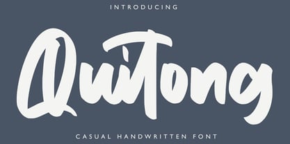 Quitong - Handwritten Font is a handwritten with a natural & stylish flow. This collection of scripts is perfect for personal branding. this works well for many applications. Everything from personal branding & wedding invitations to advertising could benefit from this collection of signature fonts Features : • Character Set A-Z • Numerals & Punctuations (OpenType Standard) • Accents (Multilingual characters) • Ligature
 - Agraham by Hishand Studio,
$15.00 Agraham is aesthetic serif font which the inspiration come from the unique Italy's vibes and some little touch from the beauty of Paris, France. It is so perfect for Logo brand, product packaging, advertisement, social media post, fashion brand, magazine headers and many more complete with ligatures alternates regular italic icon kerning multilingual support
 - Mother's Hand by Celebrity Fontz,
$19.99A down-to-earth font from the hand of a mother from a time when writing was something still done with accuracy and poise. This font evokes motherly memories that you cannot let die, memories of a woman who didn't have it easy, who never gave up, and who made sacrifices for her children. - Easy Tiles by Intellecta Design,
$21.00 A nice mix of 62 decorative tile images. Designs are reminiscent of rubber stamps of architectural tiles found in historical homes and other buildings through the ages and printed devices from old catalogues. Generic enough to add interesting detail to just about any design. From invitations and greeting cards to book jackets, labels or fabric.
