10,000 search results
(0.174 seconds)
- Rameau by Linotype,
$29.99Rameau for classic elegance The type family Rameau™ was designed by Sarah Lazarevic She started with the italics; these she derived from the manuscript of the opera Les fêtes de l´hymen et de l´amour", the music for which was composed by Jean-Philippe Rameau in 1747. In the 18th century, musical compositions were published in the form of impressions from copper plates that had been hand-engraved in contrast with books and other texts, which were printed from moveable lead type. The italic letters of Rameau include many ligatures and are thus typical of the engraving style of the period. Rameau exhibits much of the harmonious rhythm associated with genuine manuscript. The marked Antiqua contrasts make the pages on which the font is used quite literally sparkle. This effect is enhanced by the excessively sharp terminals and the prominent serifs of the upper case letters. This highly legible and stylish type family can be used for printing high quality books, invitations, menus and all kinds of texts - anywhere the grace and elegance of France in the 18th century is to be invoked." - Montague Script by Stephen Rapp,
$59.00 Montague Script takes its name from a small hilltown of western Massachusetts rich in culture and history. I lived in this beloved community for a number of years and it’s where I first began my study of calligraphy and lettering. While most brush scripts take their cue from mid-twentieth century samples, Montague Script is a fresh, contemporary alternative. It comes directly from lettering written with a #3 sable brush on smooth vellum and is digitized with the same sensibility a lettering artist writes with. Montague reflects a dynamic interplay between form and rhythm not usually associated with type. Words suggest a baseline, yet are not bound by it. Beginnings, endings, alternates and ligatures come in as needed while you type. Many more alternates are available in the glyph palette of most current graphic software. Exuberant swash versions of upper and lowercase letters, as well as ligatures can be accessed through both the type and glyph palettes. Montague Script is a natural for advertising, point of purchase displays, packaging and logo design, cards, invitations, journals and much more. You will be delighted at how well it can dress up a project and how easily it sets.
 - Fallery Script by Zane Studio,
$15.00 Fallery Script is a calligraphy script font that comes with exquisite character changes, a kind of classic decorative copper script with a modern twist, designed with high detail for an elegant style. Fallery Script is interesting because it is smooth, clean, feminine, sensual, glamorous, simple and very easy to read, because of its many fancy letter relationships. I also offer a decent number of stylistic alternatives for some of the letters. Classic style is very suitable to be applied in various formal forms such as invitations, labels, restaurant menus, logos, fashion, make up, stationery, novels, magazines, books, greeting/wedding cards, packaging, labels or all kinds of advertising purposes.
 - Art Director JNL by Jeff Levine,
$29.00 Free-form hand lettering on a 1979 poster for the Washington, D.C. exhibition of watercolors and etchings by the Elie Abrahami inspired Art Director JNL, which is available in both regular and oblique versions. This type of lettering was most popular in the late 50s through the mid-60s for movie titles, greeting cards and poster text.
 - Maginia by Digitype Studio,
$20.00 Maginia font can make your project look more unique, beautiful, and awesome like magic. Maginia has many alternatives and ligatures making this font very suitable to be applied to various formal forms such as invitations, labels, logos, magazines, books, greeting/wedding cards, packaging, fashion, make-up, stationery, novels, labels, or any kind of purpose. Thank you very much
 - Brocken by RMU,
$35.00 Good ideas never will die. Based on the concepts of former Leipzig student Volker Küster in the mid-1960s, I redrew and digitized the basics and extended them into a complete multilingual caps-only poster font which I named “Brocken”. Its letter-forms strongly remind me of the mighty rocks covering the highest peak, Brocken, in Northern Germany.
 - Trionik by Josiah Tersieff,
$15.00 Trionik is a monospace experiment in modular, grid-based typography. It is a future-forward take on the computer system typefaces of the mid- to late-20th century—when computers began to rise in usability and integrate into all art forms. Working best as a display font, the Trionik family features 4 separate styles with varying widths.
 - Normande by Bitstream,
$29.99A French form of Fat Face, derived from the British; matrices survive at Berthold in Berlin. - Bright Aurora by Mega Type,
$12.00 INTRODUCING Bright Aurora is a fun handwritten font, Mix uppercase and lowercase for a fun and unique look! Bright Aurora is perfect for quotes, t-shirt designs, websites, branding, store brand, kids designs, svg designs, blogs, poster, logos, invitations and more! Have fun using Bright Aurora!!! Feel free to follow, like and share. Thank you very much for checking my store!
 - Night Clown by Putracetol,
$20.00 Night Clown - Quirky Clown Font. With its quirky, decorative, and playful design, this font captures the essence of clowns, parties, and April Fools' festivities. Offering a delightful range of seven variations - regular, clown hat, mask, surprise, laughter, decorative, and funny face - Night Clown is a perfect fit for children-oriented projects, kids' events, posters, greeting cards, birthday invitations, and even logos.
 - Cinnamon Cookie by Tigade Std,
$10.00 Cinnamon Cookie is combination of cute-uppercase-display-font with beauty-lowercase-script-font. When it is used together, it is almost perfect for various usage such as; wedding invitation, signature, decoration, until the range of kids products. It also support international characters. Other than that, you will get couples of additional stylistic set characters to improve/enhance your design.
 - Puipui by Jipatype,
$25.00 Puipui is a sans serif typeface with a rounded, contrast stroke and minimal look. Comes with 9 weights and italics of each weight total 18 styles. Support multi-languages and Thai language. Suitable for Headline or text body. Puipui can help you to create a mood and tone of cuteness suitable for kid, pet, food product or anything about cuteness content.
 - Punch of Love by Sipanji21,
$15.00 Punch Of Love is a lovely display font that radiates charm. It features gorgeous hearts in each letter which give it an incredibly romantic feel. this font suitable for valentine day poster, logo, t shirt, event banner and etc. you can use this font for any design, apparel, kids logo, logo type, with many swash for make your design awesome.
 - Winter Swash by Illushvara,
$14.00 Hello, Introducing a new font Winter Swash inspired by graffiti style. It's bold, dramatic, urban styled display font. Add this font to your favorite creative ideas and notice how it makes them come alive like a poster, kids flyer, merchandise, quotes, branding, cartoon, comic and more. If you have any question, don’t hesitate to contact me. Happy Designing !!! Thank You, Bayu Suwirya
 - Chizcake by Tigade Std,
$35.00 Chizcake. Do you love random shape thick font? This font is cuteness overload. It is for everyone, for various design purpose. This font is suitable for happy theme, cute, party, holiday, kids and many more. It is also suitable for Logo, Cards, Branding, Social Media, Youtube Thumbnail, Advertisement, Posters, any many others. Features: – Standard Characters (Uppercase and Lowercase) – Numerals – Punctuation – International Characters
 - Phantom Peach by Hanoded,
$15.00 This summer there is an abundance of peaches. However, every time I like to eat one, they’re gone. My kids love them, so that leaves me looking for phantom peaches. Phantom Peach is a very higgledy piggledy, fun (yet slightly scary) Didone font, which makes it ideal for children’s books, posters and packaging. Comes with a skin full of diacritics.
 - Violetdays by Illushvara,
$12.00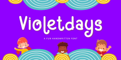 Hello, Present a new font Violetdays a handwritten font special for the kids theme promotion. Violetdays is perfect for product packaging, branding project, magazine, social media, wedding, or just used to express words above the background. Enjoy the font, if you have any question don’t hesitate to contact me comment or feedback, send me PM or email. Happy Designing! Thank you, Bayu Suwirya
 - Lighthouse Treasure by Letterhanna Studio,
$19.00 "Lighthouse Treasure" is an enchanting handwritten sans-serif font designed with a playful and informal touch, making it an ideal choice for projects with a kids' theme. This font combines the relaxed charm of informal handwriting with a touch of whimsy, perfect for capturing the imagination of young audiences. Whether you're working on children's book covers, playful posters, or vibrant educational materials
 - Guzzo by Monotype,
$50.99 A playful caricature of a midcentury grotesque, Guzzo is a fresh addition to the Monotype Library. Somewhat eccentric and full of surprises, its unmistakable quirk can be found on closer inspection, stemming from details proudly borrowed from brush lettering and calligraphy. The wide range of weights and style can take you through any design space, from the condensed weights squeezing in larger headlines or dense blocks of text with the condensed range, to experimenting with small point sizes, labels or packaging with the extended cut. However, Guzzo’s real charm is probably best expressed through its wonderfully playful shapes, its unusual 'laid-back italics' feature cursive forms and a backslant. The different stylistic sets allow you to decide what you make of Guzzo, with several sets of alternate glyphs steering it in any direction you want. Guzzo is a happy-go-lucky character, and has a warm, humble and painterly quality that - at a glance - may be unrecognizable as a typeface. It can almost pass for hand-lettering. Guzzo pairs exceptionally well with scripts and slab typefaces, and feels most at home in situ with toys, packaging, menus, broadcasting, cartoons and merchandising! Guzzo encourages you to turn up the silliness and is for designers who want to emulate hand-painted and casual motifs. Taking its name from American artist Jeremy Pinc, aka the painter Guzzo Pinc, the typeface channels the quirky, funny and poignant qualities of his paintings - with wacky characters, loosely painted geometric forms and bright colors. For this mid century, authentic, nostalgic typeface - the story is really what you make of it.
 - Cuba by Design is Culture,
$39.00 The inspiration for Cuba comes from a sign for the restaurant "La Flor de Cuba" on Bergenline Avenue in Union City, New Jersey. Its blocky, dimensional forms are reminiscent of letterforms seen in signs throughout Latin America from, Colombia, to Mexico, to Spain, to Union City. Its quirky forms are meant to evoke a sense of hand painted signage.
 - Intermediate JNL by Jeff Levine,
$29.00 The letters and numbers of a home movie titling kit from circa the 1950s or 1960s called the Magna Tech Titler Number 312 were die-cut from cardboard with a magnetic backing and were styled after Futura Bold. The user of this set composed the desired title or phrase onto a metalized board and the result was photographed with their 8 or 16mm camera. Because the dies of the characters were handmade, very slight variations in the shape and stroke width of the lettering would occasionally occur. These variations were incorporated into the design of the digital type face. Intermediate JNL is available in both regular and oblique versions.
 - Cassius by W Type Foundry,
$23.00 Cassius & Cassius Italic are a postmodern typeface system from the Garaldes family. The main characteristic of this type family is its inverted anatomy and projected terminals. Cassius was meticulously designed with special focus on its structure. With its proposal for a fresh, attractive and rhythmic system, Cassius gives great personality to all kinds of composition. The family consists of 5 weights from regular to black, with respective Italics. Each instance includes; Case sensitives Accents, Ligatures, Fractions, Small Caps, Old Style Figures, Case Sensitives (symbols and punctuation) and more. This font is perfect for books and magazines compositions, and in general for the construction of immersive printed or digital texts.
 - Beiko by Nantia.co,
$12.00 Beiko Uppercase Greek Font is a decorative display font, made from digitized brush hand lettering. Of course, the uppercase font supports a full set of Greek characters and an extended Latin character set with diacritics. Also, this handwritten font is ideal for handcrafted projects. The hand-brushed organic style of Beiko is ideal for logotypes. In fact, this cute typeface can be your next typeface for your graphic design needs. From Instagram quotes to product packaging, merchandise, and branding projects, this font is so fun to use. Also, it can be used on social media content, for branding, poster design, for children projects, and any other kind of product packaging.
 - Carissa by Just My Type,
$20.00 Everyone likes getting a handwritten letter. At least, they would if anyone still hand wrote letters. We heard a story about a type designer who gets a Christmas card from his niece. He’s been out of touch with her for years and is both delighted and surprised to receive a handwritten note. His first thought is “How sweet; how very nice to hear from her.” His second thought is,”Great font potential; I could use this.” And he did. Carissa has a fresh, spontaneous feel, with a wonderful use of uppercase letters (B and R, etc.) within the lower case. Useful as a personal font or for an off-beat menu...
 - Pre Code Movies JNL by Jeff Levine,
$29.00 The hand lettered credits from the 1931 melodrama “Safe in Hell” inspired the typeface Pre Code Movies JNL, which is available in both regular and oblique versions. The design is strongly influenced by the popular Art Deco style of thick-and-thin characters and also features rounded corners. The font’s name comes from the early era of talking pictures and the short period before the establishment of the Hays Office in 1934 when Hollywood did not self-censor itself. Many then-taboo topics were exploited on film until Will Hays cracked down on such productions. To read more about Pre-Code Hollywood, visit the Wikipedia link: https://en.wikipedia.org/wiki/Pre-Code_Hollywood
 - Grid Hero by PizzaDude.dk,
$16.00 100.000 years ago years ago, a group of mad scientists from the far away planet ZyrXX, encountered the earth and just waited to conquer the planet. Their masterplan was to use electronic brain waves to manipulate our minds. Sounds cheesy and comic, right? Well, that is the true story about this font. The font was built using a grid (hence the name!) and all I had in mind, was a mixture of old sci-fi movies and computer graphics from the 80ies. I did my best to recall and re-create this - I will let you be the judge to decide whether I succeeded! :)
 - Third Time Lucky by Hanoded,
$15.00 We’re in the process of buying a house. Our first bid was rejected, our second bid as well. Our third (and final) bid was accepted (yay!), so, for us, the old ‘third time lucky’ quote rings true! Third Time Lucky is a set of three distinct handmade fonts, each with its own italic. Use this wonderful set for your books, your packaging or even your ‘house for sale’ signs.
 - Halau Serif by Vintage Voyage Design Supply,
$10.00 Introducing mid-century modern font family – Halau Serif. Classic mid-century serif with characteristic cartoon look. Straight for your summer projects. More fun, more sun and more retro-modern! Play with it and get really cool retro-lettering style. Also, you can use some alternates (A, E, K, R, Y, a, g, l, k). Also, you get Mid-Century Modern style graphic objects set as letters and numerals alternates (36 Total).
 - Cry Wolf by Hanoded,
$20.00 When I was a kid, I loved the story of The Boy Who Cried Wolf. I thought it was pretty stupid of the boy to trick the villagers into believing wolves are attacking his flock of sheep. But I also thought it was a bit sad that the sheep are eaten by a wolf in the end. I didn’t really feel sorry for the boy (he really was stupid), nor the wolf (he just does what he is supposed to do in life), but I did feel sorry for those poor sheep. I guess this is what disinformation leads to in the end. Cry Wolf is a bit of a scary font: it was made with a really old and battered brush, using Chinese ink and some quality French paper. It has a slight tilt to the right and I added some inky splatter for dramatic effect. Use Cry Wolf for your book covers, product packaging and headlines; use if to spice up you invitations and your halloween posters. Comes in a slightly tilted Regular style and an outright Italic style.
 - Preta by Lián Types,
$39.00 Preta, portuguese for a very pure kind of black, has its name very related to its concept: I wanted to make the fattest/darkest script ever. People who follow my work may notice its forms are very related to works of my past (1) but this time the challenge was to be very cautious with the white spaces between letters. Not only I followed some rules and ductus of the copperplate style of calligraphy but also I took a lot of inspiration in posters of the early Art Nouveau (specially in Alfred Roller of the Vienna Secession) where letters forms looked like black squares if not looked from a close distance. With Preta, I wanted to achieve that same idea of “darkness” and thanks to the always welcomed question -what if?- the font grew a lot. The result is a very fat font, that looks delicious. Due to possible customer needs, I designed Preta Small, so it can be used in smaller sizes. Preta Ao Sol (which literally means under the sun!) is a style with those lovely tiny details to give the sensation of bright. Preta Ao Sol Solo was made to be used as a layered font with Preta. Finally, Preta Capitals serves as a company for Preta. Hope you enjoy the font as much as I did when designing it: The fact that it’s full of alternates, swashes, ligatures and swirls makes it really pleasurable at the moment of using it. Give it a try and dance with Preta! TIPS For better results, use Preta with the ‘standard ligatures’ feature activated. NOTES (1) Beatle in 2014. Seventies in 2015.
 - Almond Pancake by Gassstype,
$23.00 Hello Everyone, Introduce our new collection Almond Pancake is a Unique Bold Display Font, Inspired from Modern logos of brands that have very strong characteristics, very suitable for posters,card to kids cute,and guaranteed to add a sweet touch to your next design,packaging, branding, logotype and more. This handmade font will make your design has a beautiful natural touch for each details. It is perfect for any design project as Invitation,logo, book cover, craft or any design purposes. That is Almond Pancake has charming, authentic and relaxed characteristic more natural look to your text with a more natural look to your text. You can activate Ligature OpenType panel design more interesting. Almond Pancake is perfect for homeware designs,branding projects, Logo design, Quotes product packaging.
 - P22 Klauss Kursiv by IHOF,
$29.95 P22 Klauss Kursiv is the first ever digital revival and expansion of the last face Karl Klauß designed for the Genzsch & Heyse foundry in Stuttgart before he died in 1956. Karl Klauß’s classical training in the graphic arts gave him solid chops to use as a springboard for design ideas that remained relevant among the countless trends fleeting around the turmoil of two world wars. By the mid-1950s, a kind of ornamental deco aesthetic was well on its way into mainstream design in post-war Europe, and demand was high for unique, lively and non-minimal ad faces. Klauß, a reliable designer with a proven track record of calligraphic faces, pushed the envelope on his own calligraphy and designed something that packages elegance in a boldness seldom seen before in luxury scripts. Quite a bit of talent is on display in Klauss Kursiv. In spite of the restraint this kind of design imposes on itself almost by default, the interplay between thick and thin never seems forced or challenging. Clear, natural strokes build a compact alphabet that demonstrates the wrist control of a veteran calligrapher. Creative nib angling segues into very clever start-and-stop constructs to make attractive forms that work quite well together, yet stand well to individual scrutiny. P22 Klauss Kursiv comes with a load of built-in alternates and ligatures in a font of over 470 glyphs, providing extended support for Latin languages.
 - Toby Font by Ingo,
$19.00 A playful handwriting of a child Twelve-year old Tobias Düsel designed the characters of this font in 2002 during his family’s furlough in the USA. He drew the alphabet freehand in pencil on a piece of stationery, and clearly had examples of the well-known college and military fonts in mind. The characters in their basic form are geometrically thought out, as well as the construction of the shadows. But remarkably, while drawing, Tobias Düsel did not reach for the obvious aid of a ruler. In fact, the strokes of the letters are not linear, rather are recognizably well-balanced with declining and increasing straights as can be seen in polished classical fonts. Originally this font consists only of upper case letters — all other characters (punctuation marks, figures and similar) have been modified from the components of the capital letters. Complementary to the original Outline-Shadow-Version TobyFont Empty, the variations TobyFont Inside and TobyFont Full are also available. ”Empty“ is, so to speak, the frame of the typeface as “Inside” is the filling, and “Full” is the sum of both. All three versions have the exact same body size so that they can be placed over one another congruently. In this way the effect of a font in two or three colors can be attained. TobyFont is excellently suitable for designing “picturesque” or “hand-carved” contents; large weights are especially charming and striking.
 - Shopkeeper JNL by Jeff Levine,
$29.00Shopkeeper JNL derives its unusual letter forms from impressions made from a vintage rubber stamp sign and chart printing set. Originally an outline font, the letters are rendered solid in the digital version for more versatility. - Abesif by Twinletter,
$12.00 Introducing Abesif sans serif font. This font is stretched from the normal theme, it is boring, while different, it seems strange. from there we design the appearance of this font that is not normal so that it is not boring and we display it differently but not look strange. so if you use this font it will look different from the others but it doesn't look strange because it has a normal design. so that it creates an impression that is easy for each of your audience to remember when they first see your project. This font is very suitable as text with displays for various kinds of branding, advertisements, posters, banners, packaging, news headlines, magazines, websites, logo design, banners, social media design and of course you can use a lot more.
 - Persepolis by Si47ash Fonts,
$19.00 Childish but heavyweight! A rounded bubbly heavy font that was designed for texts related to kids and children. With its melted and soft forms, it brings delight and makes your letters to be pleasant to be read. Apadana font support Persian, Arabic and also Basic Latin. A joyful choice for all the designers and creatives. Shahab Siavash, the designer has done more than 30 fonts and got featured on Behance, Microsoft, McGill University research website, Hackernoon, Fontself, FontsInUse,... Astaneh text and headline font which is one of his latest designs, already got professional typographers, lay-out and book designers' attention as well as some of the most recognizable publications in Arabic/Persian communities.
 - Aragon ST by Canada Type,
$39.95 Aragon ST is a special version of Hans van Maanen’s Aragon family. It was developed for science writing, and it serves as the very first introduction of SciType, an innovative new way of building fonts specifically for typesetting science text. For more information about SciType, please consult the SciType FAQ PDF in the Gallery section. The Aragon design is a remodelling of the classic mid-1500s Garamond forms through a modern lens. It is a text workhorse that performs very well in a variety of sizes, from footnotes and legal copy to lengthy, immersive-reading body sets. Its efficient and legibility-asserting traits are wedge serifs and uniquely tapered stems that slightly shift the weight stress to the top half of the forms while maintaining the clarity and synergy of the counterspace’s sequence. Aragon ST takes all that a step further for science writers. For details about the functionality of Aragon ST, please consult the Aragon ST Access Chart PDF in the Gallery section.
 - WaterWorksCaps by Ingrimayne Type,
$12.95 In WaterWorks the letters are formed from pipes. Its origins were in a specialized font for constructing mazes.
 - Expreso by JVB Fonts,
$19.00 EXPRESO was inspired by the extinct art and craft of urban Lettering applied to buses and other kind of cars for public service of transportation. Since the mid of last century, main cities of Colombia - as Bogotá, Medellín and others - were growing in population and brought urban area expansion with it and serious traffic problems due to the lack of political will and urban planning. The problem of urban transport in Colombia's largest cities has not yet been resolved, despite adopting some examples of mass transit system in other cities in the region. Before these actions, public transport in cities such as Bogotá was quite varied, leaving space for popular culture that survived for a couple of decades, until the massive dieback of these old buses early this decade, either by practices associated with Lettering it was displaced by some technological, some expressions of art street and city that evolved or disappeared. EXPRESO can be used mainly in titles and display texts. You have a multitude of options using combination of layers from the basics of the font family to the various textures and shades. Supports East Europe languages.
 - Arbour Soft by TypeUnion,
$35.00 Arbour Soft is the cheeky version of it's big brother, Arbour. The soft version creates a smooth finish that flows perfectly across screens and print. Arbour Soft comes in 7 weights, from a delicate extra-light to a soft, strong black, with matching soft italics for each upright. The soft black weights are perfect for your new brand or article headlines, and the light weights are great for calling out text. The mid weights are perfect for longer texts.