10,000 search results
(0.024 seconds)
- Behrens Antiqua by Solotype,
$19.95Designed by Peter Behrens, well known graphic artist and architect in Germany in the late 19th and early 20th century. This "Antiqua" was done for Rudhard's Typefoundry in Offenbach A. M. around 1902, and has been used in modern times for museum retrospectives of the designer's work. - Lumier Texture by Tour De Force,
$15.00 Lumier Texture is font family targeting designers who work with packages, labels, posters - who are looking for characteristic and striking letters. It's textured version of Lumier font family and as that, it's compatible with Lumier Bold. It is adviced to be used as desktop font only.
 - Nelliy by Muksal Creatives,
$14.00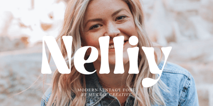 Nelliy Modern Vintage Font, special glyphs, ornament and multilingual support. It's a very versatile font that works great in large and small sizes. Perfect for editorial projects, Logo design, Clothing Branding, product packaging, magazine headers, or simply as a stylish text overlay to any background image.
 - Delphe by Muksal Creatives,
$15.00 Delphe Modern Display Font, special glyphs, ornament and multilingual support. It's a very versatile font that works great in large and small sizes. Perfect for editorial projects, Logo design, Clothing Branding, product packaging, magazine headers, or simply as a stylish text overlay to any background image.
 - Estro by profonts,
$39.99Estro was originally designed by Aldo Novarese in 1961 for the foundry Nebiolo. Estro can maybe be classified a combination of Egyptienne and script.Ralph M. Unger redrew and digitized this font exclusively for profonts in 2003. His work is based on artwork taken from old font catalogues. - Mariné Rounded by TipoType,
$19.90 Mariné Rounded is a geometric sans, but with the softness of humanistic strokes. Its mild contrast and multiple different styles allow Mariné to work well both as a text and display typeface. It also includes an Up version and calligraphic features adding a touch of informality.
 - Margoth by Asterisk,
$33.00 Margot font family, has more than 1000 + glyphs in each font. The font includes advanced language support, fractions, table shapes, ligatures, and more. Perfect for graphic design and any display use. It can easily work for websites, signage, corporate, and editorial design. documents and folders, mobile interface.
 - Best Life by Sulthan Studio,
$12.00 Best life - This cool one line handwritten font is very stylish and elegant that has a great style for your work with hearts in the middle and also lowercase swashes in front and back and lowercase swashes on back and hearts in front of letters to connect.
 - Qualettee by Ingrimayne Type,
$9.95 Qualettee is a decorative sans face with a high x-height that works surprisingly well for text. The lightest weight is almost moonline but as the styles get bolder, the contrast increases, becoming very pronounced. The family has ten members: five weights with italics for each weight.
 - Galndrie by Muksal Creatives,
$10.00 Galandrie Modern Display Font, special glyphs, ornament and multilingual support. It's a very versatile font that works great in large and small sizes. Perfect for editorial projects, Logo design, Clothing Branding, product packaging, magazine headers, or simply as a stylish text overlay to any background image.
 - Vivala Old by Johannes Hoffmann,
$11.00 The Vivala old black letter font family is characterized by its hard-cut lines. This gives the typeface a special woodcut-like character. The typeface family offers a wide range of possibilities for design. It works well for posters, packaging, and corporate design for restaurants or breweries.
 - Broost by ZetDesign,
$15.00 Broost is a groovy font that gives you a bold feel with sharp, bold strokes at each end of the letter. This font also gives a relaxed and cheerful impression to each of your works. very suitable for holiday design materials, parties, music, games, and more.
 - De Rotterdam by Roland Hüse Design,
$20.00 This font is a clean, modern sans serif bold. Named after “De Rotterdam”* this huge and super cool building (read the story below). Great for headlines, Posters, Flyers but also well legible at small size in large texts. Contains All European language accents and characters. --- The Story --- *This complex is located in the Kop Van Zuid district of Rotterdam, on Wilhelminapier. I was lucky to see this building from the beginning (2009) growing up (2013) That time when I was working and living here. I was always amazed by the design and how huge it is every time I took a look at it while driving or walking on the Erasmus Bridge. When I was going to work or just hiking around the city. It has a special meaning and message for me: I started creating fonts in my free time in 2010 when I came to this city to work. I was factory worker, dishwasher etc. I grew together with this amazing construction from brick to brick, step by step. By the time its construction finished, I was able to quit my day job and become a full time freelance designer.
 - Edgar No 9 by Type Innovations,
$39.00 Edgar No. 9 is an original design by Alex Kaczun. Edgar No. 9 is a derivative work based on his Big Boy typeface series. It was designed specifically for display headlines, logotype, branding and similar applications. Primarily a display, this extremely versatile font has generous proportions, large counters and loose fitting which also allow the font to work well across a wide range of text sizes. Edgar No. 9 is a heavy baroque slab serif and although it shares the underling skeleton of 'Big Boy', it is a much more compact in overall proportions and spacing. A handsome bold headline font that works well in text as well as display sizes—ideally suited for publications and advertising. Alex plans to expand the font series to include a large range of weights along with corresponding italics numbering 1 thru 9, as well as, true small capitals and old style figures. Distressed version(s) will also be available in upcoming releases. Stay tuned, more to come soon. The large Pro font character set supports most Central European and many Eastern European languages.variations to expand this 'hip' new font series. Groovin' baby.
 - ITC Napoleone Slab by ITC,
$29.99There is something straight-forward and no-nonsense about slab serifed typefaces. Calligraphic designs, on the other hand, evoke a sense of humanity and immediacy - even intimacy. ITC Napoleone Slab combines both slab serif and calligraphic design traits into a single typeface design. Heady stuff. The result is unlike almost any other slab serif typeface. According to designer Silvio Napoleone, “The concept developed from my explorations as a student in an independent lettering class. I sketched many historical letterforms by brush. I continued experimenting for several years after, sketching by hand and on the computer. Eventually, I chose the slab serif for production because of its distinctive design quality.” ITC Napoleone Slab is exceptionally versatile. The family is economical in width and contains true italic designs, oldstyle numbers and a suite of special ligatures. According to Silvio, “Napoleone Slab was designed to work well at all sizes, and in on-screen applications.” Silvio currently lives in Toronto, where he works for a “young, enthusiastic interactive firm.” His designs have been exhibited nationally and internationally, and his work was also part of a traveling exhibit for the American Institute of Graphic Arts. - Sutro Shaded by Parkinson,
$25.00 My affection for Slab Serifs began in the early 1960s in Kansas City when Rob Roy Kelly was at the Kansas City Art Institute, teaching and writing his book on American Wood Type. I got to know him just well enough to gain access to his fabulous collection of wood type and wood type catalogs. Later, in the1970s, I tried to re-create a Nebiolo Egiziano for Roger Black at New West magazine. And again for Roger, in the 1980s, I designed a Slab Serif logo for Newsweek Magazine. Finally, in 2003, designed the Sutro Family. There were things I didn't like about it, so, over time, I’ve been adding some things and dressing it up a little. Sutro Shaded has existed for a few years as a one color, outlined, drop-shadowed display font. It seemed like it was just dying for a little color. I added five more fonts: Fill, Gradient, Hatching, Rules and HiLite. These fonts can be used in different combinations to achieve various effects. There is a downloadable SUTRO SHADED USER MANUAL PDF in the Gallery section for this family.
 - Kostic Serif by Kostic,
$50.00 Kostic Serif is a classic transitional typeface (like Baskerville, Bookman, Caslon, Times) with tall, clean characters and a large glyph set to support all European languages - Greek and Cyrillic script included. Excellent for setting multiple pages of text and packed with OpenType features (proportional lining and oldstyle numbers, tabular figures, superscript and subscript, numerator and denominator figures, fractions and 31 ligature in 659 characters), it should meet the demands of even the most demanding typographic works. Kostic Serif is made with fairly large x-height, so the text is legible in very small sizes. Zoran began the work on Kostic Serif around 2002 and after completing Regular, Bold and matching italics, he wasn’t too pleased with the design, so he dropped further work on it to make other fonts. In 2010 Nikola came upon unfinished files for Kostic Serif, and decided to redesign the letters, while retaining basic proportions and widths that Zoran established earlier. When they were both pleased with the new look of the font, they made Medium and decided to add CE and Greek script to the glyph set, to make it pan-european.
 - Square Beat by Hanoded,
$15.00 After a lot of time sitting at my desk, creating fonts and trying to figure out how my new software works, I really like to work out a bit. The only thing that I do not like is the music they play at the gym; it is usually a selection of poppy tunes that appeals to a large audience. But not to me. I prefer my death metal - and eighties music, as it brings back a lot of good memories. So, I bought myself some ear buds and installed a music streaming app on my phone. Yes, I know, I am probably the last person on earth who discovered streaming... One day, during a workout session, I listened to a list of eighties music and one song that I had forgotten about started playing: Rappers Delight by The Sugarhill Gang. When I started working on the font, I had to think about the song and named it Square Beat. Square Beat font, other than the name implies, is a rounded, handmade font, ideally suited for books and magazines aimed at a young audience, toy packaging or posters. It comes with great language support, including Vietnamese.
 - Biwa by Wordshape,
$20.00 Biwa is a new straight-sided family of formally nuanced grotesk typefaces. Biwa’s lighter weights feel subdued, cool in tone, and neutral, while the heavier weights are more robust and full of personality. Developed over the past few years by Ian Lynam and James Todd, the 14-member Biwa family and the accompanying 14-member Biwa Display family are paeans to the immediate moment when phototype arrived on the global scene — partially smooth and partially machined. Biwa and Biwa Display are neutral in tone, have enlarged x-heights, and look amazing on-screen and in print. Each weight is designed to be highly readable in print and on-screen. The italic variations are true italics, having a single-storied italic a and have been designed for smooth, fluid reading and text-setting. Lovingly spaced and kerned, the Biwa family works equally well for text typesetting and for display design work. Languages supported include Western European, Central, and South European as well as Vietnamese. The entire family is comprised of a range of weights and a matching display family that features rounded terminals for large-scale display work. An agate version of Biwa Black is provided for free.
 - StandingRoomOnly is a captivating display font created by Nick Curtis, a designer known for his prolific output of fonts that often encapsulate vintage or retro aesthetics. StandingRoomOnly is no exc...
- Oh, diving into the whimsical world of fonts, are we? Let me tell you about Wiggly – it's quite the charmer. Imagine a font that decided to throw caution to the wind and dance to its own rhythm. That...
- The Schwabacher font, revitalized by Dieter Steffmann, is a captivating blend of history and artistry, standing as a tribute to the rich heritage of German typography. Originating from the 15th and 1...
- Yugoslavia - Personal use only

- Menhart by Monotype,
$29.99Czech designer Oldrich Menhart (1897-1962) devoted his life to making letters. He was a calligrapher, lettering artist, and typeface designer with over twenty faces to his credit. The Monotype typeface, Menhart, was the second of his designs. Menhart began work on the design in the early 1930s and turned over his final artwork to the Monotype Drawing Office in 1934. The first size cut was 14 Didot (Didot points are the traditional European system of type measure, and are roughly equivalent to the point system commonly used by today's digital fonts). The 14D font was followed by 18D and 24D, indicating that the design was considered most suitable for display work. However, a 10D size was later cut from the same master drawings at the request of a Monotype customer. Menhart's design was light and open, with an even color and a slight squareness" to its round shapes. Because the Czech alphabet has 15 accented letters, Menhart included these diacritics as an integral part of his design, not as an afterthought. As a result, accented copy set in Menhart has a cohesive quality rarely seen in other typefaces. Monotype's new digital release of Menhart is the first revival since the hot metal fonts were cut. Menhart Display is based on the original Monotype drawings, while a slightly heavier, re-spaced version has been created for text sizes. Both versions offer the full capabilities of the OpenType format, such as the automatic insertion of old style figures, ligatures and small caps. In addition to English, the extended character set supports most Central European and many Eastern European languages. One of Menhart's lifelong goals was to share the richness of his Czech culture by drawing typefaces that uniquely served Czechoslovakia literature. In his words: "I believe that a Czech style of type comes above all from the spirit in which it was designed, which gives it its 'signature,' and not so much from decorative composition, and even less from the geographic location of its creation." The typeface Menhart is a tribute to his values. Now, Menhart Pro and Menhart Display Pro capture the unique personality of this timeless design while greatly extending its range of use. " - Baluno by Luxfont,
$22.00 Introducing is a fun and playful pouty Baluno font. Font has embodied the graphic trend of cartoon flat illustrations and will successfully complement modern designs. The font has 2 types of faces, which can be used both independently and together by alternating letters in one word to avoid repeating letters, creating a unique heading. Family is ideal for children's themes, because the font resembles inflated balloons. Creates a relaxed mood and has fun. Set comes in many different carefully selected colors and gradient color options. Check the quality before purchasing and try the FREE DEMO version of the font to make sure your software supports color fonts. P.s. Have suggestions for color combinations? Write me an email with the subject "Baluno Color" on: ld.luxfont@gmail.com Features: Free Demo font to check it works. 2 types of faces. Lots of ready-made matched colors. Gradient color variants. Kerning. IMPORTANT: - Multicolor OTF version of this font will show up only in apps that are compatible with color fonts, like Adobe Photoshop CC 2017.0.1 and above, Illustrator CC 2018. Learn more about color fonts & their support in third-party apps on www.colorfonts.wtf -Don't worry about what you can't see the preview of the font in the tab "Individual Styles" - all fonts are working and have passed technical inspection, but not displayed, they just because the website MyFonts is not yet able to show a preview of colored fonts. Then if you have software with support colored fonts - you can be sure that after installing fonts into the system you will be able to use them like every other classic font. Question/answer: How to install a font? The procedure for installing the font in the system has not changed. Install the font as you would install the other fonts. How can I change the font color to my color? · Adobe Illustrator: Convert text to outline and easily change color to your taste as if you were repainting a simple vector shape. · Adobe Photoshop: You can easily repaint text layer with Layer effects and color overlay. ld.luxfont@gmail.com
 - Arable by Heyfonts,
$18.00 Arable Font Is "Unique Display Font" refers to a specific type of typography that is characterized by its distinctive, one-of-a-kind design, and it is typically used for eye-catching and decorative purposes. Here's a detailed explanation of what a unique display font is: -Distinctive Design: Unique display fonts stand out because of their distinct and unconventional design. They often deviate from traditional letterforms and can take on a wide range of creative and artistic shapes. Unlike standard, legible fonts used for body text, display fonts prioritize aesthetics over readability. -Specialized Use: Display fonts are not intended for extended reading. Instead, they are used in small quantities for headlines, titles, logos, posters, banners, invitations, and other design elements where visual impact is essential. Their unique and attention-grabbing design makes them ideal for drawing attention to specific text. -Creative Freedom: Designers have creative freedom when creating unique display fonts. This allows for a wide array of styles, from whimsical and ornate to futuristic and abstract. Some display fonts may be inspired by art movements, cultures, historical periods, or nature, leading to highly original and thematic designs. -Limited Character Set: Display fonts often have a limited character set compared to standard fonts. They typically include uppercase letters, numbers, and basic punctuation marks, but may lack lowercase letters or extended characters. This limitation is due to their specialized use and focus on visual impact. -Customization: Some unique display fonts are custom-designed for specific projects or brands. Designers work closely with clients to create a font that aligns with the brand's identity or the project's theme, ensuring a truly unique and tailored result. -Combination with Other Fonts: In many design projects, unique display fonts are paired with more standard, legible fonts to achieve a balance between visual impact and readability. This combination allows for a harmonious and effective overall design.
 - First Ladies by Celebrity Fontz,
$24.99 First Ladies is a unique collection of signatures of almost all of the First Ladies of the United States plus the First Lady of the Confederacy in a high-quality font. A must-have for autograph collectors, desktop publishers, lovers of history, or anyone who has ever dreamed of sending a letter, card, or e-mail “signed” as if by one of these famous women. This font includes 45 signatures for the following First Ladies: Martha Dandridge Custis Washington, Abigail Smith Adams, Martha Wayles Skelton Jefferson, Dolley Payne Todd Madison, Elizabeth Kortright Monroe, Louisa Catherine Johnson Adams, Rachel Donelson Jackson, Anna Tuthill Symmes Harrison, Julia Gardiner Tyler, Sarah Childress Polk, Margaret Mackall Smith Taylor, Abigail Powers Fillmore, Jane Means Appleton Pierce, Harriet Lane, Mary Todd Lincoln, Eliza McCardle Johnson, Julia Dent Grant, Lucy Ware Webb Hayes, Lucretia Rudolph Garfield, Ellen Lewis Herndon Arthur, Frances Folsom Cleveland, Caroline Lavinia Scott Harrison, Frances Folsom Cleveland, Ida Saxton McKinley, Edith Kermit Cardow Roosevelt, Helen Herron Taft, Ellen Axson Wilson, Edith Bolling Galt Wilson, Florence Kling Harding, Grace Anna Goodhue Coolidge, Lou Henry Hoover, Anna Eleanor Roosevelt, Elizabeth Virginia Wallace Truman, Mamie Geneva Doud Eisenhower, Jacqueline Lee Bouvier Kennedy, Claudia Taylor (Lady Bird) Johnson, Patricia Ryan Nixon, Elizabeth Bloomer Ford, Rosalynn Smith Carter, Nancy Davis Reagan, Barbara Pierce Bush, Hillary Rodham Clinton, Laura Welch Bush, Michelle Obama, and Varina Howell Davis (First Lady of the Confederacy). This font behaves exactly like any other font. Each signature is mapped to a regular character on your keyboard. Open any Windows application, select the installed font, and type a letter, and the signature will appear at that point on the page. Painstaking craftsmanship and an incredible collection of hard-to-find signatures go into this one-of-a-kind font. Comes with a character map.
 - Midnight Diner by Roland Hüse Design,
$30.00 Did your client just say ‘can you make it pop’? Then you already know you got it on lock. Introducing: Midnight Diner! A multi-layered dimensional script font family featuring thin, bold, outline and shadow capabilities, with a left-leaning slant to boot. You can experiment with various layer combinations and colour! How fun is that? Being effortlessly casual, retro and elegant all in one, you can play it up or down to your liking – perfect for display graphics, logos, signages, packaging, lifestyle imagery, invitations and more. It features a diverse range of stylistic alternates, contextual alternates, and standard ligatures, ensuring that you’ve countless options to choose from for your design work. This font family is delicately crafted and well thought out with every little detail in mind, to ensure its ease and versatility when used! Midnight Diner is a collaboration between lettering artist and calligrapher, Leah Chong (www.leahdesign.sg) and typeface designer, Roland Huse (www.rolandhuse.com). Product Content: Midnight Diner Layered Font - Thin (TTF) Midnight Diner Layered Font - Bold (TTF) Midnight Diner Layered Font - Outline (TTF) Midnight Diner Layered Font - Shadow (TTF) Font Guide PDF https://drive.google.com/file/d/1KPSf-gGrhX3wyaImEAmlJICERNbxu2IN/view?usp=sharing Font Guide Youtube Video https://youtu.be/GtZ8E7Y7wnQ 6 Bonus SVGs (TTF): Midnight Diner SVG - Red Yellow Midnight Diner SVG - Black Pink Midnight Diner SVG - Blue Green Midnight Diner SVG - Orange Yellow Midnight Diner SVG - Purple Pink Midnight Diner SVG - Black White Font Features: Latin character set: Uppercase & Lowercase A - Z Stylistic Alternates Contextual Alternates Standard Ligatures Numerals, Currency Symbols & Punctuation Accented Characters To access all features of Midnight Diner such as stylistic alternates etc., it's highly recommended to use professional design software such as Adobe Illustrator, Adobe Photoshop, Adobe InDesign or Procreate (via the ‘add text' feature).
 - Austin Antique by HiH,
$10.00 “More is better” may have been the motto of Richard Austin of Austin and Son’s Imperial Letter-Foundry on Worship Street at Finsbury Square in London when he designed and cut his Antique typeface. The year it was created is uncertain, but it is known to have appeared in a specimen book produced in 1827. At first glance, the upper case letters of Austin Antique look very much like Figgins Antique. But, upon examination, one will note that the Austin face is much darker. In general, the letters designed and cut by Richard Austin have fatter strokes, larger serifs and smaller counters -- more metal and less daylight. The premise was that the darker the letter, the more attention an ad using the typeface would receive. In old pictures of London and Paris one may see walls crowded with posters and “bills” -- competing for the attention of the passerby. Morris and Updike aside, the early nineteenth century marked the beginning of a commercial as well as industrial revolution. Patterns of commerce were changing. With new methods of marketing came the need for new typefaces to support the new methods. Foundries found the display types were very profitable and competed most energetically and creatively for the trade. There was a lot of trial-and-error. Some ideas faded away. Others, like the Antiques or Egyptians, were refined and developed. From them came the Clarendons that were to prove both popular and long lasting -- because they worked. Their job was to sell goods, not please the aesthetic sensibilities of the critics. They did their job well. Austin Antique has a full Western European character set, plus the following ligatures: ct, st, fi, fl, ff, ffi and ffl. Tabular numbers. Surprisingly readable.
 - Gator by Canada Type,
$24.95 Cooper Black's second coming to American design in the mid-sixties, after almost four decades of slumber, can arguably be credited with (or, depending on design ideology, blamed for) the domino effect that triggered the whole art nouveau pop poster jam of the 1960s and 1970s. By the early 1970s, though Cooper Black still held its popular status (and, for better or for worse, still does), countless so-called hippie and funk faces were competing for packaging and paper space. The American evolution of the genre would trip deeper into psychedelia, drawing on a rich history of flared, flourished and rounded design until it all dwindled and came to a halt a few years into the 1980s. But the European (particularly German) response to that whole display type trend remained for the most part cool and reserved, drawing more on traditional art nouveau and art deco sources rather than the bottomless jug of new ideas being poured on the other side of the pond. One of the humorous responses to the "hamburgering" of typography was Friedrich Poppl's Poppl Heavy, done in 1972, when Cooper Black was celebrating its 50th anniversary. It is presented here in a fresh digitization under the name Gator (a tongue-in-cheek reference to Ray Kroc, the father of the fast food chain). To borrow the title of a classic rock album, Gator is meaty, beaty, big and bouncy. It is one of the finest examples of how expressively animated a thick brush can be, and one of the better substitutes to the much overused Cooper Black. Gator comes in all popular font formats, and sports an extended character set covering the majority of Latin-based languages. Many alternates and ligatures are included in the font.
 - Voivode by Typodermic,
$11.95 Introducing Voivode—the charming and playful headline typeface that will leave you hooked! With its fish-tailed design and postmodern geometry, Voivode offers a unique and refreshing twist to traditional typography. But Voivode isn’t just a pretty face. Its welcoming letterforms give your message a genuine and sophisticated voice that will capture the hearts and minds of your audience. This typeface is perfect for anyone who wants to make a bold statement with their design while still maintaining a sense of whimsy and cuteness. Whether you’re designing a poster, a website, or even a greeting card, Voivode will add a touch of charm that is sure to delight. So what are you waiting for? Dive into the world of Voivode and experience the magic of this one-of-a-kind typeface! Most Latin-based European writing systems are supported, including the following languages. Afaan Oromo, Afar, Afrikaans, Albanian, Alsatian, Aromanian, Aymara, Bashkir (Latin), Basque, Belarusian (Latin), Bemba, Bikol, Bosnian, Breton, Cape Verdean, Creole, Catalan, Cebuano, Chamorro, Chavacano, Chichewa, Crimean Tatar (Latin), Croatian, Czech, Danish, Dawan, Dholuo, Dutch, English, Estonian, Faroese, Fijian, Filipino, Finnish, French, Frisian, Friulian, Gagauz (Latin), Galician, Ganda, Genoese, German, Greenlandic, Guadeloupean Creole, Haitian Creole, Hawaiian, Hiligaynon, Hungarian, Icelandic, Ilocano, Indonesian, Irish, Italian, Jamaican, Kaqchikel, Karakalpak (Latin), Kashubian, Kikongo, Kinyarwanda, Kirundi, Kurdish (Latin), Latvian, Lithuanian, Lombard, Low Saxon, Luxembourgish, Maasai, Makhuwa, Malay, Maltese, Māori, Moldovan, Montenegrin, Ndebele, Neapolitan, Norwegian, Novial, Occitan, Ossetian (Latin), Papiamento, Piedmontese, Polish, Portuguese, Quechua, Rarotongan, Romanian, Romansh, Sami, Sango, Saramaccan, Sardinian, Scottish Gaelic, Serbian (Latin), Shona, Sicilian, Silesian, Slovak, Slovenian, Somali, Sorbian, Sotho, Spanish, Swahili, Swazi, Swedish, Tagalog, Tahitian, Tetum, Tongan, Tshiluba, Tsonga, Tswana, Tumbuka, Turkish, Turkmen (Latin), Tuvaluan, Uzbek (Latin), Venetian, Vepsian, Võro, Walloon, Waray-Waray, Wayuu, Welsh, Wolof, Xhosa, Yapese, Zapotec Zulu and Zuni.
 - Teramo by ROHH,
$29.00 Teramo™ is daring, sharp and dynamic. Its personality is derived from asymmetry and movement. It is a contemporary serif family full of modern design elements playing with proportions of works of XV and XVI century masters such as Francesco Griffo or Claude Garamond. The family features four optical sizes. Display sizes feature extreme stroke contrast and are intended for fashion, lifestyle, cosmetics, magazine, business, hi-tech and advertising use. Text styles are created for all kinds of body copy — long and short paragraphs, books and websites in any modern design context. They are crafted to be elegant and legible, featuring more generous spacing and scrupulous kerning. Display weights are designed as modern, extraordinary variations on didone style. Teramo’s letterforms are merging classical proportions and precise, contemporary details such as asymmetric serifs, sharp edges and unconventional glyph shapes. Another important factor constituating Teramo’s personality is an angled axis, unusual for didone families and giving the typeface much more organic and dynamic feel. Teramo features a lively true italics strongly related to cursive handwriting. The italic styles imply movement, energy and fluency, introducing a new color to paragraph text, as well as being a powerful and interesting standalone display type. The family introduces additional titling letter variations for headlines and display uses, such as sharp and modern lowercase “y” or uppercase alternates for better all caps typography. Teramo consists of 56 fonts in 4 optical sizes - 28 uprights and their corresponding true italics + 2 variable fonts. It has extended language support as well as broad number of OpenType features, such as case sensitive forms, standard and discretionary ligatures, titling alternates, contextual alternates, lining, oldstyle figures, slashed zero, fractions, superscript and subscript, ordinals, currencies and symbols.
 - Rhythm by Positype,
$42.00 I hate the idea of revivals. I have publicly said I choose not to do revivals because they make me uncomfortable. This is as close as I have been to crossing my own line. To be direct, Rhythm is based on the ATF typeface, Ratio (I just recently learned the foundry of origin). I came across this typeface from a printed specimen years ago when I was in school and held onto it. It was unique and I loved how well integrated the inline worked within both the flourish and serif of the glyphs—it was old, but not, reminiscent, but fresh. My specimen was limited in the glyph offering (it was c. 1930ish) and I realized a lot would need to be done to ‘finish’ it and bring it to contemporary expectations. I didn't want to do ‘retro’ and tried to avoid the visual trappings associated with it. What I did want to do is interpret what I had in the specimen and reinterpret it digitally, refining its construction and extending its typographic equity along the way. The ‘One’ and ‘Two’ (and their matching ‘Solids’) styles diverge providing various elaborations that coordinate well between rigid bracketed serifs and compact tails. I further expanded the glyph offering to include a full diacritic set, old style numerals, fractions, stylistic alternates, swashes, titling alternates and controlled flourishes that adhere to the efficient framework of the script. And yes, I refer to it as a ‘script’ because calling it a ‘cutesy serif’ seems wrong :) I hope this is seen less as a slavish revival and more as a championing of a really unique typeface. The Original Typeface was Adastra, designed by Herbert Thannhaeuser for the Foundry D. Stempel AG in Frankfurt, Germany.
 - Raymond by Typodermic,
$11.95 Introducing Raymond, the typeface that dares to be imperfect. With its rough, textured script and unevenly stamped letters, Raymond exudes a raw, unapologetic energy that will inject your message with a sense of authenticity and personality. But don’t be fooled by Raymond’s rough exterior—underneath its imperfect surface lies a sophisticated and classy design. Each letter has been carefully crafted to give your text a touch of elegance and refinement, while the worn-out edges and misaligned characters add just the right amount of character. Whether you’re looking to create a bold statement or simply want to add a touch of edge to your design, Raymond is the typeface for you. So why settle for the same old cookie-cutter fonts when you can embrace the beauty of imperfection with Raymond? Give your message the unique and candid style it deserves with this one-of-a-kind typeface. Most Latin-based European writing systems are supported, including the following languages. Afaan Oromo, Afar, Afrikaans, Albanian, Alsatian, Aromanian, Aymara, Bashkir (Latin), Basque, Belarusian (Latin), Bemba, Bikol, Bosnian, Breton, Cape Verdean, Creole, Catalan, Cebuano, Chamorro, Chavacano, Chichewa, Crimean Tatar (Latin), Croatian, Czech, Danish, Dawan, Dholuo, Dutch, English, Estonian, Faroese, Fijian, Filipino, Finnish, French, Frisian, Friulian, Gagauz (Latin), Galician, Ganda, Genoese, German, Greenlandic, Guadeloupean Creole, Haitian Creole, Hawaiian, Hiligaynon, Hungarian, Icelandic, Ilocano, Indonesian, Irish, Italian, Jamaican, Kaqchikel, Karakalpak (Latin), Kashubian, Kikongo, Kinyarwanda, Kirundi, Kurdish (Latin), Latvian, Lithuanian, Lombard, Low Saxon, Luxembourgish, Maasai, Makhuwa, Malay, Maltese, Māori, Moldovan, Montenegrin, Ndebele, Neapolitan, Norwegian, Novial, Occitan, Ossetian (Latin), Papiamento, Piedmontese, Polish, Portuguese, Quechua, Rarotongan, Romanian, Romansh, Sami, Sango, Saramaccan, Sardinian, Scottish Gaelic, Serbian (Latin), Shona, Sicilian, Silesian, Slovak, Slovenian, Somali, Sorbian, Sotho, Spanish, Swahili, Swazi, Swedish, Tagalog, Tahitian, Tetum, Tongan, Tshiluba, Tsonga, Tswana, Tumbuka, Turkish, Turkmen (Latin), Tuvaluan, Uzbek (Latin), Venetian, Vepsian, Võro, Walloon, Waray-Waray, Wayuu, Welsh, Wolof, Xhosa, Yapese, Zapotec Zulu and Zuni.
 - Otoboke by Typodermic,
$11.95 Far out, fellow psychonauts, have you checked out the trippy typeface called Otoboke? Let me tell you, this font is not from this world—it’s straight from the cosmos! With its mind-bending letter pair thingamajigs, even repeating letters are otherworldly. Take a closer look at Otoboke, and you’ll notice the fur texture—it’s like the letters are alive and ready to party! But where did this font’s tripped-out, letterforms come from, you ask? Well, they were inspired by none other than Louis Minott’s 1965 classic, Davida, channeling the vibes, and taking it to a whole new level. So, if you’re ready to take your graphic design to a whole new dimension, look no further than Otoboke. This typeface is not for the faint of heart—it’s for the true freakazoids. Most Latin-based European writing systems are supported, including the following languages. Afaan Oromo, Afar, Afrikaans, Albanian, Alsatian, Aromanian, Aymara, Bashkir (Latin), Basque, Belarusian (Latin), Bemba, Bikol, Bosnian, Breton, Cape Verdean, Creole, Catalan, Cebuano, Chamorro, Chavacano, Chichewa, Crimean Tatar (Latin), Croatian, Czech, Danish, Dawan, Dholuo, Dutch, English, Estonian, Faroese, Fijian, Filipino, Finnish, French, Frisian, Friulian, Gagauz (Latin), Galician, Ganda, Genoese, German, Greenlandic, Guadeloupean Creole, Haitian Creole, Hawaiian, Hiligaynon, Hungarian, Icelandic, Ilocano, Indonesian, Irish, Italian, Jamaican, Kaqchikel, Karakalpak (Latin), Kashubian, Kikongo, Kinyarwanda, Kirundi, Kurdish (Latin), Latvian, Lithuanian, Lombard, Low Saxon, Luxembourgish, Maasai, Makhuwa, Malay, Maltese, Māori, Moldovan, Montenegrin, Ndebele, Neapolitan, Norwegian, Novial, Occitan, Ossetian (Latin), Papiamento, Piedmontese, Polish, Portuguese, Quechua, Rarotongan, Romanian, Romansh, Sami, Sango, Saramaccan, Sardinian, Scottish Gaelic, Serbian (Latin), Shona, Sicilian, Silesian, Slovak, Slovenian, Somali, Sorbian, Sotho, Spanish, Swahili, Swazi, Swedish, Tagalog, Tahitian, Tetum, Tongan, Tshiluba, Tsonga, Tswana, Tumbuka, Turkish, Turkmen (Latin), Tuvaluan, Uzbek (Latin), Venetian, Vepsian, Võro, Walloon, Waray-Waray, Wayuu, Welsh, Wolof, Xhosa, Yapese, Zapotec Zulu and Zuni.
 - "Top Secret" is a captivating font created by the talented Koczman Bálint, that whisks you away to a world of intrigue and espionage straight out of a Cold War-era spy novel. Its design is heavily in...
- Squaripeg by Andy Peat,
$9.00 About this font family Squaripeg is a funky square typeface with geometric shapes to create impactful headlines and web banners. This typeface was designed so that it takes up less horizontal space but still has a lot of prominence on the page. Some letters have been combined into one unit to save further space. Features 8 weights (from thin to black) Multi language Ligatures To be able to access alternative fonts, make sure the software you use can support opentype features such as Microsoft Word, Paint, Adobe, Corel draw, Cricut and other applications. Designed and published by Andy Peat. Released April 2022
 - Johnson Black by BBA Key,
$10.00 Jonhson Black Script New fresh & modern style with handmade calligraphy, decorative characters and dancing lineage! It's so wonderful for invitations, greeting cards, branding material, business cards, quotes, posters, and more. Jonhson Black Script comes with 330 glyphs. Alternate characters are divided into several OpenType features such as Swash, Stylistic Sets, Stylistic Alternate, Contextual Alternate. OpenType features are accessible by using OpenType savvy programs such as Adobe Illustrator, Adobe InDesign, Adobe Photoshop Corel Draw X versions, and Microsoft Word. And this font has code PUA unicode (font with special code), so that all alternative characters can be easily accessed by craftsmen or designers.
 - Ethna by NREY,
$19.00 Ethna is a modern sans-serif font. It perfectly represents modern and vintage esthetics. The font includes uppercase and lowercase letters and multilingual support. This font looks amazing as standalone words and as full text blocks. Also it good for bright captions and unforgettable logos. Language support for more than 30 languages: Afrikaans, Basque, Bosnian, Catalan, Croatian, Czech, Danish, Dutch, English, Estonian, Filipino, Finnish, French, Galician, German, Indonesian, Irish, Italian, Latvian, Lithuanian, Malay, Norwegian Bokmal, Portuguese, Romanian, Russian, Slovak, Slovenian, Spanish, Swahili, Swedish, Zulu etc. Download Ethna for your next project today! Thank you and have a great day!
 - Hometona Script by Lettersams,
$17.00 Hometona Script is an lovely script font that features alternative styles and ligatures that are very eye-catching and is perfect for branding, wedding invitations, and other romantic projects. To activate the OpenType Stylistic alternative, you support programs that support OpenType features such as Adobe Illustrator CS, Adobe Indesign & CorelDraw X6-X7, Microsoft Word 2010 or later. All the features and special characters of this font are included in one file. If you need help or have any questions please let me know or send an email "lettersams@gmail.com" I'm happy to help :) Thanks & Happy Designing!
