10,000 search results
(0.055 seconds)
- Elementis by Linotype,
$29.99German designer Hans-Jürgen Ellenberger originally developed the concept behind Elementis in 1975. Wanting to create an alternative typewriter script that was more round and natural, Elementis' design was born. True to its typewriter roots, Linotype's Elementis exhibits more character than one expects from that genre. The letters display a delightfully quirky nature, which is sure to lighten up any document. Elementis may be used in a number of point sizes: although the letters function best in large display settings, short passages of text in sizes of 12 point or less may also be created. This family has received a number of awards in various contests: Elementis was awarded an Honorable Mention in the 2003 International Type Design Contest, sponsored by Linotype GmbH. Additionally, Ellenberger received a Certificate of Typographic Excellence from the Type Directors Club in 2005; during their annual TDC2 type design competition, Elementis was selected as a "judge's choice." - NorB Architect CF by NorFonts,
$32.00 NorB Architect Condensed fonts are the condensed and the extra-condensed version of my NorB Architect font. It comes with 12 weights from Light to Condensed to Extra Condensed along with their Bold and Felt version. These Architectural fonts will add a beautiful architectural hand-lettering style to all your CAD project drawings. Architects have always wanted their CAD drawings to look more like they were drawn by hand, rather than by a CAD program. These AutoCAD fonts are the first step in bringing back that “artistic hand-drawn” feel to your CAD drawings or any graphic design project that can use true type fonts. They also can be used with any word processing program for text and display use, print and web projects, apps and ePub, Comics, graphic identities, branding, editorial, advertising, scrapbooking, cards and invitations … or even just for fun! NOTE: For more variations of 'NorB Architect CF' font please visit click on this link.
 - Writable Story by Din Studio,
$29.00 Have you ever dreamed of belonging to an eye-catching design happily enjoyed by customers? Well, it is time to make your dream come true. Writable Story is a modern, handmade, aesthetic calligraphy font to fascinate your customers and increase your brandings. It is more than just a handwriting because each stroke expresses luxury and beauty. In addition to being visually esthetic, Writable Story is arranged to be eligible either in its bigger-sized or smaller-sized texts. Features: Ligatures Stylistic Set PUA Encoded Numerals and Punctuation Use Writable Story for various designs, such as posters, banners, logos, book covers, headings, printed products, merchandise, social media, and more. Find out more ways to use this font by taking a look at the font preview. Enjoy your experience with this font and feel free to contact us for further product information or trouble complaints. Thank you and wish you good luck with your designs.
 - Silverline by Fenotype,
$18.00 Silverline Script & Sans Silverline Script is a hand drawn signature style script. Silverline is fast and expressive -it’s great for contemporary branding and advertising. Silverline Script is equipped with Contextual Alternates and Standard Ligatures that keep the script eloquent and connections smooth. Contextual Alternates and Standard Ligatures are automatically on. In addition Silverline Script has Swash Alternates for A-Z and a-z that can be used for extra flair. From Discretionary Ligatures you’ll find specially designed ligatures for “and”, “for”, “the”, “at” and “in”. Silverline Script is PUA encoded so you can access extra glyphs in any graphic design software. Another half of the Silverline family is Silverline Sans -a three weight ultra-condensed sans serif that works great with the Script. Silverline Sans is great for making sturdy text word blocks - a great type for any display use from magazine covers to packaging. Try combining Silverline Script with Silver Script -they make a nice contrast together.
 - Squad by Fontfabric,
$- Squad is a humanist sans serif with semi condensed proportions. Inspired by Adrian Frutiger’s perfectionist style this typeface is a harmonious breed of humanist heritage and contemporary simplicity. The balanced characteristics, clear and legible silhouette and simultaneously vivid appearance of Squad makes it perfect for any design purpose. The figures are evident — it consists of 18 styles from Thin to Black; covers Extended Latin, Cyrillic and Greek with span for more than 130 languages; flawless functionality and supporting many OpenType features, such as localizations, tabular numerals, inferiors & superiors, numerators & denominators, fractions, discretionary liga- tures, case sensitivity etc. Designers: Svetlin Balezdrov, Svet Simov Features: • Over 780 glyphs in 18 styles (Thin to Black) • Extended Latin, Cyrillic and Greek scripts for more than 130 languages; • High x-height and Semi Condensed proportions; • Moderate contrast and vertical stress; • Humanistic characteristics and open vertical terminals; • True form of italics; • Coverage of multiple OpenType features; • Perfect for text, headlines and web;
 - Headlight Blue by Kitchen Table Type Foundry,
$16.00 Several roads have been closed around my village, so I need to drive alongside narrow country roads ro get my groceries done. The roads are so narrow that two cars cannot pass, so you need to use the (muddy) kerbs. A lot of cars these days have Xenon lights and they shine really bright and blue. I am non xenon-phobic, but I can tell you that the ‘old’ yellowish headlight were softer on the eyes, especially when you’re trying to navigate narrow country roads! Yes, I know, a long story leading nowhere, but a little personal story (in my opinion) is better than a boring text full of technical bla bla. A font is a font after all and I don’t need to explain what it looks like, because you can see that for yourself! Headlight Blue is a handmade, all caps display font. It comes with all the trimmings, including two sets of alternates that cycle as you type.
 - VVDS My Spellbound by Vintage Voyage Design Supply,
$10.00 My Spellbound an authentic groovy typeface. So, The Stranger Things series is already watched and you'll waiting the last one season for another two years. Well, if you miss for late 70s or early 80s in your design – this one is for you. Smooth, groovy and playful – exactly for your vintage projects. This typeface will suit for the display block texts like package labels or will be perfect for an any display header. Create a vintage t-shirt print or make groovy stickers - Spellbound will suits perfectly. A lot of alternates will give you a really wide range of results. You may combine it with Italics and get a really playful pair. Two characters for any caps and up to 6 alternates for lowercases. Regular and true Italic Open Type Features Multilingual I would really love to see what you create with my products, so please feel free to tag me @vintagevoyagedesign on Instagram. Happy creating! Thank you.
 - Hello Monday by Fenotype,
$25.00 Hello Monday is a bold and wide vintage style serif font with a friendly charm and a reminiscence of a warm nostalgic feeling. Hello Monday is a great typeface for contemporary graphic design with that certain feeling of familiarity. It works well on logos, packaging, restaurant graphics, or any display use, as well as in headlines or shorter texts. Try Hello Monday with reduced tracking for tighter word images, or if you want to use it in really small sizes add some tracking. Hello Monday is equipped with Contextual, Swash, Stylistic and Titling alternates as well as Discretionary Ligatures and even more extra alternates. All these features can be accessed by OpenType controls or straight from Character or Glyphs window. Swash Alternates are the most exaggerating ones while Stylistic Alternates do smaller changes. In addition Hello Monday has 15 ornaments that can be accessed from 0-9 and punctuation by clicking on Titling Alternates.
 - Vuelta by Dora Typefoundry,
$19.00 Vuelta display is a modern random style font that combines serifs and sans in one font file. With serif as uppercase and sans as lowercase. You can use both uppercase and lowercase in the same word which will make your text more distinct too plus some alternatives so this font really stands out. This font is perfectly made to be applied especially in logos, and other various formal forms such as display, header, headline, poster, logos, etc on a big typography. **Features:** - All Caps Font with different uppercase and lowercase - Number & Symbol - Supported Languages - Alternates and Ligatures - PUA Encoded **What is included:** - Vuelta Display Regular We highly recommend using a program that supports OpenType features and Glyphs panels like Adobe apps and Corel Draw, so you can see and access all Glyph variations. This type of family has become the work of true love, making it as easy and fun as possible.I really hope you enjoy it! Thank you Enjoy the font and go get creative :)
 - Linotype Projekt by Linotype,
$29.99Linotype Projekt was created by German type designer Andreas Koch with both a well-defined inspiration and goal. It occurred to me that typefaces like Helvetica and Univers seemed to have a higher quality in hot-metal composition as with modern digital typesetting. They are stronger and livelier. This is in part due to the printing process, which presses the characters onto paper, and in part to the forms of the letters, which differ from the PostScript version of the same typeface. An important aspect of printing is the slight increase in character width resulting from the pressure which also serves as an optical correction to the forms. (True exact squares appear slightly barrel-formed to the eye.) I wanted to revive this peculiarity, not because of a nostalgic feeling, rather just because it is more attractive." The result is Linotype Projekt, a text font which is harmonious, clear and extremely legible. Koch lives in Bielefeld, Germany, and is a freelance book and type designer." - Arbus by Popskraft,
$18.00 When we think of a child's font, random scribbles often come to mind, but I thought, why not make a child's font fun, spontaneous, and at the same time simple and readable. This is how the Arbus font was born. This font is perfect for anyone looking for a light, free-style font that will last a long time. In addition, the font has a number of undeniable advantages: The Arbus font is perfectly balanced, which allows you to use it both in headings and for large amounts of text. Thus, you can completely design your products with one font family. The Arbus font family has nine font weights. The font supports all European languages and of course the Latin alphabet. Works on PC & Mac This beautiful Arbus font can be installed on any operating system, it can also be used in professional programs like Figma or Addobe Crative Cloud, as well as in other simpler software like Canva.
 - Clarence by Protimient,
$35.00Clarence is a modern, original typeface that has been designed to have a warm and slightly antiquated feel. It is slightly too idiosyncratic for great lengths of continuous text but does work very well at both small and display sizes. The serif structure takes some inspiration from architectural buttresses (a structure built against a wall to provide support or reinforcement). The serifs only protrude a small way from the body of the letter, which serves to ground the letter and, because the serifs bracket (the curve) joins the vertical at a relatively great distance from the tip of the serif, it remains subtle. The italic variant draws on the roman but has a more pronounced and curvier serif structure, analogous to the cursive element expected of an italic. This serif structure is present throughout the italic, even extending into the uppercase, making it more of a true italic than the commonplace sloped roman. - ITC Modern No. 216 by ITC,
$40.99 Modern typefaces refer to designs that bear similarities to Bodoni and other Didone faces, which were first created during the late 1700s. Ed Benguiat developed ITC Modern No. 216 in 1982 for the International Typeface Corporation (ITC). Showing a high degree of contrast between thick and thin strokes, as well as a large x-height, this revival is more suited to advertising display purposes than the setting of long running text, or books. Many traits in Benguiat's design are worth further notice. The thick stems of the roman weights have a very stately, solid presence. Their thin serifs have been finely grafted on, a masterful solution to the challenge of bracketing presented by Modernist designs. The italic weights have a very flowing, script-like feel to them, and the letters take the form of true italics, not obliques. The ITC Modern No. 216 family contains the following font styles: Light, Light Italic, Medium, Medium Italic, Bold, Bold Italic, Heavy, and Heavy Italic.
 - Crete by TypeTogether,
$35.00 A typeface originally inspired by a wall lettering in a small chapel on Crete, Greece. Despite its experimental character it works nicely in a text environment. Crete is perfect for display use where a feminine and elegant touch is desired. The unusual serifs and terminals add to the graceful appearance in the Thin and provide a more robust feel in the Thick. Both weights are metrically interchangeable, so text will not reflow when mixed. The accompanying Italics have several different lettershapes and therefore have, in some cases, their own widths. However, they sit comfortably next to the uprights. The style names refer to the change in serif weight instead of increasing vertical stem widths. Crete features our Basic Extended character set including four sets of numerals, ligatures. fractions, superior/inferior numerals and language support for over 40 languages that use the Latin script. Crete was selected as winner of the Granshan competition 2008 in the display type category.
 - Edit Serif Pro by Atlas Font Foundry,
$49.00 The Edit Collection is a brand new super family designed to create multi-platform brand and editorial typography. The Renaissance construction allows the typeface to handle long texts in small, medium and large sizes, balancing its astonishing and recognisable details with high legibility. The Edit Collection with its rational, clean aesthetics and great versatility is best suited for complex typography programs. Edit Serif Pro is a modern multilingual multi purpose typeface and the first release of Atlas’ next super family. Its humanist contrast combined with modern details makes Edit Serif Pro suitable for headlines and texts that need to distinguish themselves — while still expressing rational and clean aesthetics. Each style comes with 1.540 glyphs, many features and alternative character sets. As the well known Heimat Collection and Novel Collection already are, Edit will soon become a huge superfamily like all typefaces published by Atlas Font Foundry. Designed by Christoph Dunst for Atlas Font Foundry between 2012 and 2017.
 - Aldine 401 by ParaType,
$30.00Aldine 401 is a Bitstream version of Bembo type family. It was designed on the base of artwork of Francesco Griffo for Aldus Manutius. Originally the font appeared in “De Aetna” in 1495 — the book by Pietro Bembo about his journey to Mount Etna. Griffo’s design was one of the first old style typefaces followed by Garamond. It was the forerunner for the standard text types in Europe for the next two centuries. A modern version of Bembo was designed at Monotype under the supervision of Stanley Morison in 1929. Aldine 401 is still very popular in book design due to its well-proportioned classic letterforms and lack of peculiarities. Italic was based on the handwriting of Giovanni Tagliente. Books and other texts set in Aldine 401 can encompass a large variety of subjects and formats because of its classical beauty and high readability. Cyrillic version was developed by Isabella Chaeva and released by ParaType in 2008. - A10 STAR Black by Mogtahid,
$90.00 As a former typographer / lino and calligrapher, Abdallah NASRI had recourse to the nature of the idea of an "INTERCHANGEABLE" collection for types who in reality offer a police collar parallel to the complex typeface of the variable. Our fashion is outlined by a simple calculation defined by superimposed geometric circles where we used only its ¼ to fill the need for the angles of each of our letters. Always with the idea of having in the same allocated space, the same letter nested as many times as fat example from Hairline to Ultrabold. It was in this way that I was able to obtain a large number of styles, with a very interesting kerning which prompted me to extend the font to other languages with +1000 characters and +600 glyphs. I have always been treasured by the all in "1". I assure you that I sought to obtain the maximum of Visibility for a use S / Titling TV, WEB Pages and Typography Typo; once the difficult thing was done, I was rewarded by a font that has countless typographic openings for the world of graphics with 10 styles of weights in hand, and again I am happy to have personalized the charm of each letter by new details; I do not regret the time spent on thinking about it so that it is useful and at the same time pleasant as a working tool, finally profitable in all sectors and more multilingual, without forgetting that it is a family of inter change c ' is to say: All the types occupy the same height of the body and it is their fats which differs in the same space width of each of the letters, therefore no interference in spacing. Here, an additional alternative, a participation of a septuagenarian in the service of the love of modern digital typography. • TEST: At 50% screen in a body of 12 pixels, the A10 STAR Alphabet subjected to a test, has a clear Readability / Visibility. • P.S: A10 STAR integrates Diacriticism in all its forms. Texte d'origine : Abdallah NASRI a eu recours en étant ancien typographe/lino et calligraphe à la nature de l'idée d'une collection "INTERCHANGEABLE" pour les types qui en réalité offre un collier de police parallèle à la fonte complexe du variable. Notre mode est esquissé par un calcul simple défini par des ronds géométrique superposés où on a utilisé seulement son ¼ pour garnir le besoin des angles de chacune de nos lettres. Toujours dans l’idée à avoir dans le même espacement alloué, la même lettre imbriquée autant de fois de graisse exemple du Hairline à Ultrabold. C’est de cette manière que j’ai pu obtenir un grand nombre de styles, avec un crénage très intéressant ce qui m’a incité à étendre la police à d’autres langues avec +1000 caractères et +600 glyphes. J’ai toujours été prisé par le tout en « 1 ». Je vous assure que j’ai cherché à obtenir le maximum de Visibilité pour une utilisation S/Titrage TV, Pages WEB et Maquette typo ; une fois le difficile fait, j’ai été récompensé par une police qui possède d’innombrable ouverture typographique pour le monde du Graphisme avec comme atout en main 10 styles de graisses, et encore je suis content pour avoir personnalisé le charme de chaque lettre par des détails nouveaux ; je ne regrette pas le temps passé dessus à réfléchir pour qu’il soit utile et à la fois agréable comme outil de travail, enfin profitable tous secteurs confondus et en plus multilingue, sans oublié que c’est une famille d’inter change c’est-à-dire : Tous les types occupent la même hauteur du corps et c'est leurs graisses qui diffère dans un même espace largeur de chacune des lettres, donc aucune interférence dans l’espacement. Voilà, une alternative supplémentaire, une participation d’un septuagénaire au service de l’amour de la typographie numérique moderne. • TEST : A 50% d'écran dans un corps de 12 pixels, l'Alphabet A10 STAR soumise a un test, présente une nette Lisibilité / Visibilité. • P.S : A10 STAR intégre la Diacritique dans toutes ses formes.
 - 84 Rock! - Personal use only

- Alvia by Zane Studio,
$12.00 Alvia is a clean, modern script font that is carefully crafted with a touch of elegance. This font can be used to write letters, invitations, food products, headlines and more. It will turn any creative idea into a true work of art!
 - LDJ Doodaddles by Illustration Ink,
$3.00The letters of this TrueType font are decked out with holiday star ornaments for a festive and slightly quirky look. Your Christmas messages will sparkle and shine. Try it on your annual family newsletter or as a title for Christmas eve scrapbook pages. - Headey by Alex Couture,
$15.00 Headey is a clean and lining brush script with a bouncing baseline. Include OpenType alternates and common ligatures. Try the alternates and ligatures to give your designs looks good, fresh, casual, stylish, and modern. That's it! I really hope you enjoy it.
 - Organic Benefit by Bogstav,
$15.00 Say hello to my new organic monospaced unicase font! It's handmade and has this true organic look to it! Choose between 5 different versions of each letter, or just type ahead and let the Contextual Alternates do their cycling of letters automatically!
 - TOMO Nara by TOMO Fonts,
$20.00 TOMO Nara adds plenty of joy to any logo, layout or UI. Geometric shapes and a funny look come together in this font – thus, Nara might be the perfect choice for toys, books, packaging, posters or even webapps! Let’s have some fun!
 - Zhivanii by Sipanji21,
$15.00 Zhivanii is a handwritten and modern display font. This enchanting font will turn any creative idea into a true standout. Get creative with its unique look, and use it to brighten up any crafting project! This includes both Latin and Cyrillic characters.
 - Valkids by Letterara,
$12.00 Valkids is a cute and sweet handwritten font with an incredibly friendly feel. This font will turn any creative idea into a true piece of art! This font is PUA encoded which means you can access all of the cute glyphs with ease!
 - LD Dear Diary by Illustration Ink,
$3.00If you've got a secret to tell, or just crave a unique font for cool scrapbook journaling, "Dear Diary" will fit the bill. This true type font looks handwritten with tall uppercase letters, and small, narrower lowercase script. Have some fun with it! - Matricia by Type-Ø-Tones,
$40.00 Matricia by Pera Ribalta, José Manuel Urós / OpenType, 3 styles Nostalgically, the three weights of Matricia try not to recreate the modern pixel fonts but the noisy needle printers. The Uno and UnoXt are made of squares and the Dos version of dots.
 - Higher Wevil by Aldedesign,
$25.00 The Higher Wevil is a crafty and distinctive display font. With a combination of pixel-art and scary horror themes. Masterfully designed to become a true favorite, this font has the potential to bring each of your creative ideas to the highest level!
 - Staly Home by IbeyDesign,
$17.00 Staly Home Handwritten Script Font is an exquisite handwritten font, masterfully designed to become a true favorite. It maintains its classy calligraphic influences while feeling contemporary and fresh. Fall in love with Stay Home and bring your projects to the highest levels.
 - Estonia by TypeSETit,
$19.95 Estonia Regular is based on the calligraphic style found in the east European country of Estonia. The swash versions are designed to be used in conjunction with the regular version. For the full character set all in one font, try Estonia Nouveau Pro.
 - Hestia by Fidan Fonts,
$18.70 Hestia is an uppercase creative font inspired by flames of fire. We've tried to create a dynamic font based on sans-serif fonts. It's works perfectly for headlines, logos, posters, packaging, T-shirts, postcards and many more. Latin-based Language Support. Happy creating!
 - P22 Bramble by IHOF,
$24.95 Bramble is a lively organic font that draws reference from Roman characters rather than Italic forms. Use Regular for small point-size setting to retain legibility. For invigorating display settings try combining Regular and Wild. Warning: you may become attached to Bramble!
 - Surely You Jest NF by Nick's Fonts,
$10.00A late nineteenth-century type specimen catalog from Farmer, Little & Co. yielded this droll little typeface, originally called "Arbor". The distinctive decorations of the face suggested a fool's cap, and thus the font got its current name. And don't call me Surely. - Andina by Nissa Nana,
$23.00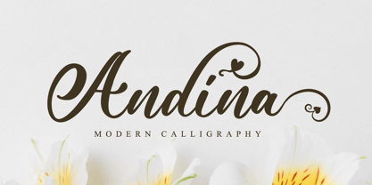 Andina is an exquisite handwritten font, masterfully designed to become a true favorite. It maintains its classy calligraphic influences while feeling contemporary and fresh. This font is PUA encoded which means you can access all of the glyphs and swashes with ease!
 - Andalusia Signature by Letterena Studios,
$9.00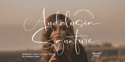 Andalusia Signature is an exquisite handwritten font, masterfully designed to become a true favorite. It maintains its classy calligraphic influences while feeling contemporary and fresh. This font is PUA encoded which means you can access all of the glyphs and swashes with ease!
 - Mansions Brush Script by Joelmaker,
$16.00 Mansions Brush Script is a handwritten font, which is so soft and modern, perfect for those who like logo designs, printed T-shirts, quotes, branding, stickers, and posters. Get this package right away, make your graphic imagination come true with Mansions Brush Script.
 - Kripke by Haiku Monkey,
$10.00 Kripke is a slab serif with rounded corners. It's readable and soft at small sizes, strong and friendly at large sizes. It's got a Greek and Cyrillic glyphs, as well as a large complement of accented characters. Try it on your designs!
 - Morpeth by G-Type,
$60.00 Hardworking and versatile condensed sans family originally designed for Morpeth Borough's wayfinding system and thus eminently usable for signage purposes. The 6 weight OpenType family includes discretionary ligatures, small caps, 5 sets of numerals plus coverage for Central European, Baltic and Turkish languages.
 - Ornata A by Wiescher Design,
$39.50 Ornata A is the first of a series of old ornaments that I am trying to save from oblivion. I am not just scanning these, I am completely redesigning the ornaments from scratch, thereby eliminating imperfections. Your digitizing type-designer, Gert Wiescher
 - Scribe by Wiescher Design,
$49.50 Scribe is an elaborate typeface somewhere in between Bodoni and an English script. It has interwoven capitals and joining lowercase letters. I have tried to make something new that has this old, settled touch. I think I like it. Yours sincerely, Gert Wiescher
