10,000 search results
(0.03 seconds)
- Blindness Graffiti by Colllab Studio,
$14.00 "Hi there, thank you for passing by. Colllab Studio is here. We crafted best collection of typefaces in a variety of styles to keep you covered for any project that comes your way! What if you could have a graffiti font collection? Or a street-inspired font collection? What if you want something clean, legible, yet still playful and fun? Searches online turn up nothing. Those popular sites only provide typical graffiti fonts. Well don't worry. What you’re looking for lies right here. We combine art and technology to bring the most extensive graffiti font collection around to your doorstep easier, faster, and cheaper than anywhere else. Introducing, Blindness Graffiti font is more than just random lettering. Its structured strokes and grungy strokes ooze its strong characteristic, inspired by urban style or cyberpunk design. It’s out of this world yet the balance between action and serenity keeps the font grounded. Blindness Graffiti is available in uppercase, lowercase, numerals, punctuations and lots of variations on each character include OpenType features, alternates, common ligatures and also additional swash to let you customize your designs. A Million Thanks www.colllabstudio.com
 - Savant by Characters Font Foundry,
$25.00 I proudly present Savant, a friendly headline typeface with an attitude. It’s got a slab serif touch and is packed with lots of nice typo-gems. The italic is a perfect companion for the regular. But beside that, it's powerful enough to stand its own ground. Savant is a good mixture of the playful and the classic. You can use it for fashion, food, magazines, packaging, corporate design- and other projects with an attitude. So show me what you’ve got! Savant Regular only is completely free in 2012, so download your free copy today!
 - Black Molasses by Hanoded,
$16.00 In Holland we eat pancakes with black syrup and I always thought that this ‘suikerstroop’ was the same as molasses. Turns out that’s not the case; syrup is made from sugar, but molasses is a by-product of the sugar refining industry. To celebrate the fact that I learned something new, I named this font family Black Molasses. Black Molasses was made using various cheap brushes and Chinese Ink. It comes in a ‘fat’ version and a ‘light’ version that work together really well.
 - Heirley Script by Groen Studio,
$15.00 Heirley Script, it is that the smooth fonts brush that has a different style. This is the perfect choice for personal branding project. Can be used for various purposes.such as headings, logos, wedding invitations, t-shirts, letterhead, lable, news, posters, badges etc. To enable the OpenType Stylistic alternates, you need a program that supports OpenType features such as Adobe Illustrator CS, Adobe Indesign and CorelDraw X6-X7. The Features of this fonts is; Standart ligatures Stylistic Alternates Stylistic sets PUA Unicode (Private Use Areas) THANK YOU
 - Austhind by Stringlabs Creative Studio,
$25.00 Austhind is a script font with stylish hand brush style. The Austhind font made with digital brush pen strokes that making this font look authentic and unique concept. This font is perfect for fashion brand, wedding invitation, business card, logo brand, signature, and then calligraphy.
 - Lily Stevan by Epiclinez,
$18.00 You know that feeling when you see something and you're like "Hey, I like this!"? Hopefully, Lily Stevan is that font. With its clean lines and playful design, it's perfect for fun little sayings, logos, and headlines. It's easy to use and will make your designs pop right off the page. Download Lily Stevan today! So what’s included : Basic Latin Uppercase and Lowercase Numbers, symbols, and punctuations Multilingual Support. Accented Characters : ÀÁÂÃÄÅÆÇÈÉÊËÌÍÎÏÑÒÓÔÕÖØŒŠÙÚÛÜŸÝŽàáâãäåæçèéêëìíîïñòóôõöøœšùúûüýÿžß PUA Encoded and fully accessible without additional design software Simple Installations Works on PC & Mac Thank You!
 - Gutheng by Letterlite Studio,
$10.00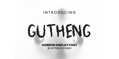 Gutheng - is a horror-themed font that is very mysterious and spooky. This font is very suitable to be used for book covers, titles, quotes, and others that require a font with a horror theme. What's Included : - Standard & Multilingual glyphs - Works on PC & Mac - Simple installations - Accessible in the Adobe Illustrator, Adobe Photoshop, Adobe InDesign, even work on Microsoft Word. - PUA Encoded Characters - Fully accessible without additional design software. - Fonts include multilingual support for; Afrikaans, Danish, Dutch, French, German, Indonesian, Irish, Italian, Norwegian, Portuguese, Scottish, Spanish, Swedish, Swiss. Hope you enjoy with our font!
 - Adecion by Dora Typefoundry,
$15.00 Adecion is designed for maximum visual and emotional impact. Its four weights excel in posters, social media, headlines, large format print - and anywhere else you want to get noticed. Hidden between straight lines and firm confidence is a hint of charm and mischievous character; Adecion gives your words a powerful sound as well as fun to use. Perfect for graphic design and any screen use of your projects such as branding, magazines, editorials, wedding invitations, logo design, posters, social media, and more! FEATURES: • 4 Font weight • Uppercase & Lowercase • Alternative Uppercase • Numbers & Punctuation • Characters with accents • Supports Multiple Languages WHAT'S INCLUDED: • Adecion - Light. • Adecion - Regular. • Adecion - Bold. • Adecion - Extra Bold. This type of family has been the work of real love, making it as easy and enjoyable as possible. I really hope you enjoy it! I can't wait to see what you do with Adecion! Feel free to use the #Dora Typefoundry tag and the # Adecion Display font to show what you've been up to!
 - Taglio by Wilton Foundry,
$29.00 Taglio’s name is derived from intaglio, which means “incised carving” or “an impression from an engraving”. Indeed, Taglio looks like an incised engraving with a contemporary calligraphic interpretation. The down strokes start with a single horizontal line that curves into a dual vertical line and ends with the same single line at the base. The dual elongated strokes create a bold overall impression but is literally twice as sophisticated than if the two lines were solid. That was exactly the goal in creating this font. We managed to create a font that is distinctive, elegant, and crisp that is also intentionally stencilled for more flexibility. For instance, it is ideal for laser cutting signage. One of the unique features in using the capital glyphs is that they stack perfectly without losing legibility, primarily because of the slanted ends of the dual vertical lines - see the example “Miami Fashion Week” display ad. Taglio’s unusual style was carefully crafted to come to life at display sizes. It is therefore ideal for use in branding fashion, restaurants, buildings, packaging, museums, signage, etc. An ideal pairing font is our WERK family which can be seen on some of the display ads below. Taglio has a sparkling and sophisticated personality that will absolutely delight!
 - Lopsickles by Ingrimayne Type,
$7.00 Lopsickles is a family in which the letters are based on lopsided, distorted ellipses. The family has four sets of letters that are combined in six different ways, yielding six fonts. Four of these fonts (styles AB, Ad, Bc, and cd) use the OpenType feature Contextual Alternatives (calt) to alternate letter sets so that top-heavy characters alternate with bottom-heavy characters. The spacing in these fonts is designed for alternating characters and will result in overlap if the characters do not alternate. The other two styles (Ac and Bd) are spaced normally. Style Ac contains the two character sets that are top heavy and style Bd has the two character sets that are bottom heavy. The Ac and Bd fonts have italics and backslanted styles that may be useful to suggest speed. Each of these ten fonts has an inset style designed to be used in a layer above the base font. This layering can be used to give the effect of hollow letters or to add a colored interior. Lopsickles joins several other alternating-characters families in the IngrimayneType library including Snuggels, CloseTogether, and Caltic, but is visually very different from them. It is a strange, unusual family that will get noticed.
 - Mockey Clown by IKIIKOWRK,
$19.00 Proudly present Mockey Clown - Cloud Type, created by ikiiko Mockey Clown is a decorative hipster font in a cloud style. This font is a contemporary and stylish typeface that is ideal for any creative project looking for a distinctive and trendy look. This font style is ideal for designs that need to communicate a sense of movement and whimsy because it has rounded edges, flowing lines, and a slightly bolder appearance. This letter has 3 styles that you can mix or play with to make it more decorative with the addition of bold or contrasting colors, creating a trendy look that is perfect for modern designs. Overall, this typeface is a sleek, customizable choice for any design project that needs a fresh, trendy look. This typeface is perfect for an youth stuff, magazine layout, poster, fashion brand, urban style, quotes, or simply as a stylish text overlay to any background image. What's Included? 3 Styles: Regular / Outline / Fill Uppercase & Lowercase Numbers & Punctuation Ligature (Bonus) Multilingual Support Works on PC & Mac
 - Happenstance by Just My Type,
$25.00 Happenstance came out of a play session with Bezier curves with a sense of fun built into its being. First came play, then came work. Thomas Edison once said,”Creativity is 1% inspiration and 99% perspiration.” Nikola Tesla thought the opposite. In this case, what started as inspiration took a lot of perspiration to corral into a usable font. So maybe the reality is a) different for different people or b) somewhere in the middle. Just sayin’.
 - Offroad by Grype,
$16.00 Geometric typefaces can harken back and visually tie themselves to so many genres, from constructivist posters, to techno club flyers, to raw industrial era power. The Offroad family finds its origin of inspiration in the O’Neal MX logo for their motocross division, represented in its truest form in the MX styles of this family, and expanded to a type megafamily. Offroad grabs hold of that unique pseudo-unicase style and runs with it to create a range of widths and weights that are perfect for historical through modern use. It embodies the hardcore motocross rigidity from the limited inspiration of the original logotype and expands to include a full and expansive glyphset, and a comprehensive range of widths and weights, creating a straightforward, uncompromising collection of typefaces that lend a solid foundation and a broad range of expression for designers. Here's what's included with the Offroad Collection bundle: 382 glyphs per style - including Capitals, Lowercase (Unicase Style), Numerals, Punctuation and an extensive character set that covers multilingual support of latin based languages. (see the 6th graphic for a preview of the characters included) 45 fonts in 6 width subfamilies: Extra Condensed, Condensed, Standard, Expanded, & Wide. 5 weights per subfamily with obliques: Light, Book, Regular, Bold, & Black. Fonts are provided in TTF & OTF formats. The TTF format is the standard go to for most users, although the OTF and TTF function exactly the same. Here's why the Offroad Collection is for you: You're in need of a geometric pseudo-unicase family with a big range of weights and widths You're a die-hard motocross fan, and want to design anything within that genre You're a club flyer designer, and need a kick-ass techno style font family You're totally into constructivist design, and want to create designs within that genre You just like to collect quality fonts to add to your design arsenal
 - Freakin Wicked by Nicky Laatz,
$30.00 It's phat, it's happy, it's weird, it's wonderful. Say hello to Freakin Wicked Display font! A retro groovy display font, but with a cheeky touch of the future. Great for any project that needs something a little loud and lot avant garde.
 - Klanting by Kulokale,
$17.00 Klanting is a stylish, clean, and modern condensed sans font, with style that is very different from the others. This font comes in two styles, Regular and Oblique Version. Klanting is well-suited for posters, social media, headlines, magazine titles, clothing, large print formats - and wherever you want to be seen. Inspired by the style of design that is currently popular, and this is the answer to all the needs of every idea that you will pour in this modern era. We highly recommend using a program that supports OpenType features and Glyphs panels such as Adobe Illustrator, Adobe Photoshop CC, Adobe InDesign, or CorelDraw, so you can see and access all Glyph variations.
 - Oceanwide Pro by California Type Foundry,
$47.00 A font perfect for not just one, but many projects! Introducing Oceanwide Pro, a sans that loves to be used in just about any situation! Designed with ultra clean lines and versatility in mind, Oceanwide wants to be your new favorite sans! Oceanwide’s ultra clean letters work anywhere you want to communicate orderliness and competence, and designed to build trust and rapport with your audience. Its wide proportions make it ideal for display and logo use. Oceanwide especially shines for white/bright letters on black/dark backgrounds! That’s because the inside shapes are nearly perfect circles in many weights. Here's a quick video tour of Oceanwide Pro by Dave Lawrence, including all the great things Oceanwide can be used for! We've tested Oceanwide for these industries, with stunning results!: Tech Arts Fashion & Style Business & Branding Corporations Logistics Architecture Food and many more... Oceanwide can be used for: Headers Subheadlines Logos Even body text, if tracked. Print & Screen The styles it can take are also many. It's great for: Modern/minimalist design Flat design Cut out design User Interface (UI) Technical designs In combination with text effects, even for grunge and other situations. And many others... DESIGN FEATURES Simplicity Tall x-height Hand-sloped obliques (italics) Narrow spacing Semi-wide proportions Expert kerning Well proportioned, usable lights & extra lights Large caps Great ALL CAPS MODE Uppercase punctuation Uppercase spacing with California Type Foundry’s Smart Tracking™ Advanced fraction support Proportional lining figures Thick joins Smooth curves Sturdy—great for textures and effects Variable font available Latin Pro character set for Central European languages. That's the writing for over 782 languages and transliterations worldwide! DESIGN STORY—THE FORGOTTEN SANS by Dave Lawrence, Lead Designer, California Type Foundry Adrian Frutiger was the 20th century master of sans, but I didn't realize he had made—not one—but TWO geometric sans! It wasn't until I had purchased the book “Adrian Frutiger: Typefaces”. I had hoped to someday meet Adrian Frutiger, but he passed away that very same year. Here is the story of Frutiger's forgotten sans. Back in 1968, Frutiger was approached by Pentagram to make a design for British Petroleum. They wanted a "new version of Futura". However, they wanted him to make a couple adjustments. First, they felt that Futura was "too fiddly." By this, they meant that it narrowed too much at the joins. (Joins are for example where the round and straight parts of the 'd' meet.) This is something that is necessary for small print text (to prevent ink clogging), but is not necessary at large sizes. Second, they wanted it to be entirely geometric, using the circular shape with minimal optical corrections. Unfortunately this font was not even used very consistently in the BP brand. A haphazard mix of Futura and Frutiger's BP font ensued. It was then replaced by another font design very soon after. My design is different in several ways. First, the commas and quotes are a more modern style. I tried his original commas, but these just didn’t work to 21st century eyes. Second, in his drawings, Frutiger went for a more standard u with a downstroke on the right. However, Oceanwide has a simpler u. Third, I made more optical adjustments. At the direction of his employer, Frutiger reluctantly put no font optical corrections into the letters. So I think my optical adjustments are similar to what Frutiger would have wanted. Fourth, I extended the weight into the light and extra light ranges. Fifth, the rest of the font I created according to the principles of Adrian Frutiger, but with no sources for inspiration. Here is Frutiger’s design philosophy, in his own words: “If you remember the shape of your spoon at lunch, it has to be the wrong shape. The spoon and the letter are tools; one to take food from the bowl, the other to take information off the page... When it is a good design, the reader has to feel comfortable because the letter is both banal and beautiful.” The words about the spoon were the ones I kept in my mind as I tried to make the curves ultra smooth, and the shapes ultra simple. Hopefully this font is a worthy successor to the font that inspired it. Released on the 93rd birthday of Adrian Frutiger, to celebrate the life and achievements of this amazing designer. ——————— Simplicity. Versatility. Oceanwide.
 - Savoire by Bale Type,
$15.00 Savoire is a hand lettered serif that have a handmade vibes. You can use this font for any project especially for design that require handmade and organic feels. This font also comes with Regular and Bold that you can use both to highlight the point. This font already support multi language.
 - Rephone by Majestype,
$15.00 Rephone is a handwriting font that has a force and rush personality but still beautiful. Each letter was made with love so that it can work well with one another. Rephone are designed to work well on the design like invitation, clothing, photography, branding, album covers, signature and the style that can work well with this font. Rephone support Multiple Language & OpenType features, that can allow you to choose a character that you like and suitable for the project you're working on.
 - MGT Vallery Hills by Magetype,
$15.00 When I was surfing the internet, with rock n 'roll music. I accidentally found a picture of a hotel sign with a very unique style, namely: Mid-century Modern (MCM). It looks very pretty and charming to me. And inspired me to create Font Family. And I am proud to present the Vallery Hills Font Family. This font is in the Retro style of the 50s to 60s. Okay, here are the specifications. 1. Vallery Hills Schrift There is one unique thing about this font. Usually, script fonts with Retro style always have an angled anatomical shape, but I made this font upright. The goal is to make a difference with other script fonts I've seen. By the way, this font comes in two styles, namely: Regular and Bouncy. Why do I make it like that? Because I want to make this font into two different functions, namely: If you want to make it a Display Font, which is usually used for Headings, then use the Bouncy style. And if you want to use it as Bodytext, then use Regular. 2. Vallery Hills Sherift This second font is a font that is very synonymous with the Mid-century Modern (MCM) era. A very distinctive form of the serif font of that era. Similar to the first font, this font also has 2 styles, namely: Regular and Bouncy. You can combine this font with the other two fonts in Vallery Hills. It could be Title, or Bodytext. And you can also combine two styles, namely: Regular and Bouncy. Try! 3. Vallery Hills Suns Sherift This last font is Sans Serif. Also has 2 styles like his two brothers, namely: Regular and Bouncy. The goal is actually the same. I am sure you are cooler to create a design that uses this font family. Well, there is one advantage of this font from its two siblings, which is that it has a feature, namely: SMALLCAPS. Which will be an option when you are bored with the mediocre shape or style of Lowercase. Try combining the Smallcaps with Uppercase or Lowercase. Must be cool! : D Oops, almost forgot. This font consists of several font formats, namely: OTF, TTF, and Webfonts. And of course everything is MULTILANGUAGE. OK, friends. That's all I can describe about the Vallery Hills Family. Hopefully it will please all of you. Cheers!
 - Linotype EEC Pi by Linotype,
$40.99This font contains a set of symbols that are used on the EEC - Virnature by Alit Design,
$19.00 Presenting 🍃The Virnature Nature Script Font🍃 by alitdesign. Welcome to the Virnature font page, Thank you for visiting and finding this font. The Virnature font is inspired by elegant script fonts combined with the concept of nature. It can be seen by the beautiful and fitting leaf ornaments that make the Virnature font besides elegance also unique with the concept of nature. The Virnature font includes full set of Uppercase and Lowercase Basic Characters, Numerals, Punctuation and Multi lingual support. Also it contains ligatures and a lot of stylistic alternatives to perfectly re-create natural calligraphy and nature concept designs (check the previews in order to see them all). The Virnature font has alternatives that you can combine between swashes and symbols that have the theme of elegant nature. Besides that this font is very easy to use both in design and non-design programs because everything changes and glyphs are supported by Unicode (PUA). The Virnature Nature Script Font has a total of 768 glyphs including symbol, multilingual. Language Support : Latin, Basic, Western European, Central European, South European,Vietnamese. In order to use the beautiful swashes, you need a program that supports OpenType features such as Adobe Illustrator CS, Adobe Photoshop CC, Adobe Indesign and Corel Draw. but if your software doesn't have Glyphs panel, you can install additional swashes font files.
 - Mollani by Alit Design,
$17.00 Presenting 🍃The Mollani Nature Script Font🍃 by alitdesign. Welcome to the Mollani font page, Thank you for visiting and finding this font. The Mollani font is inspired by elegant script fonts combined with the concept of nature. It can be seen by the beautiful and fitting leaf ornaments that make the Mollani font besides elegance also unique with the concept of nature. The Mollani font includes full set of Uppercase and Lowercase Basic Characters, Numerals, Punctuation and Multi lingual support. Also it contains ligatures and a lot of stylistic alternatives to perfectly re-create natural calligraphy and nature concept designs (check the previews in order to see them all). The Mollani font has alternatives that you can combine between swashes and symbols that have the theme of elegant nature. Besides that this font is very easy to use both in design and non-design programs because everything changes and glyphs are supported by Unicode (PUA). The Mollani Nature Script Font has a total of 818 glyphs including symbol, multilingual. Language Support : Latin, Basic, Western European, Central European, South European,Vietnamese. In order to use the beautiful swashes, you need a program that supports OpenType features such as Adobe Illustrator CS, Adobe Photoshop CC, Adobe Indesign and Corel Draw. but if your software doesn't have Glyphs panel, you can install additional swashes font files.
 - Minigap by Gravitype,
$19.90 Minigap is a geometric sans serif family that has a minimal height difference between upper and lower case. In other words for those who are into typography, it has a very high x-height. The choice was made to finally have a typeface that could appear very neat, reducing ascending and descending parts of the glyphs (b, d, g, j, l, ...) that could interfere with the lines above and below. All of that without going to extremes in a unicase style but also without renouncing to a great legibility. This aesthetic, in fact, translates into a pleasant visual effect that creates well-defined lines and enhances the layout, looking excellent also on small screens. The pointed corners of capital letters and numbers have been kept even in the heavier styles, to give consistency to the family. Stylistic alternates are included: “i” and “j” can be set to the x-height, to have a more common aesthetic; by default they are set in the lower version, fitting better the purpose of this typeface. the two-story “a” is also available, to give you one more customizable option and extend the range of use. Minigap is available in 14 styles (7 uprights + matching italics), has OpenType features and supports multiple languages. The Regular weight is offered for free, try it!
 - Combinado by My Creative Land,
$20.00 Please welcome a new Combinado Font Family that has it all: elegant display sans serif and serif fonts in three weights each; a modern calligraphy script that looks beautiful next to them; a sans serif font designed specifically for the best on-screen reading experience, which comes in two weights (for now! more to come); and the last but not least - Design Elements font that has more than 70 elements to compliment your designs. This font family is very universal and you can use it everywhere: websites, instagram ads, magazines, books, cards and invitation designs, as well as in all possible personal design project that do not fit in any of the listed categories! Enjoy!
 - Taurunum by Kostic,
$40.00 The initial idea for this font came when a friend of mine asked me to create a logo for a sports team that he was forming. Since it was a martial arts competitive sport, bold and striking lettering was needed to reflect that. When the logo was finished, I was really pleased whith the letters so I decided to create the entire font. Taurunum is made with intention to be used for display design (logos, posters, etc.), and combining the weights should give best results.
 - EBRATHO by Twinletter,
$17.00 Ebratho is a superhero-themed display font that brings strength, courage, and modernity to your projects. With a strong, bold, and full-of-character style, this font is the perfect solution for creating an impressive and aggressive look. In every letter, Ebratho radiates soul-stirring power. Each character is designed with meticulous detail and a unique style, creating a strong and compelling impression on your audience. With a modern and charismatic look, this font will give your project an unforgettable touch. Ebratho is packed with creative tools, including ligatures and alternates, that allow you to combine elements of this font in various ways to create interesting and unique stylistic variations. Additionally, multilingual support allows you to use Ebratho in multiple languages, making your project accessible to a global audience. If you’re looking for a strong, bold, modern, and bold font with a superhero touch, Ebratho is the right choice. With benefits that include the ability to create impressive looks and creative features such as ligatures and alternates, this font will quickly catch the attention of your potential customers and make a memorable impression in no time. What’s Included : File font All glyphs Iso Latin 1 Alternate, Ligature Simple installations We highly recommend using a program that supports OpenType features and Glyphs panels like many Adobe apps and Corel Draw so that you can see and access all Glyph variations. PUA Encoded Characters – Fully accessible without additional design software. Fonts include Multilingual support
 - MEORU GEND by Twinletter,
$17.00 Meoru Gend is a display font that presents superhero strength, courage, and modernity in every action. With a strong, bold, and futuristic style, this font is the perfect solution for creating action-packed and epic gaming experiences. In every letter, Meoru Gend brings life to your display with electrifying energy. From bold, sharply contoured typefaces to seamlessly blended modern elements, this font will bring immense visual power to your game projects. Meoru Gend offers not only impressive styles but also creative features that enrich your work. With the available ligatures and alternates, you can create unique and interesting variations of your style. Also, with multilingual support, this font can be used in multiple languages to reach a global audience. If you’re looking for a strong, bold, modern, and action-packed font for your game projects, Meoru Gend is the right choice. With benefits that include an impressive look, futuristic style, and creative features such as ligatures and alternates, this font will quickly catch the attention of your potential customers and bring you an extraordinary gaming experience in no time. What’s Included : File font All glyphs Iso Latin 1 Alternate, Ligature Simple installations We highly recommend using a program that supports OpenType features and Glyphs panels like many Adobe apps and Corel Draw so that you can see and access all Glyph variations. PUA Encoded Characters – Fully accessible without additional design software. Fonts include Multilingual support
 - Whitechapel BB by Blambot,
$20.00During the investigation of the infamous murders in Whitechapel, police received several letters allegedly from Jack the Ripper. Of the hundreds received, the so-called, “Dear Boss” letter actually included some details of a crime that had yet to be committed. Soon after, the information in this letter would be corroborated at a crime scene. This font was inspired by the handwriting in that letter. It includes dozens of European characters…and just might be the writing of Jack himself! - Besley Clarendon by HiH,
$12.00 Besley Clarendon ML is our version of the Clarendon registered by Robert Besley and the Fann Street Foundry in 1845. Besley Clarendon ML represents a significant change from the slab-serif Antiques & Egyptians that had become so popular in the prior three decades. Like Caslon’s Ionic of 1844, it brackets the serifs and strongly differentiates between the thick and thin strokes. Besley Clarendon is also what today is considered a condensed face, as a comparison to the various contemporary Clarendons will show. Robert Besley’s Clarendon was so popular that many foundries quickly copied it, a fact that caused him to complain vigorously. The reason it was so widely copied is simple ó it was extremely useful. It provided the attention-getting boldness to highlight a word or phrase, yet at the same time was compact and easier to read than the fat faces and antiques of the period. It wasn't until sixty years later that the concept of a typeface family of different weights was developed with DeVinne and Cheltenham. Until then, Clarendon served as everyone’s all-purpose bold face. It can be used for ads, flyers, headers or even short text. Don't leave home without it. Besley Clarendon ML includes the following features: 1. Glyphs for the 1250 Central Europe, the 1252 Turkish and the 1257 Baltic Code Pages. Added glyphs to complete standard 1252 Western Europe Code Page. Special glyphs relocated and assigned Unicode codepoints, some in Private Use area. Total of 353 glyphs. 158 kerning pairs. 2. OpenType GSUB layout features: pnum, salt, liga, dlig, hist and ornm. 3. Inclusion of tabular (std) and proportional (opt) numbers. 4. Kreska-accented letters.
 - Tulip by ArtyType,
$29.00 I've had an interest in typography ever since my college days, even submitting my NDD thesis on the subject. The basic concept for this typeface stems from that early creative period, hence the obvious 60’s retro feel. It’s only recently that I've have had the chance to carry through fully some of my dormant typographic ideas, but ‘better late than never’ as they say! The font’s characteristic style is based on repeating or rotating templates of a half and a quarter circle, the geometric, modular building blocks used here. The name was simply influenced by the letter ‘u’, which visually describes a stylized ‘tulip’ flower.
 - Harsey by Letterhend,
$16.00 Introducing, Harsey Type Toolbox. One of our best-designed product that we ever created. This product consist of many styles such as script, sans, serif, and also includes dingbats, catchwords and badges all comes in font format. What makes this product even more special is you can use and combine all these fonts perfectly matched altogether.
 - Valenteena by Ingrimayne Type,
$9.95 Valenteena is in the spirit of the 19th century, but there are no other typefaces quite like it. It is geometric, using distorted hearts to form the letters. The lower-case letters are smaller versions of the upper-case letters. The overlay variant is derived by breaking ValentinaContour into its parts: the inner letter, the white inner border, and the black outer border. To use them one must have a program that allows layers of letters. Type in and format the inside variant to get the message you want. Also select the color you want this layer to have. Copy this layer twice, formatting one to the medium and and the other to outside. Color each of them in the colors you want and them combine the three layers, placing them so the letters exactly align. You will get letters with three colors.
 - Stamp Of Approval JNL by Jeff Levine,
$29.00Back in the 20th Century B.C. (Before Computers) there was what was known as a "paper" office. Workers used typewriters, correction fluid and a drawer full of rubber stamps. Jeff Levine has taken twenty-six of the common phrases found on those old office stamps and created Stamp of Approval JNL. Use these images as they are, or run them through a filter for a worn or inked-up effect. - Boxer Punch by Putracetol,
$28.00 Boxer Punch - Soft Bold Font Boxer Punch - Soft Bold Font is a stylish and modern font designed to catch the attention of your audience. The font's unique design combines a soft bold shape with a cute sans serif, making it perfect for creating eye-catching designs. The idea behind creating Boxer Punch was to incorporate the concept of understated realism into the font. This is evident in the font's smooth and elegant lines, which make it perfect for a variety of design projects. The font is ideal for those looking to create a professional touch in their designs, while also maintaining a stylish and modern feel. Boxer Punch is an excellent choice for anyone looking for a font that is versatile and can be used in a variety of different contexts. It is perfect for sports-themed work projects, as well as branding, packaging, logo design, album covers, posters, and social media graphics. One of the standout features of Boxer Punch is its versatile OpenType features, including alternates and ligatures, which allow for even more creative freedom when designing with the font. Additionally, the font comes with uppercase and lowercase characters, as well as support for multilanguage, numbers, punctuation, and symbols. Inside the font package, you'll find three different file formats: Boxer Punch otf, Boxer Punch ttf, and Boxer Punch woff. This means that no matter what platform you are using, Boxer Punch will work seamlessly with your software. Boxer Punch is a font that is sure to make your designs stand out from the crowd. Its unique design and versatile features make it perfect for anyone looking to add a touch of elegance and style to their work. If you're looking for a stylish and modern font that is perfect for sports-themed work projects or a variety of other design projects, then Boxer Punch is the font for you. In summary, Boxer Punch - Soft Bold Font is a versatile and modern font that combines a soft bold shape with a cute sans serif to create a unique and stylish design. With its versatile OpenType features, multilanguage support, and uppercase and lowercase characters, Boxer Punch is perfect for a wide range of design projects.
 - Marshmallow by Positype,
$39.00 Marshmallow is a fun, fat, super high-contrast script typeface in two variants. A slick connected (Script) and a mellow unconnected (Fluff) style that provides the versatility you need regardless of the display usage you plan. Marshmallow Script tops out at 820 characters, and both fonts feature a wide array of swash and stylistic alternates that complement the other, with varying options in the three additional stylist sets, titling alternates, ligatures and contextual ligature combinations. The fonts even contain ordinals, superior and inferior numerals, OpenType-generated fractions. All of these extras are produced with a sense of decadence and fun to expand the possible uses of the typeface. It can’t be used everywhere, but when it is used, it should be used with indulgent abandon… which is pretty much what happens any time we take a soft, gooey bite into marshmallow now, right?!
 - FG Petra by YOFF,
$12.95FG Petra looks like usual handwriting yet very pretty! It has a large 'K' in lowercase; I think that is what makes it special. - Brush With Death by Cyberian Khatru,
$20.00 This font was made possible by creating a custom brush in Illustrator. I started with a flat brush dipped in India ink to create the stroke. From a scan of that stroke I made a vector tracing which I then I altered as necessary to get the desired dimensions. The lower case letters have a thinner stroke than the capitals.
 - Viory by Sign Studio,
$15.00 Viory is a versatile font family. There are 7 thicknesses that match the italic version. They will complement each other to support your design. Equipped with Stylistic Set, Discretionary Ligature and Alternative Character features. Viory has a smooth shape because the pressure on each curve has been adjusted to the ideal. The impression of an elegant and classic is in this family.
 - Yumo by Thinkdust,
$10.00 Yumo is a new, textured remix of the original 2010 Yume typeface, and has plenty to offer of its own. Angular and blocky, this typeface creates impactful text with a hint of playfulness, expanded upon by its rough finish. There are no extraneous edges to this font because most of them have been subsumed into the characters themselves, so any sharpness it may have from the squared corners is removed by the lack of thin strokes or serifs. Perfect for headlines and large text that wants to stand out, Yumo’s big, bold text will help your message make an impact. Playing with colours on the textured surface only helps to strengthen this effect, so that Yumo will blow people away, whatever you want to say.
 - Odd Stencil JNL by Jeff Levine,
$29.00 The sheet music for "Dancing Butterfly" had the title of the 1929 composition hand lettered in what can be only described as an odd hybrid of letters with an Art Nouveau stencil influence. This quirky style became the basis for Odd Stencil JNL, which is available in both regular and oblique versions.