10,000 search results
(0.041 seconds)
- Verily Serif Mono - Unknown license

- Hyperpolar by Bisou,
$12.00 Made in La Chaux-de-Fonds (Switzerland), hyperpolar is born while the designer (Bisou) watches "Godard mon amour", a biopic about Jean-Luc Godard's depression in 1967-68. A parade of murder mystery books is staged at the middle of the movie and at exactly 56 minutes and 47 seconds, the book "Confrontation" strikes Bisou's eye. It is the first inspiration for this awsome retro font. Hyperpolar is thought from ground up to give a strong impact. It’s retro 50’s crime stories style makes it best suitable book covers. It works perfectly with short texts for advertisement like a trench coat or a smoking pipe store. Just hang it over a video club and see what thrilling cinephiles will come in.
 - Planny by Kaer,
$19.00Planny is a blueprint font created for the reproduction of a technical drawing or engineering drawing. All characters were designed with construction lines. The blueprint process was characterized by white lines on a blue background, a negative of the original. What you will get: Regular style Uppercase and lowercase glyphs Multilingual support Numbers and symbols Please feel free to request to add characters you need: kaer.pro@gmail.com - Le Monde Courrier Std by Typofonderie,
$59.00 A rounded slab in 4 styles In our age, since the arrival of microcomputing, the majority of professional letters have been composed in quality typefaces. Typewriters & the typestyles they used have become antiques. A letter set in Times or Helvetica & printed with a laser printer at 600 dpi or more are of such quality that one can no longer distinguish it with a document produced by offset printing. But letters composed in this way appear overly institutional when a bit of informality is needed. Le Monde Courrier, designed by Jean François Porchez, attempts to re-establish a style halfway between writing and printing. Informal neo-tech style This rounded slab serif returns the informal character of “typewritten” fonts to letters and suit well all bad conditions, from inkjet printed memos to webfonts use. With a unique typographic colour, it integrate itself with the rest of the Le Monde family with effective contrast. The verticals metrics and proportions of Le Monde Courrier are calibrated to match perfectly others Typofonderie families. Bukva:raz 2001 Type Directors Club .44 1998 European Design Awards 1998
 - Billy Serif by SparkyType,
$19.00The serifed companion to the popular Billy family comes in 3 very different but complimentary weights that when combined create a very strong, playful and persuasive style. - P22 Ringwell by IHOF,
$24.95 Ringwell is pure Victoriana in two styles, plain and decorative, that can be mixed and matched. The Pro version combines the two styles using stylistic alternate features.
 - Drawzing by Fonthead Design,
$19.00 Drawzing is a font designed by Ethan Dunham that mimics the looks of either chalk or crayon. The font is well balanced and is not overly childish.
 - FG Emmy by YOFF,
$19.95FG Emmy works great for both small and large text pieces and headings. I like the way the font bends in different directions. That makes it interesting! - Heft by Device,
$39.00 Heft is a heavy slab serif that packs a powerful punch. Available in square-cornered and rounded versions, each with italics, plus two distressed variants — an inky version that evokes the urgency of cheap hot-metal printing, and a worn, distressed version that suggests vintage woodtype or photocopied text.
 - Crucifix by Canada Type,
$39.95In June of 2004, Canada Type released Crucifix, a condensed three-tiers typeface that tried to bridge the gap between traditional blackletter forms and the traditional European gothics. The main goal of Crucifix was to have as many as 4 different variations on each letter form, so the original release consisted of three fonts: a main font with a standard character set, a small caps set, and a unicase variation. Now Canada Type presents the next generation of this typeface: Crucifix 2.0 and Crucifix Pro. This new version takes advantage of both Unicode and OpenType technologies to make Crucifix as versatile as ever. The PostScript Type 1 and the True Type version boast extended Latin character set support, including Western, Eastern and Central European, Turkish and Baltic, as well as two non-Latin scripts: Cryillic and Greek. The OpenType version, Crucifix Pro, goes even further by including all of above in one font, along with proper automation to accommodate on-the-fly ligatures, small caps, numerators, denominators, some fractions and a ton of stylistic and contextual alternates - all programmed to work with the latest OpenType-enabled programs. Unique, stark, and with more than 900 characters, Crucifix has that clinical sharpness and special dramatic wonder to make it perfect for mystery, gothic, and horror design settings. - Instant Harmony by Hanoded,
$15.00 Wouldn’t it be nice to have a pack of Instant Harmony in your cupboard? Just add water and *poof* - all strive and struggle have gone, having been replaced by peace and quiet. The grass seems greener, the sky bluer and the air smells like a fresh mowed lawn. Ahhhh! Zap! Back to reality. There is no instant harmony, don’t go looking for it in your local supermarket! If you want a taste of something resembling instant harmony, then add this super-duper font family to your collection and use it for your designs. You may find that your creativity levels are up, your morning coffee tastes better and your designs look exactly like you had in mind. Pinky promise!
 - Black Sapphire by Silverdav,
$14.00 Black Sapphire font is a modern font with a luxurious retro style, carefully crafted to produce the best product, there are 4 styles that you can use and mix to produce a unique, luxurious, and elegant design. Black Sapphire consists of, Regular, Italic, Outline & Outline italic, combine and create your own design, plus a lot of uppercase and lowercase alternate letters will add to the uniqueness and luxury of the design you create. Black Sapphire is perfect for Branding, Logo, Magazine, T-Shirt, Mockup, Quotes, Poster, and more, try it yourself and create amazing designs with Black Sapphire font. What’s Included: Black Sapphire Black Sapphire Italic Black Sapphire Outline Multilingual Support 185 Uppercase & Lowercase Alternates Ligatures If you have any Question Please Contact Us
 - Octin Sports by Typodermic,
$11.95 Octin Sports is a typeface that commands attention and exudes a sense of strength and resilience. The seven available weights—light, book, regular, semi-bold, heavy, and black—provide a range of options for designers looking to add a bold, dynamic element to their work. But make no mistake, this typeface is not just for the sports world. Octin Sports has a versatility that extends beyond the playing field and can lend a rugged, no-nonsense vibe to a variety of themes. Whether you’re designing for a school, construction site, or law enforcement agency, Octin Sports is up to the challenge. The sleek, angular lines of this typeface give it a distinct sporty feel, making it an ideal choice for designs that seek to convey energy and excitement. The bold weight options are particularly striking and provide a strong visual impact that demands attention. Overall, Octin Sports is a solid choice for designers who want to infuse their work with a sense of toughness and vitality. Its versatility and sporty design make it a font that can rise to any challenge, whether it’s on the field or in the boardroom. Check out the rest of the Octin families: Octin College, Octin Prison, Octin Stencil, Octin Vintage & Octin Spraypaint. Most Latin-based European writing systems are supported, including the following languages. Afaan Oromo, Afar, Afrikaans, Albanian, Alsatian, Aromanian, Aymara, Bashkir (Latin), Basque, Belarusian (Latin), Bemba, Bikol, Bosnian, Breton, Cape Verdean, Creole, Catalan, Cebuano, Chamorro, Chavacano, Chichewa, Crimean Tatar (Latin), Croatian, Czech, Danish, Dawan, Dholuo, Dutch, English, Estonian, Faroese, Fijian, Filipino, Finnish, French, Frisian, Friulian, Gagauz (Latin), Galician, Ganda, Genoese, German, Greenlandic, Guadeloupean Creole, Haitian Creole, Hawaiian, Hiligaynon, Hungarian, Icelandic, Ilocano, Indonesian, Irish, Italian, Jamaican, Kaqchikel, Karakalpak (Latin), Kashubian, Kikongo, Kinyarwanda, Kirundi, Kurdish (Latin), Latvian, Lithuanian, Lombard, Low Saxon, Luxembourgish, Maasai, Makhuwa, Malay, Maltese, Māori, Moldovan, Montenegrin, Ndebele, Neapolitan, Norwegian, Novial, Occitan, Ossetian (Latin), Papiamento, Piedmontese, Polish, Portuguese, Quechua, Rarotongan, Romanian, Romansh, Sami, Sango, Saramaccan, Sardinian, Scottish Gaelic, Serbian (Latin), Shona, Sicilian, Silesian, Slovak, Slovenian, Somali, Sorbian, Sotho, Spanish, Swahili, Swazi, Swedish, Tagalog, Tahitian, Tetum, Tongan, Tshiluba, Tsonga, Tswana, Tumbuka, Turkish, Turkmen (Latin), Tuvaluan, Uzbek (Latin), Venetian, Vepsian, Võro, Walloon, Waray-Waray, Wayuu, Welsh, Wolof, Xhosa, Yapese, Zapotec Zulu and Zuni.
 - Carlton by ITC,
$29.99Carlton is based on a typeface designed by Prof. F. H. Ehmcke. In 1908, Ehmcke released his Ehmcke-Antiqua design through the Flinsch typefoundry in Germany. Ehmcke-Antiqua was later distributed by the Bauer typefoundry in Frankfurt am Main. The Caslon Letter Foundry in England discovered the design and released their own typeface based upon the model, which they named Carlton. Carlton entered the Stephenson Blake program after they acquired the Caslon Letter Foundry in the late 1930s. As hot and cold metal typesetting became outdated technologies, Carlton and Ehmcke-Antiqua fell out of general use. In the 1990s, Letraset revived this classic design, distributing it under its English name, Carlton. Carlton's clean and generous capitals, as well as its understated yet detailed lower case, have found popularity again in recent years. The elegance of Carlton is best used for displays with large letter and word spacing. Carlton shows all of the hallmarks of a delicate serif typeface design; its forms capture a distinct moment that was common within Central European type design during the first third of the 20th Century. Carlton is similar to several other expressive typefaces from the early 1900s, including Bernhard Modern, Koch Antiqua, Locarno, and Nicolas Cochin." - Serenata Vantages by Fikryal,
$23.00 Serenata Vantages is a sophisticated and elegant sans-serif font that exudes modernity and refinement. With its clean lines and well-proportioned letters, this font is perfect for a wide range of design projects, from branding and advertising to editorial and web design. The font features a range of weights, from thin to bold, giving you the flexibility to create both delicate and bold designs. The characters are beautifully crafted with subtle curves and angles, creating a sense of fluidity and balance. Serenata Vantages is perfect for designs that require a touch of class and sophistication, such as luxury branding, high-end fashion, and editorial publications. It is also ideal for websites and digital interfaces that need a modern and clean look. Overall, Serenata Vantages is an elegant and versatile font that can elevate your designs to new heights, making it a must-have for any designer’s toolkit. Features : Serenata Vantages Light Serenata Vantages Regular Serenata Vantages Bold Multilingual Support If you have any questions please don’t hesitate to contact me follow my Instagram: @fkryall Thank you
 - Mon Nicolette by Sudtipos,
$49.00 This is a digital revival by Cristóbal Henestrosa based on an experimental typeface named Charter, designed – yet never fully accomplished – by the prominent William Addison Dwiggins. It is an upright italic, unconnected script typeface, whose main features are a pronounced contrast, condensed forms and exaggerated ascenders. While Dwiggins worked on this project from 1937 to 1955, he only completed the lowercase and a few other characters. However, it was used to set a specimen in 1942 and a short novel in 1946. The sources that Cristóbal used for Mon Nicolette were the original sketches by WAD as well as printing trails kept at the Boston Public Library, and a copy of the 1946 edition of The Song-Story of Aucassin and Nicolette. This gorgeous typeface can be used successfully in headlines, subheads and short passages of text from 12 points onwards, in applications such as fashion magazines, soft news, advertising, poetry, albums, and book covers. This project started ten years ago, while Cristóbal was studying the Type@Cooper Extended Program at New York City. A previous version was selected to be part of the Biennial Tipos Latinos 2018, and now Mon Nicolette is finally ready for commercial distribution with Sudtipos… and we are very proud of it! Festina lente.
 - PF Bague Inline Pro by Parachute,
$79.00 Bague Inline Pro is the inline version of Bague Universal a contemporary geometric typeface family which blends distinct minimalist characteristics with mainstream details. Despite its inspiration from Herbert Bayer’s drawings of the 1920s, it diverts from the constructivist rigidity and display structure of early geometric typefaces by incorporating humanist characteristics as well as classic letterform shapes which balance out the extremity of the minimal shapes. Bague Inline is a typeface that stays true to its urban nature and heritage. A very interesting feature of Bague Inline is its vast array of uppercase alternates and ligatures which truly shine when set at display sizes. Make your selection from 4 groups of alternates as well as a rich set of discretionary ligatures and watch it transform into a flexible, charming and stylish typeface with strong modern aesthetics. This typeface offers enormous possibilities and variations for editorial design and branding. Bague Inline is the only commercially available inline typeface that comes in 4 weights for uppercase and lowercase letters. Each style consists of 775 glyphs with more that 128 alternates and ligatures and an extended set of characters which supports simultaneously Latin, Cyrillic and Greek. PDF Specimen Bague Inline on Behance
 - Bigsize by Astageni,
$16.00 Unleash the playful vibes with Bigsize, a vibrant display font crafted to command attention and inject a dose of fun into any design. The bold, rounded letterforms make it a perfect choice for titles, headlines, and product packaging. Its whimsical charm also positions it as an ideal companion for brands targeting a youthful or lighthearted audience. Bigsize isn't just about fun; it's designed to be both playful and functional. Its readability, even at larger sizes, ensures that your message shines through. The font's distinctive style is a testament to the designer's creative exploration of letterforms, resulting in a typeface that strikes the perfect balance between playfulness and legibility. With over 350 glyphs, including support for broad Latin and Cyrillic languages, Bigsize proves its versatility across various design projects. Whether you're working on posters, billboards, logos, or digital ads, this font is your ticket to making a bold and memorable statement. Whether you're crafting a poster, developing packaging for a brand, or spearheading an advertising campaign, Bigsize is the font that will set your project apart. Its bold and comical aesthetic captivates your audience's attention, while its readability ensures your message resonates effortlessly."
 - Ardhelia by Jamalodin,
$20.00 Ardhelia is a beautiful display font that is suitable for branding, wedding invitations, greeting cards, posters, name card, quotes, blog header, logo, fashion, apparel, letter, stationery and other projects. Ardhelia come with 500+ glyphs. The alternative characters were divided into several Open Type features such as Swash, Stylistic Sets, Stylistic Alternates, Contextual Alternates. The Open Type features can be accessed by using Open Type programs such as Adobe Illustrator, Adobe InDesign, Adobe Photoshop Corel Draw X version, And Microsoft Word. And this Font has given PUA unicode (specially coded fonts). so that all the alternate characters can easily be accessed in full by a craftsman or designer. Ardhelia : Uppercase ( Four style variations ) & Lowercase International Language & Symbols Support Punctuation & Number PUA Unicode Range Standard Stylistic Alternates Stylistic Set 1-21 Character Variant Contextual. The file include the following : Ardhelia.otf If you don't have a program that supports OpenType features such as Adobe Illustrator and CorelDraw X Versions, you can access all the alternate glyphs using Font Book (Mac) or Character Map (Windows). If you have any question, don't hesitate to contact me. Thanks for your visit.
 - Elisetta by Sudtipos,
$39.00 Musical notes and letterforms, silences and white spaces, pentagrams and lines, music and writing have much in common and go beyond time, cultures, styles and locations. This new typeface emerges from the blend between the lyrics and the harmony, rhythm, femininity and luminosity of the traditional musical forms. It`s not about blues or rock, tango or salsa, instead it recovers the neoclassical characteristics of the current musical notation system and revitalize the essence of its signs. Taking care of both the function and the form, Elisetta has been specially designed for the writing of texts and musical sheets considering all its elements and communication needs. This source of inspiration also makes the font really good for extensive texts, since its design is based on situations that require high line performance, great readability and high aesthetic coherence. With 5 variables that vary in weight and style, the typography gathers asymmetry and organic nature in vertical structure, narrow horizontal proportions, high x height and extreme contrast between black and white. Elisetta Book has been created for the writing of clear texts and long lines composed in small sizes inside and outside the pentagram; Elisetta Italic intensifies the organic nature of the musical keys by offering softer signs, contextual alternates and initial caps; finally, Elisetta Display increase and emphasize the contrast between vertical stems and horizontal lines to highlight short texts and titles. For those who love music and for those who like romantic forms, this typography has a lot to offer: Elisetta is the best option to write light words with style, compose clear and rhythmic lines and read comfortable paragraphs with high performance. You can tell everybody this is your font, how wonderful life is while you're in the world! * This typeface was originally designed and supervised as «Elisa», the main project of the Master in Typography at University of Buenos Aires, Argentina.
 - Raylig by Khaiuns,
$16.00 Raylig is a graceful serif but full of energy, Raylig is an experimental project full of selfishness in it, this project was designed by khaiuns in May 2021, he made it himself so it took about 4 months. Raylig is a desire to present the perfect font for your wide variety of projects so that this type of font can be selected for branding, especially in the UI / UX industry, also suitable for typographic layout for magazines, posters, books, etc. With hard work and spending a lot of time, comes the Raylig Serif font that has interesting things, such as: 10 styles: 5 Original, 5 Alternative 650 glyphs in each style Support for more than 190+ languages: Expanded Latin, and many other languages Each style has 33 really cool alternatives, and find something interesting Raylig also has classic characters, but it is also perfect for your modern design, you can see it on display, such as in thin body size (light), Raylig makes a neutral impression, but when the size is getting bigger (Bold), users are taken on a fun search to find interesting movements, graphic peculiarities, and unusual solutions. All letter patterns are perfectly adjusted. I hope you have a blast using Raylig. Thanks for use this font ~ Khaiuns X zelowtype
 - Grenale by insigne,
$24.00 The elegant Grenale brings a new look to the classic didone. This shimmering sans-serif family with its mild deco shades alters the typical serifs and terminals of the classic style to form a gracefully eye-catching, high-contrast font. While high-contrast, sans serif forms tend to disappear in the copy, Grenale's meticulously designed features exhibit proper balance in the spacing and in the thorough improvements of its contours. The rigorous consideration given these details leaves a delicate typeface that doesn't get washed out in certain applications. Its pure, polished, geometric structure has a glamorous sensitivity, drawing heavily from the inspiration of the haute couture influence. Grenale's thin weights are simple but vibrant--elegant forms that naturally lend themselves to high fashion journals, high-end branding, and other five star applications. With added energy and power, the thicker weights with their ink traps and optical compensation intensify the gravitas for a statelier look to the graceful forms. Grenale's upright versions are also matched by optically adjusted italics, intentionally tailored to maintain their counterparts' sharp edge, causing the font's fierce characteristics to shine through the refined face. The typeface also includes a wide variety of alternates that can be accessed in any OpenType-enabled application. The stylish features include a large group of alternates, swashes, and meticulously precise details with teardrop terminals and alternate titling caps to accessorize the font. Also included are capital swash alternates, old style figures, and small caps. Take a look at the informative PDF brochure to see these features in action. OpenType enabled applications such as the Adobe suite or Quark can take full advantage of the automatic replacing ligatures and alternates. This family also offers the glyphs to support a wide range of languages. It's time to think high-class. Graceful and confident, Grenale's carefully crafted features transfer pleasantly to each page with elegant charm. With its variety of alternate glyphs and its high, classy contrast, this five star font is a great option for bringing a more refined look to your work. Production assistance for Grenale provided from Lucas Azevedo and iKern.
 - Neuropa by Device,
$39.00 Neuropa is a five-weight extended sans that projects a muscular corporate authority. The bowls of the rounded characters use an ‘obround’ form, and the apexes of the A and V and the uprights on the D and E are curved to suggest a sleek modernity.
 - Antonietta by Latinotype,
$59.00 Antonietta is Mauricio Astete Brito's first typeface, which is inspired by the eccentricity of the rococo style and Queen Marie Antoinette's wild personality. This project, supervised by Latinotype Team, was born from the idea of turning lettering into a digital typeface. Antonietta is based on the Copperplate style and inspired by the works of, among others, Hermann Zapf, Ricardo Rousselot and Herb Lubalin. The font comes in the following variants: Antonietta Script, Antonietta Caps, Antonietta Caps Illuminated, Antonietta Caps Shadow, Antonietta Caps Inline and Antonietta Ornaments. Antonietta Script is characterised by a big x-height, condensed proportions, and short ascenders and descenders, which can be modified by using the contextual alternates included in the set. Antonietta Caps, a companion font to the Script, is an all-caps typeface with rational structure and high contrast between thin and thick strokes. Antonietta is a 7-weight typeface well-suited for logotypes, labelling, headlines and short text. The Script variant contains a set of 878 characters that provide a wide range of contextual alternates to fit any project. The typeface also comes with an 'Ornaments' variant, which includes dingbats, borders and catchwords that complement the rest of the fonts.
 - Elipses by Lián Types,
$30.00 It all began with an ellipse. Like an artist who goes from a pictorical logic to a more abstract one, in Elipses geometry is stripped of any distractive or ornamental detail. The font is naked and it shows that it does not need complex shapes or decisions in order to be very attractive. The font is a compendium of ellipses and stems, with a didone 'pensiero'. It also gets some inspiration from the art-deco letters and architecture, due to obvious reasons. Geometry at its best. Elipses will be useful for magazines, books, ads, or any piece of design that needs elegant letters. Note about the styles The styles named "Alt" (from Alternative) have their swashes with less loops. Use them if you are more into naked geometry. Apart from many alternates and ligatures, I've included some different sized glyphs in all the styles so you can also play on the rhythm! Have fun!
 - Monto Screen by Lucas Tillian,
$28.00 Introducing Monto Screen – the latest addition to the Monto superfamily, distinguished by its rational and meticulously constructed aesthetic. This new sub-family complements the success of Grotesk and Grotesk Display while offering a fresh take on Monto's design principles. Monto Screen is purposefully crafted for the digital era, ensuring unparalleled legibility and visual clarity on screens of all sizes. Its stroke endings align precisely at 90 and 0-degree angles, and its rounded shapes feature carefully designed verticals, creating a clean and harmonious structure. Through its rational construction, Monto Screen exudes a very trustworthy feel and established aesthetic, embodying a sense of reliability and timeless elegance. Its cap height aligned to the ascenders presents a unique choice that sets it apart, making it a compelling and distinct addition to the Monto superfamily. Embrace the future of typography with Monto Screen – a modern and rationally designed typeface that sets new standards for clarity and readability on digital platforms.
 - Cy Grotesk by Kobuzan,
$25.00 Cy Grotesk is the result of combining the clear forms of mid 20th-century European neo-grotesks and the expressiveness of the 19th-century grotesques. It is display typeface with an eccentric character and a special rhythm. Symbols have sharp long angled spurs and large wedge incision between the bowl and the stem, diluting it with smooth curves and the tight aperture. Built like a multifunctional workhorse that has a wide range of font uses. This type family consists of 27 styles that are adjustable in weight and width. Or one variable font with 2 axes. From pure thin to radically black. From roomy key to catchy grand. All styles include an extended set of Latin characters and a basic Cyrillic. Features: – Total glyph set: 676 glyphs; – 27 styles (3 widths x 9 weights) + variable; – Support 210+ languages; – Latin Extended; – Cyrillic Basic. OpenType features: – Uppercase, lowercase; – Proportional, circled, tabular numerals, superiors, inferiors, fractions; – Punctuations and symbols; – Arrows; – Stylistic sets (ss01-ss10); – Ligatures; – Case-sensitive forms.
 - Brandon Text by HVD Fonts,
$40.00 Brandon Text is the companion of the famous Brandon Grotesque type family. It has a higher x-height than the Grotesque version and is optimized for long texts, small sizes and screens. This sans serif type family of six weights plus matching italics was designed by Hannes von Döhren in 2012. Influenced by the geometric-style sans serif faces that were popular during the 1920s and 30s, the fonts are based on geometric forms that have been optically corrected for better legibility. Brandon Text has a functional look with a warm touch and works perfectly together with Brandon Grotesque . It is manually hinted and optimized for screens, so it will be a good choice for Websites, eBooks or Apps. The whole Brandon series is equipped for complex, professional typography with different sets of numbers, alternate letters, fractions and an extended character set to support Central and Eastern European as well as Western European Languages.
 - FingerSpeller BF by Bomparte's Fonts,
$40.00 Many years ago I studied American Sign Language in an effort to better communicate with some friends of mine within the deaf community. I found ASL to be a beautifully expressive language from a vibrant and active culture. Out of that attempt came this stylized depiction of the manual alphabet used in finger-spelling. Until recently it had only existed in analog form, born of pen and ink on paper. So now I'm glad to say it’s turned digital. Typing a period (.) will reveal the sign for “I Love You” (a combination of the letters I, L and Y), which fits nicely within the shape of a heart. Holding down the shift key while again typing period (greater symbol) will reveal the heart in its filled-in form, which can serve as an underlay. Use these in an application that supports layering in order to create different color combinations. There’s a stylistic alternate letter “S” and an “OO” ligature which can be accessed in OpenType-savvy apps.
 - Hierophant by Monotype,
$40.00 Hierophant is a humanist serif type family that has the heritage of classic Old Style and Transitional type while having the crisp lines and functionality of contemporary fonts. Its defining features include a high-contrast combined with diagonal stress, along with pinched stems and horizontals. This gives Hierophant a distinctive hand-drawn feel which also reflects the strong influence of the work of 16th century calligrapher Giovanni Francesco Cresci upon this family. OpenType features include stylistic sets of alternate glyphs – the first of which contains ornate teardrop serifs and ball terminals (ss01). This style dramatically changes the look of your typography and is ideally suited for short runs of text, headlines and branding purposes. Swash alternates for certain glyphs are available via Stylistic Sets 2 and 3. Other useful features include Small Caps at the click of a button, and Old Style Figures are an option to the default proportional figure style. There are 14 fonts altogether over 7 weights in roman and italic, you can also avail of two variable fonts which allow you to fine tune the weight to your exact liking. Hierophant has an extensive character set (1000+ glyphs) that covers every Latin European language. Key features: 7 weights in both roman and italic 112 Alternates Small Caps Variable fonts included with full family Full European character set (Latin only) 1000+ glyphs per font.
 - Data Error Horiz AOE Pro by Astigmatic,
$24.00 The Data Error Horiz AOE Pro family is a spinoff of my Data Error AOE Pro family. Quite simply, it takes on a slightly different feel than the original pin matrix grid by stroking across all horizontal glyph lines. The horizontal lines add more readability to the original grid and lend a more sci-fi vibe to the family. Check out the range of posters created to see the various Capitals, Lowercase, smallcaps and varying styles that the family has to offer and how it both differs from and compliments the original Data Error AOE Pro family. Be sure to note that the "family" price is the same as the "individual" price, so buy the family for the price of a single font!
 - Kari Display by Positype,
$49.00 Kari Display is the product of a long standing idea I had to give the well-received Positype typeface, Kari, plastic surgery. Just referring to giving a typeface plastic surgery, or letter lipo, stuck in the back of my head until I was able to pick the project up. The ultimate objective was to refine Kari Display to a point where each glyph was expressed as simple as possible... and in that simplicity a sexiness would appear. Kari is a beautiful script, but it is very 'controlled' and orderly and I wanted Kari Display to break that mold with much more movement, curviness, greater modulation and a more elegant feel on the page. I did not want to take it too far, limiting the use of the typeface, but rather opted for a delicate balance of thick and thin against the added movement of the glyphs. The wealth of sketches and proposed variants during the concepting phase was encouraging and I really pushed to add as many alternate characters, ligatures, swashes (and more) as I possibly could. Just about every character has at least one or more alternates AND the complete offering of alternates completely covers a wide range of Latin-based language groups including Central European diacritics. If you are using any type of OpenType enabled application, then the Kari Display Pro typefaces are the way to go. They include everything found in the 3 separate variants for each style as well as entirely expanding offering of additional swash and ligature sets.
 - Joy Of Reading by Typephases,
$25.00The theme in these illustrations is the pleasure of books and reading wherever you are, at any time. This series collects illustrations of people enjoying the pleasure of reading in the most diverse places and situations, some of them frankly absurd and funny, ranging from children reading tales to a witch with her magic brewing manual. A fraction of the contained images comes from other Whimbats, but most of them are exclusive. We hope you will feel like reading and start reading a good book! These illustrations are ready to use at any size and in any application (their vectorial format ensures they can be scaled to any size with no loss of sharpness). They can be used out of the box, or easily customized in any graphics program, adding colour or texture, resizing, combining... the variety of suggested uses is huge, from small spot illustrations to full-page layouts. Use them to great effect in magazine spreads, advertisements, stationery, packaging, bulletins or poster creative designs. - Freitag Display by Zetafonts,
$39.00 Probably as a reaction to the pragmatism of modernist design, the seventies saw an explosion of buoyant, vivacious typography. Psychedelia fueled a return to the melting, lush shapes of Art Nouveau while Pop culture embraced the usage of funky, joyful lettering for advertising, product design and tv titling. New low-cost technologies like photo-lettering and rub-on transfer required new fonts to be expressive rather than legible, pushing designers to produce, bubbly, high-spirited masterpieces, where geometric excess and calligraphic inventions melted joyfully. Freitag is Cosimo Lorenzo Pancini's homage to this era and its typography. His starting point was the design of a heavy sans serif with humanist condensed proportions, flared stems and reverse contrast, that generated both the main family, and a variant display subfamily. The main typeface family slowly builds the tension and design exuberance along the weight axis - a bit like our desire for the weekend increases during the week. In Light and Medium weights the font shows a more controlled, medium-contrast design, tightly spaced for maximum display effect. The Book weight follows the same design but uses a more relaxed letter spacing to allow usage in smaller sizes and short body copy. As weight increases in the Bold weight the style becomes more expressive, with a visible reverse contrast building up and culminating in the Heavy weight with his clearly visible "bell bottoms" feel. In the display sub-family the design is pushed further by introducing variant letterforms that have a stronger connection to calligraphy and lettering. Also, the weight range becomes a optical one, with weights marked as Medium, Large, XLarge, as bringing the contrast and the boldness to the extreme creates smaller counterspaces that require bigger usage sizes. Another important addition of the display sub-family is the connected italics that sport swash capitals and cursive letterforms, developed with logo design and ultra-expressive editorial design in mind. To balance the extreme contrast in the XL weight, contrast of punctuation is reduced, creating a rich, highly-dynamic texture wherever diacritics and marks are used in the text. The full family includes 16 styles + 4 variable fonts, allowing full control of the design over its tree-hugging design space. All 20 fonts share an extended latin charset with open type features including case sensitive forms, single and double story variants and alternate glyphs. According to its creator, "Freitag is the typeface that sounds like an imaginary Woodstock where on the stage with Jimi Hendrix with Novarese, Motter, Excoffon and Benguiat playing onstage with Jimi Hendrix". Jeepers creepers!
 - AwanZaman by TypeTogether,
$93.00 AwanZaman has a three-phase story, beginning with Dr Mamoun Sakkal’s two Arabic styles and culminating with Juliet Shen’s Latin extension. AwanZaman started as simply Awan, a commission for a modern, clean, monoline typeface for writing headlines and story titles in a forward-thinking Kuwaiti newspaper. Awan was based on the geometric forms of Kufic script, while in phase two, a second typeface (Zaman) was designed to add enough calligraphic Naskh details to make it easy to read in demanding newspaper settings. Together these two phases give the typeface a warm, familiar, and progressive look, as well as an explanatory two-part name — AwanZaman. Since most editorials use typical Naskh headline fonts with an exaggerated baseline, Awan’s rational forms immediately distinguish it as a modern and progressive voice in the crowded field of Arabic editorial typefaces. As the companion Arabic typeface, Zaman has the same basic proportions and forms as Awan, but with many cursive, energetic, and playful details. And since modern monoline fonts are increasingly being used to set extended texts, more features were borrowed from Naskh calligraphy to expand the typeface’s use from headlines into text setting. When using the AwanZaman Arabic family, Awan (geometric Kufic forms) is the starting point. To add the sweeping, energetic personality of Zaman (calligraphic Naskh forms), simply activate an alternate character through the option of 20 stylistic sets available in any OpenType-savvy software. The two typefaces function as one file — the AwanZaman Arabic family — allowing users to combine features from both designs to transform the appearance of text from geometric and formal to playful and informal. The third phase of AwanZaman’s development introduced a companion Latin typeface designed by Juliet Shen to fulfil the persistent need in the Arabic fonts market for modern and geometric bilingual type families. Due to the Arabic’s monolinear strokes, AwanZaman Latin was destined to be a sans serif with a tall x-height, larger counters, and corresponding stem thickness to harmonise with the Arabic’s overall text colour and page presence. But it needed much more. One of AwanZaman’s chief assets is making the two languages look on a par when typeset side by side. Arabic and English readers will have a different sense of what that entails, but this type family defers to the Arabic — graceful and artistic with a good mix of straight stems and curved forms. Latin in general doesn’t aesthetically flow the way Arabic does, yet the tone of the Latin needed to mirror both the Arabic’s more squarish curves and formal personality of Awan and the undulating and more playful shapes of Zaman without looking outlandish. That need was met by creating some novel Latin characters, which are accessed through four stylistic sets the same way as AwanZaman Arabic. The alternates are not just clever in the way they look and how they echo the Arabic aesthetic, but also in harmonising the disparate languages and serving designers well when needing a balanced, bilingual text face with a warm and lively voice. AwanZaman is a clever, seven-weight powerhouse that makes extensive use of OpenType’s stylistic sets (20 in the Arabic and four in the Latin) so writers and designers can make the most of everything from a single glyph in display sizes down to dense text in paragraphs. As AwanZaman Arabic has no italic, neither does the Latin; contextual distinction normally handled by italics is achieved by exploiting the family’s seven weights. AwanZaman’s intricate OpenType programming supports Persian and Urdu, with features such as the returning tail of Barri Yeh treated properly. From its inception in geometry to its melding of two worlds with novel forms, AwanZaman is a personal labor by designers Dr Mamoun Sakkal and Juliet Shen, and embodies the TypeTogether ideals of serving the global community with innovative and stylish typeface solutions. The complete AwanZaman Arabic and Latin families, along with our entire catalogue, have been optimised for today’s varied screen uses.
 - Bunny Daydream by Hanoded,
$15.00 My niece has two bunny rabbits: Skye and Pippi. She really loves them, so I named this font after her pets. Bunny Daydream is a rounded, handmade kids’ font. It comes with cute swashes and all the diacritics you need.
 - Megatype Script by Mega Type,
$16.00 Megatype Script is a handmade script that comes with a extrude effect. This font Inspired by Retro style and combination with Hand Lettering style. I hope this can make inspire you from your work. You don't need extra effort to create an extrude effect for this font. That's because we include the extrude with this font. This means you can saves your time by only adding the extrude font on the back layer. Megatype Script is great for Logotype, Branding Design, Logo Design, Digital Lettering Arts, Poster, T-Shirt/Apparel, Magazine, Quotes, Signs, Instagram Design, Advertising Design, and any Type Design needs. Megatype Script also has a standard Multilingual Support. Megatype Script features OpenType stylistic alternates, ligatures and International support for most Western Languages is included. To enable the OpenType Stylistic alternates, you need a program that supports OpenType features such as Adobe Illustrator CS, Adobe Indesign & CorelDraw X6-X7, Microsoft Word 2010 or later versions. Megatype Script is coded with PUA Unicode, which allows full access to all the extra characters without having special designing software. Mac users can use Font Book , and Windows users can use Character Map to view and copy any of the extra characters to paste into your favourite text editor/app. If you have any question, don't hesitate to contact me by email : megatype04@gmail.com Thanks so much for looking and Enjoy it!
 - Alvito Nova by JAM Type Design,
$24.00 Introducing our newest serif typeface – Alvito Nova - a timeless, sophisticated font that embodies elegance and refinement. Crafted with care, this type family is perfect for those seeking to add a touch of class to their designs. With its classic and traditional appearance, this typeface is sure to impress and stand the test of time. Designed for professionals, this serif typeface exudes authority and gravitas, making it the perfect choice for high-end brands, legal documents, and academic publications. Its clean and precise lines give it a professional edge, while the serif elements add a touch of personality and warmth. Whether you’re designing a business card, a book cover, or a website, this font will give your project a touch of prestige and sophistication. One of the key features of Alvito Nova is its versatility. While it’s perfect for formal and traditional designs, it also has a contemporary edge that makes it ideal for modern applications. Its unique blend of classic and modern elements makes it a standout choice for any design project. Whether you’re designing for print or digital, this font family will make your work stand out from the crowd. So why settle for a bland and generic font when you can elevate your designs with Alvito Nova? Try it today and experience the difference for yourself!
 - Wild Summer by Epiclinez,
$18.00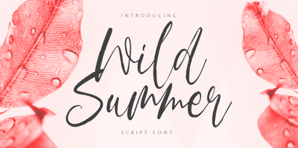 Wild Summer is a casual dry brush font that is suited for retro-style logos and posters. So what’s included: Basic Latin A-Z & a-z. Numbers, symbols, punctuations, and ligatures. Multilingual Support. Accented Characters : ÀÁÂÃÄÅÆÇÈÉÊËÌÍÎÏÑÒÓÔÕÖØŒŠÙÚÛÜŸÝŽàáâãäåæçèéêëìíîïñòóôõöøœšùúûüýÿžß Thank You.
 - Retro Mansion by Olivetype,
$18.00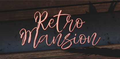 Retro Mansion is a casual dry brush font that is suited for retro style logo and poster. So what's included: Basic Latin A-Z & a-z. Numbers, symbols, punctuations and ligatures. Multilingual Support. Accented Characters : ÀÁÂÃÄÅÆÇÈÉÊËÌÍÎÏÑÒÓÔÕÖØŒŠÙÚÛÜŸÝŽàáâãäåæçèéêëìíîïñòóôõöøœšùúûüýÿžß Thank You.
