10,000 search results
(0.039 seconds)
- Kaczun Oldstyle Bold by Type Innovations,
$39.00 There are many subtle and dramatic differences incorporated into this classic beauty. Many shapes have undergone a bold transformation, while others lines remain faithful to that classic period of time that we all know and love. Kaczun Oldstyle works great in headlines, but it works equally well in text at a wide range of point sizes. Use it instead of the old times because, after all, we live in new times.
 - Zera JNL by Jeff Levine,
$29.00Zera JNL is one of those fonts that defy any simple description. While trying out effects on Transactive JNL, Jeff Levine came up with a set of letters comprised of intersecting rings that could illustrate chain, cellular structure, bubbles or probably anything your imagination can come up with to adapt the font to a particular project. Please keep in mind this design works best in larger point sizes. - Brushflow by Trim Studio,
$15.00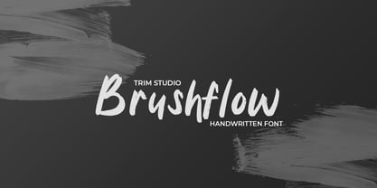 **Brushflow** font is a bold and simple handwritten brush font that is perfect for creating designs with a personal touch. The thick brush strokes of this font give it an impactful and commanding presence, making it perfect for titles, headlines, and other design elements that need to stand out. Thank you for let us be your design partner, If you have any questions please don't **hesitate** to drop me a message
 - Seashell Paradise by Letterhanna Studio,
$19.00 Introducing "Seashell Paradise," a delightful new handwritten font. This font captures the essence of tranquility and elegance with its flowing lines and graceful curves. "Seashell Paradise" is a versatile typeface that can be used for a wide range of design applications, from invitations and greeting cards to branding and product packaging. Its clean, modern look makes it a perfect choice for projects that require a contemporary and sophisticated feel.
 - Port Blair by Rook Supply,
$14.00 Point Blair is a script typeface that mimics natural handwriting and signature styles. Inspired by the scribblings found in travel journals from early explorers, this script font focuses on a free flow feel, with real brush pen texture and variance built into each character. To keep things looking natural, every character a-z and A-Z has an alternate available so that you can add variance to your text.
 - Apple Slices by Prioritype,
$13.00 It's a mix of two simple fonts that can make your design projects amazing. You could say that it is beautiful and eye-catching for this one font. You can apply it to branding designs, social media posts, logos, posters, quotes, food menus, wedding invitations, book covers, video content etc. See some of the previews above for reference. Features: -Uppercase -Lowercase -Numeral -Punctuation -Multilingual -PUA Encoded -Opentype Features Thanks.
 - Jester Script by Paul O'Connell,
$9.95This comical styled Jester Script font was created to suit various design applications within the typeface market and is aimed at people looking for a clown styled brush script typeface that is very unconventional indeed. Designed and produced by Paul O'Connell of POCT, it is a distinct styled font script, loosely drawn with irregular rounded edges and curves to create a free flowing handwritten font that will appeal to everyone. - Table Shake by PizzaDude.dk,
$16.00 Table Shake is somewhat like sunshine after a cloudy day: It puts a smile on your face and makes your trouble seem easier to overcome. Table Shake handmade, yet digitally re-organized, but leaving the organic handmade details. Maybe it is that particular font that makes your designs blow into space with happiness! I've added 3 different versions of each lowercase letter, and they automatically cycle as you type.
 - Kindheart by ARToni,
$19.00 Kindheart is a delicate and flowing calligraphy typeface with characters that dance along the baseline. It will add a luxury spark to any design project that you wish to create!
 - Burpee by Yock Mercado,
$12.00 Burpee is a basic condensed sans typeface, designed for headlines that needs be powerful and punchy, Burpee is inspired in sports, looking for a visual impact that get the attention.
 - Delina by Letterena Studios,
$9.00 Delina is a romantic and sweet calligraphy typeface with characters that dance along the baseline. It will add a luxury spark to any design project that you wish to create!
 - Giugnia by Phoenix Group,
$12.00 Giugnia is a font that gives a happy vibe to anyone who sees it, Giugnia represents the human heart that enjoys life and creates a positive aura in social life.
 - Darontsky by Rockboys Studio,
$18.00 Darontsky is a romantic and sweet calligraphy typeface with characters that dance along the baseline. It will add a luxury spark to any design project that you wish to create!
 - Baldufa by Letterjuice,
$66.00Baldufa is a charming typeface with strong personality, which looks very comfortable in text. There is a search to obtain complicated curves and detailed features, which give the typeface a touch of beauty and elegance. However, this is also a self-conscious design that claims appreciation for quirkiness and human imperfection through the rounded serifs and irregular vertical stems. The typeface family is also a multi script project, containing Latin and Arabic scripts. The Latin consists of Regular, Bold and Italic styles, including Small Caps and many other typographic features. Whereas Arabic Naskh includes Regular and Bold weights. The whole family has been designed to work harmoniously together to help to produce catalogues and small publications of cultural content. We believe that Baldufa is a tiny but nice contribution to build bridges between cultures and this make us very happy. The letterforms in the Latin are inspired by the slight distortions and idiosyncrasies that came with old printing methods. It has distinct, features such as rounded serifs, irregular vertical streams, ink traps and extremely thin junctions. In the Italic, serifs have been removed to enhance movement and expressivity. These experiments in form have not come at the cost of legibility: The typeface remains suitable for both small and display text. To certain extent, the design of the Arabic gathers the same interest for experimentation than its Latin companion. Baldufa Arabic respects the basic features of Arabic script such as thick stokes in the baseline, multiple vertical axis, genuine stem modulation and good linking between words. However, it steps away from traditional Calligraphic Style. It has rounded top terminals and the traditional contrast between curves and straight stokes has been softened. Letter shapes sometimes slightly differs from tradition in order to obtain more expressivity. Overall, Arabic has been designed to acquire the same elegant and quirky aspect of the Latin. - Ongunkan Archaic Etrusk by Runic World Tamgacı,
$50.00 Etruscan was the language of the Etruscan civilization, in Italy, in the ancient region of Etruria (modern Tuscany, western Umbria, northern Latium, Emilia-Romagna, Veneto, Lombardy and Campania). Etruscan influenced Latin but was eventually completely superseded by it. The Etruscans left around 13,000 inscriptions that have been found so far, only a small minority of which are of significant length; some bilingual inscriptions with texts also in Latin, Greek, or Phoenician; and a few dozen loanwords. Attested from 700 BC to AD 50, the relation of Etruscan to other languages has been a source of long-running speculation and study, with its being referred to at times as an isolate, one of the Tyrsenian languages, and a number of other less well-known theories. The consensus among linguists and Etruscologists is that Etruscan was a Pre–Indo-European,and a Paleo-European language and is closely related to the Raetic language spoken in the Alps, and to the Lemnian language, attested in a few inscriptions on Lemnos. Grammatically, the language is agglutinating, with nouns and verbs showing suffixed inflectional endings and gradation of vowels. Nouns show five cases, singular and plural numbers, with a gender distinction between animate and inanimate in pronouns. Etruscan appears to have had a cross-linguistically common phonological system, with four phonemic vowels and an apparent contrast between aspirated and unaspirated stops. The records of the language suggest that phonetic change took place over time, with the loss and then re-establishment of word-internal vowels, possibly due to the effect of Etruscan's word-initial stress. Etruscan religion influenced that of the Romans, and many of the few surviving Etruscan language artifacts are of votive or religious significance.
 - Serath by Letterara,
$24.00 Step into a world of bold sophistication with Serath, a remarkable blackletter font that exudes power and elegance. Its distinct and imposing design showcases uniquely shaped letters, making it the perfect choice for creations that demand a touch of distinction. Whether you're working on product packaging, branding, or any project that requires bold and daring typography, Serath will effortlessly make a statement. Unlock its full potential with its PUA encoding, granting you easy access to a wide array of glyphs and swashes. Embrace the confidence that comes with incorporating Serath into your projects, and prepare to be amazed by the remarkable results it delivers.
 - BORCHA by Top Type,
$9.00 Hello there.. I introduce to you a new work by the name of BORCHA. This font has an attractive style as well as elegant. In addition, this font is also equipped with several ligature features, stylistic alternate and stylistic set so that it can be the best work in each of your work. This font can be used to create letters, advertisements, logos, banners, web, and everything else. Thank you, glad to be able to contribute to your best work.
 - Rosart and Fleisch Hi Res by California Type Foundry,
$129.00 This font is not just historic, but classy, timeless, and in its current form, a modern classic. The original Titling Caps and icons Jacque François Rosart painstakingly carved, now meticulously digitized to be a true, accurate, and complete representation of the original designs. You can get the fully matching family with "ALL", or choose the set that meets your immediate needs: Zodiac and Constellations - The Stars Have Aligned into a Great Font So what's your sign? Whatever it is, R&F has it, and in so many ways! Pictograph, symbol, constellation and picto-constellation are all included. Constellations are useable even in scientific and education settings: based on current star charts and matched to Bayer designations, these stars shine both in design and accuracy! Includes Rosart's original moon and sun faces. Faces for the planets to match those for the sun and moon. Rosart's symbols for the planets. Astrology symbols including, Rosart’s pictographs for the twelve signs. Constellations of the Zodiac from precise star charts. Precise small star shapes, so you can design other constellations. Pinwheel, saltires, asterisks, solid stars, and even the Christmas star. Dave Lawrence, "Each symbol was carefully designed to match the main font." Alchemy Symbols - Turns A Design into Gold From labeling your cupboard of magical ingredients to getting one step closer to the golden goose, these rare alchemical symbols are a treasure trove of possibilities. Including: classic symbols for elements combinations medicinals chemistry mathematical symbols Includes music symbols for titling, as well as Verse and Response symbols. Seasons - Symbols to Keep Things Organized Throughout the Year Classic weather stylings, including old fashioned lightning and an eclipsing moon with the four-o'clock shadow. Map Markers Religious Symbols Phases of the moon. Pointing symbols: fingers, arrows, triangles, with circles Matching Italics CAL's Dimension Slant™ Instead of sloping all the pictures and drawings to an even slant, a multidimensional approach was used. And each symbol was evaluated and crafted individually. Pro World1 Font The pro world font contains all of these: Latin Standard set Rosart's original backwards X alternate. Alternate U shape. In the italic: swash variants for the J, Q, and Y. Proportional Lining (default), proportional old style, small caps figures. CAL Dimension Slant, for dynamic italics Includes Rosart's original moon and sun faces, along with additional faces for each planet. Rosart’s symbols for the planets and pictographs for the twelve signs of the zodiac. Constellations of the Zodiac along with small star shapes. Large stars, pinwheel, saltires, asterisks Symbols for chemistry Medicine Music symbols Mathematical symbols Pointing symbols like the finger, acorn, arrow and triangle. Geometrical shapes. Plus these more: Latin Pro character set for central European languages and Turkish. Rare kerns for Polish, Czech, Slovakian and others. Ligatures needed for some central European orthographies. Lowered German Umlauts for better line spacing. Cyrillic uppercase and small caps for eastern Europe, southern Europe, and Russia, with kerning. Rosart’s original Greek uppercase and small caps, but also tonos for monotonic Greek. Vietnamese, which has been kerned. Pinyin, including a special form of the Ü so that titles can be set closer. Numbers: A set of stacking (nut) fractions, along with very elegant automatic fractions A large set of currency symbols in lining, old style, small caps, denominator and numerator sizes. Our first Retail Pricing Feature: (ss03 + ss04) Just turn on the feature and type $1.99 and Rosart will do the rest. Ampersand alternates. Numerator sized musical sharp and flat symbols. Dave Lawrence, “From the moment I saw these letters I knew I had to make this typeface. What I didn’t know was that I would end up drawing most of Rosart’s special symbols... But it was too hard to resist."
 - Yuletide Doodles by Outside the Line,
$19.00 Yuletide Doodles is the perfect font for that quickie Christmas party flyer, menu, or invitation. Or make your own gift tags. The uses are endless. This font includes gifts, ornaments, snow globe, snow man, holly, olive branch, lots of trees and stars, a light bulb, deer, moose, wreaths, pine boughs, skate, stocking and crown. This font works well with Christmas Doodles and Christmas Doodles Too . Mix and match to your heart's desire.
 - VT Showcard by VarsityType,
$15.00 This condensed block is a true knockout. VT Showcard is a heavy-hitting headliner with presence. Inspired by the boxing showcards of the 60’s and 70’s, VT Showcard towers over body copy and demands attention. This tall and mighty athletic display typeface features chiseled corners and subtle embellishments that reinforce a steady rhythm across its dramatic letterforms. With 7 weights, VT Showcard provides a versatility for sports headlines and similar projects.
 - Bergsland Fashion by Hackberry Font Foundry,
$24.95 This is a stylized sans serif font family that is very high-waisted and sleek. The stroke is only slightly modulated. The letterforms are higher, with a more open aperture, and sprinkled with breaks to add light and sparkle. This an attempt at a readable sans serif for text. It has many OpenType features and 465 characters per font: Caps, lower case, small caps, old style figures, numerators, denominators, accents characters and so on.
 - Fladerling by Graphicfresh,
$18.00 This minimalist font inspired by cherry stems is a great choice for impactful logo design and branding. The elegant and simple shapes of each character make it versatile and suitable for any type of logo, whether it's a wordmark or a symbol. The cherry stem inspiration adds a unique touch that sets it apart from other fonts. Use this font to create a lasting impression and memorable branding for your business or project.
 - Design System by Dharma Type,
$14.99 Design System is a great type system consisted of 5X7X2=70 font styles from 70s-style simple square sans to the widest style of all time that are best for titles, logo and text. Their simple form does not limit the target of design and can be used for any creative work. Additionally they all have been designed not to provide a feeling of strangeness when they are used in mixture each others.
 - Sword Art by Sipanji21,
$10.00 Sword Art is a cute display font that has 2 different styles, namely the slice look and the solid look. Sword Art is a good font to use for various graphic designs, such as poster titles, banners, advertisements, logotypes, and is good for combining various types of icons. This font is also good for packaging, crafting, children's and adult clothing. apply this font for your various designs to make it more powerful
 - Dominica Calligraphy by Ride Studio,
$10.00 Dominica Calligraphy is a balanced, subtle, elegant and stylish handwritten font. It has beautiful character. This font comes with a matching Outline/Monoline version. Perfectly match the design of invitation cards, company logos, movie titles, movie names, business cards, book titles, brand names and various other designs. Dominica Calligraphy is a chic, refined script font that emanates sophistication and elegance. Its stylish alternates and ligatures make this font the perfect match for any project.
 - Abhartach by Fontdation,
$18.00 Introducing Abhartach, funky reverse-contrast display typeface. A perfect mix from both classic and modern typography. Packed with lots of alternate characters and ligatures (and faux-italic style too!), lets you explore more letter variations that will level up your designing projects. Check out the entire preview images to get the inspiration & hints of how powerful slash beautiful this typeface is. Hope you enjoy this typeface as much as we created it for you! Cheers!
 - Kage Pro by Balibilly Design,
$25.00 Greetings: We are introducing an advanced version of the Kage font released and received great exposure from users and worldwide font enthusiasts. The massive development puts forward experimentation on the alternate letters. We redesign each shape to make it more functional and comfortable when text size escalation occurs. In addition to rejuvenating the letterform, we also apply an oblique style to provide diverse style choices. Learn more about Kage Pro here: Graphics presentation | Type Specimen | The Inspiration: The radical exploration world of fashion inspires us. It leads our minds to the Neo-classical type style created during the age of enlightenment in the 18th century. It has a reasonably extreme contrast from the previous serif style, making the impression that it is emitted more expensive and classy. Organically, this Neo-Classical typeface is closely related to the fashion world, especially in Europe, and even spread across the globe. Fashion and this typeface reflect each other. After, we boldly observed Japanese fashion designer Rei Kawakubo. Famous for radical & deconstructive fashion, which makes the world of fashion more flexible and dynamic. The Design: As well as the typeface that we made, we started it with a cultural foundation of the Didone typeface. We tried to deconstruct the appearance. The decoration that better reflected the dynamic of fashion implemented in the fashionable alternate and calligraphical stylistic set ended with ball terminals. The versatile impression created is like taking off a scarf on the model's hair during a fashion show. The deconstructive image is combined with a legibility structure like the appearance of the Neo-Classical style. Kage Pro is designed to visualize a costly and exclusive image of a thing, product, world clothing brand, famous fashion magazine, etc. The modern transitions of each letterform are softer, so when repositioning and escalating the size of this font, it will remain beautiful without injuring other elements. So, Kage Pro is a bold choice on headlines and more prominent media with a portion of 50% even more. The Feature: Kage Pro has 11 upright and 11 oblique styles from thin to black; all family-style consist of one variable font with 2 axes. The total number of glyphs is 1,665 in each style. She comes with tons of swirly ligatures and stylistic alternates in Advance OpenType features, including: Case-sensitive forms, small caps, standard and discretionary ligatures, stylistic alternates, ordinals, fractions, numerator, denominator, superscript, subscript, circled number, slashed zero, old-style figure, tabular and lining figure. Support multi-language including Western European, Central European, Southeastern European, South American, Oceanian, Vietnamese.
 - Looking Flowers by Sudtipos,
$49.00 Lu Nolasco, also known as Lunol, is a fresh representative of a new generation of Souther American lettering artists. She was born in Lima, Peru. After learning from some of the region’s best teachers and exploring the pointed nib on her own, she became a prolific lettering workshop instructor herself. Miraflores is one of Lima’s main tourist attractions. An upscale district with a great window on the Pacific ocean, it is the place where Lu looks for inspiration. It particularly inspired this “Looking flowers” (Miranda las flores), Lunol’s first typeface, designed in collaboration with Ale Paul. It is a comprehensive informal script that comes with many alternates, swashes and ligatures, along with small cap and quite a few ornaments. The fonts cover an expansive range of Latin languages, and are intended for use in stationery, menus, packaging, and general design where the main objective is to relay a sense of fun, playfulness and sensibility.
 - Rukyltronic by Typodermic,
$11.95 Welcome to Rukyltronic—a synthetic bitmap font that brings a unique and intriguing twist to your designs. Inspired by the eccentric computer fonts from the 1980s science fiction computer games, Rukyltronic boasts an array of interesting effects that will add a touch of nostalgia to your creations. With its variable gaps, Rukyltronic is the perfect choice for anyone looking to create an authentic pixel font look. The kerning is limited to full pixel increments, allowing you to achieve an authentic low resolution look and feel in your designs. Whether you’re working on a retro video game, a sci-fi movie poster, or a digital art piece, Rukyltronic is the font you need to bring that vintage 80s computer feel to life. Its unique style and limited kerning create a humble yet striking appearance that is sure to catch the eye of your audience. So what are you waiting for? Give Rukyltronic a try today and let your designs stand out! Most Latin-based European writing systems are supported, including the following languages. Afaan Oromo, Afar, Afrikaans, Albanian, Alsatian, Aromanian, Aymara, Bashkir (Latin), Basque, Belarusian (Latin), Bemba, Bikol, Bosnian, Breton, Cape Verdean, Creole, Catalan, Cebuano, Chamorro, Chavacano, Chichewa, Crimean Tatar (Latin), Croatian, Czech, Danish, Dawan, Dholuo, Dutch, English, Estonian, Faroese, Fijian, Filipino, Finnish, French, Frisian, Friulian, Gagauz (Latin), Galician, Ganda, Genoese, German, Greenlandic, Guadeloupean Creole, Haitian Creole, Hawaiian, Hiligaynon, Hungarian, Icelandic, Ilocano, Indonesian, Irish, Italian, Jamaican, Kaqchikel, Karakalpak (Latin), Kashubian, Kikongo, Kinyarwanda, Kirundi, Kurdish (Latin), Latvian, Lithuanian, Lombard, Low Saxon, Luxembourgish, Maasai, Makhuwa, Malay, Maltese, Māori, Moldovan, Montenegrin, Ndebele, Neapolitan, Norwegian, Novial, Occitan, Ossetian (Latin), Papiamento, Piedmontese, Polish, Portuguese, Quechua, Rarotongan, Romanian, Romansh, Sami, Sango, Saramaccan, Sardinian, Scottish Gaelic, Serbian (Latin), Shona, Sicilian, Silesian, Slovak, Slovenian, Somali, Sorbian, Sotho, Spanish, Swahili, Swazi, Swedish, Tagalog, Tahitian, Tetum, Tongan, Tshiluba, Tsonga, Tswana, Tumbuka, Turkish, Turkmen (Latin), Tuvaluan, Uzbek (Latin), Venetian, Vepsian, Võro, Walloon, Waray-Waray, Wayuu, Welsh, Wolof, Xhosa, Yapese, Zapotec Zulu and Zuni.
 - Main Street by FontMesa,
$25.00 Main Street is a revival of the old font Soutache, the original version of this decorative alphabet was created in 1873 by Julius Herriet, a type designer active during the period marked by the Western expansion. Main Street with its split serifs and ornate scrollwork reflects the romantic splendor of the old west from fancy garb and Cowboy Saddles to Ice Cream Parlors and painted window signage. Main Street goes one step further by creating a base fill font which can be placed behind the regular Main Street font giving this font more of an inline appearance. You will need an application that allows layering of your fonts in order to take advantage of FontMesa Fill fonts.
 - Sabler Titling by insigne,
$- Make the right statement with the elegant Sabler Titling. This showstopping font features an inherent grace combined with the classic style of the Art Deco period. The subtle beauty of its letters is highlighted by the typeface’s stems, which taper towards the baseline highlight--a feature that adds clear distinction to your design. Originally inspired by a WPA poster, this typeface has been expanded to include three equally elegant proportions. Sabler Titling includes more than 60 free alternative forms, including support for most Latin-based languages. Add a hint of seduction to your work with Sabler’s high-contrast letterforms--ideal for magazines, advertisements and books on fashion, fine arts, and luxury goods of all kinds.
 - Inkston by Fenotype,
$35.00 Inkston is a hand drawn font collection of six different types and several versions and a set of extras. All the fonts are drawn using the same grid and scale so that they play together well. Inkston Extras is a set of pictograms, swashes, ornaments and catchwords designed to support the font. Inkston fonts work nice as they are yet they’re equipped with OpenType features to give you even more tools to customise your design. Try combining any two or more of the fonts for impressive results. Purchase the whole collection for the best price and go crazy with the possibilities! Inkston collection will go for anything from cute to artisanal to streetwise hand lettering style.
 - College Nouveau JNL by Jeff Levine,
$29.00 By the late 1920s, lettering and design had already begun to feel the influences of what would become the Art Deco Movement. The sheet music for the 1927 song "Without You Sweetheart" had its title hand lettered in a block style letter with rounded corners – with the exception of the 'S' and 'R' in "Sweetheart"; reflecting design elements of both styles. For consistency, those letters were changed to fit the rest of the design, and the result is the digital font College Nouveau JNL, available in both regular and oblique versions.
 - Plantin Infant by Monotype,
$29.99Plantin is a family of text typefaces created by Monotype in 1913. Their namesake, Christophe Plantin (Christoffel Plantijn in Dutch), was born in France during the year 1520. In 1549, he moved to Antwerp, located in present-day Belgium. There he began printing in 1555. For a brief time, he also worked at the University of Leiden, in the Netherlands. Typefaces used in Christophe Plantin's books inspired future typographic developments. In 1913, the English Monotype Corporation's manager Frank Hinman Pierpont directed the Plantin revival. Based on 16th century specimens from the Plantin-Moretus Museum in Antwerp, specifically a type cut by Robert Granjon and a separate cursive Italic, the Plantin" typeface was conceived. Plantin was drawn for use in mechanical typesetting on the international publishing markets. Plantin, and the historical models that inspired it, are old-style typefaces in the French manner, but with x-height that are larger than those found in Claude Garamond's work. Plantin would go on to influence another Monotype design, Times New Roman. Stanley Morison and Victor Larent used Plantin as a reference during that typeface's cutting. Like Garamond, Plantin is exceptionally legible and makes a classic, elegant impression. Plantin is indeed a remarkably accommodating type face. The firm modelling of the strokes and the serifs in the letters make the mass appearance stronger than usual; the absence of thin elements ensures a good result on coated papers; and the compact structure of the letters, without loss of size makes Plantin one of the economical faces in use. In short, it is essentially an all-purpose face, excellent for periodical or jobbing work, and very effective in many sorts of book and magazine publishing. Plantin's Bold weight was especially optimized to provide ample contrast: bulkiness was avoided by introducing a slight sharpening to the serifs' forms." - Plantin Headline by Monotype,
$29.00Plantin is a family of text typefaces created by Monotype in 1913. Their namesake, Christophe Plantin (Christoffel Plantijn in Dutch), was born in France during the year 1520. In 1549, he moved to Antwerp, located in present-day Belgium. There he began printing in 1555. For a brief time, he also worked at the University of Leiden, in the Netherlands. Typefaces used in Christophe Plantin's books inspired future typographic developments. In 1913, the English Monotype Corporation's manager Frank Hinman Pierpont directed the Plantin revival. Based on 16th century specimens from the Plantin-Moretus Museum in Antwerp, specifically a type cut by Robert Granjon and a separate cursive Italic, the Plantin" typeface was conceived. Plantin was drawn for use in mechanical typesetting on the international publishing markets. Plantin, and the historical models that inspired it, are old-style typefaces in the French manner, but with x-height that are larger than those found in Claude Garamond's work. Plantin would go on to influence another Monotype design, Times New Roman. Stanley Morison and Victor Larent used Plantin as a reference during that typeface's cutting. Like Garamond, Plantin is exceptionally legible and makes a classic, elegant impression. Plantin is indeed a remarkably accommodating type face. The firm modelling of the strokes and the serifs in the letters make the mass appearance stronger than usual; the absence of thin elements ensures a good result on coated papers; and the compact structure of the letters, without loss of size makes Plantin one of the economical faces in use. In short, it is essentially an all-purpose face, excellent for periodical or jobbing work, and very effective in many sorts of book and magazine publishing. Plantin's Bold weight was especially optimized to provide ample contrast: bulkiness was avoided by introducing a slight sharpening to the serifs' forms." - Endless Sunrise by Wing's Art Studio,
$10.00 A hand-made retro script font duo inspired by 80s action movies! This hand-made, retro styled script font was born from a childhood watching countless 80s action movies. Stories of inspirational heroism and competition, all set against impossibly beautiful Summer sunsets. And no self-respecting 80s movie would be without the coolest title design, setting the stage with a seemingly spontaneous glide of the designer’s brush. Endless Sunrise aims to capture this spirit through it’s loose, hand-drawn design and complimentary sans-serif. It comes with a complete set of alternatives and underlines for true customisation, meaning you’ll never have to repeat an E or an I; the tale-tell signs that give away other script fonts. It also features uppercase and lowercase characters, along with numerals, punctuation and language support. An awesome font that will work equally well across film, sports, music, merch and more! Find more from The Video Store Collection at Wingsart Studio
 - Luciferum by Artisticandunique,
$25.00 Luciferum - Serif font family - 6 Styles - Multilingual supports. Luciferum is a stylish serif font family with different alternative character designs. It has a structure that you may encounter especially in horror novels, movies, posters and similar content. This font provides flexibility in all your projects with the alternatives it offers you with its multiple language options, 6 styles and rich glyph options. You will have the opportunity to enrich the content of your projects with alternative characters. Depending on the purpose of use in typographic compositions that you will create with the aesthetic structure of alternative characters; You can enrich your titles in books or magazines, and your logos in branding. Especially for movie titles, posters, album covers, editorials, magazines, books, branding, packaging, logo design, web design, headlines, etc. If you're looking for a font with stylistic alternatives, Luciferum serif font might meet your needs. With this font you can create your unique designs. Have a good time.
 - Asittany Script by Javatypestd,
$10.00 Introducing Asittany Script is monoline script font which natural movement and elegant for signature style. Asittany Script is perfect for branding projects, logo, wedding designs, social media posts, advertisements, product packaging, product designs, label, photography, watermark, invitation, stationery and any projects that need handwriting taste. What’s Included : - Standard glyphs - Ligature - Works on PC & Mac - Simple installations - Accessible in the Adobe Illustrator, Adobe Photoshop, Adobe InDesign, even work on Microsoft Word. - PUA Encoded Characters – Fully accessible without additional design software. - Fonts include multilingual support
 - Cut Along by Hanoded,
$15.00 I made Cut Along by stealing some red cardboard from my kids (red, because they didn’t have any black…) and cutting out the glyphs one by one with a pair of scissors. I then pasted the shapes onto white paper, scanned them and turned them into a font. Cut Along is a very nice font for ads, book covers, packaging and children’s books. Enjoy!
 - Sublime by Coniglio Type,
$19.95 Sublime45-Regular Sublime Revised for 2021. One font in Opentype format as Sublime45. Families and all TT Truetype versions eliminated in this wonderful stand alone. The Spring 1997 original release of Sublime —borne an organic creature of black water soluble ink & digitized by Coniglio Type. Sublime is a fun font to use in commercial layouts. It is soft and fluid as ink. Like the wrinkles of time, it is imperfect. That in itself makes it incredibly attractive, warm and “human factor”. Sublime offers legibility so sorely missed in the current recreational font market. Sublime was inspired by World War II US fighter pilot Donald Alling. He flew missions over Nazi Germany. His squadron also dropped food, medicine and relief supplies over the Netherlands. Known as “the Colonel” to his friends. Don as a civic engineer ruled literally miles of ink letter callout’s with a template device called a LeRoy in peacetime on vellum and mylar across his career as a technical illustrator. You didn't want to screw up inking into a template with wet black permanent ink. You really had to have a steady hand and it was all done by hand. You can say Don worked “unplugged”. And that is cool! He was part of the broad stroke of postwar industrial expansion that helped keep America strong, rendering exploded views on top secret projects. Many of us were not even born yet when all this was going on. Today at over 80 years young Don is like a national treasure, savvy and bright—and the ladies love him! The Colonel remains a dedicated master airbrush man, stand–up man, caricature artist and letterman all without use of a computer! He was lucky enough to retire before a desktop cathode tube was put in his face. Today the Colonel enjoys restoring VW’s, flying and freelance consulting when not being called to supper by his lovely wife Rea.