10,000 search results
(0.058 seconds)
- Peatloaf - Unknown license

- Explosif - Unknown license

- YonderRecoil - Unknown license

- Zodillinstrisstirust - Unknown license

- TommyGun - Unknown license

- Xtraflexidisc - Unknown license

- Squealer - Unknown license

- Ptarmigan Condensed - Unknown license

- Parcival Antiqua by RMU,
$35.00 Schelter & Giesecke's highly esteemed font family, cut by Herbert Thannhaeuser, freshly redesigned for present-day use.
 - FS Pele by Fontsmith,
$50.00 Iconic Conjuring memories of chunky typefaces from the late-60s and early-70s, and named after the world’s greatest footballer of that and probably any other era, FS Pele is one of a set of Fontsmith fonts designed specifically for headlines and other prominent applications. “We wanted to create fonts that could be integral to the design of posters, album covers and magazines,” says Jason Smith. Welcome to FS Pele, iconic, like its namesake (though, perhaps, a little less nimble). Big Pele, little Pele There was only one Pele. But there are two sizes of FS Pele. FS Pele One, with the finer counters and details, adds considerable weight and style at large sizes, especially in big block headlines on posters. FS Pele Two’s thicker “slots” make it a better choice for smaller-sized text. A load of blocks FS Pele began as an exercise by Phil Garnham in turning squares into legible letters, via the least means necessary. The idea extended his ideas about logo-making, and the search for a stamp-like brand mark that lends authority, stability and instant identification. “The thought that the type was a 2D/3D jigsaw of slotted, architectural pieces was almost an after-thought. I wanted to create a strong, stacking, block aesthetic for the most contemporary poster design. “At the time there were a lot of designers creating their own versions of the same thing but I wanted to take the blocker forms to the next step, and infer a more legible text without sacrificing the idea.”
 - FS Pele Variable by Fontsmith,
$199.99Iconic Conjuring memories of chunky typefaces from the late-60s and early-70s, and named after the world’s greatest footballer of that and probably any other era, FS Pele is one of a set of Fontsmith fonts designed specifically for headlines and other prominent applications. “We wanted to create fonts that could be integral to the design of posters, album covers and magazines,” says Jason Smith. Welcome to FS Pele, iconic, like its namesake (though, perhaps, a little less nimble). Big Pele, little Pele There was only one Pele. But there are two sizes of FS Pele. FS Pele One, with the finer counters and details, adds considerable weight and style at large sizes, especially in big block headlines on posters. FS Pele Two’s thicker “slots” make it a better choice for smaller-sized text. A load of blocks FS Pele began as an exercise by Phil Garnham in turning squares into legible letters, via the least means necessary. The idea extended his ideas about logo-making, and the search for a stamp-like brand mark that lends authority, stability and instant identification. “The thought that the type was a 2D/3D jigsaw of slotted, architectural pieces was almost an after-thought. I wanted to create a strong, stacking, block aesthetic for the most contemporary poster design. “At the time there were a lot of designers creating their own versions of the same thing but I wanted to take the blocker forms to the next step, and infer a more legible text without sacrificing the idea.” - Gryffensee by Catharsis Fonts,
$30.00 Gryffensee is designed to be the Futura of blackletter, combining the time-honored gravity and relentlessness of the Gothic script with the clean, contemporary freshness of the geometric sans. Built from a tightly controlled inventory of lines, arcs, sharp cuts, and OpenType features, Gryffensee was born and raised in the digital age, yet retains the powerful charisma and human warmth of its mediaeval blackletter ancestors. As a result, it excels in a wide range of display settings, logotypes, and short text. Unlike most conventional blackletters, it even handles all-caps usage with grace, and includes an extensive Cyrillic character set (in the Pro version). Apart from a generous range of automatic ligatures and contextual alternates, Gryffensee offers stylistic alternates that allow users to customize its appearance to their tastes. The capital letters |AGHIKZ| come in alternate cuts that trade traditional shapes for increased legibility, while the letter |s| appears in three cuts, each with a unique, distinct flavor. All these options are accessible through OpenType stylistic sets in the main Latin font, Gryffensee Eins. For easy use in applications without OpenType support, we provide two additional Latin fonts (Gryffensee Zwei and Drei) in which these options replace the default cuts. Finally, Gryffensee Pro offers all the functionality of Gryffensee Eins, plus Cyrillic support. My intention to devise a contemporary geometric blackletter was inspired by four hand-painted letters, |ABCD|, in Sasha Prood�s online portfolio. I later found out that he had, in turn, taken those letters from an existing font, Bastard, by Jonathan Barnbrook. Luckily, by that time my project had taken on a life of its own. Gryffensee is an original design that bears only the most superficial resemblance to Bastard. Gryffensee is a mediaeval spelling of the lake Greifensee near which I grew up. It is pronounced [?gri?f?n?se?], or "GRIEF-un-say" in English approximation. This font is dedicated to Simone.
 - Sinadey by Craft Supply Co,
$20.00 Introducing Sinadey – Cute Sans Serif Adorable Simplicity Sinadey – Cute Sans Serif is the epitome of adorable simplicity, offering a charming sans serif font with a crisp shape. Crisp Elegance What sets Sinadey apart is its crisp elegance. It’s the ideal choice when you need a cute sans serif font that still maintains sharp and well-defined characters. Playful Charm Sinadey’s playful charm adds a delightful touch to your designs, making it perfect for a wide range of creative projects. Versatile Application This font’s versatility shines through, ensuring that it can be used in various design contexts, from invitations to logos and more. In Conclusion In summary, Sinadey – Cute Sans Serif is your go-to when you desire a cute sans serif font with crisp, well-defined shapes. Its adorable simplicity, crisp elegance, and playful charm make it versatile and suitable for a diverse array of design projects, ensuring that your content remains engaging and inviting to all readers.
 - KAPITAL by Superfried,
$32.00 KAPITAL is an elegant, geometric uppercase sans. It is available in standard and stencil style across four weights – light | regular | medium | demi – covering 346 glyphs. It is based on the capital character set from a previous release – Basik. Continuing the clean, geometric aesthetics, KAPITAL was refined further to create a more minimal style. This enabled the characters to discreetly perform their role – to simply convey the message of the writer without distraction. To achieve this, special attention was applied to the form consistency of the glyphs across the weights and negative space throughout. In many typefaces as the weight is increased the form and style can deviate significantly from the original design. With regards to negative space – although inevitable – wherever possible key letterforms were adjusted to alleviate this.
 - TOMO Fango by TOMO Fonts,
$20.00 A sans serif typeface, designed to speak very happy and friendly.
 - Wild About Myself JNL by Jeff Levine,
$29.00 Lettering found on the cover of the 1923 song "I Love Me (I'm Wild About Myself)" can take on various graphical possibilities. Although its design is Art Nouveau in concept, it is somewhat reminiscent of the "bubble letters" most school kids used to doodle on notebook and portfolio covers; yet the lettering style also evokes the 1960s-70s Hippie movement. As a sidebar, a couple of lines from the song's lyrics were used by Jeff Levine's late mother to chastise him as a youth when he got "a little too full of himself". The lyrics were: "I love me! I love me! I'm wild about myself! I love me! I love me! My picture's on the shelf!"
 - Yseult by Scholtz Fonts,
$9.00 Yseult is a ultra-romantic, elegant handwritten font, reminiscent of pre-Raphaelite beauties and classical paintings. It refers to the opera Tristan und Isolde (also spelt as Yseul, Isolda etc.) in three acts by Richard Wagner. The opera was based largely on the romance by Gottfried von Strassburg. Its design was influenced by Genevieve and, less directly, by Silver Dagger. Suggestions for use: - wedding stationery - greeting cards - valentines day media - beauty product media - lingerie tags - women's magazine pages - classical music media - theatre posters The font is fully professional: carefully letterspaced and kerned. It contains over 235 characters - (upper and lower case characters, punctuation, numerals, symbols and accented characters are present). (It has all the accented characters used in the major European languages).
 - Ogenblik by Hanoded,
$15.00 The other day, I was thinking how time flies and how my kids grow up so fast. In the blink of an eye, they had turned from babies into almost-teenagers. They're not teenagers yet, but given their tantrums, it does feel like I have three teenagers in the house... ;-) Ogenblik, in Dutch, means: ‘in the blink of an eye’, ‘lightning fast’, or ‘for a brief moment’. It’s similar to the German ‘Augenblick’, which means exactly the same. Ogenblik was made with the same dried out marker pen that helped me create my font Castlerigg. I guess it had more than one extra font in it! Ogenblik is a bit of a grungy, yet quite legible and neat font. Comes with multilingual support.
 - Wisdom Teeth by DM Founts,
$20.00 Wisdom Teeth is the fifth typeface released by DM Founts. It's a modern and personal take on the original Baby Teeth font by Milton Glaser, and inspired by the lettering used for the Pac-Man series of games (and its clones). This typeface was around 25 years in the making, and was made in response to the large number of hideously bad clones of Baby Teeth circulating around the Internet. Version 1.0 Included in Version 1.0 are a number of accent characters, and alternate characters for A and Y, along with the usual ASCII characters. For the time being this is an all caps typeface. Please let me know your thoughts and suggestions, and I may add some more characters in the near future.
 - Mr Eaves Modern by Emigre,
$59.00 Mr Eaves is the often requested and finally finished sans-serif companion to Mrs Eaves, one of Emigre’s classic typeface designs. Created by Zuzana Licko, this 2009 addition to the Emigre Type Library expands the versatility of the original Mrs Eaves with two complimentary families: Mr Eaves Sans and Mr Eaves Modern. Mr Eaves was based on the proportions of Mrs Eaves, but Licko took some liberty with its design. One of the main concerns was to avoid creating a typeface that looked like it simply had its serifs cut off. And while it matches Mrs Eaves in weight, color, and armature, Mr Eaves stands as its own typeface with many unique characteristics. The Sans version relates most directly to the original serif version, noticeably in the roman lower case letters a, e, and g, as well as in subtle details such as the angled lead in strokes, the counter forms of the b, d, p, and q, and the flared leg of the capital R, the tail of the Q. The distinctly loose-fitting letter spacing of Mrs Eaves was applied also to the Sans version. This, together with generous built-in line spacing due to a small x-height and extended ascenders and descenders, renders the same kind of lightness and airiness when setting text that is so characteristic of Mrs Eaves. Deviations from the original Mrs Eaves are evident in the overall decrease of contrast, as well as in details such as the flag and tail of the f and j, and the finial of the t, which were shortened to maintain a cleaner, sans serif look. And the lower case c had to be balanced out differently after it lost its top ball terminal. And with the loss of serifs, Mr Eaves set width is slightly narrower. Mr Eaves Italic also carries over many forms from its Mrs Eaves model, most notably the v, w, and z, which are unusually flamboyant for a sans italic design. It also utilizes lead in and terminal tails that are reminiscent of the serif italic. The biggest departure here is the width of the characters. The extra narrow gauge and delicate features seemed more appropriate for the Serif than the Sans. To allow for a comfortable fit, Mr Eaves Italic has a more robust design and wider character width. Meanwhile, the Modern family provides an overall less humanistic look, with simpler and more geometric-looking shapes, most noticeably in the squared-off terminals and symmetric lower case counters. This family has moved furthest from its roots, yet still contains some of Mrs Eaves’ DNA. The Modern Italic is free of tails, and overall the Modern exhibits more repetition of forms, projecting a cleaner look. This provides stronger differentiation from the serif version whenever a more contrasting look is desired. Each version (Sans and Modern) contains its own set of alternates providing unique options for applications such as headlines, word logos, letterheads, pull quotes, and other short text settings. Both the Sans and Modern come in six weights. The simpler forms of a sans-serif provide the opportunity of more weights than do serif letter forms, which are more complex in structure, making it difficult to accommodate additional weight without distortions. Regular and Bold match the original Mrs Eaves weights, while the Heavy provides an additional weight for extra emphasis.
 - Comalle by Latinotype,
$49.00 Comalle is an organic typeface that rescues some elements of handwritten script, but its stroke does not necessarily answer to a literal calligraphy structure. So Comalle could produce a powerful impact on the page, it was designed with thicker strokes than its counter forms. The objective is that the black of the letter fills the page and causes a fastest visual impact than typographies that balance blacks and whites. One of the most important tasks of the Comalle design was to think of how to handle the unequal percentages of blacks and whites in the typeface. The peculiar thing, is that the precision work of the letter does not make the blacks, but the whites; this is the reason why in one first instance it was very valid to start off designing in a very gross way, nevertheless, the majority energies are put in the details of the design of counter space. From the drained filling concept of forms Comalle was born, a typeface that pretends to enchant with its delicate counter space design and to impact with the heavy outlines which compose its form.
 - Fresh Pineapple by Zeenesia Studio,
$12.00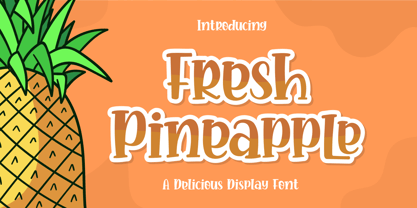 Fresh Pineapple, Delicious handwritten font. It is a beautiful quirky font that perfect for a lettering project like t-shirt design, mugs, advertisements, cutting vinyl, silhouettes, book covers, posters, business cards, social media and more. It supports multiple languages and offers PUA encoding. The doodles make this font so perfect. Hope you love it
 - Autumn Voyage by Hanoded,
$15.00 Autumn is my favourite time of the year: I love the colors in the forest, the colder temperature and the stormy winds. Autumn Voyage is a very nice set of hand made fonts: a fat one, a thin one and a lovely autumn leaves doodle pack. Comes with a heap of diacritics as well.
 - Offhand Brush by PintassilgoPrints,
$24.00 Offhand Brush is a fast and spontaneous brush font with quite a messy feel, a great option for book covers, packaging projects, album art, web titles, and even small chunks of text. It looks messy, but don't get it wrong: on the inside, it's a laborious piece of work, with four alternates for each Latin letter and two for numerals, as well as two options for Cyrillic and Greek letters. To make things even more uneven, there are still a few different letter designs programmed to pop up when specific combinations of three or four glyphs appear in the text. These are managed by the OpenType 'Standard Ligatures' feature, although they are far from standard and are not quite ligatures. And why so? Because this way it will usually be on by default, making the font way more interesting. Hey, wait! There are some ornaments too. And a couple of contextual kerning pairs, hell yes! Use it big!
 - Outscript by outdesign,
$9.00 Outscript is a "groovy script font" which has alternative to already ones. The most popular of this category has a disrepute for commercial uses. Outscript is a better way to use for amusing commercial purposes or just fun.
 - Boutique by Milieu Grotesque,
$99.00 Boutique is a reinterpretation of Modern typefaces that posits an alternative present for the genre. Our initial version of Boutique explored the relationship between Modern typefaces and Modernism. Built upon a Didone Skeleton, we amplified its geometric character and stripped away ornament to create an elegant sans-serif with an idiosyncratic edge. We have since overhauled Boutique to create a comprehensive family. Adding a serif and italic in three optical variations for small (S), medium (M), and large (L) applications. The updated Boutique features additional and refined glyphs, styles, and weights to create a freely interchangeable typographic system.
 - Sanuroemi by Azetype,
$19.00 Presenting Sanuroemi Font! A Display San Serif with more alternates. This font is made with the perfect combination of each character. You can type by Mix & Match to get a unique combination. It looks original and can be used for all your project needs. Each glyph has its own uniqueness and when meeting with others will provide dynamic and pleasing proximity. This font can be used at any time and on any project. So, Sanuroemi Font can't wait to give its touch to all your design projects such as quotes, poster design, personal branding, promotional materials, logotype, product packaging, etc. Happy Creating! www.azetypestudios.com
 - Stat Text Pro by Jure Kožuh,
$45.00 www.Stat-Type.com Complementary Type Family Stat Display Pro Stat Text Pro is an information design sans serif type family which was developed as a complementary to Stat Display Pro. Stat Text Pro retains many characteristics of its display counterpart, while giving readability a greater importance. It has simpler letter shape details which enable it to accomplish a constant rhythm whiles being read. Its main intended use is to accompany Stat Display Pro in places where longer passages of text are needed. In this way the visual character of the composition is retained and at the same time readability of text is given attention. As its display counterpart it has a large character set with multiple weights, which are defined by optimal size ratio, wide aperture and balanced counters. It contains nearly 700 glyphs, including diacritics, ligatures, small caps, old–style figures, arrows and more. This enables it to achieve wide language support. It consists of four weights (Light, Regular, Medium, Bold) which are accompanied by their corresponding obliques. Stat Text Pro type family has higher than average x height (72% of cap height) which is accompanied by matching ascender and descender size ratios. The development of the type family was based on research in legibility to achieve highly legible letter shapes, while not diminishing their visual character. A detailed description of Stat Pro type family is available at Stat-Type.com where a DEMO font can be downloaded.
 - LiebeLotte Swell by LiebeFonts,
$29.90 Have you heard? It’s in the stars: next July we collide with Mars! But until then, there are plenty of good reasons to treat yourself to this swell typeface. LiebeLotte Swell is a great investment for letter lovers who design beautiful things for their friends and family and also for designers who love their clients: Your next birthday invitation? Check. That photo album you’re making for your mom? Check. The business cards you’re designing for your friend who runs a deli? Check. There are so many nice things that want to be designed, and LiebeLotte Swell wants to be your assistant in the old-fashioned way: polite and friendly. Just like her monolinear siblings in the LiebeLotte family, charming LiebeLotte Swell knows how to impress with her perfectly drawn curves and her perfectly connected loopy letterforms. Of course LiebeLotte Swell comes with a state-of-the-art character set. She also sports a variety of ligatures and alternative forms, available through OpenType features. (Please make sure your software supports ligatures for the letter connections and OpenType if you wish to use the advanced features.) Advanced designers, check out the complete LiebeLotte family with six weights of monolinear loopiness. You may also want to take a look at our best-sellers LiebeErika and LiebeKlara, they get along great with LiebeLotte Swell.
 - Nordlig by Prominent and Affluent,
$35.00 A Timeless Revival of 70s Vintage Typography. In the realm of design, where trends ebb and flow, emerges Nordlig—a serif font meticulously crafted to pay homage to the enduring charm of 70s retro typography. Each character carries the essence of an era defined by deliberate lines and distinctive serifs, offering a contemporary take on a classic aesthetic. An Ode to Nostalgia: Nordlig transports you to a bygone era, infusing your projects with the unmistakable allure of 70s design. It’s a font that whispers of nostalgia while maintaining a fresh, relevant appeal. A Bridge Between Eras: Nordlig seamlessly marries the timeless charm of the 70s with the demands of modern design. It’s more than a font; it’s a conduit through which the past and present converge, enabling you to create designs that resonate across time. Elevate your designs with Nordlig, a serif font that not only pays homage to a rich design legacy but also sets a new standard for modern elegance. Embrace the spirit of the 70s with a font that transcends eras, and let your creativity soar. Experience Nordlig today and witness the magic of vintage typography reimagined for the contemporary creator.
 - Osande TXT by XdCreative,
$29.00 About Osande-TXT Neo-Grotesques Sans Osande TXT was created and inspired by Osande Pro (by. faldykudo), which carries a modern sans style with a touch of neo-grotesques / neo-gothic These include a large x-height, simpler forms and more static, low contrast, and often a condensed width. Osande TXT comes with enhancements characters and more complete language support, so you will be more flexible to use this font family for your various design, both for body text or displays. Thank you in advance _xdCreative
 - Ribbonetter by Ingrimayne Type,
$5.00 Ribbonetter is an experimental font playing with the calt or contextual alternatives feature of OpenType. This feature alternates letters in ovals with letters in hourglass shapes to create a banner. The letters in the ovals will be determined by the start of the line, whether it starts by typing an upper-case or lower-case letter. Using layers, background color can be added (dot accent and ring characters) or the outline color can be changed (sterling and yen characters). The font may also be useful with the contextual alternatives turned off. Different amounts of character spacing may give interesting results. With default character spacing, ovals with will overlap. If you are typing numbers and want the start to be an oval, switch on OpenType style set 2. In at least one word processor (Pages 5 for Macintosh) the carriage return adds the shape assigned to the space character. If you encounter this, try adding a nonbreaking space (option-space on the Macintosh) before the carriage return.
 - Alumni by TypeSETit,
$29.00 At first glance, there is something familiar about this font, but one may not be sure... “Where have I seen this font before?” Known for his diverse portfolio of script style display fonts, typographic designer and lettering artist Rob Leuschke has taken a step back in time with Alumni™. A true departure from present trends, this font resurrects the clean and simple forms made popular in the 1950s. Originally inspired by the black face Impact™, it soon evolved to include numerous weights from the Black flavor of its progenitor to a super thin Pinstripe. The extreme weights (Pinstripe, Hairline and Black) are designed for display situations while the remaining weights may be used for more traditional textual design applications. The Inline and Collegiate flavors offer added display options. Alumni™ is available in Roman and Italic versions of each weight. Extensive kerning and OpenType programming have been applied to give it optimal functionality.
 - taller evolution - Personal use only

- cibreo - Personal use only

- Metolurgy2 - Unknown license

- Lovelica by PandAE86,
$10.00 Lovelica is a magical handwritten font carefully created with a touch of elegance. It will elevate a wide range of design projects to the highest level, be it branding, headings, wedding designs, invitations, signatures, logos, labels, and much more! Uppercase Lowercase Numeral Punctuation Ligatures Multilingual characters support Thank you and have a nice day ! Dedi T A
 - Basika Core by NOS,
$18.00 The Core edition unleashes the true nature of Basika. A powerful communication means for designers and a bridge from the past into the future of experimental typeface design. Basika Core comes in three styles, it includes discretionary ligatures and stylistic alternates. Don't hesitate to get in touch at nos.ink. Basika Core current version: 1.0 - released in May 2022.
 - Mo' Funky Fresh by ITC,
$29.99Mo' Funky Fresh is the work of New York designer David Sagorski. It is an all capital typeface which includes a set of alternative capitals, compatible symbols and lively illustrations. Mo' Funky Fresh brings to mind sunny days, tiki bars, surfboards and cool drinks and is a great choice for headlines requiring a vital, energetic look. - Alchemite by Comicraft,
$19.00 Turn base letters into gold, bring a norse flavor to your dialogue, and may you live happily ever after! Conjured up by John Roshell of Comicraft for Kurt Busiek and David Wenzel's 'Wizard's Tale', this font should be handled with great care, lest it turn you into a toad. Artwork from The Wizard's Tale by Busiek & Wenzel


