10,000 search results
(0.044 seconds)
- Chong Modern by Monotype,
$29.99In the tradition of Goudy Old Style and Goudy Modern, Chong Wah drew Chong Old Style™ and Chong Modern™ as visually different – but complementary – designs. According to Chong Wah, “The extended family of typefaces started as a concept rather than a preconceived design. The concept is different sans serif type styles with a common underlying structure and a clear lineage to traditional serif designs. While there are similarities between the designs, each typeface was drawn as a separate entity.” Chong Old Style has the flavor of traditional old style designs without slavishly replicating the earlier design traits. It has the heft and color of an old style design but lacks the serifs and inclined stroke axis customarily seen in these typefaces. The result is a versatile suite of typefaces that deliver a straightforward message in large or small sizes. Chong Modern is a sans serif interpretation of the classic modern, or neoclassical, designs of Bodoni and Didot. More than a Bodoni without serifs, Chong Modern also has an elegant, Art Deco demeanor. This is a design that walks the line between traditional and contemporary with grace and aplomb. Chong Wah drew his Old Style and Modern designs in Light, Regular and Bold weights, adding an Extra Bold to the Old Style. All designs benefit from harmonizing italic counterparts. Both branches of the Chong family are also available as OpenType Pro fonts, allowing graphic communicators to take advantage of OpenType’s diverse capabilities. These fonts, in addition to providing for the automatic insertion of old style figures, ligatures and small caps, also offer an extended character set supporting most Central European and many Eastern European languages - Glory Mathilda by Atharuah Studios,
$16.00 Introducing Glory Mathilda! An energetic brush stroke fonts. With two sets of all-caps letters, Glory Mathilda can support your creativity on your logo design, brand imagery, quotes, merchandise, product packaging, music projects, social media posts, etc. Glory Mathilda also has ten swashes that you can access in each alternative letter A-J. That's it! I hope you enjoy it. You can also say hello to me on Instagram: https://www.instagram.com/atharuah_ Thank You!
 - Clunic by Greater Albion Typefounders,
$16.95 Clunic is a Blackletter font in the best traditions of Victorian Gothic revival—that is to say aesthetically marvelous but no historical basis whatsoever. The design combines the perpendicular character of medieval manuscripts with modern legibility and a healthy respect for calligraphic principles. There are alternate large and small forms of some glyphs. Clunic is ideal for use on certificates, themed invitations, posters, headings, initial capitals or sign-writing with an historic theme.
 - Brittany Signature by Creatype Studio,
$25.00 Brittany Signature Script consists of a fashionable sophisticated signature-style script with its own unique curves and an elegant inky flow. This font is perfect for photography, watermark, social media posts, advertisements, logos & branding, invitation, product designs, label, stationery, wedding designs, product packaging, special events, or anything that needs handwriting taste. Thanks for checking it out, and feel free to message me if you have any questions! say hello by e-mail: creatypestudioco@gmail.com
 - Joseph Sophia by Fargun Studio,
$14.00 Joseph Sophia! A new fresh ans modern hand lettered font with decorative characters and a dancing baseline. So beautiful on invitation like handicraft, greeting cards, branding materials, business cards, quotes, posters, and more design concepts. Features : Unique ligatures Stylistic sets Basic Latin A-Z and a-z Numbers International Symbols included Punctuation Please send a message if you have questions or problems, and don't hesitate to say hello on Instagram https://www.instagram.com/fargunstudio/ Thank you.
 - Sweet Dreams by Fargun Studio,
$14.00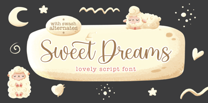 Sweet Dreams! A new fresh ans modern hand lettered font with decorative characters and a dancing baseline. So beautiful on invitation like handicraft, greeting cards, branding materials, business cards, quotes, posters, and more design concepts. Features : Unique ligatures Stylistic sets Basic Latin A-Z and a-z Numbers International Symbols included Punctuation Please send a message if you have questions or problems, and don't hesitate to say hello on Instagram https://www.instagram.com/fargunstudio Thank you.
 - Hanthing by IRF Lab Studio,
$12.00 Hanthing Script consists of a fashionable sophisticated signature-style script with its own unique curves and an elegant inky flow. This font is perfect for photography, watermark, social media posts, advertisements, logos & branding, invitation, product designs, label, stationery, wedding designs, product packaging, special events, or anything that needs handwriting taste. Thanks for checking it out, and feel free to message me if you have any questions! say hello by e-mail: irflabstudio@gmail.com
 - Cloud Dancer by Reyrey Blue Std,
$16.00 Say Hi to Cloud Dancer. It is bold and high-contrast display serif typeface with delightful nostalgic feeling. Cloud Dancer contain several stylistic alternates that can make it unique and different. This typeface is perfect for corporate identities, websites, publications, titles, books, magazines, business cards, logos, product labels, packaging, or any kind of advertising purpose. Features : · All Uppercase and Lowercase · Number & Symbol · Supported Languages · Alternates and Ligatures · PUA Encoded Hope you enjoy with our font!
 - Brass by HiH,
$8.00 The Brass Family has a lineage that extends into English history. About five hundred years ago a devout, but anonymous Englishman gave glory to the God he worshipped by designing the capital letters and decorations of these two fonts. Originally recorded in The History Of Mediaeval Alphabets And Devices by Henry Shaw (London 1853), they are described by Alexander Nesbitt in his Decorative Alphabets And Initials (Mineola, NY 1959) as “Initials and stop ornaments from brasses in Westminster Abbey.” I wish I could say I remember seeing them when I was there, but that was forty-two years ago and all I remember was seeing the tomb of Edward the Confessor. One definition of “stop” as a noun is a point of punctuation. I have heard people from the British Isles speak of a “full stop” when referring to a period. Some may remember a 19th century form of communication called a telegram being read aloud in an old movie, with the use of the word “stop” to indicate the end of a sentence or fragment. A full dozen of these stop ornaments are provided. They occupy positions 060, 062, 094, 123, 125, 126, 135, 137, 167, 172, 177 & 190. The Brass Family consists of two fonts: Brass and Brass Too. Both fonts have an identical upper case and ornaments, but paired with different lower cases. Although the typefaces from which the lower cases were drawn are both of modern design, both are interpretations of the textura style of blackletter in use in England when the upper case and ornaments were fashioned for the Abbey. Brass is paired with Morris Gothic, which matches the color of the upper case quite well. Brass Too is paired with Wedding Regular, which is distinctly lighter than the upper case. I find it very interesting how each connects differently. The resulting fonts are unusual and most useful for evoking an historic atmosphere.
 - Ongunkan Enochian Script by Runic World Tamgacı,
$60.00 I drew this font staying true to the original design. The letter table in the relevant book was taken as reference. Enochian (/ɪˈnoʊkiən/ ə-NOH-kee-ən) is an occult constructed language[3] — said by its originators to have been received from angels — recorded in the private journals of John Dee and his colleague Edward Kelley in late 16th-century England.[4] Kelley was a scryer who worked with Dee in his magical investigations. The language is integral to the practice of Enochian magic.
 - Mediator by ParaType,
$30.00 Mediator is a balanced contemporary sans serif typeface that performs well both in display sizes and body text. The family contains 30 fonts in 3 widths: 8 romans with matching italics, of slightly extended proportions, from Thin to Black; 7 narrow and 7 condensed, from Thin to ExtraBold. The character set in normal upright faces was expanded to include small caps and all faces include old style figures. The typeface was designed by Manvel Shmavonyan with the participation of Alexander Lubovenko and released by ParaType in 2016.
 - Swiss 721 WGL by Bitstream,
$49.00 Swiss 721™ is a sans serif family that ranges in style from thin to black while mixing in a few unexpected, but beautifully made and ironically flattering, outline weights that spice up the grotesque design. Couple these upstanding letterforms with matching italic styles and you have yourself a beautiful tool that is as legible on screen as it is off, has the technical prowess to conquer even the trickiest of design riddles and will work in a myriad of projects. Swiss 721 is a staple sans serif that you’ll never be sorry you have in your library. It’s been said that a simple sans serif is one of the most difficult typefaces to design. This is because when letters are reduced to their most basic details, irregularities and inconsistencies in design become immediately visible. The Swiss 721 typeface family is a quintessential example of letterforms distilled to their essence while still possessing warmth and verve. Based on mid-century sans serif typefaces, Swiss 721 is a versatile family of weights and proportions ideally suited to a wide variety of print and interactive design projects and is equally at home as headlines on billboards as it is navigation content on small screens. Swiss 721 takes the essence of mid 20th century sans serif typefaces and melds it with modern design consistency and a systematic weight range. OpenType® fonts of Swiss 721 also benefit from a rich character set and a range glyphs supporting most Western European and many Eastern European languages.
 - Lachrymose by Hanoded,
$15.00 Lachrymose is a word that stems from ‘lacrima’, the Latin word for tear. It means ‘tearful’, or ‘given to weeping’. Now, before y’all think I am depressed or so - I am not. I just like the sound of this word and the way it is written. All I needed to do was to build a font for it! Lachrymose is a handmade brush font. I used my fantastic Chinese ink and a cheap brush to create the glyphs. Lachrymose is a display font, so use it for anything display-ish.
 - Charlonka by PleasureFonts,
$22.00 I‘d like to introduce “Charlonka“ to you. When my daughter finished high school, she wanted to get rid of her entire school stuff. So I saved a few sheets of her beautiful handwriting and promised her to create a typeface out of it. That‘s how the idea of Charlonka was born, a typeface family out of Charlotte‘s handwriting (by the way: that‘s her name). Some characters of Charlonka have extended crossbars, like in upper case A or H, and reduced descenders, like in lower case g or y.
 - ITC Outpost by ITC,
$29.99Hal Taylor's ITC Outpost was not the result of a detailed design brief, nor was there a methodical development of key concepts or characters. Outpost just seemed to emerge all at once during a brief sketching session," says Taylor. "I guess what I was thinking of was an antiquated Western perception of some sort of Middle Eastern hand lettering - a 'mysterious East' sort of thing." ITC Outpost's sense of the exotic has an almost Art Nouveau quality, with its sensuous curves and sweeping strokes. The open bowls and opposing weight bias in many of the characters add to the design's striking personality. A suite of alternate and swash letters enables the setting of distinctive display copy. ITC Outpost's family of roman, italic, and swash characters is compact but versatile. The caps have the grace and authority of a titling face. Add in the lowercase and swash letters and copy is transformed into something lighthearted and full of verve. ITC Outpost creates dramatic headlines and adds a flourish to invitations, menus, logos and packaging An accomplished designer, Taylor has spent most of his career in the lettering and typographic arts. He began as a photo-lettering typographer, setting headlines and creating custom lettering, and now works in the publishing industry. " - ATC Arquette by Avondale Type Co.,
$20.00 ATC Arquette, is a best-selling geometric sans-serif font created with minimal ornamentation to adhere with accessibility and visibility guidelines, and be as visually legible as possible. Contains 400+ glyphs, full alphabet, ligatures, numberals, accents and punctuation. ATC Arquette was released in 2018.
 - The "KG Be Still & Know" font is a captivating creation by Kimberly Geswein, a typeface designer known for her distinctive and emotive font designs. This particular font is a clear reflection of Kimb...
- The KG What the Teacher Wants font, crafted by Kimberly Geswein, is a testament to the personal and approachable style that has become synonymous with educational and instructional environments. At i...
- "KG Mercy in the Morning" is a distinctive font that carries the unique touch of Kimberly Geswein, a noted typeface designer known for creating fonts with a personal feel. This particular font is no ...
- Hanleth by great19,
$14.00 Hanleth family is a combination of script and all cap sans. This duo font was made and inspired by old vintage script and simple sans, polished with a little bit of modern style. This font family is a vintage, authentic and hand crafted piece of typeface. 1. Hanleth script : comes with clean and rough version. with some swash and alternates that make it looks unique and elegant. 2. Hanleth sans : comes with clean and vintage rustic version. a simple sans that generally good for tittle and body text. 3. Hanleth icon : comes with 52 vintage rustic icons is perfect to boost the vintage feel of this family. Hanleth family is perfect to make logotype, product packaging, tittle for poster or greeting card, promotional message, branding project and more.
 - Roger by Tail Spin Studio,
$20.00The Roger family was designed in memory of a friend of ours who passed away recently. We created a humorous design for him because he was always laughing and never failed to see the funny side of things. We miss his great outlook on life. - Therhoernen by Proportional Lime,
$9.99 Arnold Therhoernen. (Arnoldus ther Hornen, Drucker des Dictys , Arnold ter Hoernen, Arnold ther Hoernen, Arnoldus TherHornen.) Who was this guy? He was a printer active in the city of Cologne, having graduating from the university there. He learned his craft under Ulrich Zell. He printed books from 1470 to 1482 when the plague carried him off. Was he just another printer of the era? No, he brought out the first edition of the "Fasciculus temporum'' (The most popular work by a living author at that time.) And he was the first to use both a title page and page numbers. His page numbers, an idea probably suggested to him by Werner Rolevinck, were interesting in that they were centered half way down the page on the outer margin and were set in Roman Numerals.
 - Girasol by Lián Types,
$35.00 This is a cute story about a mother and her son. :) About a decade ago my own mother got very interested in my work. She used to say my letters had so many swirls and dazzling swashes, and suggested my job seemed to be very fun. She wondered if she could ever try to make her own alphabet... Well, she is a civil engineer and a maths teacher, and appeared to be a little tired of exact sciences... I remember answering this, while she was listening with her typical tender look: -"Mamá... While type-design may be a really enjoyable thing to do, it also involves having a great eye and knowledge about the history of letters: nice curves and shapes require a meticulous study and, like it happens in many fields, practice makes perfect"-. Well, she raised her eyebrows at me. -"and so what?"- She didn't have any experience neither in the field of art nor in the field of graphic design so, I told her that if she really wanted to get into this she should borrow some of my calligraphic books from my beloved shelves in my office. So... she did. Some weeks after that, she came to me with many sketches made with pencils and markers: some letters where very nice and unique while others naturally needed some work. I remember she added ball terminals to all of her letters (even if they didn't need them) because that was one of the rules she imposed. After some back and forth, we had the basis for what would be today, ten years later, the seed of this lovely font Girasol. Her proposal was nice, something I was not accustomed to do, that’s why many years later I decided to watch it with fresh new eyes and finished it. While she was in charge of making the lowercase letters, I helped with the uppercase and also added my hallmark in the alternates, already seen in others of my expressive fonts. The result is an upright decorative font that follows the behavior of the copperplate nib with a naive touch that makes it really cute and useful for a wide range of products. Many alternates per glyph make Girasol a very fun to use font which will delight you. Above posters are a proof of that! This font is a gift for my mother, Susana, who, in spite of her exacts academic background, taught me that beauty can also be found in the imperfect. 1 NOTES (1) In my fonts I'm always in seek of the perfect curve. When I designed Erotica and Dream Script, I read about Fibonacci’s spirals!
 - Jus Hangin PB by Pink Broccoli,
$16.00 Jus Hangin was inspired by the lettering on the cover of the 1999 Counting Crows album, “This Desert Life”. It was one of those child-like lettering styles that was just begging to be fleshed out and made into a typeface that was as wild and carefree as the lettering inspiration. With an open spacing format, and an exuberant baseline bounce, Jus Hangin is fun to typeset with, while alternates and double letter ligatures keep things from getting repetitive. You’ll find Jus Hangin is ready and waiting to announce your festivities.
 - Aprek Febux by Twinletter,
$15.00 "Welcome to the vibrant and bold world of typography!" Aprek Febux is a display typeface that adds sharpness, aggressiveness, and excitement to your projects. Aprek Febux, with its unequaled capacity to generate spectacular displays, is the ideal answer for your diverse variety of visual creations. Aprek Febux offers more than simply lovely letters. This font enables maximum versatility and creativity in every step of your design with excellent features such as ligature and alternate. You may quickly construct one-of-a-kind letter combinations to add a personal touch to your projects. We also recognize the significance of engaging with a worldwide audience. As a result, Aprek Febux supports numerous languages, guaranteeing that your communications are clearly received by everyone on the planet. Enhance your projects with the powerful visual appeal of Aprek Febux. Get this font right away and see how your every design becomes more impressive and stylish!
 - Subway Circle by Hanoded,
$15.00 My eldest son Sam always wanted to visit Japan and he has been saving up for a ticket for years now. We should have traveled there this year, but due to the pandemic, that was impossible. We’re now trying to go next year. Sam and I did make some kind of itinerary and I told him how we were going to get around, as I have been to Japan many times. I told him about the Shinkansen trains, the cute Tram in Nagasaki and the immense subway system in Tokyo. One of the lines in Tokyo is the so-called Yamanote Circle Line, which I have used on numerous occasions. A new font name was born and it stuck to this particular font! Subway Circle is a 100% handmade font. It is rounded, slightly slanted and comes with a sunny disposition. I am sure that, when you use it, you will find your 生きがい… ;-)
 - Kwalett by Ingrimayne Type,
$5.50 Kwalett is a sans serif typeface family with low contrast and a high x-height. Kwalett has two widths, each with five weights and each weight has an italics. The family is derived from the thinnest member of the Qualettee family. As members of that family get bolder, their contrast increases. As members of the Kwalett family get bolder, their contrast remains very low. Kwalett is designed to work better as text than the Qualettee family. The family has two ways to get fractions. A few fractions are preformed and are accessed with the OpenType discretionary ligatures feature. The OpenType fraction feature uses the superscript and subscript numbers to create any fraction.
 - Zamenhof by CastleType,
$59.00 Zamenhof is a family of five fonts that can be used singly or in combination to create a variety of bold, yet elegant, display styles. Inspired by Russian hand-lettering that appears to have been based on Jakob Erbar’s Phosphor, Zamenhof is essentially a Latin interpretation (with Cyrillic and Greek) of a Cyrillic interpretation of a Latin type design, with many changes along the way. (For example, all the Latin-only letters are quite different between the two designs: D, F, G, J, K, N, Q, R, S, U, V, W, Y, Z.) The Inline and Inverse styles of Zamenhof are the basic fonts and can be used effectively on their own. The Plain and Outline fonts — which I recommend using only in combination with the main designs — were created specifically to be combined with Inline and Inverse, as underlay and overlay layers, respectively. (You will need an application that supports layers, such as Adobe InDesign or Photoshop.) Zamenhof supports most European languages as well as modern Greek, and of course, Russian and other languages that use the Cyrillic alphabet. Needless to say, as Zamenhof is named after the father of Esperanto, it also supports Esperanto (as do all fonts from CastleType).
 - Boogie Nights NF Pro by CheapProFonts,
$10.00 A typical Art Deco font. I have redesigned the uppercase “S” to mach the lowercase, tweaked a little here and there - and completely redesigned all the diacritics (which didn't really match the letter designs). Nick Curtis says: "The inspiration for this font came from a poster for an Austrian trade show from the 1920s, credited simply to Wasserman." ALL fonts from CheapProFonts have very extensive language support: They contain some unusual diacritic letters (some of which are contained in the Latin Extended-B Unicode block) supporting: Cornish, Filipino (Tagalog), Guarani, Luxembourgian, Malagasy, Romanian, Ulithian and Welsh. They also contain all glyphs in the Latin Extended-A Unicode block (which among others cover the Central European and Baltic areas) supporting: Afrikaans, Belarusian (Lacinka), Bosnian, Catalan, Chichewa, Croatian, Czech, Dutch, Esperanto, Greenlandic, Hungarian, Kashubian, Kurdish (Kurmanji), Latvian, Lithuanian, Maltese, Maori, Polish, Saami (Inari), Saami (North), Serbian (latin), Slovak(ian), Slovene, Sorbian (Lower), Sorbian (Upper), Turkish and Turkmen. And they of course contain all the usual “western” glyphs supporting: Albanian, Basque, Breton, Chamorro, Danish, Estonian, Faroese, Finnish, French, Frisian, Galican, German, Icelandic, Indonesian, Irish (Gaelic), Italian, Northern Sotho, Norwegian, Occitan, Portuguese, Rhaeto-Romance, Sami (Lule), Sami (South), Scots (Gaelic), Spanish, Swedish, Tswana, Walloon and Yapese.
 - The font "KG Primary Penmanship 2" by Kimberly Geswein is an exuberant and charming font that captures the essence of early childhood handwriting. This font has been meticulously designed to replicat...
- ITC Conduit by ITC,
$45.99 A no-nonsense modern sans serif design, the ITC Conduit type family embodies an earnest vernacular spirit. Its designer, Mark Van Bronkhorst, explains: “It’s the kind of lettering you might find on boilers, assembly diagrams, and desiccant packets,” he explains. “It’s plain, grid-based, visually incompetent, yet legible and direct.” Brilliantly assembled from a typographic kit of parts, ITC Conduit's letterforms project a coolness, without feeling austere or unapproachable. It's an excellent choice for publication, packaging, or even wayfinding design systems. The ITC Conduit collection is available in 14 styles, with weights from extra light to black—all with matching italic designs. An easy, efficient way to bolster your go-to typographic arsenal, add it to your type library today!
 - Breviary by Heyfonts,
$18.00 Breviary - Display Typeface "UNIQUE serif modern font" likely refers to a typeface that combines elements of traditional serif design with contemporary and distinctive features. Serif fonts have small lines or strokes attached to the ends of characters, which can contribute to a more formal or traditional appearance. The term "modern" in this context typically implies a contemporary or updated style. Here's an explanation of the characteristics and significance of a UNIQUE serif modern font: -Serif Elements: Serifs are the small lines or strokes at the ends of characters, and they are a hallmark of traditional typography. In a UNIQUE serif modern font, these serif elements are likely to be present but may have a distinctive shape or style that sets them apart from more conventional serif fonts. -Contemporary Design: The "modern" aspect of the font suggests a contemporary or updated design. This may involve a departure from the more classical serif styles seen in traditional typefaces, incorporating modern design principles, cleaner lines, and a more minimalist aesthetic. -Distinctive Characters: A UNIQUE serif modern font is likely to feature characters with unique and individual design elements. This could include unconventional serifs, letter shapes, or other stylistic details that make the font stand out and contribute to its uniqueness. -Versatility: While serif fonts are often associated with formality and readability, a UNIQUE serif modern font may offer versatility suitable for a range of design applications. It could be used in both traditional and modern contexts, providing flexibility for various design projects. -Applicability to Branding: Fonts play a crucial role in branding, and a UNIQUE serif modern font could be an excellent choice for businesses or projects that want to convey a sense of tradition and reliability while maintaining a contemporary and innovative image. -Digital and Print Design: Modern serif fonts are often designed with both digital and print applications in mind. The clarity of the typeface, even at smaller sizes, and its aesthetic appeal make it suitable for a variety of design projects, from websites and apps to print materials like brochures and posters. -Attention to Detail: The uniqueness of the font may be reflected in the careful attention to detail in each character. This could include refined curves, balanced proportions, and other design elements that contribute to the overall visual appeal and readability of the font. -Available Features: Unique serif modern fonts may come with additional features, such as alternative characters, ligatures, or stylistic sets, allowing designers to customize the appearance of the text for specific design needs.
 - Meta Language - Unknown license

- Ghouliez by MADType,
$21.00 This face was drawn on paper with a calligraphy pen and way too much ink. It's perfect for that spooky globular look.
 - Cabrito Semi by insigne,
$24.00 Relax. Deep breath. And step away to font nirvana with Cabrito Semi. Like its Cabrito relatives, Semi’s handwriting-inspired feel is mellow and care-free. But don’t misunderstand us. Even with its fun-loving peculiarities, this free spirit will command whatever party you invite it to. It’s a perfect blend of unique and functional. So what’s the secret of this little one’s strength? It’s pure balance. Cabrito Semi’s energy surges from deep within the relaxed, balanced tones of its humanist structure and calligraphic crafting. The 36 fonts of this well-crafted semi serif originate from the popular Cabrito, an insigne design slab serif developed for the kid’s book, The Clothes Letters Wear. Along with its other amigos, Inverto and Sans, Cabrito Semi rounds out this easy-going household of fonts. The four fonts play well together on anything from meals and candy to toys and cars. With the support of the other three, Semi makes a great choice for titles and moderately long text like you would use for websites, flyers, and packaging. Semi’s complete pack of alternates is accessible in any OpenType-enabled system. This kiddo has loads of alternates, swashes, and alternate titling caps to add a bit of sweetener to the balance. Also bundled are swash alternates, old style figures, and compact caps. Preview any and all of these features in the interactive PDF brochure. This font members of the family also consists of your glyphs for 72 languages. So who says you can’t love quirky? Take a look at Cabrito Semi--and any of the other members of the Cabrito family. You’re bound to find yourself loving fun all over again.
 - Engebrechtre Expanded - Unknown license

- Engebrechtre Expanded - Unknown license

- Meteor Condensed MF by Masterfont,
$59.00 A practical font family with 8 weights for all your day by day design needs: headlines, body text, signage etc. High legibility at small sizes. An extended serif typeface with elegant endings that provide unique softness appearance without losing legibility.
 - Father Love by Yoga Letter,
$16.00 "Father Love" is a beautiful and unique handwritten font. This font is equipped with uppercase, lowercase, numerals, punctuation, ligatures, and multilingual support. This font is perfect for Christmas, Father's Day, Memorial Day, the 4th of July, teacher appreciation, graduation, and others.
 - Reaper BT by Bitstream,
$50.99Thomas Oldfield’s typeface, Reaper, is reminiscent of inscribed Greek letterforms but he claims that its origin is much simpler than that. “I recall”, Tom says, “that I just began the design by making the uppercase ‘I’ and continued using it to make up the other characters.” The cap only typeface has alternate cap forms in the lowercase positions, including a vastly scaled downed O and Q that make for some unusual text settings. Contrary to what the name might have you believe, there’s a lot of life in this quirky typeface.


