10,000 search results
(0.032 seconds)
- P22 Aglio by IHOF,
$24.95 Aglio was developed from letterforms originally painted by muralist/artist Tanya Zabinski. Aglio maintains the character of bold brushstrokes with random gaps and marks, and there are flourishes of articulated endstrokes. This typeface merges the looseness and freedom of hand painting with a decorative artistic sensitivity. Aglio (the Italian word for garlic) has an organic construction that evokes the spirit of this most assertive culinary favorite.
 - Dutch Mediaeval Book by Canada Type,
$29.95This is the elaborately expanded version of what is arguably the most classic and popular of all historic Dutch faces: Sjoerd Hendrik de Roos's Hollandse Mediaeval from 1912. Over the decades, many pressmen and typography connoisseurs have gushed loving prose about this typeface. An extended family of two weights, corresponding italics, small caps, four condensed fonts, four book fonts, a set of initials and some very Dutch ornaments, Dutch Mediaeval is a versatile workhorse that flows comfortably and artistically, with the elegance of the main weights nicely complemented by the sturdiness of the bolds. Very few text faces are this clean and inviting while being crafty as well. The Dutch Mediaeval family comes with quite a few OpenType features and extended Latin language support. - Dutch Mediaeval by Canada Type,
$29.95This is the elaborately expanded version of what is arguably the most classic and popular of all historic Dutch faces: Sjoerd Hendrik de Roos's Hollandse Mediaeval from 1912. Over the decades, many pressmen and typography connoisseurs have gushed loving prose about this typeface. An extended family of two weights, corresponding italics, small caps, four condensed fonts, four book fonts, a set of initials and some very Dutch ornaments, Dutch Mediaeval is a versatile workhorse that flows comfortably and artistically, with the elegance of the main weights nicely complemented by the sturdiness of the bolds. Very few text faces are this clean and inviting while being crafty as well. The Dutch Mediaeval family comes with quite a few OpenType features and extended Latin language support. - Arkham77 by Jvne77 Studio,
$20.00 Inspired by the works of Howard Philips Lovecraft (1890-1936), and the city of Arkham lying abroad the Miskatonic River... witth all those witchcrafts secrecy and the infamous Necronomicon. The Elder Ones and the mighty Cthulhu, who lies and not dies within the dephts of the ocean in R'lyeh he's awaiting... arf, anyway this font will well set for posters, detective stories or horror books, pulps and others... *Full western latin language with most diacritics and numbers* Included in this set: - ARKHAM77 Black (More formal display) 560 glyphes - ARKHAM77 Elegante (for a creepiest rendition) 590 glyphes - ARKHAM77 Titles (as its name do not tells, for credits, or simple text) 560 glyphes - ARKHAM77 Extras (Embellish your work with this cool collection of frames and ornaments) +100 glyphes
 - 1467 Pannartz Latin by GLC,
$38.00 This family was inspired by the edition De Civitate Dei (by Sanctus Augustinus) printed in 1467 in Sobiano (Italy, Roma) by Konrad Sweynheym and Arnold Pannartz who was the Punchcutter. It is one of the first few “Roman style” fonts, just before the birth of Jenson’s pattern (look at 1470 Jenson Latin). The present font contains all of the specific latin abbreviations and ligatures used in the original (about 54). Added are the accented characters and a few others not in use in this early period of printing. Decorated letters such as 1512 Initials, 1550 Arabesques, 1565 Venetian, or 1584 Rinceau can be used with this family without anachronism. If Italic style is required (not yet existing in early time of printing), we recommend using 1557 Italique.
 - Borest by Flavortype,
$20.00 Borest, a new carefully crafted roman sans serif display font. The ideas for this font has a wide range of reference, from vintage, classic, art deco, until the modern era. So the looks of this font must be in the wide range of the reference above. Borest has a versatile and luxury feel as you can see in our creations on the display, such as Branding, Header, Logotype, Poster, Magazine, Packaging, Wedding Invitation with art deco style, and more. It shows that Borest can accommodate various design style. Borest comes with OpenType Features. such as Stylistic Alternates as an Ascender swash and Descender Swash and Ligatures. Every glyphs for alternates are curated for the best and without eliminating the characteristics of this font.
 - Tribunus SG by Spiece Graphics,
$39.00 Warren Chappell was the original designer of this handsome pen-formed roman typeface introduced by the Stempel Foundry in 1939. It was cast in Germany as Trajanus and named after the Roman emperor whose accomplishments are preserved on the Trajan Column in Rome. This version, Tribunus, retains the same rugged but handsome quality of the oldstyle original. A set of italic oldstyle figures are included with the italic roman. Tribunus is also available in the OpenType Std format. Some new characters have been added to this OpenType version. Advanced features currently work in Adobe Creative Suite InDesign, Creative Suite Illustrator, and Quark XPress 7. Check for OpenType advanced feature support in other applications as it gradually becomes available with upgrades.
 - WildForest by Enfeeltype,
$15.00 This font was born out of love with nature, designed to preserve and instill an even greater appreciation for our world. WildForest is a modern typeface born from the wild. This font was born out of love with this nature, and its intention is to capture the spark of something beautiful, yet wild and full of life. This font was designed with a careful eye on the details and has accents that recall the spirit of nature, made in a style that will be loved by both professionals and amateurs. Made with care and precision, WildForest appeals to both professional designers and amateur designers alike. Worthy of any article or design, WildForest embodies a typeface that is truly unique.
 - Welcome Ramadhan by Letterara,
$16.00 Welcome Ramadhan is an Arabic-styled display typeface. This font features irresistible characters which make this font unique because it looks like the standard Arabian alphabet or is written in Arabic style. This Islamic Ramadhan Arabic font is perfect for any graphic design related to the Islamic style. Using this font, you will get an Arabic feel for every text you type. Made with serif characters so that it can be read internationally and does not have to be able to read by Arabic characters It is PUA encoded which means you can access all of the glyphs and swashes with ease! Add it confidently to your projects, and you will love the results.
 - Grimoire by Floodfonts,
$29.00 Grimoire on the other hand combines two seemingly contradicting principles — calligraphic and constructive ideas — and makes them work together. The font is based on a modular system but simulates a handwritten typeface. Felix Braden about this concept: "I was so fascinated by this idea, that I have since designed a couple of typefaces following this principle, e.g. the psychedelic Bikini released by Volcanotype. Even my recent work, the multi awarded FF Scuba is inspired by this concept, however with increasing age I have become less interested in experimental typography and more so in designing typefaces which are more versatile in use." For a detailed type specimen have a look at: http://on.be.net/17WyhE6
 - Lamia by Atelier laia,
$50.00 The Lamia font is inspired by the work of the most famous calligrapher of the Basque Country, Jose Francisco de Iturzaeta Eizaguirre (Getaria1788-Madrid 1853). His writing method was compulsory in Spanish schools since 1835. His "unpolished Spanish font" tried to be more effective than the more commercial English version by avoiding embellishments and excessive rear tearing. More akin with the liberal values imported by the French, his offerings sought uniformity, speed and efficiency to ensure that those in the less-favored echelons of society had an effective communication tool. From his "general collection of characters of European Letters" published in Madrid in 1833, we have chosen the "lower case pancilla reformed" represented in one of the prints. We have tried to reinterpret it by keeping its essence but also ensuring that it is viable for potential contemporary uses which, thanks to its good readability and effectiveness in longer texts, basically means as a decorative or display font. The upper case was generated using the lower case as a reference.
 - Martian Grotesk by Martian Fonts,
$35.00 Martian Grotesk is a large typeface family originally designed for the screen which consists of a variable font with 2 axes of variation and 63 styles: Condensed to Ultra Wide, Thin to Ultra Black. Aesthetics The font style is characterized by some brutality and assertiveness. Overhanging terminals, a closed aperture, and an almost complete lack of contrast lead to this effect. Additionally, some elements of the letters are especially enlarged. This font gives any text the impression of being a “signature” style. Nevertheless, we still maintain the golden mean between its rebellious nature and readability. Perfect for web development We created Martian Grotesk for the web and digital project world. When laying out web pages, frontend developers are constantly faced with the fact that uneven metrics do not allow text to be evenly placed on some design element, for example, on a button. Instead, they have to compensate in some way, like making the top padding smaller and the bottom padding larger in CSS. This little deal really hurts. Also, if your project adheres to design system principles, you might be unable to stand a lack of systematic approach when working with fonts. We researched and calculated vertical metrics and set them up in a way that guarantees equal space above the cap height and under the baseline. This enables the text labels to be evenly placed on buttons, inputs, lists, and forms. In addition, we found a proper ratio of the letter heights, so, with commonly used font sizes—10, 15, and 20 pixels—the glyph heights stick to the pixel grid. As a result, the letter shapes become sharper, which reduces the load on the reader's eyes and simply looks much better. The typeface also comes equipped with OpenType and TrueType hinting, and Martian Grotesk appears legible on most platforms, even when being rendered in small sizes. When coupled together, all the above features make Martian Grotesk a reasonable choice for any user interface design. Roadmap Martian Grotesk right now is a work-in-progress product. The font is completely ready for professional use, however, many great features are still ahead! For example, support for Extended Cyrillic characters, and italics. Pricing Purchasing an early version of the font presents the opportunity to get it at a very attractive price! That’s because with every new version, costs will go up to reflect the additional value that comes with every release. But after purchasing Martian Grotesk, all its future updates are included for free!
 - Nori by Positype,
$49.00 First, the important information…Nori is a hand-lettered typeface that contains over 1100 glyphs, 250 ligatures, 487 alternate characters, 125+ swash and titling alternates, lining and old style numerals. To make sure it is perfectly clear—Nori is the result of brush and ink on paper. The textures produced in each glyph are real and the imperfections are intentional and add to the sincerity of the letters. I say this to be as blunt as possible in order to avoid confusion and to frame what this typeface represents—calligraphic, handwritten letters captured digitally for their warmth and poetic variation for print and screen. Like my handwritten, calligraphic or brush-driven faces before it (the Baka series and the TDC2 2010 winning typeface, Fugu), Nori is a product of my analog and digital hand. To view the words and sentences formed by this typeface is to look at how my hands, yes hands, make letters. The fluidity, as well as the irregularity, is human, honest and intentional—to do so lets the brush I am holding breathe life into each letter. Once digital, any number of points and repetitive processes can’t mask its influences—and I like that. The brush, a simple instrument, my tool, my friend designed to emulate traditional Japanese sumi-e brushes... the Pilot Japan Kanji Fude brush pen. Each letter, each variation was written over and over again until I found the right combination. From there, each was scanned, digitized and optimized. Points were removed in order to ‘clean’ the glyphs up some but I did not want to compromise the integrity of the actual brush stroke. Once this base set of characters (about 350) were completed, the thoughtful manipulation of the glyphs, their gestures and forms were further expanded to solidify the embellishments used within the ligatures, alternates, swashes and additional features. This process was admittedly self-indulgent to an extent. I wanted the words created with this typeface to have the flexibility of variation and cohesiveness of movement that someone fluidly producing these letters by hand might have. I hope you enjoy this typeface as much as I did during the six months working on it. A specimen and style guide is included with the purchased of Nori.
 - Burlington by ITC,
$29.00Burlington was designed by Alan Meeks in 1985 and is a decorative typeface in the neoclassical style of the middle of the 19th century. Characteristic of faces from this time is the low x-height, which makes the font look as though it is reaching upward. This combined with the white areas in the strokes give Burlington a light, airy feel. The elegant Burlington is particularly good for headlines and can also be used for short texts in point sizes of 12 or larger. - Azarosa by Trifásica Studio,
$9.00 Azarosa (a.sa.ˈɾo.sa) is a display font inspired by the work of the urban artist Arkano in Bogotá (Colombia). The orthogonal shapes of a continuos line adapt themselves pretty well to the architecture of the city, and the not common ductus of the letters gives a very attractive visual texture, which is always seen before read. Visually, Azarosa is related to the graffiti movement pichação in Brasil and with some nordic runes; this is why this visually "encrypted" font is not easy to read, ideal for underground purposes.
 - Major Production NF by Nick's Fonts,
$10.00 This typeface was designed specifically for producing movie posters, as well as VHS and DVD packaging for them. The uppercase letters are ultracondensed, and the lowercase letters are small caps, approximately a third the size of the uppercase. Also included are various logos and symbols suitable for the intended use, including those for MPAA ratings, and various audio and video formats. Both versions of this font include the complete Unicode Latin 1252 and Central European 1250 character sets.
 - Bravado NF by Nick's Fonts,
$10.00 This growing family of friendly faces is based on the typeface Bravour, designed in 1913 by Martin Jacoby-Boy for the D. Stempel AG foundry in Frankfurt am Main. The wide stance and very large x-height shared by the family members makes them warm and inviting, and equally suitable for use in headlines or text blocks. All versions of this font include the Unicode 1250 Central European character set in addition to the standard Unicode 1252 Latin set.
 - Vasari NF by Nick's Fonts,
$10.00The pattern for this font was found in the 1906 specimen book for the Keystone Type Foundry under the name Ancient Gothic, which is a pretty accurate description of the particular appeal of this typeface. Use it liberally anytime you want to add an air of mystery or menace...or simply some quaint charm. Both versions of the font include complete Latin 1252, Central European 1250 and Turkish 1524 character sets, with localization for Moldovan, Romanian and Turkish. - Original Surfer Pro by Stiggy & Sands,
$29.00 Our Original Surfer Pro is an offbeat sans serif font bursting at the seams with lively personality. Inspired by a vintage advertisement for the "California Cliffs Caravan Park", this font exudes all of the fun of a summer vacation anytime of the year. The letterforms are clear and cleanly legible, while nothing is formal or uptight about this font. The SmallCaps and extensive figure sets offer Original Surfer Pro an even wider range of design options.
 - Rennie Mackintosh by CRMFontCo,
$35.00The Classic Charles Rennie Mackintosh Font. Created in 1993, the timeless beauty of Charles Rennie Mackintosh’s letterforms is now available at MyFonts for the first time. Often imitated, but never bettered, this font has been used in various projects all over the globe, enjoying the limelight of Hollywood when it was requested for use in Sam Raimi’s second “Spider Man” adventure. A form of this font has subsequently been used for the TV series “An American Horror Story”. - Tomatoes Cake by Balpirick,
$15.00 Tomatoes Cake is a Cute Handbrushed Font. Whether you’re using it for crafts, digital design, presentations, or making greeting cards, this font has the potential to become your favorite go-to font, no matter the occasion! This font only has allcaps letters. - also multilingual support Enjoy the font! Feel free to comment or feedback! Thank you!
 - Mogzilla NF by Nick's Fonts,
$10.00An uncredited typeface discovered within the pages of Alphabete: Ein Schriftatlas von A bis Z named "Fat Cat" provided the pattern for this exercise in minimalist type design. Best used sparingly for inescapable, if somewhat cryptic, headlines. Both versions of this font include the complete Latin 1252 and CE 1250 character sets, with localization for Romanian and Moldovan. - Fernburner NF by Nick's Fonts,
$10.00This stunning display face is based on Hans Bohn’s 1929 opus for Gebr. Klingspor, originally named Orplid. One of the treasures discovered in the legendary green vinyl binder that launched Nick’s love of type, it’s a real crowd pleaser. Both versions of this font include the complete Latin 1252, Central European 1250 and Turkish 1254 character sets. - Taka Sans by FSodic.com,
$15.00 Taka is a font that can be used in all situations, be it Articles, News, Titles and so on. We will be adding variants of the font in the coming weeks which will make this font even more complete. This font is only sold by Monotype and its subsidiaries, make sure you get the original only here!
 - YT Big Latin by Yangtype,
$9.00 The concept of this letter is a young alligator. Young crocodiles have lean bodies and are agile. It has uncontrollable power, and the angular leather vinyl and teeth feel vivid. This font was created to convey the most compressed energy possible through a collection of compressed squares. Although it doesn't attack, it is quite an aggressive letter.
 - Pismo Clambake NF by Nick's Fonts,
$10.00This stylish stout script was originally issued in the 1930s under the name “Fulgor” by the spanish foundry Fundición Gans. Cursory research suggests that Saks-Fifth Avenue found it suitably snooty to use extensively in its newspaper ads of that period. Perhaps somewhat ironically, this version takes its name from one of comedian W. C. Fields' many odd aliases. - Bully Pulpit Plain NF by Nick's Fonts,
$10.00 This engaging headline face is based on a rather pudgy typeface named “Bullion Shadow”, which was originally released somewhere on the cusp between the hippie and disco eras, and was equally at home in both. Now available in shaded and plain. Both versions of this font support the Latin 1252, Central European 1250, Turkish 1254 and Baltic 1257 codepages.
 - Caesar Pro by RMU,
$35.00 In 1913, Leipzig-based foundry C. F. Ruehl released a hot-metal font called Caesar-Schrift which was cut by the engraver and medalist Georg Schiller (1858-1937). This humanist sans combines successfully traditional classic forms with the flowing lines of the Art Nouveau period. Now revived as Caesar Pro, this font was carefully extended and made multilingual.
 - Exotile by Sylvain Zimmer,
$15.99 Hexagons are all over the place in nature : from honeycombs to snowflakes and the tiling patterns seen on fruits. That form guided me in the creation of this new font. So Exotile is a font inspired by nature. This typeface is ideal for display purposes. It comes in 3 different weights and support for different languages.
 - Nalgae by Diven,
$40.00 About This Font Nalgae is a Korean modern-traditional conceived from Hermes' shoes. By flowing the end of the letters with a brush, the speed of stroke : express wind, It is a design font created for complement it more as an illustration. This font is for express Hangeul (Korean alphabet) unique, importance, logotype, pattern, title, branding and more.
 - Cupid Gummies by Balpirick,
$15.00 Cupid Gummies is a Sweet and Cute Handbrushed Font. Whether you’re using it for crafts, digital design, presentations, or making greeting cards, this font has the potential to become your favorite go-to font, no matter the occasion! This font only has allcaps letters. - also multilingual support Enjoy the font! Feel free to comment or feedback! Thank you!
 - Tequila by BA Graphics,
$45.00 A revival from the past this animated letter will fit right into todays market. With its subtle flair and Latin feeling it will surely give a feeling of pure fun. This style was very popular in the 40s and 50s then it was reborn in the 60s and 70s once again it is coming back and becoming popular again.
 - Herkules by Nandatype Studio,
$15.00 Herkules is a whimsical script font with a relaxed theme, with a series of hooking hooks for a beautiful style. Whatever the topic, this font will be a great asset to your font library, as it has the potential to enhance any creation. This font is PUA encoded which means you can access all the glyphs and sweeps easily!
 - Nodhe by Wontenart,
$18.00 Fonts with special characters in lowercase vowels: a, i, u, e, o Make sentences more colourful. This font is neutral for use in any product. Especially for happy things, or life motivational words. or contemporary like the teenage years, discover the beauty of harmony in your work with this font. The right choice of fonts, makes a great product.
 - LTC Fournier Le Jeune by Lanston Type Co.,
$24.95 Based on the all caps decorative face Fournier le Jeune of 1768 by Pierre Simon Fournier for the Peignot Foundry. This version uses more elaborate "Vouge Initials" caps which were offered by ATF in 1920s. Because of the decorative nature of this design, a full character set is not included, but accented characters and basic punctuation are included.
 - Grand Scoth by Rhd Studio,
$11.00 Introducing, Grand Scoth - The Essential Duo Font Collection Grand Scoth is the perfect and essential combination of a duo of fonts including , round sans and authentic signature. This font duo also supports multilingual, numeric and symbol. You can use this font for any purpose. The best part is, you don't have to look for a partner Thank you....
 - Purple Bread by Balpirick,
$15.00 Purple Bread is a Tall Handwritten Font. Whether you’re using it for crafts, digital design, presentations, or making greeting cards, this font has the potential to become your favorite go-to font, no matter the occasion! This font only has allcaps letters. - also multilingual support Enjoy the font! Feel free to comment or feedback! Thank you!
 - Bemis by Leksen Design,
$29.00 I accidentally fell in love with type design, and more specifically, the inscription on the historic Bemis building in Seattle. A high waist and great contrast are characteristics of this classic caps lettering that inspired my debut typeface, with additions of 3/4 caps and ornaments to boot. Read and hear more about the creation of this digital revival.
 - Queens Burger by Balpirick,
$15.00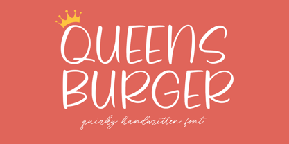 Queens Burger is a Quirky Handwritten Font. Whether you’re using it for crafts, digital design, presentations, or making greeting cards, this font has the potential to become your favorite go-to font, no matter the occasion! This font only has allcaps letters. - also multilingual support Enjoy the font! Feel free to comment or feedback! Thank you!
 - Organic Space by Melissa Lapadula,
$19.95Organic Space is about preserving what natural goodness there is left in the world, with its use of curves and space usage. It represents the selection of consumers, which choose organic products instead of the alternative genetically modified version. This typeface aims to be organic and unique. This font can function as headings, subheadings and body text.