10,000 search results
(0.028 seconds)
- Ageitha by Sakha Design,
$14.00 Ageitha is a modern and luxurious handwritten font. Elegant and stylish, this font will become your top choice in no time. This font is PUA encoded which means you can access all of the glyphs and swashes with ease!
 - Brocklyns by ahweproject,
$14.00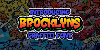 Brooklyn is a cool, graffiti-style display font. Add this font to your urban and casual creations, and you will love the outcome. This font is suitable for designs such as t-shirts, sportswear, logos, advertisements, clothing, and more.
 - Strezed by Gholib Tammami,
$14.00 This font is for anyone who wants to give a touch of pain and horror to their project. This handwritten font is suitable for display use, titles, and some designs with the theme of sadness, fatigue, or anything alike.
 - Amsterdam Belmonteria by Letterena Studios,
$9.00 Amsterdam Belmonteria is a delicate and cursive handwritten font. This gentle font will look gorgeous on a variety of design ideas. This font is PUA encoded which means you can access all of the glyphs and swashes with ease!
 - Galiba by Juraj Chrastina,
$29.00 Give your voice an eye-catching hand-drawn look thanks to this playful font family. You'll get three styles, along with OpenType features including alternates, ligatures and stylistic sets. Galiba Regular works very well with his small brothers Light and Thin. In addition Galiba Light can be used at smaller size along with the other styles to keep the same line thickness. To achieve a random-like effect, the regular style is packed with 4 different variants of each glyph, that automatically cycle if stylistic alternates are turned on. Also you can choose from 5 stylistic sets to easily change the look of a given string, or pick alternates by hand. Not to mention that we've attentively fine-tuned the kerning that’s crucial for this kind of typeface.
 - Haircult by Hijinx,
$15.00Fifties-style beauty parlor signage is the main influence of this series of hairstyle silhouettes. - Hughoney by Arterfak Project,
$17.00 Introducing our new exploration of a brush font, Hughoney . This freestyle script font is created by creative randomization the letter shapes. Gives minimalist, sweet, elegant and solid looks to your creative projects. This font has a lot of feature that you can apply as you need. The features in this font have a consistent adjustment with the basic letters. This sweet brush font is suitable for your poster, quotes, t-shirt design, menu, product design, invitation, etc. Very recommended for Headline or your display. We hope you are interested.
 - Lerum by Larin Type Co,
$15.00 Lerum this is elegant stencil font. Classic serif, bold weight, stencil style, it all carries this font and with it in highlight the main thing, make a title or logo and much more. It can also be more expressive and playful, thanks to the many alternates that are harmoniously combined in this font and make it more attractive and expressive. Try to change the alternatives, ligatures and you will get a lot of options for your project that will make it unique. This font is easy to use and has OpenType features.
 - Spanish Main by FontMesa,
$19.95 Spanish Main is a revival of an old MacKeller Smiths & Jordan font named Sloping Black. Like most foundries MacKeller Smiths & Jordan doesn't display all the letters of the fonts in their specimen books so it took a little more time to find the complete character set for this old beautiful classic font. New in this version is the addition of a Greek character set which is experimental as you normally don't see Old English style fonts include a Greek alphabet.
 - Aeris by Linotype,
$29.99 Aeris™ typeface is a contemporary book face created by the American designer Tom Grace. It combines the proportions and rhythm of a sans serif font with the high contrasts and flexed strokes of script faces, while the open counters also ensure optimal legibility. Tom Grace focuses on providing subtle differentiations in his cuts and, as a consequence, this font family has its own individual structure: there are A and B variants of the basic forms regular, italic, bold and bold italic, and a display version for use in titles that also comes in A and B variants. It is advisable to use the A variant for larger font sizes, while the slightly more emphasized B variant can be recommended for smaller font sizes. Where the basic forms are to be mixed together in a work, it is important to use the corresponding A/B variants throughout as their designs have been carefully coordinated. Aeris is available in the OpenType Pro format and thus includes a wide range of different glyphs. The font family can be used in various environments, such as books, magazines, advertisements and promotional materials, but it is also the perfect choice for printed corporate documentation.
 - P22 Stickley Pro by IHOF,
$39.95 Stickley Optical Family is an expansion of P22 Stickley Text, a humanist, Oldstyle-rooted design with a contemporary execution and full OpenType abilities. The font contains ten distinct cuts across four optical masters—in addition to Text for page content, the optical family includes Display for titling; Headline for emphasis; and Caption for footnotes and small sizes. Typefaces were originally designed for the physical size at which they were to be printed, with subtle variations in proportion, detail, contrast, and visual weight to ensure they were as clear at 6 pt. as they were elegant at 68 pt. This created a unified design as the various sizes were set together on a page. Text is the foundation of this typeface family and is built for use in extended reading. Its proportions are carefully balanced for visual clarity while retaining its character; designed for use at 9 to 13 pt. Caption is a sturdy, simplified interpretation of the Text letterforms, with ink traps, generous letters and spacing, and hefty proportions to give balance to the smallest content on a page; designed for use at 5 to 8pt. Headline is a complement to the Text master size. It is a gently modified version with larger small caps to add visual strength and has a greater delicacy; designed for use at 14 to 26 pt. Display is an elegant refinement with stylized details. It harmonizes with the smaller optical masters as a more intricate manifestation of the typeface. Designed for use at 34 pt. and above. Opentype features include ligatures, oldstyle and lining figures, alternates, Central European characters and diacritics, and Swash Caps for the Italics. Stickley Optical Family is a feature-rich workhorse with international functionality.
 - Biome by Monotype,
$29.99 In the sketches that formed the basis for his typeface Biome, Crossgrove experimented with inner and outer shapes in different styles, adapted letters to the form of the super-ellipse, and added curves only to remove these again. His challenge was to find a harmonious and coherent approach that provided sufficient contrast with existing fonts. Biome is essentially in the sans serif tradition and the letters exhibit only minor variations in terms of line thickness. There is still a suggestion of the super-ellipse at many points, but this never becomes the predominant design factor. While most of the terminals of the vertical strokes are only slightly rounded, the horizontals and diagonals have pronounced arches and it is these that basically determine the round and soft character of the typeface. The more unconventionally shaped letters, such as the lowercase 'g' with its two semi-open counters and the 'k' and 'x' with their crossbars, provide Biome with an individual personality. And this effect is emphasized by the generously rounded links in the 'v' and 'w' and the uppercase 'M' and 'N'. Biome has been designed as a typeface super-family. From the near hairline Extra Light to the amply proportioned Ultra, there are seven clearly differentiated weights and three tracking widths. There are oblique italic versions of all variants. The range includes small caps and numeral sets containing lowercase and uppercase digits. With its available range of characters, Biome can be used to set texts in all Eastern European languages. Although the remarkable individuality of Biome is most clearly apparent in the larger point sizes, this typeface is not just suitable for producing headlines and logos. Biome's elegant visual effects mean that it is equally comfortable in short texts while its large x-height and generous counters make it readily legible even in the small font sizes. Biome is a contemporary typeface that employs mid-20th century futurist elements which ironically give it a retro feel.
 - 99 Names of ALLAH Pilot by Islamic Calligraphy75,
$12.00 We have transformed the “99 names of ALLAH” into a font. That means each key on your keyboard represents 1 of the 99 names of ALLAH Aaza Wajal. The fonts work with both the English and Arabic Keyboards. We call this Calligraphy "Pilot" because it was the very first one we produced. The first "Alef" doesn't have a "hamzit wasel" nor a "fatha", this indicates to skip the pronunciation of that letter. So instead of saying "AR-RAHMAAN" you say "R-RAHMAN". (in the zip file you will find a pdf file explaining the differences in the "harakat", pronunciation and spelling according to the Holy Quran). Decorative letters used in this calligraphy: "Mim, Aain, Sin, HHe, He, Kaf & Alef". Purpose & use: - Writers: Highlight the names in your texts in beautiful Islamic calligraphy. - Editors: Use with kinetic typography templates (AE) & editing software. - Designers: The very small details in the names does not affect the quality. Rest assured it is flawless. The MOST IMPORTANT THING about this list is that all the names are 100% ERROR FREE, and you can USE THEM WITH YOUR EYES CLOSED. All the “Tachkilat” are 100% ERROR FREE, all the "Spelling" is 100% ERROR FREE, and they all have been written in accordance with the Holy Quran. No names are missing and no names are duplicated. The list is complete "99 names +1". The +1 is the name “ALLAH” 'Aza wajal. Another important thing is how we use the decorative letters. In every font you will see small decorative letters, these letters are used only in accordance with their respective letters to indicate pronunciation & we don't include them randomly. That means "mim" on top or below the letter "mim", "sin" on top or below the letter "sin", and so on and so forth. Included: Pdf file telling you which key is associated with which name. In that same file we have included the transliteration and explication of all 99 names. Pdf file explaining the differences in the harakat and pronunciation according to the Holy Quran. Here is a link to all the extra files you will need: https://drive.google.com/drive/folders/1Xj2Q8hhmfKD7stY6RILhKPiPfePpI9U4?usp=sharing
 - Narnia BLL - Unknown license

- Catholic School Girls Intl BB by Blambot,
$20.00This font is, like, totally inspired by the handwriting of, like, teenage girls. You’ll note that the [ ] keys are actually adorable little hearts! Totally rad! This font includes enough European characters to fill a loose leaf binder. - Rythme NF by Nick's Fonts,
$10.00 Originally released as Éclair by the French foundry Deberny, Peignot & Cie., this face is pure Art Deco in motion. Both versions of this font support the Latin 1262, Central European 1250, Turkish 1254 and Baltic 1257 codepages.
 - Decaf by Twinletter,
$15.00 DECAF is a display typeface with male features, as well as being robust and bold. Don’t be afraid to use this font since it will make your project charismatic, impress all audiences, make it stand out from the crowd, and, of course, it will appear classy, sophisticated, and stunning. This graffiti font is great for product logos, poster titles, headlines, packaging, film titles, logotypes, gorgeous writing, and trendy graffiti designs, among other things. Of course, if you utilize this font in your numerous creative projects, they will be perfect and outstanding. Use this typeface right away for your one-of-a-kind and remarkable projects.
 - Gluffers by Aliptype,
$10.00 Gluffers is bold with a retro and funky style display font. Mannualy design by handcrafted letterings, use this display font to add special result on your artwork. This font have a good potential to bring your artwork design to the next level ,also feeling the funky and groovy vibes touch. This font is very suitable for posters, pamflets, packaging, logo, quotes, advertisement, greeting cards, also many more can do and explore with this font for design work.
 - Conso by Larin Type Co,
$15.00 CONSO is an elegant, modern and contrast sans-serif font family. It includes upright and Italic style, each of them has seven weights from thin to bold. This is a multi-purpose font that is perfect for any project, it is contrasted, modern and easy to read. With it, you can create logos, use in advertising, packaging, book covers and magazines, headings, descriptions and much more. CONSO includes stylistic alternates with a teardrop-shaped tail for uppercase and lowercase, with them, you can change the style of your project and add personality to it and make it more stylized. This font is easy to use has OpenType features.
 - Justine Garden by Attract Studio,
$12.00 -INTRODUCING- Justine Garden Script is a beautiful modern calligraphy typeface, I hope you will be interested in this font, if you want to use it for your work. This font can be used easily and simply because there are many features in it. contains a complete set of lowercase and uppercase letters, assorted punctuation, numbers, and multilingual support. Justine Garden is very suitable for market designs being developed today, this font has a stylish, trendy, natural and soft font, with this font you can take advantage of opportunities every moment is a great way to highlight the celebration of the best of the party, because this font will be an advocate for the purposes such as wedding invitations, branding, parties, graduations, birthdays, gatherings, etc. Thank you, Attract Studio
 - Bosten by Letteralle,
$23.00 Introducing the perfect addition to your design! Bold and masculine font! Bosten is specifically designed to make a strong impact, whether you're creating headlines or crafting brand messaging. With its sleek and powerful lines, this font is sure to grab your audience's attention and leave a lasting impression. Crafted with care, this font is not only visually stunning, but also incredibly easy to use. It's compatible with all major design software, making it the perfect addition to any designer's toolkit. Whether you're creating marketing materials, designing a website, logo design, packaging, ads, clothing, merch, etc, Bosten is the perfect choice. So why wait? Take your branding to the next level with this powerful font today! Thank You!
 - Geometry Soft Pro by CheapProFonts,
$10.00 The Geometry Pro family has been designed to be the final word in purely geometric fonts, and this rounded “Soft” sub-family is the ultimate web 2.0 style font collection. Even though it is strictly geometric (as drawn with a compass and a ruler fixed to 90 and 45 degree angles) it is not slavishly modular: letters have differing widths, and the sidebearings, spacing and kerning has been finely adjusted to create smooth text. The Soft family contains three weights each with 6 variants: A is the basic form and the starting point B has more dynamic and modern shapes C has open and swirly shapes X is the serious text version Y has a very horizontal look Z is a collection of all the remaining more funky shapes Mix and match to your heart’s desire! Please enjoy the free “Bold N” version - this “notched” variant lets you test out the quality of the outlines and the language support. ALL fonts from CheapProFonts have very extensive language support: They contain some unusual diacritic letters (some of which are contained in the Latin Extended-B Unicode block) supporting: Cornish, Filipino (Tagalog), Guarani, Luxembourgian, Malagasy, Romanian, Ulithian and Welsh. They also contain all glyphs in the Latin Extended-A Unicode block (which among others cover the Central European and Baltic areas) supporting: Afrikaans, Belarusian (Lacinka), Bosnian, Catalan, Chichewa, Croatian, Czech, Dutch, Esperanto, Greenlandic, Hungarian, Kashubian, Kurdish (Kurmanji), Latvian, Lithuanian, Maltese, Maori, Polish, Saami (Inari), Saami (North), Serbian (latin), Slovak(ian), Slovene, Sorbian (Lower), Sorbian (Upper), Turkish and Turkmen. And they of course contain all the usual “western” glyphs supporting: Albanian, Basque, Breton, Chamorro, Danish, Estonian, Faroese, Finnish, French, Frisian, Galican, German, Icelandic, Indonesian, Irish (Gaelic), Italian, Northern Sotho, Norwegian, Occitan, Portuguese, Rhaeto-Romance, Sami (Lule), Sami (South), Scots (Gaelic), Spanish, Swedish, Tswana, Walloon and Yapese.
 - Esperanto by Linotype,
$29.99Franko Luin, Esperanto's designer, on this typeface: Esperanto has a lot in common with classic typefaces, and newer interpretations of the classics. The italic reminds of the lettering idea of the Renaissance and their manuscripts. This typeface's name refers to the international language Esperanto, of course. The font is not compatible with the character set of the Esperanto language - Victorah Gaerioa by Letterena Studios,
$9.00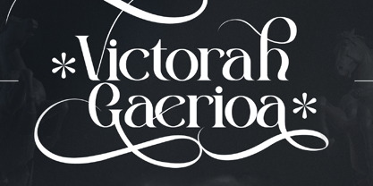 Victorah Gaerioa is a lovely and timeless serif font. It is the best choice for creating eye catching logos, branding and quotes. This font is PUA encoded which means you can access all of the glyphs and swashes with ease!
 - Premiere California by Letterena Studios,
$9.00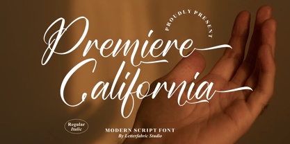 Premiere California is a lovely and timeless handwritten font. It is the best choice for creating eye catching logos, branding and quotes. This font is PUA encoded which means you can access all of the glyphs and swashes with ease!
 - Hallery by Carpiola Studio,
$12.00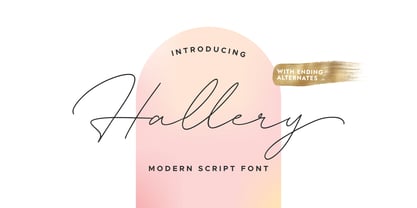 Hallery is a lovely and timeless handwritten font. It is the best choice for creating eye catching logos, business card, branding and quotes. This font is PUA encoded which means you can access all of the glyphs and swashes with ease!
 - Stillovers by Ardian Nuvianto,
$18.00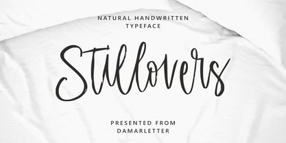 Stillovers is a chic, refined script font. Its stylish ligatures make this font the perfect match for any project. Stillovers is consisting of a fashionable style script make looks classy and touch of stylish. This font was created to look as close to a natural handwritten script as possible. Stillovers is perfect for branding projects, logos, wedding designs, social media posts, advertisements, product packaging, product designs, label, photography, watermark, invitation, stationery and anything that you want. This font is PUA encoded which means you can access all of the amazing glyphs and ligatures with ease!
 - Staylight by Ardian Nuvianto,
$18.00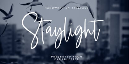 Staylight is a chic, refined script font. Its stylish ligatures make this font the perfect match for any project. Staylight is consisting of a fashionable style script make looks classy and touch of stylish. This font was created to look as close to a natural handwritten script as possible. Staylight is perfect for branding projects, logos, wedding designs, social media posts, advertisements, product packaging, product designs, label, photography, watermark, invitation, stationery and anything that you want. This font is PUA encoded which means you can access all of the amazing glyphs and ligatures with ease!
 - Staincool by Viaction Type.Co,
$12.00 Staincool is a layered Font, with a retro style, and is inspired by the artist's sign painter style. There are 6 layers that are easy to use. Staincool developed from the Stengkol 04 font (https://www.myfonts.com/font/viaction-type/stengkol/) that is added to 3D fonts. This font is perfect for various design purposes such as labels, merchandise, packaging, logotype, sign and more. The Staincool font is perfect for modern & vintage themes by adjusting the desired color on the 3D layer. This font can be used in Adobe Illustrator & Adobe Photoshop. If you have questions & need help please contact us via message or email.
 - Kathmandu by Volcano Type,
$19.00Kathmandu, the Nepalese capital in the foothills of the Himalayas, is not like any other city. That's why Kathmandu Bold is not like any other font going by the name of a town, either: This font is not as digital as Chicago but not as solid as Aachen. Kathmandu Bold's capital letters are slightly irregular, giving the font its unique character, which is extended and more black than bold. Everyone who has hitherto regarded "naïve" and "cool" as being an oppositional pair should check out this font by Ingo Juergens. For special needs, such as foreign languages, there is a host of special characters. - Cebreja by Rafaeiro Typeiro,
$29.90 Cebreja is made of “cereja” (Cherry in English) with “br” in the middle, “br” from Brazilian. So called because the font is made with Brazilian cherry wood, which allows thin rods to be carved without breaking and maintaining its shape with use and allowing the ink to spread evenly and precisely, since the density of the wood guarantees this robustness. Its well-polished and minimalistic, works wonderfully on its own for logos, headlines, posters, packaging and smaller applications! And with seven different weights with their correlated italics and all SmallCaps to choose from, your option to create more unique and versatile designs is a lot wider. Have fun and produce more. This typography has the OpenType features that are standard in our type foundry, complete set of numerals, standard ligatures, discretionary ligatures, Stylistic Alternates, Stylistic Sets –ss01 and ss02, in addition these features have been enriched with smarter scrypts, which make fractions form automatically; prevents alternate glyphs from clash. Making composition with this typography even faster and easier.
 - Nouveau Heading JNL by Jeff Levine,
$29.00 Some pleasant Art Nouveau spurred serif hand lettering was found on the cover of a 1902 issue of “The Century Magazine”. This is now the digital typeface Nouveau Heading JNL, and is available in both regular and oblique versions.
 - Morocco by Linotype,
$29.99Morocco is a round, curvaceous font from Swiss designer Michael Parson. Many of the letterforms in Morocco are inspired by the Modern Greek alphabet. Five of the lowercase letters have additional ascenders/descenders that are not typical in the Roman alphabet (h, n, s, u, x). This experimentation continues into the uppercase as well; many capital letters in this font have been bequeathed with ascender or descender-like elements, and some capital letters, like the Q", only come up to the x-height of the lowercase letters. This experiment in type design is one of ten from Parson that has been included in the Take Type 5 collection from Linotype GmbH." - Synthica by Volcano Type,
$35.00 Synthica is the advanced version of a geometrically constructed typeface – designed for a thesis project in summer 2010 in Pforzheim. In the context of electronic music and the profound analysis of its parameters, this typeface is primarly based on a strict modular grid. Additionally, the ascender, descender and the x height had slightly been increased in order to even out a visual difference in size between the glyphs. The name „Synthica“ dervives from a basic principle in electronic sound synthesis. Sinus, triangle and square are some of the basic waveforms in the synthesizers’ oscillator section and were thus used as geometric modules for the grid. The modularity and geometry also derive from different structures of electronic music. The strong emphasis on diagonal lines creates a rhythmic typeface that connotates electronic music patterns with highly recognisable glyphs. The contrast between digital and analog is another basic idea of this typeface: while Synthica Outline has a more synthetic and fragile character, the filled version Synthica Black serves as the analog counterpart.
 - Gabby by Bellafonts,
$25.00 Gabby is an authentic handwriting of a First Grader. I took all the papers from her backpack during her first grade year and scanned in various letters, cleaned them up, and turned them into a font. This font is how I captured memories of my daughter's handwriting. This font is perfect for projects requiring the handwriting of a child, such as kid-friendly t-shirts and school projects. Comic Sans can move over because Gabby is readable and authentic. Unlike many decorative fonts, Gabby works well in All Caps or Caps and Lower case. The license allows creative and commercial use, meaning you can use this font on t-shirts, marketing gear, and just about any project you want to do, whether you make money or not. The only stipulation I have is try not to be a jerk with the font. This is my daughter's handwriting, and we would both cringe if we discovered it was used to bully or threaten people. The license attempts to protect religious icons and the US Military, but overall, just don't be mean with the font. If you want to be mean, try Comic Sans.
 - Satigof by holyline design,
$19.00 Satigof by Holyline is a playful sans serif font family, This font very playful and unique comes in nine weight, thin to black . It's very unique, fancy, playful very easy to combine with multiple design style. Satigof perfect for headline, sub headline ,custom logo,packaging, quote, invitations, watermark,social media posts, label, anything for your creativity and Satigof is perfect font if you want something new with your project, and you can pairing this font with the weight, its very satisfy. Happy creating!
 - Knightsbridge by ITC,
$29.00Knightsbridge is a robust, bold italic, which Alan Meeks designed in 1975. This typeface appears to be a wholly new interpretation of the alphabet, free from specific typographical/historical references. This courageous assertiveness extends into the very design of the letterforms, making them feel secure and assured on the page. Knightsbridge is the perfect typeface for newsletter and magazine headlines, and it may be used for various advertising typesetting purposes as well. - Gin And Tonic by Mans Greback,
$49.00 Gin And Tonic is a classical serif typeface family. In a cocktail of soft arches and sharp corners, this traditional type has a multifaceted flavor, just like a well-balanced drink. Inspired by turn-of-the-century quality produce, Gin And Tonic is a genuine victorian typeface, that brings class and authenticity to any graphic project. The type of lettering that could be seen in an old-west saloon. This serif font is provided in eight styles: Thin, Regular, Bold and Thin Italic, Regular Italic, Bold Italic. As well as the Outlined style and its complementary Outline Italic. Write in CAPS for decorative conjunction words. Example: Gin AND Juice, Bird OF Prey (Download required.) The font is built with advanced OpenType functionality and has a guaranteed top-notch quality, containing stylistic and contextual alternates, ligatures and more features; all to give you full control and customizability. It has extensive lingual support, covering all Latin-based languages, from North Europe to South Africa, from America to South-East Asia. It contains all characters and symbols you'll ever need, including all punctuation and numbers.
 - Groovy 3D Caps JNL by Jeff Levine,
$29.00 It all started with a simple idea back in 1998: do a digital version of a "lost" 70's typeface, and make up the missing letters that were not present in the only available example Jeff Levine had to work with. Jeff wasn't yet doing his own digital font creation, so he hooked up with Brad Nelson who owns a small foundry called Brain Eaters Fonts. Together, they collaborated on "Action Is"- a freeware font named after the source of the type example. This was a title page for a commemorative photo album of images from the 60's TV music show "Where the Action Is", formerly hosted by Jeff's employer at the time, singer-writer-producer Steve Alaimo. The free font took off like a rocket, being released just at the peak of the 60’s/70’s retro craze in the late 1990’s, and it was EVERYWHERE! It showed up on TV shows, packaging and web design -- and was even spotted on signage used on the side of a major amusement resort’s retro-themed hotel. From that point on, Jeff kept getting requests for a version with a lower case. Although they shared the copyright in the freeware version, Brad Nelson gave Jeff his blessing to re-work and take Action Is into the realm of commercial type. Newly improved and re-released as Groovy Happening JNL, it became one of Jeff's better selling type designs. A simplified, yet similar font was issued called Groovy Summer JNL. Now, after about a decade, Jeff had decided to clean up the 3-D (drop shadow) version that was originally freeware with many minute design flaws and re-release it commercially. Groovy 3D Caps JNL is an all-caps, limited character set font which ties in well with the previous releases, yet retains itís 1960s-1970s era charm. The font flag art is courtesy of Barbara D. Berney and is used by permission.
 - Cisalpin by Linotype,
$29.99 The ideal typeface for cartography The Swiss designer/typographer Felix Arnold designed Cisalpin during the late 1990s, after he had challenged himself to create a contemporary typeface that could be used for cartographic uses. Arnold came to the subject of cartographic typefaces after analyzing many maps and atlases, and discovering that there was no standard typeface for these types of documents. Like any good cartographic type, Cisalpin is very legible at small sizes. While he was drawing this typeface on his computer, Arnold used a reduction glass to refine his design, making it work in these situations. Cisalpin is a linear sans serif face, with slight resemblance to renaissance serif types. The various weights are all clearly differentiated from one another. And because space is often a premium on maps, Cisalpin runs narrow. Words close in around themselves to help them become more identifiable. The letterforms in Cisalpin are durable, and can maintain their readability when placed over complex backgrounds. They have open interior forms, flattened curves, tall x-heights, and a capital height that almost reaches the tops of the ascenders. Cisalpin also has pronounced Italics, with a very clear angle of inclination. Each letterform in the family has been optimized so that they cannot be easily mistaken for another. This again helps minimize the misunderstandings that often occur because of illegibility. Although Cisalpin was developed for use in cartography, it may be used for countless other purposes; any font that can work well in small sizes on a map could be used almost anywhere else!
