10,000 search results
(0.043 seconds)
- Holingston by HansCo,
$12.00 Holingston is a Handwritten brush script that is written casual and naturaly. the letters are made with brushes on paper and then scanned carefully drawn into vector format. This typeface is ideal for use in any professional project, such as blog titles, posters, wedding elements, t-shirts, clothing, book covers, business cards, greeting cards, branding, merchandise etc. It has 4 styles, regular, regular slant, clean and clean slant variations, this package is also has many alternatives underlines that make your text and design more interesting. Tutorial how to Install & use Alternate / Special Character : https://hanscostudio.com/tutorial/ Enjoy !
 - Glamwords by Mostardesign,
$9.00 If you love outrageous clothes, makeup, hairstyles, platform-soled boots, flamboyant costumes, so Glamwords is what you need for your design creations. Glamwords typeface is new font with a nostalgic reference to the Glitter style developed in 1970s. This font has been especially designed for Mostardesign Studio by Olivier Gourvat. Created in 2009, this font family can be used for very short texts however it is particularly effective for headlines in larger point sizes so that its details are emphasized. Glamwords is a very geometric face best used in experimental designs (i.e., logos, web sites, flyers, and expressive headlines).
 - Banuk by Grontype,
$16.00 Banuk is a brand new techno font designed with slanted line accent, the fonts is rounded edges and little imminent space between fonts. This font is a regular bold font and all caps with different style between uppercase and lowercase. Banuk is perfectly used font in any project such as logo font, flyer header, name card, invitational header, movie poster, poster, website header and much more. Features: Uppercase and lowercase Numeral and punctuation More Alternates and Ligatures Multilingual Support What inside Main Files Banuk .ttf Banuk .otf webfont Thankyou for choosing this font, i hope you enjoy it. Regard, Grontype
 - Coda Loop by Slex Studio,
$25.00 Coda Loop is a Sans Serif font created with balanced line sizes, this font is inspired by Logo which uses block letters. Coda Loop comes with uppercase, lowercase, numbers, punctuation and so many variations on each character including common ligatures as well as additional strokes to allow you to customize your designs. This font is perfect for Logotypes, Letterheads, Formal Letters, Newspapers, Posters, Clothing Designs, Labels, and more. Also supported is PUA encoded. Simply copy and paste alternative characters using the Character Map (Windows), Font Book (Mac) or a software program such as PopChar (for Windows and Mac).
 - Mastadoni by Eclectotype,
$40.00 Mastadoni is a bold headliner/masthead typeface, with high vertical contrast in a Didone style. That's the starting point at least. There's much more to this font than another modern clone. It is a specialized (only one weight) typeface that comes in five optical grades. Use G1 at very large sizes and G5 at smaller sizes. The grades can be combined so that the thins of type set at different point sizes appear the same thickness - a very useful feature for magazine layouts. Optical grades could also be used in circumstances where a logo needs to be size-specific; the text on your bistro sign can afford to be more delicate than that on your coffee cups. This is a typeface with a big x-height, small cap-height and stubby ascenders and descenders, which contribute to an overall appearance somewhat different from must Didones, and make for some interesting layout possibilities in tight spaces. Mastadoni features a number of useful OpenType features. All fonts include standard ligatures and automatic fractions. In the discretionary ligature feature, you'll find the esoteric "percent off" glyph. Just type '%ff' with dlig engaged and there it is! Case-sensitive forms are available in all the fonts. The contextual alternates feature performs a subtle trick that resolves an optical illusion whereby two ascenders next to each other appear to be different heights. The Roman and Italic styles have a different group of stylistic sets as follows: Roman: SS01 substitutes a less decorative 4; SS02 is a different eszett; SS03 substitues the # with an attractive numero glyph; and SS04 gives an alternate K. Italic: SS01 and SS03 are the same as in the Romans; SS02 gives you more bulbous variants of v, w, and y letters; SS04 is a single storey g; SS05 changes C, G and S to non-ball-terminal varieties; and SS06 changes the swash versions of E, L, N and Q (when the swash feature is engaged). Speaking of the swash feature, the italic fonts feature swash capitals from A to Z, and swash variations for lower case h k m n v w and z. Lastly, the discretionary ligature feature in the italic fonts has vi, wi, KA and RA ligatures. Mastadoni is a typeface that would find itself immediately at home in glossy magazines, while offering a different aesthetic palette from the more standard choices of Didones.
 - Store Clerk JNL by Jeff Levine,
$29.00 The cover of the 1929 sheet music from the First National/Vitaphone picture “The Girl from Woolworth’s” had its title (“Someone”) hand lettered. This single word title was the model for Store Clerk JNL, which is available in both regular and oblique versions as well as solid and solid oblique versions (without an inline). A bold, casual sans serif with rounded ends and an inline, Store Clerk JNL is perfectly suited for projects where a strong, yet playful title is necessary to grab the reader’s attention. For those old enough to remember, Woolworth’s was a leading “Five and Dime” store chain, especially in the days when a nickel or a dime actually could purchase something.
 - Toothpaste Two by Eclectotype,
$20.00 Toothpaste Two is a reworking of Toothpaste . The new font has all the features of the original Toothpaste, but is now even crazier, with the line twisting and turning over and under itself, making a tangled string of text bordering on the edge of legibility. As in Toothpaste, every letter and number connects and there are numerous contextual alternates and ligatures to keep it all running smoothly. This is a fun, decorative font. It would look good on kids' websites, scrapbooks, party invitations and the like. It works best in brighter colors on darker backgrounds, which give the characters a neon light quality. Also, try it with a stroke for a cool cartoony effect.
 - Brillo by Alessandro Pivetta Type,
$15.00 Brillo Typeface stems from the effort of combining the modern look of a grotesque sans serif font with the elegance of the calligraphic copperplate's swashes. The result is a typeface that is perfectly suitable for modern graphic applications, such as publishing, branding and web, but which has some ornamental features that differentiate it from all the other grotesque families. Brillo doesn't want to be a neutral typeface. It's a font with a strong personality, which can give outstanding aesthetic and conceptual relevance to the graphic projects which will be used in. Brillo is a typeface thought for titling rather than for texts. For this reason it works better with character sizes bigger than 16 points.
 - Tendria by Linotype,
$29.99Patricia Pothin-Roesch's Tendria typeface bases its letterforms on the logo for the French “Tendriade” mark. Clearly inspired by writing and hand lettering, Patricia Pothin-Roesch began her work on Tendria in Adobe Illustrator. After a few letters, she went back to designing the old-fashioned way: drawing by hand on layers of tracing paper. Tendria is a sturdy upright script face with a warm, childlike feeling. Its letters are like the typefaces often used in primary schools; the counterforms are large and open. The name Tendria is reminiscent of the French word for tender, “tendre.” Designers who set Tendria lovingly will reap rewards; this is an excellent addition to a display heading toolkit. - MFC Semicirculus Monogram by Monogram Fonts Co.,
$19.95 The inspiration source for Semicirculus Monogram is a stylish sans serif letterset from a vintage embroidery publication which combines to create a semi-circular form monogram. Originally intended to adorn handkerchiefs, it has so many other possibilities. Ornaments from numerous antique specimen books were combined with the letter set to accent and complete its form. This is one of many monogram designs for the early 1900s which fall into a two letter format that is either adorned or interwoven with ornamentation. Download and view the MFC Semicirculus Monogram Guidebook if you would like to learn a little more.
 - Vintage King by Putracetol,
$25.00 Introducing Vintage King. A retro bold script style font, come with clean and rough font version. Inspired from retro typography and lettering in the 70's and 80's combine with bold typography style. Vintage King is perfect for vintage and retro design, badge, logos,t-shirt, poster, branding, packaging, signage, book coverand so much more! Come with Opentype feature with a lot of alternates, its help you to make great lettering. This font is also support multi language. The extrude and shadow in the preview are not included in the package, it is used only for presentation purposes.
 - Circulaire by Canada Type,
$24.95 Circulaire is a set of initial caps designed by Sjoerd Hendrik de Roos in 1926, and digitized in 2009 by Hans van Maanen. Unusual serifs, spurs and swashes make for interesting continuity points in the familiarly angled shapes, while adding a unique calligrapher's touch to the beheld forms. As far as initials go, this set contains the extra touch of personality needed to lead into a paragraph, which is preferable to the usual swashed italics that are widely used. Circulaire is available in all popular font formats and includes extended support for a wide variety of Latin-based languages.
 - Elvogena by Keristyper Studio,
$14.00 Elvogane is a classy chic font that is both stylish and unique with smooth curves. This font is good for logo design, Social media, Movie Titles, Books Titles, short text even long text letters, and good for your secondary text font with sans or serif. **Featured:** * Standard Uppercase & Lowercase * Numeral & Punctuation * Multilingual : ä ö ü Ä Ö Ü ß ¿ ¡ * Alternate & Ligature * PUA encoded We recommend programs that support the OpenType feature and the Glyphs panel such as Adobe applications or Corel Draw. so you can use all the variations of the glyphs. Hope you enjoy our fonts!
 - Haspier by skillyas studio,
$23.00 The Haspier is a Modern sharp bold script. Haspier is handcrafted Carefully with sharp curves on the edge. this font is great for Branding, Logo Design, Lettering, Logotype, Clothing, Poster, magazine, and another design project. The Haspier Character Set : Uppercase & Lowercase Letters -Punctuation & Symbols Support PUA encoded Range Standard Alternative Style Standard Ligature Multilingual Support If you don’t have a program that supports OpenType features such as Adobe Illustrator, Adobe InDesign, Adobe Photoshop, Corel Draw, you can access all the alternative glyphs using Font Book (Mac) or Character Map (Windows). Thank you for your purchase! Hope you enjoy our font!
 - Helmswald Post by Sharkshock,
$125.00 Helmswald Post is a handsome Blackletter that's been years in the making. There's a mix of wispy terminals, flamboyant caps, and the use of negative space to create contrast. Elements from High German, Old English, and many other styles make their way into this gorgeous display font. The result is a medieval looking script with cleaner, more modern feel. In addition to European accents Helmswald Post is equipped with Cyrillic, alternates and ligatures. Old world numerals are present by default but may be substituted by accessing the stylistic sets. Use it for a book cover, web headings, or a restaurant logo.
 - Nebula Navigator by Objectype,
$13.00 Nebula Navigator is a font designed to meet the needs of modern design. With two distinct styles, stencil and regular, this font offers incredible flexibility for a variety of design projects. Whether it’s for sharp technology posters, dynamic sports branding, or stunning space visualizations, Nebula Navigator is ready to elevate your design to a new dimension. The font provides variety with both uppercase and lowercase letters, ensuring that every word you convey has maximum impact. With the ability to adapt from subtle text to bold statements, Nebula Navigator is the perfect choice for designers looking for something truly unique and versatile.
 - Caleb Mono by Brenners Template,
$19.00Caleb Mono Font Family It is originally inherited from Caleb Grotesk. And, It is a reinterpretation of the proportional and grotesque sensibility of Glphs with a more modern and rarity feeling. Monospace fonts are a great choice for any designer who wants to create a retro, and minimalist feel. The disadvantages of ambiguous readability due to its wide width and mechanical placement are clearly present, but still attractive and elegant. To overcome these shortcomings, this font family gave variable side bearing values to each glyph and adjusted the width of the glyphs themselves. It is designed with a more human sensibility. - Pico by d[esign],
$8.46 Pico is the pixel font that works small and large—from web buttons to LED boards. The native font size is 16px, however you can work within any size that’s a multiple of 2. Pico is featured in the gorgeous mobile game Space Age: A Game of Cosmic Adventure by Big Bucket! The latest version of Pico (1.300) includes a staggering 454 new characters (from 235 to 689)! This update includes support for south eastern European and all new Cyrillic, Hebrew, Greek and math characters. Latin characters and kerning have also been updated and improved for legibility.
 - Fully Automatic by Hanoded,
$15.00 I raise chickens for eggs and meat. I usually buy fertilised eggs online and place them in my incubator, which says that it is 'fully automatic'. Of course I added that rather random introduction to tell you how I came up with the name for this new font... Fully Automatic is a handmade cartoon font: I used a sharpie pen to draw the glyphs onto rough paper. The result is a wobbly, yet quite clean cartoon font. Fully automatic comes with extensive language support and two sets of alternates for the lower case glyphs that cycle as you type.
 - Zim by Scholtz Fonts,
$19.00 Zim is a bold, earthy font, named for the Great Zimbambwe ruins (a World Heritage site). Its solid silhouette represents the timelessness of this ancient structure. The font is very readable, and its bold, rugged shape make it ideal for display purposes, for posters and headlines. Fully professional, it contains a complete set of 255 characters — Upper and Lower case, all numerals, punctuation, symbols and accented characters. It is suitable for layout work in all major European languages — Spanish, Portuguese, German, French, Swedish and Italian (to name a few). The characters are spaced for readability and have been carefully kerned.
 - Rusty Store by Alit Design,
$15.00 Introducing Rusty Store Typeface Rusty Store Typeface is inspired by the classic era typeface in the 1800 era but is combined with today’s era and produces a very elegant and charming typeface. The details of the “Rusty Store” shape are very subtle and flow creating unique and gorgeous curves. Elegant serif like “Rusty Store” are very easy to apply to any design, especially those with an elegant and smooth concept, apart from that this font is very easy to use in both design and non-design programs because all alternates and glyphs are supported by Unicode (PUA).
 - Copadena by Keristyper Studio,
$14.00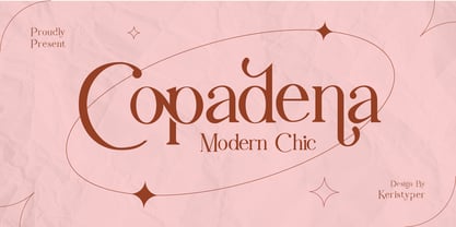 Copadena is a stylish font that is a Modern - Chic, it's an elegant and unique font. This font is good for logo design, Social media, Movie Titles, Books Titles, short text even long text letters, and good for your secondary text font with sans or serif. **Featured:** * Standard Uppercase & Lowercase * Numeral & Punctuation * Multilingual : ä ö ü Ä Ö Ü ß ¿ ¡ * Alternate & Ligature * PUA encoded We recommend programs that support the OpenType feature and the Glyphs panel such as Adobe applications or Corel Draw. so you can use all the variations of the glyphs. Hope you enjoy our fonts!
 - Bocfer by Brenners Template,
$19.00 Designed by Ryul Davidson, this typeface is a special style for designers who prefer a sense of space and differentiation in the layout system. It applies a design concept that continues the modern and contemporary grotesque lineage. And, It adopts a somewhat low x-height system and has a classic and sophisticated balance. As the height of lowercase letters is lowered, more differentiated and rhythmic typography can be realized, and it showcases a wide range of coverage from offline publishing to display areas. The elaborately optimized kerning system is a good choice for designers who prefer more professional logos and editorial designs.
 - Core Sans E by S-Core,
$29.00 The Core Sans E family is part of the Core Sans series, such as Core Sans N, Core Sans M, Core Sans A, Core Sans G and Core Sans D. This is a modernized, grotesque font family with horizontal terminals, low-stroke contrast, enclosed apertures and little-line-width variation. Its tall x-height makes the text legible; and the spaces between individual letter forms are precisely adjusted to create the perfect typesetting. The Core Sans E family consists of 9 weights, from Thin to Black with italics. It supports WGL4, which provides a wide range of character sets—Greek, Cyrillic, and Central and Eastern European characters. Each font includes support for tabular numbers, arrows, mathematical operators, and OpenType features (such as proportional figures, numerators, denominators, subscript, superscript, scientific inferiors, fractions, case features, and standard ligatures). We highly recommend it for use in books, web pages, screen displays, and so on.
 - PF Lindemann Sans by Parachute,
$49.00 Lindemann Sans is an immediately-inviting typeface with a pleasing distinct visual voice grounded by geometry and golden proportions. This modern geometric san serif typeface serves the interpretive needs of modern design through its legibility. This legibility is achieved through proportional balance of each letter based on the golden ratio, open counters, high x-height and wider individual shapes. In addition, a high level of legibility is arrived through distinctive glyphs like a, e, @, and f, which are engaging and add to Lindemann Sans visual voice. Being a modern, spirited, tech-savvy typeface, Lindemann Sans has many of the features demanded by today's designers. These features include 800 characters within each font, many ligatures, full numbers sets, small caps, alternative characters and other niceties found in opentype fonts. Due to Lindemann Sans high legibility, geometric sans tradition, and a large feature set list, it is a very versatile typeface and can be used in replacement of the more commonly used sans. Specifically, Lindemann Sans can be used by technology corporations, architectural firms in their supporting materials, in magazines as headers and key-points, as the typeface for professional keynotes, for the package design industry as a whole, in automotive concept projects, and for cosmetic branding for high class hair products. With its inviting nature it may also be used for liberal arts promotional materials. In addition, this typeface can be used by green industries because of its nature derived proportions. Each style and weight of Lindemann Sans adheres to the same geometric and golden proportions, however, each weight is innately noteworthy. For example, there is a charm that is found in the ultralight weight's elegant geometry and lights impressive use as oversized headlines. It shines with true clarity of vision with the book weight and the versatility of the medium. One cannot overlook the power and pacing of the bold and extra bold weights with its clear counters and restrained letter forms. Within Lindemann Sans family each weight has a distinctive role to play but stays true to its purpose.
 - Vox Round by Canada Type,
$39.95 Vox Round is the softer version of the Vox family. The original brief for Vox was a extensive monoline typeface that can be both precise and friendly, yet contain enough choice of seamlessly interchangeable variants for the user to be able to completely transform the personality of the typeface depending on the application. Basically, a sans serif with applications that range from clean and transparent information relay to sleek and angular branding. When the first version of Vox was released in 2007, it became an instant hit with interface designers, product packagers, sports channels, transport engineers and electronics manufacturers. This new version (2013) is the expanded treatment, which is even more dedicated to the original idea of abundant application flexibility. The family was expanded to five weights and two widths, with corresponding italics, for a total of 20 fonts. Each font contains 1240 glyphs. Localization includes Cyrillic and Greek, as well as extended Latin language support. Built-in OpenType features include small caps, caps to small caps, four completely interchangeable sytlistic alternates sets, automatic fractions, six types of figures, ordinals, and meticulous class-based kerning. This kind of typeface malleability is not an easy thing to come by these days.
 - Billock by Alit Design,
$19.00 Presenting the Billock Script font by alitdesign. The Billock script font is inspired by the strokes of a highlighter marker that has a bold square character combined with a dynamic signature script style. Combined with the concept of bright and neon colors, the design of the Billock font becomes more sporty and modern. This Billock script font is very suitable to be the latest collection of your font library, because it has many and very unique swashes and alternatives that make the designs you will make look different and cool. The Billock Script font is perfect for magazine cover designs, brochures, flyers. Instagram ads, Canva Design and so on with unique and modern concepts. besides that this font is very easy to use both in design and non-design programs because everything changes and glyphs are supported by Unicode (PUA). The Billock Script contains 887 glyphs with many unique and interesting alternative options. Language Support : Latin, Basic, Western European, Central European, South European,Vietnamese. In order to use the beautiful swashes, you need a program that supports OpenType features such as Adobe Illustrator CS, Adobe Photoshop CC, Adobe Indesign and Corel Draw. but if your software doesn't have Glyphs panel, you can install additional swashes font files.
 - Stabile by PintassilgoPrints,
$26.00 Stabile is a rather stylish casual font with loads of good vibes and alternates: there are four glyphs for each letter, two for each numeral plus swashes to this side and the other. Two for each side, in fact. It's a flexible font that looks unique and quite distinctive, with its charming uneven look that gets even more uneven when Contextual Alternates are turned on. Stabile family brings a delish accompanying font, Stabile Toys, packed with organic shapes inspired by the breathtaking work of the american artist Alexander Calder. These play together deliciously well, you can bet. Are you prepared to balance them? Enough reading, then, just go ahead! A couple quick notes on usage: . Go with Contextual Alternates to instantly cycle glyphs. Eye-catching results guaranteed! . Swash feature turns on (guess what...) swashes. But there's always alternative swashes, like to this side going up or to this side going down, that side up or down, so it's cool to pick your choices through a glyphs palette.
 - Wild Thing by ITC,
$29.99Wild Thing was created by British designer Martin Wait and appeared in the ITC library in 1995. The forms look as though they are normal alphabet figures viewed through swirling water, wavy and irregular. Wild Thing is a font which is always moving and is perfect for fresh new designs. - DEXTER by Type Innovations,
$39.00 Dexter is an original new typeface creation by Alex Kaczun. It is a warmer, more sophisticated grotesque that is both fun and interesting. Its tight letter spacing and narrow proportions make the typeface particularly well suited for display sizes and headlines. This intriguing sans with distinctive letter shapes is typical for display fonts of the late 19th and early 20th centuries. Dexter is ideal for titles and headlines looking for impact and style. Dexter is also an excellent choice for magazines, books, posters, brochures, flyers, etc. The large Pro font character set, which supports most Central European and many Eastern European languages, also includes a corresponding small caps font along with old style figures.
 - Steampunk by Kustomtype,
$25.00 The Steampunk font is inspired on sixties hand lettered French movie poster of Charles Bronson. This style of type is instantly associated with advertising and design for high-end products with a touch of Arts & Crafts. Steampunk is carefully drawn for quality and readability. Steampunk is great for display, logos, branding, packaging, advertising, food, sports, titles, film, tv, and more. Steampunk comes in 2 styles witch match perfectly together. Steampunk is a great display family with roots in the past century advertising and sign painting industry, and no wits but smooth polished wit hall the features a good designer needs. Steampunk is designed by Coert De Decker in 2018 and published by Kustomtype Font Foundry.
 - Transcend by Monotype,
$31.99 Transcend has been designed specifically for titling and branding purposes. This 8-font, all caps typeface is packed with OpenType features including discretionary ligatures and alternates that – when used subtly – help you to create distinctive headline typography. Transcend aims to be “The Ultimate Titling Typeface”. This typeface is an exploration of my own “Carrig” from 2014. I have evolved its core personality and embellished it by means of crisp, sharp lines and serifs, adding stylised ink traps/notches, as well as carefully considered swashes, flourishes, and ligatures that add a touch of class and refinement to every word you type. Key features: • 8 weights – Thin to Ultra • Alternates, Discretionary Ligatures, and Old Style Figures • European Character Set – Latin Only • 600+ glyphs per font.
 - Ankormati by Taznix Creative,
$17.00 Ankormati Is a font with a touch of classic Victorian era style with bold letters wrapped in small ornaments that add to the feel of the Victorian era, but here it makes the look of this font with a colorful retro feel, not really like the old Victorian era design. But this can be tailored to the desires of your design needs, This font fits perfectly with the retro vintage style which will add classic value to your designs. What's Included : Standard glyphs Ligature Works on PC & Mac Simple installations Accessible in the Adobe Illustrator, Adobe Photoshop, Adobe InDesign, even work on Microsoft Word. PUA Encoded Characters - Fully accessible without additional design software. Fonts include multilingual support for; ä ö ü Ä Ö Ü ß ¿ ¡ Hope you enjoy with our font! Taznix
 - Zanna by Valentino Vergan,
$16.00 Zanna is a modern typeface with lots of style and elegance. The Zanna typeface was inspired by the high contrast Didot look, which has been synonymous with fashion for decades. The Zanna typeface also has a very thin hairline and short non-bracketed serifs, which gives it a nostalgic and modern look. The Zanna typeface comes in two styles Regular and Stencil, each style has an oblique version. The Zanna typeface has over 140 ligatures and alternate characters, this makes it perfect for creating modern and elegant feminine logos. With so many ligatures and alternates characters to choose from, you can definitely create stunning designs for your brand or clients. The Zanna typeface can be paired with a beautiful minimal sans serif or light script font, this combination will make your next project look elegant and classy. The Zanna typeface is very versatile and can cover a wide range of project such as: fashion branding, mastheads, magazines, feminine logos, facebook banners, wedding invitations, Instagram posts, websites, blog posts, pull quotes, editorials, product packaging, trendy social media posts, advertisements and much more. If you are looking for something modern, nostalgic and chic for you next project, Zanna is the font for you. What you get: Zanna Regular.otf Zanna Oblique.otf Zanna Stencil.otf Zanna Stencil oblique.otf Zanna includes a full set of: Uppercase and lowercase letters. Numbers. Punctuation. Ligatures. Alternate characters. Small Caps. Multilingual symbols. We hope you enjoy using the Zanna typeface.
 - Oita by insigne,
$- Oita might be a carefully crafted typeface family, created by a meat-bag human. Or, it might have been made by a supremely clever sentient robot. Found in the dark recesses of a top secret spy agency’s quantum computer, this font came with this somewhat unusual description, which is presented without comment. "To conquer, we cannot simply overcome. Success is found in supremacy--in the dominance of Oita. While looking for the right tool for this success, our research has led us to the finely executed forms found of military domination throughout history. In our labs, we've used our specialized machines to harness these forms' power and refined their impact through elements of contemporary and computer design. The structure proves to be robotic and squared on its edges. However, the chutzpah of this technical face still allows it to pass as if created by human hands. Our resulting payload, Oita, is modern and sturdy. While based on a practical, octagonal structure, make no mistake; this new instrument will drive forward the energy you want to push through your projects. Oita has 42 cuts certain to encompass your designs on world domination. Each font contains the glyphs to support over 52 languages. The font also includes tabular and lining figures, numerous ligatures, and selected advanced Opentype options, including stencil and experimental options to bring out the dynamic characteristics that have already been crafted into Oita. Early tests have found that the new instrument is easily scalable to smaller dimensions without reducing its impact. The font remains highly readable across a variety of applications. We speculate from our findings that it will be successful for sporting and technical applications. So for you who venture to use Oita, use it boldly. Don't just overcome. Dominate. Go and conquer mightily with Oita. We'll be watching." We may never know whether Oita hails from mind or mechanism. What we do know is that, should you choose to take on Oita, you'll be acquiring a dynamic poster and packaging face, a minigun-toting bad robot of a font that exudes pace and power.
 - Autoray by PizzaDude.dk,
$16.00 Usually fonts that are related to computers, space, future are not handmade, but rather digital made. Autoray is 100% handmade, and I am not sure which category it fits in. It has this futuristic and intergalactic look, but at the same time the handmade details are pointing in a more grafitti and comic way. I will let you decide where to go with Autoray! I have added 5 different versions of each letter, and they automatically changes as you type - and of course, there's multilingual support - and even intergalactic gravity! :)
 - FF Dagny by FontFont,
$68.99 Swedish type designers Örjan Nordling and Göran Söderström created this sans FontFont in 2009. The family has 12 weights, ranging from Thin to Black (including italics) and is ideally suited for editorial and publishing, logo, branding and creative industries, poster and billboards, software and gaming as well as web and screen design. FF Dagny provides advanced typographical support with features such as small capitals, case-sensitive forms, fractions, super- and subscript characters, and stylistic alternates. It comes with proportional lining, tabular oldstyle, and tabular lining figures. In 2011, FF Dagny received the ISTD award.
 - Anicon Sans by NREY,
$19.00 Anicon Sans font family consist of 18 weight: from Thin to Black, each weight paired by italic. Also including Latin & Cyrillic language support with more than 35 languages. Anicon is a superfamily, semi condensed sans serif and slab serif with humanistic forms in the characters. This font was crafted with the intention to present clean, legible, multipurpose characters that are easy to read wether it's on screen or print. Fit for all purposes; text, display, headline, print, corporate identity, logo, branding, product, infographic, photography and other applications and medium.
 - Neue Latein by Spirit & Bones,
$33.00 This sans serif font carries the flair and mood our Schneidler Latein font family. The calligraphic appearance and the human sound are evident thanks to the preservation of some significant broad edged pen elements. The forms are reduced to the subtle level where they are simplified, but the essence still remains. The expressive and artistic expression of the Schneidler Latein continues to work like a background melody. Together they build a superfamily that works perfectly in combination with each other. More weights will follow soon.
 - Diecast by Device,
$39.00 A companion piece to Mulgrave, this font is the intermediary design between the chunky Victorian style that Mulgrave reproduces and the Ministry of Transport sans introduced in 1933 and digitised as Ministry. Although they date from between 1910 and 1933, these signs show the beginnings of several features Ministry later incorporated, notably the thinner strokes and the more modern forms of the G, M, R and S. The letter widths are approaching a monospace - the L, F and E are relatively wide compared to the W and M, a feature that may have something to do to the casting process. These idiosyncracies were all ironed out when the first version of the MOT alphabet was produced. The Device digitization, as with Mulgrave, stays true to the worn and repainted original metal source material and preserves the unusual widths.