10,000 search results
(0.078 seconds)
- Barjiah by Letterena Studios,
$9.00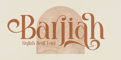 Barjiah is a stylish serif font that has modern and unique elements. It is perfect for creating luxurious logos, book or movie title designs, fashion brands, magazine covers, clothes, lettering, quotes, and so much more. This font is PUA encoded which means you can access all of the glyphs and swashes with ease!
 - Hallo Skull by Letterara,
$14.00 Hallo Skull is a fun friendly and spooky display font. It is suitable for each of your party designs or Halloween creation. Add it to your creative Halloween-themed ideas and notice how it makes them stand out! This font is PUA encoded which means you can access all of the glyphs.
 - Sugary Pancake by Hanoded,
$15.00 Sugary Pancakes - ahh, my kids love them. We don't make them too often, as they are 'energetic' enough as it is. This calorie-rich font is ideal for Children's Books and posters: it is fun, bouncy, very legible and full of character. Comes with a topping of diacritics and a stack of happiness.
 - Rain Love by Jehansyah,
$15.00 Rain Love is an elegant and modern script font with a luxurious feel. It is suitable for all titles or large writing, e-mail, magazines, book titles, movies, notes, brands, logos, and much more. This font is PUA encoded, which means you can access all of the glyphs and swashes with ease!
 - Filiya by Anastasia Kuznetsova,
$19.00 Say hello to 'Filiya'! This is a funky hand-drawn handwritten font, perfect for all your holiday designs!! Add some retro fun using the 'Filiya' font inspired by the 70s font! This font is perfect for all your retro designs, procreate designs, social media, shirts, stickers, branding, logos, prints, Cricut designs, svg designs and more! This font includes a basic set of retro letters from A to Z, as well as some fun festive Christmas themed letters. Create, enjoy and create your own unique image! 'Filiya' is available in five versions! The kit includes - regular, contour, shadow, luminous and doodle!! Font Features: - A-Z; a-z character set; - 1 language (English); - numbers and punctuation marks, symbols. Fonts can be opened and used in any software that can read standard fonts, even in MS Word. No special software is required to get started. It is recommended to use it in Adobe Illustrator or Adobe Photoshop. Made with love and magic ♡ Thank you for reading it, and do not hesitate to send me a message if you have any questions! ~ Anastasia
 - FS Kim by Fontsmith,
$80.00 Unconventional beauty FS Kim is bold and intriguing – exuberant and unmissable, but playing a supporting role when needed. This typeface shines brightest as a display font, and is perfect for applications across fashion, theatre, cultural projects and pretty much any brand that wants to make a statement. While FS Kim is dramatic, it’s incredibly versatile, too, and works to showcase content in a stylish, striking way. This font makes you look, and makes you curious – perfect for brands and publishers that relish unconventional beauty. A playful text version While FS Kim’s text version is more constrained than the display, the strength and playfulness remain. Modifications for the text version include larger x-heights, longer ascenders and descenders, wider proportions and spacing, longer and more defined serifs and a lower contrast. “The overall idea is that it’s not an optical size,” Radoeva explains. Text and display maintain a strong connection that mean they can be used together. A display with a twist The calligraphic starting point helped to create familiar forms, while a contemporary display feel is achieved through short wedge serifs, with bold touches added through the font’s exaggerated forms and details. FS Kim’s narrow proportions, short ascenders and descenders, and tighter spacing make the font suitably compact for display use. The overall aesthetic feels bold and sharp, but closer inspection reveals that all the corners are softened. Decorative inlines In an unusual twist, FS Kim’s display version was first drawn using a broad-nib pen to create familiar forms and elegance while still breaking from serif traditions and making it all about standout character. There are also two additional styles, based on the Regular and Black with inlines – in uppercase, figures and symbols. The inline brings an extra option for an even stronger, more decorative display use.
 - FS Kim Variable by Fontsmith,
$349.99Unconventional beauty FS Kim is bold and intriguing – exuberant and unmissable, but playing a supporting role when needed. This typeface shines brightest as a display font, and is perfect for applications across fashion, theatre, cultural projects and pretty much any brand that wants to make a statement. While FS Kim is dramatic, it’s incredibly versatile, too, and works to showcase content in a stylish, striking way. This font makes you look, and makes you curious – perfect for brands and publishers that relish unconventional beauty. A playful text version While FS Kim’s text version is more constrained than the display, the strength and playfulness remain. Modifications for the text version include larger x-heights, longer ascenders and descenders, wider proportions and spacing, longer and more defined serifs and a lower contrast. “The overall idea is that it’s not an optical size,” Radoeva explains. Text and display maintain a strong connection that mean they can be used together. A display with a twist The calligraphic starting point helped to create familiar forms, while a contemporary display feel is achieved through short wedge serifs, with bold touches added through the font’s exaggerated forms and details. FS Kim’s narrow proportions, short ascenders and descenders, and tighter spacing make the font suitably compact for display use. The overall aesthetic feels bold and sharp, but closer inspection reveals that all the corners are softened. Decorative inlines In an unusual twist, FS Kim’s display version was first drawn using a broad-nib pen to create familiar forms and elegance while still breaking from serif traditions and making it all about standout character. There are also two additional styles, based on the Regular and Black with inlines – in uppercase, figures and symbols. The inline brings an extra option for an even stronger, more decorative display use. - Brown Marlyn by Ergibi Studio,
$20.00 This is the perfect combination of fonts, we are proud to introduce BROWN MARLYN, these fonts are of two types serif and script. Display Serif inspired by famous logo, This typeface has been made carefully to make sure its premium quality and luxury feel. The ligatures on serif makes this typeface unique and stands out rather than the regular serif font, perfectly for headlines, wedding, social media, logos, posters, packaging, T-shirts,coffee shops, restaurants, magazine’s headers, signs or gift/post cards,cafe’s and weddings or any type of advertising purpose. What's Included : Standard glyphs Ligatures International Accent Works on PC & Mac Simple installations If there is a problem, question, or anything about my fonts, don't hesitate to ask! Big Thanks ~ Ergibi Studio
 - Heather Flourish by Krntype Studio,
$18.00 Introducing Heather Flourish font Heather Flourish is a signature font created to impress an elegant and luxurious look Heather Flourish is perfect font for branding & logo projects, such a photography studio, clothing/fashion studio, also suitable for Product Packaging, Title on your article or book cover, Stationary, and many more. this font has a ligature and swash which you can access by typing the letters a-g You can try it first by typing the name you want below, I hope you can create amazing custom personal signature or logo with this font you can buy this font at https://www.myfonts.com/foundry/krntype-studio/ Enjoy the font, feel free to comment or feedback, send me PM or email at krntype@gmail.com. Thank you!
 - Shalyne Typeface by Krismagraph,
$19.00 Introducing the Shalyne Typeface. This luxury and timeless italic serif is perfectly designed with Ligature & Alternates . can make your lettering/logotype become more attractive. The clean and neat serif combined with the alternate & ligatures makes this font very attractive. This font is perfectly made to be applied especially in logos, and other various formal forms such as invitations, labels, logos, magazine headers, books, greeting/wedding cards, Clothing Branding, product packaging, fashion, makeup, quotes, stationery, novels, cutting, labels and advertising purpose. Features : uppercase & lowercase numbers and punctuation multilingual ligatures stylistic alternates PUA encoded We highly recommend using a program that supports OpenType features and Glyphs panels like many Adobe apps and Corel Draw so that you can see and access all Glyph variations. Thanks & Happy Designing!
 - Figgins Antique by HiH,
$12.00 “Hey, look at me!” cried the new advertising typefaces. With the nineteenth century and the industrial revolution came an esthetic revolution in type design. Brash, loud, fat display faces elbowed their way into the crowd of book faces, demanding attention. Those who admired traditional book types harumphed and complained. Robert Thorne had fired the opening round with his Fatface. With the cutting of Figgins Antique, the battle was well and truly joined. Job printing came into its own and it seemed like everything changed. The world of printing had been turned upside down and the gentile book-type aficionados recoiled in horror much as the rural landed gentry recoiled at the upstart middle class shopkeepers and manufacturers. William Savage, approvingly quoted by Daniel Berkeley Updike over a hundred years later, described the new display faces as “a barbarous extreme.” These were exciting times. According to Geoffrey Dowding in his An Introduction To The History Of Printing Types, “The types which we know by the name of Egyptian were first shown by Vincent Figgins in his specimen book of 1815, under the name Antique.” Of course, dating the design is not quite as simple as that. Nicolete Gray points out that Figgins used the same “1815” title page on his specimen books from 1815 to 1821, adding pages as needed without regard to archival issues. As a result, there are different versions of the 1815 specimen book. In those copies that include the new Antique, that specific specimen is printed on paper with an 1817 watermark. The design is dated by the 1817 watermark rather than the 1815 title page. Figgins Antique ML is an all-cap font. This typeface is for bold statements. Don't waste it on wimpy whispers of hesitant whimsies. And please don't use it for extended text -- it will only give someone a headache. Think boldly. Use it boldly. Set it tight. Go ahead and run the serifs together. Solid and stolid, this face is very, very English. FIGGINS ANTIQIE ML represents a major extension of the original release, with the following changes: 1. Added glyphs for the 1250 Central Europe, the 1252 Turkish and the 1257 Baltic Code Pages. Added glyphs to complete standard 1252 Western Europe Code Page. Special glyphs relocated and assigned Unicode codepoints, some in Private Use area. Total of 331 glyphs. 2. Added OpenType GSUB layout features: liga and pnum. 3. Added 86 kerning pairs. 4. Revised vertical metrics for improved cross-platform line spacing. 5. Redesigned mathamatical operators. 6. Included of both tabular (standard) & proportional numbers (optional). 7. Refined various glyph outlines.
 - Typical Pro by Typicaltype,
$25.00 Get ready for a modern spin on your typographic projects with the Typical Pro Sans Serif Font 9 Weight. This font offers a clean, grotesk feel that is perfect for any technical or heading design. Its contemporary design makes a perfect choice for projects with a modern flair. With clean lines, tight letter spacing, and a classic sans serif style, this font is sure to bring a unique edge to any project. Enjoy the perfect mix of texture and proportion with this modern font. Get ready to take your typography to the next level with Typical Pro Sans Serif Font 9 Weight. Typical Pro Sans Serif Font is a grotesk typeface of modern design, with technical precision and a clean finish. Its 9 weight offers clear and refined letters that provide perfect legibility for headlines and other text styles. Its line height is consistent and balanced, making it suitable for producing high-impact visual messages. Its modern, straightforward letterforms give projects an air of sophistication, while retaining a firm technical backbone. With nine different weights, it is the perfect choice for any heading or label that requires a strong, contemporary look.
 - Mencken Std by Typofonderie,
$59.00 An American Scotch remixed in 27 fonts Mencken has twenty seven styles, divided into three widths, three optical sizes, romans and italics. Generally, optical size typeface families belong to a same common construction. It falls into the same category of type classification, while presenting different x-heights or contrasts. Mencken is unique because it is designed according to different axis and optical sizes. Firstly, Mencken Text is a low-contrast transitional typeface, designed on an oblique axis, asserting horizontal with featuring open counters. Its capitals follow Didots to better harmonize the rest of the family. On the other side of the spectrum, Mencken Head (and narrow variations) is designed on a vertical axis, high contrast, in a contemporary Didot style. The Mencken is therefore a typeface answering to different sorts of uses, whose design is different according to its uses: from oblique axis in small size to vertical axis in large sizes. Vertical proportions (x-height, capitals height, etc.) were calibrated to be compatible with many Typofonderie typeface families. Lucie Lacava and I followed the idea launched by Matthew Carter few years ago for some of his typefaces intended for publications. From Baltimore Sun’s project to Typofonderie’s Mencken It is a bespoke typeface for American newspaper The Baltimore Sun started at the end of 2004 which marks the beginning of this project. The story started with a simple email exchange with Lucie Lacava then in charge of redesigning the American East Coast newspaper. As usual, she was looking for new typeface options in order to distinguish the redesign that she had started. At the time of its implementation, a survey of the newspaper’s readers has revealed that its previous typeface, drawn in the mid-1990s, was unsatisfactory. The Mencken was well received, some reader responses was particularly enjoyable: “It’s easier to read with the new type even though the type is designed by a French.” Why it is called Mencken? The name Mencken is a tribute to H. L. Mencken’s journalistic contributions to The Sun. According to the London Daily Mail, Mencken ventured beyond the typewriter into the world of typography. Because he felt Americans did not recognize irony when they read it, he proposed the creation of a special typeface to be called Ironics, with the text slanting in the opposite direction from italic types, to indicate the author’s humour. Affirming his irreverence, the Mencken typeface does not offer these typographic gadgets. Henry Louis Mencken (1880 — 1956) was an American journalist, satirist, cultural critic and scholar of American English. Known as the “Sage of Baltimore”, he is regarded as one of the most influential American writers and prose stylists of the first half of the twentieth century. He commented widely on the social scene, literature, music, prominent politicians and contemporary movements. Creative Review Type Annual 2006 Tokyo TDC 2018
 - Crafting Island by Tigade Std,
$20.00 Crafting Island. You are right!! This font that is intended for the crafting world (not only island). This is a cute, happy, sweet font that is suitable for any theme or seasonal use. It can enhance your crafting products for a better look. It comes with some alternate glyph that are accessible via All Alternate (easy access by using Adobe Illustrator or Photoshop). It is suitable for Logo, Cards, Branding, Social Media, YouTube Thumbnail, Advertisement, Posters, any many others. Features: - Standard Characters (Uppercase and Lowercase) - Numerals - Punctuation - International Characters - Ligatures - Alternate Characters Extras: - Crafting Island Paintbrush Style - Crafting Island Flower Style Disclaimer: Clips arts shown in the posters/images are not included. It is for promotional purpose. Enjoy designing and stay safe! Tigadestd
 - Los Lana Pro by Latinotype,
$39.00 Los Lana Pro is a handmade display typeface. Unlike other font families, this type has not a modular structure, that is, each character has been individually designed. The coherence of structure elements across different characters is given by irregular strokes. This curveless typeface is perceived as being curved because of its straight lines, which form different-size angles. Los Lana Pro is a rustic typeface that captures the stereotypical “Andean hippie” handmade aesthetics. Irregular shapes and broken lines give it a distinct personality. Los Lana Pro looks better in larger sizes. Includes many ligatures, two groups of alternate characters, and titling caps characters. Languages include: Basic Latin, Western European, Euro, Catalan, Baltic, Turkish, Central European, Romanian and Pan Africa Latin. Photos by Sergio Recabarren.
 - DF Dejavu Pro by Dutchfonts,
$39.00 This font is an orphanage where all the beautiful details of classical grotesque typefaces from the early twentieth century are gathered, and thus living together, are forming a ‘new’, happy family. The aim was to collect my favorite characters in one font. The start was an eclectic collection orientated on British types from the Caslon Doric No. 4, the Monotype Grotesque, the Gill, the Franklin Gothic up to the Transport. In this amalgamation I avoided the narrow apertures in the ‘e’, ‘c’ and in the numerals ‘5’, ‘6’ and ‘9’ and enlarged the x-height dramatically. To the classical slanted form of the italics I added real italic forms for ‘a’, ‘e’ and ‘g’ in order to obtain a more distinguished italic style. DF-Dejavu Pro supports all Latin-based languages (Western, Central-European, Eastern-European, Baltic and Turkish) and includes small capitals, ligatures, inferior & superior numerals and letters, fractions, various numeral styles: proportional lining, tabular lining, proportional old-style, tabular old-style and last but not least a slashed zero.
 - GOBAH by Product Type,
$15.00 Welcome to Gobah, a font that presents the future atmosphere in an amazingly modern and futuristic style. Are you looking for the perfect solution for modern, futuristic, sci-fi, and future-themed projects? Gobah is the right choice. Gobah is a font that transports you to an extraordinary world with a unique look that reflects a sophisticated future feel. Each letter is uniquely designed, giving your project a modern, innovative, and charming look. With Gobah, you can steal the show and create an unforgettable impression. The main benefit of Gobah is its ability to deliver stunning styles. Each letter has an exclusive design, creating an eye-catching futuristic look. This font will give your projects a strong visual appeal, reinforcing the message you want to convey. Gobah also supports multilingualism, allowing you to display text in multiple languages without a hitch. This flexibility ensures that you can easily reach a global audience and convey your message with consistent clarity across cultural contexts. Take a step forward in your design with Gobah. This font will give a stunning modern and futuristic twist, creating a memorable impression on your logos, posters, and web presence. Let Gobah be the right choice for your vibrant, modern, futuristic, sci-fi, and future projects.
 - Kattelo by Malindo Creative,
$10.00 Introducing, Kattelo is a beautiful retro style font, with a Kattelo giving a touch of attractive design typography, Kattelo is one of the handwriting projects. It was very inspired by the famous retro typography design. Kattelo also comes with the Extruded Font version. So you don’t need extra effort to make the effect repel for this font,with Kattelo you can create many design styles. Kattelo is also equipped with 514 Glyphs, and also features OpenType. The Features includes: Stylistic Alternates, Swashes, Ligatures, and Stylistic Set.Extrude,and You can pick the alternate for all style Kattelo has given PUA encoded (fonts with special code). This Font Equipped: -Uppercase -Lowercase -Figures & Punctuation -Stylistic Alternatives -Ligatures -Extruded for All Glyph -Language Support To enable the OpenType Stylistic alternates, you need a program that supports OpenType features such as, Adobe Indesign,Adobe Illustrator CS & CorelDraw X6-X7, Microsoft Word 2010 or later versions. How to access alternate glyphs? you can see it on this link goo.gl/1vy2fv If There Any questions, Please Let Me Know,Contact Me,At malindocreative@gmail.com,Your support and suggestion is needed, And I am Happy To Help You. Thank you for your kindness and support,Hopefully Useful,And Good Luck For You.
 - Krul by Re-Type,
$99.00 ‘Krul’ is a typographic interpretation of the lettering style created by Dutch letter painter Jan Willem Joseph Visser at the end of the 1940s, which decorated the traditional brown bars of Amsterdam. In the beginning, these letters were strongly associated with the pubs connected to the Amstel brewery, given that Visser was the company’s official painter. As the years passed, the style became increasingly popular, and various business owners in Amsterdam and other Dutch and Belgian cities also commissioned its use. In the 1970s and 1980s, Leo Beukeboom, another talented letter painter, continued and expanded this lettering tradition while employed under the Heineken brand. Much of his work can still be found in the Jordaan and De Pijp neighborhoods in Amsterdam. The Amsterdamse Krulletter, or Amsterdam’s curly letter, is strongly inspired by the calligraphic works of the 17th century Dutch writing masters, of which Jan van den Velde was a central figure. However, distinct characteristics of this style, for example, its unusual and beautiful ‘g’, originate from a model that was published by Johannes Heuvelman in 1659, which J. W. J. Visser referenced. Typographic circles have somehow overlooked the Amsterdamse Krulletter and its heritage. The Dutch calligraphic hands preceded and influenced the formal English penmanship which has inspired numerous typefaces in the Copperplate style. In contrast, the models from van den Velde, Heuvelman, and Jean de la Chambre, among others, are a missing chapter in Dutch typographic history, and had never been turned into typefaces until now. Conscious of the cultural and identity issues that arise in reviving a unique style, and concerned about the speed with which the lettering style was disappearing, Ramiro Espinoza focused the project of designing ‘Krul’ on digitally recreating the calligraphic complexity of these beautiful letters. Created through several years of research, ‘Krul’ is not a direct digitization of the Amsterdamse Krulletter, but instead, an interpretation that incorporates numerous alternative characters absent in the original model, and improves upon details where necessary, resulting in an optimal performance on the printed page. The typeface is presented in Open Type format, with an abundance of intricate ligatures, fleurons, and swashes, which permit the creation of numerous calligraphic effects. The very high contrast and rhythm of the strokes in this typeface make it especially suited for media applications conveying a sense of elegance and sophistication. Designers of feminine magazines, advertisements, and corporate identities within the fragrance and fashion industries will find in this typeface to be an extremely useful and appropriate resource.The great Amsterdamse Krulletter is finally back, and we are proud to make it available to you.
 - Lavoza by Alit Design,
$22.00 Presenting the LAVOZA typeface from alitdesign. LAVOZA font is designed by combining a slant blackletter font with a classic serif font style. The Lavoza font is inspired by a classic roman design that we apply modern elements according to current trends. This bold classic concept will create a design that is frightening but still looks modern and elegant. The Lavoza font is perfect for the design of young people who dare to be different and unique from the current trending design concept. Lavoza font is highly recommended to be a collection of fonts for current or future design creation. LAVOZA is perfect for magazine cover designs, brochures, flyers. Instagram ads, Canva Design and so on with unique and modern and brave concepts. besides that this font is very easy to use both in design and non-design programs because everything changes and glyphs are supported by Unicode (PUA). The "LAVOZA"contains 587 glyphs with many unique and interesting alternative options. Language Support : Latin, Basic, Western European, Central European, South European,Vietnamese. In order to use the beautiful swashes, you need a program that supports OpenType features such as Adobe Illustrator CS, Adobe Photoshop CC, Adobe Indesign and Corel Draw. but if your software doesn't have Glyphs panel, you can install additional swashes font files.
 - Dharma Gothic P by Dharma Type,
$19.99 Dharma Gothic P font family is designed based on Dharma Gothic and a distressed offshoot from the original. The glyphs that damaged by printing the original had been tweaked by hand work with great care. This family contains basic Roman, Italic, Bold and it’s Italic to suit a wide range of creative works. g, r & y have their alternative glyphs that can be used with OpenType salt feature. This font will be one of the most powerful solutions for printing and web.
 - Invocation AOE by Astigmatic,
$19.95 Made from a simple font incantation, the Invocation typeface was born. Inspired by an old Atari game called Necromancer where trees uprooted and came after the wizard, or something like that. The end result, a thematic typeface spawning roots. On darkened night, the moon eclipsed, a cryptic verse does pass my lips, from ancient parchment, edges worn, this Invoctation font is born... Sometimes we need an evil look for our designs, so why not summon this typeface into your hands today!
 - Xander by Monotype,
$29.99Based on the handwriting of the eminent Dutch typographer Alexander Verberne, Julius de Goede's Xander typeface manages to be both sophisticated and whimsical. This monoline connecting script dances across the page with the grace of a ballerina. An accomplished graphic designer and writer of more than 20 books on calligraphy, de Goede's lettering skills are evident in this careful translation of casual handwriting into a lighthearted, affable typeface family. Like a warm breeze on a spring day, Xander is fresh and welcome. - Funny Toons by Indian Summer Studio,
$20.00 Soft, funny round cartoon display font containing 500+ glyphs, Diacritics, Ligatures, Fractions in Latin, Cyrillic and Greek. Made entirely after Ekke Wolf's Greek 'rho' letter's idea in Runde Wien: — Damn, it's funnier than every [cartoon] mouse, duck and everything. — The source letter for a whole special typeface — with own funny happy mood. — As I see, it's the decent respected well-mannered sans. And this 'rho' is the source for the completely different Funny Toons display type. Just found it around this brilliant oval.
 - Settikef by Twinletter,
$14.00 Settikef is a handwritten script font with cute and cute nuances but still beautiful and elegant. This font is great for you to use as a title in your designs as well as great for writing names and words. and to be sure this font is not only limited to that purpose but also very special for every need of your project, be it a formal or non-formal project, this font is still beautiful and elegant. start creating awesome designs with this font! This charming font also offers the beauty of abstract typography harmony for a wide variety of design projects, including digital natural handwriting for designs, quote designs, for social media business designs, advertisements, trademarks, food and beverage promotion banners, text, posters, a signature, and all designs require handwriting or whatever design you want. This font is equipped with uppercase, lowercase, numbers, punctuation marks, swhases and several variations on each character including multi-language. ================================================== This font is best suited for open type friendly applications. How to get alternative glyphs from open type fonts: http://adobe.ly/1m1fn4Y PUA Character Code - Fully accessible without additional design software. do not hesitate anymore start using this font. and Feel free to send any message you want to convey.
 - Technopen JNL by Jeff Levine,
$29.00 At first glance, the lettering style of Technopen JNL seems to emulate the computer-age fonts of the 1980s. In actuality, this font is derived from an alphabet sample found in an instructional booklet for the Esterbrook Drawlet Pens. The Drawlet line was Esterbrook's answer to the iconic Speedball pen points sold through their chief competitor, the Hunt Pen Manufacturing Company. So, what seems to be late 20th Century typography is actually from vintage source material. In fact, the entire contents of the instructional booklet were copyright 1929! A few minor changes were made to the original A-Z alphabet and additional characters were added. The name Technopen is a shortening of the term 'technical pen', which is both a nod to the techno age of the 80s and the technical instruments of the past utilized for drawing and lettering.
 - Maybe by Twinletter,
$14.00 Introducing our new Font called Maybe This font has a young, powerful and energetic character, nuances of Halloween and Christmast, of course it is very suitable to be used for modern and vintage projects, the beautiful and beautiful lettering makes this font look charming for you to use as a title, logo or anything else in any design project. you. This charming font also offers the beauty of abstract typography harmony for a wide variety of design projects, including digital natural handwriting for designs, quote designs, for social media business designs, advertisements, trademarks, food and beverage promotion banners, text, posters, a signature, and all designs require handwriting or whatever design you want. This font is equipped with uppercase, lowercase, numbers, punctuation marks, swhases and several variations on each character including multi-language. ================================================== This font is best suited for open type friendly applications. How to get alternative glyphs from open type fonts: http://adobe.ly/1m1fn4Y PUA Character Code - Fully accessible without additional design software. do not hesitate anymore start using this font. and Feel free to send any message you want to convey.
 - Grandis by Eimantas Paškonis,
$- Grandis ("chainlink") was initially intended for a first person shooter’s UI, so this guided the design. The font had to be readable while maintaining sci-fi feel and also to not rely on kerning (most video games don’t support it). This meant a large x-height, steep diagonals and squared bowls to reduce the amount of white space between letters. Tabular numbers as default facilitate UI design where timers or tables are involved. What makes the font stand out from similar grotesks is the letters’ classical proportions with wide bowls and narrow rectangles. The result is a readable, versatile workhorse with an interesting dynamic rhythm and where extreme weights/widths can also be used for display purposes. Supports multilingual Latin and Cyrillic, including Bulgarian and Serbian alternates.
 - Halesbridge by Joanne Marie,
$12.00 Halesbridge is a soft sans serif font family consisting of 7 weights (from hairline to black), 4 widths (regular to super wide) and all styles are in italic. Many languages are supported (see the picture showing the international glyphs). It’s simple letterforms make it easy on the eyes for reading large amounts of body text and looks very modern, especially in the lighter weights. This family is perfect for editorial design, website design and general informative media. However, I can see endless possibilities for typographic logo designs because of the different widths and weights. Overall, this font family will be a great addition to your design assets, commanding the attention your creative projects deserve. For regular updates and freebies please follow me on Instagram at joannemarie_cm
 - Kokoschka by PintassilgoPrints,
$25.00 Dense and strong, this family is inspired by the lettering on the poster of a short expressionist play by the astonishing and highly skilled Austrian painter, printmaker and writer Oskar Kokoschka in 1909. If the typeface itself is already deeply vigorous, the font programming makes it shine, making great use of OpenType features. Contextual Alternates will cycle alternate glyphs, providing a more realistic handlettered feel. Ligatures will not only trigger special glyphs, but also build new combinations through a smart kerning adjustment. And yet there are also some stylistic alternates to add that extra-twist. The family counts with a nice textured version, also an oblique and a very handy assortment of extras, making this family an impressive toolbox for expressive designs.
 - Passiflora by Compañía Tipográfica de Chile,
$30.00 Passiflora is a unicase display font with elegant shapes and swashes, imitating the handraw in a friendly and llamative aesthetic. This font inspires the facade inscriptions and rotulations of the buildings in the XX century of Santiago, as the fresh features of rounded brushes. Passiflora counts with 7 variants: Regular, Shadows, Outline, and Decorative version. Every variable contains more than 800 glyphs and a wide support of languages from Occidental, Central and Oriental Europe and Vietnamitese. This font is perfect to decorate book covers, showcases, packagings, posters, titles , among other uses. Passiflora counts with OpenType Alternates, Swashes, Titling alternatives, Stylistic sets, Discretionary Ligatures, Ornament sets and modern numbers, denominators and numerators, customized and become unique, allowing dinamism to the design.
 - Celestial Planet by Kufic Studio,
$15.00 Celestial Planet, a truly stylized and minimalist font. Perfect placements of glyphs and ascenders/descenders. This font includes all characters and glyph alternates (Included) to bring more charm and style into your designs. The idea of generating this font was for storytelling purposes, each character brings an individual impact in a story & posts. The complete font bucket includes; Regular, Italic, Light, Light Italic, Bold, Bold Italic, Ultra Bold & Ultra Bold Italic which will confidently bring a chic style touch to your designs and websites, the font is designed so easily be read & bring the minimalist effect to any kind of design. Kufic Studio is a platform that provides professional and high-quality designs & fonts to fill the gap that has been missing in the market.
 - Fangs ALot by Ingrimayne Type,
$9.00 FangsALot is a bizarre typeface family that was designed to alternate two character sets. These sets are alternated automatically in applications that support the OpenType feature Contextual Alternatives (calt). The template used to design characters is a distorted triangle that resembles a curved tooth or a fang. This shape can be flipped horizontally, vertically, and both horizontally and vertically to give four orientations. Two of these orientations are used in the regular style and two in what is called the italic style. I thought the fang motif did not come through clearly in the regular and italic styles. Rather the impression they give is more like graffiti lettering. To emphasize the fang motif I added two more members to the family by filling fang outlines with unadorned sans-serif characters. Then to allow more color in lettering, I added two more styles with letters on black. I then had six styles based on triangles skewed left and right. Why not fill the family out with three more styles based on an isosceles triangle? The end result is a family of nine. All members of the family are monospaced and are hard to read. The three graffiti-like styles have some alternative letters that can be accessed with the OpenType feature Stylistic Sets. Also, for each style it is possible to use only one set of characters by adding a space after each letter and then adjusting the character spacing. The graffiti-like styles can be useful in situations where the hard-to-read property is not important but where a menacing and vicious touch is needed, such as topics of sharks, teeth, biting, and vampires.
 - Love Story by Latinotype,
$29.00 Love story is a display hairline typeface for use in big sizes and short texts. It’s inspired by different kinds of love and specially designed for Valentine’s day. Its soft curves and sweet style give it a lovely personality. Designed by Luciano Vergara and his wife Guisela Mendoza who has been studying ornaments since 2007 and has done her best for each project. You can see in her dingbats specially Printa and Abel designed for generate patterns. Now she integrated her passion to the ornament in a clean set which includes dingbats, ornaments and patterns. Luciano Vergara has designed very strong fonts with a particular work in the lines study and close to the geometry since 2005, getting a structure style, you can see in his fonts specially Regia and Kahlo. Now he integrated his study of lines, in a hairline font delicate, continuous and beautiful. In this story both designers have been merged their worlds creating a gorgeous product. This is a romantic type story, a love story.
 - Merchande by Tom Chalky,
$19.00 Introducing the 'Merchande' Font Trio Inspired by a variety of midcentury typefaces, the Merchande trio was designed to add pizzazz to your branding, packaging, advertising, and print projects. What's Inside? The serif is fantastic for headlines, logos, and anything that needs to grab attention. Its tall, condensed, and confident appearance is a great head-turner, made even better when combined with the two below. The script is perfect when a premium touch is needed for your work. Its use immediately adds a charming, personal quality. The best part, it's wonderfully legible in any size. While the sans works fantastic as a large display font, it truly shines when used for its intended purpose. Small text. Evidence of this is scattered throughout the presentation images. Tip: Increase the space between the letters (tracking), it looks awesome. Thanks for looking! Tom
 - Menor by Twinletter,
$15.00 Menor is a graffiti font with a distinctive and appealing abstract shape that has a unique shape in each character, making this font appropriate for your outstanding project. This font also contains an alternation of enormous letters to beautify your project, so don’t wait. Use this typeface once more to create a lovely and stylish project. This graffiti font is great for product logos, poster titles, headlines, packaging, film titles, logotypes, gorgeous writing, and trendy graffiti designs, among other things. Of course, if you utilize this font in your numerous creative projects, they will be perfect and outstanding. Use this typeface right away for your one-of-a-kind and remarkable projects.
 - Trapper by Typeco,
$29.00Trapper is so named because it exploits a typographic design mechanism known as ink traps purely for graphic effect. Ink traps are a device used by type designers to create significantly higher legibility under adverse printing conditions, especially when the intended use of the type is to be printed at small sizes on mediocre substrate. For Trapper the ink trap is overused for exaggerated visual effect. This gives the Round version a playful twisted balloons look while the Sharp has a stern mechanical default effect. Trapper is a versatile font family of 8 fonts -- Sharp and Round variations in regular and bold weights each with an accompanying oblique. - Utility Signage JNL by Jeff Levine,
$29.00 Utlity Signage JNL is a collection of fifty-two various "all purpose signs" we've all seen in hardware and variety stores is perfect for spot illustrations in ad copy, making one-off images for props in a stage play or production or even for novelty jokes or gags. NOTE: Usage of this font to create printed or digital "stock signs" for resale is not part of, nor allowed under the terms of the standard Jeffrey N. Levine Software License Agreement. A separate license for the manufacture and distribution of derivative products is required by contacting the font author directly. Please refer to the EULA for further details.
 - Legestue by Bogstav,
$16.00 Legestue is danish and means playroom. But perhaps that translation is too direct. Legestue is a place where you can come with your kids and play with other kids. Kinda like a kindergarten, but in much smaller scale. I attended a Legestue when my kids were like 2 years old. But that's a looong time ago! I like the idea of just dropping by and see who's playing and who's around. And the same goes for this font - each letter is off and different, and quite playful. Also, the letters has a crunchy outline, which made me think of some of the cookies I ate at the Legestue :)
 - Mercurius Script by Monotype,
$29.99 Mercurius Script font was designed by the Hungarian wood engraver and type designer Imre Reiner in 1957 for the Monotype Corporation. The expressiveness of this bold script typeface is the result of Reiner's use of a bamboo pen for Mercurius Script's elemental shapes. Used sparingly, Mercurius Script font gives even the dullest headlines genuine spirit and excitement.