10,000 search results
(0.137 seconds)
- UppenArmsNF - 100% free

- Ashbourne 1241 by New Renaissance Fonts,
$20.00 Rick Bradley - known for his Fine Hand, Bible Script, Bradley Hand and Calligraphic Ornaments - drew this font from a gravestone in Ashbourne, Derbyshire, dated 1241. The irregularity lends a special charm to this 'English dialect' version of the international Lombardic style, while the ornamental points reflect the mediaeval 'horror vacui', fear of empty spaces where the evil one might creep in with his influences. Perhaps most useful as a display font, but complete with lower case and extras.
 - Matryoshka by Volcano Type,
$19.00 Matryoshka is a display layering type family which is inspired by the Russian wooden doll. The family contains eight different weights from XXS (thin) to XXL (fat) + Pregnant (all in one). The design is based on an elaborate and complex grid, so each font fits perfectly into the other. With the Matryoshka family the typographer can create millions of new solutions. Play with it!
 - HS Wamda by Hiba Studio,
$40.00 HS Wamda is based on some modern style of Naskh calligraphy which supports Arabic, Persian and Latin with a Sans Serif with subtle round on stems and corners. The typeface has been optimized for corporate identity work, editorial design, book, magazine and modern projects when a contemporary and simple look with a similarity between Arabic and Latin is requested. It features a small number of ligatures. Its proportions allow high impact on the tightly set lines of big and small text alike. This font consists of five weights (Thin, Light, Regular, Mediums and bold). It can constitute a striking addition to the library of Arabic and Latin contemporary fonts models that meet the purposes of various designs for all tastes.
 - Agatha Bergman by PeachCreme,
$22.00 Introducing our new modern signature font "Agatha Bergman". We would say that "Agatha Bergman" is a result of our latest experiment since a few new things have been done: "Agatha Bergman" is a voguish sophisticated signature-style script with three different uppercase alternatives for each letter and a unique short swash for each lowercase letter. We usually used to make long and wavy swashes, however, that's not the case this time. Also, the stylistic alternates were coded as both ligatures and swashes so that turning on the “Standard ligatures” was enough to access them. The font includes 152 fancy standard ligatures and 6 discretionary ligatures, and while working on them we tried to consider those letter combinations that are often met in surnames, e.g. -ovsky.
 - ITC Stepp by ITC,
$29.99When Hal Taylor saw the 1930 logo for the Stetson Shoe Company of Weymouth, Massachusetts, he didn't run out and buy a pair of loafers. Instead, he seized on this striking example of an Art Deco logotype as the basis for a new typeface design. “I was impressed with the delicate and sophisticated letter forms,” Taylor recalls, “particularly the enlarged cap S -- in any other case it would have seemed unbalanced, but in the context of this logo, it worked perfectly.” All the letters in the original all-caps Stetson Shoe logo were rendered with condensed proportions except the O, which was a perfect circle. While the prominent O added visual interest to the logo, Taylor knew that such a character would limit his typeface to display applications. For versatility's sake, he drew his O for ITC Stepp with the same proportions as the rest of the alphabet. Taylor also gave the logotype's inverted S a more traditional design, but kept the original as an alternate character in the OpenType font. Taylor's toughest challenge during the design process was creating a lowercase. “A good type design tells you what it wants to be,” he says, “and after a little while the Stepp caps began to tell me what the lowercase should look like.” Taylor's lowercase is slightly more conventional than the caps. The jaunty g" and almost upside-down "s" add subtle charm, while the capital letters provide the broader gestures of Stepp's personality. Together, they create a versatile and distinctive typeface design. One of Hal Taylor's first jobs was as a photo-lettering typographer in Philadelphia, setting headlines and creating custom lettering. This was followed by a stint doing finished lettering for John Langdon, whose ambigrams appear in Dan Brown's best-selling novel, Angels & Demons. Today, Taylor works as a graphic designer in the publishing industry, but he still finds time to create an occasional hand-lettered book jacket, and draw handsome typeface designs. ITC Stepp is available in four weights, ranging from Light to Ultra Bold. All four weights have companion italics, and the lightest three weights also offer a suite of small caps." - VLNL Wurst by VetteLetters,
$35.00 VLNL Wurst started as a final result in the Typographic Chinese Whispers project for Typeradio.org, in collaboration with the Type & Media master course. A soundtrack of festive Bavarian music accompanied by burping, followed by loud crunching and munching, inspired Alexandre Saumier Demers to create this typeface family. The fraktur letter forms were composed with sausages to form a recipe available in three flavours: Brat, Blut and Bier Wurst. This 'charcuterie typographique' is ideal for an established butcher shop, a local grocery store or a casual BBQ with friends. Wurst is so tasty, you can't get enough of it! A "Wurst Schreiber" script was developed to automatically draw the sausages around the skeleton.
 - PR Hallow Doodles 01 by PR Fonts,
$10.00 This font is a collection of ornaments and drawings suitable for Halloween themed materials. There are bats, singly and in swarms, owls, dead trees, spiders and webs, as well as calligraphic ornaments with a decidedly creepy bent. Most of the characters in this font were drawn on a napkin with a felt marker, and the resulting ragged texture was very suitable to the Halloween subject matter. Where the same stroke is repeated in one glyph, the contours have been edited to minimize obvious repetition. Use it for your Halloween party invitations and posters. Combines well with: PR Bramble Wood 1, PR Bramble Wood 2, PR Hallow Doodles 02, PR Cauldron, PR Swirlies 01, PR Swirlies 05.
 - Athens by IKIIKOWRK,
$19.00 Introducing The Athens - Flowtype, created by ikiiko. The Athens is inspired by the ropes in the runner's finish line. The letters are script fonts with a flexible and wavy style. This font have a unique waveform and has a large selection of stylistic sets. This typeface is perfect for an magazine cover, flyer design, poster design, inspirational quotes, photography layout, and also good for vintage product, or simply as a stylish text overlay to any background image. What's included? Uppercase & Lowercase Number & Punctuation Alternates & Stylistic Swashes Multilingual Support Get also a good offer & FREEBIE at our site : www.ikiiko.com Enjoy our font and if you have any questions, you can contact us by email : ikiikowrk@gmail.com
 - Halis Rounded by Ahmet Altun,
$19.00 The Halis Rounded Font Family from Ahmet Altun comes in eight weights. In addition, all weights have small caps for romans. Halis Rounded is the smoother version of the Halis Grotesque family. With rounded corners, this new font seems much softer and eye-pleasing even though it still has geometric and straight borders. Halis Rounded is legible from very small size to very large ones and also suitable for letterpress. Thanks to small caps accommodation, this font family makes their use in web typography even easier. As with the small caps, all fonts can be used to create great works on the web as logos, texts, presentations etc. and in prints as posters, t-shirts, magazines, and notices.
 - Reverie OT by District,
$20.00 Reverie is a cheerful band of letters that bounce across the page and get together to create words in four weights. Generous spacing and a modest x-height project an airy typeface that's open but not frail. Quirky without being too whimsical. Use the regular weight for surprisingly readable text or put the light and heavy weights to use for decorative headlines and titles. Reverie OT is the follow-up to the popular Reverie. This version comes loaded with new features: ligatures, small caps, swash caps, a larger numeral set, more language glyphs, and a fourth, heavy weight. This all adds up to a vastly more functional and flexible family of fonts.
 - MultiType Pixel by Cyanotype,
$- MultiType Pixel, an all caps typeface focused in display purposes. 27 styles to be mixed with retro gaming and computing vibes in a fresh way. This is the first release of an upcoming multiverse of mixable fonts. The whole family of typefaces has been designed to work at big sizes and display purposes such as branding, headlines, thumbnails, posters and animations. You can swap between the three additional alternate sets through all the styles to add diversity to your composition, even in Cyrillic. This version features small caps in a independent font file. MultiType Pixel is inspired by bitmap fonts, fonts from video games, arcades and variable fonts. Have fun mixing all the styles in your projects.
 - HWT Brylski by Hamilton Wood Type Collection,
$24.95 HWT Brylski is a typeface by Nick Sherman, named for retired wood type cutter Norb Brylski and designed to be cut as wood type at the Hamilton Wood Type & Printing Museum. This font is the digital counterpart to the wood type made as part of the Hamilton Legacy Project . It incorporates several themes that were common in 19th-century type design, including split tuscan serifs with angled mansard-style sides, heavy weight placement at the top and bottom of letters (traditionally referred to as French or Italian/Italienne, regardless of any actual relation to those countries), and an extended overall width. This digital version contains over 400 glyphs for full European language coverage.
 - ITC Panache by ITC,
$29.99Typefaces, like most other works of art, provide a small window into the personalities and sensibilities of the artists who create them. ITC Panache not only provides this window, it is also aptly named. Mr. Edward Benguiat the dreator of ITC Panache, has all the dash, verve (and panache) hinted at in the design, Creative, capable and prolific, Ed Benguiat has drawn hundreds of exciting and popular typeface designs. Benguiat's design goal was to create a sans serif typestyle that is versatile, utilitarian - and distinctive. We think he has succeeded admirably. ITC Panache's three weights mix exceptionally well to complement each other or provide emphasis where necessary. Extensive testing at text sizes and design fine-tuning has produced a typeface family which is remarkably homogenous and consistent in color. Text set in ITC Panache is inviting without dissapointment. It is exceptionally easy to read, even in long text blocks of copy or small point sizes. When set in larger sizes or used for headlines, ITC Panache's character traits becomes more apparent and pronounced to the reader. They help to create graphics with distinction and style. Big or small. a little or a lot. it's hard not to use ITC Panache well. If you could pigeonhole ITC Panache, it would probably be classified as a stressed sans", but this would not completely describe, or do justiceto, the design. There is a slight contrast in stroke weight, which becomes more pronounced as the familiy weight increases; but there is a more to distinguish ITC Panache from ather sans serifs. Perhaps most obvious is its high waist and correspondingly slight condensation of the top half of the "round" capitals. Both of these traits link ITC Panache with the sensuous forms of art nouveau creations. In contrast are the typicall old style "e" found in designs like Cloister and ITC Berkeley Old Style, and the two storied "g" common to the early 20th century sans serif designs. The capital "A" even has the cupped top found in Caslon designs. Part of the beauty of ITC Panache is that all of these seemingly unrelated desig traits are melded into a design of exceptional continuity." - Royalite by Sarid Ezra,
$13.00 Royalite Script is classic script font that contain stylistic alternate, swash, etc to create your own customized signature. You can feel the elegant and luxury from this font. It's time to try a new classic script. Use this font for your fashion brand now! Also Royalite support multi language. This font available in OTF and TTF. Also Support PUA. Royalite contain start and end swash that you can use only by activate opentype. You can try this feature with copy and paste to the font testing -- -3royalite+3
 - Mondera by Twinletter,
$17.00 Introducing MONDERA, our newest san serif font. We created this font by paying close attention to the harmony between each letter, resulting in a lovely blend of words when viewed or read. If you use this font for all of your projects, both official and informal, everything will look the same. of course, your various design projects will be perfect and extraordinary if you use this font because this font is equipped with a font family, both for titles and subtitles and sentence text, start using our fonts for your extraordinary projects.
 - Guzzo by Monotype,
$50.99 A playful caricature of a midcentury grotesque, Guzzo is a fresh addition to the Monotype Library. Somewhat eccentric and full of surprises, its unmistakable quirk can be found on closer inspection, stemming from details proudly borrowed from brush lettering and calligraphy. The wide range of weights and style can take you through any design space, from the condensed weights squeezing in larger headlines or dense blocks of text with the condensed range, to experimenting with small point sizes, labels or packaging with the extended cut. However, Guzzo’s real charm is probably best expressed through its wonderfully playful shapes, its unusual 'laid-back italics' feature cursive forms and a backslant. The different stylistic sets allow you to decide what you make of Guzzo, with several sets of alternate glyphs steering it in any direction you want. Guzzo is a happy-go-lucky character, and has a warm, humble and painterly quality that - at a glance - may be unrecognizable as a typeface. It can almost pass for hand-lettering. Guzzo pairs exceptionally well with scripts and slab typefaces, and feels most at home in situ with toys, packaging, menus, broadcasting, cartoons and merchandising! Guzzo encourages you to turn up the silliness and is for designers who want to emulate hand-painted and casual motifs. Taking its name from American artist Jeremy Pinc, aka the painter Guzzo Pinc, the typeface channels the quirky, funny and poignant qualities of his paintings - with wacky characters, loosely painted geometric forms and bright colors. For this mid century, authentic, nostalgic typeface - the story is really what you make of it.
 - Oceania by Hipfonts,
$17.00 Prepare to be swept away by the mesmerizing allure of Oceania, the font that will transport your designs to a world of elegance and beauty. Say goodbye to dull and uninspiring typography because Oceania is here to revolutionize your creative endeavors. With its graceful curves and enchanting letterforms, this gorgeous curvy typeface exudes sophistication and charm. Each letter is meticulously crafted to perfection, forming a harmonious dance of curves that will captivate the eyes of your audience. Whether you're designing wedding invitations, crafting stunning logos, or adding a touch of class to your branding materials, Oceania is the secret weapon that will make your designs shine. Dive into the depths of this exquisite font and let its timeless elegance elevate your creations to a whole new level of visual splendor. Get ready to make waves in the design world with the irresistible allure of Oceania!
 - Brighter Sunday by Din Studio,
$25.00 What is the right font to beautify your designs? Brighter Sunday is the answer. Brighter Sunday is a duo font mixture of script and serif font from which you can either combine as a set of beauty or separate a part based on their own beautiful style. The curves and strokes resembling a handwriting style on the script expresses elegant, natural vibrations. In addition, the serif style weights will leave strong, modern impressions to all of your designs. Enjoy the interesting features available on this font. Features: Ligatures Stylistic Sets Multilingual Supports PUA Encoded Numerals and Punctuations Brighter Sunday fits for any design projects, such as posters, banners, logos, invitations, magazine covers, quotes, headings, printed products, social media, etc. Find out more ways to use this font by taking a look at the font preview. Thanks a lot for purchasing our font. Happy Designing.
 - Bluset Now Mono by Elsner+Flake,
$35.00 Bluset Monospaced enlarges the re-worked and expanded text- and headline typeface family Bluest Now with 6 new cuts. The concept for Bluest Now was based, in its original form, on a corporate design typeface by Elsner+Flake in 2004, ordered by the Landor Agency for a large German energy corporation. Regularly re-worked and brought up to modern standards, the typeface is still used to this day. Because of its large x-height and its well-balanced appearance, Bluset Now Mono is also excellent for use in small typesizes. The three Roman cuts, Regular, Medium and Bold, and the corresponding obliques, allow a clear differentiation of base- and display applications for every typesize. The character complement has been created for 72 Latin-based language areas and thus allows a neutral text exchange across language borders. Translation Inga Wennik
 - Bakehouse by Vozzy,
$10.00 Introducing a curly label font named "Bakehouse". This family includes three styles - Regular, Light and Thin. Samples you can find on the preview. This font will look great on any retro design like poster, t-shirt, label, logo and more.
 - Malmont by Larin Type Co,
$15.00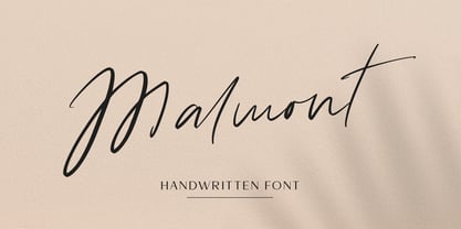 Malmont is an amazing handwritten font is light and elegant, and will emphasize your individuality in any project and will charm you with his signature. This font includes alternates and ligatures for lowercase. You can also use them to create a logo, branding, t-shirts, book covers, stationery, marketing, blogs, magazines, cosmetic, signboard and more. This font is easy to use has OpenType features.
 - Schnorr by HiH,
$10.00 Schnorr is a family of three fonts drawn by a German designer, Peter Schnorr. Schnorr Dekorativ is one of the less frequently seen of the alphabets he designed and one of the few for which he designed as lower case. Like many of the alphabets of the period, Schnorr Dekorativ is a delicate design. To provide a little more presence, we have added a DEMIBOLD version. Included in both Schnorr Dekorativ and Schnorr Demibold are an ornament of Schnorr’s design, seven T-ligatures and an alternate lower case t. 123=Ta, 125=Te, 135=Th, 137=Ornament, 167=Ti, 172=To, 188=Tr, 190=Tu and 177=alternate t. Schnorr’s design for the lower case t is unusual and not readily recognized. The alternate may be used to improve readability. Schnorr Initialen was designed as an upper case only design and as such is quite popular. It is often seen under the name of Odessa. Our font is a fresh scan and is paired with our Schnorr Demibold to provide a compatible lower case, along with all the rest of the auxiliary characters. Schnorr Initialen includes all the extras supplied with Schnorr Dekorativ and Schnorr Demibold: 123=Ta, 125=Te, 135=Th, 137=Ornament, 167=Ti, 172=To, 188=Tr, 190=Tu and 177=alternate t. In addition, Schnorr Initialen also includes an alternate uppercase I (172) and five lotus ornaments (123, 125, 167, 188 and 190).
 - Swiss 721 by Bitstream,
$29.99 Swiss 721™ is a sans serif family that ranges in style from thin to black while mixing in a few unexpected, but beautifully made and ironically flattering, outline weights that spice up the grotesque design. Couple these upstanding letterforms with matching italic styles and you have yourself a beautiful tool that is as legible on screen as it is off, has the technical prowess to conquer even the trickiest of design riddles and will work in a myriad of projects. Swiss 721 is a staple sans serif that you’ll never be sorry you have in your library. It’s been said that a simple sans serif is one of the most difficult typefaces to design. This is because when letters are reduced to their most basic details, irregularities and inconsistencies in design become immediately visible. The Swiss 721 typeface family is a quintessential example of letterforms distilled to their essence while still possessing warmth and verve. Based on mid-century sans serif typefaces, Swiss 721 is a versatile family of weights and proportions ideally suited to a wide variety of print and interactive design projects and is equally at home as headlines on billboards as it is navigation content on small screens. Swiss 721 takes the essence of mid 20th century sans serif typefaces and melds it with modern design consistency and a systematic weight range.
 - Roadkill by Device,
$39.00 Derived from a photograph Rian Hughes took in Hong Kong, the Roadkill family of typefaces is a literal interpretation of rough and worn road lettering. The original provided almost all of the key character shapes, with the others being designed to keep the unique hand painted feel intact. Most of the letters have alternate versions provided. This font works equally well at wider letterspacing settings. Roadkill Alternates provides curved versions of the 2 and the S, a G with higher crossbar, and less worn versions of several other characters. The heavy version packs even more gritty wallop in a non-condensed and blacker weight. Roadkill Heavy packs even more gritty wallop in a non-condensed and blacker weight. Use in conjuction with the original Roadkill and Roadkill Alternates. A set of arrows and other road symbols again taken directly from tarmac to Mac, thus preserving the worn and eroded appearance of the original characters is also part of the Roadkill family.
 - Breadley Sans by Ardyanatypes,
$14.00 Introducing Breadley Sans, a modern, elegant tagline sans serif type look. This font equipped with 5 levels of thickness, from thin to black suits your needs. Pairs well with modern san serifs and scripts as pictured, or stands strongly on its own as a heading and brand representative for an elegant look. This Breadley Sans overcome with the professional modern characteristic font which could bring elegant and appealing identity to your company for business utilities use like business card, name tag, uniform as brand elevation Advertising usage? sure! This modern Breadley Sans Serif typeface obviously fit to embossed as a letter signboard or even splash it along your office with an elegant look cutting sticker. The type shape of this elegant Breadley Sans, also stunning for books cover or magazine writing You can view all of the available characters in the screenshots above, and you can try out the modern & elegant of Breadley Sans now for any design matter Breadley Sans is also equipped with many languages, so it is easy to use for any country and language usage, and also equipped with Ligatures and alternative stylistic to make your design more attractive. A guide to accessing all alternatives Adobe Photoshop go to Window – glyphs Adobe Illustrator go to Type – glyphs Thank you and have a nice day
 - Ondine by Linotype,
$29.99 Ondine is one of the early typefaces of Adrian Frutiger. It looks as though it were written with a broad tipped pen, however, Frutiger actually cut the forms out of a piece of paper with scissors. The forms of Ondine are reminiscent of the humanist period, the high point of the Italian Renaissance text typefaces of the 15th century. This movement was centered in Florence, the base of the Humanist movement overall, and the home of a famous type school of the time. The main goal of the educated writers was to faithfully recreate the writing of the admired literary works, whose aesthetic was as important as their content. Ondine displays a regular and open character. Texts set in this typeface give the impression of being hundreds of years old. Ondine should be used in point sizes of 12 and larger and is best for short texts and headlines.
 - NAKED - Personal use only

- Classic Grotesque by Monotype,
$40.99 Classic Grotesque by Rod McDonald: a traditional font with a modern face. The growing popularity of grotesque typefaces meant that many new sans serif analogues were published in the early 20th century. Setting machines were not compatible with each other but all foundries wanted to offer up-to-date fonts, and as a result numerous different typeface families appeared that seem almost identical at first glance and yet go their separate ways with regard to details. One of the first fonts created with automatic typesetting in mind was Monotype Grotesque®. Although this typeface that was designed and published by Frank Hinman Pierpont in 1926 has since been digitalised, it has never achieved the status of other grotesque fonts of this period. But Monotype Grotesque was always one of designer Rod McDonald’s favourites, and he was overjoyed when he finally got the go-ahead from Monotype in 2008 to update this “hidden treasure”. The design process lasted four years, with regular interruptions due to the need to complete projects for other clients. In retrospect, McDonald admits that he had no idea at the beginning of just how challenging and complex a task it would be to create Classic Grotesque™. It took him considerable time before he found the right approach. In his initial drafts, he tried to develop Monotype Grotesque only to find that the result was almost identical with Arial®, a typeface that is also derived in many respects from Monotype Grotesque. It was only when he went back a stage, and incorporated elements of Bauer Font’s Venus™ and Ideal Grotesk by the Julius Klinkhardt foundry into the design process, that he found the way forward. Both these typefaces had served as the original inspiration for Monotype Grotesque. The name says it all: Classic Grotesque has all the attributes of the early grotesque fonts of the 20th century: The slightly artificial nature gives the characters a formal appearance. There are very few and only minor variations in line width. The tittles of the ‘i’ and ‘j’, the umlaut diacritic and other diacritic marks are rectangular. Interestingly, it is among the uppercase letters that certain variations from the standard pattern can be found, and it is these that enliven the typeface. Hence the horizontal bars of the “E”, “F” and “L” have bevelled terminals. The chamfered terminal of the bow of the “J” has a particular flamboyance, while the slightly curved descender of the “Q” provides for additional dynamism. The character alternatives available through the OpenType option provide the designer with a wealth of opportunities. These include a closed “a”, a double-counter “g” and an “e” in which the transverse bar deviates slightly from the horizontal. The seven different weights also extend the scope of uses of Classic Grotesque. These range from the delicate Light to the super thick Extrabold. There are genuine italic versions of each weight; these are not only slightly narrower than their counterparts, but also have variant shapes. The “a” is closed, the “f” has a semi-descender while the “e” is rounded. Its neutral appearance and excellent features mean that Classic Grotesque is suitable for use in nearly all imaginable applications. Even during the design phase, McDonald used his new font to set books and in promotional projects. However, he would be pleased to learn of possible applications that he himself has not yet considered. Classic Grotesque, which has its own individual character despite its neutral and restrained appearance, is the ideal partner for your print and web project.
 - FF ThreeSix by FontFont,
$62.99 British type designers Paul McNeil and Hamish Muir created this display FontFont in 2012. The family has 52 weights, ranging from 018 Thin to 144 Black and is ideally suited for logo, branding and creative industries, music and nightlife as well as poster and billboards. FF ThreeSix provides advanced typographical support with features such as ligatures. It comes with tabular lining and proportional lining figures. FF ThreeSix received several awards: the ISTD Premier award in 2011 and the ISTD Certificate of Excellence award in 2011. The typeface was also selected as one of Typographica’s favorite typefaces of 2012.
 - Iki Mono by CAST,
$45.00 Iki Mono is a multifaceted monospaced typeface designed for publishing and coding. Its sans serif structure displays some letterforms (as well as a degree of contrast) that are reminiscent of 19th-century grotesques, while in the non-oblique versions the letters have been very slightly slanted leftwards. Like typewriter typefaces Iki Mono has to cope with the limitations of a width system that forces shapes into a specific space. This extensive type family of forty weights and styles – from Compressed Thin to ExtraExpanded Bold, including their slanted versions – takes its name ‘Iki’ from the Japanese word for breath.
 - Normaliq by Differentialtype,
$12.00 Normaliq is a geometric and modern sans serif family that exudes a unique and minimalist charm. comes in nine weights, ranging from Thin to Black, combined with an Italic style, as well as the addition of Black Outline and Black Italic Outline. The balance of hard lines and subtle curves provides strength and eye-catching for every weight of the family. Each font in the family can stand alone, dynamic and authoritative. This font family offers versatility for a variety of design needs, designed specifically for looks such as titles, branding, logos, books, branding and other impactful editorial work.
 - So Lovely by Positype,
$20.00 Effortless, personal, nonchalant. So Lovely just slides into the room, without a care in the world, flowing from one letter to the next. This simple typeface has a secret—behind that nonchalant attitude is a ton of Stylistic, Swash, and Titling Alternates. It even contains 44 special ligature combinations to insure you have the smoothest entrance possible. So Lovely is the third release of the Positype Relaxed Script Collection of typefaces—all focused on fluid, effortless script fonts for simple use.
 - Mr Palker Dad by Letterhead Studio-YG,
$35.00 Mr Palker Dad — has appeared in a natural evolution of the Palker-Palkerson family. Its closest relative - grotesque Mr Palker Dadson. This generation is more stout than the previous one. One may even be brave enough to use them for composing small texts. Notably Mr Parker Dad has become one of the frequently sold typefaces on the «Peterburg. The city speaks» map as it is highly readable while remaining extremely tight. Mr Parker Dad has all the features of P&P’s family.
 - Linotype Feltpen by Linotype,
$29.99Linotype Feltpen is part of the Take Type Library, chosen from the contestants of Linotype’s International Digital Type Design Contests of 1994 and 1997. This fun font was designed by the Swedish artist Lutz Baar with clear, light forms. The spontaneous, even letters seem to have been written with the felt pen from which the font takes its name. Linotype Feltpen is available in two weights, regular and medium, both suitable for short and middle length texts and medium for headlines as well. - TG Aqsa Grotesque Pro by Tegami Type,
$30.00 TG Aqsa Grotesque Pro is the latest version of the font that was previously released in 2017, TG Aqsa Grotesque. In this latest version there are several optical fixes on each glyphs. In this latest version also added 2 new weights namely black and ultra black so that TG Aqsa Grotesque Pro has 6 fonts of different weights. Still maintaining the sans serif grotesque style coupled with the improvement of the letter form make TG Aqsa Grotesque Pro have a good level of readability when applied as a body text. And this version also has extended latin which will support more than 90+ different languages.
 - Ramadhan Night by Nathatype,
$29.00 Introducing Ramadhan Night, a captivating display font that effortlessly captures the essence of Arabic letters. Ramadhan Night pays homage to the flowing beauty of Arabic script, where each letter gracefully connects to the next. It brings the charm of this age-old tradition to your designs. This font maintains low contrast between strokes and curves, ensuring clarity and easy reading in various contexts. Ramadhan Night is highly versatile, making it suitable for various designs. It fits in headlines, logos, posters, flyers, branding materials, print media, editorial layouts, and many more designs. Find out more ways to use this font by taking a look at the font preview.
 - Assakita by Alifinart Studio,
$15.00 Assakita simplifies elegance into one truly outstanding handwritten font. It maintains its classy calligraphic influences while feeling contemporary and fresh. This versatility will appeal to a wide range of crafty ideas, from letterheads and titles, to stationery. This font is PUA encoded which means you can access all of the glyphs and swashes with ease. The Assakita font features beautiful and stunning Stylistic Alternates. You can access this feature through software that supports the OpenType Feature or can be accessed via the Character Map on Windows or Font Book on a Mac. Please note that the Stylistic Alternate features are also available on Multilingual Accents. Thank you. Alifinart Studio alifinart@gmail.com
 - 1613 Basilius by GLC,
$42.00 This family was created inspired from the typeface models hand drawn circa 1610s by Basilius Besler (Germany) for the carved plates of his spendid “Hortus eystettensis”, a botanical manual, masterpiece of the period. This “Pro” font contains standard ligatures & numerous alternates, usable for Western, Central and Eastern Europe, Baltic and Turkish.
 - Office Typewriter by Ana's Fonts,
$16.00 Office Typewriter SVG font is a monospaced typewriter font in two styles: Regular and Underlined, and two weights: Regular and Bold. It is a SVG font in which each glyph is an image (instead of a vector). This means the typewriter texture could be captured in an extremely realistic way. In addition, each glyph has 3 variations that appear "randomly" via contextual alternates. This makes it versatile and fun to use in modern and vintage designs alike. This font is also very legible at a wide range of sizes (although it looks better at small and medium sizes, as the image can become blurry at larger font sizes), and looks great in both long or short texts, in digital collages, branding and packaging, social media posts, logotypes, etc. The Office Typewriter SVG font family includes: Office Typewriter font, in Regular and Bold weights Office Typewriter Underline, in Regular and Bold Office Typewriter Misprints, with assorted misprints, doodles, circles and underlines Software requirements for the SVG font: Photoshop CC2017+ // Illustrator CC2018+

