10,000 search results
(0.05 seconds)
- Victorian Orchid by Dharma Type,
$19.99 Victorian Orchid is a gorgeous vintage flower. Victorian Orchid is a beautiful, organic serif font family available for both text and display. Its bizarre serifs for A and other diagonal letterforms came from decorative types and letterings in old Victorian era. These unusual serifs support and enhance the horizontal flow of the eyes and vertical alignments. Very eye-catching lowercase g also came from the Victorian era and this is one of the most dramatic letterform of this font. Lowercase such like n and d also have horizontal serifs which designed in the same theory. Victorian Orchid is somewhat organic, humanistic and soft-impression font like Transitional Serif as typified by Times New Roman. But at the same time, this font has horizontal serif and vertical stressed letterform like Modern Serif. They make this font sharp, handsome and neat. In addition, Victorian Orchid has low contrast and the serifs are not too flat and not too coved. By them, Victorian Orchid create strong and casual impression like Slab Serif fonts. Victorian Orchid family consist of 5 weights from Light to Bold including about 500 glyphs, international accented letters, some OpenType features. Italics are "True" italics which designed very carefully to match Romans.
 - Giraffenhals by TypoGraphicDesign,
$19.00 The kiddy and rough character and the huge capital height with the tiny x-height (plus the cute giraffe character dingbats), gives the typeface a high recognition value and uniqueness. Application Area The warm, child-like, bold and striking handmade font “Giraffenhals” would look good at logos, display size for poster, flyer, comics and graphic novel lettering, headlines in magazines or websites, packaging, music covers or webbanner etc. Technical Specifications ■ Font Name: Giraffenhals ■ Font Weights: Regular-Condensed + Bold-Condensed + DEMO (with reduced glyph-set) ■ Font Category: Display for headline size ■ Font Format:.otf (OpenType Font for Mac + Win) + .ttf (TrueType Font) ■ Glyph Set: 443 glyphs ■ Language Support: Afrikaans, Albanian, Catalan, Croatian, Czech, Danish, Dutch, English, Estonian, Finnish, French, German, Hungarian, Icelandic, Italian, Latvian, Lithuanian, Maltese, Norwegian, Polish, Portugese, Romanian, Slovak, Slovenian, Spanisch, Swedish, Turkish, Zulu ■ Specials: Alternative letters, stylistic sets, automatic contextual alternates via OpenType Feature. Euro, kerning pairs, standard & decorative ligatures, Versal Eszett (German Capital Sharp S), extras like Dingbats & Symbols, arrows, hearts, emojis/smileys, stars, further numbers, lines & shapes ■ Design Date: 2011–2017 ■ Type Designer: Manuel Viergutz ■ License: Desktop license, Web license, App license, eBook license, Server license
 - Lens Grotesk by Typedepot,
$39.99 Lens Grotesk is a Neo-grotesque type family of 16 fonts born as a result of a very conscious research in the field of the neutral Swiss aesthetic. There's a reason for all the prominent examples of this design like Helvetica and Univers to be used on a daily basis for more than 70 years and it's a simple one - they just work. The closed terminals, the low contrast, uniform widths and proportions makes the Neo-grotesques feel just right. Although very often branded as stiff, the neutral Neo grotesques are here to stay and Lens Grotesk is our own reading of the popular style. Lens Grotesk takes the Neo-grotesk model one step further adding a pinch of Geometric sans-serif to the mix thus creating a way more modern and contemporary looking design. Characterized with more generous oval proportions and slightly more open terminals, Lens Grotesk keeps the modulation and rhythm needed for a slightly longer texts while visibly keeping everything in order. Zooming in you'll find traces of the Geometric aesthetic - the robust almost right angled approach of the arches and tails (look t, f, j, y) and the way more circular rounded shapes. Like all our fonts, Lens Grotesk is equipped with a range of OpenType features, stylistic alternatives and of course Cyrillic support. It comes in a pack of 16 fonts with 8 styles and their matching italics or one variable font file available with all full family purchases. Live Tester | Download Demo Fonts | Subscribe
 - Budge by Flavortype,
$12.00 Budge, a new carefully crafted layered Italic Typeface. The ideas of this fonts come from a wide range of reference and deserts and beverages are our main focus for this font family. Budge will give a versatile, fun, cute and beauty feel to your projects. Budge was created with beautiful swashes, and also comes with 3 Layer : Regular, Shadow and line. Perfectly fitted layers to give you more contrast, and a bolder look. Every glyphs for alternates is curated for the best and without eliminating the characteristic of this fonts. Budge also comes with a Sans Serif as Font Pair that completes the needs for your design. Our creation on the display give you a reference of what it looks like on your projects such as branding, headers, logotypes, posters, magazines, packaging, food menus, and more. It shows that Budge clearly can accommodate various design style. Type Specimen here : http://tiny.cc/y9mfnz
 - Impending Distaster by Hanoded,
$15.00 There's nothing really disastrous (impending or not) going on in my life right now, but I have always liked the expression. I thought about it when I watched a news item about the recent storm we had in Europe. The news showed footage of a person narrowly escaping a huge falling tree. Impending Disaster font is certainly no disaster. I created it using my fantastic Chinese ink and a broken tapas skewer (I seemed to have run out of my regular satay skewers). The result is a slightly rough, comic book kinda font. It comes with two sets of alternates for the lower case letters (which cycle as you type), one set of stylistic alternates for the 'O' glyph (and all accented O's), an alternate ampersand, asterisk, question mark and exclamation mark and a set of alternate numerals. Impending Disaster comes with extensive language support, including Vietnamese, Greek and Sami - so don't come running and say you didn't have any options! ;-)
 - Uniform Rounded by Miller Type Foundry,
$25.99 Uniform Rounded is a type family based on the 2014 Miller Type Foundry release, Uniform. This superfamily is comprised of three widths (regular, condensed, and extra condensed) each with six weights. The result is a fun and playful typeface that is extremely versatile and is a great asset for any project on any medium. Uniform Rounded is a multi-width geometric type family designed around the circle. The O of the Regular width is based on a circle, the O of the Condensed width is based on 1.5 circles stacked (with straight sides) and the O of the Extra Condensed width is based on two circles stacked with straight sides as well, and all other characters are derived from this initial concept. This unique idea creates a remarkably fresh type family that bridges the gap between circular geometric typefaces and condensed straight-sided typefaces. Uniform Rounded also includes many opentype features like Old Style Figures, Tabular Lining Figures, Alternate characters, Ligatures and more.
 - Aspira by Durotype,
$49.00 Aspira: the legible geometric typeface. Aspira is a multi-purpose typeface. It is suitable for both text and display use — for graphic design, corporate identity design, magazines, newspapers, books, reports, advertising, signage, etc. Aspira is a versatile typeface. It offers 112 styles consisting of 8 weights and 7 widths. It offers 56 upright fonts and 56 italic fonts. It offers lining and oldstyle figures (proportional and tabular). It offers small caps, ligatures, arbitrary fractions, and extensive language support. Aspira is a geometric typeface. It offers a fresh geometric personality which is pleasant and not too conspicuous. Aspira is a multi-width typeface. It offers 7 widths — much more than what is currently usual. Aspira is a legible typeface. Many of its details, like its open apertures and subtle variations in stroke width, are designed to enhance its legibility. Free demo font available. Aspira in use: 1 2 3 4 5 6 7 8 9 10. For more information about Aspira, download the PDF Specimen Manual.
 - Lev Serif by TypeFaith Fonts,
$15.00 Lev is a slab serif font, the rectangular serifs and the straight angled shoulders and links contrasting the curves and loops. Lev Serif is characterized by thick, block-like serifs. Lev contains 12 high quality fonts.
 - Bobber Motorcycles by Vozzy,
$10.00 Introducing a vintage look label font named Bobber Motorcycles. It includes five styles - Base, Rough, Outline, Shadow and Light. This font will good viewed on any retro design like posters, t-shirts, labels, logos and more.
 - Sneaker Script by Dharma Type,
$34.99 This script loops and loops like a spaghetti using the power of OpenType alternates. The lettering made by this font would evoke your young days in the 60s & 70s.Please check the instruction in the Galley tab.
 - Mashiya by Stringlabs Creative Studio,
$25.00 Mashiya is a Monoline Script Font with elegant style. This font is perfect for fashion brand, apparel, shoes company, wedding invitation, business card, logo brand, clothing, and also business brand name like barber shop or taylor.
 - Arnarn by Designsuh,
$12.00 The sight refracted through glass is mysterious. The san serif font was designed to look like it is visible through glass. Try using beautiful fonts. I put a lot of effort into each and every letter.
 - Venture by Linotype,
$29.99Venture Script reflects Hermann Zapf's handwriting. It was originally written with a Japanese feltpen. And like with Zapf's typeface Noris Script he wanted to preserve the rough outline of the handwritten form in the final drawings. - Quotes and Texts by Pixel Colours,
$24.00 Quotes and Texts is a sweet handwritten uppercase font designed to look clear and chic in small formats like texts, quotes, and social media posts. Includes: Uppercase and lowercase caps characters, numbers and punctuation Supports Language
 - Gluster by Maulana Creative,
$14.00 Gluster Serif Display Font Typeface is a single weight black serif, modern casual typeface perfect use for headline, logo, magazine, and any editorial design needs also readable body text. I hope you like it, keep awesome!
 - Graffiti Xenoa by Nirmana Visual,
$22.00 Graffiti Xenoa is a fun, urban-style display font. This font is suitable for designs like logos, advertising, apparel, jerseys, sportswear, skateboard designs, and more. Take your concepts to the next level with this stunning font!
 - Soho by Monotype,
$29.99 Soho is the latest addition to the growing range of typefaces from Sebastian Lester. This grand opus of a project resulted in a typeface that comprises nine weights and five widths of precision engineered OpenType. 40 fonts, 32,668 characters and 24 OpenType features. Hot on the heels of the popular Neo Sans and Neo Tech range, and his first typeface release Scene, Soho represents three years of work by Lester. As a type designer I'm preoccupied with finding ways in which I can address modern problems like good legibility in modern media, and create fonts that work precisely and efficiently in the most technically demanding of corporate and publishing environments." Slab serif typefaces are enjoying something of a renaissance, offering versatility whether for corporate identity, product branding, text or display use. With 40 weights to choose from Soho gives designers endless possibilities from the ultra chic lines conveyed by the lighter weights to the rock solid statement made by the heavier weights. Soho is cross-platform compatible. The Pro version provides extended language support for Central European languages. Used in conjunction with software applications that support OpenType many useful features like "stylistic sets" can be leveraged -- in which a wide variety of alternative characters can be introduced at the click of a mouse button giving one font several "tones of voice" from conservative to cutting edge. The wide range of glyphs includes ligatures and small caps."
 - DT Skiart by Dragon Tongue Foundry,
$30.00 Looking for something between a Serif and Sans Serif font? Try the DT Skiart font. This high quality, versatile font has the professional feel of a Serif, but has the open readability of a Sans Serif. A smart crisp font with smooth simple lines. It has a medium to strong stroke contrast, with the vertical line being heavier than the horizontal line, and no serifs. The DT Skiart family is made up of 5 weights in both italic and normal.
 - Rabbit Escape by Hanoded,
$15.00 Lately I have been thinking about rabbits. Not that I have a particular love for rabbits - they’re cute, but also kind of stupid. But as Christmas dinner is approaching, I see more rabbit carcasses lining the shelves of supermarkets. These poor animals never saw the light of day, never felt the grass between their paws and never had a ‘true life’. In honour of the hundreds of thousands of rabbits being slaughtered for Christmas this year, I have named this font: Rabbit Escape. Rabbit Escape is a slightly back-slanted typeface - handmade with a permanent marker I bought in Japan. It is quite unusual, maybe a bit weird, but it will serve you well. Comes with a generous stuffing of diacritics.
 - Weekly by Los Andes,
$29.00 Weekly: a slab serif that wants to be a sans. The font was created under the premise that it can be used as a sans: a fresh design without that retro feel typical of slab fonts. As a result, we developed an Egyptienne font—more simple compared to others of its kind, a feature that gives it its unique personality. Weekly was based on fonts with humanist proportions, such as ‘Oficina’ and ‘Caecilia’, both created in the ’90s. Typefaces like these give designers the possibility to use them in books or magazines, in contrast to geometric slab fonts or early 20th century fat faces, which are mainly used for advertising or display text. Another feature that reminds us of humanist sans fonts is the small difference between x-height and cap-height. Some characters in Weekly like ‘a’ or ‘g’ lack serifs and some like ‘c’ or ’s’ have short serifs, giving it a semi-serif air. Weekly comes in both light and heavy weights. The heavier ones bear resemblance to Egyptienne slab serif typefaces with strong personality. These variants are ideal for use in posters and big, powerful headings.
 - Sagona by René Bieder,
$39.00 Sagona is a contemporary slab serif building on the clarendon/ionic model dating back to the 19th century. Like its most famous representative Clarendon, Sagona features strong serifs and a variable stroke contrast resulting in a versatile typeface working great in headlines and small text sizes. Where great typefaces like Sentinel, Belizio or FF Hertz are staying close to the industrial and strict appearance, Sagona is focusing on a warm and welcoming approach, emphasizing a subtle elegance especially in the mid weights. The family comes in nine weights with matching true italics. It is equipped with a large set of alternative glyphs, ligatures, old style numbers, initials and finitials, two sets of arrows and many more opentype features making it a perfect choice for professional type setting.
 - Woonder by Khaiuns,
$15.00 Woonder Script Fonts, a handcrafted brush font! This bold, free-flowing, confident brush font is designed to be easily customized to your liking with 2 letter sets, also featuring swashes and some unique textures. Find a unique Woonder Script Font by adding a plus (+) to each letter and number and you'll have a cool letter. Woonder Script Fonts is a brush font which you can use and enjoy again and again, for anything from promotional material and handwritten quotes, to product packaging, merchandise and branding projects. Please message me if you want your language included or If there are any features or glyph requests, feel free to send me a message, I would like to update it. I hope you have a blast using Woonder Script Fonts!
 - Sanatha by Pen Culture,
$19.00 Proudly Present "Sanatha - A Stylish Calligraphy Font" Sanatha is a stylish calligraphy font with natural handwritten that perfect for any kind of design project like wedding invitation, branding, poster and others. This font come with lovely swashes and ton of ligature which make this font stylish and elegant. What inside and what will you get: Uppercase and lowercase letter Number and punctuation Ligature Lovely swashes I really hope you enjoy it – please do let me know what you think, comments & likes are always hugely welcomed and appreciated. More importantly, please don’t hesitate to drop me a message if you have any issues or queries. Thank you
 - Cord by Roland Hüse Design,
$20.00 Cord (Zsinór in Hungarian) was originally a commissioned work for a tablecloth pattern with a thread like frame decoration that is actually consist of letters. The lettershapes were being created based on Rovas characters, which were reinterpreted without decreasing legibility. Therefore, the Rovas alphabet was designed in the first place followed by its matching Latin company. The full character set contains: Western, Central and South Eastern European Latin characters basic symbols and punctuation Rovas alphabet Rovas number symbols and punctuation Display font, best fit in larger sizes for souvenirs, folk art theme, embroidery, ribbon like decorative texts and signages. Good luck and Happy Creating! Roland
 - Kreme De Fresh by PizzaDude.dk,
$20.00Kreme de Fresh is most likely the lacking ingredient for your next project! - ThaiType by Oporto Design,
$39.90 Latin characters were turned into Tha-like types to create the ThaiType font.
 - Strawberry Gossip by PizzaDude.dk,
$20.00 Here is something to talk about! Spread the word - spread the gossip! An elegant combination of thin and fragile lines, made with a fine pen. Fine lines, crunchy, sweet curls.
 - Club Type Script Pro by Club Type,
$65.00 A quill pen-like joined script typeface which echoes the cartoon lettering of 17th Century court papers during the period of the English Civil war. A nifty feature of this font is that if you enter a vertical bar '|' character, it will turn off the exit stroke of a joining character.
 - Penny Arcade by Solotype,
$19.95A popular caps-only type of late Victorian times was called Mural, brought out by Boston Type Foundry in 1890. We always liked it, drew a lowercase for it, and then strengthened it by adding a bit of weight. It now has a nice, understated retro look for paragraphs of copy. - Fille De Joie by Tension Type,
$10.00 Fille de Joie is a distressed typewriter font created from a vintage typewriter that a friend of mine bought in Paris. It’s pretty dirty and nasty. Included are open type ligatures for all of the double letters like “EE” “TT” “FF” etc. to give the font a more natural look.
 - Hello Lovely by Fargun Studio,
$12.00 Hello Lovely! A new fresh ans modern hand lettered font with decorative characters and a dancing baseline. So beautiful on invitation like handicraft, greeting cards, branding materials, business cards, quotes, posters, and more design concepts. Features : Stylistic sets Basic Latin A-Z and a-z Numbers International Symbols included Punctuation
 - Manic Mood PB by Pink Broccoli,
$14.00 An offbeat alternate caps typestyle inspired by the cover of a vintage LP titled, Organ Moods by Jerry Thomas. A playful and childish font from a sexy cheesecake album! Go figure. Switching on Contextual Alternates enables automatic alternations between caps and alt caps like AlTeRnAtIoNs to create a more randomized look.
 - Subliminal BF by Bomparte's Fonts,
$40.00 Subliminal BF presents a cool, distinctive look that’s a superb selection for a wide variety of uses from music CD covers to packaging. Like Glow Gothic BF, it represents experimentation in the realm of halftone effects. At smaller than headline sizes it “colors up” to exhibit a unique, kinetic sensation.
 - ALS Scripticus by Art. Lebedev Studio,
$63.00 There are many script typefaces but there is only one Scripticus. Scripticus is like a chameleon: In whatever surroundings you put it, it adapts itself and looks like it couldn't be anywhere else. Be it a sales advertisement, a music Website, a comic strip or a journal with complex chemical formula – Scripticus always solves the problem in a natural and leisurely way. And it never makes compromises concerning clarity. But where does Scripticus come from? … From the good old high school blackboard! Blackboards have become almost obsolete in teaching, but be it a black or white background – clear, strong characters placed on the board while the facts are explained are still one of the best ways to make and keep things understandable. Scripticus is dedicated to my high school chemistry teacher who was an expert in just this. While the letterforms come from different inspirations, its aim is the same as the pedagogical aim of my teacher: Combining clarity with a strong personality. Scripticus has a special trick to give it its natural look: Four alternates for each letter and each number plus rotation coding make the glyphs appear in lively melodic flow. In this way even mathematic equations look nice! Scripticus has a lot of OT-features that help it do its job. They are: capital spacing, localized forms, subscript, scientific inferiors, superscript, numerators, denominators, fractions, ordinals, tabular figures, historical forms, ligatures, stylistic alternates, stylistic set and ornaments. Finally, as is my general goal in type design – Scripticus supports close to one hundred languages from Latin extended to Cyrillic extended.
 - Integral CF by Connary Fagen,
$35.00 Integral CF is designed for maximum visual and emotional impact with its stunning, superbold letterforms. An all-caps titling font family, Integral's six weights excel in posters, social media, headlines, video, and print. Hidden behind the linear, confident construction is a hint of roguish charm. Designed to be bold and large, Integral pairs nicely with lighter typefaces that provide contrast, such as a sans serif like Greycliff CF, Criteria CF, or Work Sans. Text-friendly serifs like Artifex CF are also pair well with Integral. All typefaces from Connary Fagen include free updates, including new features, and free technical support.
 - Scott McCloud by Comicraft,
$39.00 Whether you're Making, Understanding or Reinventing comics, you'll need a comic book font that makes your comic book—or comic book about making, understanding or reinventing comic books—look like a, um, comic book. Yes, it's all very well writing about the Invisible Art of Making Comics, but if you can't read about the Storytelling Secrets of Comics, Manga and Graphic Novels, they'll still be secrets, won't they? That's why Scott McCloud came to us to create the official "Making Comics: Storytelling Secrets of Comics, Manga and Graphic Novels" comic book font, or as we like to call it: McComicBookFont.
 - Mia Pets by 10four,
$9.00 Mia is a 1 year old. She likes animals. But not just any old barnyard variety animals, she likes cute and fun, pseudo-animals that nobody else knows about. Now she is willing to share her favorite “pets” with the world in this exclusive symbol font designed by 10four. Originally conceived as wall graphics for Mia's bedroom, Mia Pets has been expanded to include 62 distinct icons. A collection of friendly creatures, now set free from Mia's bedroom and ready for whatever mischief you can find for them... great for wall vinyl, web graphics, or T-shirt graphics!
 - 1565 Renaissance by GLC,
$20.00 This set of initial letters was inspired from French renaissance decorated letters. It is a typical pattern, one among dozen quite similar, but this one was in use in Paris, unchanged, for centuries, and was still in use in the beginning of 1900s. This explains the difference between I and J, U and V. These characters were engraved years after the original set. Our font was inspired from a late 1800s publication. It can be used as well with Humane fonts (like our 1543 Humane Janson or 1592 GLC Garamond) as with modern fonts like our 1820 Modern or 1906 French News.
 - Robard by Dear Alison,
$24.00 My brother is an architect, and I have always loved his lettering, you know, the style of writing that can be found on architectural drawings. There is a common thread to it, yet each architect or engineer brings their own personality to it. I have seen a similar style being used by some hand-letterers for invitations, place cards and signage. Inspired, I set out to create my own, and the result is my new typeface, Robard! I wanted something compact, somewhat modular, done quickly but with control, and sourced from hand-lettering. Starting out with a handful of pigment ink pens, I settled on a 0.1mm Copic Multi-Liner, and using a light table with a grid underneath the paper, I cranked out grouping after grouping, letter after letter, numbers, punctuation, accents, just trying to zero in on the feeling and the look I was after. There were some ideas that didn't work, like unicase (there would be no regular lowercase), or swash alternates. Ultimately, I ended up with a decent array of glyphs to choose from, and alternates like oldstyle numbers, and an alternate set of caps for the lowercase slots, and even alternative figures so doubles like 88 would be different. In the font, the OpenType ligature code automatically alternates the cap and lowercase (alternate cap) letters, and numbers as you type, lending Robard that hand-lettered look in a digital typeface that I was hoping for. There are also oldstyle figures, and unlimited fractions, ordinals, and a few alternate letters. I hope you like Robard!
 - Camelia Script by Fargun Studio,
$12.00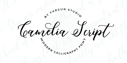 Introducing! Camelia Script - a modern script with a handmade calligraphy style, decorative characters and a dancing baseline! So beautiful on invitation like greeting cards, branding materials, business cards, quotes, posters, and more design concept! Features : - Unique ligatures - Stylistic Alternates - Stylistic sets - Basic Latin A-Z and a-z - Numbers - International Symbols include - Punctuations