10,000 search results
(0.046 seconds)
- Righttoast by Maulana Creative,
$12.00 Righttoast is a modern script font. It's a clean store with high contrast line. It readable in short text. Righttoast includes opentype features Ligatures. It support multilingual more than 100+ language. This font is good for logo design, Movie Titles, Books Titles and any awesome project you create. Make a stunning work with Righttoast script font. Cheers, MaulanaCreative
 - Loventha by Arkrist Letter,
$14.00 Loventha font is the latest script written by Arkrist Letter studio. A font inspired by a very romantic thing. Designed with great care so as to produce very neat and elegant letter lines, it looks beautiful and romantic. Loventha is very suitable for greeting cards, t-shirt designs, logos, etc. Loventha is a masterpiece created with love!
 - Hello Amelinda by Muksal Creatives,
$12.00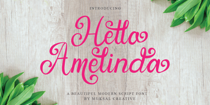 Hello Amelinda is an incredibly unique handwritten font. Masterfully designed to become a true favorite,Hello Amelinda feels incredibly elegant and flowing. It looks stunning on wedding invitations, thank you cards, quotes, greeting cards, logos, business cards and every other design which needs a handwritten touch. It features a varying baseline, smooth lines, gorgeous glyphs and stunning alternates.
 - Caracas Stencil Pro by John Moore Type Foundry,
$25.00 Caracas Stencil Pro is a new family of stencil sans serif fonts, looking friendly, sweet and comfortable to read. Where text flow between straight lines and round by becoming transparent in the interest of readability. Caracas Stencil is ideal for working in small letters and texts of a technical nature. Caracas is a humanistic approach to reading sans forms.
 - Hofstad by Hanoded,
$15.00 Hofstad is a font which was modeled on a poster designed by Dutch graphic artist Jan Lavies (1902 - 2005). Lavies became famous for the posters he designed for the Holland America Line of cruise ships. Hofstad font was named after the theatre group "Vereenigd Rotterdamsch - Hofstad Tooneel" for which Jan Lavies designed a poster. Hofstad comes with all diacritics.
 - P22 Coda by IHOF,
$39.95 Coda Pro is a simple but decorative and controlled sans serif design. Coda literally means ‘tail’ (Italian, from latin cauda) and refers to the way the letters h, m and n stretch below the writing line towards the end of a sentence or before a final stop. Coda Pro is an elegant and contemporary font suited for display purposes.
 - Mo' Funky Fresh by ITC,
$29.99Mo' Funky Fresh is the work of New York designer David Sagorski. It is an all capital typeface which includes a set of alternative capitals, compatible symbols and lively illustrations. Mo' Funky Fresh brings to mind sunny days, tiki bars, surfboards and cool drinks and is a great choice for headlines requiring a vital, energetic look. - Media Blackout by KC Fonts,
$14.00 Media Blackout is a handmade font with rugged good looks. The Media Blackout Family consists of three fonts: Normal, Italic & Marker. Media Blackout Marker takes the handcrafted look one step further by adding heavy hand etched lines for a truly unique look. For an even more handmade look, switch between uppercase and lowercase for a change of etching.
 - Drakkar by Jorgensen-fonts,
$30.00Drakkar is a Latin typeface based on runes, the medieval script of the Vikings and Northern Europe. It imitates letters carved in wood with flared strokes. Just as the actual runes, it is a single-case font; instead of lower case letters, Drakkar has a set of slightly changed caps to enable the user to express handmade lettering. - Shenandoah by Mans Greback,
$59.00 Shenandoah is a beautifully crafted script by Måns Grebäck, and is made for lovely, flowing and professional typography. Shenandoah has bold, crisp lines, giving it a rustic and retro effect whilst keeping it sleek and modern. This typeface and a bit of love could be used for fashion, apparel, stationary, magazines, typography, film, books and marketing!
 - Maison by Milieu Grotesque,
$99.00 Maison is a mono-lined grotesque constructed using rigid elements to achieve a minimalist industrial feel in homage to the early twentieth century modernist design concepts.Originally created as a mono-spaced typeface family—with less optical corrections than its successor Maison Neue—Maison has been further developed to work equally in both mono-spaced and proportional alignments.
 - Oxford by Monotype,
$29.99Oxford was designed by Arthur Baker for Agfa Compugraphic in 1989. A calligraphic typeface with a slight incline, fine lines, and delicate serifs, Oxford is easily identified by its quirky lowercase b. Oxford is a functional display type for headings, announcements, and brochures that also works for setting small amounts of text, such as ad copy. - Nokio by TypeUnion,
$25.00 Nokio is a clean, minimalist Sans Serif typeface designed in 2013 by TypeUnion. Nokio uses clean lines and curves matched with smooth, rounded terminals to produce a structured typeface with a subtle playfulness. Nokio is made up of 5 weights, and is built for multiple uses, from digital applications such as Apps and Websites to logotypes and print applications.
 - Danger Girl by Comicraft,
$19.00 Ancient Evil! Nazi Spies! High Adventure! Spandex! As the sun sets and the sky fades from 100Y, 50M to 100Y, Jeff Campbell's Warm and Friendly Display Letterforms are already receding over the far horizon in a Dakota, trailing a long broken red line all the way from Venice to Cairo! This font really does not belong in a museum!
 - Hello Father by Sealoung,
$10.00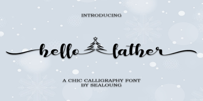 Hello Father feels equally charming and elegant. This stunning handwritten font is a stylish homage to classic calligraphy. It features a varying baseline, smooth lines, gorgeous glyphs and stunning alternates. It will elevate a wide range of design projects to the highest level, be it branding, headings, wedding designs, invitations, signatures, logos, labels, and much more!
 - Halliday JNL by Jeff Levine,
$29.00 Halliday JNL was redrawn from impressions made by a rubber stamp sign printing set, thus providing the slight imperfection of line widths that gives a hand-made approach to the typeface. The lettering style is based on Beton Open Condensed, a clean and popular slab serif used for decades in print display titling and rubber stamp manufacture.
 - TKT Kate by TKT,
$35.00 TKT Kate is a new interpretation of elegant sans serif display font with a modern touch. It inspired from Optima and Humanist font. The overall look is round, open counters and with a large x-height, geometrically constructed which is intentionally meant to be used in branding projects such as packaging, corporate design to on line applications.
 - Aventra by Graphite,
$18.00 Aventra is a handmade organic sans serif typeface family. With curved edges and slightly uneven lines, it has a warm and friendly appeal. Its clean and minimal design makes it legibility and readable even in smaller point sizes. With a distinct and informal human touch, it is ideal for packaging, branding, display, posters, logos, advertising, signage and editorial design.
 - Mogathe by Invasi Studio,
$16.00 Mogathe was inspired by the west life era. Mogathe is a slab serif font with a vintage western look and feel. Four varieties are available: Regular, Stamp, Spurs, and Spurs Stamp. The use of this font results in carefully-crafted styles. Mogathe font is ideal for branding projects or packaging that need a vintage western feel.
 - Ferpa by Typeóca,
$30.00 Ferpa is Typeóca's Fierciest Font Family. Drawn using only straight lines, Ferpa uses every kink, every kink and every serif as an opportunity for expressivity. From Thin to Black in both Roman and Italic constructions, Ferpa is available as 18 otf static font files, with a character set that goes a little beyond Latin Extended A.
 - Kitchen Disaster by PizzaDude.dk,
$18.00 Kitchen Disaster is a wordplay, and not really a disaster! I deliberately made the lines a bit off here and there, to mimic bad poster design. In order to make your text even more natural, I added 5 different versions of each letter - and they automatically cycle as you type! Besides that, Kitchen Disaster comes with multilingual support!
 - Skorid by Totem,
$20.00 Skorid is a geometric condensed sans serif font family, constructed only out of straight lines. Coming in 7 weights, regular and italic, from thin to black, you have a wide array of possibilities of using Skorid for any purpose you need. Skorid speaks around 70 languages, including Cyrillic. Contains a lot of alternative letters to boost your creativity.
 - HU Specialmovie by Heummdesign,
$15.00 HU Specialmovie is a retro, wide square typeface, characterized by streamlined, narrow stroke ends. The first consonants are designed to be large with full modules to improve readability. The grapheme 'O', which is the face of the font, is in the form of a square in harmony with straight lines and curves, expressing a solid and simple feeling overall.
 - Astroz by Gravitype,
$14.90 Astroz is a single weight display font inspired by sci-fi culture and space environments. It has been conceived for logos, headlines and posters. The sharp lines mixed with perfect circles give a wonderful futuristic aesthetic. In addition, alternates of letter “A” and number “1” are included to give you more stylistic options. Multilingual support is available.
 - Prospect Heights JNL by Jeff Levine,
$29.00 While the inspiration for Prospect Heights JNL may have been a piece of vintage sheet music entitled "My Ohio Lullaby", the name is classically New York. To be precise, it's a neighborhood in the Borough of Brooklyn. Prospect Heights JNL is available in both the regular version (with an engraving line) and a solid (plain) version.
 - Thoolloves by Maulana Creative,
$12.00 Thoolloves is a Cute modern calligraphy font. It's a clean store with high contrast line. It readable in short text. Thoolloves includes opentype features Ligatures. It support multilingual more than 100+ language. This font is good for logo design, Movie Titles, Books Titles and any awesome project you create. Make a stunning work with Thooloves handwriting font. Cheers, MaulanaCreative
 - Skittles N Beer NF by Nick's Fonts,
$10.00Handlettering on a 1929 brochure for the P&O British-India Steamship Line inspired this tiddly typeface. Art Deco sensibilities combine with a playful attitude to yield a delightful and amusing headline font. The PC PostScript, TrueType and OpenType versions contain the complete Latin language character set (Unicode 1252) plus support for Central European (Unicode 1250) languages as well. - You are Superb by DainType,
$15.00 Nicely scribbled script font. It has a masculine, wild and wild mood. It also has a feeling of being torn. It is good when you want to use a lively atmosphere because of the fast flow of strokes. It is good to use when you want a cool and striking design such as a bromide for a rock festival, an album cover for music, a beer package, or a beer logo.
 - Quintet by Lauren Ashpole,
$15.00 Quintet is a narrow, stylized sans serif font made up of thin, looping lines. This font tries to walk the line between retro and modern and to incorporate some hand drawn imperfections without being too obvious about it. I kicked off designing without any particular inspiration in mind but, as time went on, started associating it in my head with an old-timey, swingy jazz aesthetic. So hopefully it captures the spirit of the Jeeves and Wooster throwback theme song and opening credits, the music of Stéphane Grappelli and Django Reinhardt (who the name is a nod to), and countless album covers from that era.
 - Sinah by Linotype,
$29.99Linotype Sinah is part of the Take Type Library, selected from the contestants of Linotype’s International Type Design Contests of 1994 and 1997. Designed by the German artist Peter Huschka, Linotype Sinah is a rounded, ornamental font with many strokes ending in teardrop forms. The letters of this wide-running font do not share a common base line. The capital S and the lower case l both drop under it although neither have descenders. Overall, Linotype Sinah has an almost Asian or Indian feel. The font must be used with generous line spacing and is intended exclusively for headlines or shorter texts in point sizes of 12 or larger. - Primal by Zeptonn,
$10.00 It’s time for Primal. It’s time to Rock! Primal is a polygonal typeface created with primeval times in mind. All forms have been created using few lines, angles and points. This typeface will enable you to create type that will almost scream off the page. Raaawwhrrr! Very useful for concert posters, techno parties or caveman signs. Whichever you prefer! Primal contains uppercase, smallcaps and underscored lowercase letters. By turning on standard ligatures the underscored letters will automatically connect, resulting in one single underscored line. Primal also contains a number of opentype ordinals and catchwords. The latter can be unlocked by using discretionary ligatures. This typeface is created by illustrative designer Zeptonn.
 - Mtwane by Scholtz Fonts,
$9.50 Mtwane is a contemporary font, fusing the vigor of African design with the clean-lined sophistication of the European fonts popular at the turn of the 20th century. In the wake of African Renaissance, European and African cultures are counter-influenced, resulting in an exciting fusion of the two. Mtwane plays on the line between upper and lower case characters, creating a young, powerful, in-your-face effect. Use Mtwane for clear, powerful impact in contemporary design. Mtwane contains over 250 characters - (upper and lower case characters, punctuation, numerals, symbols and accented characters are present). It has all the accented characters used in the major European languages.
 - Sinah Sans by Linotype,
$29.99Linotype Sinah is part of the Take Type Library, selected from the contestants of Linotype’s International Type Design Contests of 1994 and 1997. Designed by the German artist Peter Huschka, Linotype Sinah is a rounded, ornamental font with many strokes ending in teardrop forms. The letters of this wide-running font do not share a common base line. The capital S and the lower case l both drop under it although neither have descenders. Overall, Linotype Sinah has an almost Asian or Indian feel. The font must be used with generous line spacing and is intended exclusively for headlines or shorter texts in point sizes of 12 or larger. - Jalopy JNL by Jeff Levine,
$29.00 History, as it's said, tends to repeat itself. The round-point pen lettering used in the 1920s logo and ads for Dodge Brothers cars (pre-General Motors) is an early predecessor to the techno type styles of the 1980s. Square in shape, with unique stylization to some letters, Jalopy JNL can cross the decades and be used for a 1920s period piece and still look fresh in an ad for computer parts. Rather than round out the inside lines of the characters to fully emulate the strokes of a lettering pen, the inside lines have straight intersections for the contemporary side of this font's design.
 - deccodisco - Personal use only

- Hype vol 2 by Positype,
$20.00 Hype lives up to its name. An energetic attempt to blow past previous sans’ descriptive words of massive, large, extensive, super and others. Hype transcends the everyday marketing terms and rests solely atop them all with a jaw-dropping current offering of 432 fonts that spans 18 widths and 12 weights. Insert a long pause and mic drop here, because nothing compares. Hype Volume 2 includes 6 of the 18 subfamilies that comprise the full Hype Collection. Each of these subfamilies represent 1 of the 18 available widths and each width contains 12 weights and matching italics. Volume 2 contains 144 fonts. Families included in Volume 2: Hype 0200, Hype 0500, Hype 0800, Hype 1100, Hype 1400, and Hype 1700. If you would like to complete your collection be sure to view and purchase Hype vol 1 and Hype vol 3. Hype’s bombastic approach meant supplying everything it could within each typeface: including small caps, yes small caps, a full numeral set that includes inferiors and superiors, super- and subscripts, full fraction support, case-sensitive forms, stylistic alternate letterforms, and more while touting a full Western, Central and South Eastern European character support. Embracing a Univers-esque bravado and a willingness to push the envelope, Hype leaves even more room to grow. No corners were cut, no shortcuts taken with a focus on sensible, efficient letter construction and functional reliability that ignores any one classification and instead looks to form an amalgam of classic sans styles influenced by wood type, movie showcards, and urban industrial letterforms.
 - Hype vol 3 by Positype,
$20.00 Hype lives up to its name. An energetic attempt to blow past previous sans’ descriptive words of massive, large, extensive, super and others. Hype transcends the everyday marketing terms and rests solely atop them all with a jaw-dropping current offering of 432 fonts that spans 18 widths and 12 weights. Insert a long pause and mic drop here, because nothing compares. Hype Volume 3 includes 6 of the 18 subfamilies that comprise the full Hype Collection. Each of these subfamilies represent 1 of the 18 available widths and each width contains 12 weights and matching italics. Volume 3 contains 144 fonts. Families included in Volume 3: Hype 0300, Hype 0600, Hype 0900, Hype 1200, Hype 1500, and Hype 1800. If you would like to complete your collection be sure to view and purchase Hype vol 1 and Hype vol 2. Hype’s bombastic approach meant supplying everything it could within each typeface: including small caps, yes small caps, a full numeral set that includes inferiors and superiors, super- and subscripts, full fraction support, case-sensitive forms, stylistic alternate letterforms, and more while touting a full Western, Central and South Eastern European character support. Embracing a Univers-esque bravado and a willingness to push the envelope, Hype leaves even more room to grow. No corners were cut, no shortcuts taken with a focus on sensible, efficient letter construction and functional reliability that ignores any one classification and instead looks to form an amalgam of classic sans styles influenced by wood type, movie showcards, and urban industrial letterforms.
 - CAL Bodoni Terracina by California Type Foundry,
$47.00 Bodoni Terracina is a legible, fun-formal script face, with lots of curls. Sometimes script faces are hard to read. Sometimes being formal means that there’s no personality and there’s no fun. Enter Terracina: one of the masterpieces of font design. Some of the most personable italics ever carved. Includes powerful new features for: • Dates • Pricings • Addresses Not is only Terracina formal but fun, it’s also fun to use! In a program like Adobe Indesign or Illustrator, just highlight a word and see lots of fun options. Bodoni himself etched these symbols, and his fun-loving personality shines through. As a semi-script, it can go together with many script fonts, but it is more readable. When you need something equal parts elegant and whimsical, Terracina strikes a perfect balance to let the fun shine through, such as for holiday designs or fairytales. Terracina is a subheads font, but Bodoni also used it for paragraphs. So Terracina works well doing subhead paragraphs, especially when contrasting with the mood of the first font. And because of the swash variety, it works well for setting German and other European languages. CAL Bodoni Terracina is a member of our Origins Series. Origin Fonts are designed to be true to the original designer's intentions and fonts. Our Bodoni origin fonts ARE Bodoni fonts, not imitations or interpretations. They were drawn by Bodoni, our team just expanded it for modern use. For Terracina, Bodoni's original weight is the "Quasi-Lite" option, all other weights have been meticulously matched by the CAL Origins Team.
 - Clinto by XdCreative,
$29.00 Clinto Sans Serif Clinto Sans is a simple geometric sans serif font Clinto Sans are constructed using basic geometric shapes such as circles, squares, and triangles. The letterforms are based on simple geometric proportions, resulting in a consistent and harmonious visual rhythm. Clinto sans serif fonts embrace simplicity and have a minimalistic approach. They aim to reduce letterforms to their essential elements, eliminating any unnecessary embellishments or flourishes Clinto Sans also has Straight Lines and Clean Edges. Clinto Sans also have open apertures, which refer to the space enclosed by the curved or diagonal strokes of certain letters like "a," "e," "g," and "s." The open apertures contribute to legibility and readability, especially at smaller sizes. Special features: - Ink trap Ink traps are small recessed areas or notches incorporated into the corners or junctions of letterforms. They were originally designed for letterpress printing to prevent ink from filling in and distorting the shapes, especially at small sizes. However, in modern digital fonts, ink traps are often used as a design element to add visual interest and maintain legibility at small sizes or in low-resolution environments. - Alternates Stylistic alternates offer alternative shapes or forms for certain letters in the font, a, e, g, and r, etc. Stylistic alternates can be accessed through OpenType features in design software. OpenType is a font format that allows for advanced typographic features and character substitutions, you can access the alternate letterforms through the glyphs palette or the OpenType panel in their design software and apply them selectively to specific letters. Thank You _
 - Hype Vol 1 by Positype,
$20.00 Hype lives up to its name. An energetic attempt to blow past previous sans’ descriptive words of massive, large, extensive, super and others. Hype transcends the everyday marketing terms and rests solely atop them all with a jaw-dropping current offering of 432 fonts that spans 18 widths and 12 weights. Insert a long pause and mic drop here, because nothing compares. Hype Volume 1 includes 6 of the 18 subfamilies that comprise the full Hype Collection. Each of these subfamilies represent 1 of the 18 available widths and each width contains 12 weights and matching italics. Volume 1 contains 144 fonts. Families included in Volume 1: Hype 0100, Hype 0400, Hype 0700, Hype 1000, Hype 1300, and Hype 1600. If you would like to complete your collection be sure to view and purchase Hype vol 2 and Hype vol 3. Hype’s bombastic approach meant supplying everything it could within each typeface: including small caps, yes small caps, a full numeral set that includes inferiors and superiors, super- and subscripts, full fraction support, case-sensitive forms, stylistic alternate letterforms, and more while touting a full Western, Central and South Eastern European character support. Embracing a Univers-esque bravado and a willingness to push the envelope, Hype leaves even more room to grow. No corners were cut, no shortcuts taken with a focus on sensible, efficient letter construction and functional reliability that ignores any one classification and instead looks to form an amalgam of classic sans styles influenced by wood type, movie showcards, and urban industrial letterforms.
