10,000 search results
(0.025 seconds)
- Klasted by Arendxstudio,
$18.00 Klasted Brush Script Font is a font with distinctive handwritten characters perfect for branding projects, logos, wedding designs, media posts, advertisements, product packaging, product designs, labels, photography, watermarks, invitations, stationery, and any project that needs a handwritten feel. Features : • Character Set A-Z • Numerals & Punctuations (OpenType Standard) • Accents (Multilingual characters) • Ligature • Swash There it is! I really hope you enjoy it - comments & likes are always welcome and accepted. And more importantly, don't hesitate to send a message if you have a problem or question. Now just read this, go there and make it happen!
 - An Education by David Engelby Foundry,
$25.00 Go ahead, and call it a rational serif. After all, An Education owes its basic style to the neoclassical typefaces like Bodoni and Didot. But it’s more than simply a rational approach – An Education is pure love for a classic expression of elegance (combined with a touch of European decadence, I mean, who needs Le Corbusier all the time?). An Education is a tailor made text font for those of you who crave elegant typographic design. Elegantly spice up your reports, your book layouts, your posters and many other designs – without sacrificing legibility or contrasts.
 - Sattin by Khaiuns,
$15.00 Introducing Sattin Font Duo - Two types of fonts with a modern serif style and Script which has an elegant style flow with two fonts having textures Sattin is a very versatile font, covering a wide range project types, from bold magazine imagery , to wedding invitations, to branding, poster design and so much more. Please message me if you want your language included or If there are any features or glyph requests, feel free to send me a message, I would like to update it. I hope you have a blast using Sattin Font Duo!
 - Spekulatus by Bogstav,
$18.00 Spekulatus is a made up name, and that was what I needed for a font like this. I am not sure which category it fits in: grunge, square, handmade, rough or maybe even graffiti? Well, let's just say that it fits in all 5 - or perhaps even more? All letters are handdrawn, and messed up a bit with a thin fine white liner, leaving a gentle grungy and worn effect. I've added 5 different versions of each letter, which is quite nice - not having the same letters repeating all the time!
 - Drawboard BT by Bitstream,
$50.99Drawn by Italian graphic designer Nicola Serradimigni, Drawboard is a fun, freeform display typeface. Serradimigni based each character on a rectangle and kept the use of curved shapes and diagonals to a minimum. Serradimigni had intended to use his sketches as a basis for a more precise outline, but we liked the spontaneity of the drawings so much that we encouraged him to keep that motif. The looseness of Drawboard is the result. The character set supports Central Europe, and includes some upper and lowercase alternates accessible via OpenType features. - Logx 30 by Fontsphere,
$12.00 LOGX-30 is a geometric, all-caps, display typeface. As a brother of LOGX-10 and LOGX-20 , this is the most narrow version in a series of three related typefaces. LOGX-30 is designed, like other LOGX versions, for a wide range of graphic designs and visual identifications. I think that it works best in works with a technical, geometric style, and rather striving for minimalism. Both the normal and the italic version can be used together to compose graphics, photos, large and small text in an interesting way.
 - Encoder by District,
$20.00 This is not a stencil font. At least it isn't intended to be. The foundation for the entire font comes from a progression in experimental rules on stroke intersections (pinching, separating) while maintaining proportions and elements from a more conventional typeface. More latitude was given to the unicase "Fat" face but still retains the overall flavor of the original. The end result is a typeface that's hard to categorize as any one personality. Most likely a good candidate for logo, display, or headline work, the applications for Encoder are yet undeciphered.
 - CA Slalom by Cape Arcona Type Foundry,
$40.00 The starting point for CA Slalom was the aspiration to create a contemporary interpretation of classics like Gill and Antique Olive in terms of aesthetics, flexibility and usefulness. The outstanding S soon became the visual hook and starting from the extra bold extended weight, CA Slalom evolved into a huge family with four widths. It’s rather round instead of squarely with stroke-ends pulled deep and a relatively low x-height. This gives CA Slalom a taste of its own, and although it is clearly contemporary, it has the potential to become a classic.
 - Aries by GroupType,
$19.00 In 1995, FontHaus came upon a rare opportunity to create a revival of Aries, a little known and previously unavailable typeface designed by the legendary Eric Gill in 1931. Discovering a lost typeface by one of the major designers of the 20th Century, was like the discovery of buried treasure, and being the first type company to release it in a digital format was an honor. Aries® is now in the fonts catalog of GroupType who owns the the registered trademark and has licensed this historical typeface to FontHaus as distributor.
 - Bilal by Arendxstudio,
$16.00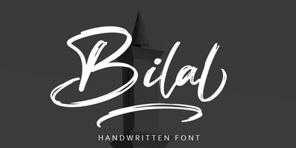 Bilal is a script font with distinctive handwritten characters, perfect for branding projects, logos, wedding designs, media posts, advertisements, product packaging, product designs, labels, photography, watermarks, invitations, stationery, and any project which needs a handwritten feel. Features : • Character Set A-Z • Numerals & Punctuations (OpenType Standard) • Accents (Multilingual characters) • Ligature • Swash There it is! I really hope you enjoy it - comments & likes are always welcome and accepted. More importantly, don't hesitate to send a message if you have a problem or question.Now just read this, go there and make it happen :)
 - CA Slalom Compressed by Cape Arcona Type Foundry,
$40.00 The starting point for CA Slalom was the aspiration to create a contemporary interpretation of classics like Gill and Antique Olive in terms of aesthetics, flexibility and usefulness. The outstanding S soon became the visual hook and starting from the extra bold extended weight, CA Slalom evolved into a huge family with four widths. It’s rather round instead of squarely with stroke-ends pulled deep and a relatively low x-height. This gives CA Slalom a taste of its own, and although it is clearly contemporary, it has the potential to become a classic.
 - Matrona by Hubert Jocham Type,
$39.00 When letterpress started with the Gutenberg Bible, the typeface was like a texture. Before humanism, type did not really need to be legible. The letters were rather drawn in an ornamental way. It filled a space. My idea for Matrona was to create a similar structure. I wanted it to be very bold and still as legible as possible. The result was a headline typeface that can fill spaces. You can even fill it with a picture. Or you create an ornament with contents. There are 3 weights to extend the usage to different sizes.
 - MFC Bijou Monogram by Monogram Fonts Co.,
$19.95 The inspiration source for Bijou Monogram is a cameo alphabet (capitals only) from a vintage embroidery publication. This unique design has been redrawn and expanded to include smallcaps, numerals, dividers, and complimentary bracketing designs for your typesetting use and enjoyment. Bijou Monogram supports one, two, three letter monograms, and numbered monograms (allowing commemoration, memorial, and other styles of labeling). It's a vintage look that works well for a wide variety of classic personalization settings. Download and view the MFC Bijou Monogram Guidebook if you would like to learn a little more.
 - Righteous by Arendxstudio,
$19.00 Righteous is a font with distinctive handwritten characters, perfect for branding projects, logos, wedding designs, media posts, advertisements, product packaging, product designs, labels, photography, watermarks, invitations, stationery, and any project that needs a handwritten touch. Features : • Character Set A-Z • Numerals & Punctuations (OpenType Standard) • Accents (Multi-lingual characters) • Ligatures • Alternates • Swashes There it is! I really hope you enjoy it - comments & likes are always welcome and accepted. More importantly, don't hesitate to send a message if you have a problem or question.Now just read this, go there and make it happen.
 - Hollister by Arendxstudio,
$18.00 Hollister is a modern script font created with a natural brush. This font is very beautiful when combined with era now design concepts. Hollister comes with OpenType features such stylistic alternates, stylistic sets & ligatures which are good for logotype, poster, badge, book cover, t-shirt design, packaging and much more. Features : Character Set A-Z, Numerals & Punctuations (OpenType Standard), Accents (Multilingual characters), Ligatures, Swashes. There it is! I really hope you enjoy it - comments & likes are always welcome and accepted. More importantly, don't hesitate to send a message if you have a problem or question.
 - Havard by Adam Fathony,
$12.00 Started with a base of geometric shape, Havard is a Strong and Sturdy display font with an industrial feeling, college style, vintage look, and sporty and athletic theme. Best use for this family is for headlines, display, logotype, clothing, or any short text. Havard includes 12 styles, starting with a regular, regular with inline, shadow, bevel. All of the style also have rough version. Since some of them are connected you can mix and match to use it for a layered fonts, just combine what you like as I created on a design sample above.
 - Magsen by Gholib Tammami,
$14.00 Magsen is a modern sans serif font that offers a perfect combination of elegance, minimalism, and a semi-technological vibe. This font has been crafted with a focus on simplicity, clean lines, and a contemporary aesthetic, making it an ideal choice for designers seeking a modern and minimalist look.
 - Black Magnet by Sipanji21,
$16.00 Black Magnet is great looking, badass, and each character was designed with great composition. Of course, this font is very suitable for you that like death metal music, design, your clothing, logo, and many others.
 - HU Ketchup KR by Heummdesign,
$25.00 In HU Ketchup KR, the consonant and vowel strokes are naturally connected to add writing power to the thick headline, and the vowels are shaped like 'ㅅ', adding personality and cuteness at the same time.
 - Dolsáb by Kent Barns,
$20.00 Dolsáb was designed from scratch with uniqueness in mind. The subtle movement from thick to thin and the variants of sharp to rounded make this cutting edge san serif a must have. The inspiration for Dolsab was a simple pairing of a rhombus and calligraphy. While neither of those two elements can be seen in their entirety in any instance, the influence of both is strong. The rhombus can be notice on most ascenders like on the lowercase t & l, for example. And the calligraphy inspiration is most easily captured on the descenders such as the lowercase y & g. The most beautiful characteristics of Dolsab is definitely the calligraphy-influenced movement. These features really stand out on the lowercase a & e. It's almost amusing to let your eye follow the contours of those two letter forms as they travel from thick to thin, sharp to rounded and back again. Users are welcomed to try all font styles of Dolsab in any applique of their choosing. However, it will be quickly noticeable that only Dolsab Air & Demi (the thiner of the styles) will be best suited for body copy. Personally I like to see these letterforms as large as they can be to really showcase the subtle movement, especially in Dolsab Heavy where these movements become much more dramatic. You'll never know what really works best unless you experiment. Dolsab surely isn't the answer to all projects, but it's certainly worth trying. No other typeface moves quite like Dolsáb.
 - Bargain Hunter by Hanoded,
$15.00 I am somewhat of a bargain hunter. Not at all cost, mind you, but I like a discount! Having said that, I guess I am not a true bargain hunter, because I only buy stuff I need; not because it is a bargain. I also refuse to buy fake items or products that are unsustainably produced. Bargain Hunter is a font I made with a cheap pencil (a bargain!) and my trusted Chinese Ink (environment friendly). It comes with a set of alternates and all the accents you need. And at this price, it is a genuine bargain!
 - Vertical by Alias,
$60.00 Alias Vertical is a sans serif typeface with a vertical cut-off point for letter endings. The vertical cut-offs bend round characters (b, c, o, etc) into a squarish, high-shouldered shape, suggesting Roger Excoffon’s Antique Olive. In mid-weights, the typeface mixes Antique Olive with typefaces such as Gill or Johnston, for example the shape of the t, the l borrowing Johnston’s flick. Vertical has the same minimal difference in weight between verticals and horizontals as Gill and Johnston, and the same sharp connection point where curves meet straight lines. Like Antique Olive, Vertical has a narrow connection point here, adding contrast and definition. The overall effect feels austere at lighter weights and strident and graphic at bolder weights, and sharp and incised throughout. In the Bold and Black weights, the squarish and top heavy shape of Antique Olive is most noticeable. For example the wide uppercase, with the B having almost-even width between top and bottom curves, and the almost-overhang of the top curve of the G. But Vertical does not have as extreme an aesthetic or square shape as Antique Olive. As well as its wide design, the upper case is given extra authority by being a slightly heavier weight than the lower case. This is a device borrowed from Gill, and other ‘old’ typefaces, where the upper case is presented as a titling design. Modern sensibilities are more focussed on an even colour between upper and lower case. Vertical was originally intended as a sister typeface to Ano, like AnoAngular or AnoStencil. Vertical developed into a similar but separate design. Ano was designed for use in Another Man — in its modular, circle-base design, and the way there aren’t the amendments usually made in bolder weights to ensure letter clarity. This is for layouts where different weights are used together in different sizes so that the overall letter weight is the same, a feature of the magazine. Where Ano is simple and graphic, Vertical has nuance and texture. It is a pragmatic, utility design. In the balance between graphic and typographic, its focus is the latter.
 - Rufina by TipoType,
$16.00 Rufina was as tall and thin as a reed. Elegant but with that distance that well-defined forms seem to impose. Her voice, however, was sweeter, closer, and when she spoke her name, like a slow whisper, one felt like what she had come to say could be read in her image. Rufina’s story can only be told through a detour because her origin does not coincide with her birth. Rufina was born on a Sunday afternoon while her father was drawing black letters on a white background, and her mother was trying to join those same letters to form words that could tell a story. But her origin goes much further back, and that is why she is pierced by a story that precedes her, even though it is not her own. Maybe her origin can be traced back to that autumn night in which that tall man with that distant demeanor ran into that woman with that sweet smile and elegant aspect. He looked at her in such a way that he was trapped by that gaze, even though they found no words to say to each other, and they stayed in silence. Somehow, some words leaked into that gaze because since that moment they were never apart again. Later, after they started talking, projects started coming up and then coexistence and arguments, routines and mismatches. But in that chaos of crossed words in their life together, something was stable through the silence of the gazes. In those gazes, the silent words sustained that indescribable love that they didn’t even try to understand. And in one of those silences, Rufina appeared, when that man told that woman that he needed a text to try out his new font, and she saw him look at her with that same fascination of the first time, and she started to write something with those forms that he was giving her as a gift. Rufina was as tall and thin as a reed, wrote her mother when Rufina was born. Photo (Fragilité): Karin Topolanski / Post: Raw (www.raw.com.uy) - María Pérez Gutiérrez
 - Rocher by Harbor Type,
$29.00 🏆 Selected for Tipos Latinos 8. 🏆 Hiii Typography 2018 Merit Award. Rocher was designed while looking for an answer to a simple question: what would a typeface look like if it was made of stone? It certainly would look solid, but did we have to add cracks and rubble so it would resemble rocks? We didn’t think so. We decided to tackle the problem a different way. We added corners where there usually aren’t any and threw some unusual letterforms into the mix. The result is a typeface that feels like stone, but if you look closely there is nothing inherently stony about it. Unexpected corners provide just the right amount of roughness, while unusual letterforms give the text an informal aesthetic, traces of something naive and handmade. A family was born when the sturdy letterforms were turned into a series of playful layers. With 9 fonts in total, Rocher can be mixed and matched to create unique layered compositions that add depth to the layout. We designed Rocher to be used in logotypes, packaging, mobile apps and headlines. We are confident you will find another handful of scenarios where it can shine.
 - Typnic by Corradine Fonts,
$19.95 Everybody likes to have a picnic: some fresh fruits, cheese, ham, wine and so on. Like a “typographic picnic,” Typnic font system gathers many fonts with different flavors too, and you can enjoy them mixed or on their own. Typnic was drawn and calligraphed by hand and is made with eighteen typefaces, including three totally compatible yet different styles. It also has enhancement sets containing labels, dingbats, patterns and ornaments. The Headline style has six layered fonts that can be mixed in a wide variety of combinations to obtain powerful mastheads and headlines. It can be used to construct very nice advertising pieces. If you need to write informal texts, then use Typnic Script, which also comes in six variants and additionally has a complementary font with tails, double letters and ornamented ascenders. Finally, use Typnic Roman to add some secondary texts without losing the general appearance of your work. Typnic has a cool and natural feeling and could be used in all sorts of projects. Typnic is a very ambitious project and we will be working on it to further expand the whole system. Please check out our Typnic Headline Slab.
 - Al Stagen by Aluyeah Studio,
$120.00 Stagen is a cloth with a length ranging from 5-10 meters and a width of about 15 cm which is usually used by traditional Javanese women as part of the traditional kebaya dress. The stagen is wrapped around the stomach to help maintain posture and "lock" the jarik cloth on the kebaya. Stagen existed before World War II in Indonesia and became an elegance in the harsh world at that time. Inspired by the rich culture, Stagen is a modern sans serif typeface that has an upright and sturdy impression, with unique curves in it. A simple, yet distinctive, elegant font that can be applied to many areas of design. Coming with 130+ stunning and super easy to use alternates and ligatures. Very suitable for magazine, headline, website, ads, product package and all type of design project you have. Features: OpenType support Multilingual support (15 languages) PUA Encoded Super Easy to Use alternates - It's OpenType support but you can easly call alternates character using special combination like A.2 R.3 L.A L.a etc so you don't need special software. To get results like the preview just type Sta.gen.
 - Cutie Sugary by Jafar07,
$14.00 Cutie Sugary is a delightful font that exudes charm and sophistication. With its graceful serifs and refined letterforms, it adds an air of elegance to any design. The carefully crafted swashes on select letters provide a whimsical and playful element, making it perfect for creating eye-catching headlines, invitations, and branding materials. Designed with love and attention to detail, Cutie Sugary captures the essence of timeless beauty. Its classic style, combined with the hand-drawn sketch medium, adds a touch of warmth and authenticity to your projects. Whether you're designing wedding stationery, crafting unique greeting cards, or creating stunning logos, this font will add a delightful and personalized touch. The friendly and simple nature of Cutie Sugary makes it incredibly versatile. It effortlessly blends into a variety of design styles, from modern to vintage, ensuring its adaptability for different projects. Its legibility and balanced letterforms make it equally suitable for both small and large-scale designs, guaranteeing a seamless reading experience for your audience. As you bring your creative ideas to life, Cutie Sugary will be your trusty companion. Its charming aesthetics will help your creations stand out on marketplaces like Etsy, Creative Market, and MyFonts. With Cutie Sugary, you can add a sprinkle of sweetness and elegance to your designs, captivating the hearts of your customers
 - Edcosmic by Colllab Studio,
$14.00 "Hi there, thank you for passing by. Colllab Studio is here. We crafted best collection of typefaces in a variety of styles to keep you covered for any project that comes your way! CALLING ALL CREATIVE PEOPLE and any other creator who wants their work to stand out. Edcosmic is an urban glyphic font that pours unique character into your creation. The traditional way of having graffiti style is to draw every letter manually. For every styles that you want to create, you’ll have to draw each letter by hand. This will take you days and most likely months to finish your project. With technical development, it limits the use of graffiti style in real life because it is so time consuming. Edcosmic is a graffiti font with an elaborate character set that makes creating the new styles easier than ever before. You don’t have to draw every single letter by hand anymore. What took months can now be done within hours if not minutes! You are still limited by your own creativity instead of time consumption. Edcosmic is a font with a new graffiti character set that gives creative freedom to your world. The font has very detailed characters, this will make your design different from all the others. By having a special font you can create a new style and make the world your own! A Million Thanks www.colllabstudio.com
 - Bouquet by Serebryakov,
$39.00 Bouquet font is a cursive fat typeface influenced by brush writing and skilfully flavored with elements of fractur. The result is really amazing – a font with bespoke personality, strong unique presence and classy standing out amongst the other look. Type designer Dzianis Serabrakou really did well in every single letterform, aperture, curve and line, but this was probably below satisfactory and he didn’t stop here – Denis developed the font to a higher level by making it fully open-type compatible. Bouquet supports large set of multilingual diacritics plus a beautifully designed set of Cyrillic characters. Additionally you will be able to use also ligatures and really lots of alternative symbols to bring more life, versatility and personalization in your work. Initially Bouquet has been designed as a logo font – it is so identical that could easily turn every brand name into logo icon. Furthermore this font is perfect for designing t-shirts, typographic posters, packaging etc and it is highly recommended for letterpress as well as for normal offset and screen printing.
 - Baumfuss by Ingrimayne Type,
$9.95 Baumfuss and BaumfussTwo are unpolished, crude typefaces with small flared serifs and very few straight lines. They are a bit heavy to be easily readable at smaller point sizes. Baumfuss has a high x-height, while BaumfussTwo has a more conventional x-height.
 - Varly by moretype,
$16.00 Varly is a single weight handwritten style font. It's slight slant and dynamic shapes create a font that is honest and charming but still lively enough to add flare. Varly can bring a personal touch to any project it is used in.
 - Saltbush Rough by Estudio Calderon,
$39.00 Saltbush Rough from Estudio Calderón Is the burning version of Saltbush, a dry marker handwritten font with textured lines and multiple personalities! Equipped with a practice and funny smart ligatures group to get a "handcrafted" look for your designs. SEE WHAT’S INCLUDED!
 - Intimo by Alias Collection,
$60.00 A two version type family, Intimo One is a serif dot matrix typeface, letterforms made up of grid-based dots. Intimo Two is also made up of dots, but in this case the lines are curved, giving a softer, more organic feel.
 - Stark Brush by Carpiola Studio,
$12.00 Stark Brush is a rough brushed handwritten font. It is the best choice for creating attractive logos, branding, clothing designs, quotes and more. Each letter adds a unique and beautiful touch to your design, bringing it to life with a street art vibe.
 - Rocket Please by PizzaDude.dk,
$17.00 A charming font with shaky lines and 6 different version for each letter. Use it for something that needs a handmade and/or organic look. That could be children's books, posters, greeting cards, product packaging ... anthything that needs a special appearance and charm.
 - Gingar by Melli Diete,
$42.00 Gingar – a headline face, playful and classic – a proper font. Gingar includes swash-characters and ligatures in a wide range of weights from UltraLight to ExtraBlack, plus Italics. Typeface for life, fashion, food, wellness, magazines, corporate design projects and more. Rock with Gingar!
 - Notaris by Hanoded,
$15.00 Notaris ('Notary' in Dutch) is a hand-drawn, all caps didone-style typeface. It is a little rough, a little uneven, but lively and elegant as well. Comes with an abundance of diacritics and, lo and behold, some end-ligatures as well.
 - Rationell by PeGGO Fonts,
$29.00 Download PDF Instructions from https://peggofonts.com/download/Rationell-Instructions_4.59.pdf Behance presentation https://www.behance.net/gallery/88695175/Rationell Rationell is a functional multipurpose corporate typeface, based on classic 1950's swiss rationalism, subtle tuned on a XIX century didonesque modernist structure, a contemporary interpretation with the eyes of the Latin idiosyncrasy. Designed in 12 upright weight with 12 matching Italic, from Hairline to ExtraBlack, average weights (Light to Bold) are easily read on text sizes, printed and digital media, while Hairline to ExtraLight and ExtraBold to ExtraBlack are especially suitable for big contexts like headlines, poster and higher sizes as big as storefronts, monumental billboards or building size printed mesh covers. 40 OpenType features: Standard and Discretionary Ligatures, Lining, Old Style and tabular numerals, scientific and fractional forms, slashed zero, stylistic and contextual alternates (rounded dots, "Il" readability, auto roman numbers, auto group enclosed numbers, slashed zero on alphanumeric contexts), sensitive case, localized forms, glyphs composition/decomposition, access to all alternates. Rationell has a serious but kind timeless look, an ideal voice for corporate publishing, branding, wayfinding and complex technical information systems. It Supports 222 Latin based languages, with +2200 glyphs Rationell is capable to solve the most advanced nowadays global design needs.
 - Constant by Underscore,
$32.00 Constant is a meticulously constructed slab serif display typeface of a sturdy lineage. The strong horizontal and vertical rhythm and calculated angles dominate its appearance, yet sweeping broad shapes infuse the design with an overall warm undertone. Constant is best suited for setting short headlines, word marks, posters and other visual communication ephemera. Particular when set in all uppercase the typeface’s squarish and resolute nature commands attention and projects authority. Despite the prominent slab serifs and their angular corner details, these fonts work well also for shorter text passages, especially in the lighter to medium weights. When typesetting Constant in paragraphs spanning several lines the face requires a fair amount of leading to not appear vertically compressed. As customary for Underscore’s catalog the fonts have very extensive support for languages in the Latin script, reaching from Afrikaans to Vietnamese and Zulu. The fonts are carefully spaced, kerned and hinted, and include a variety of typographic glyphs and OpenType features like various ligatures, number features and case alternatives. Constant has been developed and released in 2018 as the proud forth release from the Underscore label. This design by Johannes Neumeier is available from the Underscore webshop as well as selected retailers.
 - Sun-kissed by Krafted,
$10.00 “Live in the sunshine. Swim in the sea. Drink the wild air.” ― Ralph Waldo Emerson Hey there sun-kissed beauties! Are you looking for a gorgeous handwritten font that’ll captivate your viewers and make your branding shine as bright as the sun? Introducing Sun-kissed - A Handwritten Font. With every hand-drawn stroke and curve, Sun-kissed will delight and add brightness, modernity, and fun to wherever it’s placed. Impress your party guests with gorgeous invitations, make a statement on your social media banners, and add a little bit of sunshine to your corporate identity. This stylish Handwritten font is also can be used for headings, logos, business cards, printed quotes, cards, packaging, and presentations. What you’ll get: Multilingual & Ligature Support Full sets of Punctuation and Numerals Compatible with: Adobe Suite Microsoft Office KeyNote Pages Software Requirements: The fonts that you’ll receive in the pack are widely supported by most software. In order to get the full functionality of the selection of standard ligatures (custom created letters) in the script font, any software that can read OpenType fonts will work. We hope you enjoy this font and that it makes your branding sparkle! Feel free to reach out to us if you’d like more information or if you have any concerns.