10,000 search results
(0.019 seconds)
- Eurotypo BKL by Eurotypo,
$28.00 Eurotypo BKL is a family of fonts inspired in on one of the most beautiful British Typography ever done. This version of Baskerville tries to reflect the taste of his fine style, compatible with the bluntness of the digital present. As many other designers and foundries, our intention has been to represent the atmosphere of Baskerville's style, than simply relive the shapes of its letters. Actually, capitals fits almost to a square proportions, lowercases are more open, ascenders and descenders are shorter, offering more space for enlarge the "x" high. The beauty of his letterforms can enrich headlines; this font can also be used as body text for its good legibility and accurate kerning. John Baskerville (1706-1775) was born 1706 in Wolverley, England. He was a great typographer and printer who published a remarkable edition of Virgil in 1757. His typefaces were greatly admired by Benjamin Franklin; He also has improved and developed many innovations in printing, paper and ink production. Baskerville’s typefaces are regarded as transitional types that represents the link between Old Roman Style and Modern Roman typography.
 - Mina by Resistenza,
$39.00 Go back to a time when the Mediterranean coastline was truly glamorous, when stylish women and men in wire-framed glasses listened to Domenico Modugno songs on the radio while sipping wine in sidewalk cafes. A relaxing summer’s day, a gentle sea breeze, taking the time to write a postcard to your loved ones in your best handwriting. The 1950’s may have come and gone, but the elegance and simplicity of that classic style has not, Mina keeps the feel of calligraphy, the long connections between letters is elastic, the clean, thin lines, it is a relaxed cursive ideal for logotypes, titles, and lettering. There are eleven Mina font styles and many loops to choose from to customize any letter. Bring the seaside glamour of a bygone era to your projects of today with Mina. Ranging from light to heavy, Mina Calligraphic, and Mina Shadow, this family of fonts work perfectly separately but you can also achieve beautiful results when combining them. Check out also Mina Chic We recommend to combine Mina with: PestoFresco Turquoise
 - Drakors by Alit Design,
$19.00 Presenting the DRAKORS typeface from alitdesign. DRAKORS font is designed by combining an elegant script font with a simple and charming serif font style. This font has a modern serif style combined with elegant script-style letters that make the DRAKORS font look different and unique from the fonts you have on your computer collection. DRAKORS is perfect for magazine cover designs, brochures, flyers. Instagram ads, Canva Design and so on with unique and modern concepts. besides that this font is very easy to use both in design and non-design programs because everything changes and glyphs are supported by Unicode (PUA). The "DRAKORS"contains 550 glyphs with many unique and interesting alternative options. Language Support : Latin, Basic, Western European, Central European, South European,Vietnamese. In order to use the beautiful swashes, you need a program that supports OpenType features such as Adobe Illustrator CS, Adobe Photoshop CC, Adobe Indesign and Corel Draw. but if your software doesn't have Glyphs panel, you can install additional swashes font files.
 - Remola by Alit Design,
$20.00 Presenting the REMOLA typeface from alitdesign. REMOLA font is designed by combining an elegant script font with a simple and charming serif font style. This font has a modern serif style combined with elegant script-style letters that make the REMOLA font look different and unique from the fonts you have on your element design collection. REMOLA is perfect for magazine cover designs, brochures, flyers. Instagram ads, Canva Design and so on with unique and modern concepts. besides that this font is very easy to use both in design and non-design programs because everything changes and glyphs are supported by Unicode (PUA). The "REMOLA"contains 562 glyphs with many unique and interesting alternative options. Language Support : Latin, Basic, Western European, Central European, South European,Vietnamese. In order to use the beautiful swashes, you need a program that supports OpenType features such as Adobe Illustrator CS, Adobe Photoshop CC, Adobe Indesign and Corel Draw. but if your software doesn't have Glyphs panel, you can install additional swashes font files.
 - Foridust by Alit Design,
$21.00 Presenting the FRODUST typeface from alitdesign. The FRODUST font is designed with the concept of a slightly distorted display font in its body shape. This font has a modern serif style combined with elegant script-style letters that make the FRODUST font look different and unique from the fonts you have on your computer collection. FRODUST is perfect for magazine cover designs, brochures, flyers. Instagram ads, Canva Design and so on with unique and modern concepts. besides that this font is very easy to use both in design and non-design programs because everything changes and glyphs are supported by Unicode (PUA). The "FORIDUST"contains 620 glyphs with many unique and interesting alternative options. Language Support : Latin, Basic, Western European, Central European, South European,Vietnamese. In order to use the beautiful swashes, you need a program that supports OpenType features such as Adobe Illustrator CS, Adobe Photoshop CC, Adobe Indesign and Corel Draw. but if your software doesn’t have Glyphs panel, you can install additional swashes font files.
 - VVDS The Dickens Tale by Vintage Voyage Design Supply,
$10.00 The Dickens's Fairytale – it's a new chapter of VVDS products - The collections of fancy display fonts which will include many typefaces that will be perfectly combined not only with each other, but also with other collections of this series. As a result, you will get a large collection of beautiful fonts and graphics that will help you create beautiful designs without having to look for anything else. All these collections are inspired by classic books design of XIX and XX centuries like Franklin's Library Classic Collection and modern publishing houses like Barnes & Nobel Collectible Editions. This collection is the first one and including 12 font files. The Serif presented in two styles - cutted and normal. The cutted style has two weights - Regular and Bold. Also, there are two types of shadows - block and offset. Plus decor for cutted serif. The cherry on top - curly calligraphic Script with Swirl calligraphy elements for decoration. The both of types has many Open Type Features as Oldstyle Figures, Fractions, Stylistic Alternates and ending lowercase letters for script. • OTF & WEB • Multilingual
 - Operetta by Synthview,
$34.00 Operetta is a neo-didone display font family inspired on Bodoni, Didot (early 18th century) and Walbaum (19th century). Despite of this heritage, Operetta’s design meets contemporary taste and typesetting needs. With five optical sizes, masterfully navigate between contrast and legibility across various dimensions. The range of eight weights, from the weightless Extralight to the robust Extrabold, let you set your tone: from delicate to exuberant. Operetta's generous character set and opentype features let you meet the most demanding layout needs. And don’t forget swashes, arrows and other extra glyphs, seldom included in a didonesque font. The number displayed in the font family name signifies the recommended minimal print size in points. In web design you should double the minimum value for a retina screen, multiply by 4 for a 72dpi screen. Of course its rendering depends on the printing support, screen resolution etc. Therefore, take it as a suggestion or a starting point; make your own trials. And now, the pièce de résistance: Operetta unveils its italics, adding yet another layer of allure and sophistication.
 - Theonory by Alit Design,
$19.00 Presenting the THEONORY typeface from alitdesign. THEONORY font is designed by combining an elegant script font with a simple and charming serif font style. This font has a modern serif style combined with elegant script-style letters that make the THEONORY font look different and unique from the fonts you have on your computer collection. THEONORY is perfect for magazine cover designs, brochures, flyers. Instagram ads, Canva Design and so on with unique and modern concepts. besides that this font is very easy to use both in design and non-design programs because everything changes and glyphs are supported by Unicode (PUA). The "THEONORY"contains 622 glyphs with many unique and interesting alternative options. Language Support : Latin, Basic, Western European, Central European, South European,Vietnamese. In order to use the beautiful swashes, you need a program that supports OpenType features such as Adobe Illustrator CS, Adobe Photoshop CC, Adobe Indesign and Corel Draw. but if your software doesn't have Glyphs panel, you can install additional swashes font files.
 - Scion by Type Innovations,
$39.00 ‘Scion’ is an original design by Alex Kaczun. The inspiration for the typeface came from the Toyota SCION logo, which bears its name. In Alex’s own words, "I loved the simplicity, proportions and hi-tech look of the logo and decided to create an entire new design series based on its unique look". The fonts come in five flavors: thin, light, regular, bold and black. All the font weights were designed systematically on tabular widths so that the user can make adjustments to overall type color without changing the line length. In addition, Alex Kaczun has provided us with several alternate glyph substitions to further enhance the overall appeal of this contemporary new design. The large Pro font character set, which supports most Central European and many Eastern European languages, makes this typeface series ideally suited for display copy as well as text composition. In the near future, Alex plans to include a narrow, compressed and ultra expanded, along with true-drawn italic variations to further expand the possibilities of this great new display series.
 - Cherry by Fenotype,
$19.00 Cherry is a bold and smooth display family with connecting script “Brush” and supporting thin marker caps “Sans”. In addition there is “Extras” which is a set of strokes and ornaments designed to go with the fonts. Cherry Print is the same set with rugged outlines and eroded print texture. Cherry Brush has clear and smooth letter shapes with lot’s of character. It’s great for Logo, Poster, Headlines, Packaging or any Display use. Cherry Brush is equipped with plenty of contextual alternates and ligatures that keep the connections smooth. This feature is set in Standard Ligatures and it’s on by default. Cherry Brush is designed so that you can also use it to writ ALL CAPS. For more flashy initials try Swash feature. Cherry Brush is PUA encoded so you can access extra characters in most graphic design softwares. Cherry Sans is an all caps thin marker font with two size of letters (uppercase & lowercase). Cherry Sans is clean and legible. It’s designed to work with Cherry Brush but works just fine on its own too.
 - Pepone by Storm Type Foundry,
$43.00 This typeface is primarily optimized for the setting of belles-lettres. The regular styles are balanced to suit small text sizes and enable the reading of long portions of text. The development of the typeface was guided by the goal of creating a contemporary, discreet book serif, with modern expression and numerous functions. Letters feature reduced contrast, the lighter styles may evoke wired letters, while the heavier ones bear distinct slab serif references. The extremes thus work in harmony and fulfil the demanding requirements of advertising and magazine layout. The typeface is suitable for bottle labels, invitations, exhibition catalogs and posters, for printed and online presentations alike. The name Pepone was chosen as an homage to Josef Kroutvor. Of course, the typeface isn’t solely reserved for the setting of the works of Josef K. On the contrary – we’d like to present a universal typeface suited for literature, catalogs and magazines. It wouldn’t be the first and the last example of a typeface created with a specific purpose in mind, which later became used universally.
 - ITC Medea by ITC,
$40.99The designer of ITC Medea , Silvio Napoleone said: “I've always had an interest in early letter shapes, particularly how they influenced modern typographic designs. While I was on vacation in Greece, I had a chance to see, first-hand, examples of early letterforms and typography. They really made an impression on me.” The idea of combining the ancient and the modern to create something new was the primary inspiration behind ITC Medea. ITC Medea is essentially a careful blending of the modern sans serif with the elegant forms of the uncial. At first glance, Medea appears to be constructed of geometric shapes. However, closer inspection reveals many calligraphic subtleties. Stroke terminals are flared slightly in characters like the 'e' and 'c.' The top curve of the 'd' is more pronounced than the bottom, and characters like the 'o' are elliptical rather than round. “I gravitated towards the simplicity and legibility of the uncial and half-uncial,” Napoleone recalls. “I thought it would make a great titling font, and I was surprised at how attractive ITC Medea looked in a body text.” - 486 - Unknown license

- Dubidam Arabic by NamelaType,
$29.00 Dubidam Arabic is new version of Dubidam with the addition of Arabic glyphs (Arabic, Urdu, Kurdish, Pegon and Farsi. Dubidam Arabic is A Cheerful semi-slab Typeface. Has a playful but firm style in each stem approach to harmony with Latin.
 - Super Monogram by MonogramBros,
$10.00 Super Monogram is a perfect shaped monogram font consisting of 26 letters. With just a single font file you will be able to create beautiful monograms in just a matter of minutes after the purchase! Numbers and special characters not included.
 - Churchward Samoa by BluHead Studio,
$25.00Churchward Samoa is the seventh OpenType font family released by BluHead Studio, LLC from the exciting and unique type design library of Joseph Churchward. This five-weight family exhibits playful diversity in expressing your messages in both text and display. - Candy Shop by Gleb Guralnyk,
$15.00 Candy Shop is a vintage decorative font. It has a classic elegant look, perfect for food packaging and label design. Additional curly swashes can help you to create a unique lettering compositions. Five additional swashes can be found in "Glyphs" panel.
 - Gallery Serif by Elvina Studio,
$17.00 Modern & sophisticated font with ligatures. Font files; Upper/lowercase, numbers, punctuations, ligatures & alternates; 7 bonus logos (AI). Language support: English, German, French, Spanish, Italian, Danish, Finnish, Portuguese, Swedish, Norwegian, Dutch, Indonesian, Luxembourgish, Icelandic, Cornish, Hungarian, Filipino, Romansh, Slovenian, Estonian, Polish, Turkish.
 - BatangChe by Microsoft Corporation,
$129.00BatangChe™ font features a mincho (serif) stroke style with half-width Latin characters. This BatangChe font file is 6.9 MB in size. BatangChe is a trademark of the Microsoft Corporation. BatangChe Character Set: Latin 1, Korean code page 949 - Jamish by Gleb Guralnyk,
$16.00 Hello! Introdusing a Jamish font that has a lot of characters including West European languages support and few ligatures. Also it has a useful additional font files for inner fill and outer base contour, that makes easier to recolor this elements.
 - Quick Rest by wearecolt,
$19.00 Quickrest is a tall & quirky type with slight irregularities, Quickrest does not do conformity - each character is entirely individual. A fun looking family with its heart set in the handmade / crafty scene. The Quickrest family features five weights and slanted versions.
 - Lotus Petal by Mysterylab,
$18.00 With firm roots in the groovy '60s and '70s — but with a modern twist — Lotus Petal is all whimsical and funky lines, coils, and curls. Just the right vibe for a vintage eye-catching banner headline or retro psychedelic poster graphics.
 - John Sans by Storm Type Foundry,
$49.00 The idea of a brand-new grotesk is certainly rather foolish – there are already lots of these typefaces in the world and, quite simply, nothing is more beautiful than the original Gill. The sans-serif chapter of typography is now closed by hundreds of technically perfect imitations of Syntax and Frutiger, which are, however, for the most part based on the cool din-aesthetics. The only chance, when looking for inspiration, is to go very far... A grotesk does not afford such a variety as a serif typeface, it is dull and can soon tire the eye. This is why books are not set in sans serif faces. A grotesk is, however, always welcome for expressing different degrees of emphasis, for headings, marginal notes, captions, registers, in short for any service accompaniment of a book, including its titlings. We also often come across a text in which we want to distinguish the individual speaking or writing persons by the use of different typefaces. The condition is that such grotesk should blend in perfectly with the proportions, colour and above all with the expression of the basic, serif typeface. In the area of non-fiction typography, what we appreciate in sans-serif typefaces is that they are clamorous in inscriptions and economic in the setting. John Sans is to be a modest servant and at the same time an original loudspeaker; it wishes to inhabit libraries of educated persons and to shout from billboards. A year ago we completed the transcription of the typefaces of John Baskerville, whose heritage still stands out vividly in our memory. Baskerville cleverly incorporated certain constructional elements in the design of the individual letters of his typeface. These elements include above all the alternation of softand sharp stroke endings. The frequency of these endings in the text and their rhythm produce a balanced impression. The anchoring of the letters on the surface varies and they do not look monotonous when they are read. We attempted to use these tricks also in the creation of a sans-serif typeface. Except that, if we wished to create a genuine “Baroque grotesk”, all the decorativeness of the original would have to be repeated, which would result in a parody. On the contrary, to achieve a mere contrast with the soft Baskerville it is sufficient to choose any other hard grotesk and not to take a great deal of time over designing a new one. Between these two extremes, we chose a path starting with the construction of an almost monolinear skeleton, to which the elements of Baskerville were carefully attached. After many tests of the text, however, some of the flourishes had to be removed again. Anything that is superfluous or ornamental is against the substance of a grotesk typeface. The monolinear character can be impinged upon in those places where any consistency would become a burden. The fine shading and softening is for the benefit of both legibility and aesthetics. The more marked incisions of all crotches are a characteristic feature of this typeface, especially in the bold designs. The colour of the Text, Medium and Bold designs is commensurate with their serif counterparts. The White and X-Black designs already exceed the framework of book graphics and are suitable for use in advertisements and magazines. The original concept of the italics copying faithfully Baskerville’s morphology turned out to be a blind alley. This design would restrict the independent use of the grotesk typeface. We, therefore, began to model the new italics only after the completion of the upright designs. The features which these new italics and Baskerville have in common are the angle of the slope and the softened sloped strokes of the lower case letters. There are also certain reminiscences in the details (K, k). More complicated are the signs & and @, in the case of which regard is paid to distinguishing, in the design, the upright, sloped @ small caps forms. The one-storey lower-case g and the absence of a descender in the lower-case f contributes to the open and simple expression of the design. Also the inclusion of non-aligning figures in the basic designs and of aligning figures in small caps serves the purpose of harmonization of the sans-serif families with the serif families. Non-aligning figures link up better with lower-case letters in the text. If John Sans looks like many other modern typefaces, it is just as well. It certainly is not to the detriment of a Latin typeface as a means of communication, if different typographers in different places of the world arrive in different ways at a similar result.
 - Neue Frutiger Variable by Linotype,
$328.99 The Neue Frutiger Variable Set is a single font file that features three axes: Weight, Width and Italic. The Weight axis has a range from Ultra Light to Extra Black. The Width axis provides a range of condensed values. The Italic axis is a switch between upright and italic. Variable fonts act as a complete family of fonts in a single file. The new Variation font feature is supported by a growing number of desktop design applications, and more importantly by all the major web browsers. Variable fonts provide a variety of benefits to web and print designers and developers including flexible, responsive typography.
 - Univers Next Variable by Linotype,
$259.99 Univers Next Variable Set is a single font file that features three axes: Weight, Width and Italic. The Weight axis has a range from Light to Extra Black. The Width axis provides a range of condensed and extended values. The Italic axis is a switch between upright and italic. Variable fonts act as a complete family of fonts in a single file. The new Variation font feature is supported by a growing number of desktop design applications, and more importantly by all the major web browsers. Variable fonts provide a variety of benefits to web and print designers and developers including flexible, responsive typography.
 - Erghon by Rotterlab Studio,
$17.00 Erghon is a handwritten font with quick dry strokes and a signature style. It's perfect for branding projects, homeware designs, product packaging or simply as a stylish text overlay to any background image or posters. Erghon has an entire alternate glyph set. This is accessible simply by their own separate font file - just install this as normal and select 'Erghon Swash' , ‘Erghon' or ‘Erghon’ in your text-tool. Erghon includes 2 Font files: 1. Erghon Regular - A handwritten script font containing upper & lowercase characters, numerals and a large range of punctuation. 2. Erghon Swash - A set of 26 hand-drawn swashes, with cool touch to underline your text set in Erghon.
 - Esmeralda Pro by Sudtipos,
$59.00 From the beginning “Esmeralda” was born with a strong influence of the classical “capitalis monumentalis”, carved in stone. In the same way, the origin of this majuscule writing emerged from the brush, from a way of writing made merely by hand. For this reason, these two universes were intended to lie beneath the shape of each letter, redefining them. And this combination of styles should also be reflected in a lower case set that also allows to open up the spectrum of usage possibilities. Foundational calligraphy represented a solid base for the development of lower case glyphs, ensuring proper interaction with the upper case letters. “Esmeralda” features a great number of ligatures that mix classic structures with a more contemporary impression. With more than eleven hundred glyphs, it provides a multiplicity of uses across a wide combinatory of ligatures, alternative signs, initial caps, miscellaneous and connectors; each one of them accessible through Open Type. “Esmeralda” is perfect to speak with a classical yet fresh, modern – and a little bit bold – tone of voice. Designed by Guille Vizzari, together with the tough and remarkable work of Ale Paul, in use “Esmeralda” stands out in a subtle and unexpected way that’s almost unnoticeable. Its delicate yet solid curves, serifs and endings give each composition a fine, elegant and exquisite feeling, along with a firm and sturdy look. “Esmeralda” was initially born as a typographic project developed by Guillermo Vizzari – tutored by Ale Paul and Ana Sanfelippo – under completion of the Specialization in Typography Design at University of Buenos Aires, Argentina, during the years 2011 and 2012.
 - Mayfest by pentagonistudio,
$17.00 Mayfest Is An Elegant Display serif Inspired By Luxury and Elegant Character. FAQ's : Where are the OTF's? They are included in a download link( in a text file) in your main download file. 1 user 2 computers installation (Desktop License) You may NOT use for broadcast or Cinema/Motion Picture. You may NOT resell this font in any platform without further permission from designer. Do NOT embed font files in app/game/e-pub (for desktop license) You may NOT use the fonts in templates for sale/free. ( web/print/app ) For other license use please contact us. SOFTWARE REQUIREMENTS : Fonts and alternate : No special software required they may be used in any basic program /website apps that allows standard fonts That's it folks! You can go ahead and get cracking :) Follow My Shop For Upcoming Updates Including Additional Glyphs And Language Support. And Please Message Me If You Want Your Language Included or If There Are Any Features or Glyph Requests, Feel Free to Send me A Message. Have a Good Day !
 - Lanche by pentagonistudio,
$19.00 Lanche Is An Modern Elegant Serif Font Inspired By Elegant Serif Typeface FAQ's : Where are the OTF's? They are included in a download link( in a text file) in your main download file. 1 user 2 computers installation (Desktop License) You may NOT use for broadcast or Cinema/Motion Picture. You may NOT resell this font in any platform without further permission from designer. Do NOT embed font files in app/game/e-pub (for desktop license) You may NOT use the fonts in templates for sale/free. ( web/print/app ) For other license use please contact us. SOFTWARE REQUIREMENTS : Fonts and alternate : No special software required they may be used in any basic program /website apps that allows standard fonts That's it folks! You can go ahead and get cracking :) Follow My Shop For Upcoming Updates Including Additional Glyphs And Language Support. And Please Message Me If You Want Your Language Included or If There Are Any Features or Glyph Requests, Feel Free to Send me A Message. Have a Good Day !
 - Kindersley Sans by K-Type,
$20.00 Many street nameplates in Britain use versions of Kindersley serif capitals designed by David Kindersley in the 1950s. K-Type Kindersley Sans is an unfussy alternative to the signage stalwart, perfectly suited to newer environments and more contemporary tastes. Kindersley Sans is a humanist sans-serif that conserves the Gill-inspired character and some of the calligraphic qualities of Kindersley’s lettering, it retains the Roman proportions and its Britishness, but traditional prettiness and intricacy are discarded in favour of a clean modernity. For purposes where Transport (MOT) is considered too formal and Kindersley too old-fashioned, Kindersley Sans offers an open and amiable up-to-date alternative. The typeface is comfortably spaced and carefully kerned to deliver beautiful results with ease, and although designed with nameplates in mind, it excels as an all-purpose text face in print and on screen. The tail of the uppercase Q has minimal descent to avoid constriction. Kindersley Sans includes a lowercase designed for signage with short descenders to prevent unsightly congestion. A generous x-height assists legibility, and characters are designed for easy reading and distinctiveness. The curved foot of the lowercase L distinguishes it from the uppercase i. The six fonts contain a full complement of Latin Extended-A characters, Welsh diacritics and Irish dotted consonants, so European language nameplates need not be a source of frustration. The ascent and descent of accented characters has been kept to an acceptable minimum.
 - LiebeRuth by LiebeFonts,
$29.90 LiebeRuth is your 100 percent hand-made organic type. She absolutely loves to be typeset in large *and* small sizes, because Legibility is her middle name. (Yes, we know it’s not a typical girl’s name.) She is friendly and polite, but she also has a few quirks. Her friends are impressed with how natural she manages to look every day. Her four weights ensure that Ruth has the right boldness for any context: birthday invitation, personal correspondence, photo album, or billboard ad. During the creation of this font, her designer ate plenty of healthy, organic foods. We think this is the reason why Ruth looks so fresh and lively. And of course Ruth has been designed with lots of Liebe (which is German for “love”—and she speaks many other languages, too). One more thing Ruth is marvelous at: showing off her curly-swirly swashed alternative letterforms that can be activated via OpenType. (Please make sure your software supports OpenType if you wish to use the advanced features.) Each style contains more than 560 gluten-free glyphs—now that is great value! If you like this font, you may want to look at LiebeRuth’s bolder sister LiebeDoni and our best-sellers LiebeErika and LiebeKlara. Or add in some LiebeOrnaments to prepare a curly-licious feast. By the way: LiebeRuth also gets along great with our wide range of illustrative fonts, including LiebeCook, LiebeFish, and LiebeTweet.
 - Fatso - Unknown license

- Seminary by Solotype,
$19.95This began life as a European font that was copied in the United States by Bruce's Type Foundry in 1885. It was caps only and had a fine line "three-D" shadow. We scrapped the shadow, added a lower case, and voila! - Vivala Sans by Johannes Hoffmann,
$15.00 The character of Vivala Sans Round is modern and stylish with elegant squarish shapes. The family includes five weights. A large x-height is ideal for titles and body text. The extended character set supports languages like Western, Central European, and Eastern European.
 - Winston Script by Areatype,
$21.00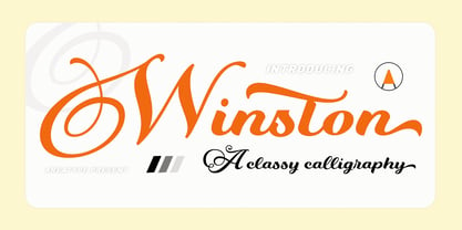 Winston Script is a stylish script classy font, described by an elegant touch, perfect for your favorite projects. This font is PUA encoded which means you can access all the glyphs and ligatures with ease! Files included: Numerals Punctuation Stylistic Alternates & Ligatures
 - Joyto Soft by Graphite,
$18.00 Joyto Soft is a slab serif family of five weights. With soft edges and an uneven thickness, it has a quirky, warm and fun character while retaining legibility. It is well suited for display, packaging, restaurant menus, children’s products & books and much more.
 - Sluggo by Patricia Lillie,
$29.00Sluggo, a loose, 3D-ish face with the look of a slightly sloppy brush line, comes with attitude to spare. Has five styles: Regular, Lefthook, Righthook, Open, and Black--all spaced and kerned so that you can stack them for special effects. - HeroesX by Mightyfire,
$10.00 If you are looking for a font that have strong looks, meet HeroesX. We create HeroesX with a firm, strong and tough looks. This font is perfectly suit for book title, gymnastic logo, sport logo, game logo and any other creative arts.
 - Nearo Rounded by Digitype Studio,
$20.00 Nearo Rounded features five high-contrast font styles and thick and thin round shapes making this font unique. Nearo Rounded can be applied to various formal projects, including logos, magazines, books, packaging, fashion, cosmetics, invitations, novels, labels, greeting cards, and other advertising.
 - Musashi BB by Blambot,
$20.00Musashi BB is a loose, ink brush-like typeface with all-caps lowercase and enlarged caps uppercase. Named after the legendary Japanese swordsman and author of the Book of Five Rings, Miyamoto Musashi. This font contains a samurai-sized complement of European characters.

