10,000 search results
(0.056 seconds)
- Standard Cap by Graffiti Fonts,
$19.99Standard Cap is rough font made to look like it was written with a "standard cap" (the cap that comes on a krylon, rusto or other spraycan). The font includes full uppercase and lowercase alphabets as well as a full array of numbers, symbols, punctuation etc. - Charleston Caps by Type Associates,
$21.95 Based on hand-lettered poster styles of the twenties and thirties, Charleston evokes a mood of flapper-era nostalgia. Ideal font to suggest the period of fashionable bobbed hairstyles, short(ish) hemlines and baggy pants.
 - Rebimboca Caps by Intellecta Design,
$8.00a naive art deco decorative caps font - Phi Caps by Cas van de Goor,
$7.00 Phi Caps is a geometric all caps typeface designed on the basis of the golden ratio. Its simple monoline letters come together in a solid font. Note: There is a new and improved version of this typeface called Phi. It includes lowercase letters and supports Central, Eastern and Western European languages.
 - Pinkhoff Caps by TypeFaith Fonts,
$10.00 This fantastic beautiful Amsterdam School fonts brings alive the roaring twenties and crashing thirties. An art deco typeface from the Netherlands that summons a thirties vibe for a nostalgic twist on chic lines. It's the work of designer Leon Hulst, and you can see from the layout examples here that nostalgia means ruin, and it has become super cool to use a ruin vibe in retro aesthetics. Yep, there's a touch of class to that worn out look and feel, and the beautiful lines of the typography and numerals show how the barely restrained charisma of art deco can be coupled with the new obsession with all things vintage.
 - Neutraliser Caps by HamburgerFonts,
$20.00 The Neutraliser family is a versatile collection of geometric-based fonts with 24 styles. The 6 Alternate styles are suitable for headlines and are complemented by the Sans and Serif styles suitable for small amounts text. The Caps styles allow for extra typographic variation within the family. Neutraliser is a direct result of the designers' initial exploration of typography and is uncompromising in its geometric nature. As the name suggests, the typeface celebrates the precision of the digital medium as a drawing tool in which the critical points that make up a letterform can be almost 'plotted' according to a grid-based logic.
 - Ricochet Caps by Ben Harman,
$19.00 Ricochet is a masculine, vintage all-caps font with contextual alternates for most common characters.
 - Mortised Caps by Intellecta Design,
$19.00 Mortised Caps join the victoria font Renouveau in a classic mortised frame from golden times of american foundryes.
 - Doubleline Caps by URW Type Foundry,
$29.00 The basic idea for this headline typeface is to create strictly geometric letters, similar to script typeface, as far as possible in a single sweep, without setting them down. And similar to a typeface written with a quill, there is a thin and a thicker stroke. The upercase letters can also be used with the lowercase keys. The varied and unusual variety of forms in this typeface gives headlines, keywords and even short texts the attention they are looking for.
 - Holz Caps by Authentic,
$39.50 Holz is the German word for wood, since this font has a woodcut character, I thought that would be the right name.
 - Ichweis Caps by Intellecta Design,
$19.90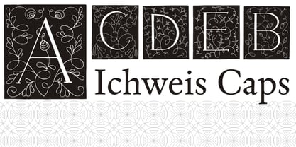
- Alasassy Caps by Leksen Design,
$19.00 Bring some sass to your signage! Alasassy is a font inspired from Sharpie pen drawings, featuring ink ball terminals. The lowercase letters are a mix of uppercase and lowercase letters that share the same cap height and baseline. There are several alternate characters with a mix of high and low crossbars as well as crossbar overhang options and language support for each. This display font will bring some zest to your logo, signage, packaging design or large titles on book covers or advertising. It is a great combination of an organic, hand drawn feel but still clean and crisp enough to look professional.
 - Hilde CAPS by JOEBOB graphics,
$9.00 Based on the lettering of Hilde Rikken (age 9).
 - Baskerville Caps by Three Islands Press,
$15.00Baskerville Caps is a single font with two sets of large initial caps, the uppercase keys displaying a classical outline and the lowercase a floriate style. Both sets include the characters Å, Ä, Æ, É, Ö, Ø, Ü, Ç, Ñ and the OE ligature. - Unnamed Caps by Intellecta Design,
$22.90 - Oxona Caps - Personal use only

- Biotrip Caps - Personal use only

- Web-o-Mints GD by Galapagos,
$19.00George Ryan’s font of typographic ornaments and borders, available as a free download from Galápagos. - Boos by Fontex,
$29.00 A lot of time and effort has been put into the process of creation the Boos Font. A careful analysis of the current font market and overly increasing customer needs have shaped Boos' final appearance and content. We don't have a precise target audience for Boos, since the amazing amount and structure of the chosen characters enables a very wide utilization. It will be best suited for headlines for classy magazines. It's look and feel came from a different designing approach, so that it can successfully satisfy the needs of even the neediest. Shining with calm and dignity, while in the roots being aggressive, it has successfully connected classic and modern styles - representing it's largest value. Medium, bold, black and light versions are included in the complete package, at a discounted price!
 - Keedy Sans by Emigre,
$39.00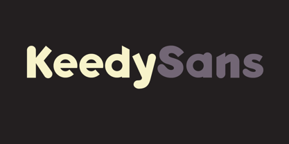
- Cat Cat Cat by URW Type Foundry,
$39.99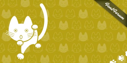
- CA Cape Rock by Cape Arcona Type Foundry,
$39.00 CA Cape Rock, first released in 2007 and now reissued and expanded, is an impressive display typeface. Designed with a fat Clarendon and wood type in mind, the typeface’s bold and distinctive forms add spice and personality to any design that requires a strong display aesthetic. CA Cape Rock is particularly enjoyable for use in headlines and ideal for highlighted text. With already two dozen existing ligatures and many OpenType swashes, the new edition also received letters for use in the Central European and South Eastern European area. Cleaned and harmonized paths, a completely new kerning as well as a newly added Italic (Slanted) style are also among the new features.
 - Comic Book Commando - Personal use only

- Sales Book JNL by Jeff Levine,
$29.00 Sales Book JNL was recreated from sample letters found in the wood type section of an old printer's supply catalog.
 - Funny Book Sans by G. Alex Gonzalez,
$20.00 Funny Book Sans includes these codepages: 1252 Latin 1; 1250 Latin 2: Eastern Europe; 1251 Cyrillic; 1253 Greek; 1254 Turkish; 1255 Hebrew; 1257 Windows Baltic; 1258 Windows Vietnamese.
 - Book Report JNL by Jeff Levine,
$29.00Here's another stencil font designed from and inspired by the lettering guides used for years by teachers, school children, merchants and others. - Dutch Mediaeval Book by Canada Type,
$29.95This is the elaborately expanded version of what is arguably the most classic and popular of all historic Dutch faces: Sjoerd Hendrik de Roos's Hollandse Mediaeval from 1912. Over the decades, many pressmen and typography connoisseurs have gushed loving prose about this typeface. An extended family of two weights, corresponding italics, small caps, four condensed fonts, four book fonts, a set of initials and some very Dutch ornaments, Dutch Mediaeval is a versatile workhorse that flows comfortably and artistically, with the elegance of the main weights nicely complemented by the sturdiness of the bolds. Very few text faces are this clean and inviting while being crafty as well. The Dutch Mediaeval family comes with quite a few OpenType features and extended Latin language support. - Specimen Book JNL by Jeff Levine,
$29.00 A thin Roman typeface with slab serifs shown in various editions of the American Type Founders’ Specimen Book as either Lining Antique or Lining Central Antique was the model for Specimen Book JNL which is available in both regular and oblique versions. This is the 1700th design released by Jeff Levine Fonts since its inception in January, 2006 and was named Specimen Book JNL to celebrate the era when metal type and letterpress were the modern technology of their time.
 - Open Book ING by Ingrimayne Type,
$9.00 OpenBookING is a gimmick or novelty font that has letters on pages of a book. It is caps only and monospaced. The letters on the upper-case keys are on the left-handed pages of an open book and the letters on the lower-case keys are the same letters but on the right-handed pages of an open book. One could alternate upper and lower case keys to get letters on complete books, but the Opentype feature of contextual alternatives (calt) does this automatically. Several previous typefaces from IngrimayneType used the calt feature to alternate shapes that fit together in an interlocking pattern, such as alternating concave and convex shapes. OpenBookING uses the calt feature in a different way, to alternate two halves of a symmetrical shape. To provide two copies of numbers and common symbols, some non-alphabetical characters are unavailable because their slots were taken by the second form of the number or common symbol. If stylistic set one (ss01) is turned on, spaces are replaced with empty pages. This may leave you with unwanted spaces at the end of lines, and to eliminate them, turn off the feature (or change the font) for these spaces. The empty pages can be used in a layer to add color to the text. There is also a second set of empty pages with a filled page that can also be used in layers. (See poster for examples.) These pages are on the (logicalnot multiply) and (register divide) characters for the first set and on the (ordmasculine ellipsis) and (macron trademark) keys for the second set. Finally, OpenBookING has a large set of accented characters if anyone should need them. The letters used on the books were derived from the font Myhota-Bold. For a related typeface of letters on book covers, see NewLibrary. OpenBookING has limited uses and is priced accordingly.
 - Kids Book olst by Olexstudio,
$8.00 KIDS BOOK olstd Font will look gorgeous on all your designs, kids invitation, kids poster design, kids book design, branding materials, kids logo's, and all project design other. WHAT'S INCLUDED KIDS BOOK olstd Font contains standard characters, Uppercase, Lowercase, numbers, punctuation, ligatures and international glyphs. Happy Designed.! regard olexstudio
 - BB book Mono by bb-bureau,
$65.00 bb-book mono is a monospaced version of bb-book A and bb-book B . language: all latin glyphs
 - ITC Zapf Book by ITC,
$29.99 Zapf Book font is the work of German designer Hermann Zapf, a blend of the characteristics of Walbaum, Melior and the contrasting weights of Bodoni. It is a typical Zapf font, distinction without eccentricity and superb sensitivity and letterfit, and clearly demonstrates his concern that an alphabet work not just as a collection of single letters, but also have a sense of unity in itself.
 - BB book B by bb-bureau,
$65.00 A font family in continuation of the bb-book A , also kicking up weight, width and contrast, but upside down. 4 styles: condensed, regular, expanded and ultra-expanded.
 - BB book A by bb-bureau,
$65.00 bb-book A — breaking rules typeface Expressive book serif (triangular and curved) kicking up weight, width and contrast — in 4 styles: light, regular, medium and bold.
 - Date Book JNL by Jeff Levine,
$29.00 The pen lettered opening credits for the 1937 film “The Awful Truth” inspired Date Book JNL, which is available in both regular and oblique versions. A hybrid of both Art Nouveau and Art Deco influences, this casual type design is perfect for any project that wants to convey its message in a pleasant, informal manner.
 - Mantika Book Paneuropean by Linotype,
$67.99Mantika Book expands the Mantika super family: a contemporary serif font with a soft, yet robust character and a classic lookMantika Book, an Antiqua, is the third member of the Mantika super family, which consists of the Mantika Sans and Mantika Informal. Designer Jürgen Weltin has gone back to the roots of his font, which he had originally derived from a Renaissance Antiqua. These origins are recognizable in the first member of the Mantika family, Mantika Sans, in the form of carefully suggested line use and a contrast in the weights that recalls the Antiqua. This solid sans serif, optimized for use in text, also has a particularly energetic and dynamically designed italic. Mantika Informal also brings to mind a cursive font at first glance; ultimately, however, it is not easily categorized. Its light, organic shapes combine the informally flowing style of cursive handwriting with the open and airy form and contrast of a humanist sans serif. The shapes in the serif Mantika Book are also based on the Renaissance Antiqua, just like the other members of the Mantika super family. However, the contrast in the weights is somewhat stronger than is conventional for this genre, and the serifs are characteristically asymmetrical, with slanted ends. Lightly grooved stems with an implied curvature in the lower-case letters as well as dots whose shape flirts with a fountain pen lend the Mantika Book a dynamic and particularly friendly character. Details like the open "g" or the contoured foot of the "k" emphasize this dynamism. The letters of Mantika Book have the same large x-height as the other members of the super family, but are equipped with somewhat longer ascenders and descenders. - Monkton Book Condensed by Club Type,
$36.99 Packing more copy in a narrow space is the main reason for using a condensed type. Characters with a more ovular shape tend to be less wide than their circular counterparts and will allow for more letters per line. In narrow columns for example, this typeface can provide up to 25% more copy than the regular typeface in the same space. Another reason is when a larger type size is called for — used sparingly it is useful for headings or headlines. For emphasis, narrower letters can provide a stark contrast in the flow of reading, creating impact while retaining typographic character. Condensed types can specially useful in tables and charts because typically both use few words in each block. If space now allows, you may think about the luxury of a larger point size. This optimizes space while keeping your typography more easily legible.
 - BB book Text by bb-bureau,
$65.00 bb-book text is a text version of bb-book A and bb-book B . language: all latin glyphs
 - BB book Contrasted by bb-bureau,
$65.00 bb-book contrasted is a display and contrasted version of bb-book A .
 - Stinky School Book by Nerfect,
$15.00Stinky School Book was created to letter the adventures of a particular Mr. Stinky the Elf, but you can use it for that informal look when used for body copy or as a display face for headlines.


