8,381 search results
(0.017 seconds)
- Quartell Round by NREY,
$19.00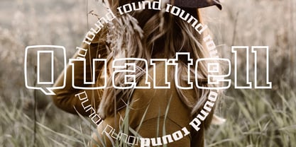 Hello! Introducing Quartell - modern display typeface family. Font looks amazing as alone words and as full text blocks. Also it good for bright captions and unforgettable logos It have supporting for many languages as: Czech, Danish and Norwegian, Deutsch, English, Espanol, French, Italiano, Magyar, Nederlands, Polish, Portuguese, Finnish, Swedish, Turkish, Russian and other based on extended latin. Thank you for purchasing and happy designing :)
 - Type Ultimate by VP Creative Shop,
$39.00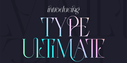 Type Ultimate is an exquisite serif font that combines elegance and sophistication. It comes in regular and italic versions, each containing a stunning collection of 383 ligature glyphs and alternate glyphs, as well as 26 swashes for both regular and italic versions. With its extensive character set, Type Ultimate supports a wide range of languages, making it a versatile choice for various projects. This font is perfect for creating a memorable logo, establishing a strong brand identity, and making headlines that stand out. Its timeless and refined design also makes it an excellent choice for elegant wedding invitations and other formal occasions. Overall, Type Ultimate is a font that exudes beauty and refinement, adding a touch of sophistication to any project it's used in. Language Support : Afrikaans, Albanian, Asu, Basque, Bemba, Bena, Breton, Chiga, Colognian, Cornish, Czech, Danish, Dutch, Embu, English, Estonian, Faroese, Filipino, Finnish, French, Friulian, Galician, Ganda, German, Gusi,i Hungarian, Indonesian, Irish, Italian, Jola-Fonyi, Kabuverdianu, Kalenjin, Kamba, Kikuyu, Kinyarwanda, Latvian, Lithuanian, Lower Sorbian, Luo, Luxembourgish, Luyia, Machame, Makhuwa-Meetto, Makonde, Malagasy, Maltese, Manx, Meru, Morisyen, North Ndebele, Norwegian, Bokmål, Norwegian, Nynorsk, Nyankole, Oromo, Polish, Portuguese, Quechua, Romanian, Romansh, Rombo, Rundi, Rwa, Samburu, Sango, Sangu, Scottish, Gaelic, Sena, Shambala, Shona, Slovak, Soga, Somali, Spanish, Swahili, Swedish, Swiss, German, Taita, Teso, Turkish, Upper, Sorbian, Uzbek (Latin), Volapük, Vunjo, Walser, Welsh, Western Frisian, Zulu Ligatures Uppercase - AB,AC,AD,AG,AK,AL,AM,AN,AP,AR,AS,AT,AV,AY,BE,BL,BO,BU,CE,CH,CK,CO,CT,DE,DI,DO,EA,ED, EE,EF,EI,EL,EM,EN,EP,ER,ES,ET,EV,EX,EY,FA,FE,FF,FI,FO,FR,FT,FU,GA,GE,GH,GO,GR,HA,HE,HI, HO,HT,KE,KI,KN,LA,LD,LE,LF,LI,LL,LO,MA,ME,MI,MM,MO,MP,MU,NA,NC,ND,NE,NG,NK,NO,NS,NT, NY,OA,OD,OK,OL,OM,ON,OO,OP,OR,OS,OT,OU,OW,PA,PE,PL,PO,PP,PR,RA,RD,RE,RI,RO,RR,RS,RT, RY,SA,SE,SH,SO,ST,SU,TA,TE,TH,TI,TL,TO,TR,TS,TT,TU,UG,UL,UN,UR,US,UT,VE,VI,WE,WH,WI,WO,YO, YS,MEN,WER,FRO,RON,ROM,THE,AND,ING,HER,HAT,HIS,THA,ERE,FOR,ENT,ION,TER,WAS,YOU,ITH, VER,ALL,THI,TIO,OUL,ULD,IGH,GHT,AVE,HAV,ICH,HIC,HIN,HEY,ATI,EVE,HING,WERE,FROM,THAT,THER, TION,OULD,IGHT,HAVE,THIS,THIN,THEY, ATIO,EVER,MENT Lowercase - ab,ad,ag,ai,ak,al,am,an,ap,as,at,av,ay,ba,be,bl,bo,bu,ca,ce,ch,ck,co,ct,de,di,do,ea,ec,ed,ee,ef,eg,ei,ej,el,en,ep,es,et,ev,ew,ey,fa,fe,fi,fo,fr,fu,ga,ge,gh,gi,gr,ha,he,hi,ho,ht,ic,id,ie,ik,il,im,in,io,ir,is,it,iv,ke,ki,kn,la,ld,le,lf,li,lo,ly,ma,me,mi,na,nc,nd,ne,ng,ni,nk,nl,no,nt,ny,oa,oc,od,of,oi,ok,ol,om,on,oo,op,ot,ou,ov, ow,pa,pe,pi,pl,po,pp,qu,ra,rd,re,ri,rm,rn,ro,rr,rs,rt,ru,ry,sa,se,sh,si,so,sp,ss,st,su,ta,te,th,ti,tl,to,ts,tt, tu,uc,ug,um,un,up,ur,us,ut,va,ve,wa,we,wo,xp,ye,yo,ys,men,wer,fro,rom,ron,the,and,ing,her,hat,tha, ere,for,ent,ion,ter,you,ver,thi,ght,ave,hey How to access alternate glyphs? To access alternate glyphs in Adobe InDesign or Illustrator, choose Window Type & Tables Glyphs In Photoshop, choose Window Glyphs. In the panel that opens, click the Show menu and choose Alternates for Selection. Double-click an alternate's thumbnail to swap them out. Mock ups and backgrounds used are not included. Thank you! Enjoy!
 - Versus by Latinotype,
$29.00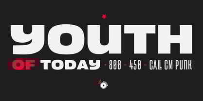 A unicase typeface inspired by Latin American wrestling. Versus is a type system designed for use with short and block text. The font, based on well-known typefaces found on boxing posters, combines Latin American elements and wrestling; it is this mixture of widths and weights and different styles which helps give your designs a unique flavour and personality. Versus is a unicase sans serif font well-suited for display use; its orthogonal terminals and short ascenders and descenders make it ideal for block of texts. By mixing different weights, you can have a wide range of design options—short text, isolated words, logos, titles, branding design, posters, etc. The Versus family comes in 9 weights—from a lightweight and condensed Extra Light to an expanded and heavy Ultra. Its character set supports over 200 different languages. The font also includes a large number of stylistic alternates and a complete ligature set which give your compositions a strong identity and personality.
 - MGT American Copper by Magetype,
$29.00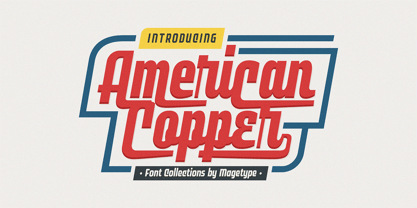 American Copper Family is a vintage font inspired by an old American motorcycle logo. The logo looks very manly and strong, just like the motorbike. American Copper Script is the dominant one that turns the logo into a font. Whereas the Sans and Block family is a complement to the Script. But all three are a very good unit to be juxtaposed together. American Copper is a font made for you (designers) who love automotives: old cars and motorbikes. Anything related to automotive. Besides these two objects, this font is also very cool for music-themed design needs; rock n roll, metal, rockabilly, and others. Oh yes, Custom Culture is another very interesting thing to be depicted with this font. Workshop logo for example. It will look very unique with Interlock on American Copper Script. Pair it with American Copper Block. And, BOOM! The logo will look very manly. If you are curious, you can download the American Copper Script Demo version to try. Happy Designing. Cheers
 - Night Train by FontMesa,
$19.95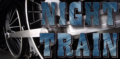 Night Train is a new font built from the ground up; while Night Train may resemble an old classic wood type there are a few lines that make this font a little more modern setting it apart from other wood type revivals. If you're a railroad enthusiast you're sure to enjoy the steam locomotive graphic located on the less than and greater than keys on all versions of this font, due to the fine detail of this train illustration the best printing results will be at 600dpi or higher on a laser printer. An alternate K and R are within the Night Train fonts, for Win Type1 these alternates are on the left and right bracket keys, for Truetype and OpenType you may access the alternates by using the Character Map in Windows or Adobe Illustrator, for OpenType you may also find them on the stylistic alternates page of the glyph map in Illustrator. There's something new with Night Train that the sign making people will love, for the first time FontMesa is pleased to offer a block shadowed version in four directions. One fill font is all that is needed for all four open faced fonts, you'll need an application that works in layers in order to use the fill font with the open faced fonts, simply place the fill font in its own layer then move it behind one of the open faced fonts of Night Train. The Night Train name has been on my list to use as a font name for a few years, a friend from years ago used to sail his boat in the Mackinac race from Chicago to Mackinac Island, the name of that boat was the Night Train. Watching the 2010 Olympic four man U.S. bobsled team win gold with their sled also called Night Train has inspired me to complete this font.
 - Paverify by Esintype,
$14.00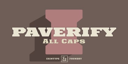 Paverify is an all-caps geometric slab serif display face inspired by a particular pavement tile component which is evoking a blocky “I” letter. All other characters were interpreted based on its look and drawn accordingly. There are three uppercase Roman fonts in different weights and widths substantially. With the additional versions, type family consisting of 7 fonts in total. Over 220 Latin, Cyrillic and Greek script languages supported. Each font contains an extensive multilingual support with more than 1600 glyphs and OpenType features, including number forms, fractions, and stylistic alternate sets those provide different looks by the typographic preferences. For the lowercase letters there are small caps variants, i.e., shorter caps. These also have identical glyphs and matching marks to enable “Small Capitals From Capitals” feature. Narrower Medium and Bold styles was produced to accompany the Black first design. Paverify comes with an ornaments font named as “Extras”, which contains geometric graphical elements, i.e., paver stone patterns, banner/sticker background sets, star comps and a collection of catchwords to simplify creating feature rich layouts. As is known as interlocking paver in certain regions — a rectangular shape with the distinctive diagonal tabs — transcribing the simplest letter to draw into the whole alphabet was a challenging task. Not only it was the single thing that can be used as a source, considering its thick form in roughly 1.2:1 proportions compared to the sophistication of letterforms was the challenge. Starting point was keeping design consistent while both avoiding and preserving a particular appearance to achieve a similar texture, basically a repeating pattern on the streets. In contrary of a traditional approach, Paverify tend to have more contrast than the other slab serifs which helps to reduce massive stem weight of the source form. This look contributes to its hand painted sign effect achieved in a certain degree, which may otherwise impractical to transform because the source material is an inorganic, static form by definition. Tight and even spacing of the pavement tiles was inspirational for the kerning balance of the letters. Although the lighter weights have more space between the letter pairs, black weight adjusted as to be close to each other as the original grid. Tight spacing can be ignored by using Capital Spacing OpenType feature for the Outline versions as layer fonts. In one stroke, this gives an extra space between the letters to avoid diagonal armed letter terminals overlap. Black typographic colour and texture gives a sturdy appearance to the lines, it is useful for the projects where a robust display faces preferred for the titling, strong headlines, letter stacks, dropcaps, initials, short names on materials such as advertisements, book covers, posters, logotypes, wordmarks, package designs, and more in print or digital. Paverify can be paired as a complimentary face in a combination with broader type systems, where vintage look compositions and woodcut style fusions requiring an extra stunning texture.
 - Strawberry Gossip by PizzaDude.dk,
$20.00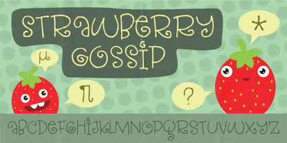 Here is something to talk about! Spread the word - spread the gossip! An elegant combination of thin and fragile lines, made with a fine pen. Fine lines, crunchy, sweet curls.
 - Flixuble by PizzaDude.dk,
$20.00Flixuble is a mess! It was made involving an inky pen and sandpaper! Comes with more than 60 ligatures in order to make the font look more like handmade letters! - LHF Henderson by Letterhead Fonts,
$35.00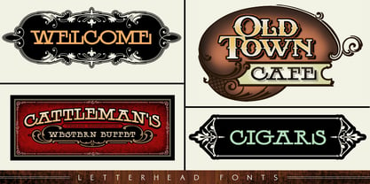 An excellent example of early 1900's sign artistry. This Letterhead Fonts' revised version of Mike Henderson's bold font features all new spacing, kerning and improved characters. Includes 6 alternates.
 - Stencille by Bogusky 2,
$34.50Stencille Une is that long-sought delicate and refined stencil font. Unique but not gimmicky, giving it the legibility often lost in most stencil fonts. Totally kerned pairs, including puncuation. - Letterpress Leftovers JNL by Jeff Levine,
$29.00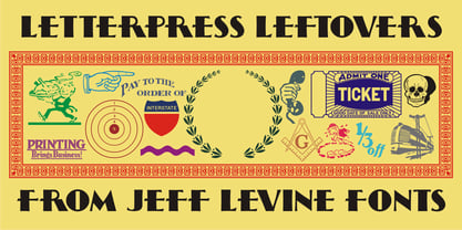 Letterpress Leftovers JNL gathers twenty-six vintage letterpress cuts on a variety of themes as well as an attractive wood type border in various positions on the 0-9 keys.
 - KD Diagona by Kassymkulov Design,
$9.95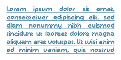 KD Diagona is a display, geometrical face with 45 degree diagonal cut. Letter spacing along with almost 4000 kerning pairs were designed to match the diagonal progression of the font.
 - Owuro by Alexey Makarov,
$24.00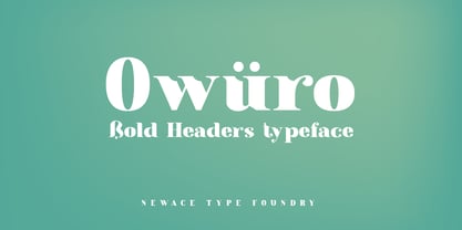 Presenting a professional designer font. Specially designed for the header, it will complement your collection. It contains standard ligatures. More than 1,500 kerning pairs. Standard Latin alphabet and European diacritics.
 - Rosette Ornaments by Gerald Gallo,
$20.00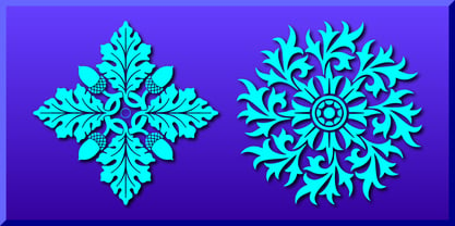 Rosette Ornaments was inspired by the wide spectrum of ornamental styles produced during the Victorian era. There is an assortment of 47 ornaments all located under the character set keys.
 - Comicrazy by Comicraft,
$99.00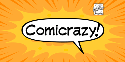 Originally created for exclusive use in Image's wildly successful GEN-13 title, Comicrazy was eventually made commercially available in response to inquiries from comic book creators all around the world!
 - Oriental Ornaments by Gerald Gallo,
$20.00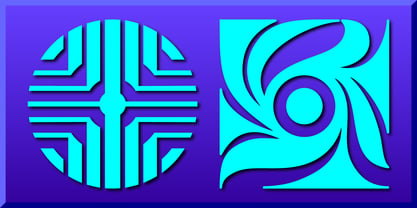 Oriental Ornaments was inspired by the ancient design motifs of the far east. There is an assortment of 85 ornaments located under the character set and shift + character set keys.
 - Interlaced Ornaments by Gerald Gallo,
$20.00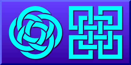 Interlaced Ornaments is composed of various geometric shapes appearing to be woven together. There is an assortment of 69 ornaments located under the character set and shift + character set keys.
 - Altaria Miguel by Rillatype,
$15.00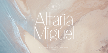 Introducing, my latest font. Altaria Miguel! Altaria Miguel is an elegant and modern sans serif font. altaria miguel can offer a thin font with a modern look that's perfect for your various design needs from headline, branding, logo, advertisement, product design, etc. Altaria Miguel was created with great care and precision with the aim of none other than to make this font perfect as a font that can be used in a variety of needs. The kerning in this font is also done with great care to maintain the perfection of this font. In addition, Altaria Miguel also provides a slanted version which is also re-kerned separately to get maximum kerning results. There it is. We really hope that you enjoy this font, and please feel free to reach me if you have any question. Thank You!
 - Waypointer by Tarallo Design,
$18.99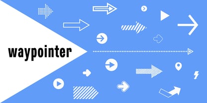 Waypointer is a font of arrows. These can be used to indicate direction or emphasis in documents, signage, or websites. The arrow sizes match the standard cap height of most fonts making it simple to use within text. The arrows are accessed with the standard keyboard keys. Make your own arrow of any length with the 1 to 9 keys. Use uppercase (A to Z) and lowercase (a to z) for pre-made arrows that point right, left, up, or down. Those who use OpenType will find useful features, such as stylistic sets for changing arrow directions in 360 degree angles and stylistic alternates for quick changes between pointing right and left. It has a few extras such as a map pin, anchor, and lightning bolt. These are included and accessed with the comma, period, and zero key.
 - Coal Brush by Hanoded,
$15.00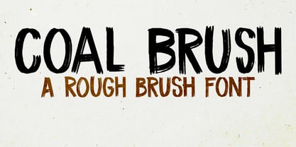 Coal Brush is a bit of a misleading name. It looks as though it was made with a brush, but it was, in fact, made with a almost dried out old marker pen. But a font named ‘dried out old marker pen’ doesn’t really fly, so I decided to pimp the name. There you have it, you can’t even trust an honest typographer! Marker pen or brush, Coal Brush is a very sweet little font. It is all caps, but upper and lower case differ and can be mixed freely. Plus there’s a hidden stash of alternates for the lower case letters and an alternate ampersand! I actually threw that in to make up for my lie. So, use it for your books, your posters, your rap albums, rock operas, grilled food restaurants and designer BBQ sauces. It’s yours for the taking!
 - Yin Yang Messages by Ingrimayne Type,
$9.00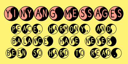 YinYangMessages contains two sets of letters, those on the upper-case keys that fit on the left side of a yin-yang symbol and those on the lower-case keys that fit on the left side of a yin-yang symbol. One can alternate the two sets manually but the OpenType contextual alternatives feature does this automatically in any program that supports this feature. The family contains two fonts. In one the filled half is on the left and in the other the filled half is on the right. The slash and backspace keys contain blank halves of the symbol, which are useful for completing words with an odd number of letters. The two styles can be used in layers. YinYangMessages is a fun and playful family that every once in a while may be the ideal typeface for some unusual situation.
 - Fear Factor - Unknown license

- Damage™ Bludgeon - Unknown license

- Riipale by Morganismi,
$15.00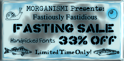 Riipale is a font family with two sets of hand-drawn characters. Quality picture fonts are also included in the family of Riipale. Riipale Lined and Riipale Black support most European languages.
 - Limousine JNL by Jeff Levine,
$29.00Limousine JNL takes the basic outline shape of Crestview Six JNL (an actual design from the Art Deco era) and gives it a stylized treatment as a solid black letter display face. - Martini by Katatrad,
$29.00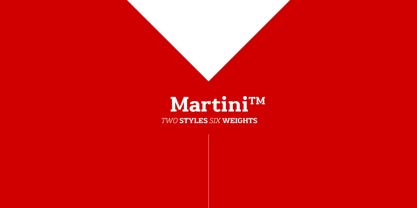 Martini™ typeface is a slab-serif based typeface that included six weights, two styles from ExtraLight to Black with advance typographical support with features such as discretionary ligatures and alternate characters.
 - Soundstar by PintassilgoPrints,
$29.00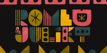 Soundstar is an original, cheerful, highly decorative typeface. It’s kind of geometric, but handmade. It’s kind of blocky, but not that straight. It’s kind of playful, and quite playful indeed. Have fun!
 - Sfondo Fiorito by Celebrity Fontz,
$19.99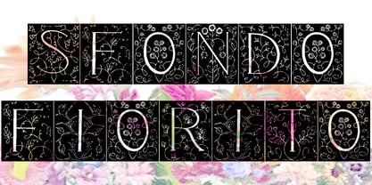 Sfondo Fiorito is a digital revival of an antique flourished alphabet. Each letter is surrounded by a different beautiful flower or plant design on a rectangular black background. Includes many accented characters.
 - P22 Platten Neu by IHOF,
$39.95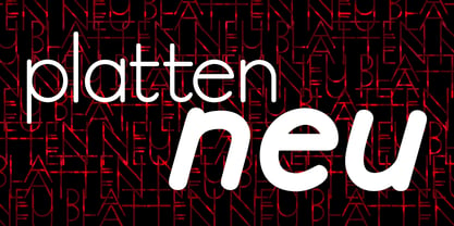 The P22 Platten font family has been revisited and expanded by designer Colin Kahn. Platten is based on lettering found in German fountain pen practice books from the 1920s (you may have seen the similar Speedball books in the US). This round tip pen lettering is comparable to the basic forms used in grammar school teaching alphabets, but with a few original characteristics. The Italic version has even more of these unusual features. Geometric and simple yet casual and timeless. Perfect for many uses.
 - Astrida by Designova,
$23.00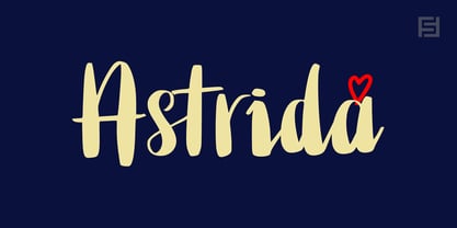 Astrida is a beautiful and fresh handwritten brush font for posters / marketing graphics / instagram story design / branding / logotype / decorations / signage / greeting cards / promotional designs and anything that needs the unique casual look. Astrida is completely handmade with perfection and aesthetics at its level best. Advanced Kerning & Extended Character Sets: We have performed advanced, in-depth kerning to make sure the font looks amazing on all possible letter combinations. The font includes extended language support including Western European & Central European sets with a total of 259 glyphs.
 - Belle Sans by Park Street Studio,
$25.00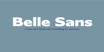 Belle Sans is a clean, straightforward sans serif typeface family, and a very large family at that! It has seven widths, from Ultra Condensed to Extra Wide, and seven weights, ranging from Light to Black, all with Oblique companions. Belle Sans offers up great legibility for on-screen usage, and the breadth of width and weight make it very usable for text applications as well. The heavier weights, especially the Black, are exceptional for creating visual impact! Each font supports Western and Central European languages, ligatures, tabular figures, unlimited fractions, superiors & inferiors, and ordinals.
 - Linotype Paint It by Linotype,
$29.99Jochen Schuss designed Linotype Paint It in 1997 with exclusively capital letters and in two weights. The best way to describe the weight Paint It might be to compare it with a labyrinth in which the figures only become clear to the reader dedicated to finding them. The second weight, Paint It black, is almost the solution to this puzzle. The characters are black and stand out strikingly from the background. Linotype Paint It is particularly good for headlines in large point sizes or wherever a text should display a playful character. - Checker by Shinntype,
$29.00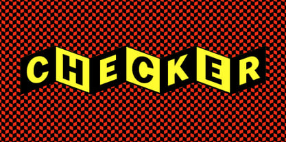 Checker is an all-cap ‘three-D’ font which automatically alternates white letters on black tiles with black letters on white tiles, by means of the Contextual Alternates feature. Checker is an attention grabber suitable for logos, titles and short headings. With its tiled construction, it's a natural for colorful interpretation. The letters are properly italicized and back-slanted, and adjusted for maximum readability within the constraints of the font’s concept. The letter style is bold grotesque, so Checker will mix smoothly with any other fonts in a layout.
 - Yingyai by Jipatype,
$26.00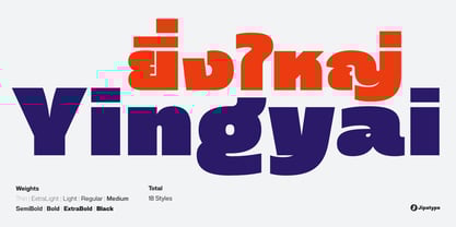 ฟอนต์ยิ่งใหญ่ เป็นอักษรแบบแซนเซอริฟ ที่มีความหนาของเส้นมากว่าปกติ สังเกตุได้จากน้ำหนัก Black ให้ความรู้สึกหนักแน่น หนา ใหญ่ และ ทันสมัย มีทั้งหมด 9 น้ำหนักและตัวเอียงของแต่ละน้ำหนักรวมทั้งหมดมี 18 สไตล์ รองรับหลากหลายภาษา เหมาะสำหรับการใช้ผาดหัว ป้าย เนื้อความ ฟอนต์ยิ่งใหญ่สามารถช่วยส่งเสริมให้งานของคุณดูสะดุดตาอย่างยิ่ง เหมาะกับผู้ที่ต้องการให้โฆษณาสินค้าและบริการดูสะดุดตากว่าใคร ๆ Yingyai is a sans serif typeface with a large line stroke thickness more than usually, especially Black weight. It gives a heavy, big and modern feel. Comes with 9 weights and italics of each weight total 18 styles. Support multi-languages. Suitable for headline, sub-headline or text body. Yingyai can make your work more eye-catching, for those who want to advertise products and services more eye-catching than others.
 - Decalcomania JNL by Jeff Levine,
$29.00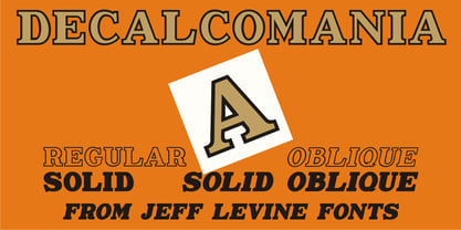 Decalcomania JNL is based on examples of gold and black water-applied initial decals made by the Transfer Monogram Company of Chicago circa the 1940s. It is presumed the patterns for the letters were hand cut, possibly explaining the variations in line widths and character shapes. These eccentricities were left intact and followed through to the other characters in order to represent a more "authentic" digital version of these vintage decals. Decalcomania JNL is available in both the regular (outline) version, and a solid black version, as well as obliques of both styles.
 - Xavier by CastleType,
$29.00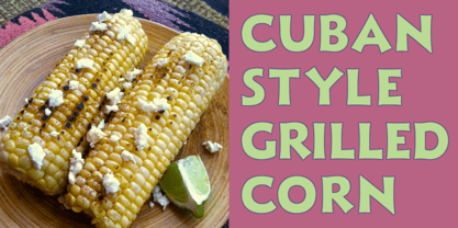 The Xavier family of typefaces is based on the delightful deco typeface called Ashley Crawford, originally designed in 1930 by Ashley Havinden. After designing Xavier Black (Serif) and Xavier Sans Black, I added Bold Sans, Medium and Medium Sans and finally added lowercase to the medium weights. Although more manageable than Ashley Crawford, Xavier, due to its very playful nature (splayed A, M, etc.) needs to be used with care, especially in terms of spacing. Xavier is a playful typeface and I have been particularly pleased to see it used in children's books.
 - LeopardSkin by Scholtz Fonts,
$19.00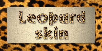 LeopardSkin is an exciting, contemporary display font, incorporating the distinctive markings of one of Africa’s most famous “big cats”. Two versions are available: LeopardSkin Aarde, based on the Aarde Black font, is best used in conjunction with Aarde Black or Aarde Outline. LeopardSkin Umkhonto is based on the best-selling Umkhonto font, and may be used in conjunction with the Umkhonto font collection. The popularity of the “animal skin” look in contmporary clothing and soft furnishing design make LeopardSkin a must for artists on the creative edge of contemporary design.
 - Sunsive by Yukita Creative,
$14.00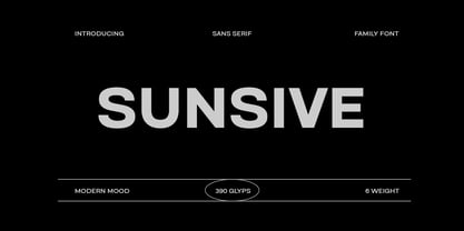 Sunsive Sans Serif Font family is the perfect choice for clean, minimalist, and professional designs. With a variety of weights and styles, it's suitable for headlines, body, web, print, and modern branding. This font provides a bold and elegant look to your graphic projects. Sunsive Sans Serif Font family provides a variety of variations from Regular to Black, allowing you to customize the appearance of the text according to your needs. From simple Regular to powerful Black, each weight provides flexibility in designing text with a professional, modern touch.
 - Baker Half by Ingrimayne Type,
$9.00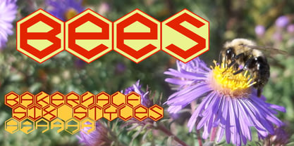 One of the odder things I remember from high school (50+ years ago) is the tile floor of hexagons in the bathroom. There is something fascinating with the way hexagons fill the plane. BakerHalfDozen is made of white letters that fit on black, hexagonal tiles. BakerHalfWhite switches the letters to black on white tiles, and BakerHalfBare eliminates the tiles. There are no true lower-case letters, but some letters have alternate shapes. To make the tiles line up right, alternate lines must be indented half a space. Use the {} characters (brackets) to do this.
 - Larch by Mans Greback,
$29.00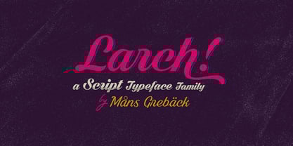 Larch is a clear and crisp high quality script typeface. It consists of five weights: White, Bright, Shaded, Dark & Black. Each style is working great separately, but they make the perfect combination together. Larch is designed by Måns Grebäck in 2016. The font supports hundreds of languages. It contains contextual and stylistic alternates, swashes and ligatures. Write # after any lowercase letter to make swashes! You can also write % after the following letters to make left swashes: b d f h i j k l t Example: Black% Lar#ch

