8,381 search results
(0.029 seconds)
- MMC Insignia by MMC-TypEngine,
$30.00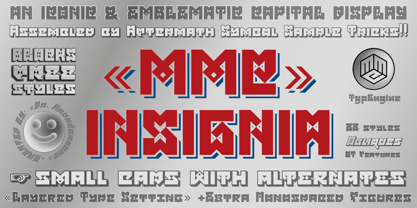 MMC Insignia, is an Iconic & Emblematic Neogothic Geometric Capitals Display… Assembled by Trivial Squares and Diagonals Symbols Pattern from a puzzled grid Aftermath!! Includes Stylistic Alternates!! +Extra Monospaced Figures. In 22 styles, with Obliques, both for single display and layer Typesetting, plus OpenType Features & Bonus Blocks Fonts! MMC Insignia is a Small Caps Typeface, which default lowercases character set is included in the Pro family, its cursive version, apart from it, has also Exclusive Stylistic Alternates… Its atmosphere stands by on both Corporative to Decorative, Modern, Fashion, Federalist, Bohemian, Romantic, Ludic, Treasured Look, Etc. This Display font-family is the result of the repeated applications of this unique infamous Icon or Symbol, of two counterpointed triangles, implicit as hourglasses, in order to compose an innovative and unprecedented typographic pattern and modulation concept through the letterforms, in an extremely Geometric style. The Graphic Sign used throughout this type, is a remarkable trend used already in Logos of different businesses, whose most famous case refers to a famous International Bank, which doesn’t need to be mentioned, as it is instantly associated! This characteristic innovation was the main motivation while creating this type. Usage Suggestions: Type Fancy Titling texts, Display Remarkable Logos, Branding Projects, Labels, Emblems, Fashion Patterns, or in everything Noble and designed for Excellence as a type of Insignia, or distinguished marks and attributes of Royalty and Power!! That’s also forwardly, the reason why it was named MMC Insignia… TIPS: 1-Combine styles into innumerous possibilities of Chromatic Typesetting, by ‘central pasting’ layers… You may dislocate layers for improvisations! 2-USE BLOCK “FREE-STYLES” 1 & 2 also to add default 3D! Change 3D directions by switching Block 1 to Block 2, that way you can Zig-Zag words and lines. *Also shift the block layer up to bottom limit, it makes the 3D direction turn upside down. Greetings! André, MMC-TypEngine.
 - Technique BRK Pro by CheapProFonts,
$10.00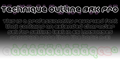 I noticed this font for its versatile techno look - it makes wonderful logotype word images. Every letter combination is perfectly kerned so that the letters fit together nicely... Also includes some alternate letterforms, but only in their basic forms (not made in combinations with diacritics). These alternates are available via your programs' glyph palette or using the OpenType functions "Stylistic Alternates"/"ss02" and "Swash"/"ss01". Technique BRK Pro is the perfect companion for Technique Outline BRK Pro (it exactly fills the "holes") but also a nice techno font in its own right. ALL fonts from CheapProFonts have very extensive language support: They contain some unusual diacritic letters (some of which are contained in the Latin Extended-B Unicode block) supporting: Cornish, Filipino (Tagalog), Guarani, Luxembourgian, Malagasy, Romanian, Ulithian and Welsh. They also contain all glyphs in the Latin Extended-A Unicode block (which among others cover the Central European and Baltic areas) supporting: Afrikaans, Belarusian (Lacinka), Bosnian, Catalan, Chichewa, Croatian, Czech, Dutch, Esperanto, Greenlandic, Hungarian, Kashubian, Kurdish (Kurmanji), Latvian, Lithuanian, Maltese, Maori, Polish, Saami (Inari), Saami (North), Serbian (latin), Slovak(ian), Slovene, Sorbian (Lower), Sorbian (Upper), Turkish and Turkmen. And they of course contain all the usual "western" glyphs supporting: Albanian, Basque, Breton, Chamorro, Danish, Estonian, Faroese, Finnish, French, Frisian, Galican, German, Icelandic, Indonesian, Irish (Gaelic), Italian, Northern Sotho, Norwegian, Occitan, Portuguese, Rhaeto-Romance, Sami (Lule), Sami (South), Scots (Gaelic), Spanish, Swedish, Tswana, Walloon and Yapese.
 - NK Fracht Square by HouseOfBurvo,
$15.00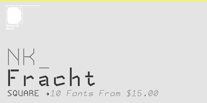 NK_Fracht Square (meaning Cargo or Freight) is a stylized version of Neue Konstrukteur Square. It is more suited for headline and display purposes, but can also be used quite successfully for short blocks for running text and captions.
 - Soldier Stencil JNL by Jeff Levine,
$29.00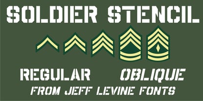 Soldier Stencil JNL is a re-working of a vintage example of a sign painter's "block" or "chamfer" font design into stencil form. The result is Soldier Stencil JNL, which is available in both regular and oblique versions.
 - Galaxy Power by Yoga Letter,
$30.00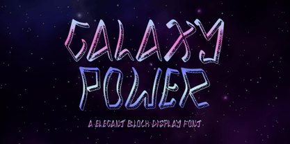 "Galaxy Power" is an elegant display block font that is perfect for action movie titles, graffiti, 3D works, advertisements, banners, posters, branding, stickers, mockups, and more. This font is equipped with uppercase, lowercase, numerals, punctuation, and multilingual support.
 - NK Fracht Round by HouseOfBurvo,
$15.00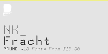 NK_Fracht Round (meaning Cargo or Freight) is a stylized version of Neue Konstrukteur Round. It is more suited for headline and display purposes, but can also be used quite successfully for short blocks for running text and captions.
 - Militaria JNL by Jeff Levine,
$29.00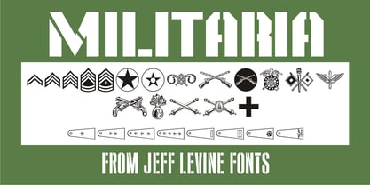 Militaria JNL is a collection of various military insignias modeled from vintage printer's blocks. While this in no way represents all ranks, specialties and branches of the military, it is still a nice little package for themed projects.
 - Haarlem by Monotype,
$40.99Haarlem, designed by Leslie Cabarga, was inspired by the sort of marks you get when you write with a flat-headed magic harger. There are two fonts in the Haarlem family, White and Black. Haarlem White is an outlined, shadowed version of Haarlem Black. - Sleepy Hollow 2.0 - Unknown license

- Imperial Symbols - Unknown license

- Ganz Grobe Gotisch by URW Type Foundry,
$39.99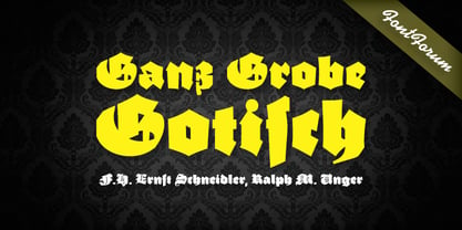 It is not only coarse but extremly black, and it is quite right to name it Black Letter in English. Ernst Schneidler, the designer, created the smallest possible counters. Still, this very coarse black letter is sensitive in detail and drawn with a high level of aesthetics. By the way, it was said in Schneidler's design class in Stuttgart that his number one student Walter Brudi had cut some of the characters with �silhoutte scissors� from black paper. Sharing his ideas and work with his students does not at all decrease or lower his copyright.Ganz Grobe Gotisch is not only a distinguised but also a very catchy design.(Albert Kapr in Fraktur -- �Form und Geschichte der gebrochenen Schrift�.)
 - Letteria Pro by Latinotype,
$29.00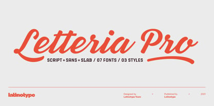 A triple threat, Letteria Pro is a typographic trio designed for branding and packaging. With the soul of a broad nib pen and the grace of a brush, it has five weights and a lot of style. In order to achieve a pragmatic contrast between a composition’s communication levels, we have created a mechanical typeface with only capital letters in sans and slab versions that elude to a De Stijl style. Ligatures and swashes provide a plethora of options, including Thin, Light, Regular, Bold and Black weights, while its companions offer a single weight. Together, this Latinotype original covers more than 200 languages within the Latin alphabet. Yet another powerful tool for your arsenal of fonts that command consumer attention.
 - Cream by Monotype,
$30.00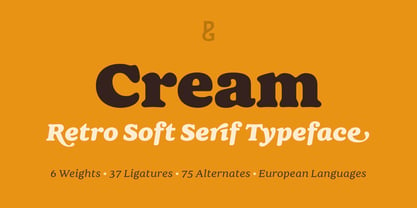 Cream is a retro soft serif typeface comprising 12 fonts. It can handle most typographic applications from branding to body copy with its range of weights and inherent legibility. Whatever you type will have a friendly message, but it really comes into its own when you start applying some of the additional ligatures and alternates that are built into this type family. You’ll soon be creating distinctive typographic compositions that are pleasing to the eye. There are 12 fonts altogether, ranging from Light to Black weights in both roman and italic. It has an extensive character set that covers all Latin European languages. Key features: 6 weights in Roman and Italic 75 Alternates 37 Ligatures Full European character set (Latin only) 730 glyphs per font.
 - VLNL Agitka by VetteLetters,
$30.00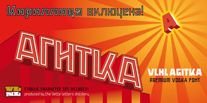 As a font designer for films Henning Brehm delivers fonts with a whip-sharp eye for precision. His latest Vette Letters release, VLNL Agitka is a Cyrillic-inspired (and including) alphabet with both feet rooted in Soviet Union-era propaganda posters. Its design is constructivist (look Mom, no curves!) geometric and strong. Like Russian vodka. Aside from the Regular, Light, Bold and Black weights, Agitka comes in four Neon styles as well. For a dazzling design effect, layer those neons over a regular weight for a star struck embossed-letter effect. We would also like to point out the usage of VLNL Agitka in the Bourne Ultimatum movie, for which Brehm designed neon signage for a scene at a Russian supermarket. За здоровье – Za Zdarovje!
 - Aarde by Scholtz Fonts,
$19.00This is the definitive standard African font. It combines wonderful readability with tremendous panache. The fact that it has a full character set (UPPER and lower case), all punctuation and all special characters, means that it can be used in just about any African design context. If you had only one African font in your arsenal, it would have to be Aarde Black. The name "Aarde" means "earth" and refers to the gutsy, earthy character of the letterforms. It includes a full character set: characters for English, French, Italian, German, and Portuguese. The numerals are mono-spaced, and are very readable so that they will line up correctly in columns of figures. The letters of the alphabet are correctly kerned so that they appear correctly in text. - Glot by Wordshape,
$20.00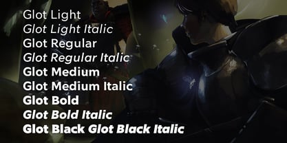 Glot is a ten-member flared terminal sans serif family of typefaces based on a mix of proportions of Roman square capitals and hyper-readable sans serifs. Glot comes in five weights with matching true italics: Light, Regular, Medium, Bold and Black. The Glot family has a wide range and is incredibly functional, working well for longer texts as well as display typography. After designing the house typefaces for a handful of the most predominant multi-player online games out there, we decided that it was time to bring the battlefield to the people. Glot comes armed with ample language support (Central, Eastern, and Western European) and OpenType ornamental spiked alternate characters for when one needs a hint of danger.
 - Glot Round by Wordshape,
$20.00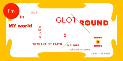 Glot Round is a ten-member flared terminal sans serif family of typefaces based on a mix of proportions of Roman square capitals and hyper-readable sans serifs with slightly rounded corners. Glot Round comes in five weights with matching true italics: Light, Regular, Medium, Bold and Black. The Glot family has a wide range and is incredibly functional, working well for longer texts as well as display typography. After designing the house typefaces for a handful of the most predominant multi-player online games out there, we decided that it was time to bring the battlefield to the people. Glot Round comes armed with ample language support (Central, Eastern, and Western European) and OpenType ornamental spiked alternate characters for when one needs a hint of danger.
 - Newland by Resistenza,
$39.00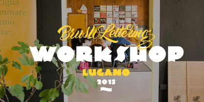 Newland is a blocky typeface inspired by Rudolf Koch’s calligraphic Neuland.
 - Cross Stitch Ornaments by Gerald Gallo,
$20.00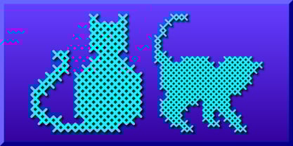 Cross Stitch Ornaments is a collection of classic stitched geometric shapes, plants, birds, and animals. There is an assortment of 47 ornaments located under the character set keys. All ornaments that are asymmetrical have a flopped version located under the shift+character key.
 - New Prairie by Aboutype,
$24.99A modern text design with a medium x-height and short ascenders. The axis of the curves is inclined to the left in the Old Style tradition. New Prairie was kerned for text point sizes but requires subjective display kerning and compensation. - Audacious by Monotype,
$40.00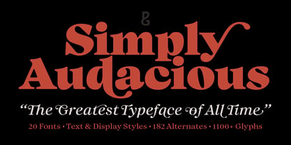 Audacious is a quirky, confident and adorable serif type family across five weights in both text and display styles. This attention-grabbing retro typeface has an imperfect nature that embraces its quirks and irregularities, giving each font a distinctive and somewhat oddball personality. Its defining characteristics include large open counters, awkward stresses, large exaggerated wedge serifs, and voluptuous teardrop terminals. Whatever typographic compositions you create, Audacious will demand attention, making it perfect for titling, headlines, logotype, and branding projects. Take advantage of the 182 stylistic alternates to embellish your type and add that touch of class to titles and logos. Display weights work really well with close line spacing and stunning headlines are a breeze to create. Text weights make for a pleasant reading experience while packing all the punch and versatility found in the display variants. There are 20 fonts altogether, in Text and Display styles with weights from Regular to Black in both roman and italic. Audacious has an extensive character set that covers all Latin European languages. Key features: 2 Styles in Roman and Italic 5 weights: Regular, Medium, SemiBold, Bold, & Black 182 Alternates Full European character set (Latin only) 1100+ glyphs per font.
 - Axia by Kontour Type,
$50.00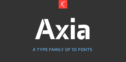 Axia is a robust sans serif of concise letter forms. It comes in ten weights from Light to Black with extended language support, a host of OpenType features including Small Caps, multiple figure styles, and more. Each, the roman and italic weights harmonize perfectly in line width. Text set in Light or Black results in the same fit. Stencil display weights with a unique aesthetic and perfect for captivating type sizes add further distinctive options to the typographic palette. The stencil display weights consist of abstract floating parts that seduce the eye and form nicely proportioned type when united. Originally designed for the Rice University School of Architecture in 2011, this contemporary sans found some inspiration in the TwinCities™ typeface family created by Sibylle Hagmann for the University of Minnesota in 2003. Orchestrated from scratch, the inner arched strokes off the stem on the lowercases 'n' or 'd', for example, progressively open the letter forms and express conceptual clarity throughout the system. A feature doing double duty that contributes to great legibility in the heavier weights and attributes to the versatility of individual weights.
 - Megalithic by IC Fonts,
$20.00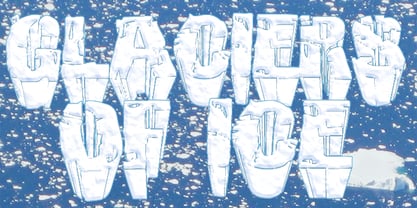 3D Chiseled Rock type font based on the ideas of Ancient Megalithic Structure and Stone Masonry. This Font comes in a Solid Bolder type or Outlined Type for that Chiseled Ice Block Look. Based on Hulkbusters by Dan Zadorozny.
 - Woodout by Justyna Sokolowska,
$15.00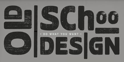 Wooden font block. Taken from the typesetting department at the Academy of Fine Arts in Warsaw. All the letters were printed on paper, scanned and polished on the computer. It’s very detailed font, which are suitable for large prints.
 - JT Marnie by JAM Type Design,
$14.00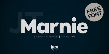 The design is influenced by the geometric style sans serif faces which were popular during the 1920s and 30s. The JT Marnie font family is well suited for headlines and small blocks of text, particularly in advertising and packaging.
 - Winning Team JNL by Jeff Levine,
$29.00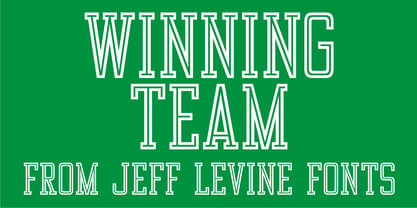 The second volume of the Robbins Music Corporation's "Hollywood Song Folio" features the word "Hollywood" lettered in a condensed block style with inline, strongly reminiscent of sports or college-themed typography. This was the inspiration for Winning Team JNL.
 - Tudor Perpendicular by Greater Albion Typefounders,
$12.00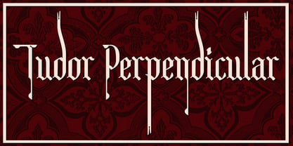 Tudor Perpendicular is Greater Albion's seasonal Black letter release (not that we rule out the possibility of non-seasonal ones...) for 2012. As the name suggests, it is a design which emphasises, and yes, exaggerates for effect, the perpendicular up and down nature of Black Letter typefaces. There's no particular historical basis for this one - straight out of our own minds, just as a lot of Black letter 'revivals' have been over the years. Come and visit 'Ye Olde' world today...
 - Eponymous by Monotype,
$25.99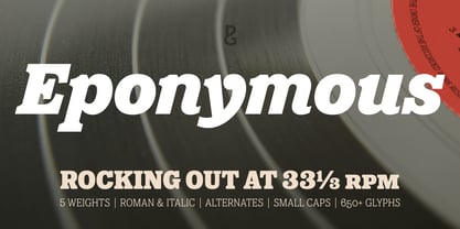 Eponymous is an Egyptian-style typeface with chunky, scalloped serifs. It is available in five weights in both roman and italic. I have always loved slab serif type and have created Eponymous to fulfil a yearning for a versatile, stylish and contemporary slab face. A key design characteristic is the implementation of scalloped serifs which, to me, imbues the typeface with a distinctive personality. Make use of the Open Type features that are part of Eponymous. For a start, you can implement some stylistic alternates, so, if the main characters don’t quite suit your concept, try activating Stylistic Set 1. There’s also a full set of small caps included. You can mix and match these characters with regular lowercase to create some interesting unicase typography. Of course, all characters have complementing diacritics, enabling multi-language support. Key features: Eponymous is is an Egyptian-style typeface with chunky, scalloped serifs 5 weights in roman and italic: Light | Regular | Medium | Bold | Black Full set of small caps with diacritics and figures 30+ alternate characters Full European character set 650+ glyphs per font Eponymous was redrawn and re-spaced to a higher standard in April 2021 (v2.0).
 - Thorngumbald by Fettle Foundry,
$10.00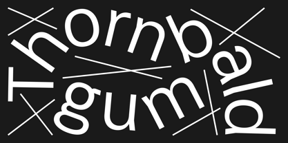 Thorngumbald is a quirky and playful sans-serif typeface designed to provide a high level of differentiion between glyphs, aiding with reading fro dyslexic and vision impaired users. It’s also a great option for any organistaion or designer looking to use something a little different. There are five weights, ranging from thin to black, with matching italics. Thorngumbald features 885 glyphs, supporting a large nuber of latin languages, with thorough kerning for accented character combinations, polish alternatives for acute accents, oldstyle and tabular figures, expanded currency symbols, contextual, discretionary, and standard ligatures, mathmatical symbols, contextual alternatives, and more. Thorough kerning has been undertaken for non-English languages, making Thorngumbald the perfect choice for organisations that need to display information in different latin-based languages. Originally launched in 2022, Thorngumbald has been through a robust process of updates and refinements and is stronger than ever. Originally featuring a core RIBBI font set, the family has grown to include additional styles for when the occasion calls for something extra. Language support includes: Bosnian, Catalan, Czech, Danish, German, English, Spanish, Estonian, Finnish, French, Irish, Croatian, Hungarian, Icelandic, Italian, Lithuanian, Latvian, Maltese, Dutch, Norwegian, Polish, Portuguese, Romanian, Slovak, Slovenian, Albanian, Swedish, Turkish.
 - Layal by Arabetics,
$39.00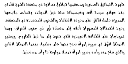 Layal is an Arabetic type design with a calligraphic flavor. It follows the guidelines of the Mutamathil Taqlidi type style with one glyph for every basic Arabic Unicode character or letter, as defined in Unicode Standards version 5.1, and one additional, final-position, glyph for each Arabic letter that is normally connected with other letters from both sides in traditional cursive Arabic strings. Layal employs variable x-height values. It includes all required Lam-Alif ligatures and uses ligature substitutions and selected marks positioning but it does not use any other glyph substitutions or forming. Text strings composed using types of this family are non-cursive with stand-alone isolated glyphs. Tatweel (or Kashida) glyph is a zero width space. Keying it before any glyph will display that glyph isolated form. Keying Tatweel before Alif Lam Lam Ha will display the Allah ligature. Layal family includes both Arabic and Arabic-Indic numerals; all required diacritic marks, Allah ligature, in addition to standard English keyboard punctuations and major currency symbols. Layal is available in normal, bold, black, light, and extra light, each both in regular and italic styles.
 - Lard Pro by The Type Fetish,
$25.00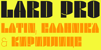 Lard Pro Regular is an extreme contrasted extra black typeface designed for usage at larger sizes. Lard Pro Bold is an extra black typeface designed for usage at larger sizes. They contain extended Latin, Cyrillic and Greek alphabets to support a very wide range of languages.
 - Merrimac by Aboutype,
$24.99Broad pen script typeface from 1930s and 40s; magazine advertising. - Scriptonah Pro by Jonahfonts,
$45.00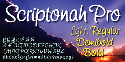 Scriptonah-Pro now with Central European Diacritics and Improved kerning.
 - Charles by Aboutype,
$24.99Broad pen script typeface from 1930s and 40s; magazine advertising. - Float by Aboutype,
$24.99Broad pen script typeface based on late 1960s Turkish signage. - Willem by Aboutype,
$24.99Broad pen script typeface from 1930s and 40s; magazine advertising. - Salonika by Aboutype,
$24.99Broad pen script typeface based on late 1960s Turkish signage. - Toulouse by Scholtz Fonts,
$21.00Toulouse is a city of culture. It has long nurtured literature, music, dance, theater and concerts. It is therefore an entirely appropriate name for an elegant and classical french-style font. Toulouse, the font, is classically calligraphic with a sharp-edged look to the character terminus that speaks of skilled penmanship. Careful attention has been paid to the weights of the vertical strokes, keeping them consistent with the pen angle, and enhancing the faithfulness of this font to the period style. Toulouse will be very useful wherever an ambience of measured elegance is required. It will enhance the appearance of advertisements, wedding and other invitations, as well as menus, headlines and posters. It contains a full character set and is professionally letter-spaced and kerned. - Jerk Chicken BT by Bitstream,
$50.99British designer Thomas Oldfield, who brought you Hombre BT and Reaper, has scratched out another typeface, this one called Jerk Chicken BT. I guess, if you can imagine a quill tip pen somehow wedged 'tween a scrawny chicken's toes, you'd end up with the scrawl, blobs, blotches and bleeds that would make most type designers run for the hen house. Not Thomas; he saw only commercial potential. So lay down some scratch and order up some Jerk Chicken BT. Hey, while you're at it, why not extend the license to a dozen users? Available as an OpenType font, Jerk Chicken BT includes of a couple of ornaments, well parts, namely a drumstick and a whole fryer, and its extended character set supports Baltic and Central European languages. - PiS Coalfield by PiS,
$26.00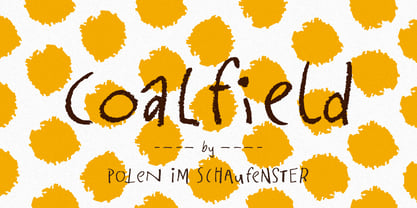 Written with a blunt graphite pen, PiS Coalfield features a scruffy scribbled look, loosely inspired by the expressive handwriting on various posters by Sister Corita Kent, an influential pop artist experimenting with serigraphs in the '60s. There is one set of regular and 4 sets of alternate glyphs for each basic letter programmed to cycle through automatically with the contextual alternate feature (which makes 5 possible versions of each letter). You can also hand-pick the 4 alternate sets if you prefer that of course! A super-lively handwritten look is guaranteed, readability is given in display but also in smaller sizes too! Use it for your organic tofu brand, children’s books or that hip sweet coffee shop around the corner!

