10,000 search results
(0.143 seconds)
- Kaori by ReivNick,
$12.00 Kaori is perfect for title, logo, product packaging, branding, magazine, social media, wedding, or just used for quotes.
 - Apadana by Naghi Naghachian,
$100.00 Apadana is a new creation of Naghi Naghashian. Apadana design fulfills the following needs: A. Explicitly crafted for use in electronic media fulfills the demands of electronic communication. Apadana is not based on any pre-digital typefaces. It is not a revival. Rather, its forms were created with today's technology in mind. B. Suitability for multiple applications. Gives the widest potential acceptability. C. Extreme legibility not only in small sizes, but also when the type is filtered or skewed, e.g., in Photoshop or Illustrator. Apadana's simplified forms may be artificial obliqued in InDesign or Illustrator, without any loss in quality for the effected text. D. An attractive typographic image. Apadana was developed for multiple languages and writing conventions. Apadana supports Arabic, Persian, and Urdu. It also includes proportional and tabular numerals for the supported languages. E. The highest degree of geometric clarity and the necessary amount of calligraphic references. This typeface offers a fine balance between calligraphic tradition and the contemporary sans serif aesthetic now common in Latin typography.
 - Ekbatana by Naghi Naghachian,
$75.00 Ekbatana is a new creation of Naghi Naghashian. Ekbatan design fulfills the following needs: A. Explicitly crafted for use in electronic media fulfills the demands of electronic communication. Ekbatana is not based on any pre-digital typefaces. It is not a revival. Rather, its forms were created with today's technology in mind. B. Suitability for multiple applications. Gives the widest potential acceptability. C. Extreme legibility not only in small sizes, but also when the type is filtered or skewed, e.g., in Photoshop or Illustrator. Ekbatana's simplified forms may be artificial obliqued in InDesign or Illustrator, without any loss in quality for the effected text. D. An attractive typographic image. Ekbatana was developed for multiple languages and writing conventions. Ekbatana supports Arabic, Persian, and Urdu. It also includes proportional and tabular numerals for the supported languages. E. The highest degree of geometric clarity and the necessary amount of calligraphic references. This typeface offers a fine balance between calligraphic tradition and the contemporary sans serif aesthetic now common in Latin typography.
 - Core Sans A by S-Core,
$19.00 Core Sans A Family from S-Core is a modern sans-serif typeface that is clean, simple and highly readable. It is a part of the Core Sans Series (Core Sans N SC, Core Sans N, Core Sans NR, Core Sans M and Core Sans G). Letters in this type family are designed with genuine neo-grotesque and neutral shapes without any decorative distractions. The spaces between individual letter forms are precisely adjusted to create the perfect typesetting. Core Sans A family consists of 8 weights (Thin, Extra Light, Light, Regular, Medium, Bold, Extra Bold, Heavy) with their corresponding italics. Core Sans A contains complete Basic Latin, Cyrillic, Central European, Turkish, Baltic character sets. Each font includes proportional figures, tabular figures, numerators, denominators, superscript, scientific inferiors, subscript, fractions and case features. We highly recommend it for use in books, web pages, screen displays, and so on.
 - Bologna by David Turner,
$35.00 Inspired by pointed pen calligraphy and modulated sans serif typefaces used for advertising in the 1920´s, Bologna is a high contrasted sans serif with a modern and fashionable look. Bologna comes in three weights: Regular, Bold and Black. The Regular and Bold weights are, despite of their high contrast, also build for body texts. Whereas Bologna Black, with a more expressive look and sharp angles, is specially designed for large and striking headlines, packaging or identities. Overview: 3 weights - Regular, Bold, Black Regular/Bold: 657 Glyphs Black: 871 Glyphs Lining, tabular and old style figures Ligatures: fl, fi, ff, ffi ffl, Unicase Letters: a, e, m, n, r Alternative Guillemets Case Sensitive Arrows Bologna Black: hairline accents and interpunctations Fractions Extended Language Support Stylistic Sets: ss01 = Alternative Guillemets / Alternative y ss02 = Unicase glyphs ss03 = Numerals in circle ss04 = Numerals in black circle ss05 = Hairline Accents and Interpunctations (Bologna Black)
 - HG Marugothic by RICOH,
$199.00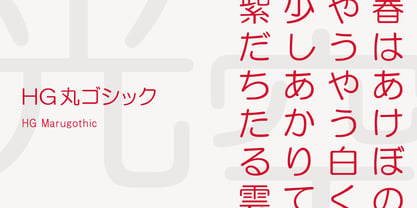 HG丸ゴシックは、リョービの書体「シリウス」を字母とする丸ゴシック体です。L、M、Bと、3つの太さがあります。線はやわらかで、全体的に明るく、あたたかさがあります。ふところは大きくとられていて、かつ、仮名も大きめに作られていて、判別もしやすくなっています。また、それらの特徴から、カジュアルな印象を強く与えますが、ややコントラストがあるため、すっきりとしていて、優しい印象も与えます。
 - Mont Rose by Eurotypo,
$24.00 Rose fonts are based on examples published in the book "Script Lettering" written by M. Meijer in 1957. These kind of handmade lettering were served as a point of departure or inspiration for many other designers along the time. These writings had flowing lines, elegant curves and flourishes, which gave him a lot of rhythm and unique personality. Mont Rose is thin, feminine, friendly and sexy, each font contain 637 glyphs with many stylistic variations, swashes and ligatures in all its letters, and a set of interesting catchwords that you can mix and match to achieve a more interesting effect in your design project. They support also, Central, Eastern and Western European languages. Mont Rose are very versatile fonts, ideal for high-end logos, magazines and book covers, fashion, headlines, cards, posters, websites, packaging. Using these fonts you will achieve a very elegant and warm work.
 - Ergonomique by Monotype,
$31.99 Ergonomique is a humanist sans serif typeface that has been designed to be efficient and comfortable to use across all applications. Ergonomique’s personality is defined by its spurless lowercase glyphs – the stems are truncated and blend into their adjoining arcs, as can be seen in the a/b/d/m/n/p/q/r/u characters. Ergonomique is ideal for branding and display purposes, but also performs well as body copy if you’re seeking a unique style for your text. With its nine weights and complementing italics, Ergonomique is highly versatile, especially when you consider that there are small caps and old style figures included, along with a Latin Extended character set. Key Features: • 18 font family – 9 weights in Roman and Italic • Small Caps, Ligatures, with Proportional, Old Style, and Small Cap figures, plus Fractions, Numerators, Denominators, Superiors, and Inferiors • Full European character set (Latin Extended) • 800+ glyphs per font.
 - Nami by Linotype,
$29.99Nami, the Japanese word for wave," is the latest collaboration between Adrian Frutiger and Linotype's Type Director, Akira Kobayashi. This typeface family is the most humanistic sans serif design ever to come from Adrian Frutiger, and it has an interesting twist: lapidar alternates that may be surfed through with the help of OpenType-savy applications. Adrian Frutiger began the design that would blossom into Nami during the 1980s. Although it would not be produced during the 20th century, it was quite forward thinking. The typeface included several seemingly avant garde alternates; these were "lapidary" versions of common letterforms. Revisiting the project in 2006, Akira Kobayashi reworked the concept into a working family of three typefaces. Each font contains 483 glyphs, including 11 alternates-two extra forms of the lowercase g, as well as new forms for a, e, h, l, m, n, r, t, and u." - Chord Symbols by Tijs Krammer,
$24.00 Chord Symbols is a font for musicians. With this font, you can quickly write beautiful chords, using only simple keyboard characters as input. Musicians tend to write chords with regular characters. They use # instead of a genuine sharp, b instead of a genuine flat, dim instead of a small circle, etc. With Chord Symbols, your chords will be better looking, more easily readable and more efficiently notated. Chord Symbols helps you to write the chords the way you like it. Whether you prefer ‘maj7’ or ‘m7’ or a small triangle for a major seventh, whether you want ‘m’, ‘mi’, ‘min’ or a horizontal line for a minor chord, this font will suit you. Chord Symbols is originally created out of the need to write chords above pop song lyrics. It is designed to also work smoothly in music notation software, like Sibelius, Finale and Encore.
 - Core Sans C by S-Core,
$20.00 Core Sans C family is a part of the Core Sans Series, such as N, M, E, A, D, G, R and B. Core Sans C is inspired by classic geometric sans (Futura, Avenir, Avant Garde etc.). It is based on geometric shapes, like near-perfect circle and square. It has a much higher x-height (height of lowercase letters), an effect which promotes readability especially at small print sizes. The Core Sans C Family consists of 9 weights (Thin, Extra Light, Light, Regular, Medium, Bold, Extra Bold, Heavy, Black) and Italics for each format. Core Sans C supports complete Basic Latin, Cyrillic, Greek, Central European, Turkish, Baltic character sets. Each font includes proportional figures, tabular figures, oldstyle figures, numerators, denominators, superscript, scientific inferiors, subscript, fractions and case features. Core Sans C is an ideal font family for use in magazines, web pages, screens, displays, and so on.
 - ITC Scram Gravy by ITC,
$29.99The 1928 logotype for Sertal Toiletries consisted of a stylized woman's head, a very snaky S, and five fine, fat deco caps spelling out the rest of the brand name. From these five clues, designer Nick Curtis divined the rules" of the typeface and drew a complete alphabet, including a lower case. The result: ITC Scram Gravy. The finished product could be described as Bodoni on steroids. Tight curls in characters like the 'm,' 'r' and 'y' soften the lower case and give the design a light-hearted flavor. ITC Scram Gravy takes its name from one of many running gags in the screwball comic strip "Smokey Stover," which had folks alternately splitting their sides and scratching their heads from 1935 to 1973. Those familiar with Bill Holman's strip will recall Smokey's car, the Foomobile, and one of his famous nonsense declarations: "No foo-ling, that scram gravy ain't wavy."" - Regulator Nova by Device,
$39.00 A high lower-case x-height geometric sans with open counters, Regulator Nova is extremely legible at text sizes and in extended settings while the range of weights also make it suitable for headlines. The stoke terminals are all cut at close to 90 degrees, lending a sharp precision to the characters. Alternate versions of the g, j, r, w, K, R, W, # and ampersand are available in both upright and italic, and can be toggled on and off in the Opentype panel or the Glyphs palette. Clean, elegant and legible, Regulator Nova has a classical proportions based on a circumscribed circle and square, and shares structural similarities to early sans serifs such as Rudolf Koch’s Kabel, while adopting more British forms for the M and R. Regulator Nova is an extension and reworking of Regulator, now with extra weights, reweighed italics, Opentype-savvy alternates and a full European character set.
 - Core Sans E by S-Core,
$29.00 The Core Sans E family is part of the Core Sans series, such as Core Sans N, Core Sans M, Core Sans A, Core Sans G and Core Sans D. This is a modernized, grotesque font family with horizontal terminals, low-stroke contrast, enclosed apertures and little-line-width variation. Its tall x-height makes the text legible; and the spaces between individual letter forms are precisely adjusted to create the perfect typesetting. The Core Sans E family consists of 9 weights, from Thin to Black with italics. It supports WGL4, which provides a wide range of character sets—Greek, Cyrillic, and Central and Eastern European characters. Each font includes support for tabular numbers, arrows, mathematical operators, and OpenType features (such as proportional figures, numerators, denominators, subscript, superscript, scientific inferiors, fractions, case features, and standard ligatures). We highly recommend it for use in books, web pages, screen displays, and so on.
 - Rockwell by Monotype,
$40.99 Whether you call them slab serif, square serif, or Egyptian, you know them when you see them – sturdy, nearly monoweight designs with blunt, straight-edged serifs and a no-nonsense attitude. The Rockwell® Nova family is a fine example of this appealing and eminently usable type style. This is a design that is both robust and adaptable. Marked by the flat top-serifs on the cap A, unusual Q tail and high-legibility two-storied lowercase a, Rockwell has a bit of handmade charm that distinguishes it from the cool, more modern interpretations of the slab serif style. The family is excellent for branding, headlines and other display uses. The simple shapes and hearty serifs also make it a good choice for short blocks of textual content in both print and on-screen environments. The light and bold weights are perfect for setting blocks of text copy, while the extra bold and condensed designs bring authority to display copy. Throw in a little color, and you amp up Rockwell’s messaging power. The regular and italic designs perform handsomely, in the most modest of screen resolutions. With four weights of normal proportions, each with a complementary italic, and three condensed designs, two with italics, the family is a commanding and versatile graphic communicator. Rockwell’s large x-height, simple character shapes and open counters, make for an exceptionally legible design. It should not, however, be set so tight that its serifs touch, as this will erode legibility and impair readability. A benefit to Rockwell’s slab serifs, however, is that the design combines beautifully with both sans serif typefaces and a variety of serif designs. Rockwell OpenType® Pro fonts have an extended character set supporting Greek, Cyrillic, most Central European and many Eastern European languages, in addition to providing for the automatic insertion of ligatures and fractions. Looking for its perfect pairing? Look no further than ITC Berkeley Old Style, Between™, ITC Franklin Gothic®, Harmonia Sans™, Metro® Nova or Frutiger® Serif.
 - Merilland by Prioritype,
$15.00 Hello everyone, here is a font that comes with a beautiful impression and is equipped with alternative characters that can be processed at will. You can apply this font in various print and digital media such as logos, wedding invitations, craft products, promotions on social media and many more. Lots. For reference, see preview. Features: -Uppercase -Lowercase -Numeral -Punctuation -Multilingual -Alternate -Ligature -Swash
 - Agustrush by eyetype,
$16.00 Agustrush a work that is purely a result of handwriting, has a natural characteristic. this is perfect for invitations, signatures, blogs, social media, business cards, product brands. Agustrush a work that is purely handwritten, has its own characteristics with the style of monoline It is perfect for invitations, signatures, blogs, social media, business cards, product brands, also equipped with 52 ligature.
 - Bevalonia by Prioritype,
$15.00 Hello everyone, this is a handwritten font that comes with a beautiful, elegant and very beautiful impression, especially with some very charming ligatures. You can apply this font in various print and digital media such as logos, wedding invitations, craft products, promotions on social media, business cards and much more. For reference, see preview. Features: -Uppercase -Lowercase -Numeral -Punctuation -Multilingual -Ligature
 - Metro Beardy by Figuree Studio,
$16.00 Hello, This is Metro Beardy! Metro Beardy is a retro bold font that comes from hand scratches to get natural writing. With the main style of the hand-lettering display font. Metro Beardy is very suitable for use in various media such as; packaging, logos, labels, posters, shirt designs, wisdom quotes, bulletins, typography, and many other media, especially with retro or vintage looks.
 - Astral Night by Arendxstudio,
$13.00 Astral Night - A Blackletter Typeface is a display font that is inspired by gothic and horror style because its shape is very unique and is perfect for any project that you will use with this theme. Astral Night with opentype features such stylistic alternates, stylistic sets & ligatures good for logotype, poster, badge, book cover, tshirt design, packaging and any more. Features : 1.Uppercase & Lowercase 2.Multilingual support 3.Number 4.Symbol 5.Punctuation. 6.Extra Dingbat 7.Support in Mac and Windows OS -Support in design application (photoshop, illustrator, and more)
 - Bellarosa by Letterara,
$12.00 Bellarosa is a refined and delicate handwritten font. This lovely script font has a wide spectrum of applications ranging from greeting cards to headlines and is guaranteed to add a romantic feel to your next project. It will turn any design project into a true stand-out. Add it to your most creative ideas and notice how it makes them come alive! This font is PUA encoded which means you can access all of the amazing glyphs and swashes with ease! It also features a wealth of special features including alternate glyphs, swashes, and ligatures.
 - Kau by Scholtz Fonts,
$21.00 Kau is a quirky, sans serif display font in two weights. Its funky, stencilled outline bursts onto the page with in-your-face energy, just demanding to be noticed. Kau Black is big and bold, specially crafted for posters, headlines, ads and logotypes. Kau Light forms a perfect foil - clear, skinny and edgy. Use the two together, in a contrasting explosion of form, to create exciting contrasts and vibrant designs The font has all the features of a fully professional typeface. Language support includes all European character sets.
 - Le Vangeline by Reyrey Blue Std,
$14.00 Le Vangeline - is a romantic calligraphy font, with classic root and elegant touch. It is perfect for any projects such as : logos, branding projects, homeware designs, product packaging, mugs, quotes, posters, shopping bags, t-shirts, book covers, name card, invitation cards, greeting cards, label, photography, watermark, special events, and all your other lovely projects that need a beautiful script taste. Add it to your most creative ideas and notice how it makes them come alive! Features : · All Uppercase and Lowercase · Number & Symbol · Supported Languages · Alternates and Ligatures · PUA Encoded
 - Congress by Monotype,
$29.99Congress from Adrian Williams was shown for the first time at the Association Typographique International Congress, which proved to be so popular in 1980 at Kiel; designed to present a style equally appealling in European languages. Many characters are more condensed than is usual, while others have had certain elements exagerated, bringing notice to new elements of certain letters. The concept being to bring an equality of importance to the whole, producing a collection of International characters working together in harmony on the page -- a common aim that Europeans wish of any Congress. - Earth Encounters by Scrowleyfonts,
$24.00 When my Taiji teacher gave all of his students a handwritten card with their name on I noticed that he had an unusual and beautiful handwriting. I persuaded him to write out each of the standard glyphs for me in return for me doing some repairs to his trousers! Earth Encounters Family is the result. The regular font and the light version include OpenType coding to offer the option of different versions of the same letter in words, giving the effect of real handwriting. Earth Encounters also comes with a Shadow style.
 - Destructive Decisions by Chank,
$99.00 Destructive Decisions is a font based upon the inherent flaws of human nature—presented under the guise of complete legibility. At first impression this font is very readable, but upon closer examination you'll notice the edges are fuzzy and some of the lines are off-kilter. You can read it, but it is also a bit foggy. No matter how hard it strives for perfection. This font was originally designed for a cable tv show about substance abuse, but is now available for use in your web and print designs, too.
 - Stinky Slime by Arendxstudio,
$13.00 Stinky Slime - Dripping Halloween Font is a display font that is inspired by gothic and horror style because its shape is very unique and is perfect for any project that you will use with this theme. Stinky Slime with opentype features such stylistic alternates, stylistic sets & ligatures good for logotype, poster, badge, book cover, tshirt design, packaging and any more. Features : 1.Uppercase & Lowercase 2.Multilingual support 3.Number 4.Symbol 5.Punctuation. 6.Extra Dingbat 7.Support in Mac and Windows OS -Support in design application (photoshop, illustrator, and more)
 - Mejicana by Page Studio Graphics,
$29.00The PIXymbols™Mejicana fonts are designed to create both single color, and two-color titles. The fonts are designed for use in creating menus for Mexican restaurants, notices of festive occasions with a Mexican theme, promotion of Mexican folk crafts, and of travel to Mexico. Each font package includes both TrueType and PostScript versions, and is available in either PC/Win or Macintosh format. In order to avoid serious problems, be sure not to install the same fonts in both TrueType and PostScript on the same computer. - Vamps Crime by Arendxstudio,
$13.00 Vamps Crime - Halloween Display Font is a display font that is inspired by gothic and horror style because its shape is very unique and is perfect for any project that you will use with this theme. Vamps Crime with opentype features such stylistic alternates, stylistic sets & ligatures good for logotype, poster, badge, book cover, tshirt design, packaging and any more. Features : 1.Uppercase & Lowercase 2.Multilingual support 3.Number 4.Symbol 5.Punctuation. 6.Extra Dingbat 7.Support in Mac and Windows OS -Support in design application (photoshop, illustrator, and more)
 - Diorite by Three Islands Press,
$24.00Diorite is modern face built on classical letterforms -- but left with a bit of residual roughness. Some might call Diorite forthright, others brutal. (It reminded the designer of the dark, hard igneous rock of the same name, treasured by the ancient Egyptians for statuary.) The typeface has a relatively chunky, four-style family; the italics are true cancellaresca corsiva, also writ heavy. "The cancellaresca is of course a Gothic design," notes the designer. "Just use a broader pen, and you'll see!" Has four styles: regular, bold, cursive, and cursive bold. - HS Ishraq by Hiba Studio,
$59.00 HS Ishraq introduces a modern OpenType Arabic Typeface that combines the features of Kufi and Naskh Style with noticeable both curvy and sharp segments beside the refinements of its letters that made it more readable. HS Ishraq can be used in both titles and text in modern graphic and publication projects. It supports Arabic, Persian, Urdu and Kurdish languages and contains five weights: Thin, light, regular, Medium and bold which can add to the library of Arabic fonts contemporary models that meet with the purposes of various designs for all tastes and all projects.
 - Roughgates by Mozatype,
$15.00 Roughgates Display Font is a bold and chunky lettered display typeface. It’s a versatile serif typeface that gives a vintage aesthetic. Roughgates has multi-language support with western characters included. Roughgates include 2 font , clean version and rough version Add this font to your creative ideas and notice how it will make them stand out! What’s Included : – Works on PC & Mac – Easy to use ( Installations ) – Easy Convert to webfont – Compabilty Windows, Apple, Linux, Cricut, Silhouette and Other cutting machines Thanks for downloading, and I hope you enjoy it!
 - Umbrella by Supersemarletter,
$10.00 Umbrella is a cute and quirky handwritten font. It will add an incredibly joyful touch to your designs. Add this beautiful font to each of your creative ideas and notice how it makes them stand out! Honestly it works perfectly for headlines, logos, posters, packaging, T-shirts and much more. Font Features : • Regular version • Character set A-Z in uppercase and lowercase • Numerals & Punctuation • Accented Characters • Multiple Languages Supported Recommended to use in Adobe Illustrator or Adobe Photoshop with opentype feature. If you have questions, just send me a message and I'm glad to help.
 - Clear Prairie Dawn by Quadrat,
$25.00Clear Prairie Dawn is an original humanist sans serif family based on the designer's own printing. Designed for use as a text face, as a humanist sans it shares some of the characteristics you might notice in other such faces as Optima, Gill Sans or Stone Sans. The italic is a designed italic, rather than merely a slanted roman, and incorporates many of the ideas that the designer found too lively for the roman fonts. The complete CPD package consists of three weights with italics, and a set of original ornaments. - San Marco by Linotype,
$29.99San Marco is a part of the 1990 program Type before Gutenberg, which included the work of twelve contemporary font designers and represented styles from across the ages. Linotype offers a package including all these fonts on its web page, www.fonts.de. San Marco was designed by Karlgeorg Hoefer and brings to mind the style of the Italian Gothic found on the cathedrals of Milan and Florence as well as on the facade of St. Mark’s Cathedral in Venice. Its highly stylized characters make San Marco a good choice for extravagant typography. - Bartley by Flawlessandco,
$9.00 Introducing Bartley, a striking blackletter font that merges tradition with a modern edge. This exquisite typeface is meticulously crafted to bring a touch of Gothic elegance to your designs. An Original typeface that suitable for any graphic designs such as branding materials, t-shirt, print, business cards, logo, poster, t-shirt, photography, quotes .etc This font support for some multilingual. Modern Sweet Retro that contains uppercase A-Z and lowercase a-z, alternate character, numbers 0-9, and some punctuation. If you need help, just write me! Thanks so much for checking out my shop!
 - Nerone by The Ampersand Forest,
$20.00 Nerone is a quasi-unicase display type family in four weights, from light to black. In its lighter versions, it's reminiscent of dignified flared serifs like Albertus. In its black version, it's comparable to display faces like Serif Gothic, with a hint of Mostra-like despotism... Inspired by ancient Roman capitals, Nerone takes a whimsical look at how they might turn into a black fatface, and how a matching lowercase might give the whole affair a whimsical feel — specifically when applied to fun branding and marketing uses. Part of The Ampersand Forest's Sondheim Series.
 - Wild Inferno by Arendxstudio,
$13.00 Wild Inferno - Blackletter Display Font is a display font that is inspired by gothic and horror style because its shape is very unique and is perfect for any project that you will use with this theme. Wild Inferno with opentype features such stylistic alternates, stylistic sets & ligatures good for logotype, poster, badge, book cover, tshirt design, packaging and any more. Features : 1.Uppercase & Lowercase 2.Multilingual support 3.Number 4.Symbol 5.Punctuation. 6.Extra Dingbat 7.Support in Mac and Windows OS -Support in design application (photoshop, illustrator, and more)
 - Still Valentine by Letterara,
$13.00 Still Valentine is a lovely romantic handwritten font with lots of authenticities!. It has beautiful and well-balanced characters and as a result, it matches a wide pool of designs. It will turn any design project into a true stand out. Add it to your most creative ideas and notice how it makes them come alive! This font is PUA encoded which means you can access all of the amazing glyphs and swashes with ease! It also features a wealth of special features including alternate glyphs and ligatures.
 - Aelita by ParaType,
$30.00 Aelita is a low contrast serif typeface in 6 styles. It's distinguished by lowercase character alternates that noticeably change the text pattern. The main character set is quite strict and is characterized by sharp and clear terminals and stiff junctions between stems and bowls. Alternates are more facile and calligraphic. Neutral design of the main character set makes the typeface suitable for scientific and literary texts. Alternates are ideally suited for science fiction, fantasy and art books. The typeface was designed by Natalia Vasilyeva and released by ParaType in 2014.