5,265 search results
(0.04 seconds)
- Stephanie Marie JF Pro by Jukebox Collection,
$36.99
- Maiers Nr 21 Pro by Ingo,
$42.00 A handwritten ”font for technicians“ from ca. 1900. Very geometrical, rigid forms borrowed from the typical characteristics of Jugendstil / Art Nouveau. This script is found in a magazine from the Otto Maier publishing house, Ravensburg, which was issued sometime in the years shortly before WWI. The magazine is entitled ”Schriften-Sammlung für Techniker: Verkleinerte Schriften der wichtigsten Alphabete“ (Collection of scripts for technical specialists: reduced scripts of the most significant alphabets) and published by Karl O. Maier. The original copy, produced by means of a galvanized plate, is just 7 centimeters wide. It served as the model for technical professions in which, at that time, the captions of drawings were still done by hand. The characters have been scanned, digitized and greatly magnified. Special attention was given to ensure the ”uneven“ edges, typical of handwritten script, remained effectively noticeable even in the digitized form. As a result, this ”technical“ font retains a handmade touch. Especially worthy of note are the Jugendstil forms characteristic at the turn of the19th century. In comparison, many alleged ”ultramodern“ font types of today suddenly look quite old-fashioned. Maier’s Nr. 21 Pro is suitable for all European languages. It includes ”Latin Extended-A,“ for Central and Eastern Europe incl. Turkish, and even Cyrillic and Greek, too. The font includes several stylistic alternates as well as a number of ligatures.
 - PR8 Charade - Unknown license

- Pho Twice by Baqoos,
$18.00 Pho Twice is a boisterous neoteric handwritten typeface apt for headline, editorial, branding, packaging, printed materials and typographic applications. 200+ glyphs including punctuation and numerical.
 - Rhinos Pero by Sipanji21,
$20.00 "Rhinos Pero" is a quirky graffiti font that embodies a playful and unconventional style. Fonts in this category often feature eccentric and unique letterforms, incorporating creative elements that deviate from traditional typographic norms. This particular font might showcase irregular shapes, whimsical characters, or unconventional design traits, offering a distinct and unconventional appearance. With its quirky attributes, "Rhinos Pero" is suitable for designs aiming to convey a fun and offbeat visual impression. It could be applied in various creative projects seeking a playful and distinct graffiti-inspired typographic style. **Uppercase
 - MSung PRC by Monotype HK,
$523.99 Song style typefaces originated in the age of woodblock printing in Song Dynasty. Being an essential Chinese type style for printing and publishing all since Ming Dynasty. Based on the Kaishu calligraphic script, its structure has evolved, regularised and standardised with thick stems (豎), thin horizontal strokes (橫) and triangular finials. Dots (點), hooks (勾) and downstrokes retained some features of calligraphy, hence an appropriate choice for continuous reading. The typeface is equipped with a variety of stroke weights, all highly legible .
 - Bros Signage by Blankids,
$20.00 Are you looking for a vintage layering display font? Do you want of creating Something that stand out and inspire creativity, imagination, and endless fun? Wait no more, we will give you the best choice. Bros Signage a Vintage Layered Font Bros Signage a Vintage Layered Font, Inspiring from old signage typography. This font is perfect for a design that makes it more attractive and playful. made with a very good level of aesthetics making this font suitable for book cover, poster, packging, merchandise, logotype and much more. Bros Signage font includes Multilingual Support, among others : Afrikaans, Albanian, Asu, Basque, Bemba, Bena, Breton, Catalan, Chiga, Cornish, Danish, Dutch, English, Estonian, Faroese, Filipino, Finnish, French, Friulian, Galician, German, Gusii, Indonesian, Irish, Italian, Kabuverdianu, Kalenjin, Kinyarwanda, Luo, Luxembourgish, Luyia, Machame, Makhuwa, Meetto, Makonde, Malagasy, Manx, Morisyen, North Ndebele, Norwegian Bokmål, Norwegian Nynorsk, Nyankole, Oromo, Portuguese, Quechua, Romansh, Rombo, Rundi, Rwa, Samburu, Sango, Sangu, Scottish Gaelic, Sena, Shambala, Shona, Soga, Somali, Spanish, Swahili, Swedish, Swiss German, Taita, Teso, Uzbek (Latin), Volapük, Vunjo, Zulu FEATURES : Uppercase Lowercase Number Punctuation Multilingual PUA Encode Opentype
 - Hernandez Bros by Latinotype,
$29.00 Hernández Bros, is a typeface designed by Daniel and Eli Hernández. Born in the year 2021, in the midst of the Covid pandemic, from a collaborative spirit where everything called them to work together as family, in order to obtain better results in such trying times. The Hernández siblings, started a ping pong of drawings based on Bulfinch found in the 1912 ATF catalogue. From this exercise, Hernández Bros was designed, a modern Sans Serif, with 8 weights ranging from Extralight to Black. This is an elegant font, with beautiful and harmonious contrasts, which makes it ideal for titles, brands, editorial design, magazines among others.
 - 19-PRA by ILOTT-TYPE,
$29.00 Inspired by the elegance of Herman Zapf’s designs crossed with the readability of early 20th century Gothic fonts by Morris Fuller Benton, 19-PRA is a sans-serif with a visible stroke contrast and a humanist tone of voice. The large x-height seen in fonts like News Gothic and Palatino increases legibility and condensed proportions give excellent readability making it perfect for newspaper and magazine publishing. A typeface that can serve for both body text and titling the uppercase excels for headlines and renders beautiful brand names when tracked out. It sets well with both a serif or sans serif and has various open type features including: 12 standard ligatures, 3 discretionary ligatures, tabular figures, old stye figures as well as European accents.
 - Mad Props by Graffiti Fonts,
$19.99Classic & clean tag style lettering that's easy to read & flexible. Mad Props includes 2 full alphabets, full numbers, punctuation & other symbols. This style works well with outlines & effects. - Cro Aloha by FontHaus,
$19.95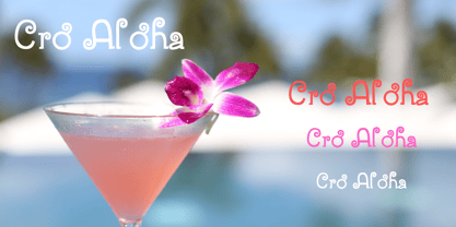
- Choco Bro by Sipanji21,
$18.00 "Choco Bro" is a cute and chubby display font characterized by truncated or shortened characters. Fonts with truncated characters often feature letterforms where certain parts are cut off or abbreviated, giving them a unique and distinctive appearance. This font can be a delightful choice for various design projects, especially those targeting children's themes or playful designs. The truncated characters add a quirky and playful touch to the font, making it suitable for posters, invitations, children's books, or any project that aims for a fun and whimsical typographic style.
 - Chartu Poo by Enfeeltype,
$15.00 Chartu Poo is a stunning modern sans serif font that exudes a sense of luxury and sophistication. Its futuristic concept is truly unique, and makes it stand out from other fonts in its class. The sleek lines and bold curves of Chartu Poo give it a sense of elegance and refinement, while also conveying a sense of modernity and innovation. One of the things that sets Chartu Poo apart is its versatility. It can be used in a wide range of design projects, from logos and branding materials to website designs and advertising campaigns. Whether you're looking to create a bold and impactful headline, or a subtle and understated body copy, Chartu Poo is the perfect font for the job. Another great feature of Chartu Poo is its readability. Despite its bold and unique design, this font is incredibly easy to read, making it a great choice for both print and digital media. Whether you're designing a brochure or a website, Chartu Poo will ensure that your message is conveyed clearly and effectively. In short, if you're looking for a modern sans serif font that combines luxury, sophistication, and innovation, look no further than Chartu Poo. Its unique and futuristic concept, combined with its versatility and readability, make it the perfect choice for any design project.
 - Banzai Bros by Fenotype,
$20.00 Banzai Bros is a deadly efficient multidisciplinary all-caps assault font. It's highly recommended for posters, signs, flags & banners. Banzai Bros comes with a small set of ornaments. Available as a single font or in packs with other Fenotype fonts.
 - Prop Ten by Galapagos,
$39.00Some years ago we developed a monospaced 12 pitch sans serif for a client. We also created a 10 pitch version that was later discarded. PropTen is the 10 pitch version modified to proportional widths. The name PropTen refers to 'Proportional 10 Pitch'- which is a technical impossibility. It does have a slight 'its time to vote' twist to it. You know, after you pick your candidate you also need to vote yes or no on the following Propositions, don't forget Prop10, the team needs those uniforms. - Bros Rover by Blankids,
$27.00 Introducing a new font is Bros Rover Classic Sans Serif. Bros Rover good for logotype, poster, badge, wedding invitation, book cover, tshirt design, packaging and any more.
 - English Gothic, 17th c. - Unknown license

- SF Proverbial Gothic Extended - Unknown license

- SF Proverbial Gothic Condensed - Unknown license

- SF Proverbial Gothic Extended - Unknown license

- SF Proverbial Gothic Condensed - Unknown license

- New Lincoln Gothic BT by Bitstream,
$50.99New Lincoln Gothic is an elegant sanserif, generous in width and x-height. There are twelve weights ranging from Hairline to UltraBold and an italic for each weight. At the stroke ends are gentle flares, and some of the round characters possess an interesting and distinctive asymmetry. The character set supports Central Europe, and there are three figure sets, extended fractions, superior and inferior numbers, and a few alternates, all accessible via OpenType features. Back in 1965, Thomas Lincoln had an idea for a new sanserif typeface, a homage of sorts, to ancient Roman artisans. The Trajan Column in Rome, erected in 113 AD, has an inscription that is considered to be the basis for western European lettering. Lincoln admired these beautiful letterforms and so, being inspired, he set out to design a new sanserif typeface based on the proportions and subtleties of the letters found in the Trajan Inscription. Lincoln accomplished what he set out to do by creating Lincoln Gothic. The typeface consisted only of capital letters. Lincoln intentionally omitted a lowercase to keep true his reference to the Trajan Inscription, which contains only magiscule specimens. The design won him the first Visual Graphics Corporation (VGC) National Typeface Competition in 1965. The legendary Herb Lubalin even used it to design a promotional poster! All this was back in the day when typositor film strips and photo type were all the rage in setting headlines. Fast forward now to the next millennium. Thomas Lincoln has had a long, illustrious career as a graphic designer. Still, he has one project that feels incomplete; Lincoln Gothic does not have a lowercase. It is the need to finish the design that drives Lincoln to resurrect his prize winning design and create its digital incarnation. Thus, New Lincoln Gothic was born. Lacking the original drawings, Lincoln had to locate some old typositor strips in order to get started. He had them scanned and imported the data into Freehand where he refined the shapes and sketched out a lowercase. He then imported that data into Fontographer, where he worked the glyphs again and refined the spacing, and started generating additional weights and italics. His enthusiasm went unchecked and he created 14 weights! It was about that time that Lincoln contacted Bitstream about publishing the family. Lincoln worked with Bitstream to narrow down the family (only to twelve weights), interpolate the various weights using three masters, and extend the character set to support CE and some alternate figure sets. Bitstream handled the hinting and all production details and built the final CFF OpenType fonts using FontLab Studio 5. - Hand Stamp Gothic Rough by TypoGraphicDesign,
$25.00 “Hand Stamp Gothic Rough” is based on real vintage rubber stamp letters from Germany. A classic american gothic face mixed with a modern condensed sans serif type. Rough & dirty with a authentic hand stamped look for a warm analogue vintage charm. It started analogous with only a few rubber stamps and finally it was digital 776 glyphs. With 4 × A–Z, 4 × 0–9, 4 × a–z and many other alternative glyphs like @. Plus modern OpenType Features like contextual alternates (automatic generated loop for letter variation). The different variations from the dynamic pressure by hand intended to show the hand-made nature and creates a liveliness in the display font. The font has 80 decorative extras in the form of symbols & dingbats like arrows, hearts, smileys, stars, further numbers, lines & shapes. A range of figure set options like oldstyle figures, lining figures, superiors & inferiors. Additionally standard ligatures, decorative ligatures (type the word “show” for ☛ and “love” for ❤ … ), Versal Eszett (German Capital Sharp S) and many emojis & symbols. Example of use It’s your turn … for example everywhere where it makes sense. The hand stamped font would look good at headlines. Advertising (big headlines), Corporate Design (type for logos & branding), Editorial Design (magazine or fanzine headlines), Product Design (typographical packaging) or Webdesign (headline webfont for your website), flyer, poster, music covers or web banner … How To Use – awesome magic OpenType-Features in your layout application: ■ In Adobe Photoshop and Adobe InDesign, font feature controls are within the Character panel sub-menu → OpenType → Discretionary Ligatures … Checked features are applied/on. Unchecked features are off. ■ In Adobe Illustrator, font feature controls are within the OpenType panel. Icons at the bottom of the panel are button controls. Darker ‘pressed’ buttons are applied/on. ■ Additionally in Adobe InDesign and Adobe Illustrator, alternate glyphs can manually be inserted into a text frame by using the Glyph panel. The panel can be opened by selecting Window from the menu bar → Type → Glyphs. Or use sign-overview of your operating system. For a overview of OpenType-Feature compatibility for common applications, follow the myfonts-help http://www.myfonts.com/help/#looks-different ■ It may process a little bit slowly in some applications, because the font has a lot of lovely rough details (anchor points). Technical Specifications ■ Font Name Hand Stamp Gothic Rough ■ Font Weights Regular & Dirty (Bold) ■ Font Category Display for headline size ■ Font Format.otf (OpenType Font for Mac + Win) ■ Glyph Set 776 glyphs ■ Language Support Basic Latin/English letters, Central Europe, West European diacritics, Turkish, Baltic, Romanian, OpenType Features, Dingbats & Symbols ■ Specials Alternative letters, stylistic sets, automatic contextual alternates via OpenType Feature (4× different versions of A–Z & 0–9 + a–z), Euro, kerning pairs, standard & decorative ligatures, Versal Eszett (German Capital Sharp S), 80 extras like Dingbats & Symbols, arrows, hearts, emojis/smileys, stars, further numbers, lines & shapes. ■ Design Date 2016 ■ Type Designer Manuel Viergutz ■ License Desktop license, Web license, App license, eBook license, Server license
 - Sonny Gothic Vol 2 by W Type Foundry,
$25.00 Sonny Gothic Vol 2 is an extension of our popular font Sonny Gothic. All corners have been softened to get a friendlier and fluffy visual language. As Sonny Gothic, this typeface has ligatures inspired by the incredible work of Herb Lubalin, chiefly Avant Garde. We designed carefully Sonny’s Vol 2 ligatures, and we also created new ones to control the whites formed between softened characters such as FL, FB, FD, FE, FF, FH, FI, FK, FN, and FR. Developed with powerful OpenType features in mind. Each weight includes alternate characters, ligatures, fractions, special numbers, arrows, extended language support, small caps, and many more. Perfectly suited for graphic design advertising.
 - Gothic Special Normal Italic by Wooden Type Fonts,
$15.00 A revival of one of the popular wooden type fonts of the 19th century, suitable for text or display, short descenders, tall ascenders, the narrow, italic version, completing the Gothic Special family of 5 fonts in total, sans serif.
 - Century Gothic Paneuropean Variable by Monotype,
$209.99 Century Gothic™ is based on Monotype 20th Century, which was drawn by Sol Hess between 1936 and 1947. Century Gothic maintains the basic design of 20th Century but has an enlarged x-height and has been modified to ensure satisfactory output from modern digital systems. The design is influenced by the geometric style sans serif faces which were popular during the 1920s and 30s. The Century Gothic font family is useful for headlines and general display work and for small quantities of text, particularly in advertising. Century Gothic family has been extended to 14 weights in a Pan-European character set from Thin to Black and their corresponding Italics. The already existing 4 weights of Regular and Bold with their Italics are additionally still available in the STD character set. For international communication, the W1G versions offer the appropriate character set. They contain Latin, Greek and Cyrillic characters and thus support all languages and writing systems that are in official use in Western, Eastern and Central Europe. Century Gothic Variable is features two axes: Weight and Italic. The Weight axis has preset instances from Light to Black. The Italic axis is a switch between upright and italic. Looking for the perfect way to complete your project? Check out Aptifer™ Slab, ITC Berkeley Old Style®, FF Franziska™, Frutiger®, ITC Legacy® Square Serif or Plantin®.
 - Letter Gothic 12 Pitch by Bitstream,
$29.99Roger Roberson skillfully adapted the sanserif to the monospace IBM typewriter at Lexington, Kentucky, in 1956. - Gothic Special Medium Italic by Wooden Type Fonts,
$15.00 A revival of one of the popular wooden type fonts of the 19th century, suitable for text or display, short descenders, tall ascenders, the narrow, italic version, completing the family of 6 fonts in total, sans serif.
 - Hess Gothic Round NF by Nick's Fonts,
$10.00 The family tree of this friendly face runs deep. Its primary inspiration is Twentieth Century, designed by Saul Hess as a monoline version of Paul Renner’s Futura. The design was reinterpreted by Herb Lubalin as Avant Garde in the 1970s. This version softens the harsh geometry of the original designs with rounded line endings: the result is a warm, inviting face that is elegant, confident and inviting. All versions of this font include the Unicode 1250 Central European character set in addition to the standard Unicode 1252 Latin set.
 - ITC Avant Garde Gothic by ITC,
$42.99 ITC Avant Garde Gothic is a font family based on the logo font used in the Avant Garde magazine. Herb Lubalin devised the logo concept and its companion headline typeface, then he and Tom Carnase, a partner in Lubalin’s design firm, worked together to transform the idea into a full-fledged typeface. The condensed fonts were drawn by Ed Benguiat in 1974, and the obliques were designed by André Gürtler, Erich Gschwind and Christian Mengelt in 1977. The original designs include one version for setting headlines and one for text copy. However, in the initial digitization, only the text design was chosen, and the ligatures and alternate characters were not included. The font family consists of 5 weights (4 for condensed), with complementary obliques for widest width fonts. When ITC released the OpenType version of the font, the original 33 alternate characters and ligatures, plus extra characters were included. ITC Avant Garde Gothic® font field guide including best practices, font pairings and alternatives. Featured in: Best Fonts for Logos, Best Fonts for Websites, Best Fonts for PowerPoints
 - Iwata UD R Gothic by IWATA,
$199.00 - ITC Handel Gothic Arabic by ITC,
$103.99 ITC Handel Gothic Arabic is a modern Kufi design by Nadine Chahine, created especially for headlines and display purposes. It comes in 5 different weights ranging from Light to Heavy which extends its usage capabilities considerably. The design is mono-linear and with the typical geometric construction associated with the Kufi style. Its usage can vary from headlines to logos to packaging. Given its large counters, it can function quite well in very small sizes too. Its pattern is quite homogenous, so it is not recommended to use this for whole paragraphs. The character set supports Arabic, Persian, and Urdu and also includes Basic Latin.
 - Gothic 16 CG Decorative by Intellecta Design,
$17.90a gothic drop caps font - Trade Gothic Next Rust by Linotype,
$29.00 Trade Gothic Next is Akira Kobayashi's 2008 revision of Jackson Burke's 1948 design. Developed over many years, the original Trade Gothic was filled with many inconsistencies. Under the direction of Akira Kobayashi, Linotype's Type Director, the american type designer Tom Grace, a graduate of the MA Typeface Design in Reading, was commissioned to redesign, revise, and expand the Trade Gothic family. Kobayashi and Grace refined many details such as the terminals and stroke endings, symbols, and the spacing and kerning. Moreover, there are newly added compressed widths and heavy weights perfect for setting even more powerful headlines. The Regular weight has been beefed up making it stronger and more robust in text settings. Trade Gothic is a staple of the advertising and newspaper industries, and now Trade Gothic Next brings more features and better quality for today's astute typographers. In addition several weights are available as soft rounded versions.
 - FF Letter Gothic Mono by FontFont,
$62.99 Italian type designer Albert Pinggera created this sans FontFont in 1998. The family has 6 weights, ranging from Light to Bold (including italics) and is ideally suited for editorial and publishing, logo, branding and creative industries as well as software and gaming. FF Letter Gothic Mono provides advanced typographical support with features such as ligatures, alternate characters, case-sensitive forms, super- and subscript characters, and stylistic alternates. It comes with tabular oldstyle and tabular lining figures. This FontFont is a member of the FF Letter Gothic super family, which also includes FF Letter Gothic Slang and FF Letter Gothic Text.
 - Cheddar Gothic Sans Two by Adam Ladd,
$25.00Cheddar Gothic Sans Two is a hand-drawn, multi-weight display family. An all-caps, sans serif typeface with condensed proportions that works great for a variety of display uses. The uppercase characters add distinction with extended crossbars and chiseled terminals, while the lowercase provides a more classic sans serif appearance. This family is an expanded version of the original Cheddar Gothic Sans, with more weights and even broader language support. - News Gothic No. 2 by Linotype,
$40.99News Gothic No. 2 is an enhanced version of News Gothic produced by the D. Stempel AG type foundry in 1984. It added more weights to the News Gothic family than were available in other versions, increasing its use in contemporary design and communication. The lighter weights of the original News Gothic were designed by Morris Fuller Benton in 1908 for American Typefounders (ATF). News Gothic typeface is quite similar to Benton's other sans serifs from the early twentieth century, including Franklin Gothic and Lightline Gothic. The bold weights were added to the News Gothic scheme in 1958. The capital letters in News Gothic No. 2, just like those found in News Gothic, have a similar visual width to each other. The lowercase is compact and powerful. These design attributes contributed to Benton's strong handle on the sans serif genre, and for years his types have been popular for newspaper headlines and many other uses. Still a popular presence on the font charts, News Gothic has proven its ability to get the job done right. - Benton Gothic Thin NF by Nick's Fonts,
$10.00 This typeface takes its inspiration from Lightline Gothic, designed by Morris Fuller Benton for ATF in 1908. This version is even lighter, making it suitable for headlines. Both versions of this font support the Latin 1252, Central European 1250, Turkish 1254 and Baltic 1257 codepages.
 - FF Letter Gothic Text by FontFont,
$62.99 Italian type designer Albert Pinggera created this sans FontFont between 1996 and 1998. The family has 6 weights, ranging from Light to Bold (including italics) and is ideally suited for advertising and packaging, editorial and publishing, logo, branding and creative industries, software and gaming as well as sports. FF Letter Gothic Text provides advanced typographical support with features such as ligatures, alternate characters, case-sensitive forms, fractions, super- and subscript characters, and stylistic alternates. It comes with a complete range of figure set options – oldstyle and lining figures, each in tabular and proportional widths. This FontFont is a member of the FF Letter Gothic super family, which also includes FF Letter Gothic Mono and FF Letter Gothic Slang.
 - Monotype News Gothic Paneuropean by Monotype,
$92.99Similar in design to Franklin Gothic, News Gothic was one of a number of sans serif faces manufactured by American Type Founders in the early years of the twentieth century. Initially cut as a light sans, heavier versions were made in the 1940s and 50s along with some condensed weights. The News Gothic font family offers an uncomplicated design that is well suited for use in newspapers and magazines for headlines and in advertisements.


