10,000 search results
(0.222 seconds)
- Handikraf by Keristyper Studio,
$9.00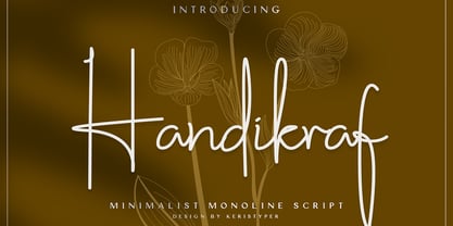 Handikraf Signature Script Font is charming and elegant Typeface. Created with an authentic, handwritten feel. It looks stunning on wedding invitations, thank you cards, quotes, greeting cards, logos, business cards, and every other design which needs a handwritten touch. Handikraf Signature Script Font multilingual support: Afrikaans, Albanian, Catalan, Danish, Dutch, English, Estonian, French, Finnish, German, Icelandic, Indonesian, Italian, Malay, Norwegian, Portuguese, Spanish, Swedish, Zulu, and many more. What’s Included : Web Fonts Standard & Multilingual glyphs Ligature Works on PC & Mac Simple installations Accessible in Adobe Illustrator, Adobe Photoshop, Adobe InDesign, and even work on Microsoft Word. Hope you enjoy our font!
 - Puffy Chips by Say Studio,
$15.00 Hallo everyone, puffy chips! puffy chips - it's groovy,retro, bold, chubby, and playful, chubby typeface of circle in groovy style. Perfect for make any project like header, quote, layout magazine and other. Even better if you use it on 60s and 70s design project Embracing the psychedelia era combine with groovy style, open type features such as stylistic alternates and multilingual support What's you get? - Unique letterforms - Works on PC & Mac - Accessible in the Adobe Illustrator, Adobe Photoshop, Microsoft Word even work on Canva! - PUA Encoded Characters - Fully accessible without additional design software. Have a wonderful day, *Say Studio*
 - SK Fushimi by Shriftovik,
$32.00 SK Fushimi is an accidental experimental font inspired by modern Japanese culture and aesthetics. Its futuristic geometric shapes, on the one hand, follow the spirit of the time of the land of the rising sun, and on the other hand, they make homage to technology. Like Japanese culture, the SK Fushimi font plastic fits perfectly into many areas of graphic design, supporting and complementing any graphic solutions. In addition, this font supports a multilingual set of more than fifty characters, including Cyrillic and Latin alphabets. Unusual in all respects, the font is perfect for the same unusual design or will make it so!
 - Lloyd Serif by Ivan Kostynyk,
$- Initially, I participated in the contest to design the logo for Bill Lloyd. In the end, the design was rejected, but letters remained. I then decided to continue with the idea and complete the entire typeface. After a couple of months, I realized that the typeface was imperfect, and now that I’m working on an updated Lloyd type, this one is free. The main characteristic of the typeface is its bold and curvy shapes. It is also tall and original in design. It was a great experience because it taught me how failure inspires people to move on, and create something better.
 - Down The Wall by Hanoded,
$15.00 I have no great love for walls, especially when they are built to keep people out. When I started working on this font, I realized it looked a bit like protest graffiti, found on… yes, walls. Down The Wall is a great little font: it is handwritten, messy and in your face. It has no real baseline and glyphs jump all over the place. Use it for book covers, posters, album covers - anything really. It certainly would look good on a wall too! Comes with a whole bunch of diacritics, so whatever you have to say, the world will understand.
 - Androgino by Cititype,
$17.00 Androgino is a unique handwritten font with deconstruction concept, where each letters connected to others with different spaces and sizes and sometimes overlaps. This font has an abstract 'dual interpretation'. On the one hand, the unique design of the letters does not have a stylistic tendency. On the other hand, the letters are combined in a unique form when they become sentences. Coupled with several ligatures that add diversity and give a certain surprise and impression when typed. Unique and stand out is the right definition for Androgino. It’s another word of Androgynous, Feminism which is masculine, suitable for all types of branding.
 - Nouveau Calendar JNL by Jeff Levine,
$29.00 Inspired by the lettering on Koloman Moser’s poster design for Fromme’s Calendar (circa 1912), Nouveau Calendar JNL is available in both regular and oblique versions. According to Wikipedia: “Koloman Moser (30 March 1868 – 18 October 1918) was an Austrian artist who exerted considerable influence on twentieth-century graphic art and one of the foremost artists of the Vienna Secession movement and a co-founder of Wiener Werkstätte. Moser designed a wide array of art works, including books and graphic works from postage stamps to magazine vignettes; fashion; stained glass windows, porcelains and ceramics, blown glass, tableware, silver, jewelry, and furniture.”
 - Eixample Glaces by Type-Ø-Tones,
$55.00 The Eixample project is inspired by modernist signage of various examples found in the Eixample neighbourhood in Barcelona. The name of each subfamily is related to its location or to specific elements of the original sign. In 2003 we photographed a sign with the word GLACES painted on a refrigerator, on which, over the years, we have speculated on how to manage the concept of double vertical modulation. This model has been expanded and the original idea has been developed in three variants that oscillate between monolinear and high contrast. In order to increase its versatility, the character set includes small caps.
 - Norwich Aldine ML by HiH,
$12.00 Norwich Aldine ML is a all-cap typeface with enlarged serifs, designed and produced in wood by William Hamilton Page of Norwich, Connecticut in 1872. Norwich Aldine ML is a fine example of the strength of decorative wood types: large, simple type forms that provide the visual boldness sought by advertisers of the Victorian period. While our marketing has gotten so very sophisticated, there is always a place for a simple, visually strong typeface. Although about 14 miles inland, Norwich, Connecticut lies at the head of the Thames River. The river is both wide and deep, and therefore was not bridged in the early 20th century. Until then, if you wanted to get from Groton on the west bank to the whaling port of New London on the east bank by land, you had to go by way of Norwich. Because of its size, the Thames is navigable all the way from Norwich to New London. Docks were built in Norwich around 1685 and the city became Connecticut’s 2nd largest port by 1800. With the construction of the Norwich & Worcester Railroad in 1835, Page could easily ship his wood type north by rail or south by coastal schooner. Included with our font, Norwich Aldine ML, are two 19th century printer’s ornaments of sailing ships similar to those that sailed up the Thames to Norwich. Reference: Moon’s Handbooks, Connecticut 2nd Edition (Emeryville CA 2004) The family has expanded from one to four fonts: 1. Norwich Aldine ML: the concept font, computer-sharp corners and smooth curves, as we imagine it was designed. 336 Glyphs including some reduced-width alternatives for better letter spacing. 2. Norwich Aldine Worn ML: the way actual wooden type would look after have been used for a while. 332 Glyphs 3. Norwich Aldine Distressed ML: the way the wooden type would look after it had really been used, perhaps abused. Alternatives to the more popular letters reflect the damage that typically occurs on a well-wormn font, with nicks, cuts and scratches and the overall wear that reduces the overall height and leads to uneven inking due to varying heights in the chase. A couple of bullets look like bullet holes. 345 glyphs. 4. Norwich Aldine Cyrillic: Cyrillic includes alll English and Cyrillic letters for MS Windows Code Page 1251, ISO 8859-5 and MacOS Cyrillic. 235 glyphs. We did Cyrillic because is was fun and we felt the basic design cried out for Cyrillic. While obviously subjective, we hope you will agree.
 - Ah, the "Scooby Doo" font by Lauren Ashpole, where every letter looks like it's ready to jump into a groovy mystery machine and solve a case or two while avoiding ghosts and ghouls! This font is as p...
- Kewl Script by Sudtipos,
$59.00 Kewl is the result of being caught in the afterimage of one design project while conceptualizing another one. Just before finishing the final tests on Mrs Blackfort, the first of what became a long series of Charles Bluemlein fonts, some of the letters began morphing differently in my mind. The idea was to go on the heavier and more playful side, but with a South American sign letterer’s twist, rather than just good handwriting. I did some sketching, took some notes, then got busy with other projects. Some of that stuff eventually seeped into Candy Script and, to a lesser extent, the Whomp font. But it was only a matter of time before I got back to the original concept and finished it. Kewl is ideal for food packaging, book and music covers, magazines, and window splashes. Illustrations by Catriel Martinez.
 - Contribute by Fontscafe,
$39.00 The Contribute font is one that takes you back to the days of the fountain pen. To those who are old enough to remember, fountain pens were tiresome to fill and use – but also a pleasure to own, something to cherish that became so much a part of your daily life, a symbol of etiquette and sometimes even a style statement! Our Contribute fonts will definitely remind you of that, and everything else to do with a touch of vintage class. This 30s-like font is sure to become one of your favorite cursive fonts, be it for use on a poster or a web page. This font is ideal for those situations where you need your viewer to connect on a more personal level than formal. Think ‘writing a letter rather than typing it out’, and you will know what we mean!
 - Beware The Neighbors by Intellecta Design,
$23.90 Beware The Neighbors is based on “Personality Script”, a rough alphabet originally drawn by Ross F. George, and published in one of the Speedball series of lettering catalogs that ran from 1935 to 1948. The design is something of a minor classic, and several foundries have recreated digital fonts based on it. However, mostly of these interpretations are very “geometric”, formed using straight lines. Intellecta preferred to create a new interpretation using smoother, curved lines to create a creepy appearance. Also included are several ligatures and OpenType stylistic alternates. This version also has an extended character set for use in Central as well as and West European countries, plus Baltic, Turkish and Romanian. Check out Intellecta’s Clarvoyant for another creepy experience based on lettering from old Speedball catalogs. CLOSE THE DOORS AND WINDOWS AND BEWARE OF YOUR NEIGHBORS!
 - Fastenating JNL by Jeff Levine,
$29.00 Since the 1800s, many patents were issued for methods to hold papers together. The two most popular and enduring tools still in use today are the stapler and the paper clip. In recent times a number of clips in novelty shapes have been available in just about every size, shape and color imaginable. Back in the beginning there were many variations as well, but the purpose of these design variants was to try and command the majority of sales in the fledgling market of bent wire clips by offering a unique and hopefully better product. Fastenating JNL contains twenty-five images based on those early clip designs as well as one classic paper fastener (on the Z and z keys). The standard gem clip has been the most enduring design and is well over one hundred years old.
 - Thirdlone by Letterhend,
$14.00 Thirdlone is a handmade typeface with monoline script and sans. This font is perfect to be used as t-shirt designs, logo/brands, signatures, headlines, lettering quotes, and more. It also comes in uppercase, lowercase, punctuation, symbols, numerals, stylistic set alternate, ligatures, and multi-lingual support. Thirdlone Script includes 3 different styles: Regular, Stamp, and Ink. Thirdlone Sans includes 4 different styles: Regular, Stamp, Ink, and Edge. Regular styles are a regular style that have clean look on it. Stamp styles give you aged texture on the font that will push out the vintage feel. Ink styles will give the font a little bit of an ink feel. The Edge style give this font a rough feel on its edge. You can choose one of the styles mentioned above that match perfectly for your style, or just mix and match it.
 - More Printing Helpers JNL by Jeff Levine,
$29.00More Printing Helpers JNL gathers another assortment of vintage printing embellishments and ornaments from the late 1800s. Within the standard twenty-six alphabet keys are pointing hands, corner pieces, border elements and decorative center and end pieces. On the lower case, certain elements have been flipped or inverted for matching effects. Some additional positions are available on the 1 through 9 keys and on the colon and semicolon. A bonus to this font: three expandable panels. the first (with decorative end caps) is attained by typing the left parenthesis for the left side, the hyphen for the center lines and the right parenthesis for the right side. The second one features ribbon ends, and the combination of the less than-equal-greater than keys creates this panel. The third design can be made by typing the left brace/vertical bar/right brace keys. - PR Vanaheim by PR Fonts,
$10.00 This is a perfect font for historical or fantasy titles. It is influenced by ancient Nordic runes. the strokes flare slightly, to a concave terminal for a finely carved appearance. There are two sets of capitals in PR-Vanaheim-DC (Dual Capitals); one set of narrow letters, more closely related to Runic forms, and one set which includes wider and circular letters, which can be freely combined with the narrow letters for the variety associated with hand lettering. There is one version with dots placed in the centre of large counters and one version without the dots. The broad caps character set includes characters which allow for tight spacing; a dropped L, and a tall T. There are also two different lowercase sets, one modern, and one archaic, all of which can be freely mixed to fine tune the appearance of your text. Here is the brief description of the available faces: PR-Vanaheim-Med-DC-01 Duplex Caps PR-Vanaheim-Med-DC-02 Duplex Caps, Dotted counters and dot space PR-Vanaheim-Med-DC-03 Duplex Caps, Dotted counters PR-Vanaheim-Med-LC-04 Broad Caps, with modern style lower case. PR-Vanaheim-Med-LC-05 Narrow Caps, with modern style lower case. PR-Vanaheim-Med-LC-06 Broad Caps, with archaic lower case. PR-Vanaheim-Med-LC-07 Narrow Caps, with archaic lower case.
 - The KR Snowman font, crafted by the talented Kat Rakos, stands as a charming and whimsical addition to the realm of typography. This font captures the essence of joy and playfulness that is reminisce...
- Caviar Dreams - 100% free

- NewRocker - 100% free

- Pabellona (A) Símplex - Personal use only

- Pabellona (C) Tríplex - Personal use only

- Oaxaqueña Tall - Personal use only

- Righton by Letterhend,
$13.00 Introducing, Righton - a luxurious font duo that brings a classy and luxury look. It contains two fonts, script and serif, which perfectly pair. They work great if you need a typeface for headlines, logotypes, apparel, invitations, branding, packaging, advertising etc. This typeface is comes in uppercase, lowercase, punctuation, symbols, numerals, stylistic set alternate, ligatures, and also has Multi-Lingual support. We hope you enjoy the font, please feel free to comment if you have any thoughts or feedback. Or simply send me a PM or email me at letterhend@gmail.com
 - Hello Kartina by madjack.font,
$14.00 Hello Kartina Script is a beautiful, organic, and fun hand-painted script with different basics and handkerchiefs that can be applied at the beginning and end of all lowercase letters. International support for most Western languages is included. For separate font swash, type lowercase a-z for initial swash and final swash. This font can be used for various purposes. Such as titles, signatures, , wedding invitations, t-shirts, letterhead, signage, labels, news, posters, badges etc. Thank you very much for searching and letting me know if you have questions.
 - Peanut Square Layer by PizzaDude.dk,
$19.00 This is a font that will fit in the "hard to read section" because it may not be super legible at first sight - that is because of the negative space. But when you combine the two layers (Layer and Box) the letter suddenly appears very legible! Play around with your favourite colour palette while adjusting the transparency in order for the colours to blend, giving a really nice handcrafted look! You have 4 different versions of each letter to play around with and of course there is multilingual support!
 - Chillink by Four Lines Std,
$15.00 Get ready to chill and thrill with Chillink Font! With its bold and playful style, this font is sure to make your text pop and stand out from the crowd. Plus, its unparalleled readability and versatility make it the perfect choice for any project, whether it's a social media post, website design, or even a logo. The best thing about Chillink Font is that it's so easy to use! Just copy and paste it into any project, and you'll be ready to go in no time at all.
 - Admiral by Greater Albion Typefounders,
$12.00 Admiral was inspired by and extrapolated from the Art Nouveau lettering incised into the facade of a local hostelry. This gave us some inspiration for the capitals 'A', 'B', 'C', 'E', 'H', 'I', 'L', 'O', 'S', 'T' and 'U'; we then had great fun extrapolating the rest! The source of the name Admiral can be spotted if you look at characters such as 'A', 'H' and 'N'. Admiral's distinctive charm and humour lends it to projects with a 1900s Art Nouveau theme, be they book covers, posters, signage, invitations, cards, or anything else you enjoy!
 - Dinastri by Mantra Naga Studio,
$20.00 Dinastri is a condensed sans serif font that has a modern edge with bold characteristics. At 385 glyphs, this font is perfect for modern logos, contemporary web designs, or printed headlines. 385 Glyphs 5 Opentype features 7 Ligatures and 11 Stylistic alternates Multilingual support for 89 languages We highly recommend using a program that supports the OpenType feature and the Glyphs panel like many Adobe and Corel Draw applications, so that you can view and access all variations of Glyphs. Thanks for your support of our product and using it in your project.
 - Salom by Schriftlabor,
$44.00 Salom was designed by Austrian type designer Igor Labudovic during his year at Reading University. Besides Latin, it originally included Arabic and Hebrew. The peaceful coexistence of both writing systems in his fonts led him to combine the words Salaam and Shalom to the font family name. Salom’s sibling, Salom Sans, features the same letter proportions and therefore allows a rich spectrum of diverse typography, yet keeping the harmony between all styles. The sans has an additional light weight, while the serif comes with an expressive stencil style.
 - HGB Bluesband Two by HGB fonts,
$23.00 The roots of this font go back to 1967. A book title in trendy letters was created in a completely ingenuous way as a film prop for a Super 8 fun film. I drew the letters with felt-tip pen and poster paint without thinking too much about it. It wasn't until a good 50 years later that I realized, this was a first awkward typeface draft. The flower power vibe was captured here subconsciously. In 2019 I completed the few glyphs and created variants that I would not have thought of at the time.
 - Enyo by Antipixel,
$20.00 Enyo Slab is a decorative, display, serif handwritten font. This font will provide an informal look to your work! It can be used for small ammount of text, and specially for display usage because of its glyph quality. Enyo offers OpenType features, including ligatures, alternates, smallcaps, scientific superior/inferior figures, oldstyle figures, fractions, slashed zero, and kerning. This handwritten font has a large glyph coverage, supporting at least 133 languages including English, Spanish, French, German, Italian, Portuguese, Swedish, Polish, Czech, Vietnamese, Russian, among many others. Enyo has also available the Cyrillic and Greek alphabets.
 - ITC Musclehead by ITC,
$29.99ITC Musclehead is the work of type designer Timothy Donaldson, a robust, densely packed handwriting typeface. It almost looks like brushwork but was in fact made with a ruling pen which Donaldson had bought from a company in Salem, Massachusetts. He says, The world's gone ruling-pen mad at the moment [late 1990s] and I was beginning to tire of all the skinny splashiness of the letters that most people were making with them. I wanted to do something heavy and robust with the tool, so that's what I did."" - Taler by Serebryakov,
$40.00 Taler is a serif typeface is represented by seven weights. It was conceived as a continuation of the sans-serif Nekst. In the process of design it became clear that it is a completely different typeface. The rectangular, slightly elongated serifs, the plastic stiffness, and the combination of different styles make Taler a true representative of contemporary. It's old-fashioned and modern, it's for a display titles and for plain text, it's rough and elegant — it's all present in design at the same time. The duality of it nature is it peculiarity.
 - Afiche Script by Mysterylab,
$19.00 Afiche Script is an engaging vintage-flavored script font that features excellent legibility and versatility. It's equally suited for large logo and headline applications as it is for longer text passages, being very readable even at small sizes. The appealing curves and rounded finials give it a casual and fun vibe, and the subtle reverse stroke contrast makes it a standout choice to catch the eye as being something new and different. The capitals dip below the baseline, providing a lively bounce to each line of upper and lowercase type.
 - Hand Stamped JNL by Jeff Levine,
$29.00Years before the many "modern" ways to creates signs and posters, the popular method was the rubber stamp printing set. Many of these sets used the classic DeVinne typeface, and were manufactured by at least a half dozen different companies. The "sign and chart printers" (as they were known) often consisted of both upper and lower case letters, numbers, punctuation, pointing hands and other symbols. "Hand Stamped JNL" puts all the fun of the rubber stamp printing set into an easy-to-use digital font with no messy ink spills or clean-up. - Cira Serif by Huerta Tipográfica,
$45.00 Cira is a superfamily with 7 weights and italics under two main styles: sans and serif. The original concept was created for Katachi Media as a corporate font for text and experimentation in an iPad magazine. It has a diversity of outlines with straight angles which create unusual shapes and counterforms. Its middle weights are suitable for text and can be combined with extreme weights at display sizes. Cira is a versatile superfamily with an original and modern feeling and it’s a great option for giving identity to your designs.
 - Song Composer JNL by Jeff Levine,
$29.00 The sheet music for the 1939 tune "Chico's Love Song (Ma-La-Ja Fa-La Pas-Ka Lah-Ta) [Cuban Double Talk]" may have had an odd title, but the main portion of it was hand lettered in an interesting style. Condensed letters with rounded corners complemented by sharp lines and angles give the characters an almost futuristic look, despite the fact that they were designed during the Art Deco era. This became the basis for Song Composer JNL, which is available in both regular and oblique versions.
 - Lyonette NB by No Bodoni,
$39.00 These four typefaces, Berlinette NB, Lyonette NB, Marseillette NB and Parisette NB, were designed from the same basic shape, a geometric form that avoids strict horizontals and uses more offbeat triangular shapes. Lyonette is a fanciful type, gentle and precocious. It seems aloof at times but isn�t really. The frivolity and quirkiness of the narrow width is offset by the fey, finger-like horizontals, vaguely reminiscent of strange encounters and dark closets. It�s great for fashion advertising with literary pretensions. Or maybe a kinder, gentler sci-fi movie.
 - Destructive Decisions by Chank,
$99.00 Destructive Decisions is a font based upon the inherent flaws of human nature—presented under the guise of complete legibility. At first impression this font is very readable, but upon closer examination you'll notice the edges are fuzzy and some of the lines are off-kilter. You can read it, but it is also a bit foggy. No matter how hard it strives for perfection. This font was originally designed for a cable tv show about substance abuse, but is now available for use in your web and print designs, too.


