10,000 search results
(0.032 seconds)
- Zaftig Pro by Typeco,
$49.00Many current poster artists like to reference the graphic type styles that were popular in the ’60s and ’70s. Zaftig is a contemporary font that takes the geometric and blocky inspiration from that era but then steps off in a modern direction. At first glance, it may appear that the capitals of Zaftig all take up the same amount of space, but certain letters have been designed proportionally for a better flow. However, if the designer would prefer to stack the capital letters in even columns, like blocks, then one can use the Titling Alternates feature. In this feature the metrics of all the capital letters are the same, and certain letters have been designed narrower, allowing for seamless stacking. The space, bullet, asterisk have also been given the same monospaced metrics in this feature to make stacking easy. The Small Caps feature in Zaftig is designed so that the small cap glyphs are the same height as the lowercase. This allows the graphic designer not only the option of small caps, but also the ability to mix and match both kinds of letters to create a distinctive style. There are also alternate numerals in the Small Caps feature that match the height of the small caps. In Stylistic Alternates 1 you will find alternate designs for the Q, A, I, J, L, n, and u glyphs. Or you can find alternates in the Glyph Pallet of your favorite OpenType savvy application. Zaftig is more than it appears on the surface. This OpenType font contains over 1200 glyphs and language support. That makes it an international font which contains letters for most languages that use Latin, Central European, Cyrillic, and Greek scripts. - El Fonte Angelia by Gilar Studio,
$16.00 Hello Everyone.. Introducing a new Font " El Fonte Angelia " Beautiful Serif Type Family is inspired by the serif typefaces used in editorial media in the 70s and 80s.such as the soft and gentle shapes found in Cooper or the fluid, angled strokes in Windsor— mixed into one single design that features familiar, fresh, modern flavors. Designed to reflect nature, it creates a sense of natural softness and expressiveness. We pushed the concept into a usability focused direction, to work as a bold tool and beautiful communicator. El Fonte Angelia variable allows fluid design across 5 weights The font broadens its use by supplying weights all the way from Light to Bold. The natural curves, swells and sloping trunks, grow in character as the font gains weight. Whilst the thinner weights have lowered contrast and optical corrections to create a warm and gentle appearance. El Fonte Angelia character set incorporates additional symbols, stylistic alternates, unique ligatures and case sensitive punctuation - producing a stable workhorse family ready to tackle projects of any size.The type family melds organic curves and gentle repetition into powerful and harmonious type. At large point sizes you can appreciate the letter shapes, whilst the same restraint and focus creates an even texture for small point sizes and long reading. Its variety of weights provide a range of choices that will help you find the best typographic color for your project. Lighter weights are well-suited for body text while heavier ones are ideal for high impact headlines. The available stylistic alternates offer a number of different characters that give your logo or business card a unique look. Check my other Font here : https://gilarstudio.com/ Thank you Regards, Gilar Studio
 - Aviano Gothic by insigne,
$22.00 The Aviano collection returns, refined into a new, mid-contrast sans-serif inspired by the design and style of early 1900ís American engravers. Engravers would meticulously carve lettering into copper plates for printing, and often these letters, for more impact, would be extended and only utilize capitals. While taking inspiration from the past, Aviano Gothic is distinctly one-of-a-kind, and is not a revival, but instead is based on the structure of pre-existing Aviano type families for interchangeability and interoperability. Aviano Gothic has been diligently honed to be sinuous and seductive, making it great for high-end work such as including jewelry, beauty, and other luxury products. The full Aviano Gothic family presents you with six distinct weights and is full of OpenType options. Available with the face are deco alternates for replicating inscriptions and signage of the í20s and í30s. Style sets are offered, together with four full sets of art deco-inspired alternates, swashes, and titling, in addition to an expansive range of other alternates to help ìunique-ifyî your layouts. Aviano Gothic also features forty discretionary ligatures for inventive typographic compositions. Begin planning your work with Aviano Gothic by looking at these options in the instructive .pdf brochure. OpenType-able applications, including Quark or the Adobe suite, allow for the comprehensive benefit of the ligatures and alternates. This typeface also features the glyphs to aid a broad number of languages. Several variants have been made to extend the usefulness of the typeface, and it makes for a fine substitute for Copperplate, ITC Blair or Engravers Gothic. Aviano Gothic also pairs perfectly with the other members of the Aviano collection, including the original Aviano, Aviano Serif, Aviano Sans, Aviano Didone, Aviano Flare, Aviano Future, Aviano Wedge, Aviano Contrast and Aviano Slab.
 - Cinque Donne by Debi Sementelli Type Foundry,
$44.99 Cinque Donne means “Five Women” in Italian. It was inspired by the five sisters in my family as well as a group of five high school friends I have known for 46 years, aka “The Club Girls”. The Pro version has 3370 glyphs with all the bells and whistles! Women are connectors, encouragers and supporters. Young, old, shy, extroverted, when you put us together, somehow we make a beautiful impact on each other’s lives. This is what Cinque Donne does in a visual way. Some letters are simple and prefer to sit quietly. Others are flourished and proud and like the limelight in the middle of a word. And then there are alternates that are flexible and work in any number of surprising places. Stylistic sets can add a vivacious feel while contextual alternates bring better understanding. Classic or contemporary, subdued or flamboyant, these letters represent the variety of women that make life interesting for us all. Within the varied glyphs, I hope you find characters that remind you of the special women in your life. Let Cinque Donne salute them on the page! The Cinque Donne Family includes: Cinque Donne, Cinque Donne Bold, Cinque Donne Swash and Cinque Donne Pro. Check out the Buying Choices tab to see special discounted combinations! Crafters: All of my fonts have been specially coded for PUA (Private Use Area) so you can access all of the swashes and alternates using Character Map (PC) or Character Viewer (Mac) or with any number of apps including PopChar. If you would like to purchase PopChar at a special discount email me and I will send you the link. Cinque Donne Pro and Cinque Donne Swash include Swash, Stylistic and Titling Alternates, Contextual Alternates, Standard and Discretionary Ligatures, Roman Numerals & Fractions.
 - Turbinado by Aerotype,
$48.00 The ten font Turbinado™ Set was designed to be clear and easy to read with a friendly personality, ideal for advertising and packaging in both text and display settings. Included are three weights of brushed casual script, each with a dry version, two condensed all caps faces, another hand printed caps face and an Elements package with 100 brushed elements that include swashes, botanicals, shells, arrows, repeatable patterns and a few other doodads that play well with the fonts. Like our most recent release Fave, all of the fonts use the OpenType standard ligature feature to automatically differentiate consecutive lowercase letters and numbers, using separate glyphs rather than a single ligature so they can be set on a curve or colored separately, etc. They also automatically differentiate like characters that are separated by another letter when standard ligatures is enabled. The script fonts have alternate characters like swash glyphs for ends of words and a few ligatures too; single crossbar to unite the At and Att letter combinations etc. The two condensed faces also have a third set of less uniform glyphs that can be used to create a more quirky, fun and bouncy effect (see the ‘she sells seashells’ graphic above) when the discretionary ligature feature is on. The script fonts have 10+ lowercase t (and double t) crossbar alternates that can be selected from the OpenType glyph table manually, or you can enable the contextual alternates feature to automatically insert a bigger crossbar as the surrounding letters allow throughout a text box or document. Hello? Are you still there? :) And for those intrepid typographers who would rather fashion their own lowercase t to custom fit a specific design, all of the lowercase t ascenders and crossbars are also available separately in the glyph table, and can be combined manually.
 - Olymp80 by Konst.ru,
$10.00 Dedicated to the XXII summer Olympic Games. I was inspired by the icons of these games when creating font Olymp80. This is an excerpt from the official report of the Moscow Olympics: "Sports pictographs, as we know, are pictographic drawings symbolising sports. They serve as points of reference and help overcome language barrier. Over the past few years, they have been integrated into the decoration of Olympic cities, and have been depicted in Olympic posters, commemorative medals, postage stamps, tickets, souvenirs, etc. On the OCOG-80’s request, graduates from several art colleges took up the design of the pictographs of the insignia as the theme of their dissertations. With the help of the research institute of industrial aesthetics, the Organising Committee chose the work submitted by Nikolai Belkov, Mukhina Art School graduate from Leningrad. The State Committee for Inventions and Discoveries under the USSR Council of Ministers recognised the new design as a production pattern. Though highly stylised, the new signs are easily comprehensible. They are smoother in outline because they are constructed at an angle of 30-60 (previously the angle was 45-90). Another merit of the new system is that the designs can be adapted for use in four representations: direct (solid, black against a white background), reverse (solid, white against a black background), contour (black contour against a white background), and reverse-contour (white contour against a black background), and permit several colour and shade and size variations." All text and pictures you may see on 1980 Moscow, Volume 2, Part 2, Page 420. Monospaced font for names, logotypes, titles, headers, topics etc. Font includes only uppercase letters with two alternative designs for each letter.
 - Cabrito Sans by insigne,
$24.99 It's time to kick off your shoes and feel the "sans" between your toes. Like Cabrito Inverto , its stress-reversing cousin, the new Cabrito Sans serves up something nice and cool in the heat of the project. A quick recap: the original Cabrito is an insigne Design slab serif produced for the kid's book The Clothes Letters Wear. It's been pretty well-received--even more than I expected. I promised to grow the family with a free-standing inverted style that could pair well with Cabrito. (See Cabrito Inverto.) Now, I'm rounding out the family with this well-crafted sans. And so now, Sans is where it's at. Strip away the serifs of Cabrito, and you have a laid back, rounded sans serif alternative served up over easy. This handwriting-inspired creation--like its relatives--is definitely not uptight about its forms (though not afraid to show them off a little). Cabrito Sans' whole pack of alternates is accessible in any OpenType-enabled program. This kiddo consists of a workforce of alternates, swashes, and alternate titling caps to give the font a little extra sweetener to its flavor. Also bundled are swash alternates, old style figures, and compact caps. Check out the interactive PDF brochure to test out each these options. This font family members also consists of the glyphs for 72 various languages. Cabrito Inverto and Cabrito do pair nicely with Cabrito Sans (in case you doubted). Use Sans--or all three of these amigos--to express friendliness on just about anything: food, candy, toys, cars (if you're feeling bold). Don't wait, though. Purchase Cabrito Sans today, and bring a one-of-a-kind look to whatever your computer's next design party is.
 - Turban Hey NF by Nick's Fonts,
$10.00The “Moorish arch” treatment of certain letters on a 2001 book on Dutch design, executed by René Knip, provided the inspiration for this exotic unicase typeface. The font also includes arabesque designs in the brace, florin and section mark positions. Both versions of the font include 1252 Latin and 1250 CE (with localization for Romanian and Moldovan) character sets. - Gudeg Theo by Letterayu Studio,
$15.00 Gudeg Theo is a modern Slab serif style display font category. This font is very attractive. Perfect for cute quotes, packaging, branding, invitations, greeting cards, and more. Features : – Uppercase and Lowercase letters – Numbering and Punctuations – Multilingual Support – Works on PC or Mac – Simple Installation – Support Adobe Illustrator, Adobe Photoshop, Adobe InDesign, also works on Microsoft Word
 - Fernburner NF by Nick's Fonts,
$10.00This stunning display face is based on Hans Bohn’s 1929 opus for Gebr. Klingspor, originally named Orplid. One of the treasures discovered in the legendary green vinyl binder that launched Nick’s love of type, it’s a real crowd pleaser. Both versions of this font include the complete Latin 1252, Central European 1250 and Turkish 1254 character sets. - Happy Trip by Vozzy,
$10.00 Introducing vintage label font named Happy Trip. This font has a wide languages support with west european and cyrillic characters (check out all available characters on previews). The font familty has six styles: Regular, Aged, Texture, Outline and three colorful styles. This font will look good on any vintage styled designs like a poster, T-shirt, label, logo, etc.
 - Fine And Dandy JNL by Jeff Levine,
$29.00 Fine and Dandy JNL comes from the hand lettered title of the 1929 movie "Isle of Escape"; found on the sheet music for its theme song "My Kalua Rose". An engraved and fancy Roman, the style combines elements of Western, Art Nouveau and Art Deco into one attractive type design; available in both regular and oblique versions.
 - Fillippo by Stefani Letter,
$12.00 Fillippo is a stunning monoline style script font with authentic and casual vibes. It looks beautiful on a variety of designs requiring a personalized style, such as wedding invitations, thank you cards, advertising, poster, greeting cards, logos and so on. Fillippo is PUA encoded which means you can access all of the glyphs and swashes with ease!
 - Obnoxious Tie by PizzaDude.dk,
$16.00 That tie you wore in the 1990'ies...the one from the 1980'ies...perhaps even the one from the 1970'ies...could look obnoxious today - or maybe ... it's super fashionable these days! :) This Obnoxious Tie is a mix of upper- and lowercase ... well, that goes for the "lowercase" - the uppercase is uppercase, just as usual!
 - Christmas letter by Stefani Letter,
$12.00 Christmas letter is a stunning monoline style script font with authentic and casual vibes. It looks beautiful on a variety of designs requiring a personalized style, such as wedding invitations, thank you cards, weddings, greeting cards, logos and so on. Christmas letter is PUA encoded which means you can access all of the glyphs and swashes with ease!
 - Flashes by profonts,
$39.99Flashes is a striking display font based on Enric Crous-Vidal's design from 1953. Unger redesigned the font based on artwork from old font books, and extended the character set to cover not only standard Western but also the Central European character set. It has been a tremendous amount of meticulous work to digitize and edit all the flashes! - Schoolyard Blues JNL by Jeff Levine,
$29.00 Schoolyard Blues JNL is based on the hand lettered title found on the sheet music for the 1938 song "I Was Late for School". A condensed sans serif with chamfered corners, it reflects the Art Deco influences of the day in some of the letter forms. This type design is available in both regular and oblique versions.
 - Friendship by Sinfa,
$10.00 Friendship is a simple font with a natural look but extraordinary for use on letters, social media posts, instagram, magazines, watermarks on photography, quotes, album covers, logos, business cards, and many other design projects. Friendship comes with uppercase letters, lowercase letters, several alternative lowercase letters, numbers and punctuation to make it easy for you to do what you want.
 - Avenue by Hackberry Font Foundry,
$24.95Avenue is an eleven font family with five synthesist serif faces, five humanist sans serif faces, and one old style face. It is designed as an extrememly versatile body copy set. There are many special dingbats for bullets, and so on. It has oldstyle numbers and the small caps versions have lining numbers and small caps numbers. - Allerton by Jeff Levine,
$29.00 Presenting a condensed Art Deco sans serif font with rounded corners and squared inner lines, based on the hand lettered title on the cover of the sheet music for 1944’s “Just A Little Fond Affection”. Allerton JNL is available in both regular and oblique versions, and was named after a neighborhood in the Bronx, New York.
 - Frosted by Great Lakes Lettering,
$24.95 Frosted is a font based on a naive, illustrated handwriting that can be used on a daily basis. It is a delicate, handwritten font with a somewhat masculine feel which mimics the natural stroke of pointed pen calligraphy. Paired with structured flourishes and wreaths, Frosted embodies a folksy feel that brings true character to any design.
 - Fleurons Initials by Wiescher Design,
$39.50Fleurons Initials is a set of elegantly decorated blocked initials, reminiscent of old Jazz and Circus Posters. I have added one set of flat underlays and one of blocked underlays, so you can easily add a little colorful touch here and there. Easy because those underlays have the the same spacing! Have fun. Your elegant designer, Gert Wiescher - Jungle Drums JNL by Jeff Levine,
$29.00 Jungle Drums JNL is based on the hand-lettered title on the 1929 sheet music of its musical namesake. A bold, free form design with a hint of the Art Deco movement of the coming decades, this casual typeface has the vintage charm to enrich many design projects. Jungle Drums JNL is available in both regular and oblique versions.
 - Wood Sans Narrow JNL by Jeff Levine,
$29.00 Wood Sans Narrow JNL is based on examples of an extra condensed Hamilton Wood Type. The design was cleaned up a bit to provide more uniform stroke widths, but still retains the nostalgic feel of a tall, narrow type face found on broadsides and posters of the late 1800s. It is available in both regular and oblique versions.
 - Mule Train JNL by Jeff Levine,
$29.00 Instead of being directly based on classic wood or metal type examples, Mule Train JNL takes a roundabout route in its development. Images of a set of letters and numbers cut from plywood (which in turn were based on a vintage type design) served as the work models. Mule Train JNL is available in both regular and oblique versions.
 - Federasyon by Yasin Yalcin,
$14.00 Federasyon was designed on the principles simplicity, legibility and functionality. The font family includes four weights and each weight has more than 240 characters on its own. Federasyon contains more than 10.000 optical arrangement data for each character to work in harmony with each other. Federasyon supports a total of 22 languages, including Western and some Central European languages.
 - Gyftype Bones by giftype,
$20.00 This font is based on the different bones of an skeleton , it is ideal To make a clear an original text , designed to make a very special gift !. On the other hand it has a multitude of use both in posters and in documents of differents Kind , parties , invitations ...finally , it includes Greek and Cyrilic characters.
 - Sport Bar by Vozzy,
$10.00 Introducing original label font named Sport Bar. This font has a wide languages support with west european and cyrillic characters (check out all available characters on previews). The font family has six styles: Regular, Contour, Fill1,Fill2, Rough1 and Rough2. This font will look good on any vintage styled designs like a poster, T-shirt, label, logo, etc.
 - ITC Golden Cockerel by ITC,
$40.99ITC Golden Cockerel font is based on designs created by Eric Gill in 1929 for the Gold Cockerel Press in England. These elegant and meticulously crafted typefaces were inspired by and modeled on Gill's skills of stone carving, calligraphy and wood engraving. The typeface family includes ITC Golden Cockerel Roman, Italic, Titling, and Initials and Ornaments. - Rail Route Stencil JNL by Jeff Levine,
$29.00 Rail Route Stencil JNL is based on a hand-cut paper stencil depicting a logo for the Baltimore and Ohio (B&O) Railroad. The lettering is from the motto encircling an image of the Capitol dome: "Linking 13 Great States with the Nation". This motto was not present on some other versions of the B&O logo.
 - ITC Galliard eText by ITC,
$29.00A clear and enjoyable reading experience hinges on the legibility of text copy, especially when reading on screen. This is why Monotype has developed the eText collection of fonts specifically tailored for the text-heavy display environments of e-readers, tablets, mobile devices, and the Web. Matthew Carter designed the original ITC Galliard. Carl Crossgrove created this eText version. - Burdigala X Sans by Asgeir Pedersen,
$24.99 Burdigala X Sans is an open and spacious typeface, ideal for larger amounts of (printed) texts in brochures, magazines and books. Being wider than usual, it works especially well in media intended for on-screen reading, such as in Pdf-documents, e-books, applications and so on. Burdigala is the ancient Roman name of the city of Bordeaux France.
 - Morning Sans by cm5dzyne,
$12.00From the March 2008 issue of In Your Face: "(Morning Sans) is an especially legible stressed sans (that) manages to combine both a calligraphic fluidity with the hard edges of incised lettering without focusing too much attention on individual characters: it remains very readable and keeps an even color on the page, even in long settings." - Vellay by Stefani Letter,
$12.00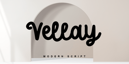 Vellay is a stunning monoline-style script font with authentic and casual vibes. It looks beautiful on a variety of designs requiring a personalized style, such as wedding invitations, thank you cards, advertising, poster, greeting cards, logos, and so on. Vellay is PUA encoded which means you can access all of the glyphs and swashes with ease!
 - Handmade Font by Ingrimayne Type,
$14.95 In Handmade Font the letters are made of hands or handprints, something children sometimes do when they are set free with paint. It is caps only but the letters on the lower-case keys differ from those on the upper-case keys. It comes with a large assortment of accented letters to support most European languages.
 - Boldblaster by Sign Studio,
$12.00 Boldblaster brings vintage themes into the modern era. Neatly arranged lowercase characters are needed for writing a brand or logo. With regular and italic styles, the Boldblaster family can be used together in one display and can support each other in your designs. Supporting font on preview : HEXI ( https://www.myfonts.com/fonts/sign-studio/hexi/ ) Thank You
 - Skipper by Fenotype,
$35.00 Skipper is a bold and flowing connected script. Skipper is equipped with three alternate characters for every basic letter: click on Swash, Stylistic or Titling Alternates on any OpenType savvy programs to create custom looking designs. Inside Skipper there’s a set of 35 ornaments designed to support the font. Access the ornaments from the Glyph Palette.
 - Visual Arts JNL by Jeff Levine,
$29.00 Visual Arts JNL is a classic Art Deco typeface based on the hand lettering found on a 1930s-era WPA (Works Progress Administration) poster for Women Artists. The exhibit took place in the Federal Art Gallery in Boston, and was part of the arts project underwritten by the WPA to keep many creative people working during the Depression years.
 - No Remorse by Vozzy,
$10.00 Introducing vintage label font named No Remorse. This font has a multilungual and cyrillic characters support (check out all available characters on previews). The font family has six styles: Regular, Inline, Shadow, Inline FX, Shadow FX and Aged. This font will look good on any vintage styled designs like a poster, T-shirt, label, logo, etc.
 - Griezelig by Hanoded,
$15.00 I love creating fairytale fonts, but for some reason I haven’t made one for quite a while. So, without further ado, I present Griezelig! Griezelig in Dutch means ‘scary’ or ‘creepy’. The word itself even looks kind of creepy! Griezelig was loosely based on two of my favourite (but unfortunately rather inconspicuous) fonts called Hexenhammer and Bronwen.