6,334 search results
(0.104 seconds)
- DF Staple Mono by Dutchfonts,
$33.00 DF Staple Mono is a personal answer on the archaic and ‘middle-of-the-road’-forms of typewriter typefaces like ‘Courier’ and ‘American Typewriter’. The form of a staple (office supply no. 1) and its transformations inspired me during the design process. The first four weights are all monospaced and are completed with a real italic.
 - Grand Prairie NF by Nick's Fonts,
$10.00This addition to the Whiz-Bang Woodtype series in based on a 100+ year-old typeface originally named Medallic. Due to the highly ornate nature of this font, it has a limited character set (no math operators or footnote accessories). The Opentype version of this font supports Unicode 1250 (Central European) languages, as well as Unicode 1252 (Latin) languages. - Vidalia Sunshine NF by Nick's Fonts,
$10.00A single line of type, identified as "Ornamented No. 5" and spelling out "ROPE ONIONS", from the 1888 MacKellar, Smiths & Jordan specimen book provided the pattern for this whimsical face. Offbeat yet elegant, graceful yet bold, it’s a natural choice for distinctive headlines. Both versions of the font include 1252 Latin, 1250 CE (with localization for Romanian and Moldovan). - Kasuga Brush by insigne,
$21.99 Kasuga Brush is a contemporary script with eastern influence and authentic brush drawn character. The script offers two variants. One is slightly distressed along the character's edges while the other is painted with a dry brush for interesting texture. Sixty-four optional ligatures add a realistic, hand-drawn effect and ensure that no two letters in a word repeat.
 - White Risolles by pentagonistudio,
$19.00 White Risolles Is Clean Script Font Inspired By Handwritting Characters. Font Features : White Risolles OTF ( Open Type ) White Risolles WOFF ( Web Font ) SOFTWARE REQUIREMENTS : Fonts and alternate : No special software required they may be used in any basic program /website apps that allows standard fonts That's it folks! You can go ahead and get cracking :) Have a Good Day !
 - LTC Hess Monoblack by Lanston Type Co.,
$24.95 A very rare metal face made a brief appearance in Lanston Specimen books and has all but vanished from use. In fact no examples of the font in use seem to exist. It shares some of the hand-rendered casual feel of Nicholas Cochin, but much heavier and well suited for bold headlines and package design.
 - Mykogae by ErlosDesign,
$15.00 Mykogae - Display Sans Serif by erlosDESIGN Mykogae is a display sans serif with modern style and trendy. No matter the topic, this font will be an incredible asset to your fonts’ library, as it has the potential to elevate any creation. It is perfect for book covers, social media post, logos, business card, quotes and so much more.
 - Yemeyi by AukimVisuel,
$9.00 Yemeyi family is a modern and daring display font. No matter the topic, this font will be an incredibly asset to your fonts’ library, as it has the potential to elevate any creation. Yemeyi is a simple and neat lettered sans serif font. Add this font to your creative ideas and notice how it will make them stand out!
 - De Vinne by Bitstream,
$29.99 This revival of the Bruce Foundry’s No. 11 is typical of the nineteenth century types derived from the work of Didot and Bodoni; the face remains popular with lawyers and government printers. In fact, Theodore Low De Vinne opposed this kind of design as hard to print and read; he had Century designed to replace it.
 - Purple Bread by Balpirick,
$15.00 Purple Bread is a Tall Handwritten Font. Whether you’re using it for crafts, digital design, presentations, or making greeting cards, this font has the potential to become your favorite go-to font, no matter the occasion! This font only has allcaps letters. - also multilingual support Enjoy the font! Feel free to comment or feedback! Thank you!
 - Messy Linocut 2D by 2D Typo,
$24.00 Don't try to find logic in this font, nor the harmony of the forms. It is meant to be crank. All the letters were first cut in linoleum and then digitized. Hence, everything is alive. You will find no uniform elements. We think this font will find its use in the hands of a brave designer.
 - Queens Burger by Balpirick,
$15.00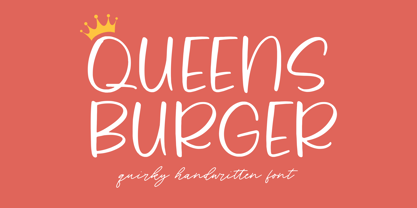 Queens Burger is a Quirky Handwritten Font. Whether you’re using it for crafts, digital design, presentations, or making greeting cards, this font has the potential to become your favorite go-to font, no matter the occasion! This font only has allcaps letters. - also multilingual support Enjoy the font! Feel free to comment or feedback! Thank you!
 - Sails Next by East end,
$16.30 This font was created from scratch in a simple, strong, and unique style. No other fonts were used as references. Its name was inspired by the shape of the first letter, A, that flashed into being. Sails next is perfect as a display font for posters, flyers, and magazine headings. The font family consists of the regular font only.
 - Bleecker Street NF by Nick's Fonts,
$10.00This late Victorian typeface flirts with Art Nouveau sensibilities, as evidenced by the graceful curves and the decorative crossmembers in several of the uppercase letters. The result is a font that combines simple, understated elegance with a no-nonsense, workmanlike stance. Both versions of the font include 1252 Latin, 1250 CE (with localization for Romanian and Moldovan). - Runaround Kid by Hanoded,
$15.00 I was listening to some old Smashing Pumpkins albums when I created this font. The name comes from a song called *** You (An Ode To No One). Runaround Kid is a hand painted typeface. I used Chinese ink and a cheap Chinese brush to create the inky look. Comes with double-letter ligatures and a whole bunch of diacritics.
 - Tadao by The Northern Block,
$19.30 A precise rounded typeface with a clean and linear appearance. The simple compact nature of the design allows for great economy of space across layouts. Also deliberate consideration has been paid to inner corners to ensure no dark areas are produced within texts. Details include 6 weights, an extended European character set, manually edited kerning and Euro symbol.
 - Bastinado by Elemeno,
$25.00Big, thick and chunky, Bastinado is imposing, but the bat-like, scalloped edges give it a sinister presence. Bastinado is an ancient Asian method of torture in which the bottoms of the victim's feet are beaten until he can no longer walk. This font looks like it wants to catch other fonts in a dark alley. - Nautical Doodles by Outside the Line,
$19.00 Sail the seas with Nautical Doodles. This seaworthy font has 32 illustrations of water craft, anchors, star, compass, flags, whale, shark, birds, starfish, seahorse, rope etc. Even a mermaid... and the scripted word Ahoy! If you would like the character chart go to the Gallery Tab and print. (PDFs are no longer downloaded with the font.)
 - Bareback by Solotype,
$19.95The devil does indeed find work for idle hands. This was designed by Dan X. Solo about with no excuse whatsoever. The name comes from the fact that a circus that we regularly did work for used it in one of their programs, the only time it was ever used as far as we can recall. - Karlisbad by Ingrimayne Type,
$9.95 Karlisbad is a monospaced font in which lines expand and contract to form letters. The No-Lines styles can be used alone but it was their use in layers that inspired their creation. They can be used to give the letters a different color than the lines or to create an outline or hollow-letter effect.
 - Silver Thunder by Olivetype,
$18.00 Looking for a unique and badass font to add some edge to your designs? Look no further than Silver Thunder. This graffiti-inspired font is a good option for apparel, posters, headlines, magazines, and more. With its cool black metal aesthetic, Silver Thunder will give your work a truly one-of-a-kind look. Thank You!
 - Exit Punch by Bogstav,
$17.00 What exactly is an exit punch? I have no clue! :) I named the font after a wordplay with random words, and somehow I found the name suited the font perfect. The letters are awkward and unpredictable in a legible but playful manner. I've added ligatures for the most common double letters, such as bb, cc, dd etc.
 - Almond Cookie by Balpirick,
$15.00 Almond Cookie is a Monoline Handwritten Font. Whether you’re using it for crafts, digital design, presentations, or making greeting cards, this font has the potential to become your favorite go-to font, no matter the occasion! This font only has allcaps letters. - also multilingual support Enjoy the font! Feel free to comment or feedback! Thank you!
 - Silvergates by Gienlee,
$15.00 Yo! Welcome to gienlee cartoon, design, and other artworks Silvermoon is Medieval Font. Commonly used for middle ages those combined with the beauty of crystal and silver stone. Item Description Standard Glyphs (Uppercase, Lowercase, Numeral & Punctions) Works on PC & Mac No Special Software is required File Description Silvergates-Regular OTF file Silvergates-Line OTF file enjoy your download
 - Splinterhand by Hanoded,
$12.00 No, I did not have a splinter in my hand when I came up with the name for this font. It sounded right, so I used it! Splinterhand is a script font made with an almost dried out marker pen. It comes with a whole bunch of diacritics and it can be used for just about anything.
 - Spring Chicken by Hanoded,
$15.00 The other day I discovered that, regrettably, I no longer am a Spring Chicken. Time flies when you’re making fonts… So, after I recovered from that shock, I created this font and called it Spring Chicken! Spring Chicken is a handmade cartoon-ish, script-ish, dunno-how-to-label-it-ish font. Use it and be rad.
 - Dudek PRO by Hotniedog Studio,
$22.00 Dudek is a highly functional font family. Styles from thin to black with italics for each one, allows to create wide and consistent design systems. I wanted Dudek to be soft and simple. Not too much geometrical, but also not calligraphic in detail. Dudek can help in every day jobs and wide multilingual support leaves no one behind.
 - Adlery Pro by Zetafonts,
$39.00 Adlery is a brush typeface designed by Cosimo Lorenzo Pancini for display use. It has a handmade feel and it’s optimized for maximum readability at medium sizes. The typeface comes in three styles: Basic, Swash and Blockletter Uppercase and has a double set of lowercase alphabets that alternate in writing, so that no double letters are the same.
 - Write Marker by Balpirick,
$15.00 Write Marker is a Bold Marker Font. Whether you’re using it for crafts, digital design, presentations, or making greeting cards, this font has the potential to become your favorite go-to font, no matter the occasion! This font only has allcaps letters. - also multilingual support Enjoy the font! Feel free to comment or feedback! Thank you!
 - Kage Retro by Sakti Avellin,
$15.00 Kage Retro is a fun and retro font, it's perfect for designs that need a playful, cheery accent. Kage Retro is suitable for book covers, posters, packaging, merchandise, logotypes, and many more! -standard glyph -Works on PC & Mac -Accessible in Adobe Illustrator, Adobe InDesign, it even works in Microsoft Word. PUA Encoded Characters – Fully accessible with no add-ons.
 - Golem by Comicraft,
$19.00 Trolls are lurking under each and every river crossing. The earth is shaking as Ogres stomp across the land, spiked clubs in hand. Swordsmen and Sorcerers are waging war on one another even as the pure and young and stout of heart search for the talisman which will restore harmony once more. Are you under the spell of some wizard's magickal incantation or are you just looking for exactly the right typestyle for your J.R.R. Tolkien Convention newsletter? Regardless, an ancient curse has been lifted and the Talmudic Legend of the Clay Beast they call GOLEM has been restored to his former majesty. The shapeless mass is no longer one of unfinished substance, no longer a body without a soul. The Homunculus that was once Comicraft's Golem has had a spiritual awakening and is now available with the crinkly bits smoothed off.
 - Polyphonic by Monotype,
$31.99 Polyphonic is a highly versatile slab serif typeface comprising 60 fonts across 6 weights and 5 widths. It is a no-nonsense, clear and legible type family whose multiple voices will suit numerous typographic applications. Its overall personality is polite, understated and formal – there are no frills with this typeface, it conveys messages simply and efficiently without hyperbole. Polyphonic’s lighter weights are great for body text and its heavier weights the perfect complement for branding, titles, headings and logotype options. Small Caps are included with each font and available with one click, as are Old Style Figures, there is extensive language support too – European/Latin only. Key features: • 6 Weights in Roman and Italic • 5 Widths – Condensed, Narrow, Regular, Wide, Extended • Small Caps • Old Style Figures • European Language Support (Latin) • 600 glyphs per font. See more detailed examples at the Polyphonic microsite.
 - Hello Darling by Nk Studio,
$14.00 Your purchases include the Hello Darling Script, conjunctive handwritten script, and printed, handwritten, and printed script fonts. Hello Darling is made side by side to work together. All lowercase letters are placed to receive a connecting tail from Hello Darling. You can mix and match the same words to your heart's content! Hello Darling is also made with the crafter in mind: there are no closed counters on either type, meaning they can easily be used for stencils and electronic cutters such as the Cricut line and the Silhouette. The Hello Darling package includes: - More than 300 glyphs in the Hello Darling font, designed to work together! - No closed counters - useful for stencils and vinyls! - More than 200 accented characters in each font. - Double letter binder staggered for a hand drawn look! - PUA-encoded for easy character map access! Enjoy and thank you.
 - Sunshine Group by HiH,
$6.00 The Sunshine Group is a series of four closely related fonts that combine a visual rendition of a bright noonday sun with Page No. 508, a wood type designed by William Hamilton Page of Norwich, Connecticut in 1887. Page No. 508 was released in a digital version by HiH and is available from Myfonts.com. Woody Sunshine is the simplest. The name alludes to its wood type roots. The sun shines on the upper case letters only (and the ampersand, which is considered lower case). Double Sunshine has the sun on both upper and lower case. Smiley Sunshine adds a smiley face to the first font. Double Smiley adds it to the second font. Warning: immoderate use of Double Smiley may expose the user to charges of overly aggressive cuteness. Please be careful. The Culture Vultures are lurking in the treetops.
 - Disforia Inersia by Skinny Type,
$15.00 Introducing Disforia Inersia! Your purchase includes Disforia Inersia Script, conjunctive handwritten script, and Print, handwritten, printed script typeface. Disforia Inersia created side by side to work together. All lowercase letters are placed to receive a connecting tail from Disforia Inersia. You can mix and match in the same word to your heart's content! Disforia Inersia was also created with the crafter in mind: there are no closed counters in either type, meaning they can easily be used for stencils and electronic cutters such as the Cricut line and the Silhouette. Disforia Inersia Package includes: - Nearly 300+ glyphs in Inertia Dysphoria font, designed to work together! - No closed counters - useful for stencils and vinyls! - More than 200 accented characters in each font. - Double letter staggered ligatures for a hand-drawn look! - PUA-encoded for easy character map access! Enjoy and thank you. Skinny Type
 - Stamen by Wordshape,
$20.00 Stamen is the answer to a big question: What would happen if one tried to create a typeface that was ‘out of time’? If a type designer was to turn off the internet and put away the type specimens and just try to explore limbic, phantom history, what might that look like? No slavish explorations of the past. No gropings toward the future. No exhaustive core sample of the contemporary. Instead, using what one remembers of history and our collective vision of the future (usually a future imagined from the past) and channeling that into something that is, hopefully, new… The Bentons meet Frutiger for a Manhattan on a space station while Matthew Carter sways to the sweet sounds of the chorale that occasionally played through the halls of Stephenson Blake. This smear of implicit history expressed without explicit reference—this is Stamen: a family of 12 typefaces with a ton of alternate characters. The bold weight was designed for the LP “I Thought the Future Would Be Cooler” ( http://ittfwbc.com/ ) by the band YACHT in response to their request for a typeface that was ‘lost in time’, and refers to neither strict historical models nor purely futuristic forms. I built a small family out from there. It works well in text, but just as well for display setting. I think you’ll enjoy using it.
 - Agatized Formal by ULGA Type,
$25.00 Agatized Formal is a chunky stencil typeface with slightly condensed letterforms and tight spacing. Designed primarily for display use, it’s ideal for posters, logos, advertising, book cover designs or small chunks of text such as pull-out quotes. It exudes authority without taking itself seriously, like a plump jolly uncle in charge of a brass band. Agatized Formal is a big, bold typeface with a charismatic presence that commands attention – in a friendly way, of course. But what really makes this typeface come alive is its arsenal of alternative characters and ligatures. There is a saying: Use sparingly. Whoa! Not here, no, no, no. Make your Glyphs palette earn its money. Flex your OpenType muscles: get stylized, contextualized, indulge in some ligaddiction. This typeface is a peacock that likes to put on a show, spread its plumage and strut around in all its blazing glory. Agatized, according to Wiktionary, means: A living thing converted into the form of agate; fossilized. I felt the name suited the solid, almost rock-like letterforms, but most of all I just wanted a typeface name that began with the letter A. Although Agatized Formal is a single-weight typeface it has a sibling, Agatized Informal, an older, more casual brother, rougher round the edges with craggy good looks and an altogether more jaunty style.
 - Cryptocurrency by Bülent Yüksel,
$14.00 "Crypto Currency - Block Chain" quickly entered our lives and its use is increasing day by day. Blockchain became more popular in web, TV and printed works. It is necessary to use their logos when defining "Crypto Currencies". But it is not easy to access these logos fast. "Cryptocurrency Font Family" which I prepared for you, is a resource that you can reach without searching for too many logos. Cryptocurrency Font Family contains 200+ logos. These are the most popular "Block Chain" logos in recent years. The popularity rankings changed over time and you can contact me if you need new logos and changing logos. I can create the "Block Chain" logo you need or apply the changes. You can send your new logo and logo change requests to me at "buyuksel@hotmail.com". Subsequent corrections and additions will be completely free. After the first purchase, there is no additional payment for updates. When using Cryptocurrency Font Family, "Cryptocurrency No.00 Guide Map" is absolutely free to download and use. This will help you a lot to define coins. "Guide Map" contains the letter and the Unicode numbers. --- Contents --- Ardor ARDR, Bitcoin BTC, Bitcoin Cash BCH, Bitcoin SV BSV, Bitcoin Gold BTG, Bitcoin Diamond BCD, Bitcoin Private BTCP, Bitcoin Plus ZBC, Bitcoin Z BTCZ, Etherium ETH, Etherium Classic ETC, Xrp Ripple XRP, Ripple, Teher USDT, Litecoin LTC, Litecoin Cash LCC, Eos EOS, Binance Coin BNC, Monero XMR, Cardano ADA, Steller XLM, Tron TRX, Tezos XTZ, Unus Sed Leo LEO, Chain Link LINK, Cosmos Atom ATOM, Huobi Token HT, Neo NEO, Hedge Trade HEDG, Crypto.com CRO, Iota MIOTA, Dash DASH, Maker MKR, Usd Coin USDC, Ontology ONT, Nem XEM, Ve Chain VET, Dogecoin DOGE, Basic Attention BAT, Z Cash ZEC, Paxos Standard PAX, Ftx Token FTT, Decred DCR, Qtum QTUM, Syntehetix Network SNX, True Usd TUSD , Raven Coin RVN, Ox ZRX, Okex OKB, Algorad ALGO, Holo HOT, Centrality CENZ, Augur REB, ZB Token ZB, Seele SEELE, Omisego OMG, Swipe SXP, Waves WAVES, Horizen ZEN, Kucoin Shares KCS, Theta THETA, Nano NANO, Nervos Network CKB, Byton BTM, Lisk LSK, Molekular Futures MOF, Digibayt DGB, Bittorent BTT, Icon ICX, V Systems VSYS, Iost IOST, Abbc Coin ABBC, Komodo KMD, Nexo NEXO, Siacom SC, Monacoin MONA, Luna LUNA, Enjin ENJ, DxChain Token DX, Hyper Cash HC, Verge XVG, Bytecoin BCN, Steem STEEM, Zilliqa ZIL, Maidsafe Coin MAID, Energi NRG, Bitshares BTS, Digixdo DGD, Rif Taoken RIF, Aeternity AE, Block Stamp BST, Zcoin XSC, Matic Network MATIC, Quart QNT, Silverway SLV, Kyber Network KNC, Iexec Rlc RLC, Electironeum ETN, Ren REN, Status SNT, Status Euro EURS, Single Colleteral SAI, Nash Exchange NEX, Grin GRIN, Decentraland Mana MANA, Stratis STRAT, Solve SOLVE, Kick Token KICK, Aelf ELF, Golem GLT, Pumdi X NPXS, Enigma ENG, Metaversa Etp ETP, Digitex Futures DGTX, Elastos ELA, Gxchain GXC, Chiliz CHZ, Ripio Credit RCN, Aion AION, Fetch Ai FET, Loopring LRC, Dragon Coin DRG, Wayki Chain WICC, Thunder Token TT, Iotex IOTX, Nebulas NAS, Hedera Hashgraph HBAR, Bread BRD, Hyperion HYN, Ignis IGNIS, True Chain TRUE, Wax WAX, Tierion TNT, Wanchain WAN, Reddcoin RDD, Wink WIN, Gatechain Token GT, Diamond Platform DPT, Nuls NULS, Yap Stone YAP, Vertcoin VTC, Project Pai PAI, Denta Coin DCN, Ark ARK, Fun Fair FUN, Loom Network XMX, Edu Care EKT, Aragon ANT, Factom FCT, Populous PPT, Revain R, Harmony ONE, Qash QASH, Groestl Coin GRS, Civic CVC, Fantom FTM, Swiss Borg CHSB, Santiment Network SAN, Moeda Loyalty MDA, GoChain GO, Dent DENT, Edc Blockchain EDC, Storj STORJ, Divi DIVI, Pivx PIVX, Bancor BNT, Metal MTL, Loki LOKI, Wirex Token WXT, Bitkan KAN, Gnosis GNO, Network NEW, Thorchain RUNE, Odem ODE, Bibox Token BIX, Bosagora BOA, Oceon Protocol OCEON, Celer Network CELR, Chimpion BNANA, Mixin XIN, Veritasium VERI, Mine Bee MB, Bankera BNK, Bitcoin2 BTC2, Casino Coin CSC, Bitforex Token BF, Dynamic Trading DTR, Poseidon Network QQQ, Obyte GBYTE, Cloak Coin CLOAK
 - Fairplex by Emigre,
$49.00 Zuzana Licko's goal for Fairplex was to create a text face which would achieve legibility by avoiding contrast, especially in the Book weight. As a result of its low contrast, the Fairplex Book weight is somewhat reminiscent of a sans serif, yet the slight serifs preserve the recognition of serif letterforms. When creating the accompanying weights, the challenge was to balance the contrast and stem weight with the serifs. To provide a comprehensive family, Licko wanted the boldest weight to be quite heavy. This meant that the "Black" weight would need more contrast than the Book weight in order to avoid clogging up. But harmonizing the serifs proved difficult. The initial serif treatments she tried didn't stand up to the robust character of the Black weight. Several months passed without much progress, and then one evening she attended a talk by Alastair Johnston on his book "Alphabets to Order," a survey of nineteenth century type specimens. Johnston pointed out that slab serifs (also known as "Egyptians") are really more of a variation on sans serifs than on serif designs. In other words, slab serif type is more akin to sans-serif type with serifs added on than it is to a version of serif type. This sparked the idea that the solution to her serif problem for Fairplex Black might be a slab serif treatment. After all, the Book weight already shared features of sans-serif types. Shortly after this came the idea to angle the serifs. This was suggested by her husband, and was probably conjured up from his years of subconscious assimilation of the S. F. Giants logo while watching baseball, and reinforced by a similar serif treatment in John Downer's recent Council typeface design. The angled serifs added visual interest to the otherwise austere slab serifs. The intermediate weights were then derived by interpolating the Book and Black, with the exception of several characters, such as the "n," which required specially designed features to avoid collisions of serifs, and to yield a pleasing weight balance. A range of weights was interpolated before deciding on the Medium and Bold weights.
 - Wilhelm Klingspor Schrift by Alter Littera,
$25.00 A comprehensive and faithful rendition of one of the finest metal typefaces of the 20th century. Rudolf Koch designed Wilhelm Klingspor Schrift (initially conceived as “Missal Schrift”, and later referred to also as “Wilhelm Klingspor Gotisch”) between 1919 and 1925 for the Gebr. Klingspor Type Foundry in Offenbach am Main. It is an impressive textura typeface, being sharp, elegant, spiky, sensitive and noble at the same time. Some of its most notable features have to do with the delicate decorations, the thin but subtly swelling lines that parallel or bridge strokes in the capitals, the hairline endings that terminate each stroke in both the capitals and the lowercase letters, the subtle joining of hairlines to thicker strokes, and the tension of some of the transitional curves. Koch’s original design included two sets of capitals (normal and condensed); alternates for a, d, e, r, s and z, plus long s; short and long flourished finial forms for f and t; thirty-five ligatures; and eighteen decorative pieces (Zierstücke). All of these features, plus several additional ones for modern use (including the usual standard characters for typesetting in modern Western languages, additional alternates and ligatures, plus carefully coded Opentype features), have been thoroughly implemented to the highest and most lively level of detail in the present font, in the hope that the past greatness of Wilhelm Klingspor Schrift will finally step into the modern OpenType realm. The main sources used during the font design process were several pages from a specimen book issued by the Gebr. Klingspor Type Foundry in 1927. Other sources were as follows: Bain, P., and Shaw, P. (Eds.) (1998), Blackletter: Type and National Identity, New York: Princeton Architectural Press (p. 43); Hendlmeier, W. (1994), Kunstwerke der Schrift, Hannover: Bund für Deutsche Schrift und Sprache (pp. 56-7); Kapr, A. (1983), Schriftkunst, Dresden: VEB Verlag der Kunst (p. 453); Kapr, A. (1993), Fraktur - Form und Geschichte der gebrochenen Schriften, Mainz: Verlag Hermann Schmidt (pp. 124-5); and Klingspor, K. (1949), Über Schönheit von Schrift und Druck, Frankfurt am Main: Georg Kurt Schauer (pp. 136-7). Some public and private comments by renowned designer and design historian Paul Shaw have also influenced both the design and the description of the present font. Specimen, detailed character map, OpenType features, and font samples available at Alter Littera’s The Oldtype “Wilhelm Klingspor Schrift” Font Page.