10,000 search results
(0.032 seconds)
- Torus by Monotype,
$25.99 Torus is a simple, rounded monoline typeface that has been designed specifically for logo design, headlines and branding purposes. While the default character set is distinctive in its own right, graphic designers will love playing with the numerous alternate glyphs that will help them create unique wordmarks and logo designs. Torus’ simplistic forms and soft terminals make this a lovely, warm typeface perfect for a multitude of typographic applications. Please also consider: Torus Variations (2018) Torus Pro (2021) Key features: 6 weights 49 Alternates (via 2 Stylistic Sets) Full European character set (Latin) 550+ glyphs per font.
 - Valentine Heart by Haksen,
$13.00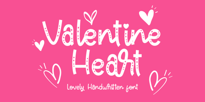 "Valentine Heart" is a stylish modern handwritten font with casual quirky style. It is perfect for branding, birthday/valentine invitation, promotion, product packaging, and other needs. You will get full set of lowercase and uppercase letters, numerals and punctuation, multilingual symbols, ligatures and extra swashes that giving realistic hand-lettered style. In order to use the beautiful swashes, you need a program that supports OpenType features such as Adobe Illustrator, Adobe Photoshop, Adobe Indesign and Corel Draw. Or please check the end of the preview to know how to get the swashes. Thanks and have a wonderful day, Haksen
 - Bryan Talbot by Comicraft,
$39.00 The lettering style of Lancashire's finest comic book artist, graphic novelist and NEMESIS deviant Bryan Talbot is finally at your beck and call thanks to the good graces of those awfully nice chaps at Comicraft. Created for Bryan's magnum opus, Alice in Sunderland, the Bryan Talbot font will take you on a journey into delirium, through the looking glass of British underground comix into the complex world of experimental narrative techniques and bestow upon you semi-legendary cult status and prestigious awards from no less than the New York Times.* *Results may differ if you are not actually Bryan Talbot.
 - Mixtra Sansserif by T4 Foundry,
$21.00Mixtra is a versatile and complete type family designed by Bo Berndal. The three Mixtra family branches are Roman, Sansserif and Slabserif, each with a full set of weights. The Roman also has a Small Caps font. Combining the three family members is a good starting point for creating a coherent typographical design. Mixtra works well in magazines and all sorts of print in need of a strong visual identity. "Mixtra is a multiface", says Bo Berndal. "With or without serifs, or with powerful slabserifs, you can pick the version that best suits the design and printing technique you have chosen." - Risoluto by Jawher Matmati,
$39.99 Risoluto is an italic font made to mimic the beautiful italic typefaces used in the 19th and 20th century by music publishers. It was based on an italic typeface found in a publication by Max Eschig from the 1950s. Hundreds of specimen for each glyph were studied and carefully drawn in a way to have a sharp rendering without losing any of the old charm. The oblique "g" is one of the characteristics of such old typefaces. Risoluto covers a large range of languages and symbols and offers stylistic alternates for numerals, contextual ligatures and music accidentals.
 - HVD Comic Serif Pro by HVD Fonts,
$- So many designers hate Comic Sans. They think people who don't know design are overusing this funny little friendly font, which is nearly every time out of place. Some years ago, type designer Hannes von Döhren created a free alternative to Comic Sans. The difference: It has serifs and a much cooler look. The big success of the HVD Comic Serif pushed Von Döhren to create a Pro Version with an eastern, central and Western European language support. “The HVD Comic Serif should spread all over and make the world a little bit better.” says Hannes.
 - Chunky Dressing by Bogstav,
$14.00 A chunky dressing may not sound very delicate, but I remember my grandmother used make a very chunky dressing for the mashed potatoes. I really loved it - actually I wish I had the recipe so that I could reproduce that particular consistency. But instead I made this font in memory of that lovely chunky dressing! :) Chunky Dressing has got a little Garamond in it, Baskerville as well - and even a touch of Times... Each lowercase letter has 5 different versions and they magically cycles as you type, leaving your text very lively with a natural twist of energetic and organic look
 - Slabber by Monotype,
$30.00 Slabber is a big ol’ chunky serif that’s specifically designed for display purposes – headlines, logotype, branding, titles, packaging, signage, etc. Its characteristics include heavy bracketed serifs with a strong 19th century wood type influence, while a very large x-height combined with a small cap height creates an awkward tension that delivers a strong, stylish, contemporary typeface. Slabber is enhanced by 22 alternates that will allow you to add flourishes to your typography. All Latin European languages are covered in this 6-weight typeface. Key features: 6 Weights 22 Alternates European Language Support (Latin) 500 glyphs per font.
 - TT Tangerine by Tropical Type,
$29.00 TT Tangerine made in 2017 has been a global hit. It's been used by the biggest performing artist in the world, luxury brands, designer packaging and more. Due to its popularity an italic style was added in Feb 2023. From the designer: I wanted to make a retro font with that 70's good vibes feel but i didn't want to just copy letters from that era. I decided to make new unique letters that had that groovy 70s feel. The bold curves pay homage to the big hair and bell-bottoms of the golden era.
 - Soothsayer by Comicraft,
$39.00 A soft spoken sorceress whispers sweet somethings in your shell-like ear. Her words excite and enthrall, tantalize and tease, they soothe and seduce, stimulate and sustain you, they awaken and arouse you, they entice and engorge you, they -- oh, I'm sorry, what was I supposed to be saying? Oh yeah, from the pages of DC Comics' Vertigo title, THE WITCHING HOUR, and Joe Kelly and Chris Bachalo's STEAMPUNK, Comicraft is happy to make available one of our most requested fonts... Hey, what happened to that cute girl with the white hair? And, Hey, Where's my wallet?!?
 - Barrington by Letteralle,
$18.00 Say hello to Barrington! A font with relaxed style and carries the impression of luxury. Barrington comes with 64 ligatures to give a natural impression, Uppercase Alternates to give different styles, and also ending swash. To access ending swash you only need to add the number "1" at the and of the word. for example if you want to write "Barrington" with the swash ending, you just have to write "Barrington1", and that's it. Very simple. Barrington is perfect for branding & logo projects, also suitable for Product Packaging, Titles on articles or book covers, Stationary, and much more. Thank You!
 - Absolutely Fabulous by Comicraft,
$19.00 These Charming letterforms, filled to the brim with the pop sensibility of late sixties je-ne-sais-quoi and the high camp detachment of the early seventies, scream out 'I am THIN and GORGEOUS!' Daring, Sexy, Witty and Subversive, Absolutely Fabulous swings from the pages of Marvel's UNION JACK to provide you with all the handheld wobble you'll need for thrilling titles, taut climaxes and logos that tingle with sartorial sophistication. If you're not thinking of miniskirts, black leather and concealed transmitters in bowler hats when you install this font, you're just not on the right wavelength, baby.
 - Canned Whale by Hanoded,
$15.00 Each year whalers from Japan kill more than 1000 whales. Japan says that the killing of whales is a 'cherished Japanese tradition', and that it is taking 'scientific data'. A portion of the whale meat is canned and marketed as 'traditional food'. How sad is that? A huge whale being reduced to a chunk in a can… Canned Whale is a hand drawn, outline style font with a cartoonesque twist to it. It can be used in ads and posters, it can be filled in with color, or kept as an outline. Canned Whale comes with extensive language support.
 - Carista by Haksen,
$19.00 Carista is the family of classic serif style with Uppercase and Lowercase feel nice balanced. Provide alternates font in uppercase and lowercase variant style make the design letter looks incredible. Honestly it works perfectly for headlines, logos, posters, packaging, T-shirts and much more. Recommended to use in Adobe Illustrator or Adobe Photoshop with opentype feature. How to access Alternates Character? Open glyphs panel : In Adobe Photoshop choose tool Window glyphs In Adobe Illustrator choose tool Type glyphs If you have questions, just send me a message and I'm glad to help. Have a great day, Haksen
 - Purveyor by Hustle Supply Co,
$18.00 Purveyor Purveyor is a bold modern sans serif with a lot of character. This will be your "Work Horse" for a lot of projects. It works nicely for projects that require a more refined yet vintage aesthetic. Purveyor is a simple yet refined All-Caps sans serif. I had a ton of fun making the specimens for this font, which is usually a good sign that I'll use it regularly. Purveyor includes 8 versions: Regular, Rounded, Rough, Textured (+ 4 Oblique Versions). Purveyor comes with Western European Characters. By the way, I included 2 R's - Just uppercase and lowercase to access
 - English Script by Linotype,
$40.99English Script Regular is a typeface made in the manner of English Copperplate, a kind of writing that was very popular in England during the 18th Century. Also referred to as English Round Hand, the style was promulgated by various writing masters, who published copybooks of their handwriting for students to use as guides. The style has remained popular to this day, and almost no sort of font is more readily identifiable with the ideas of formal," "old fashioned," "traditional," or "high society." English Script Regular is the perfect choice for use on wedding invitations and other announcements." - Lucida Calligraphy by Monotype,
$40.99 Lucida Calligraphy is a chancery cursive script typeface family designed by Kris Holmes and Charles Bigelow. It is a very legible and readable typeface, designed for use on screen and in print environments. Lucida Calligraphy was originally released in one weight. It is now available in five weights, from Thin to Black. Lucida Calligraphy is part of the Lucida superfamily of fonts from Bigelow & Holmes. Lucida is highly regarded for legibility and its extensive range of type styles. The Lucida Calligraphy typeface family has a Standard character set with 255 glyphs supporting the basic range of Latin languages.
 - Mixtra Roman by T4 Foundry,
$21.00Mixtra is a versatile and complete type family designed by Bo Berndal. The three Mixtra family branches are Roman, Sansserif and Slabserif, each with a full set of weights. The Roman also has a Small Caps font. Combining the three family members is a good starting point for creating a coherent typographical design. Mixtra works well in magazines and all sorts of print in need of a strong visual identity. "Mixtra is a multiface", says Bo Berndal. "With or without serifs, or with powerful slabserifs, you can pick the version that best suits the design and printing technique you have chosen." - Noctura Georgia by Ergibi Studio,
$20.00 Introducing Noctura Georgia is a handwriting brush effect and sans that comes with a style that seems real. This font style inspired by urban style and branded makes in many ways for your latest project. Noctura Georgia is perfect for logos & branding, photography, invitations, watermarks, advertisements, product designs, stationery, wedding designs, labels, product packaging, special events or anything that requires handwritten content. Noctura Georgia Also available for some lowercase characters that have swash, as well as multilingual. This can be accessed easily via opentype in Photoshop / Illustrator. if you have any questions, don’t hesitate to contact us Ergibi Studio
 - Redaktor by Spinefonts,
$10.00 My friends didn't use capitals when sending me text messages, e-mails and using all their digital toys. At the beginning, I was feeling ignored. But after time I thought, that... I can do something for them. And so, I've made Redaktor. Redaktor is a cute monospaced family of four fonts, which has only lowercase characters and large x-height. If you want to write an uppercase character, you can't do it. (OK, to be fair, there will be small underline, just to show you, what you have done...) You may find Redaktor useful for posters, titling, info-graphics or websites.
 - VVDS Clementia by Vintage Voyage Design Supply,
$15.00 • Clementia – a stylish condensed serif font with Art Deco mood and huge variety of stylistic alternates and ligatures. Thereby your typographic gets a unique and authentic style for a vide variety of projects. Cafe's menu, wedding invitation, branding, magazine's headers, t-shirt prints, posters - all these projects will breathe uniqueness. Your typography may be more discreet with basic stylistic set or it can be more playful, artistic and expressive with any of ligatures or stylistic alternates. • 970 Glyphs total; True Italics; Open Type Features as stylistic alternates, ligatures, old style / tabular / fraction / superior figures, manicules and small caps; Multilingual (Include alternates)
 - Laxory by PizzaDude.dk,
$20.00 My handwriting with a speedmarker turned into a font - well, not really, to be honest! Personally I did do all the writing of letters, but in order for the letters to fit perfectly together, I manipulated them - just a tad! But the result is a hasty set of letters! When I say I wrote all the letters, I mean it literally!!! All letters are unique, meaning all the accented characters are unique! On top of that, Laxory comes with ligatures for both double lowercase letters and numbers! You will need to use OpenType supporting applications to use the autoligatures.
 - Bobbi Bee by Baseline Fonts,
$39.00 Bobbi Bee won't stop popping her bubblegum, even though that's not very ladylike. Bobbi Bee is very proud of all of her 361 numbers, letters and alternates - all of which are chock full of summer sunshine and life. The font comes in a single weight (because she's perfect just the way she is.) She's cut out for a very special book title, logotype, or love letter. Keep Bobbi's hand firmly in yours in shopping malls, as she tends to get distracted and wander, and though it's hard, always remember to tell her how smart she is, as well as how beautiful.
 - Kapra Neue Pro by Typoforge Studio,
$39.00 Kapra Neue Pro is a younger sister of Kapra Neue – he was the #1 bestselling Grotesque Sans released in 2017 on MyFonts and grandson of Kapra. Now you really have a lot of options to choose! New family is full of everything – 96 weights contain a wide range of instances, from Condensed to Expanded, everything with rounded corners or with sharp ones. Now, font has also: small caps, cyrillic script, and old-style figures. Kapra Neue Pro is inspired by a “You And Me Monthly” magazine, published by National Magazines Publisher RSW "Prasa” in Poland, from May 1960 till December 1973.
 - La Patio by Nasir Udin,
$16.00 Say hello to La Patio Script, a monoline script font with fun vibes to spread happiness. A perfect choice to give a holiday vibe to any products, merchandise, restaurant or cafe. La Patio comes with several alternates and swashes for you to play with. Also the underline & border features help you to give a special character to your design. It's especially created for restaurant signs with outdoor/open air concept. That's why it's called La Patio. Beside that, it's also perfect for poster, business cards, magazines, blog, book, neon signage, badges, and many more happy things!
 - Ingrid Mono by Jörg Schmitt,
$35.00 The birth of the monospaced types dates back to the past. There was a need for the creation of typesets for typewriters. The difficulty was to align the different glyphs in the same width. This led to particular problems with letters like "M" and "l"; the former seemed to be squeezed into the same width of all letters and the second one appeared way too stretched. Despite - or perhaps because of - the impression of the typewriter it is still popular with Graphic Designers. The Ingrid Mono font family with a high range of glyphs and symbols has that special appearance.
 - Editors Note by Jen Wagner Co.,
$17.00 Say hello to the Editor's Note Family, an editorial serif display that includes 16 fonts, regular and italic, from Hairline weight to Bold, and still has all the clean lines, tight curves, and trendy minimalist vibes! I've been loving the clean, editorial type trend happening in design right now (let's be real, there's always a place for timeless editorial type). Editor's Note is a stunningly crisp upper and lowercase typeface that looks incredible in both large settings as a display text (think big headers, pretty quotes, calls to action, etc.). I've been loving combining the regular and italic, especially in big, bold quotes.
 - Borderline by Arendxstudio,
$18.00 Borderline is a casual modern script font that is luxurious in a casual and distinctive way. It is perfect for your branding design and will also be very beautiful in your wedding invitations and business cards and especially for your brand name logotype. Borderline Luxury Calligraphy has beautiful Uppercase and Lowercase, figures and ligature. There it is! I really hope you enjoy it. Comments and likes are always welcome and accepted. More importantly, don’t hesitate to send a message if you have a problem or question. Now just read this, go there and make it happen.
 - Chromosome by Three Islands Press,
$19.00 It hit me one day that the '60s-vintage labelmaker I had lying around might make an interesting display face. I began playing with it -- clicking out letters at various pressures, scanning the results, going over the scans in a vector-graphics program. Looked pretty good. To my chagrin, however, I soon afterward got a glimpse of someone else's label-tape font. Though modeled after a more modern device, its rocketing popularity prompted me to set Chromosome aside for a year or so. Finally finished it up in late-1995. Full release has light and heavy weights, regular and reversed styles.
 - VLNL Brokken by VetteLetters,
$35.00 'Brokken’ is the Dutch word for ‘chunks’. They are the hearty specialty of the house, prepared by the ship’s cook Donald DBXL Beekman. Nice'n'greasy and monospaced, you'll always find a decent way to cram the letters in. Brokken is straightforward, straight-lined with beveled corners, and all caps. For the ones who have to watch their weight, or who simple don’t like their fonts to be too fatty, DBXL designed a diet version called Brokken Light. With their big contrast, both weights combine very well and are great for making ultra-compact ribbon headlines or stacking vertically.
 - Mirage by Chris Costello,
$22.75 I designed Mirage using ink and a calligraphy brush to evoke the writing styles of ancient and exotic civilizations. After completing the project, it was filed and forgotten. About 15 years later, I was sifting through some of my old art files and found a "photostat" of the entire character set... a truly a magnificent archeological discovery. Then I thought, hey, maybe it's day has come. Why not share it with the world?... a completely digitized version for the new millennium. This unique font is a versatile, calligraphic option for travel, history, and greeting card themes. What other uses can you imagine?
 - Roses Queen by Nathatype,
$29.00 Roses Queen is an exquisite serif font made in uppercases that reigns with elegance and beauty. What sets Roses Queen apart is the meticulous addition of ornate details, transforming each letter into a regal work of art and bestowing a sense of opulence to the overall appearance. The characters in Roses Queen boast a commanding size, evoking a sense of authority and grace. The stability of the letter size ensures a harmonious visual flow, contributing to the font's overall sense of refinement. The real magic, however, lies in the intricately designed ornaments that adorn each letter, adding a touch of sophistication and enchantment. In addition, enjoy the features here. Features: Alternates Multilingual Supports PUA Encoded Numerals and Punctuations Roses Queen fits in headlines, logos, posters, flyers, branding materials, greeting cards, print media, editorial layouts, and many more designs. Find out more ways to use this font by taking a look at the font preview. Thanks for purchasing our fonts. Hopefully, you have a great time using our font. Feel free to contact us anytime for further information or when you have trouble with the font. Thanks a lot and happy designing.
 - FS Brabo Paneuropean by Fontsmith,
$90.00Worldly Even though it’s a new arrival, FS Brabo has seen the world. Designed by a Brazilian working in London and studying in Belgium under a Dutchman, it’s certainly well-travelled. And it was inspired by the extraordinary archive of early book typefaces at the world-renowned Plantin-Moretus Museum in Antwerp, while Fernando Mello was attending Frank Blokland’s Expert class Type Design course at the Plantin Institute of Typography. It was there that Fernando became engrossed in the collection of early metal type, matrices, punches and type samples by figures such as Garamond and Granjon. So much so that he took on the mighty task of developing ‘a beautiful, functional, serifed text font’ of his own. Heroic FS Brabo’s journey from sketch to font family took an epic three years, starting in Antwerp, continuing at Fontsmith in London, and reaching its conclusion back in Fernando’s home city of São Paulo. No wonder Fernando was reminded of another titanic face-off: that of Antwerp’s Roman hero of legend, Silvius Brabo, and the evil ogre, Antigoon. Brabo came to the town’s rescue after the tyrannical giant had been charging ships’ captains extortionate taxes and chopping off the hands of those who refused to pay up. Having finally downed Antigoon after a long and terrible duel, Brabo cut off the giant’s own hand and threw it into the river Scheldt, unwittingly giving the town its name: the Dutch for ‘hand-throw’ is hand werpen. What better way for Fernando to name his literary typeface than after the hero of Antwerp’s oldest tale? The garalde factor FS Brabo is not a revival, but a very much a contemporary, personal interpretation of a garalde – a class of typeface originating in the 16th century that includes Bembo, Garamond and Plantin, with characteristically rounded serifs and moderate contrast between strokes. Brabo’s ‘ct’ and ‘st’ ligatures, upper-case italic swashes and contextual ending ligatures – ‘as’, ‘is’, ‘us’ – all preserve the beauty and character of traditional typefaces, but its serifs are chunkier than a garalde. Their sharp cuts and squared edges give them a crispness at text sizes, helping to bring a beautifully bookish personality to hardworking modern applications. A workhorse with pedigree It may give the appearance of a simple, four-weight typeface, but FS Brabo has hidden depths beneath its simplicity and beauty. OpenType features such as cap italic swashes, contextual ending swashes – programmed only to appear at the end of words – and stylistic alternatives make this a complete and well-equipped typeface. Comprehensive testing was carried out at text and display sizes, too, to prevent counters from filling in. All of which makes FS Brabo a very modern take on a traditional workhorse serif typeface: colourful and versatile enough to adorn not just editorial projects but also signage, advertising and logotypes. - FS Brabo by Fontsmith,
$80.00 Worldly Even though it’s a new arrival, FS Brabo has seen the world. Designed by a Brazilian working in London and studying in Belgium under a Dutchman, it’s certainly well-travelled. And it was inspired by the extraordinary archive of early book typefaces at the world-renowned Plantin-Moretus Museum in Antwerp, while Fernando Mello was attending Frank Blokland’s Expert class Type Design course at the Plantin Institute of Typography. It was there that Fernando became engrossed in the collection of early metal type, matrices, punches and type samples by figures such as Garamond and Granjon. So much so that he took on the mighty task of developing ‘a beautiful, functional, serifed text font’ of his own. Heroic FS Brabo’s journey from sketch to font family took an epic three years, starting in Antwerp, continuing at Fontsmith in London, and reaching its conclusion back in Fernando’s home city of São Paulo. No wonder Fernando was reminded of another titanic face-off: that of Antwerp’s Roman hero of legend, Silvius Brabo, and the evil ogre, Antigoon. Brabo came to the town’s rescue after the tyrannical giant had been charging ships’ captains extortionate taxes and chopping off the hands of those who refused to pay up. Having finally downed Antigoon after a long and terrible duel, Brabo cut off the giant’s own hand and threw it into the river Scheldt, unwittingly giving the town its name: the Dutch for ‘hand-throw’ is hand werpen. What better way for Fernando to name his literary typeface than after the hero of Antwerp’s oldest tale? The garalde factor FS Brabo is not a revival, but a very much a contemporary, personal interpretation of a garalde – a class of typeface originating in the 16th century that includes Bembo, Garamond and Plantin, with characteristically rounded serifs and moderate contrast between strokes. Brabo’s ‘ct’ and ‘st’ ligatures, upper-case italic swashes and contextual ending ligatures – ‘as’, ‘is’, ‘us’ – all preserve the beauty and character of traditional typefaces, but its serifs are chunkier than a garalde. Their sharp cuts and squared edges give them a crispness at text sizes, helping to bring a beautifully bookish personality to hardworking modern applications. A workhorse with pedigree It may give the appearance of a simple, four-weight typeface, but FS Brabo has hidden depths beneath its simplicity and beauty. OpenType features such as cap italic swashes, contextual ending swashes – programmed only to appear at the end of words – and stylistic alternatives make this a complete and well-equipped typeface. Comprehensive testing was carried out at text and display sizes, too, to prevent counters from filling in. All of which makes FS Brabo a very modern take on a traditional workhorse serif typeface: colourful and versatile enough to adorn not just editorial projects but also signage, advertising and logotypes.
 - Zombie Brush by Ditatype,
$29.00 Zombie Brush is a haunting script font that brings the undead to life with its eerie charm and brush-style appearance. Designed intentionally in large letters, this typeface commands attention and exudes a sense of horror and intrigue. Each letter is meticulously crafted with brush-like strokes, adding a touch of handcrafted artistry to the font. The brush-style appearance of this font evokes a sense of chaos and unpredictability, as if the letters were created by an unsteady hand under the influence of dark forces. The large size of the letters enhances the font's imposing presence, making it impossible to ignore. For the best legibility you can use this font in the bigger text sizes. Enjoy the available features here. Features: Multilingual Supports PUA Encoded Numerals and Punctuations Zombie Brush fits in headlines, logos, movie posters, flyers, branding materials, print media, editorial layouts, headers, and zombie-themed projects. Find out more ways to use this font by taking a look at the font preview. Thanks for purchasing our fonts. Hopefully, you have a great time using our font. Feel free to contact us anytime for further information or when you have trouble with the font. Thanks a lot and happy designing.
 - Agatized Formal by ULGA Type,
$25.00 Agatized Formal is a chunky stencil typeface with slightly condensed letterforms and tight spacing. Designed primarily for display use, it’s ideal for posters, logos, advertising, book cover designs or small chunks of text such as pull-out quotes. It exudes authority without taking itself seriously, like a plump jolly uncle in charge of a brass band. Agatized Formal is a big, bold typeface with a charismatic presence that commands attention – in a friendly way, of course. But what really makes this typeface come alive is its arsenal of alternative characters and ligatures. There is a saying: Use sparingly. Whoa! Not here, no, no, no. Make your Glyphs palette earn its money. Flex your OpenType muscles: get stylized, contextualized, indulge in some ligaddiction. This typeface is a peacock that likes to put on a show, spread its plumage and strut around in all its blazing glory. Agatized, according to Wiktionary, means: A living thing converted into the form of agate; fossilized. I felt the name suited the solid, almost rock-like letterforms, but most of all I just wanted a typeface name that began with the letter A. Although Agatized Formal is a single-weight typeface it has a sibling, Agatized Informal, an older, more casual brother, rougher round the edges with craggy good looks and an altogether more jaunty style.
 - LiebeLotte Swell by LiebeFonts,
$29.90 Have you heard? It’s in the stars: next July we collide with Mars! But until then, there are plenty of good reasons to treat yourself to this swell typeface. LiebeLotte Swell is a great investment for letter lovers who design beautiful things for their friends and family and also for designers who love their clients: Your next birthday invitation? Check. That photo album you’re making for your mom? Check. The business cards you’re designing for your friend who runs a deli? Check. There are so many nice things that want to be designed, and LiebeLotte Swell wants to be your assistant in the old-fashioned way: polite and friendly. Just like her monolinear siblings in the LiebeLotte family, charming LiebeLotte Swell knows how to impress with her perfectly drawn curves and her perfectly connected loopy letterforms. Of course LiebeLotte Swell comes with a state-of-the-art character set. She also sports a variety of ligatures and alternative forms, available through OpenType features. (Please make sure your software supports ligatures for the letter connections and OpenType if you wish to use the advanced features.) Advanced designers, check out the complete LiebeLotte family with six weights of monolinear loopiness. You may also want to take a look at our best-sellers LiebeErika and LiebeKlara, they get along great with LiebeLotte Swell.
 - Serapion by Storm Type Foundry,
$39.00Another variation on the Renaissance-Baroque Roman face, it extends the selection of text type faces. In comparison with Jannon, the contrast within the letters has been enhanced. The dynamic elements of the Renaissance Roman face have been strengthened in a way which is illustrated best in the letters "a", "b" and "s". These letters contain, in condensed form, the principle of this type face - in round shapes the dark stroke invariably has a round finial at one end and a sharp one at the other. Another typical feature is the lower-case "g"; the upper part of this letter consists of two geometrically exact circles, the inner of which, a negative one, is immersed down on the right, upright to the direction of the lower loop and the upright knob. The vertical strokes slightly splay out upwards. Some details of the upper-case letters may seem to be too daring, but they are less apparent in the text sizes. It has to be admitted that typographers tend to draw letters in exaggerated sizes, as a result of which they stick to details. Serapion Italic are italics inspired partly by the Renaissance Cancelleresca. This is obvious from the drop-shaped finials of its lower-case descenders. The type face is suitable for illustrated books, art posters and short texts. It has a rather ugly name - after St. Serapion. - Techari by Letterjuice,
$35.00 Techarí comes from a commission in which the brief consisted of the creation of a typeface family to be used for the design of the third disc of the band called Ojos de Brujo based in Barcelona. This disc was called Techarí, which means “free” in Caló, the language of the Spanish gypsies. The starting point of the design was the music of this band, the meaning of the disc 's name, and three words given by the band as key concepts: ethnic, baroque and graffiti. Techarí is a mixture of lots of influences, which give it its unique personality. From its technical viewpoint designing Techarí was a challenge, on the one hand it had to have lots of personality, and on the other it had to work in text at 9 or 10 pt size. Its goal is precisely that, while keeping a strong personality it works in text size. The typeface also contains a Stencil version for use in display sizes which keeps Techarí's innovative spirit. The way it has been “cut" is unconventional, it has been carefully done to keep the freshness of the typeface by taking advantage of the letterforms' flow. Techarí extra complements the typeface by taking a classical typographic form, the ornament, and making it a contemporary graphic tool, vindicating this wonderful typographic element.
 - FHA Broken Gothic by Fontry West,
$15.00 More than a century ago, Frank H. Atkinson presented this hand lettered style as Broken Poster. It was one of a hundred styles he demonstrated in his manual on sign painting. Even before his book was published (and certainly after), Broken Poster was a favorite with sign painters and letterers. It has graced show cards and movie posters, signs and windows displays, and advertisements of all varieties. We presented the our first digital revival of this classic in 2000. It is long overdue for an upgrade. Broken Gothic expands the basic Broken Poster to four weights, two specialty formats and some cool layed effects. The language base includes Greek, Cyrillic, Latin A, and some of Latin B and Latin Extended. There are also some nice alternates and ligatures. All weights are quite suited to posters, headlines, display copy, web headers, etc. At first glance, Broken Gothic may seem to have limited uses. Give it a chance and it will surprise you. Broken shouts out that there is a sale, a giant monster or the end of the world. Broken Gothic is comfortable in a wide range of themes and applications from zombie movie titles to salsa jar labels. While I can't recommend it for text, Broken is great for headers, banners, signs, titles, product presentation and other display applications. When you need a rough customer, Broken Gothic fills the bill.