10,000 search results (0.018 seconds)
  1. DS JugendSC Demo - Unknown license
  2. Monumental Gothic Demo - Unknown license
  3. Geometris Semi Condensed by NicolassFonts, $25.00
    Geometris Semi-Condensed is a modern versatile sans-serif typeface. What differentiates Geometris Semi-Condensed from the other fonts is its exceptionally distinctive design. Brilliantly suited for graphic design and display use and perfect for logotypes, t-shirts, packaging, brand identity, books, magazines, newspapers, posters, billboards, and advertising.
  4. Getho Semi Sans by deFharo, $12.00
    Getho is a Semi Sans family of geometric construction with 6 weights plus the italic versions all include small letters, the symbol of Bitcoin and other monetary symbols. It is an exclusive typography with neo-grotesque modulations and maximum readability in any size. The typeface has alternative letters and numbers, small caps and advanced OpenType functions. The complete Pack includes versions of the Variable Fonts type. The drawn of the vectors is meticulous to obtain smooth curves of elegant aspect to which also contributes the subtle rounding of the corners, the thicker versions have of traps of ink in the knots of the unions to be able to use them in small sizes. The Metric and the Kerning of all the versions I have reviewed individually to obtain a fluent reading in any type of text and size.
  5. Rotis Semi Sans by Monotype, $40.99
    Rotis¿ is a comprehensive family group with Sans Serif, Semi Sans, Serif, and Semi Serif styles, for a total of 17 weights including italics. The four families have similar weights, heights and proportions; though the Sans is primarily monotone, the Semi Sans has swelling strokes, the Semi Serif has just a few serifs, and the Serif has serifs and strokes with mostly vertical axes. Designed by Otl Aicher for Agfa in 1989, Rotis has become something of a European zeitgeist. This highly rationalized yet intriguing type is seen everywhere, from book text to billboards. The blending of sans with serif was almost revolutionary when Aicher first started working on the idea. Traditionalists felt that discarding serifs from some forms and giving unusual curves and edges to others might be something new, but not something better. But Rotis was based on those principles, and has proven itself not only highly legible, but also remarkably successful on a wide scale. Rotis is easily identifiable in all its styles by the cap C and lowercase c and e: note the hooked tops, serifless bottoms, and underslung body curves. Aicher is a long-time teacher of design and has many years of practical experience as a graphic designer. He named Rotis after the small village in southern German where he lives. Rotis¿ is suitable for just about any use: book text, documentation, business reports, business correspondence, magazines, newspapers, posters, advertisements, multimedia, and corporate design.Today Rotis ia also available with pan european caracter set.
  6. Semi Calligraphic JNL by Jeff Levine, $29.00
    A 1950 reissue of the 1934 tune “With My Eyes Wide Open I’m Dreaming” had the title of the sheet music hand lettered in a semi-calligraphic sans serif design. This became the model for the appropriately named Semi Calligraphic JNL, which is available in both regular and oblique versions.
  7. Burdigala Semi Serif by Asgeir Pedersen, $19.99
    Burdigala is a clean-cut, modern yet classic typeface inspired by Didones and Aicher’s Rotis family. The Semi Serif is ideal for larger amounts of (printed) texts in brochures, magazines and books. It is slighty narrow in order to conserve space, but spacious enough to faciliate reading and overall clarity. The expanded versions of the semi serif, being wider and more open, works equally well in media intended both for print and on-screen reading, e.g. in Pdf-documents etc. Burdigala is the ancient Roman name of the city of Bordeaux France.
  8. Rotis Semi Serif by Monotype, $40.99
    Rotis¿ is a comprehensive family group with Sans Serif, Semi Sans, Serif, and Semi Serif styles, for a total of 17 weights including italics. The four families have similar weights, heights and proportions; though the Sans is primarily monotone, the Semi Sans has swelling strokes, the Semi Serif has just a few serifs, and the Serif has serifs and strokes with mostly vertical axes. Designed by Otl Aicher for Agfa in 1989, Rotis has become something of a European zeitgeist. This highly rationalized yet intriguing type is seen everywhere, from book text to billboards. The blending of sans with serif was almost revolutionary when Aicher first started working on the idea. Traditionalists felt that discarding serifs from some forms and giving unusual curves and edges to others might be something new, but not something better. But Rotis was based on those principles, and has proven itself not only highly legible, but also remarkably successful on a wide scale. Rotis is easily identifiable in all its styles by the cap C and lowercase c and e: note the hooked tops, serifless bottoms, and underslung body curves. Aicher is a long-time teacher of design and has many years of practical experience as a graphic designer. He named Rotis after the small village in southern German where he lives. Rotis¿ is suitable for just about any use: book text, documentation, business reports, business correspondence, magazines, newspapers, posters, advertisements, multimedia, and corporate design. Today Rotis ia also available with paneuropean caracter set.
  9. KG Defying Gravity by Kimberly Geswein, $5.00
    Use the [ and ] key to create a unique flag ending on your words. Use alternating lowercase and uppercase with the Bounce version to create a bouncy look. To create a solid space instead of an empty space, use the bar key | which shares a key with the \ backslash on my keyboard. Your keyboard may vary.
  10. Bright Gesture DEMO - Personal use only
  11. ITC Avant Garde Gothic¿ was designed by Herb Lubalin and Tom Carnase in 1970. They based it on Lubalin¿s logo for Avant Garde Magazine - an exciting construction of overlapping and tightly-set geometric capitals. ITC Avant Garde is a geometric sans serif; meaning the basic shapes are constructed from circles and straight lines, much like the work from the 1920s German Bauhaus movement. The early versions of ITC Avant Garde became well-known for their many unique alternates and ligatures that still conjure up the typographic aura of the 1970s. These fonts contain the basic alphabets (without the old unusual ligatures). Still strong and modern looking, ITC Avant Garde has become a solid staple in the repertoire of today's graphic designer. The large, open counters and tall x-heights seem friendly, and help to make this family work well for short texts and headlines. The condensed weights were drawn by Ed Benguiat in 1974, and the obliques were designed by Andr¿ G¿rtler, Erich Gschwind and Christian Mengelt in 1977. ITC Avant Garde¿ Mono is a monospaced version done by Ned Bunnel in 1983.
  12. Franklin Gothic Hand Demi Shadow by Wiescher Design, $39.50
    Franklin Gothic Hand Demi Shadow is another one in my series of hand-drawn fonts from way back in time – before computers changed the way we worked in advertising. This one was especially used for what we called "pork-belly-ads": ads for food-stores! I think it is very useful for all kinds of advertising that demands a lot of bang! Your powerful typedesigner Gert Wiescher
  13. ITC Out of the Fridge by ITC, $29.99
    ITC Out of the Fridge is the work of German designer Jochen Schuss. Its forms look as though they were scratched on rough paper with a pen. ITC Out of the Fridge is, in the designer's own words, fresh and cool", and works well where something modern yet "proper" is desired."
  14. VTC-KomikSkans-Two - Personal use only
  15. It's About Time - Unknown license
  16. VTC Bad DataTrip - Unknown license
  17. VTC Krinkle-Kut - Unknown license
  18. VTC Anglika Bent - Unknown license
  19. VTC Krinkle-Kut - Unknown license
  20. VTC Krinkle-Kut - Unknown license
  21. VTC Krinkle-Kut - Unknown license
  22. VTC Letterer Pro - Unknown license
  23. VTC Lo-Down - Unknown license
  24. VTC Bad DataTrip - Unknown license
  25. VTC Bad DataTrip - Unknown license
  26. VTC Bad DataTrip - Unknown license
  27. VTC Krinkle-Kut - Unknown license
  28. VTC SubwaySlam Caps - Unknown license
  29. LTC Ornaments One by Lanston Type Co., $24.95
  30. LTC Halloween Ornaments by Lanston Type Co., $24.95
    Halloween is a time when perfectly reasonable people choose to reenact some lost pagan rituals. No one seems to know why exactly, but Halloween has been celebrated in its present form for a little over one hundred years. This set of ornaments dates back to the early 20th century and depicts a “classic” Halloween collection of black cats, pumpkins, witches, and other indispensable Halloween ornaments.
  31. LTC Goudy Text by Lanston Type Co., $39.95
    Frederic Goudy designed this blackletter face based on Gutenberg's 42-line Bible. The Lombardic Caps were designed as an accompaniment to Goudy Text and are offered paired with the lower case as an alternate option. The Goudy Text Shaded is an inline variant that was added later by Lanston Monotype. Both varieties of capitals, as well as an expanded Central European character set, are offered in the Opentype set versions.
  32. LTC Bodoni 175 by Lanston Type Co., $39.95
    Giambattista Bodoni created this modern typeface in 1790 which served as the structural model for Sol Hess’s faithful rendition. Hess made necessary adjustments for mechanical typesetting on Lanston’s Monotype composition system. Remastered in 2006 by Paul Hunt.
  33. LTC Jefferson Gothic by Lanston Type Co., $24.95
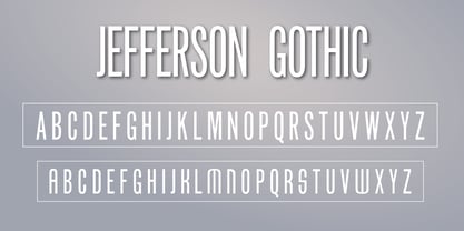
  34. LTC Vine Leaves by Lanston Type Co., $24.95
  35. LTC Ornaments Animalia by Lanston Type Co., $24.95
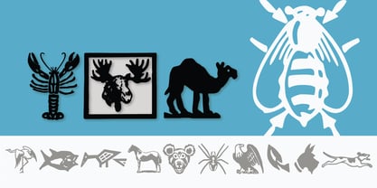
  36. LTC Nicolas Cochin by Lanston Type Co., $24.95
    Nicolas Cochin (not to be confused with another font named simply "Cochin") was originally designed by Georges Peignot in the early 20th Century and was based on engraved letters of the 17th Century artist Charles Nicholas Cochin. Many foundries including Lanston released versions in the 1920s. Several digital versions can now be found, but none have kept the irregular details of the metal type which include strokes that cross over each other as if hand drawn (see letters K & y). The new Lanston digitization is the only digital version to retain the idiosyncratic treatment which makes the metal type so alluring. The Opentype version included an expanded Central European character set as well as ligatures, alternates, fractions, superior/inferior numerals (the Italic also has swash characters).
  37. LTC Ornaments Two by Lanston Type Co., $29.95
    LTC Ornaments Two is the first Lanston Ornament font which uses OpenType features to assist in decorative border creation. The ornaments themselves features designs of Fournier and other classic fleurons and ornaments whose origins date back to the earliest printers.
  38. LTC Jacobean Initials by Lanston Type Co., $24.95
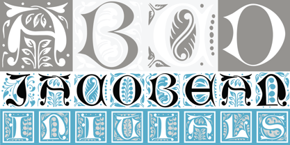
  39. LTC Globe Gothic by Lanston Type Co., $24.95
    This series of faces was designed initially by Morris Fuller Benton, circa 1900. The design is a refinement of Taylor Gothic from 1897. It features a sans serif thick and thin design with angular stems. Pre-dating art deco, this design feels quaint, yet it still has a touch of modernism. Frederic Goudy designed a bold version of Globe Gothic in 1905 for ATF. The Bold and Bold Italic digital versions have been added to the LTC library in early 2007.
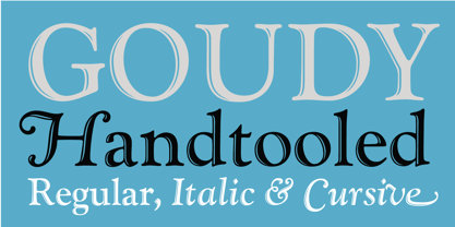
  40. LTC Goudy Handtooled by Lanston Type Co., $24.95
Looking for more fonts? Check out our New, Sans, Script, Handwriting fonts or Categories
abstract fontscontact usprivacy policyweb font generator
Processing