10,000 search results
(0.015 seconds)
- ITC Kabel by ITC,
$40.99 The first cuts of Kabel appeared in 1927, released by the German foundry Gebr. Klingspor. Like many of the typefaces that Rudolf Koch designed for printing use, Kabel is a carefully constructed and drawn. The basic forms were influenced by the Ancient Roman stone-carved letters, which consisted of just a few pure and clear geometric forms, such as circles, squares, and triangles. Koch also infused Kabel with some elements of Art Deco, making it appear quite different from other geometric modernist typefaces from the 1920s, like Futura. Linotype has two versions of Kabel in its library. Kabel has a shorter x-height, with longer ascenders and descenders, making it a bit truer to Koch's original design than the second version, ITC Kabel, which was designed by Victor Caruso. This version, also known in the United States as Cable, has a larger x-height, shorter ascenders and descenders, more weights ,and a diamond shaped i-dot. Typefaces in the same oeuvre include Avenir Next, ITC Avant Garde Gothic, Metrolite, Metromedium, Metroblack, and Erbar, just to name just a few."
 - Kabel by Linotype,
$40.99 Rudolf Koch’s personal form of the geometric sanserif started at the Bauhaus in 1926; this typeface was designed for Klingspor in the following year.
 - ITC Deli by ITC,
$29.99Jim Spiece has a taste and a talent for reviving type styles from earlier in this century. ITC Deli Supreme is a “futuristic retro” face that would be at home as a logo on a car or a roadside diner from the 1940s or '50s; the lowercase nearly joins, in script style, thanks to the long extenders stretching out from the bottom-right corner of most letters, while the caps have beginning strokes leading in from the top left. ITC Deli Supreme, like ITC Deli Deluxe, features slightly rounded corners on all the letters, for a soft, streamlined look despite the squareness of the letterforms. - MKAbel - 100% free

- Mabelle by Letterara,
$12.00 Mabelle is a romantic and festive handwritten font with a beautiful love. It is ideal for holiday-themed greeting cards, Christmas, weddings, and any crafting project that requires a romantic touch. This font is PUA encoded which means you can access all of the glyphs and swashes with ease!
 - Button T. - Personal use only

- T-Air - Unknown license

- Zupagargonizer T - Unknown license

- ocr-t by FaceType,
$7.00 Being a geometric sanserif ocr-t comes in eleven weights from ultrawhite to infrablack (brightwhite, white, silver, lightgrey, grey, darkgrey, anthracite, black, jetblack). With more than 600 glyphs it covers all your typographic needs and manages to stay at the same place no matter which width you’re using. Its readability and legibility is more than fine although it needs no kerning. The infrablack is really black, in order to achieve this, the form of letters change from darkgrey to anthracite from upright to some kind of upright italic. This also gives opportunity to mix two weights with same colour but different architecture. Find also stylistic sets, alternate letters, lots of bullets, different arrows, hands and well: kind of hearts.
 - Neue Kabel by Linotype,
$57.99 Marc Schütz, a type design teacher at the University for Art and Design Offenbach, took on the challenge of updating and re-imaging the original Kabel® typeface design. His goal was to create forms that perform well in modern imaging environments while keeping the original Kabel’s character and charm. View the Neue Kabel Video Neue Kabel maintains the spirit of Koch’s design, and adds to this the consistent traits and family structure of a 21st century design. Text copy set in Neue Kabel echoes the elegance and playfulness of Koch’s design, while delivering the versatility to shine in a wide variety of hardcopy and interactive environments.
 - Demis by Tour De Force,
$25.00 Supreme decorative typeface, with wedged display serifs.
 - T-piyo Font - Unknown license

- A T & Love - Personal use only

- Kabel DT Condensed by DTP Types,
$49.00Based on custom design work by DTP Types Limited in 1992. - K&T Sasha by K and T,
$70.00 This clean looking (all caps) font has characters made of gaps, which form the stencil divisions, spaced evenly along the strokes. The letterforms have a well-proportioned constructional appearance. The characters look like they have been built from interlocking bricks, the stencil gaps give them both rhythm and texture. The sans serif typeface also has a sense of movement because of the way the stencil gaps follow the horizontal, vertical or curved direction of the stroke.
 - K&T Heidi by K and T,
$70.00 This is a well-built, functional (all caps) typeface, which is very modern in character. The use of diagonal corners in this angular typeface is inspired by the pennant numbers on British Royal Navy warships, which adds an military quality to this typeface. The gaps, which form the Stencil divisions, follow pre-established horizontal and vertical lines, they help to achieve both geometric and proportional harmony. The direction of the gaps is always at a right angle to the stroke.
 - K&T Martine by K and T,
$70.00 This is an angular typeface inspired by axonometric construction diagrams (for flat-pack furniture), particularly the way their lines impart a sense of 3-D space. The horizontal, vertical, and diagonal constraints of stroke direction produce interesting results in characters such as the 'R', 'S', and 'V' and contribute the mechanical appearance of this typeface. There is a high degree of repetition amongst different characters (upper and lower case) for instance the ’M’ and ‘W’ are similar and so are the ’m’ and ‘w’.
 - URW Imperial T by URW Type Foundry,
$35.00
- Futura No7 T by URW Type Foundry,
$89.99 - Punch Label - Unknown license

- Impact Label - 100% free

- Label Gun by TypeArt Foundry,
$45.00
- Grand Label by Gleb Guralnyk,
$14.00 Hi, presenting a bold vintage font - Grand Label. It's an old-school typeface with decorative elements, included as a separate font file for more convenient manipulating and recoloring. Grand Label font supports most of Latin European languages (check out the screenshots with available characters).
 - Cigar Label by Solotype,
$19.95This font was inspired by the embossed lettering on cigar boxes. The letters, or entire words, are often surrounded by raised dots, and that was our idea here. We drew this about 1997, and have been refining it ever since. All letters are on the lowercase keyboard; the end pieces and spaces are on the caps. - Fleuron Labels by Wiescher Design,
$39.50Fleurons are embellishments and here is my seventh set. This time I give you all kind of different labels. Your labeled designer Gert Wiescher - Oliver Label by Jen Wagner Co.,
$12.00 Oliver Label solves a problem many creatives face – the endless search for a realistic pencil-textured font to add handwritten notes to images, quotes, blog posts, and more without having to do it themselves. With Oliver Label, you can easily add handwritten notes to your images! BIGGEST BENEFITS: Vector pencil texture 26 hand drawn elements so your quotes look beautiful and custom No more wasted time trying to add your own notes and handwritten feel to your work (or worrying about your handwriting!) INFO: Oliver Label Regular: A textured vector font that works with any Desktop application (Word, Photoshop, Canva, etc.). Includes ligatures ll, ss, and tt. Oliver Label Alternates: 'Alt' version of Oliver Label, where you'll get a whole new set of letters and numbers. This way, you can swap out regular letters for the alternates when you have two of the same letters close to one another (i.e. oo or bb) to look as realistic as possible. Includes ligatures ll, ss, and tt. Oliver Label Drawn: You'll also get 26 different hand-drawn shapes to add to quotes and graphics. Non-English support for the international designer
 - JH Mabel by JH Fonts,
$40.00 JH Mabel is a modern cursive typeface; it has three weights: light, medium and bold. It is a smart type and consists of extra characters to simulate real handwriting. Typical use: branding, greeting cards, long runing text.
 - Mix Label by Mix Fonts,
$13.00 Get the handwritten, labeled look you love with MIX LABEL – the perfect font for creating clean, thick designs. Inspired by the look of school supplies labeled with a Sharpie marker, this font is ideal for replicating the handwritten style of labels and addresses on mailers. Whether you’re looking to add a personal touch to your branding or simply want a unique font, MIX LABEL has got you covered. Don’t settle for boring, generic fonts – label your designs with MIX LABEL and stand out from the crowd. Includes the following characters: ABCDEFGHIJKLMNOPQRSTUVWXYZ abcdefghijklmnopqrstuvwxyz 0123456789 !@$#%^&*()`~♥❤✿•· ÷×+−±≈=≠≥≤[]‹›:;'",.|/?{}“”‘’-–—_ …©®™«»°¹²³ªº¡¿x₱¢€£¥§№† ÁÀÂÄÃÅĂĀĄÆĆĈČÇÐĐÉÈÊËĖĒĘĜĤIÍÌÎÏĪĮĴŁŃÑŇ ÓÒÔÖÕØŌŐŒŔŘŚŜŠȘŤȚÚÙÛÜŮŰŪŲẂẀŴÝŶŸŹẐŽŻÞ áàâäãåăāąæćĉčçðđéèêëėēęĝĥıíìîïīįĵłńñň óòôöõøōőœŕřśŝšșťțúùûüůűūųẃẁŵýŷÿźẑžżþß Discretionary Ligatures: bb dd ee gg kk ll mm nn oo pp tt
 - InkArt Labels by John Moore Type Foundry,
$24.95 Inkart is a font dingbats, shapes for new labels or frames that the user can supplement according to the requirements and purposes. It consists of a set uppercase containing the forms, and a set is lower case which has areas of the same shapes to be colored by layers. Contains retro and modern styles.
 - Authentic Labels by Decade Typefoundry,
$28.00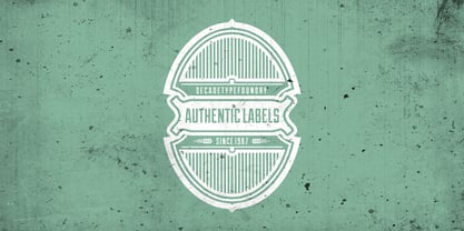
- Core Label by S-Core,
$59.00 Core Label is a condensed sans serif font. You will be able to manage a lot of information into limited spaces with Core Label. Its highly legible even in condensed forms and also clear at small sizes. Supported codepages are MS Windows 1252 Latin1 and MS Windows 949 Korean consisting of 11,172 Korean letters and Symbols, except Chinese. This Type-face is good for narrow spaces such as Labels, Books and so on.
 - Abel Pro by MADType,
$39.00 Abel is a modern interpretation of the condensed flat-sided sans serif. Originally used for newspaper headlines and posters, this style can also be used for text on the web. Its angled terminals and spiked stems give it enough style to be unique at display sizes, while its mono-weight still works well at smaller text sizes.
 - F. O. T. R. by JAF 34,
$9.90 F. O. T. R. is experimental sans serif display font. Space travelling is near so I decided to bring you a brand new typeface based on insight into the future. Clean shapes, a lot of atypical alternates and the futuristic appearance. F. O. T. R. typeface is conceptually connected with a chronophotography project FUTURE OF THE RHYTHM.
 - ITC Eras by ITC,
$40.99 ITC Eras font is the work of French designers Albert Boton and Albert Hollenstein. It is a typical sans serif typeface distinguished by its unusual slight forward slant and subtle variations in stroke weight. ITC Eras is an open and airy typeface inspired by both Greek stone-cut lapidary letters as well as Roman capitals.
 - ITC Cerigo by ITC,
$29.99ITC Cerigo is the result of a challenge which designer Jean-Renaud Cuaz set for himself: to create a typeface with the grace of Renaissance calligraphy but different from the numerous Chancery scripts. He calls Cerigo a 'vertical italic' and based it on 15th century calligraphic forms. The weights are carefully designed to complement each other and are made more flexible by a number of italic swash capitals. The flexible ITC Cerigo is suitable for both text and display. - ITC Photoplay by ITC,
$29.99ITC Photoplay is another gem from Nick Curtis. Unearthed from the 1927 edition of Samuel Welo's Studio Handbook for Artists and Advertisers, the design's original suggested use was for title and caption cards for silent movies. A monoweight design that bridges the gap between turn-of-the-century decorative type and Art Deco, ITC Photoplay is both casual and stylish. And, yes, the cap S" is supposed to look that that. To expand this already handy typeface's versatility, a Black weight has been added to the original design. Curtis has also created an array of alternate characters, a couple of conjunctions, and a handful of "bishop's fingers" to help make your point. ITC Photoplay is eminently suitable for all those occasions when you need to say, "Unhand that fair damsel, you dastardly cad!", and really mean it." - ITC Gargoonies by ITC,
$29.99 - ITC Johnston by ITC,
$29.00ITC Johnston is the result of the combined talents of Dave Farey and Richard Dawson, based on the work of Edward Johnston. In developing ITC Johnston, says London type designer Dave Farey, he did “lots of research on not only the face but the man.” Edward Johnston was something of an eccentric, “famous for sitting in a deck chair and carrying toast in his pockets.” (The deck chair was his preferred furniture in his own living room; the toast was so that he’d always have sustenance near at hand.) Johnston was also almost single-handedly responsible, early in this century, for the revival in Britain of the Renaissance calligraphic tradition of the chancery italic. His book Writing & Illuminating, & Lettering (with its peculiar extraneous comma in the title) is a classic on its subject, and his influence on his contemporaries was tremendous. He is perhaps best remembered, however, for the alphabet that he designed in 1916 for the London Underground Railway (now London Transport), which was based on his original “block letter” model. Johnston’s letters were constructed very carefully, based on his study of historical writing techniques at the British Museum. His capital letters took their form from the best classical Roman inscriptions. “He had serious rules for his sans serif style,” says Farey, “particularly the height-to-weight ratio of 1:7 for the construction of line weight, and therefore horizontals and verticals were to be the same thickness. Johnston’s O’s and C’s and G’s and even his S’s were constructions of perfect circles. This was a bit of a problem as far as text sizes were concerned, or in reality sizes smaller than half an inch. It also precluded any other weight but medium ‘ any weight lighter or heavier than his 1:7 relationship.” Johnston was famously slow at any project he undertook, says Farey. “He did eventually, under protest, create a bolder weight, in capitals only ‘ which took twenty years to complete.” Farey and his colleague Richard Dawson have based ITC Johnston on Edward Johnston’s original block letters, expanding them into a three-weight type family. Johnston himself never called his Underground lettering a typeface, according to Farey. It was an alphabet meant for signage and other display purposes, designed to be legible at a glance rather than readable in passages of text. Farey and Dawson’s adaptation retains the sparkling starkness of Johnston’s letters while combining comfortably into text. Johnston’s block letter bears an obvious resemblance to Gill Sans, the highly successful type family developed by Monotype in the 1920s. The young Eric Gill had studied under Johnston at the London College of Printing, worked on the Underground project with him, and followed many of the same principles in developing his own sans serif typeface. The Johnston letters gave a characteristic look to London’s transport system after the First World War, but it was Gill Sans that became the emblematic letter form of British graphic design for decades. (Johnston’s sans serif continued in use in the Underground until the early ‘80s, when a revised and modernized version, with a tighter fit and a larger x-height, was designed by the London design firm Banks and Miles.) Farey and Dawson, working from their studio in London’s Clerkenwell, wanted to create a type family that was neither a museum piece nor a bastardization, and that would “provide an alternative of the same school” to the omnipresent Gill Sans. “These alphabets,” says Farey, referring to the Johnston letters, “have never been developed as contemporary styles.” He and Dawson not only devised three weights of ITC Johnston but gave it a full set of small capitals in each weight ‘ something that neither the original Johnston face nor the Gill faces have ‘ as well as old-style figures and several alternate characters. - ITC Atmosphere by ITC,
$29.00The Algerian designer Taouffik Semmad created the fonts in 1997. Taouffik Semmad grew up speaking Algerian-Arabic dialect and French, studied Russian, and is now living in Montreal. This could perhaps explain his current passion, to "find a universal writing", which he admits is a Utopian idea. Created with brush and Chinese ink, the characters of ITC Atmosphere came from Semmad's hand but only after they were fully formed in his mind's eye. - ITC Jamille by ITC,
$29.99Mark Jamra based the design for Jamille on the forms of the 18th century Modern Face fonts of Didot and Bodoni, but was also influenced by the work of artists like Adrian Frutiger, who reworked such fonts to adapt to the demands of modern technology. A very legible font, Jamille will give text a classic, elegant feel.


Page 1 of 250Next page