10,000 search results
(0.076 seconds)
- Halloween Carve by Mvmet,
$10.00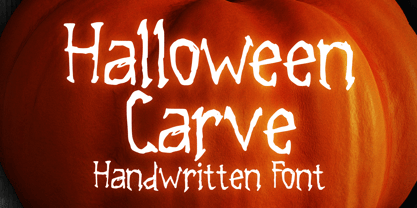 Halloween Carve is a must have cool skinny display font. You can use it for your horror and Halloween themed needs! You can use it for anything ranging from t-shirts and clothing, for your scary book designs, Halloween party needs, greeting cards, stickers, posters, banners, or anything that needs a horror touch. Try it to create fabulous designs and feel the horror and Halloween vibes with it!
 - Abrect by Hackberry Font Foundry,
$24.95 My first font for the summer of 2009, Abrect is a new sans serif font where I try to maximize the x-height and keep the design fresh and personal. It fits in with my continuing objective of designing book fonts that I can really use. Abrect is a tangent for me just taking an idea out to its end. In particular, it is a radical modification of my first font in 1993, Nuevo Litho. The hand-drawn shapes vary a lot, many pushing the boundaries of the normal character. With many of the new releases I see, the digital perfection is getting pretty extreme. It’s looking like a Rococo stage of development for many with decoration taking over from function. I'm consciously trying to head a different direction. This is not a normal font for me in that it has caps, lowercase, with the appropriate figures for each case, no small caps. This is the first time I have skipped small caps in over a decade. This font has all the OpenType features in the display set for 2009 except for the small caps. There are several ligatures for your fun and enjoyment: bb gg ff fi fl ffi ffl ffy fj ft tt ty Wh Th and more and many of them are experimental in form. Enjoy!
 - Wonder Pleasure by Invasi Studio,
$19.00 Introducing Wonder Pleasure, a new display font collection. The Wonder Pleasure font comes in a hand-drawn vintage style with rounded corners. Adding a vintage touch to your project is easy using Wonder Pleasure Font. Ensuring carefully crafted styles result from the use of this font. You can use the alternates from this font to add more fun to your projects. Its imperfections keep it casual but allow it to still be legible. There is an incredibly wide range of uses for it, so give it a try and see how it inspires your creativity! It's ideal for headlines, flyers, posters, greeting cards, product packaging, book covers, printed quotes, logotype, and album covers, among other applications. Features: - Total 210 Glyph - Uppercase & Lowercase - Numerals & Punctuation - Multilanguage Supports 60+ Latin based languages - Alternates
 - Doggie Doodie - Unknown license

- Novantico by Typofactura,
$14.00 Novantico is an all capitals typeface, influenced mainly by roman inscriptional capitals and renaissance typefaces. Classicly designed forms give text a noble and elegant feel. It is intended to be used for relatively short and important texts, titles, headings, quotes, etc.
 - Ritts Cursive by Eurotypo,
$59.00 The most notable characteristic of this typeface is that it has a compact and regular shape that is slightly condensed but fluidly connected. Its glyphs emulate the look of handwritten, inked characters. Their exuberant graphic strokes and sharp edges maintain the influences of printed types produced by mechanical processes. Unlike most of the italic type of today, the capital letters are as high as the ascending lower-case letters. The brush script style (Originally designed in 1942 by Robert E. Smith for the ATF) inspired many contemporary and beautiful typefaces, such as Wisdom Script, Mission Script, Marketing Script, Motion Picture, Thirsty Script, Lauren Script, Deftone Stylus and many others. This font has more than 700 glyphs, Central European languages support, including Open Type features, swashes, and contextual stylistic alternates. It also includes old-style figures, discretional and standard ligatures, is case-sensitive and has a set of tails and ornaments.
 - Wermut by Brownfox,
$45.00 An intoxicating blend of rare flavours is what makes the new transitional typeface Wermut (German for vermouth) resemble its alcoholic namesake. Bitter and thorny at first glance, it proceeds to surprise the palate with a complicated taste that leaves a pleasant aftertaste. Wermut may not be taken in hastily, but needs to be thoughtfully enjoyed at a measured pace. Its dark colour, compressed, spring-like, shapes, well-built proportions, and agreeable letterforms all look safe enough until one is jolted to encounter the clipped serifs that lend the page an unexpectedly edgy appearance. The font comes in two weights with an extended character set in Latin and Cyrillic scripts supporting 66 languages. A product of slow, careful distillation, this infusion of multiple ingredients comes together to form a unique mature taste which will be appreciated by true connoisseurs of typographic cocktails. Desined by Gayaneh Bagdasaryan and Vyacheslav Kirilenko.
 - Tropical Drink by Sronstudio,
$23.00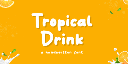 Tropical Drink – Handwritten Font is a fun display Font font, this font Is perfect for product packaging, product designs, label, photography, watermark, special events, or anything. Features: Uppercase and lowercase letters Multilingual, numerals, and punctuation Thank You!
 - Bostroom by Lemonthe,
$14.00 Bostroom is a beautiful brush font. Bostroom Font is perfect for many different project such as logos & branding, invitation, stationery, wedding designs, social media posts, advertisements, product packaging, product designs, label, photography, watermark, special events or anything.
 - Tahu Kotak by Sronstudio,
$23.00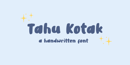 Tahu Kotak – Handwritten Font is a fun display Font font, this font Is perfect for product packaging, product designs, label, photography, watermark, special events, or anything. Features: Uppercase and lowercase letters Multilingual, numerals, and punctuation Thank You!
 - Adelyne by Good Java Studio,
$20.00 Adelyne is a modern hand-lettering font make from handwriting ideas in font design. This font includes full Alphabetical glyphs, Numerals, and punctuation. Adelyne is perfect for invitations, monograms, wedding, fashion, branding, labels, hand-lettering or logotype.
 - Omed Brush by Alit Design,
$22.00 Presenting the Omed Brush Signature Script font by alitdesign. The Omed Brush Signature Script font is inspired by spontaneous and dynamic signature strokes with an ink texture that makes the Omed Brush Signature Script look real. The Omed Brush Signature Script font looks unique and charming which makes designs using the Omed Brush Signature Script look more prominent and cool. The Omed Brush Signature Script font is perfect for a collection of new fonts on your computer, tablet and smartphone for making unique designs or lettering. The Omed Brush Signature Script font is perfect for magazine cover designs, brochures, flyers. Instagram ads, Canva Design and so on with unique and modern concepts. besides that this font is very easy to use both in design and non-design programs because everything changes and glyphs are supported by Unicode (PUA). The Omed Brush Signature Script contains 804 glyphs with many unique and interesting alternative options. Language Support : Latin, Basic, Western European, Central European, South European,Vietnamese. In order to use the beautiful swashes, you need a program that supports OpenType features such as Adobe Illustrator CS, Adobe Photoshop CC, Adobe Indesign and Corel Draw. but if your software doesn't have Glyphs panel, you can install additional swashes font files. Thank You Alit
 - Mr Eaves Modern by Emigre,
$59.00 Mr Eaves is the often requested and finally finished sans-serif companion to Mrs Eaves, one of Emigre’s classic typeface designs. Created by Zuzana Licko, this 2009 addition to the Emigre Type Library expands the versatility of the original Mrs Eaves with two complimentary families: Mr Eaves Sans and Mr Eaves Modern. Mr Eaves was based on the proportions of Mrs Eaves, but Licko took some liberty with its design. One of the main concerns was to avoid creating a typeface that looked like it simply had its serifs cut off. And while it matches Mrs Eaves in weight, color, and armature, Mr Eaves stands as its own typeface with many unique characteristics. The Sans version relates most directly to the original serif version, noticeably in the roman lower case letters a, e, and g, as well as in subtle details such as the angled lead in strokes, the counter forms of the b, d, p, and q, and the flared leg of the capital R, the tail of the Q. The distinctly loose-fitting letter spacing of Mrs Eaves was applied also to the Sans version. This, together with generous built-in line spacing due to a small x-height and extended ascenders and descenders, renders the same kind of lightness and airiness when setting text that is so characteristic of Mrs Eaves. Deviations from the original Mrs Eaves are evident in the overall decrease of contrast, as well as in details such as the flag and tail of the f and j, and the finial of the t, which were shortened to maintain a cleaner, sans serif look. And the lower case c had to be balanced out differently after it lost its top ball terminal. And with the loss of serifs, Mr Eaves set width is slightly narrower. Mr Eaves Italic also carries over many forms from its Mrs Eaves model, most notably the v, w, and z, which are unusually flamboyant for a sans italic design. It also utilizes lead in and terminal tails that are reminiscent of the serif italic. The biggest departure here is the width of the characters. The extra narrow gauge and delicate features seemed more appropriate for the Serif than the Sans. To allow for a comfortable fit, Mr Eaves Italic has a more robust design and wider character width. Meanwhile, the Modern family provides an overall less humanistic look, with simpler and more geometric-looking shapes, most noticeably in the squared-off terminals and symmetric lower case counters. This family has moved furthest from its roots, yet still contains some of Mrs Eaves’ DNA. The Modern Italic is free of tails, and overall the Modern exhibits more repetition of forms, projecting a cleaner look. This provides stronger differentiation from the serif version whenever a more contrasting look is desired. Each version (Sans and Modern) contains its own set of alternates providing unique options for applications such as headlines, word logos, letterheads, pull quotes, and other short text settings. Both the Sans and Modern come in six weights. The simpler forms of a sans-serif provide the opportunity of more weights than do serif letter forms, which are more complex in structure, making it difficult to accommodate additional weight without distortions. Regular and Bold match the original Mrs Eaves weights, while the Heavy provides an additional weight for extra emphasis.
 - Mr Eaves Sans by Emigre,
$59.00 Mr Eaves is the sans-serif companion to Mrs Eaves, one of Emigre’s classic typeface designs. Created by Zuzana Licko, this 2009 addition to the Emigre Type Library expands the versatility of the original Mrs Eaves with two complementary families: Mr Eaves Sans and Mr Eaves Modern. Mr Eaves was based on the proportions of Mrs Eaves, but Licko took some liberty with its design. One of the main concerns was to avoid creating a typeface that looked like it simply had its serifs cut off. And while it matches Mrs Eaves in weight, color, and armature, Mr Eaves stands as its own typeface with many unique characteristics. The Sans version relates most directly to the original serif version, noticeably in the roman lower case letters a, e, and g, as well as in subtle details such as the angled lead in strokes, the counter forms of the b, d, p, and q, and the flared leg of the capital R, the tail of the Q. The distinctly loose-fitting letter spacing of Mrs Eaves was applied also to the Sans version. This, together with generous built-in line spacing due to a small x-height and extended ascenders and descenders, renders the same kind of lightness and airiness when setting text that is so characteristic of Mrs Eaves. Deviations from the original Mrs Eaves are evident in the overall decrease of contrast, as well as in details such as the flag and tail of the f and j, and the finial of the t, which were shortened to maintain a cleaner, sans serif look. And the lower case c had to be balanced out differently after it lost its top ball terminal. And with the loss of serifs, Mr Eaves set width is slightly narrower. Mr Eaves Italic also carries over many forms from its Mrs Eaves model, most notably the v, w, and z, which are unusually flamboyant for a sans italic design. It also utilizes lead in and terminal tails that are reminiscent of the serif italic. The biggest departure here is the width of the characters. The extra narrow gauge and delicate features seemed more appropriate for the Serif than the Sans. To allow for a comfortable fit, Mr Eaves Italic has a more robust design and wider character width. Meanwhile, the Modern family provides an overall less humanistic look, with simpler and more geometric-looking shapes, most noticeably in the squared-off terminals and symmetric lower case counters. This family has moved furthest from its roots, yet still contains some of Mrs Eaves' DNA. The Modern Italic is free of tails, and overall the Modern exhibits more repetition of forms, projecting a cleaner look. This provides stronger differentiation from the serif version whenever a more contrasting look is desired. Each version (Sans and Modern) contains its own set of alternates providing unique options for applications such as headlines, word logos, letterheads, pull quotes, and other short text settings. Both the Sans and Modern come in three weights. The simpler forms of a sans-serif provide the opportunity of more weights than do serif letter forms, which are more complex in structure, making it difficult to accommodate additional weight without distortions. Regular and Bold match the original Mrs Eaves weights, while the Heavy provides an additional weight for extra emphasis.
 - Generale Script by Alpha Bento,
$12.00 Generale Script is the font of choice for writing things that go beyond words. This font type is designed with high detail to deliver stylish elegance. So, it can be said, the character of the change is very beautiful, a kind of classical decorative copper script. Generale Script presents alternative variants of most letters, binders, and many calligraphy tips, ideal for elegant labels, high-end packaging, stationery, and compositions for certain brands, beautiful titling, verses, letters and short texts, which are intended to be read only with the eyes or intended to whisper into someone's ear. Generale Script has 300+ glyphs and alternative characters, including various language support. With the OpenType feature with an alternative style and elegant binder. The OpenType feature does not function automatically, but you can access it manually and for the best results needed for your creativity in combining these Glyph variations. To enable the OpenType Stylistic alternates, you need a program that supports OpenType features such as Adobe Illustrator CS, Adobe Indesign & CorelDraw X6-X7, Microsoft Word 2010 or later versions. (Windows), Font Book (Mac) or a software program such as PopChar (for Windows and Mac). How to access all alternative characters using Adobe Illustrator: https://www.youtube.com/watch?v=XzwjMkbB-wQ How to use stylistic sets fonts in Microsoft Word 2010 or later versions: https://www.youtube.com/watch?v=NVJlZQ3EZU0 There are additional ways to access alternates / swashes, using the Character Map (Windows), Nexus Font (Windows) Font Book (Mac) or a software program such as PopChar (for Windows and Mac). How to access all the alternative characters, using the Windows Character Map with Photoshop: https://www.youtube.com/watch?v=Go9vacoYmBw If you need help or advice, please contact me. :) Thank You, Alpha Bento
 - Breitkopf Fraktur by profonts,
$39.99Breitkopf Fraktur was designed by Johann Gottlob Immanuel Breitkopf (1719-1794), the well-known type designer and printer of Leipzig. Breitkopf's high reputation is based on a system of printing musical notes which was developed by him. 1793, in the final stage of his life, he designed this beautiful broken script named after himself.Breitkopf Fraktur is classified as broken", something created by the German renaissance. Broken, because all round parts of the lower case characters in such typefaces look broken.Ralph M. Unger redrew and digitized this font exclusively for profonts in 2003. His work is based on artwork taken from old font catalogues." - El Mariachi by IKIIKOWRK,
$17.00 Introducing El Mariachi - Libre Type, created by ikiiko. El Mariachi is a unique typeface inspired by a Mexican vibe. A simple, bold sans serif typeface combined with attractive ligatures gives this font a strong character. This font is perfect to create layout for vintage design, mexican brand product, movie poster, food packaging, fashion product, and another fun project to a have unique or vintage look. What's included? Uppercase & Lowercase Number & Punctuation Ligature Multilingual Support Get also a good offer & FREEBIE at our site : www.ikiiko.com Enjoy our font and if you have any questions, you can contact us by email : ikiikowrk@gmail.com
 - Meizda by Patria Ari,
$15.00 Introducing Meizda, a fun handwritten font with unique alternate and ligatures. Meizda can be played off easily to use for your project to make design more beautiful. Meizda suitable for book cover, tshirt, tote bags, merchandise, books, poster, title, quotes, and many more! Fonts featured : Uppercase Lowercase Numbers Punctuation & symbols Accented characters
 - Childwood by Arterfak Project,
$12.00 Childwood is a typeface inspired with a sense of wood and kids. Recommended for your headline such as the children book cover, coloring book, interior murals, poster, t-shirt, mug & other merchandise. Available in Normal & Rough style. The playful font that you can combine the uppercase & lowercase to get the children taste!
 - Youthful Radiance by Invasi Studio,
$17.00 Young and vibrant with a brush handwriting style, Youthful Radiance font brings youth spirit to life. Youthful Radiance is perfect for casual types on greeting cards, illustrations, quotes, quaint branding, book covers, children's books, packaging, and more. Features: Total 221 Glyph Uppercase Numerals & Punctuation Alternates and Ligatures Multilanguage Supports 60+ Latin based languages
 - Bohate by Sulthan Studio,
$12.00 Introduce Bohate - is a font from handwriting on paper then made it come alive and I removed some of the smudges to make it look neat with an alternative for each letter that goes up and down differently like the letters b,d,f,g, h, j, k, l, p, t, y etc has a total of 713 glips featuring uppercase, lowercase, numbers, punctuation, language support, swash, alternatives and binders. very natural you can try it and enjoy your work with this handwriting
 - Kalesi by Craft Supply Co,
$20.00 Kalesi - The Elegant Sans Serif Font strikes a perfect balance between modern simplicity and timeless sophistication. Its clean, sans-serif style features subtle contrasts that add a touch of refined elegance. Ideal for projects demanding a contemporary, minimalist aesthetic with a touch of class. Whether it's branding, web design, or editorial work, Kalesi effortlessly enhances your project's appeal with its understated yet captivating look. With Kalesi, your designs exude contemporary elegance, leaving a lasting impression with its carefully crafted contrast and minimalist charm.
 - Masa Brush by Azetype,
$29.00 Presenting Masa Brush! A Brush San Serif with an organic texture. It looks original and can be used for all your project needs. Each glyph has its own uniqueness and when meeting with others will provide dynamic and pleasing proximity. This font can be used at any time and on any project. So, Masa Brush can't wait to give its touch to all your design projects such as quotes, poster design, personal branding, promotional materials, logotype, product packaging, etc. Happy Creating! www.azetypestudios.com
 - RFX elegant by Xaver Design Studio,
$25.00 RFX elegant is an elegant bolder typeface that looks modern and defies previous conventions. Is it a serif typeface? Yes and no. Although it doesn't actually have serifs, the curves give it the elegance of serifs. The curves make it look pleasing and friendly, but the breaks still give it a strong character. It can be used mixed and versal. It is ideal for occasions where friendliness and beauty meet elegance and character. It also offers language support for the entire European region, as well as for North & South America and Oceania.
 - Classic Notes by Balpirick,
$15.00 Introducing by Balpirick Studio Classic Notes is a Quotable Slab Serif Typeface Font. This font captures the essence of vintage typewriters, with a distinct and easily recognizable aesthetic. This font is perfect for projects that require a vintage touch, such as vintage-inspired branding, editorial designs, and book covers. Embrace the nostalgia of analog writing with our typewriter fonts, a tribute to the timeless art of typography. - also multilingual support Enjoy the font! Feel free to comment or feedback! Thank you!
 - Riana Star by Attype Studio,
$10.00 Introducing Riana Star - Inspired by Star on the space & astronaut with rocket, Riana Star is handwritten font cursive that perfect for children product. come with star layered font, make combination of this font to create amazing design! Two style Font: Handwritten & Display Riana Star is perfect for children product, branding, logo, invitation, stationery, wedding, product packaging, merchandise, monogram, blog design, game titles, cute style design, Book/Cover Title and more. Features : Multilingual Support --- Hope you enjoy with our font! Attype Studio
 - Lia Berta by Lia Baratz Fonts,
$40.00 Berta font is a typeface design that is inspired by vintage typographical styles. This font have a classic, timeless feel with distinctive details like, flourished lines, and varied stroke widths. They are commonly used in design projects that require a historical or nostalgic touch, such as wedding invitations, posters, book covers, and more. With a vintage font, designers can add a touch of sophistication and elegance to their work while also evoking a sense of bygone eras. Support both English and Hebrew letters
 - Valor by Tim Rolands,
$29.00Valor is a display face inspired by uncial forms seen through a modern roman lens. The result is a type with strong contrast between thick and thin strokes and a highly geometrical construction that even so retains a hint of the charm of hand-written uncial letters. A number of alternate forms and ligatures add to the personality of the face and offer flexibility in usage. Best suited for large titling work such as in posters or book and magazine covers. - Shaky Halloween by Putracetol,
$28.00 Shaky Halloween is a horror display font. This font is inspired by movie titles and some horror logos. The impression of horror is highly emphasized, but the alternate character of this font that curves at the beginning and end of the letter makes this font very suitable to be used as a logo and poster. Shaky Halloween would be perfect for Logo, title, logotype, cover, headline, apparel, comic, cover books, cards, posters, or anything that requires a horrror or halloween!
 - Chillphils by Maulana Creative,
$12.00 Chillphils is a casual handwritten font. With bold stroke, slant and fun character inspired by the authentic handwriting on the comic paper with a bit of ligatures. To give you an extra creative work. Chillphils font support multilingual more than 100+ language. This font is good for logo design, Social media, Movie Titles, Books Titles, a short text even a long text letter and good for your secondary text font with sans or serif. Make a stunning work with Chillphils font. Cheers, MaulanaCreativexqxd
 - Catskin by Hanoded,
$15.00 Catskin is a fairytale by The Brothers Grimm. The story is about a king who has a beautiful wife and daughter - you know, the basic fairytale stuff. Long story short: they all live happily ever after (except for the wife, who dies…). Catskin is also a nice, handmade font. I like making fairytale fonts, especially since I have three kids, who love books. And when I see one of my fonts on the cover, I can tell them: ‘daddy made this’. #prouddaddy ;-)
 - Incognia by Nasir Udin,
$29.00 Incognia is a sharp and high-contrast long-serif type family of 10 fonts inspired by classic roman typography. Ranging from light to bold with matching italics, Incognia offers many possibilities to be applied in many graphic or editorial projects. The lighter weights are suitable for short paragraph, and the heavier weights are perfect for display purpose such as titling or headlines, branding, editorial, book covers, and packaging. Incognia has extended latin character set that supports 200+ latin-based languages.
 - Portsilk by Maulana Creative,
$12.00 Portsilk is wide clean round sans display font, inspired by legendary Eurostile. Bold stroke, fun character with a bit of ligatures and alternates. To give you an extra creative work. Portsilk font support multilingual more than 100+ language. This font is good for logo design, Social media, Movie Titles, Books Titles, a short text even a long text letter and good for your secondary text font with script or serif. Make a stunning work with Portsilk font. Cheers, Maulana Creative
 - Spookies Identity by Putracetol,
$32.00 Spookies Identity is a horror display font. This font is inspired by movie titles and some horror logos. The impression of horror is highly emphasized, but the alternate character of this font that curves at the beginning and end of the letter makes this font very suitable to be used as a logo and poster. Spookies Identity would be perfect for Logo, title, logotype, cover, headline, apparel, comic, cover books, cards, posters, or anything that requires a horrror or scarylook!
 - Venettica Script by Letterhend,
$16.00 Please meet Venettica Signature, a romantic script typeface. As you can see, this typeface has elegant look with natural feel. The swashes make the font looks even more unique. You can play around and mix and match the swashes, combining into a great signature! They works perfect for you who needs a typeface for headline, logotype, apparel, invitation, branding, packaging, advertising etc. This typeface is comes in uppercase, lowercase, punctuation, symbols, numerals, stylistic set alternate, ligatures, etc also support multilingual.
 - PF Signskript by Parachute,
$75.00 Sitting inside our offline vault and print catalogs for several years but still available for purchase, PF Signskript is part of a valuable triad of typographic gems which are finally re-released, fully updated and upgraded. Designed by Vladimir Radibratović, a foremost calligrapher, type designer and illustrator, this trilogy of script typefaces was recently revamped by our design team with full support for Latin, Greek and Cyrillic. Initially released between 2000 and 2003 these typefaces manifest a human, hand-crafted feel. Designed to excel particularly within casual and natural contexts, their names reveal their exact identity. The nostalgic charm of PF Signskript, the unique vintage and rough appeal of PF Rafskript or the organic Mediterranean essence of PF Mediterra have all attracted attention to these popular typefaces for brands on the supermarket shelves, wine labels, packaging, quotes, stationery and vintage lettering.
 - PF Rafskript by Parachute,
$75.00 Sitting inside our offline vault and print catalogs for several years but still available for purchase, PF Rafskript is part of a valuable triad of typographic gems which are finally re-released, fully updated and upgraded. Designed by Vladimir Radibratović, a foremost calligrapher, type designer and illustrator, this trilogy of script typefaces was recently revamped by our design team with full support for Latin, Greek and Cyrillic. Initially released between 2000 and 2003 these typefaces manifest a human, hand-crafted feel. Designed to excel particularly within casual and natural contexts, their names reveal their exact identity. The nostalgic charm of PF Signskript, the unique vintage and rough appeal of PF Rafskript or the organic Mediterranean essence of PF Mediterra have all attracted attention to these popular typefaces for brands on the supermarket shelves, wine labels, packaging, quotes, stationery and vintage lettering.
 - PF Mediterra by Parachute,
$75.00 Sitting inside our offline vault and print catalogs for several years but still available for purchase, PF Mediterra is part of a valuable triad of typographic gems which are finally re-released, fully updated and upgraded. Designed by Vladimir Radibratović, a foremost calligrapher, type designer and illustrator, this trilogy of script typefaces was recently revamped by our design team with full support for Latin, Greek and Cyrillic. Initially released between 2000 and 2003 these typefaces manifest a human, hand-crafted feel. Designed to excel particularly within casual and natural contexts, their names reveal their exact identity. The nostalgic charm of PF Signskript, the unique vintage and rough appeal of PF Rafskript or the organic Mediterranean essence of PF Mediterra have all attracted attention to these popular typefaces for brands on the supermarket shelves, wine labels, packaging, quotes, stationery and vintage lettering.
 - VVDS Organum by Vintage Voyage Design Supply,
$10.00 Elegant and easy to use serif font family with contrast in vertical and horizontal strokes. Its variety of weights provides a range of choices that will help you to find the best typographic look. Use all caps to get the classic serif look, like Didones, or use it normally for a playful serif look. Normal and Medium widths are good for text blocks and Thin and Light, or Bold and Black are perfect for Headliners. Every letter in a word looks like as if written specially next to each other, as in hand lettering. You can use it in gentle and minimal projects, and also in projects with bold and heavy typographic base. Also, for more individuality, Organum comes with discretionary ligatures and few stylistic alternates for every caps and some lowercase letters.
 - Etrusco Now by Italiantype,
$39.00 Etrusco Now is the revival of a lead typeface originally cast in lead by Italian foundry Nebiolo in the early 1920s. Heavily inspired by the design of the Medium weight of Schelter & Giesecke's Grotesk, Etrusco was, like Cairoli, an early precursor of the modernist grotesque superfamilies: a solid, multi-purpose "work-horse" typeface family that could solve a wide range of design problems with its range of widths and weights. When designing the new incarnation of Nebiolo's Etrusco, the Italiantype team directed by Cosimo Lorenzo Pancini and Mario de Libero decided to extend the original weight and width range to keep this "superfamily" approach. Etrusco Now has twenty-one styles widths in three widths of seven weights each, with matching italics; the original weights for the typeface have been collected in the Etrusco Classic subfamily. Etrusco Now new widths allowed the team to include in the design many nods and homages to other vintage classics of Nebiolo. The lighter weights of the normal width have been heavily influenced by the modernist look of Recta, while the heavy condensed and compressed widths refer to the black vertical texture of Aldo Novarese's Metropol. This infuses the typeface with a slightly vintage mood, making Etrusco at the same time warmly familiar and unexpected to eyes accustomed to the formal and cold look of late modernist grotesques like Helvetica. Contemporary but rich in slight historical quirks, Etrusco Now is perfect for any editorial and branding project that aims to be different in a subtle way. Etrusco Now's deviations from the norm are small enough to give it personality without affecting readability, while its wide range of open type features (alternates, stylistic sets, positional numbers) and language coverage make it a problem solver for any situation. Like its cousin Cairoli, Etrusco is born out of love for lost letterforms and stands like its lead ancestor from a century ago, at the crossroads between artsy craftsmanship and industrial needs.
