10,000 search results
(0.162 seconds)
- Sensual Initials JNL by Jeff Levine,
$29.00Sensual Initials JNL is a revamped and cleaned-up version of an old freeware font by Jeff Levine. Redrawn, and now utilizing the typeface French Art Initials JNL - Grotica by Runsell Type,
$24.99 Grotica is a versatile geometric sans serif contains 7 weights from Thin to Bold. IIt's inspired by the beautiful logotype on old labels and by exploring the Retroica font we've created in 2020. This font is suitable for movies, TV, advertising, packaging, logos, posters, music, branding, posters and so on with a modern design style. With over 600 glyphs per style, Grotica supports around 150 languages in Latin and Cyrillic script. Grotica OpenType Features including alternate glyphs, fractions, contextual alternates, oldstyle and lining (proportional and tabular) numerals, numerators/denominators, superiors/inferiors, and a variety of symbols.
 - Apex Brush by Hanoded,
$15.00 I like playing around with brushes and Chinese ink. I always have some kind of idea of what the final design should look like, but once it’s done, it never ever looks like what I had in mind. Apex Brush is one of those designs: it started off as a few brush strokes, but before I knew it, I had a really nice set of matching brush fonts! Use it for any design that needs a bit of rough, a splash of ink and a pinch of rebel.
 - Scurlock by Scriptorium,
$18.00Scurlock is an original Dave Nalle design. It is a rough-hewn, hand-drawn font with some interesting character. It's excellent for doing unique, eye-catching titles and has a bit of a wicked, fantastical look. - Henderson Slab by Sudtipos,
$39.00 A few bold caps drawn by Albert Du Bois for the 1906 Henderson Sign Painter book started me in the direction of looking at how sign painters approached slabs after the industrial revolution. The usual happened from there. My exercise in the early lettering roots of what eventually became the definition of geometric typography ended up having a life of its own. The majuscules led to minuscules, one idiosyncratic bold weight led to six more, and uprights led to italics. What was kind-of-interesting in the early twentieth century persuaded me to make it interesting enough a century later. This of course meant alternates, swashes, the standard baggage that keeps calling my name. Henderson Slab is a family of seven weights plus italics, all full of open features and extended Latin language support. Part of this family’s appeal is its coverage of nearly the entire of the slab serif through the last 100 years — the basis is the manual, humanist origins, the swashed forms come right out of the phototypesetting era, and the alternates and mostly modern constructs of contemporary ideas. The result is a set with the ability to function in modern spaces, from corporate to editorial, in text or display, while both winking and nodding at the roots of what is now considered a geometric endeavor. (Basic version do not include alternates, swashes, etc).
 - Paper Cutout Pro by Kimmy Design,
$10.00 Paper Cutout Pro is a playful typeface inspired by paper letterforms cutout by scissors. It's imperfect letters create the feel of an authentic hand-cut school project. It comes in regular and round versions.
 - White Hiltony by Nathatype,
$29.00 Your selected font type has a big influence on your customers’ perceptions on your designs. It can even beautify or destroy them. With White Hiltony, worry no more about a perfect font for your designs as it is a lovely display sans serif font applicable for elegant, stylish designs. This font has no serif making it look more modern and simple. Furthermore, White Hiltony has regular structures to make it legible enabling you to freely use the font due to its great legibility. Enjoy the features available here. Features: Alternates Ligatures Multilingual Supports PUA Encoded Numerals and Punctuations White Hiltony fits best for various design projects, such as brandings, posters, banners, logos, magazine covers, quotes, headings, printed products, greeting cards, merchandise, social media, etc. Find out more ways to use this font by taking a look at the font preview. Thanks for purchasing our fonts. Hopefully, you have a great time using our font. Feel free to contact us anytime for further information or when you have trouble with the font. Thanks a lot and happy designing.
 - Provisions by Surplus Type Co,
$16.00 Provisions is a retro sans serif display font that was inspired by classic, hard working blue collar businesses such as mechanics, delis, butchers, pubs and machine shops. This versatile typeface is perfect for capturing that same era in your own branding and logo design, while also working well in apparel designs, labels, packaging & more. The full version of Provisions includes both regular and oblique styles, each with a complete set of multilingual characters.
 - Hemispheres by Runsell Type,
$9.00 Hemispheres perfectly represents clean and classy design in four weights: Script 1, Script 2, Caps 1, and Caps 2. The project was inspired by unique labels, badges, and packaging and works well for additional cases such as logotype, branding, packaging, quotes, business cards and more. Hemispheres feature uppercase, lowercase, numeral, punctuation & symbol, ligatures, stylistic alternates, multilingual support, PUA encoded. How to get access alternate glyphs from open type fonts check this link : http://adobe.ly/1m1fn4Y
 - Rundeck by Edignwn Type,
$12.00 The Rundeck perfectly represents crafted stuff of serif display. This project was inspired by a beautiful retro music poster. The product includes 4 styles (regular, smooth, rough and texture). This matches applies in some designs such as the logotype, poster, label, badge, packaging, branding, and more custom design. Rundeck includes : 4 style typefaces (regular, smooth, rough and texture) Uppercase, lowercase, numeral, punctuation and symbol Multilingual PUA Encoded Thank you for your support and choosing us.
 - Headcorps by Almarkha Type,
$29.00 Headcorps is a Serif military style font, first conceptualize was inspired by the classic vintage military stencil design . I wanted a typeface that could be a solid base for any military inspired project Headcorps Fonts can be used for wallpaper, pattern fills, web page background, surface textures. Perfect for making army posters , scrapbooking,invitation cards, label stickers, stationary, gift wrap, packaging, clothes, buttons, pendants, holiday gifts, print on fabrics and so much more.
 - Sanitation JNL by Jeff Levine,
$29.00 Sanitation JNL is a bold Art Deco sans design inspired by some stylized hand lettering on a 1930s-era WPA (Works Progress Administration) poster and is available in both regular and oblique versions. The topic of the poster was "Your home is not complete without a sanitary unit" and that was recommended by the State Department of Public Health. A "sanitary unit" is the formal name for what rural folks called an "outhouse", and it's presumed the target group were homeowners not hooked up to major sewer lines such as in those rural areas.
 - Beautifuly Agusto by Alcode,
$24.00 Beautifuly Agusto is calligraphy font with a classic style and a touch of elegance, inspired by the handwriting of Italian women and ancient manuscripts. Carefully designed to work together in harmony that makes it very suitable for wedding media, book covers, greeting cards, logos, branding, business cards and certificates, even for any design work that requires a classic, formal or luxurious. Try Beautifuly Agusto, enjoy the richness of OpenType features and let her fun and elegant excitement make you happy and enhance your creativity! You can use this font very easily. Included Multilingual Support, Alternative Characters And Special Ligatures If you do not have programs that support OpenType features like Adobe Illustrator and CorelDraw X Versions, you can access all alternative flying machines using Font Book (Mac) or Character Map (Windows):
 - Mollis Gothic by Quatype,
$25.00 Mollis Gothic is inspired by medieval gothic calligraphy. The gothic calligraphy is classical and traditional, I want to add something modern to it. So the letters are simplified as lines and without the handwriting feel, just like a sans font. Meanwhile, the gothic calligraphy visual look remained. It expands the usage area because of the modern feel of this font, such as the package, titles, logo, poster design, etc. In September 2021, we created the thin weight. Although Mollis Gothic Thin is from the font family, the kerning set and capital letters’ height are not as same as the regular weight for suiting the thin font’s usage situation.
 - Competition by sportsfonts,
$15.00 Competition is a state of the art sports typeface. A large width range, slant angles from –12 to 12, and an adjustable inline make it extremely versatile. It’s devided into 5 subfamilies, from the sizes S, M, L & XL with decreasing inline weights to Solid without an inline at all. (By the way: S doesn’t mean it doesn’t look good in large sizes!) Choose from 105 predefined styles, or 1 variable font with axes for width, slant and inline weight (which is included in the family package). Competition embraces the Latin S character set and therefore supports 400+ Latin-based languages. Go for Gold!
 - Loose by Zeptonn,
$20.00 Loose is a hand-drawn font with a slightly sloppy yet relaxed look. All glyphs have been handcrafted by illustrative designer Zeptonn. It contains lots of Open Type goodness to ensure you'll be able to give your entire text that random and handcrafted feeling. It's great for setting fun text for headers, posters or cards. Or hey, you could use it as a nice alternative for something that starts with "Comic" and ends with "Sans"! The typeface contains nice takes on traditional standard ligatures, a few discretionary ligatures and even provides contextual and stylistic alternates. This is all provided to ensure your text can have that awesome loose feeling!
 - Qixohe by Twinletter,
$18.00 Qixohe is an elegant blend of tradition and modern style. With its strong Black letter characters, this font brings an irreplaceable classic element to your projects. It's the perfect choice for creating striking titles, memorable logos, or memorable prints. Qixohe's special features include alternative ligatures and characters that allow you to express your creativity to the fullest. With Qixohe, you can create a design like no other, one that will be remembered by all who see it. Whether for graphic design, branding, or printmaking projects, Qixohe will provide the character and notoriety you're looking for. So, grab Qixohe now and give your designs an unforgettable bold and elegant touch.
 - Laca by Nova Type Foundry,
$30.00 Laca is a semi-sans serif inspired by retro Portuguese packaging of soaps. Laca is the Portuguese word for hairspray. The starting point was to design a typeface that would bring a familiar feeling of closeness and warmth but giving it a modern look ensuring it works well on modern platforms. It’s a lively typeface that brings texture and personality to the text. Perfect for branding and for all communications. There is an upright italic version available through the stylistic set that brings even more friendliness to the font. The result is a versatile typeface that has many OpenType features that brings stylistic alternates to the designer.
 - Lumios Typewriter by My Creative Land,
$19.99 Lumios Typewriter is a slab serif font that was inspired by, as you may guess, an old typewriter letters. The family has 4 unique styles: New, Used, Old and texturized Tape. All fonts benefit from OpenType features such as stylistic alternates that enhance a natural look of this font family. As well as Latin-based language support, it also offers a basic Cyrillic one. It is ideally suited for websites, packaging, editorial and branding design needs as well as for posters, greeting cards, billboards etc. Lumios Typewriter is a perfect companion to Lumios Marker, sharing the same soft curves and clean letter edges (excluding theTape style).
 - Calicanto by Sudtipos,
$39.00 Alejandro Freitez’s first commercial typeface is inspired by contemporary serifs and newspaper typography. Calicanto is a compact typeface with strong serifs, symmetrical curves and a vertical axis. It has open counters and a generous x-height with slightly condensed characters and low contrast strokes. The design of its letters are simple (with a precise rationale), and it is ideal for combining different variables and typographic bodies, for digital and printed media. Each of the 12 variables has 750 glyphs (supporting more than 90 languages), with small caps, ligatures, lining figures by default, OldStyle and tabular, mathematical and currency symbols for each set of numerals, intelligent fractions, lower and upper numerals, glyphs sensitive to capital letters and circular numerals, among other OpenType functions that make it ideal for composing demanding texts for books, magazines, newspapers, annual reports, and much more.
 - Conectiva by JVB Fonts,
$25.00 A font face with cyber, spatial, and virtual connotations that offers a decisive futuristic and techno spirit. Inspired by geometric forms from visual tendencies in the early 2000s, it was used once in corporate identity. Originally created in 1998, it remained unpublished by its author until today. It is now offered with many improvements. With one alternate for H and more diacritics and ligatures and extended range glyphs, Conectiva can be used in titles and display text that require a futuristic and dynamic style. Conectiva 2.0 has been arranged and improved with more glyphs and new OpenType features (Fractions, discretional and standard ligatures, slashed zero and more new stylish alternates). This upgrade includes 4 new weight variables (Light, book, bold and extrabold). Recommended for games, presentations, or any graphic pieces that reveal and need futuristic, techno, and/or Sci-fi style.
 - Bookseller Bk by Cyanotype,
$20.00 Bookseller Bk is a typeface designed for books and legible text at a small sizes, with an old book feeling. This typeface is the reinterpretation of a sample found in a French book, published between 1882 and 1893 and its author —Ernest Michel— lived between 1837 and 1896. This sample has influence from Didot, Scotch Roman and Clarendon (typefaces which were in use at that time). This reinterpretation expands the basic set for the contemporary era. Bookseller Bk includes small caps, old style figures, lining figures, fractions and basic Cyrillic alphabet. Everything in 3 different optical widths. You can save some lines with Reduced weight or fill some lines with Ample weight. All of them with italics, bold and bold italics. Bookseller Bk is also available in Caption size. 12 fonts for legibility at smaller sizes. Subhead & Title sizes are now in development. Finally this typeface was the result of the course Digital Reinterpretation of Classic Typography by Oscar Guerrero Cañizares at Domestika. Do you require additional glyphs? Please contact me to consider your request in order to expand Bookseller in further updates.
 - TessieSpinners by Ingrimayne Type,
$13.95 A tessellation is a shape that can be used to completely fill the plane—simple examples are isosceles triangles, squares, and hexagons. Tessellation patterns are eye-catching and visually appealing, which is the reason that they have long been popular in a variety of decorative situations, such as quilting. Most of the shapes in TessieSpinners suggest a spinning motion. Most do not resemble real world objects. The TessieSpinners fonts contain shapes that can be used to construct tessellation patterns. It has two styles, an outline style and a filled or black style. The black style can be used to construct colored patterns. To see how patterns can be constructed, see the “Samples” file here. Most or all of these shapes were discovered/created by the font designer during the past twenty years in the process of designing maze books, coloring books, and a book about tessellations.(Earlier tessellation fonts from IngrimayneType, the TessieDingies fonts, lack a black or filled version so cannot do colored patterns. Make sure the leading is the same as font size or the rows will not line up.)
 - Scribonius GTSLB by Intellecta Design,
$30.00 Blackletter typefaces, also known as Gothic, Fraktur, or Old English, have been used in the headings and initial chapters of books. This style of typeface is recognizable by its dramatic thin and thick strokes, and in some fonts, the elaborate swirls on the serifs. Blackletter typefaces are based on early manuscript lettering and evolved in Western Europe from the mid twelfth century. They are best used for headings, logos, posters, and signs, as they are not easy to read in body texts. Blackletter was type that emulated the most common handwritten scripts of the era and was used for books of hours and initial chapters of books Brazilian type designer Paulo W created this font ideally suited for advertising and packaging, festive occasions, editorial and publishing, logo, branding and creative industries as well as poster and billboards. An elegant and clean typeface, with two harmonic blackletters styles, the bold lowercases with beaufitul ornamented initials. A classic decorative design around an antique theme: The headings of gothic texts, this font works great in display purposes. ENJOY
 - Brayline by Surotype,
$30.00 Brayline is a monoline swashed script, a typeface inspired by old neon signs. It contains more than 400 glyphs, including alternative characters such as: titling, terminal forms, stylistic alternates, stylistic set, and swash variants. Brayline is very suitable to use on many of your design projects such as Signage, Book Covers, Invitation, Packaging, Logotype and more. To enable the opentype stylistic alternates, you need a program that supports opentype features such as adobe illustrator cs, adobe indesign & coreldraw x6-x7 and more.
 - Clasica by Latinotype,
$26.00 The font family "Clasica" is ideal to cover every design need. Excellent for titles, paragraphs, magazines, books, editorials and logos. The particularity and identity of this font is found in the thinness of its vertical strokes and symmetrical serif. Inspired by the "Optima" font but with a serif that gives a different and new feel. "Clasica" counts with glyphs for the letters: a, e, f, g, r and y. This font family comes with 9 different weights with their respective italics.
 - Century Expanded by URW Type Foundry,
$35.99 The first Century typeface was cut in 1894 by Linn Boyd Benton in conjunction with T L DeVinne for the Century Magazine. It was a blacker, more readable face than the type previously used. Morris Fuller Benton designed the Century Expanded version in 1900 for American Type Founders to meet the Typographical Union Standard of the day. The 'expansion' was in the vertical plane. Century Expanded is a useful font family for text setting in magazines, books, presentations and newsletters.
 - Casuallity by Zamjump,
$17.00 Introducing “Casuallity,” a stunning calligraphy-style font meticulously crafted by hand, designed to infuse elegance and charm into your creative projects. Casuallity Font embodies a perfect blend of fluidity and sophistication, making it an ideal choice for a wide range of design applications, including logo design, branding, book covers, and more. __________________________________________________________________________________ HOW TO ACCESS THE ALTERNATIVE CHARACTERS Open the glyph panel: In Adobe Photoshop go to Window – glyphs In Adobe Illustrator, open Type – glyphs Follow my shop for upcoming updates thank you
 - Caslon Titling by Monotype,
$29.99Monotype Caslon Titling was made available for hot metal casting in 1932. The capital Monotype Caslon Titling letters were based on types from the Stephenson Blake Foundry, previously the Caslon Foundry. Originally designed by William Caslon in the eighteenth century, Caslon is considered an old face although it has characteristics which were later found in the transitional typefaces. The Monotype Caslon Titling font has a distinctive style, generous width and strong color, ideal for use in advertising, magazines and on book jackets. - Baby Snowman by Attype Studio,
$10.00 Introducing Baby Snowman - Inspired by snow on handwritting, Baby Snowman perfect for winter events, making calligraphy merry christmas with snow around it. combine with Baby Snowman display to make amazing design! Two style Font: Handwritting & Display Baby Snowman is perfect for winter sale design, branding, logo, invitation, stationery, wedding, product packaging, merchandise, monogram, blog design, game titles, cute style design, Book/Cover Title and more. Features : - Baby Snowman.otf - Baby Snowman Display.otf - Multilingual Support --- Hope you enjoy with our font! Attype Studio
 - Korey Sister by Dhan Studio,
$20.00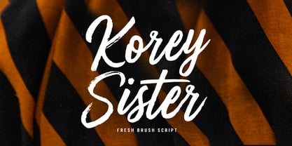 Korey Sister is a beautiful brush font, a contemporary approach to design, this is intentionally made by hand to make it more natural and attractive when used in your design. Suitable for use in title design. Such as clothing, invitations, book titles, stationery designs, quotes, branding, logos, greeting cards, t-shirts, packaging designs, posters, and others. Korey Sister includes a complete set of upper and lower case letters, and multi-language support, numbers, punctuation, and also has Alternatives and ligatures.
 - Kartell by ParaType,
$25.00 Kartell type family was designed by Oleg Karpinsky for ParaType in 2006. Design features: lower contrast between strokes and slim serifs. It consists of three weight styles with corresponding Italics. The Open Type version contains a lot of alternate characters and additional ligatures. Italic styles contain some alternate letterforms and lots of swash characters. Kartell is recommended for long text passages at magazines, books and booklets, as well as for headlines, logos, billboards, visit cards, newspaper adds and so on.
 - Nevoclara by MlkWsn,
$23.00 Nevoclara is a Modern Vintage font with beautiful ligatures, with special alternative glyphs, and multilingual support. It is inspired by the decorative arts and architecture movement that originated in the 1920s and developed into a major style in the Western European United States during the 1930s. Nevoclara includes luxury glyphs that are made individually and carefully produced, the aim is to create a quality and elegance that is sleek and semi-modern that symbolizes the glory and sophistication of vintage. It combines modernist style with good craftsmanship. Nevoclara is perfect for your project and allows you to create designs, headlines, posters, logos, badges, t-shirts and many more that are beautiful. It is also best used for posts, logos, posters, certificates, labels and more.
 - Koehler Sans JNL by Jeff Levine,
$29.00Koehler Sans JNL was inspired by a set of cardboard sign kit letters made by the Koehler Sign Company of Missouri (presumably) in the late 1940s or early 1950s. Not much is known about them, other than the letters looked interesting enough to turn into a font. - Mrs Eaves XL Serif by Emigre,
$59.00 Originally designed in 1996, Mrs Eaves was Zuzana Licko’s first attempt at the design of a traditional typeface. It was styled after Baskerville, the famous transitional serif typeface designed in 1757 by John Baskerville in Birmingham, England. Mrs Eaves was named after Baskerville’s live in housekeeper, Sarah Eaves, whom he later married. One of Baskerville’s intents was to develop typefaces that pushed the contrast between thick and thin strokes, partially to show off the new printing and paper making techniques of his time. As a result his types were often criticized for being too perfect, stark, and difficult to read. Licko noticed that subsequent interpretations and revivals of Baskerville had continued along the same path of perfection, using as a model the qualities of the lead type itself, not the printed specimens. Upon studying books printed by Baskerville at the Bancroft Library in Berkeley, Licko decided to base her design on the printed samples which were heavier and had more character due to the imprint of lead type into paper and the resulting ink spread. She reduced the contrast while retaining the overall openness and lightness of Baskerville by giving the lower case characters a wider proportion. She then reduced the x-height relative to the cap height to avoid increasing the set width. There is something unique about Mrs Eaves and it’s difficult to define. Its individual characters are at times awkward looking—the W being narrow, the L uncommonly wide, the flare of the strokes leading into the serifs unusually pronounced. Taken individually, at first sight some of the characters don’t seem to fit together. The spacing is generally too loose for large bodies of text, it sort of rambles along. Yet when used in the right circumstance it imparts a very particular feel that sets it clearly apart from many likeminded types. It has an undefined quality that resonates with people. This paradox (imperfect yet pleasing) is perhaps best illustrated by design critic and historian Robin Kinross who has pointed out the limitation of the “loose” spacing that Licko employed, among other things, yet simultaneously designated the Mrs Eaves type specimen with an honorable mention in the 1999 American Center for Design competition. Proof, perhaps, that type is best judged in the context of its usage. Even with all its shortcomings, Mrs Eaves has outsold all Emigre fonts by twofold. On MyFonts, one of the largest on-line type sellers, Mrs Eaves has been among the 20 best selling types for years, listed among such classics as Helvetica, Univers, Bodoni and Franklin Gothic. Due to its commercial and popular success it has come to define the Emigre type foundry. While Licko initially set out to design a traditional text face, we never specified how Mrs Eaves could be best used. Typefaces will find their own way. But if there’s one particular common usage that stands out, it must be literary—Mrs Eaves loves to adorn book covers and relishes short blurbs on the flaps and backs of dust covers. Trips to bookstores are always a treat for us as we find our Mrs Eaves staring out at us from dozens of book covers in the most elegant compositions, each time surprising us with her many talents. And Mrs Eaves feels just as comfortable in a wide variety of other locales such as CD covers (Radiohead’s Hail to the Thief being our favorite), restaurant menus, logos, and poetry books, where it gives elegant presence to short texts. One area where Mrs Eaves seems less comfortable is in the setting of long texts, particularly in environments such as the interiors of books, magazines, and newspapers. It seems to handle long texts well only if there is ample space. A good example is the book /CD/DVD release The Band: A Musical History published by Capitol Records. Here, Mrs Eaves was given appropriate set width and generous line spacing. In such cases its wide proportions provide a luxurious feel which invites reading. Economy of space was not one of the goals behind the original Mrs Eaves design. With the introduction of Mrs Eaves XL, Licko addresses this issue. Since Mrs Eaves is one of our most popular typefaces, it’s not surprising that over the years we've received many suggestions for additions to the family. The predominant top three wishes are: greater space economy; the addition of a bold italic style; and the desire to pair it with a sans design. The XL series answers these requests with a comprehensive set of new fonts including a narrow, and a companion series of Mrs Eaves Sans styles to be released soon. The main distinguishing features of Mrs Eaves XL are its larger x-height with shorter ascenders and descenders and overall tighter spacing. These additional fonts expand the Mrs Eaves family for a larger variety of uses, specifically those requiring space economy. The larger x-height also allows a smaller point size to be used while maintaining readability. Mrs Eaves XL also has a narrow counterpart to the regular, with a set width of about 92 percent which fulfills even more compact uses. At first, this may not seem particularly narrow, but the goal was to provide an alternative to the regular that would work well as a compact text face while maintaining the full characteristics of the regular, rather than an extreme narrow which would be more suitable for headline use. Four years in the making, we're excited to finally let Mrs Eaves XL find its way into the world and see where and how it will pop up next.
 - Closet Skeleton by Hanoded,
$20.00 Some time ago I stumbled upon a little book called 'De Sprookjeshoorn' ('Horn of Fairy Tales') by Anton Eijkens (1920 - 2012). It was published in 1946 and contains several authentic and unique fairy tales - unfortunately unreadable to modern children, as the language used is out of date. What caught my eye was the handwritten font on the cover of the booklet. Closet Skeleton is a fairytale font inspired by the one I found on the cover of De Sprookjeshoorn. It comes with several curly alternates and some end-ligatures as well. I added an 'old fashioned' ampersand and a modern one, so you can choose which one to use. Apart from that, Closet Skeleton comes with a closet choc-a-block full of diacritics.
 - Cosmic Turtle by Hanoded,
$10.00 Cosmic Turtle is the belief that the world is supported by a giant turtle. It is mostly found in Hindu and Chinese mythology and the mythologies of the indigenous peoples of the Americas. I had to think of this, as the idea of the Cosmic Turtle is referenced to in the 1982 book ‘A Wild Sheep Chase’ by Haruki Murakami - my favourite author. Cosmic Turtle is a font that I made using a broken chop stick and Chinese ink. I was actually trying to create something scary for Halloween, but this is what came out and I quite like it. Cosmic Turtle is a fat display font with rough edges, wobbly glyphs and a set of double letter ligatures for you to play with.
 - Nokarin by Alit Design,
$18.00 Introducing Nokarin Font Nokarin Font Inspired by elegant script with handwritting. Carefully designed to work together in harmony making it perfect for wedding favors, book covers, greeting cards, logos, branding, business cards and certificates, even for any design work that requires classic, formal or extravagant. Attempt calligraphy Desired, delight in those riches from claiming OpenType features and tell its exquisite fun and fervor make you euphoric What's more support your creativity! you might utilize this font precise undoubtedly. Elegant script “Nokarin Font” are very easy to apply to any design, especially those with an elegant and smooth concept, apart from that this font is very easy to use in both design and non-design programs because all alternates and glyphs are supported by Unicode (PUA).
 - Gofienda by Alit Design,
$22.00 Introducing Gofienda Typeface Gofienda typeface Inspired by ancient manuscripts in the European area. Carefully designed to work together in harmony making it perfect for wedding favors, book covers, greeting cards, logos, branding, business cards and certificates, even for any design work that requires classic, formal or extravagant. Attempt calligraphy Desired, delight in those riches from claiming OpenType features and tell its exquisite fun and fervor make you euphoric What's more support your creativity! you might utilize this font precise undoubtedly. Elegant script “Gofienda Typeface” are very easy to apply to any design, especially those with an elegant and smooth concept, apart from that this font is very easy to use in both design and non-design programs because all alternates and glyphs are supported by Unicode (PUA).
 - Vglee by Ingrimayne Type,
$8.50 With its split serifs, Vglee looks like it could be a copy of an “Old West” font but it is not. It was constructed by taking a motif and applying it regardless of consequences. Vglee does not have lower-case letters but it does include a full set of Western and Central European accented characters. Its distinctive, odd appearance can be useful in small doses for decorative purposes. The VgleeStar style contains only the ornament. It is intended to be used in layers with Vglee.