10,000 search results
(0.052 seconds)
- Swingsnug by Almarkha Type,
$25.00 Swingsnug is a Stylish & Playful Sans full of charm . It will take any DIY-project to the next level! Swingsnug is perfect for Craft , product packaging, product designs, label, branding projects, logo, wedding designs, social media posts, advertisements, watermark, invitation, stationery and any projects
 - Square Lemon by Awan Senja,
$14.00 Square Lemon feels equally charming and elegant. This stunning handwritten font is a stylish homage to classic calligraphy. It will elevate a wide range of design projects to the highest level, be it branding, headings, wedding designs, invitations, signatures, logos, labels, and much more!
 - Blitzkrieg NF by Nick's Fonts,
$10.00A Lufthansa Airlines baggage label from 1936 provided the inspiration for this genuinely German typeface, with strong Art Deco influences. Both versions include the complete Unicode Latin 1252, Central European 1250 and Turkish 1254 character sets, as well as localization for Lithuanian, Moldovan and Romanian. - Gamarasa by Differentialtype,
$10.00 Gamarasa is a sports font with a modern design. Gamarasa comes with 4 styles, and 6 weights. Makes it easy for you to combine various styles according to your design needs. Gamarasa is perfect for logotypes, sport branding, posters, apparel designs, labels, and much more.
 - Rollink by Zamjump,
$14.00 Rollink is a simple brush font that is very comfortable to read. It will elevate various design projects to the highest level, be it branding, headings, hands, logos, labels, wedding designs, invitations, signs and more! included - uppercase and lowercase - multi language - alternate - ligature - swash
 - Vector Type by Garisman Studio,
$20.00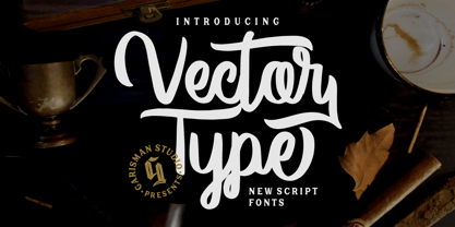 Welcome to our newest product: VECTOR TYPE In addition, this font is very suitable for design t-shirts, branding projects, wedding designs, social media posts, advertisements, product packaging, product, and logo. designs, labels, photography, watermark, invitation, stationery and any projects that need handwriting taste.
 - Scout Athletic Typeface by Hipfonts,
$18.00 Scout is a sharp, clean, and bold athletic font. It is a very versatile display typeface perfect for sports branding, emblems, jerseys, posters, apparel design, magazine headlines, labels and so much more. Scout is fully-kerned and ready to be used right out the box.
 - Thishub Graffiti by Sipanji21,
$18.00 Thishub Graffiti is a display font with a monoline graffiti style, there is some swash for your awesome design. It will elevate a wide range of design projects to the highest level, be it branding, headings, wedding designs, invitations, signatures, logos, labels, and much more!
 - Manttulcuy Signature by Juncreative,
$15.00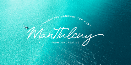 Manttulcuy Signature is a handwritten signature script with a natural & stylish flow, elegant and smooth. Manttulcuy is perfect for branding projects, logos, wedding designs, social media posts, advertisements, product packaging, product designs, labels, photography, watermark, invitations, stationery and any projects that needs a handwriting touch.
 - Lotter by Kaer,
$19.00 Lotter blackletter with Drop caps One fine day I found a vintage book, it called “A treatise by the Dominican friar-writer Marcus von Weida on the Brotherhood of the Holy Rosary”. It was printed in 1515 by Melchior Lotter in Leipzig. The text was illustrated by hand-colored engravings on religious and liturgical themes and beautiful initials I like. Lotter was the last name of a family of German printers, intimately connected with the Reformation. An innovation by the elder Lotter was his use of Roman types for Latin, reserving the Gothic types for German. I'm happy to present to you my new font family. Lotter font family has Drop cap and Regular styles. It's all you need to precisely imitate medieval style text. Use Drop cap style as a decorative element at the beginning of a paragraph or section, other part of the paragraph should be in Regular style. You’ll get: * Drop cap & Regular styles * Uppercase and lowercase * Multilingual support * Numbers * Symbols * Punctuation * Ligatures Please feel free to request any help you need: kaer.pro@gmail.com Best, Roman.
 - Rialto Piccolo dF by CAST,
$305.00 Rialto dF is a book face inspired by calligraphic tradition. Named after the famous bridge in Venice, it was conceived as a bridge between calligraphy and typography, roman and italic. It can also be thought of as an imaginary bridge between Italy and Austria, since it is the result of collaboration started in 1995 between the Austrian Lui Karner and Venetian Giovanni de Faccio. The letterforms of Rialto dF were drawn directly in digital format with a starting point deriving from humanistic letterforms memorized in the hearts, minds and the manual ability of its designers… As tradition demands, uppercase, numerals and punctuation are used in combination with italics – the same solution adopted by Francesco Griffo when he cut his first italic for the Virgil, the first of the octavo series printed and published in Venice by Aldus Manutius in 1501. Rialto dF comes in two optical weights: Piccolo, for up to 14 pt, and Grande for 16pt and above. Alternate characters and various dingbats are also provided and these are available through OpenType features developed by type designer and technician Karsten Luecke.
 - P22 Folkwang Pro by IHOF,
$29.95 Folkwang is an unusual roman type with a lowercase that resembles an upright italic. Unusual top serifs are contrasted by almost no foot serifs. Originally released by the Klingspor foundry in 1955, this face originated from Hermann Schardt while he was the director of the Folkwang Werkkunstschule in Essen Germany circa 1949. According to British book designer and printing historian John Dreyfus in the 1955 Penrose Annual: Folkwang “…is a lovingly made piece of work which could have easily have been little more than an act of awe-struck reverence for the calligraphic techniques rediscovered by Edward Johnston and spread abroad in Germany by Anna Simons. Of special interest is the serif treatment of the lower-case letters: at the feet the terminals are mostly left bare, but the ascenders and the cross-strokes of the f and t are given elaborate curving serifs which in the mass create an effect unusual in a page of letters made as movable types, resembling rather more a piece of intaglio engraving. The ligatures ch and ck are original and successful.”
 - Iridium by Linotype,
$29.99Iridium™ was designed by Adrian Frutiger in 1972 for Linotype. It is in the modern" style like Bodoni or Didot, in that it has the sparkle created by a high thick/thin contrast and a symmetrical distribution of weight. But the sometimes harsh and rigid texture of the modern style is tempered by Frutiger's graceful interpretation. Iridium itself is a very hard, brittle and strong metal; yet the Latin and Greek roots of the word mean rainbow, or iridescence. And indeed, this font is infused with a more lustrous and complex spirit than the average rather stark modern typeface - note the stems that gently taper from waist to serif, the nicely curved ovals of the round characters, and the slight bracketing of the serifs. Iridium was originally designed for phototypesetting, and Frutiger himself cut the final master photo-mask films by hand. This digital version has all the craftsmanship of that original and includes the roman, a true italic, and the bold weight. Iridium works particularly well for book and magazine text and headlines." - Baskerville by Linotype,
$40.99John Baskerville (1706-1775) was an accomplished writing master and printer from Birmingham, England. He was the designer of several types, punchcut by John Handy, which are the basis for the fonts that bear the name Baskerville today. The excellent quality of his printing influenced such famous printers as Didot in France and Bodoni in Italy. Though he was known internationally as an innovator of technique and style, his high standards for paper and ink quality made it difficult for him to compete with local commercial printers. However, his fellow Englishmen imitated his types, and in 1768, Isaac Moore punchcut a version of Baskerville's letterforms for the Fry Foundry. Baskerville produced a masterpiece folio Bible for Cambridge University, and today, his types are considered to be fine representations of eighteenth century rationalism and neoclassicism. Legible and eminently dignified, Baskerville makes an excellent text typeface; and its sharp, high-contrast forms make it suitable for elegant advertising pieces as well. The Linotype portfolio offers many versions of this design: ITC New Baskerville® was designed by John Quaranda in 1978. Baskerville Cyrillic was designed by the Linotype Design Studio. Baskerville Greek was designed by Matthew Carter in 1978. Baskerville™ Classico was designed by Franko Luin in 1995." - Baskerville Classico by Linotype,
$29.99John Baskerville (1706-1775) was an accomplished writing master and printer from Birmingham, England. He was the designer of several types, punchcut by John Handy, which are the basis for the fonts that bear the name Baskerville today. The excellent quality of his printing influenced such famous printers as Didot in France and Bodoni in Italy. Though he was known internationally as an innovator of technique and style, his high standards for paper and ink quality made it difficult for him to compete with local commercial printers. However, his fellow Englishmen imitated his types, and in 1768, Isaac Moore punchcut a version of Baskerville's letterforms for the Fry Foundry. Baskerville produced a masterpiece folio Bible for Cambridge University, and today, his types are considered to be fine representations of eighteenth century rationalism and neoclassicism. Legible and eminently dignified, Baskerville makes an excellent text typeface; and its sharp, high-contrast forms make it suitable for elegant advertising pieces as well. The Linotype portfolio offers many versions of this design: ITC New Baskerville® was designed by John Quaranda in 1978. Baskerville Cyrillic was designed by the Linotype Design Studio. Baskerville Greek was designed by Matthew Carter in 1978. Baskerville™ Classico was designed by Franko Luin in 1995." - Monotype Baskerville by Monotype,
$29.99 John Baskerville (1706-1775) was an accomplished writing master and printer from Birmingham, England. He was the designer of several types, punchcut by John Handy, which are the basis for the fonts that bear the name Baskerville today. The excellent quality of his printing influenced such famous printers as Didot in France and Bodoni in Italy. Though he was known internationally as an innovator of technique and style, his high standards for paper and ink quality made it difficult for him to compete with local commercial printers. However, his fellow Englishmen imitated his types, and in 1768, Isaac Moore punchcut a version of Baskerville's letterforms for the Fry Foundry. Baskerville produced a masterpiece folio Bible for Cambridge University, and today, his types are considered to be fine representations of eighteenth century rationalism and neoclassicism. Legible and eminently dignified, Baskerville makes an excellent text typeface; and its sharp, high-contrast forms make it suitable for elegant advertising pieces as well. The Linotype portfolio offers many versions of this design: ITC New Baskerville® was designed by John Quaranda in 1978. Baskerville Cyrillic was designed by the Linotype Design Studio. Baskerville Greek was designed by Matthew Carter in 1978. Baskerville™ Classico was designed by Franko Luin in 1995."
 - DT Paperside by Dragon Tongue Foundry,
$15.00 Paperside: Neither Papyrus nor SSI Countryside. Inspired in some ways by the Papyrus form, but untextured and smoother, with the dimensions and proportions more open, like that of Countryside SSi, with its larger easily readable lowercase body, and more consistent, shorter stems. Paperside has an open scripted feel which is pleasing on the eye and easy to read. Paperside can enhance the first letter of most sentences automatically, and changes other letters to suit their position within words, and the letters they appear beside. Now comes in 5 weights plus italic. For best results, use this ‘smart font’ with Contextual Ligatures turned on. Mulitiple Stylistic Alternatives are included. Inspiration for this font came from two other fonts. Papyrus: was designed by Chris Costello and created in 1982, it is a hand-drawn textured typeface, emulating texts written in biblical times. One of the most used (and misused) fonts of all times. Owned by Letraset, and currently published by the Internation Typeface Corporating (ITC). Countryside SSi: The serif font of an unknown designer, is currently licensed by Southern Software Inc. Feel free to preview some of the Dragon Tongue fonts that are yet to be released, at https://www.dragon-tongue.com/fonts
 - Olis by Roman Polishchuk,
$34.00 Olis is a stylish, fresh new handwritten script. Olis comes with two weights, numerals, punctuations, and some variations on character including OpenType alternates, and common ligatures. It helps set your designs apart by adding a custom-lettered look. You will also find that its initial and terminal letters can enhance your designs in new and creative ways. Hand-drawn leaves, plants, flowers, as well as large and small snowflakes add original detail while complementing the font perfectly. If you like this font you might also like an aesthetic text generator by the same author.
 - Galagar by Jadatype,
$12.00 Galagar is a font with a strong look. The font is suitable for your branding name, poster title, event, or group name, supported by the font that gives a strong effect to the reader. has its own market and fans. can be used in adobe illustrator, photoshop, or microsoft word. By purchasing this font, you will get: - Uppercase and Lowercase letters - Alternates Characters - Ligatures - Numbering and Punctuations - Multilingual Support - Works on PC or Mac - Simple Installation - Support Adobe Illustrator, Adobe Photoshop, Adobe InDesign, also works on Microsoft Word. Thank you
 - Diamond Ring by Dharma Type,
$24.99 Diamond Ring is an Art Deco font inspired by Japanese designs for cosmetic packaging and posters used from the end of the 19th century to the early 20th. The most distinguishing characteristic is the diagonal parts of the glyphs. All diagonals have the same degree of the angle. By this elements, whole design of this font and typography with this font look like the shining of diamond ring during total solar eclipse. When you prefer more humanly letter form, please try our Yasashii that used in La La Land.
 - Forest Hill by PeachCreme,
$20.00 Meet our brand new script font - Forest Hill! It is a modern casual font with a full set of easygoing letters, numerals, and punctuation. The main feature of this font is that the letters are not separated. Just look how all the letters connect one by one and form one whole piece of writing. Featuring fabulous beginning and ending lowercase swashes, Forest Hill was inspired by clean handwriting with a natural flow and works well for various designs from wedding stationery to Instagram quotes, modern logos, packaging, websites, and many more.
 - 1781 La Fayette by GLC,
$42.00 This font was inspired from the numerous font-types looking like Hand-carved in the 1700's. The capitals are mainly inspired from the font carved by Fournier in year 1781, the year of the famous American and French decisive victory at Yorktown, and drawn by Benjamin Franklin himself, and the lower cases are inspired from the well known "bâtarde coulée" style, ornamented with final loops and enriched with alternates and ligatures. The font is available for English, Western Europe (including Celtic) Icelandic, Baltic, Eastern Europe and Turquish languages.
 - Mister Honey by Alit Design,
$18.00 Introducing Mister Honey Typeface Mister Honey Typeface is inspired by the classic victorian font style combined with western style which makes the Mister Honey font look cool and unique. This font is perfect for a bold and vintage Victorian concept design. Can be used for the design of alcoholic beverage packaging, pomade designs, barbershops and so on with the Victorian classic concept. Apart from that this font is very easy to use in both design and non-design programs because all alternates and glyphs are supported by Unicode (PUA).
 - Neugen by Minor Praxis,
$20.00 Inspired by retro movies and theatre display design. A very condensed font made by Minor Praxis. Perfect for headlines, tall-format prints, posters, and displays which can utilize space of a medium. Neugen is a condensed type of font with a very dense kern. Give a strong impression which can be matched with basic sans serif fonts as a body copy that can make it more casual and modern looks. Available in medium and medium-rounded style with multi languages support. Ligatures, alternates, and stuff like icons and symbols.
 - Bocksay Mira by Trifásica Studio,
$9.00 Bocksay Mira is a text font family inspired by the manuscript Mira Caligraphiae Monumenta created between 1561 and 1596 by Georg Bocskay and Joris Hoefnagel for the Holy Roman Emperor. All shapes were taken from the original records in both regular and italic style: lower case (p. 5, 72), uppercase (p. 47, 121), small caps (p. 122, 7). The high contrast forms and the wide spacing makes this family suitable for long texts but also for titling uses, having always that calligraphic and stylish look. Find the original script here
 - Sangoma by Scholtz Fonts,
$19.00I named the font "Sangoma" after the traditional healers of the Southern African tribes. Sangomas often work by "throwing bones". The shapes of the bones have suggested the shapes of the characters in the Sangoma font. The font is useful for creating designs or producing text that has an African look. Typified by an African angularity the characters reflect the ethos of Africa. The Sangoma font contains the full range of upper and lower case characters, all punctuation and special characters as well as the accented characters used in the major European languages. - Antique Olive by URW Type Foundry,
$35.99 The first Antique Olive fonts were produced by the French type foundry Olive, in 1962-1966 and designed by poster designer Roger Excoffon (1910-1983). All Excoffons fonts are flamboyant, elegant and highly stylistic. They include the Banco, Mistral, and Calypso fonts. Antique Olive was launched to rival Helvetica and Univers, but the shapes it took were totally refreshing. Antique Olive is probably the most striking Sans Serif since Futura and Gill, and more refined than either. It is perfect for posters and display material as it works well in larger sizes.
 - Hakim Ghazali by Linotype,
$155.99Hakim Ghazali, designed by Hakim Ghazali in 2005, is an Arabic typeface in the style of Maghribi and a winner in Linotype’s first Arabic Typeface Design Competition. This style, which originated in western North Africa, is characterized by a strong baseline and long, fluid, and curvaceous curves. It can be used in headlines or in text and gives a very fresh and calligraphic look. The font includes a matching Latin design and support for Arabic, Persian, and Urdu. It also includes proportional and tabular numerals for the supported languages. - Radiant Extra Condensed CT by CastleType,
$59.00 I was commissioned by the Emporium (now Macys) to digitize Radiant Bold Extra Condensed (originally designed by Robert Middleton in 1940) for use in their Sunday supplement to the San Francisco Examiner. For several years, I stubbornly refused to add the lowercase letters to the font, because I thought it looked best just used with caps, but finally relented, added the lowercase letters and at the same time created two more weights as well: Light and Medium. Used very large and carefully, these faces can be quite elegant.
 - CG Gothic by Monotype,
$29.99This is a family of "Gothic" types from the Monotype Design Studio. The faces named "Gothic No. 1 through 4" were produced by Compugraphic. Gothic No. 1 is a condensed, late 19th century American-style sans serif typeface. Gothic No. 2 and Gothic No. 3 are based on the Metro #2 series, designed by W.A. Dwiggins for Mergenthaler Linotype during the 1920s and 30s. Gothic No. 4 looks vaguely like Gothic number one, but is heavier and smaller on the body. Gothic Extra Light Extended is a very light and wide design. - Sanitation JNL by Jeff Levine,
$29.00 Sanitation JNL is a bold Art Deco sans design inspired by some stylized hand lettering on a 1930s-era WPA (Works Progress Administration) poster and is available in both regular and oblique versions. The topic of the poster was "Your home is not complete without a sanitary unit" and that was recommended by the State Department of Public Health. A "sanitary unit" is the formal name for what rural folks called an "outhouse", and it's presumed the target group were homeowners not hooked up to major sewer lines such as in those rural areas.
 - 1809 Homer by GLC,
$42.00 This family is inspired by the small hands used in the 1700’s 1800’s to write messages carried by carrier pigeons, also named “homers”, before the use of photography and microfilms in the same way. So, it is a “small eye” or "small x-height" font. It is enriched with numerous alternates and ligatures, as to look like a various real and written manual. The standard characters set is completed with accented or specific characters for Western (Including Celtic) and Central Europe, Baltic, Eastern Europe and Turkish.
 - Linea 72 by OLOF Type Foundry,
$25.00 Linea 72 is a typical seventies display typeface that was designed by Roland Hirter back in the phototypesetting days, when typefaces were really drawn by hand. In this static environment each work step took its time. With the decision to digitize this typeface his son Thomas Hirter also chose to develop it further with todays technical possibilities. That’s why the font now includes over 600 glyphs and ten stylistic sets, offering different stylistic alternates of several letters. Linea 72 comes in the two original styles Regular and Kontur.
 - Manifold CF by Connary Fagen,
$35.00 Manifold® CF is a utilitarian typeface inspired by the precision of a computer terminal, softened by contemporary design and rounded corners. Manifold's unified letterforms and tall x-height are great for user interfaces, or track it out for a sophisticated look. Manifold also offers wide language support, including Cyrillic script, Vietnamese, and Pinyin Romanization. Manifold® CF excels as a headline or display typeface, and pairs well with contrasting simple serifs like Artifex CF and Artifex Hand CF. All typefaces from Connary Fagen include free updates, including new features, and free technical support.
 - Melon Honey by Alit Design,
$19.00 Introducing Melon Honey Typeface Melon Honey Typeface is inspired by the classic victorian font style combined with western style which makes the Melon Honey font look cool and unique. This font is perfect for a bold and vintage Victorian concept design. Can be used for the design of alcoholic beverage packaging, pomade designs, barbershops and so on with the Victorian classic concept. Apart from that this font is very easy to use in both design and non-design programs because all alternates and glyphs are supported by Unicode (PUA).
 - Blonde Fraktur by ParaType,
$30.00 Blonde Fraktur is a free interpretation of the Gothic theme in Cyrillic. The font is neither Fraktur nor any other Gothic script from the formal point of view, but it makes text look like Gothic script, no matter which language is used. Blonde Fraktur was written with a quill by Alexandra Korolkova and prepared in digital form by Alexandra Pushkova. The font contains a set of alternatives and swashed variations. It suits well for advertising of beer, sausages, pubs and other places where Gothic scripts are commonly used.
 - Lebron Slab by IKIIKOWRK,
$17.00 Introducing LEBRON Slab, created by ikiiko. A slab series font with geometric feel and modern look. Easy to use and delightfully expressive. Lebron Slab is strong and vibrant typeface. Excellent for headlines, caption, brand logo, street gear, t-shirt, school & university, and also good for sport aesthetic product. What's Included? Uppercase & Lowercase Numbers & Punctuation Multilingual Support Format File : TTF & OTF Works on PC & Mac Get also a good offer & FREEBIE at our site : www.ikiiko.com Enjoy our font and if you have any questions, you can contact us by email : ikiikowrk@gmail.com
 - Beatnik Barbie by Type Innovations,
$39.00 Beatnik Barbie is a unconventional font design inspired by Jack Kerouac and the ‘Beat Generation’. It is an original design by Alex Kaczun and it is a derivative work based on his original ‘Beatnik’ font. It has an informal style about it, and invokes a casual and friendly mood. Beatnik Barbie incorporates many alternate letter forms, which work like ligatures, so when you type, it automatically substitutes different letter forms for a truly custom hand-written look. Perfect for any application. Beatnik Barbie truly has the heart and soul of the beat mentality. Groovin' baby.
 - Ponzastura by Matyáš Bartoň,
$39.99 Ponzastura typeface was inspired by Aldo Novarese's Eurostile, but in this case, monolinear strokes took on contrast and stress. The classical appearance of Ponzastura, whose name is inspired by the Italian city Pontestura where A. Novarese was born, is more of a reaction and interplay. The character set supports most European languages and contains ligatures as well as symbols, figures and alternative characters. Its strength is in a simplicity and format; recommended for use in headlines or short sentences. Ponzastura typeface can fill in a gap of high-contrasted fonts of nowadays.
 - Urban Maxim 3d Graffiti by Sipanji21,
$15.00 Urban Maxim" is a graffiti font that features three different layers: solid, shadow, and inner shadow. By using this combination of layers in your design, you can create a three-dimensional (3D) effect on your text. Fonts like this are often used in street art, posters, or other designs that aim to add depth and dimension to their typography. With "Urban Maxim," you have the flexibility to create text that looks distinct and more pronounced by using the various layers. This allows you to customize the appearance of your text to fit your design aesthetics.